


E&J Gallo, Chesapeake Corporation and Vivendi in this edition of Recent Rebrandings.

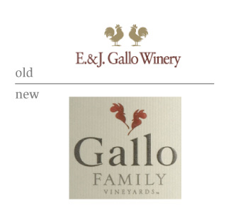
Gallo
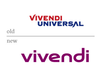
Vivendi
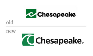
Chesapeake
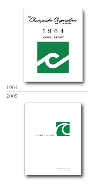
“In 1964 we introduced our new corporate logo on the cover of that year’s annual report. With our 2005 annual report we proudly unveil the first update to our logo in 41 years. This new modernized logo retains two key elements of the previous logo –the letter “C” in a stylized water wave, which offers a visual association with the word“Chesapeake,” and the color green, which symbolizes our heritage in forest products and theemphasis we place on environmental stewardship.”


gallo: I'll buy it— better.
vivendi: OK, but purple?
Chesapeake: Peaked in 64'
On May.24.2006 at 09:29 AM