


Baltimore tourism, The Phoenix Companies and Reliance

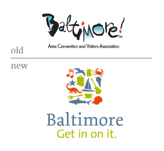
Baltimore
Was it a smart investment to spend $500,000 on Baltimore’s brand positioning?
The Phoenix Companies
“I don’t think the logo is going to make any difference,” Lipponen said “People don’t buy logos.”
Reliance
Baltimore. Now sponsored by Unilever. Get in on it.
at least the Unilever logo has some sense of personality in the rendering of its little illustrations. ironic, considering a City should have more personality represented in its logo than a conglomerate.
On Jun.16.2006 at 02:16 AM