Speak UpA Former Division of UnderConsideration
The Archives, August 2002 – April 2009
advertise @ underconsideration
---Click here for full archive list or browse below
  
If a Tree Falls in Times Square and Nobody Notices, have Designers Failed?

It is a rare occurrence when graphic designers can band together and show a large non-graphic-designing audience how visually astute and clever we are. These opportunities are commonly the result of editorial commissions for magazine features where designers take on the role of illustrators, information graphic designers and even photographers, providing amusing, poignant and invariably well-executed spots throughout the pages of any given story.

Like New York’s recent feature on Happiness with Christoph Niemann’s work grazing the cover with contributions from Open, Michael Bierut, Omnivore, Chip Kidd and Stephen Doyle peppered inside. Or, like 2003’s New York Times Magazine article on “campaign posters and buttons created for Democratic presidential candidates by top graphic designers at [the magazine’s] request” — now only available in text form at NYT Select and as a discussion started by Steve Heller here on Speak Up — back when some of us were hopeful that another political party would be taking command and designers like Michael Bierut (popular with the art directors and editors), James Victore, Number 17, Geoff McFetridge and Julia Hastings among others imagined campaigns for each candidate to varying degrees of relevance and success. Or, even the painfully misdirected visions of redesigning Google’s interface by Joshua Davis, Jenny Holzer and Shepard Fairey in a 2004 issue of Wired. All these editorial exercises render interesting results as shepherded by the editors and art directors and provide a rare, bright spotlight for graphic designers courtesy of each publication’s circulation and reputation. This Fall, more than 185 creative individuals have come together — without the aid or vehicle of a major publication, out of their own determination and with a self-imposed brief — to test their professional mettle on one of the most trafficked neighborhoods in the world — New York’s Times Square — with a somewhat wonky premise — Trees — for an unprecedented public display of design: Design Times Square: The Urban Forest Project.

Urban Forest: Introduction Urban Forest: Armin Vit
LEFT: Urban Forest introductory banner RIGHT: Banner by Armin Vit [Click on each image for bigger view, pop-up]

The project started brewing in the Fall of 2005 as a somewhat loose phone call from Worldstudio Foundation — an organization “devoted to encouraging social responsibility in the design and arts professions” — to the AIGA New York chapter with an opportunity to use 185 banners across Times Square for something, as offered by the Times Square Alliance. Yes, it was that loose. Alan Dye, board member of the AIGA New York chapter and Design Director at kate spade, along with fellow board member and untiring writer, Alice Twemlow, embarked on what seemed like a never-ending series of phone calls and meetings that eventually led to the agreement on the project and its brief: To design banners “with the form, idea or a characteristic of a tree and consider using [them] to interpret and explore an issue that [we] feel is pressing, or an idea [we] find entertaining or intriguing” with the understandable limitation that banners should not “advertise a brand or product, nor endorse a particular political party or agenda.” This was from the brief designers received as they were invited to participate. Around 70 designers were formally invited, ranging from the usual suspects — as you go through the banners you will know who they are — to the intentionally far and, perhaps, unknown. In a valiant effort to dispel the Newyorkiness of the AIGA (and the AIGA NY chapter in particular) the project committee asked for recommendations of international designers and those outside the major design hubs, with banners coming from as far away as Israel, Germany and Brazil. Another 70 or so banners were open contributions from members of the AIGA New York chapter; which ultimately contributed to the unavoidable New York centricity of the constituency. And, finally, 20-plus banners were given to the very successful AIGA NY Mentoring Program so that pairings of mentors and their students could create a banner.

Urban Forest: Chip Wass Urban Forest: Ed Fella
LEFT: Banner by Chip Wass RIGHT: Banner by Ed Fella [Click on each image for bigger view, pop-up]

Led by Speak Up’s own Bryony Gomez-Palacio, with the help of Soyoung Kim and Carrie Brunk along with the Mentoring Program’s Emma Pressler and Kris Angell, the students and their mentors went through a two-month process starting with a scavenger hunt aimed at forcing the students to see the surroundings of where the banners would be, followed by six formal workshops and critiques with two of those featuring guest critics and speakers Sam Potts on one occasion, and Michael Bierut another. The process squeezed the best out of the students (and their mentors) and exposed them to the design process, yielding some amazing results (like Radovan Jenko’s “poetree”) that at times are even hard to separate from the work of the professionals — this is both praise for the students and knock for the experienced designers.

Urban Forest: Massimo Vignelli Urban Forest: Rick Valicenti
LEFT: Banner by Massimo Vignelli RIGHT: Banner by Rick Valicenti [Click on each image for bigger view, pop-up]

Without getting into a 150-plus-banner critique I’ll just say that there are banners that are amazing, banners that are disappointing, banners that are clever, banners that are confounding and banners that are plain and unmemorable. (Which, as a side note, appropriately points to the disparaging range of ability in our profession, I think). As I went through the banners I couldn’t avoid thinking how similar this project is to our own Word It, and the common criticism that some, if not most, of its inclusions are lame or expected or poorly executed with only a few that actually stand out. Well, the same goes with the Urban Forest Project, just on a slightly larger scale. Some designers, it looks, spent plenty of time developing their banner, others may have slapped it together minutes before the deadline and, in each of these two camps, some were on the spot while others missed it gloriously. And on a third, more annoying (to me, at least), camp, there were those that regurgitated existing work.

I may have to plead solitary on this stance, as some may not share my grief but, for the life of me, I can not understand why any designer — given a blank canvas with thousands of potential eyeballs on it — would choose to repeat work that they have executed in response to another brief, job or personal inclination. According to the invitation we received, we were asked to contribute because “[our] work demonstrates the formal excellence and conceptual rigor necessary to make this a truly extraordinary public art project.” I fail to see how opening an old file, formatting it to fit seven-by-three-feet, making minor modifications and submitting it constitutes “conceptual rigor”.

Urban Forest: Milton Glaser
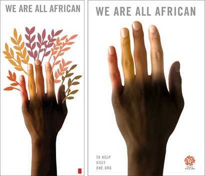
LEFT: Urban Forest banner by Milton Glaser RIGHT: Poster produced for the School of Visual Arts to help improve conditions in Africa and fight world poverty by Milton Glaser [Click image for bigger view, pop-up]

Milton Glaser contributed his year-old “We are all African” poster — already seen on phone booths around New York — with minor modifications: some sort of foliage stemming from the fingers, tighter kerning on the headline, and replacing the School of Visual Arts (who sponsored the original poster) logo with his own.

Urban Forest: Stefan Bucher, 344 Design
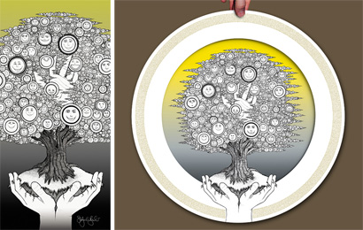
LEFT: Urban Forest banner by Stefan Bucher, 344 Design RIGHT: 2006 promotional poster “344 Questions on the Way to Wisdom” by Stefan Bucher, 344 Design [Click image for bigger view, pop-up]

Stefan Bucher, of 344 Design in Los Angeles, a designer and illustrator I admire deeply (who I hope doesn’t ice me, after reading this, when we meet again in November) submitted an amazing piece of artwork that he originally created for his yearly self-promotional poster that highlights his obsessive and unique style in the form of a tree — easily croppable into an Urban Forest banner.

Urban Forest: KarlssonWilker
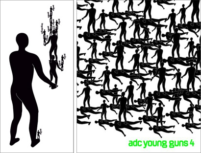
LEFT: Urban Forest banner by KarlssonWilker RIGHT: ADC Young Guns 4 book cover by KarlssonWilker [Click image for bigger view, pop-up]

New Yorkers KarlssonWilker’s banner consisted of a pyramid of their “good old friend, the standing figure” presumably in the shape of a tree — the “standing figure” was the overwhelming motif in 2005’s Art Directors Club’s Young Guns competition and is a highly recurring element in the duo’s monograph, tellmewhy.

Urban Forest: Paul Sahre
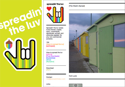
LEFT: Urban Forest banner by Greg and Paul Sahre RIGHT: “spreadin’ the luv” web site by Paul Sahre [Click image for bigger view, pop-up]

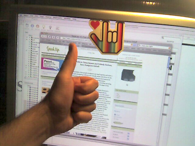
Finally, Paul Sahre’s contribution was an extension of an endeavor publicly started in January of 2006, “spreadin’ the luv”, which is based on the hand symbol for “I love You” and I assume is highly optimistic — unfortunately as someone who prefers to err on the side of cynicism and pessimism (and rarely gives anyone the benefit of the doubt) I find his contribution swimmingly self-serving. The brief suggested against endorsing a particular agenda, and while “spreadin’ the luv” is a worthy message in times like these it is Mr. Sahre’s personal agenda — the fact that his agenda is not “clubbin’ the seals” or “eatin’ the babies” perhaps makes it less opposable.

Now, some might argue that 99% of the people that will see these banners have never seen this work (much less heard of any of us) and is in turn “original” work. Fine. But we (should) know better. This is a project that publicly represents the design profession and is meant to make a stance for our originality and ability to interpret loose ideas into specific executions not our ability to rehash old ideas into redundant executions lacking originality. It also undermines the effort spent by those that created banners specifically for the project’s context. And while these duplicitous banners will have no harmful effect on the public and, like much of the design we do, it is just ephemeral and decorative, I find they are a painful misrepresentation of what designers can do. Luckily, there are a hundred other banners that make up for these.

Urban Forest: Armin's Favorites
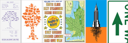
LEFT TO RIGHT: Walker Art Center, SpotCo, Douglas Riccardi, Jesse Kirsch, Rodrigo Corral, Michael Bierut [Click image for bigger view, pop-up]

From the Walker Art Center’s receipt, to SpotCo’s multi-state tree, to Douglas Riccardi’s PG-rated take on Times Square’s visual landscape, to Jesse Kirsch’s painstakingly-executed leafy Manhattan, to Rodrigo Corral’s exposé of what lies beneath the Chrysler Building, to Michael Bierut’s one way sign, and even to 2x4’s debatable “blank”, these banners (and many others) depict an acute sense of the banners’ context while providing original takes on its subjects: Trees, New York City, environmentalism, optimism and, after all, design. The project also provided an extension for some designers’ well-known styles to shine and adapt to the brief: Marian Bantjes’ infinitely connecting lines, Ed Fella’s typographic (de)arrangements, Rick Valicenti’s recent Randness, James Victore’s roughness (even though we’ve seen the high-heeled leg image before), Leif Parsons’ eerily simple figures and Michael Hodgson’s irony. These, and all, banners stand chaotically amid Times Square, dispersed from 40th to 53rd Streets and from Eighth to Sixth Avenues.

Urban Forest: Following your Style
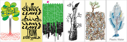
LEFT TO RIGHT: Marian Bantjes, Ed Fella, Rick Valicenti, James Victore, Leif Parson, Michael Hodgson [Click image for bigger view, pop-up]

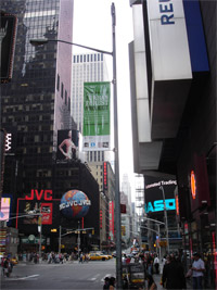
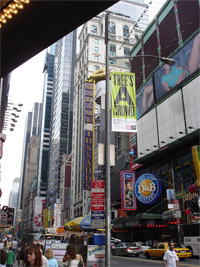
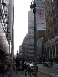
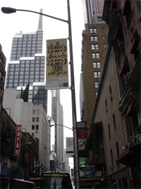
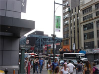
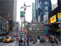
When I first pictured the project in its setting I imagined an imposing and unavoidable presence of tree banners lining the streets but when I finally saw them in person on a cloudy day, they undeniably chameleonized into the texture of Times Square. No matter how clever the concept or how tight the typography, the banners can not stand a chance against the massive LEDs, billboards, storefronts and foot-traffic that are Times Square’s raison d’être. Those that look hard (and high) enough will be rewarded with one of the profession’s few self-initiated onslaughts of public design. And while the project might have benefited from something similar to a heavy editorial hand and a more scrutinizing selection and approval process in an effort to get the best from every participant and the profession, the Urban Forest Project stands successfully tall as an example of the interpretative and evocative powers of design as proven by more than a hundred different executions (subway maps and scent pine trees notwithstanding) on the same basic theme. Whether the public at large takes notice is still the biggest challenge but we have taken the opportunity to populate a high-profile neighborhood and, maybe unknowingly, taken the risk to ask whether design, amid the distractions of life, matters.

Maintained through our ADV @ UnderConsideration Program
ENTRY DETAILS
ARCHIVE ID 2772 FILED UNDER Critique
PUBLISHED ON Aug.29.2006 BY Armin
WITH COMMENTS
Comments
Bone’s comment is:

Armin,

Poignant yet balanced critique.

My thought upon seeing the site (not being in NY) was that this could be an impressive installation.

After seeing your photos and reading your words I agree that it suffers on a few levels.

SCALE, MASS or DENSITY and INFORMATION.

Seeing the banners on the site and reading that they would be 3 x 7 feet gave me a sense that they might work in the visually congested Times Square. But to see them in your photos falls short of expectation.

I am not even sure that they ended up being produced 7 feet tall judging by the scale in your images.

Further they tacked on some infographics at the bottom which are completely out of scale as they cannot be read in place. I think this image from the New York Observer is quite telling. I can read the type on the walls and billboards which are at least a block if not two away.

Even the Introductory banner's info design fails.

As you mentioned, there just are not enough of the banners to compete with the surrounding environment. Enough said.

My last complaint is this - Why oh why are they printed on what looks to be VINYL? There are times where we must print on a material such as this but this simply seems like the wrong concept to work with. Janine James of The Moderns would have been a good resource for other vinyl-like materials if a natural material could not be used.

I may be speaking out of turn here, not knowing exactly how they are produced, but this seems like an obvious error.

Armin, thanks for the insight.

- Bone

On Aug.29.2006 at 10:18 AM
Armin’s comment is:

> But to see them in your photos falls short of expectation.

If you look at the thumbnail photos on the post, that is closer to how the banners "feel" on the street... They are hard to spot.

> My last complaint is this - Why oh why are they printed on what looks to be VINYL?

Another problem with the vinyl is that it is far too reflective. On a few angles, the banners are impossible to see.

> I think this image from the New York Observer is quite telling. I can read the type on the walls and billboards which are at least a block if not two away.

Ha! On that link, the banner is Photoshopped in. The designer information on that image is from a first proposed design, if you see my photos, you'll see the difference in the designer information. And Victore's banner is in a different block from the one that's shown on that picture – and, yes, I did stop on for a Ben & Jerry's. An "artist rendering" or some other disclaimer would have been in order on that report.

On Aug.29.2006 at 10:33 AM
Thor Stockman’s comment is:


An excellent, thoughtful article -- as always. Thanks.

Another review (mine) here:
http://thornyc.livejournal.com/151824.html#cutid1

Good to see we share some favorites. Other than Glaser's, I didn't spot the recycled/repurposed work -- but I did spank the bad designers a little more.

On Aug.29.2006 at 10:34 AM
Randy J. Hunt’s comment is:

I remember being on a couple of these conference calls early in the process, when this discussion came up under the "Design Ignites Change" moniker at AIGA National. I believe those must have been separate from the NY chapter calls and planning. What I do recall well was when the decision was announced to "curate" these after the initial open call was made. I was always curious if it was always to be curated and just miscommunicated, or if several sub-par submissions were recieved, putting up some red flags.

I was quite happy to hear that it would be filtered, as I understood this to be a huge opportunity for the design community and much preferred the idea of a carefully selected presentation of quality (even if determined by a small contingency) design.

Armin's analysis makes clear that the scale of the project is still grossly outweighed by the scale of the venue. I hope that this is the first many such projects. Next time, let's design the uniforms of the Times Sq. Alliance sanitation staff. Street-level visibility, an otherwise unused canvas (save the Allianc identity), and real people to interact with and consider.

I do clearly remember is that there were explicit suggestions and leads for seriously considering alternative materials for banner production. Do you, Armin, or anyone know what the production process was for the final banners?

I can't help but wonder if 1 more constraint might have brought them closer together and increased visibility through visual consistency. This might seem trivial, but what if every banner would limited to the use of the same 2 or 3 colors? Would this not also avoid some of the self-appropriation? Thoughts for next time.

On Aug.29.2006 at 11:11 AM
felixxx’s comment is:

i don't know about you but i feel like watering an african tree.

whew. another great article/critique, arm.

ps- if asked to judge... best poster is michael beirut's. whats most unfortunate is that 85% of these posters are complete shit.

On Aug.29.2006 at 11:23 AM
KevinHopp’s comment is:

Great post and critique Armin.

I think most of us have reused our designs at some point (and in some way) in our career, but this initiative, as noble as it is for the environment and our social patronage, is not the avenue to do so.

On another note, I was originally concerned about the banners being a blur to the busy Times Square, but I am into the idea that nonmarketing design messages should inundate the masses. Finally we see design for designers but not really, if you know what I mean.

i don't know about you but i feel like watering an african tree.

The WE ARE ALL AFRICAN piece appears to have a nonAfrican hand as the root? I went so far to bring up the levels, and played with it in Photoshop and it doesn't look authentic. Anyone else seeing this?

On Aug.29.2006 at 12:40 PM
Pesky Illustrator’s comment is:

Perhaps next time they can drop seeds all over the city from their vantage point.....

On Aug.29.2006 at 12:45 PM
marian bantjes’s comment is:

The thing that surprised me the most, when the website went up identifying the locations of the banners, was the definition of "Times Square." I had assumed that they meant Times Square proper (i.e. 7th & 43rd -ish), and while I imagined signage mayhem, I thought that the clutter of 200 banners in that space could maybe compete as a crowd of noisy rabble amongst the behemoths.

That the banners are actually spread out between 9th and 6th from 40th to 53rd may have seemed like a good thing (to give each one space), but has, I think, diminished their impact, both individually and collectively. Given that many of them are obscure in message, I would be surprised if an overall impression of "trees" or "forest" would be gained by passers-by.

In fact, I would love to know what people think on seeing them, and if, in fact, they notice them at all.

My favourite banner, by the way, is this one by Rob Alexander, who went to the trouble of identifying the national birds of every country "currently at war or in an ongoing conflict" and rendering them in the colours of the nation's flag! Plus, it's fucking beautiful.

This whole vinyl thing, by the way, may have been a decision related to the fact that when done, the banners are supposed to be constructed into tote bags. Which would address Bone's environmental concerns as well.

On Aug.29.2006 at 01:46 PM
Bradley’s comment is:

It's not that "design" matters, it's that "ideas" do. A way of thinking and of looking at the world. Not to re-hash the old cliche about how "nobody's in the railroad business, they're in the transportation business," but design itself is just a conduit for something bigger.

Some of these posters succeed in provoking a different way of thinking. Most do not.

But that's okay, because changing someone's mind about something is...well...really difficult. At least there's a conscious attempt on the part of most of the designers to do that. I applaud that.

On Aug.29.2006 at 04:22 PM
Randy J. Hunt’s comment is:

Thanks for addressing the vinyl/bag issue. Would it be better to have a bag made out of a non-petroleum-based matrial? Sure, but this is a step in the right direction. Glad to know that they may have some future use designing into them. A fair compromise.

On Aug.29.2006 at 04:40 PM
Armin’s comment is:

> I think most of us have reused our designs at some point (and in some way) in our career.

I don't want to assume on what you do, Kevin, so I just want to clarify: one thing is to reuse broad concepts, or typographic executions, or graphic devices that one has used in the past and another is to grab an already existing combination of a broad concept with a particular typographic execution in pairing with a graphic device and resubmit it as something else. I don't think I'm a design saint, but I have never done the latter – the former, sure, especially when I grab ideas from rejected/unproduced work. I can't even begin to imagine how it would make sense to reuse a particular design. But as I said, maybe you meant option a.

On Aug.29.2006 at 06:08 PM
Pesky Illustrator’s comment is:

Armin, I see your point about recycling unpublished work, but this extends to some designs that look like they were phoned in from the lounge chair. I mean, how many designs used those boring fir tree air fresheners? I looked thru the whole batch and some actually were sublime and some really dumb - supposedly clever - formula solutions with no soul. That's a pretty accurate cross section of Design today. Curiously, a good rule of thumb seemed to be that the more peculiar the name of the design studio the more artificial and pompous their design was.
It's admirable that everyone involved wanted to communicate something, I guess, but if the city really cared about trees they'd extend Central Park out another 2 blocks on all sides - No wait, impossibly high real estate prices and trees don't pay rent...right, forget that idea...

On Aug.29.2006 at 09:53 PM
Armin’s comment is:

> I mean, how many designs used those boring fir tree air fresheners?

Pesky, your question may have been rhetoric but, 6.

On Aug.29.2006 at 10:19 PM
David Barringer’s comment is:

Operation Enduring Treedom
A Burning Bush
iTree
Life & Limb
Hustle & Phloem
If A Picture of A Tree Fell in New York, Would It Leave You Alone?

On Aug.29.2006 at 11:49 PM
Jason L.’s comment is:

On the site the project seems grand in scale, but judging from the images and the proximity of one banner to the next, the grandiosity is a little more of a whimper.

That being said, considering how many entries there were, I found there to be a good percentage of quality work. Maybe I'm a softy, or maybe there are quite a few designers whose cynicism gives them the desire for a project like this to fail. On the whole I think it's an interesting and successful project.

However, We Are All African? That is a sad, sad thing to see from such a respected man. The root idea may deserve a second incarnation, but this is a poor execution at best. (He says, cringing at the prospect off having not even a hundredth of the great ideas that Mr. Glaser has had)

On Aug.30.2006 at 09:09 AM
David Barringer’s comment is:

My Other Tree Is An Honor Student

-or-

Put Your Leaves in the Air, and Wave 'Em Like You Contribute Oxygen to the Atmosphere

On Aug.30.2006 at 09:37 AM
Michael B.’s comment is:

why any designer — given a blank canvas with thousands of potential eyeballs on it

Exactly. In my long, sometimes painful experience, the following formula is inescapable for designers:

Open brief
+
High stakes
=
Low success ratio

Most designers need a specific problem to solve and a tough client to satisfy to do their best work. Lacking these, we tend to revert to...whatever.

However, on another level, this project has to be judged as an impressive success: the amount of (still-growing) attention it's drawn to the profession of graphic design. In addition to the stories already noted, yesterday's New York Times had a great piece on the project, spotlighting the mentor/mentee relationship between designer Emma Pressler and high schooler Wednesday Trotto.

For every person that sees the actual banners, hundreds, if not thousands, will see — and learn something — from stories like that one.

On Aug.30.2006 at 09:51 AM
KevinHopp’s comment is:

Hey Armin, you assumed correctly - I've never used a visual concept for project A and then again for project B. What would be the fun in that? Plus, I'm not that lazy, nor am I scared that I won't find an appropriate solution.

I think a typical story was an old compuñero of mine Mike and his logos. We always knew that he would use a steering wheel in some way as one of his solutions. That's what I meant... I did not mean a total repurpose with only minor changes.

Without continuing, the project asked for originality, why they didn't provide original solutions is beyond me.

On Aug.30.2006 at 11:23 AM
Paul Sahre’s comment is:

Armin,

I am a sporadic reader and admirer of Speak Up and I find myself writing for the first time for, of all things, a defense of spreadin' the luv.

Until now, the response to spreadin' the luv has involved a lot of CareBears and unicorns and it seems to be especially well received by the gay community and girls between the ages of 13 and 18 on Myspace.

"Eatin' the babies" Armin? come on.

In your haste to make an observation that designers can be lazy (my word not yours, but clearly this is the implication), you totally miss the point of at least one of the four banners you call out for ridicule.

The spreadin' the luv website went up this January, and it was introduced to the design community at that same time, but I have put this out in to the world 'publicly', and in many different forms for the past 6 years. The whole point of spreadin' the luv is that it spread. see, it's in the name. So, is this more or less egregious now?

You also fail to credit my brother and collaborator, the original designer of spreadin' the luv: Greg Sahre. His name is on the banner. If you had done a tiny bit of research before writing this 'critique' you would know that I am the facilitator of my brother's original symbol and sentiment (the agenda you speak of). My brother is deaf, he lives upstate with my parents and he based the symbol on sign language for 'I love you.' He is not a designer, nor did he intend to make something that specifically looked 'gay' or that 13 year old girls would dig (or that a graphic design blogger in New York City would comment on). His intent was to make something 100% positive and all-inclusive. He made a series of these symbols (each symbol changing subtly based on who he gave them to) on handmade keychains, tissue boxes and the like. He gave them to friends and to his family. This is the scope of his reach. After an initial cynical response to what he had made, I checked myself and decided to use my design ability to help spread this message more globally. It's MEANT to be stuck on millions of things. The people in Times Square (anyone and everyone) are exactly who this symbol is for. How on earth is applying this sentiment, in this case, an example of design laziness, or worse, an example of something being "swimingly self-serving?"

Technically, I have altered the file and reapplied the symbol, and I have done it hundreds of times (always with something or someone in mind), as have hundreds of others. That is also the point of the thing: that it can change. The results of this can be viewed on the website. (I assume you went to the site as there is a screen grab of the homepage included in your critique).

Of course, none of this information is required for someone to look at this banner, but it seems to me, it would help someone who takes it apon themself to critique it.

Spreadin' the luv, as a banner for the Urban Forest Project, isn't suppose to be clever or astute or smart or original or ironic or any of the other things you seem to require for this project. It is simply an opportunity to spread the luv, and what better place to spread the luv than in Times Square.

I received an e-mail from someone about your post yesterday, which read, "It seems like Mr. Vit needs some luv."

The stickers are in the mail.

-PS

On Aug.30.2006 at 07:45 PM
felixxx’s comment is:

C'mon now...

as someone who also prefers to err on the side of cynicism and pessimism (and rarely gives anyone the benefit of the doubt) I don't think Greg imagined his message being distributed in a less than fond nature.

i still have quality issues with Jan's terrible terrible ass-scratcher.
Everyone knows black men have more defined calf muscles than that.

On Aug.30.2006 at 08:47 PM
Armin’s comment is:

> "Eatin' the babies" Armin? come on.

Sarcasm, Paul, sarcasm.

> you totally miss the point of at least one of the four banners you call out for ridicule.

No, not ridiculing: Pointing out.

> You also fail to credit my brother and collaborator, the original designer of spreadin' the luv: Greg Sahre. His name is on the banner. If you had done a tiny bit of research before writing this 'critique' you would know that I am the facilitator of my brother's original symbol and sentiment

My mistake. I do fail to credit him and this is now corrected. However, in my 'tiny bit of research' all signs only pointed to you as the designer of this, from your web site's WHO IS information, to the MySpace/paulsahre link on spreadintheluv.com, to a Design Observer mention back in April (Paul Sahre invites you to spread the love. [MB]) and even to the links you prop on spreadintheluv (your good friends Felix Sockwell, Mike Essl, James Victore, along with other youngins from SVA), without a mention of greg on the site you can see how it would be hard for me to assume that maybe you are not the sole designer behind this. Now knowing that you have a brother named Greg, yes, results come up.

> How on earth is applying this sentiment, in this case, an example of design laziness, or worse, an example of something being "swimingly self-serving?"

Exactly the point I was trying to make with my sarcasm. There is nothing wrong with this sentiment. I mean, who can argue against love? That is what makes it undebatable and makes me seem like a heartless bastard for not standing underneath the banner and hugging a stranger. When I say "swimmingly self-serving", I am again on my luv-less, pessimistic persona and my gut reaction – despite that I get that this is meant to spread – is that this banner was used as vehicle for getting some publicity on a cool graphic that you are passionate about that has nothing to do with trees (other than in the replacement of the heart with an acorn, but really...). You can say that I'm a fool for thinking that. That's okay. We are all entitled to our opinions and perceptions, right?

> The stickers are in the mail.

Sweet!

On Aug.30.2006 at 09:16 PM
Hesham’s comment is:

It is so unfortunate that these posters are the work of the so called "world's most celebrated artists".

On Aug.30.2006 at 11:32 PM
marko savic’s comment is:

>> I mean, how many designs used those boring fir tree air fresheners?

>Pesky, your question may have been rhetoric but, 6.

I don't get why they are air fresheners that say New York Air Freshener on it, as opposed to visually stating that New York's air smells bad, by, you know, hanging a giant one off the Empire State Building. It's still an insta-concept, but at least its with a touch more class.

I feel like there's more to Jess Kirsch's entry than meets the eye, but maybe I'm reading too much into it. The choice of a Maple Leaf and New York's close proximity to Canada make me feel theres an underlying political message there, or at least, something Canadian sentiment. There's always Manhattoronto.

Overall the idea is great, but the signs should have really been 20 feet lower, thats how I pictued it when I saw the images online. Great assessment Armin.

On Aug.31.2006 at 12:16 AM
Randy J. Hunt’s comment is:

I never knew the backstory behind Spreadin' The Luv. What I thought was a fun but tacky logo that was making its way around through online social networks has now it's own soft spot in my heart. I know, that sounds silly, but I say it without a touch of sarcasm. Spread it.

On Aug.31.2006 at 01:24 AM
neha’s comment is:

This is all very interesting. The post, the comments, reaction to the comments... but it makes me think shouldn't a good graphic design piece work well without explanations?

Randy J. Hunt now (having read the explanation for Spreading’ The Luv) has a soft spot in his heart. Not sure how he felt before that!

But I think the constant challenge even for me, as a designer is…can you satisfy everybody all the time? and should you even try for that? I would rather be honest to my beliefs, but it would be interesting to know what everyone else has to say about it.

On Aug.31.2006 at 05:52 AM
Gunnar Swanson’s comment is:

Armin—Your criticism was misdirected. The problem was that it was not tree-oriented enough. What’s ASL for “spreading the sap”?

On Aug.31.2006 at 06:29 AM
Pesky Illustrator’s comment is:

It's in the DNA of designers to rip an idea apart, I'm as guilty as the next. But it's only half the equation. To recognize some good designs & designers and marvel at the message is part of what makes us humble sometimes. This isn't sarcasm. We're in the image business.

I'm in Atlanta. Wish I could see the NYC banners myself. This city has LOTS more trees and pollen, so I don't think the idea would work here...

Love? Yeah.....

On Aug.31.2006 at 08:42 AM
debbie millman’s comment is:

Okay, to reiterate the brief:
To design banners “with the form, idea or a characteristic of a tree and consider using [them] to interpret and explore an issue that [we] feel is pressing, or an idea [we] find entertaining or intriguing” with the understandable limitation that banners should not “advertise a brand or product, nor endorse a particular political party or agenda.

And then Armin commented:
“I may have to plead solitary on this stance, as some may not share my grief but, for the life of me, I can not understand why any designer — given a blank canvas with thousands of potential eyeballs on it — would choose to repeat work that they have executed in response to another brief, job or personal inclination.”

Armin—I think that you are being awfully harsh. While I admit I also wondered for a moment why Mr. Glaser chose to use a variation of his “We are all African” poster in this forum, I came to the conclusion (or assumption, depending on how you want to look at it) that this message is just *that* important to him. While I can force myself to see how you might take issue with Mr. Glaser endorsing an “agenda,” (please) perhaps he chose to present this message simply because it is that important to him. I hardly think, given Mr. Glaser’s productivity and prolific output over his fifty-year career that he would rest on his laurels and simply “repeat work” because he didn’t have any other original ideas. In fact, when I look at the message, I can’t help but wonder what is more “necessary”: an interesting and fun pun a la “Trees A Crowd” or a variation on a message that is enlightening, challenging and somewhat provocative. No disrespect towards your poster, dear friend, I laughed out loud when I saw it, but in this particular forum, I prefer the posters that include a meaningful message as well as an interesting design. But that’s just me. I believe that a great example of both is Marian Bantjes’ poster.

Now let’s talk about Marian for a moment (sorry, girl). You could have shown me 4000 Urban Forest posters and if her poster was among them, I could pin point it as Marian’s instantly. Is she repeating herself? Was she being lazy using her “infinitely connecting lines?” NO. It is her style. Same as Ed Fella’s “typographic (de)arrangements” or Lawrence Weiner’s conceptual typography.

I also take issue with your critique of Paul Sahre’s poster. For the life of me, I do not understand how you think his poster is “self-serving.” He is not selling anything with the “spreadin’ the luv” message and he is not asking you to buy into a political or personal “agenda” (unless you think love is an agenda, I guess). He took something that is very close to his heart (no pun intended), created a new piece of iconography to make it relevant to the brief and is sharing it with the world. With the plethora of air fresheners and subway maps and marginally interesting tree metaphors, I find the juxtaposition of a well-known design vernacular that also happens to fulfill the project brief, well, frankly, quite compelling. In fact, I rather enjoy seeing how both Glaser and Sahre extend their visual ideas to meet the objective of this assignment. That you allow for James Victore’s use of the sexy leg, which is also very much an extension of his visual vocabulary, seems inconsistent to me. How is that any different than what Paul or Milton are doing?

Finally, regarding one of the posters that has gotten some of the most heated criticism: 2x4’s blank poster. I have to say that this is one of my favorites. Yes, we have all seen "visual emptiness" before, but in this context (in the middle of the sensory overload of Times Square) I feel that it offers (and provides) a respite from the visual avalanche. If it wasn’t the first poster on the Urban Forest site, and simply plunked in the center of the presentation of 186 posters, the conceptual message would be better displayed.

You also say this:

And while these duplicitous banners will have no harmful effect on the public and, like much of the design we do, it is just ephemeral and decorative, I find they are a painful misrepresentation of what designers can do.

So harsh! I feel that there are no banners in this project that are “duplicitous.” That they may be borrowing from the cache of a designer’s style or language does not make it duplicitous. As “original” as you would have hoped? Obviously not (to you). But at least two of the posters you have chosen to critique (Glaser’s and Sahre’s) are NOT ephemeral and decorative, they are (to varying degrees) meaningful and inspiring and thought provoking. They also, in these challenging times, offer an opportunity to present a message that both “makes you look” and makes you feel. Maybe they will even make you take action. And that, to me, IS what design is all about.

On Aug.31.2006 at 11:11 AM
felixxx’s comment is:

I have to come to Arm's defense here.

Not having the brief in front of me, I would assume part of the tradeoff for having your work appear in Times Sq is that you at least try to address the tree concern.

Rob Alexander appears to have spent weeks on a gorgeous piece of artwork whereas Jan (or Hjalti) note that they spent 10 minutes. The idea, taken together, is diminished when the problem is less about trees and more about refurbishing well-known "signature" work.

To be fair, some of the pieces (Armin's included) are not design, but trite cliches like this huge piece of shit. saying design doesn't make it so.

I guess if all the designs were actually good it would be even more of an embarrassment.

On Aug.31.2006 at 12:00 PM
Christina W’s comment is:

"We're in the image business." - Pesky Illustrator

"Maybe they will even make you take action. And that, to me, IS what design is all about." - Debbie Millman

So just to throw this out there - these two ideas seem to be in conflict in the interpretation of the design brief. Are trees just a vehicle or are we actually doing something for trees here? Part of changing people's attitudes is making a request for action - implicitly or explicitly. Don't you think this would have been more powerful if they were all making a request for the same action, albeit in beautiful, designed, intriguing and different ways? Pulling together very different interpretations and explorations of "issues that we feel are pressing, or ideas we find entertaining or intriguing" (loosely quoted) is better suited to a different medium, where all the ideas are held together using a binding, or a room... not Times Square.

I'm not slamming the various worthy individual causes or any individual designs here. I'm just saying that it's no wonder we as a profession get criticized for making pretty pictures that produce no results when a design brief like this is put out.

On Aug.31.2006 at 12:47 PM
Eric Heiman’s comment is:

Nice critique, Armin. While I don't agree with all of it, I appreciate your candor and attempt at evenhandedness with the risk of losing a few more friends in the design community.

My one addendum is that you should also include one of my all-time favorite designers, Vaughan Oliver, in your "recycled work" thread. His banner is actually the same image from a 1997 poster he did for the band Tarnation's 1997 release, "Mirador", minus the typography. (See page 165 of Rick Poynor's monograph on Oliver, "Visceral Pleasures".) It's actually one of my favorite Oliver pieces, but re-use is re-use.

I'm also personally humbled by more than a few of the banner designs in this collection and I applaud Worldstudio and AIGA for even getting a project like this off the ground. I'm disappointed (like Ms. Bantjes) that the banners do seem to get lost in shuffle of their spread out across 40+ city blocks context, instead of being all lumped together in sort of a United Nations flag queue, for instance; but I'm happy to have such a showcase for design work that isn't strictly commercial or buried in rarified hipster galleries and subcultural cliques. Tell your non-designer friends and family members about this. Take them to see the banners. At the very least the Forest provides a discussion point, whether you're a designer or not.

On Aug.31.2006 at 01:04 PM
m. kingsley’s comment is:

Paul hath writ: It's MEANT to be stuck on millions of things. The people in Times Square (anyone and everyone) are exactly who this symbol is for.

Paul, does this mean you see your symbol similar to "all your base are belong to us" or "Andre the Giant has a posse?"

If it is, then what does that say about design and graphic designers in particular? And if it isn't, what does that say about the communication skills of graphic designers?

Debbie doth retort: with the understandable limitation that banners should not “advertise a brand or product, nor endorse a particular political party or agenda.

Debbie, if Paul and Greg Sahre come out with a "Spreading the Luv" book, I may just have to ask you for a retraction.

On Aug.31.2006 at 01:57 PM
Paula Scher’s comment is:

I always hate extra typing, but I feel compelled to respond to this entry. I'm sorry Armin, but it is incredibly bad form to post an entry and crit designs by others on a project where you were also invited to participate . For one thing, by calling attention to it sort of demands everyone to look at yours. Then one has to scrutinize the list of invitees, so it promotes you, by putting you in good company, or vice versa.

Then it serves to elevate the import of the project, which serves to elevate you (and the others that participated). As a long time designer of graphics on those dumb lamppole banners over NYC, let me tell you they are too dinky in size to have any impact on anything, especially when the design doesn't exist in repitition.

Most of the designs you like here are too complicated to be understood from the sidewalk without a briefing. You have to look up too high, and New Yorkers mostly look at their feet, and they're in a hurry. Maybe, if you're stuck in traffic for 57 minutes and manage to view 3 of them, you may sort of be able to figure out what's going on, but the problem is that you are still in NYC, and there is more interesting stuff going on on the sidewalk, so why bother to look.

But more seriously, it is unfair and unreasonable to speculate about other designers laziness on free jobs, and it leaves your own design open to a lot of unfair scrutiny as well. -Paula

On Aug.31.2006 at 02:30 PM
paul Sahre’s comment is:

Debbie, if Paul and Greg Sahre come out with a "Spreading the Luv" book, I may just have to ask you for a retraction.

m.

Or if i intend to somehow make money from this or even if I take some other, less obvious benifit from it. i totally agree with you, but the retraction would need to come from me, not debbie or my bro.

On Aug.31.2006 at 02:44 PM
Armin’s comment is:

Quite a few things to respond here...

> that this message is just *that* important to him. While I can force myself to see how you might take issue with Mr. Glaser endorsing an “agenda,” (please) perhaps he chose to present this message simply because it is that important to him.

Debbie, there are many things that are also *that* important to me, from the mundane (chocolate) to the serious (say, the USA/Mexico border problems) but there is no reason for me to address either of those concerns in a banner that is specifically asking to address "trees". Perhaps if I had some artwork handy that addresses my concerns for chocolate or the USA/Mexico border problems I would have submitted it. I am not opposed to Glaser's message, I'm opposed to what his submission says about following (or not following) a brief that at least another 150+ designers easily followed.

> in this particular forum, I prefer the posters that include a meaningful message as well as an interesting design. But that’s just me.

Fair enough. Me too, and if we are talking about personal preferences I prefer them even more when they are on target, within the parameters of the project and it shows me something I have not seen.

> Is she repeating herself? Was she being lazy using her “infinitely connecting lines?” NO. It is her style. Same as Ed Fella’s “typographic (de)arrangements” or Lawrence Weiner’s conceptual typography.

Of course. Which is why I – optimistically, mind you – said: "The project also provided an extension for some designers’ well-known styles to shine and adapt to the brief".

> I also take issue with your critique of Paul Sahre’s poster. For the life of me, I do not understand how you think his poster is “self-serving.”

As I noted, too, I may stand alone in my views. I stand by them.

> But at least two of the posters you have chosen to critique (Glaser’s and Sahre’s) are NOT ephemeral and decorative, they are (to varying degrees) meaningful and inspiring and thought provoking.

When I said "ephemeral" and "decorative" I meant the project in general, with your banner and mine and everyone's included. And I don't mean this in a disrespectful way. The banner project, in its manifestation, is a literal decoration of Times Square, there is nothing wrong with that just like there is nothing wrong with sparkling some typographic mannerisms on an annual report or a web site or a poster, and it is ephemeral, because in two months time very, very few people that saw the banners will remember it. And that's okay too. That's the curse of us designers. Much of what we do, just, passes.

> To be fair, some of the pieces (Armin's included) are not design, but trite cliches like this huge piece of shit. saying design doesn't make it so.

For the record: I don't think my banner's all that. Or even some of that. It is what it is.

> But it is incredibly bad form to post an entry and crit designs by others on a project where you were also invited to participate. For one thing, by calling attention to it sort of demands everyone to look at yours. Then one has to scrutinize the list of invitees, so it promotes you, by putting you in good company, or vice versa.

Again, I don't think my banner deserves any attention called to it. And I enjoy publicity as much as any other designer, but I can assure everyone that that was not my intention. I get my share other ways. As far as bad form, I guess I just did a design faux pas… Luckily I have a thick skin and I prefer that I pointed out something that I felt was worth pointing out. Perhaps I won't get invited to any more of these because of this. That's alright.

> But more seriously, it is unfair and unreasonable to speculate about other designers laziness

I just want to state that I never explicitly said that this was about laziness on the designers' part. This is not about laziness but about the principle of repeating work that was created in response to something else and applying to another something else. This is not laziness to me, it simply represent an antithesis to what design is about.

> and it leaves your own design open to a lot of unfair scrutiny as well.

That's alright too. That's what makes treedom of speech so valuable.

On Aug.31.2006 at 03:49 PM
felixxx’s comment is:

You people are way too sensitive.
Head On! Apply to the Forehead! Head On! Apply to the Forehead!


Knowing Armin, I seriously doubt he was trying to pull wool/ self- promote in this forum. His design... well, I'll just shut my mouth.

Speaking of which, a few years ago some stranger e mailed me. He said the only reason I come and post on this site was so that I could promote people to click on my name and see my work.

Hilarious. But probably true!

On Aug.31.2006 at 04:35 PM
marian bantjes’s comment is:

"with the form, idea or a characteristic of a tree and consider using [them] to interpret and explore an issue that [we] feel is pressing, or an idea [we] find entertaining or intriguing”

I agree with Christina W. that there was something disturbingly vague about the brief. In fact, when people have asked me what the banners are for, and why we made them, I start off talking about the tree thing, and then say, "but they were to have a message that was [mutter mutter mutter]" meaning, pretty much whatever you want, provided it's not political, overtly [self] promotional or offensive.

So if you focus on the tree aspect, as Armin did, you do have to scratch your head about some of the submissions. But if you go by the letter of the brief, well, there's not much that doesn't fit into that.

As with most things, a more focussed brief, or more stringent guidelines would have created a stonger visual message across the 200 banners.

On Aug.31.2006 at 04:39 PM
Kris Angell’s comment is:

I think its ironic that all of the students took the project brief into a different direction than the professionals.

The students critiqued life in New York City. At times it was specific to their lives and experiences, other banners were geared more towards those they meet or saw in Times Square or their non association with the forest.

I was fortunate to participate in the project with the students. Saw them explore Times Square and Madison Square Park (which ironically was leaveless in February). Their solutions are equal to the solutions by the professionals.

Congratulations to everyone who participated.

On Aug.31.2006 at 05:02 PM
Sheepstealer’s comment is:

Wow.

Armin, you've drawn upon yourself the wrath of the gods. I think Paula’s comments, although harsh, do make some sense—You are making some assumptions on other designers’ motives without possibly knowing what they truly are. But I think her comments carry one tragic flaw. She seems to assume that your motive for writing is self serving. I guess this is just a topic that forces people to assume they know one another’s motives.

But this brings up an important point. If we have to guess at what the motives are behind the work, is it really doing its job? I thought the whole point of design was to coax people into thinking what we want them to think—no explanation necessary.

But congrats on getting legitimate smack-down right from the top of Olympus.

On Aug.31.2006 at 05:25 PM
Paula Scher’s comment is:

A correction please. I do not assume Armin Vit, the person who designs at Pentagram on Michael Bierut's team, on the ground floor at 204 Fifth Ave is necessarily self serving. However, it is always inappropriate for people who write reviews and commentaries to write them about projects they have participated in. This is for exactly the reasons I gave in relationship to Armin Vit, the blogger. Self interest is always implied in the act and it is often referred to as "a conflict of interest."

I did not come down from Olympus, but I do work on the mezzanine.

On Aug.31.2006 at 05:50 PM
sheepstealer’s comment is:

2ché

On Aug.31.2006 at 06:26 PM
David Barringer’s comment is:

MisTreetment
Branching Opinions (or Trees of Thought)
Missing the Forest (for the trees)
sTREEt sWEEPer
Mourning Paper
Turning Over A New Beleaf
Bud Wiser
Cool Shades
Poplar Culture
Photoshopsynthesis
Lincoln Blogs
A Tree is always Home Base
Bough Down

On Aug.31.2006 at 09:41 PM
dan us radiata’s comment is:

Wow - its a 'banner' people ... and as Paula states:

"As a long time designer of graphics on those dumb lamppole banners over NYC, let me tell you they are too dinky in size to have any impact on anything, especially when the design doesn't exist in repitition"

Sooo.. I can't help but suggest this is like a pimple on a backside - the backside a big booty one called advertising, and the pimple - design. Really this ain’t that big a deal… yet it could have been.

I don’t know why this debate isn’t about how unwise the implementation is - as designers 'we' should (know) have realised the power of repetition, cohesion and simplicity. Individual banner ie the pimple would stand out on a pimple-less butt – however this is “New York farking New York” - its Advertising Mecca. Why then was the idea to express an ideal “something to do with trees” given to so many!? Looking at the state of the entries, there should have been ‘say twenty’ that where used then repeated over the ‘spread out locations’ – wouldn’t this have been better?

On Sep.01.2006 at 01:50 AM
Jeff Gill’s comment is:

Just a quick interjection: This article and the resulting conversation seems to me to be a return to form for Speak Up. Controversy, strong views, strong disagreements, insights from the actual people involved. Great reading. Well done, Armin!

Second quick interjection: I want to be a design genius like Mr Bierut when I grow up.

On Sep.01.2006 at 05:22 AM
Von Glitschka’s comment is:

I think I understand most of what you have brought up regarding this campaign, but to be honest I think you're being a little inconsistent Armin.

In a past post regarding a new branding for a CBS morning show you had no problem with them re-hashing old art for their new show identity. But now with this campaign you take issue with the designers doing essentially the same thing?

Personally I avoid re-using 'spent' concepts. If however a concept hasn't been used and another appropriate usage comes up then I think it's fair game.

On Sep.01.2006 at 05:47 AM
Armin’s comment is:

> In a past post regarding a new branding for a CBS morning show you had no problem with them re-hashing old art for their new show identity.

Von, are you referring to this? Where did it say that this was old work that C&G had done for another client? I must have missed it. Or it's not there. Let me know if it's the same thing and I'll gladly admit inconsistency. (Not that that impedes me of forming opinions on a case by case basis).

> This is for exactly the reasons I gave in relationship to Armin Vit, the blogger. Self interest is always implied in the act and it is often referred to as "a conflict of interest."

I've been thinking about this since yesterday and I'm either stubborn, thickheaded or just don't understand etiquette and knowing how much Paula hates typing (on a blog, no less) I take her comments quite seriously. Having said that, I don't feel any interests are conflicting. I can understand talking about client work (which in the past year a few of the topics we've had here have tested my proneness to spilling the beans) in a public forum like this. But this project is as open as they come. All the information is online. I was 1 among 185+ designers. I received nothing in return (and, no, I don't consider "publicity" or being included with the "world's most celebrated artists" an interest). I spent X hours on it that I could have spent doing X other things. I didn't have any interaction with the other bannerists. I was a board member of the AIGA NY chapter at the moment. My wife, Bryony, led the mentor workshops. I saw Michael B.'s banner hanging in our office before I did mine. I heard the project progress. I did it because it was a fun exercise. I went to Times Square, took a pic of my banner, smiled and went home. That's it. My banner, along with everyone else's will be auctioned and a percentage of the proceeds will go to the Mentoring Program. This is a project for us and by us. And I'll be darned if I can't speak my mind about it. Bad form or not, I don't see anyone's interests conflicting.

As far as self-interest in the act of blogging... An interesting assesment. But I guess that is true for anyone that writes in any medium, be it blogging or on the pages of The Grey Lady: We want people to read what we wrote. Then, yes, guilty as charged.

On Sep.01.2006 at 08:57 AM
Paula Scher’s comment is:

My Dear Armin,

Maybe you are a little thick-headed, or maybe there is a form of journalistic etiquette that has no meaning on blogs. Conflict of interest is not necessarily about money. It's about the percieved compromising of a priviledged position for advantage. The advantage could also be fame, power, influence, or the denegration of a competitor. The word "perceived" is very important here.

The Urban Forest Project is very sweet. But because the banners are so small on the street, the best way to view them is on-line. The people who will view them online are the designers were invited to make them, the designers who worked for the designers that made them, and the designers who weren' t asked to make them and would like to be asked next time and want figure out how to be asked, and the designers like to look at other famous designers work and discuss how crappy it is.

In effect, the project really exists as an art show for the design community. You're entry on this blog is the same as a young artist who is a protege of an older, more famous artist, who has be invited into a group show at a gallery, with many other more famous artists, writing a review of the show in a publication seen by all his peers, praising his famous mentor and criticising and questioning the work of other equally famous artists who are their competitors.

While this isn't illegal, it is a bit smarmy. One could "percieve" you used your privildge position to elevate yourself and your mentor and denigrate your competitors. It doesn't matter if Debbie Millman writes in and say's :"Oh, Armin would never do that," it's still the same broach of etiquette.

If Byronny had written the post I'd have no problem with it.

On Sep.01.2006 at 10:41 AM
Paula Scher’s comment is:

My Dear Armin,

Maybe you are a little thick-headed, or maybe there is a form of journalistic etiquette that has no meaning on blogs. Conflict of interest is not necessarily about money. It's about the percieved compromising of a priviledged position for advantage. The advantage could also be fame, power, influence, or the denegration of a competitor. The word "perceived" is very important here.

The Urban Forest Project is very sweet. But because the banners are so small on the street, the best way to view them is on-line. The people who will view them online are the designers were invited to make them, the designers who worked for the designers that made them, and the designers who weren' t asked to make them and would like to be asked next time and want figure out how to be asked, and the designers like to look at other famous designers work and discuss how crappy it is.

In effect, the project really exists as an art show for the design community. You're entry on this blog is the same as a young artist who is a protege of an older, more famous artist, who has be invited into a group show at a gallery, with many other more famous artists, writing a review of the show in a publication seen by all his peers, praising his famous mentor and criticising and questioning the work of other equally famous artists who are their competitors.

While this isn't illegal, it is a bit smarmy. One could "percieve" you used your privildge position to elevate yourself and your mentor and denigrate your competitors. It doesn't matter if Debbie Millman writes in and say's :"Oh, Armin would never do that," it's still the same broach of etiquette.

If Byronny had written the post I'd have no problem with it.

On Sep.01.2006 at 10:44 AM
Paul Sahre’s comment is:

Armin,

Did you get the stickers yet?

On Sep.01.2006 at 10:54 AM
Armin’s comment is:

Not yet, Paul. But I could use one now.

*

Paula, point taken.

*

Not backing off from my statements or action (and I'm likely to do it again if I feel strongly about something and were willing to endure whatever would ensue, as in this case)… but (as always) lesson learned.

On Sep.01.2006 at 11:04 AM
Rocco Piscatello’s comment is:

Interested in this post, I went to Times Square yesterday to experience these banners first hand.

I took a subway ride to 42nd street and arrived in the heart of Times Square. To my surprise, when searching for the banners in question, I found MTV's Music Video Award banners prominently placed in Times Square. All of MTV's banners were centrally located, consist in message, and consist with all supporting marketing materials for the event. It was effective and I enjoyed the graphics both on and off screen.

Unfortunately, the designer banners were not consistent in message or location. Many were randomly located around the perimeter of Times Square or alone down adjacent cross streets. A great obstacle to overcome.

If the designers were given a more defined problem to solve like, "75% of your banner must be covered in green" (very forest like) perhaps they still could of achieved individualism out of collectivism, not sure. Maybe some of the 92,000 pedestrians walking by (per day) might stop and ponder "It would be nice if there were more trees here?", or they just might say, "This place looks nice, lets come back again".

On Sep.01.2006 at 11:08 AM
Jason L.’s comment is:

I feel like I'm watching some sort of bizarro world where my doppleganger is criticizing Milton Glaser and disagreeing with Paula Scher. Thankfully, nobody knows or cares who I am.

To address the issue of reuse yet again, it is not laziness or motives that should be questioned, but, what seems to me, genuinely lackluster products. The original "We're All African" is insightful, and clever and beatiful in its simplicity, while the banner seems out of context, and slapped together to incorporate a tree theme that obscures the message, and hints at a tree so minimally that it's besides the point. And this one gets picked on specifically because it's from one of the most respected people in the field. The field needs better from it's leaders.

Blogs by their nature are self serving. They are built around the ideas and agendas of the blogger. Paula Scher is correct in identifying the fact that it promotes the project and, in some ways, in turn those involved in the project. However, that lends no less credibility to the critique itself. The critique is judged on it's face by those discussing it, particularly given Armin's disclosure of his involvement in the project. And while perhaps in printed journals it would be inappropriatee for those involved to comment, the blog is exactly the place to do it, as it allows for instant discussion and commentary from all those involved and from the outside. Let's remember that blogs are not magazines, or newspapers. We are building the critique as we type.

Somebody please stop my doppleganger. For the love of god, stop him!

On Sep.01.2006 at 11:11 AM
Dante’s comment is:

Subjectivity at its finest! I love you guys!

On Sep.01.2006 at 01:18 PM
Pesky’s comment is:

If it weren't for our subjectivity, we'd have no jectivity at all...

On Sep.01.2006 at 02:52 PM
marian bantjes’s comment is:

I have been thinking a lot about Paula Scher's point regarding the perceived confict of interest, and I found myself hopping back and forth over the fence so quickly I risked tearing my jeans.

I can certainly see her point. Had I written this post, I feel an uncomfortable moment of critique would have been raised with the inevitable comparison to my own contribution (unless, like Mike Essl, part of my commentary was critical of my own work).

But in a broader sense, there is something very restraining in the argument.

is the same as [...] writing a review of the show in a publication seen by all his peers, praising his famous mentor and criticising and questioning the work of other equally famous artists who are their competitors.

I do think there is a slight difference here in that writing reviews is what Armin necessarily does, what he has been doing, and what he started Speak Up to be able to do in the first place.

That he ended up working at perhaps the most famous design firm in the world, under one of its most famous practitioners should not, I think, impact his ability to do what he started out doing, and what he in fact built his reputation on.

This may be splitting hairs, but do you see the difference? Armin is not a young designer, finagling his way into the design arena and then submitting articles to existing journals. He is a writer and critic with is own established collective forum, who is also a designer good enough to start hanging with the big kids.

One could "percieve" you used your privildge position to elevate yourself and your mentor and denigrate your competitors.

If we draw an ethical line in the sand such as this, then we put a burden upon Armin, and others who both practice and critique, to make a choice: either you're a critic, or a designer. Because judging by the sentence above, commentary on what one has been involved in as a designer is self-aggrandizing, and any critique of any other design is critique of a competitor.

I think that a clear conflict of interest would be to write about a focussed professional competition for work in which one's own firm lost the bid to a competitor. But to bar a writer from commenting on the non-competitive collection of 200 designs of which one is one's own seems extreme.

I think Armin's original post is fair, and the subject fair game.

On Sep.01.2006 at 02:54 PM
David Barringer’s comment is:

Ax of Treeson
An Inconvenient Spruce
Smart Ash
Safe Arbor
Lumber Support
Pine Clone
Yew and Me Both
Dirty Copse
Maple, Maple Not
D|K
Need for Seed: Reforestation Edition
Tree Pharm
Blightmare on Elm Street
Forest Pyre
Paper View
Sap Happy

On Sep.01.2006 at 04:18 PM
Armin’s comment is:

Paul, got 'em!

Please excuse the quality of my camera phone picture

On Sep.01.2006 at 04:22 PM
Hyun’s comment is:

LoL @ David B

Next time I need a copywriter I know who I'm calling.

On Sep.01.2006 at 04:24 PM
Joe Moran’s comment is:

Too, Tree or "knot," Too, Tree?

HA!

And ...

Q. Can trees actually grow in Times Square? Has anyone asked the city of NY if it's possible? Is there dirt under those streets? And would the trees need to be small like dogwoods or could they support big trees? Like Oaks and Maples and Walnuts?

A. ... ? ( Anyone? )

Just reading and laughing and thinking ... and --I suppose -- "pickin' and grinnin'." ( Ala ~ Buck Owens. Yee-Haw! )

Respectfully,

p.s. Words of wisdom ... "You get what you get. And don't throw a fit." My son told me that one. He's really smart! My last addition -- "And don't be too hard on Armin Vit." ;-)

I LIKE TREES!

On Sep.01.2006 at 08:40 PM
Von Glitschka’s comment is:

Armin,

Yes the link you posted is the one I am referring too. In option #1 that C&G proposed they are re-using an old mark used in a previous incarnation of the same programs identity. Whether they designed the original or not they are re-hashing. I found the excuse of the limited time just that, an excuse. Lazy design in my opinion.

I know it's not the exact same situation in regards to Time Square and unfortunately I can't fly out 2,000 + miles and check for myself but that said I do tend to agree with many points you made. Seems like some are getting a little too defensive though.

In the totality of your posts on Speak Up I don't think anyone can honestly accuse you of being mean spirited or unfair. Your just being honest in this case and I can't blame you for that.

Besides it would be boring to read comments if there wasn't some form of legit controversy that was addressed from time to time.

On Sep.02.2006 at 01:49 AM
Christoph’s comment is:

It seems like all smart points have been made by now, but I still feel compelled to state that I also believe that this is a fair and important post. I think it is obvious that Armin respects the designers he criticizes greatly and for me the article is less about reviewing the work of his colleagues but about the trickiness of such competitions.

Just think of Picasso being invited to come up with something for the 1937 world fair in Paris, and then instead of taking the time and effort to come up with Guernica, resubmitting les Desmoiselles d'Avignon while rightly claiming that it is an outstanding and wonderful painting.

Doing work for such competitions is always hard because it happens in between all the other "real" work we do. So I always find it tempting to "just have fun" with the project or to (ab)use it as a vehicle for something that I always wanted to do, instead of dealing with it like it was an assignment that my livelihood for the next three months depended on.

The brilliance of Michael Bierut's contribution is a reminder of what could have been done with such a project.

On Sep.02.2006 at 08:43 AM
felixxx’s comment is:

true dat, CN.

While we're on our horses about reuse and politely tossing scorn hither and yonder I'd like to remind Ms Scher that her husband- the man she loves and respects, recently commited one the most hanus ethics crimes of all time: royalty-free

How would Seymour feel about RJ Reynolds purchasing his library of work to use in a major ad campign targeting youths?The sale offering notes "This is an archive of some of America's best illustration" yet eveyone knows selling royalty-free work is the equivelent of career suicide, not to mention the practise itself undercuts and already dwindling profession. Most of us consider it unethical. Can any "best" be roylaty-free?

If the man who posted directly above me (who, btw, is a genius like Seymour used to be) sold 500 of his "best" works available on CD this profession would not only be dealt a serious mental blow, but I for one would feel the repurcussions immediately. That brilliant op ed piece he did today in the New York Times Op Ed section? After today, you'll never see it again. Guaranteed.

On Sep.02.2006 at 05:06 PM
Stefan G. Bucher’s comment is:

Hello Armin.

Thank you for a thoughtful and interesting review. And you caught me, of course. Yes, guilty as charged: I repurposed my latest poster. I rehashed.

If you'll indulge me, I'll tell you why: When I read the brief for this project I was super excited about creating a new piece. I've never had an opportunity to design a banner and I've always wanted to. To get an open brief for a banner that would go up in Manhattan? How cool is that?

So I sat down. I doodled comps, I made new drawings. I dreamed up poetic concepts and wrote funny lines for days. But in the end, I put it all up on the wall and it became very clear that a few nights of dedicated effort didn't compare to a piece of illustration that I had worked on for hundreds of hours---an illustration that happened to feature a tree, an illustration that only a handful of my friends had seen as part of a private poster mailing.

I'm not a fan of reformatting work and I wish I could've come up with a cool new image. But the reality is this: I had to choose between a 5-month old illustration that works with the theme (and that I'm really proud of) and new custom work that just wasn't as cool. I felt uneasy about not having delivered something brand new, but when the bell rang, I decided to present what I felt was the best piece for the job at hand.

I actually asked the Urban Forest team if repurposing my poster art was acceptable to them. They agreed that the cropped tree worked well and we went ahead.

Now that you've called me on my sin---in the nicest possible way---I feel a bit embarrassed, of course. But laziness or lack of care were not the problem. I'm still proud to have my tree on view in the Big City and when I'm in New York a few weeks from now I'll go take proud pictures and I'll photoshop them until they look great and then I'll put them up on my website with proud words. (And then I'll ice you. :^)

In the meantime, it was an honor to be invited and I hope that the whole show will bring lots of good vibes to all the people at AIGA/NY, at the Times Square Alliance and at Worldstudio Foundation, who invested so much effort to make this happen.

On Sep.03.2006 at 12:19 AM
Mike Lenhart’s comment is:

Thanks, Armin, for the critique on an unbalanced and unorganized project. It could have been so much better and inclusive. My studio tried to enter the competition, but got no response from the folks in NY when attempting to ask simple questions on the entry. I feel that the whole thing was somehow set up to be only NY entrants or those with big names. I was disappointed with the whole thing.

On Sep.04.2006 at 11:41 AM
Juliette’s comment is:

I say kudos to anyone who phoned in their entry. There is no design problem here, and even if there was, the amount of time spent on a project is not an index of its quality.

The brief is vague and the topic uncontentious. Why? Because the purpose of this project is to create a commodity, not to communicate any kind of message ("the banners will be recycled into tote bags and sold at auction"). Order t-shirt here! And whether that money goes to cancer research or into a corporate pocket makes little difference in the perception of what this work is for.

Which brings me to my real point of contention: When we are so publicly seen as a commodity-makers rather than problem-solvers, what does that do to our credibility as designers?

On Sep.04.2006 at 02:40 PM
cchs’s comment is:

On the other hand, Juliette, recycling an image or idea also reinforces the notion that design has inherent value. That is, that a designer retains the rights to previously created work as intellectual property, thus removing it somewhat from the realm of commodity.

Of course, few in the public audience will have any knowledge of this context, and as Paula pointed out, the banners themselves are unlikely to make much of a public impact.

It's a glamorous project and is worthwhile in that it injects a little eco-friendly artistry into the Gotham landscape, not to mention a little green for AIGA NY's mentor program. Ultimately however, I agree with Paula again — as an expression it exists more to serve the interests (conflicted and otherwise) of the precious few.

On Sep.04.2006 at 03:10 PM
cchs’s comment is:

On the other hand, Juliette, recycling an image or idea also reinforces the notion that design has inherent value. That is, that a designer retains the rights to previously created work as intellectual property, thus removing it somewhat from the realm of commodity.

Of course, few in the public audience will have any knowledge of this context, and as Paula pointed out, the banners themselves are unlikely to make much of a public impact.

It's a glamorous project and is worthwhile in that it injects a little eco-friendly artistry into the Gotham landscape, not to mention a little green for AIGA NY's mentor program. Ultimately however, I agree with Paula again — as an expression it exists more to serve the interests (conflicted and otherwise) of the precious few.

Perhaps this answers Armin's topic question. Yes.

On Sep.04.2006 at 03:12 PM
David Barringer’s comment is:

Root Force
Urban Planting
Treemptive Strike
Sneak Teak
Plain Releaf
Grove Misconduct
Treehousing Project
Knot Now
Receding Treeline
Birdland Security
Lawn & Arbor
All Fir One

On Sep.04.2006 at 08:29 PM
Su’s comment is:

Leaf it out, George.

On Sep.04.2006 at 09:05 PM
KevinHopp’s comment is:

Dear Felix,

That was very apropos of you to bring up your issue with the husband of one of The Urban Forest Project designers. I didn't know SpeakUp was taking on a tabloid theme.

You mentioned that you are friends with Armin... and that you have to defend him. Do you think your childish/profane and flippant remarks have shed any light on his sardonic reputation?

You also write:
ps- if asked to judge... best poster is michael beirut's. whats most unfortunate is that 85% of these posters are complete shit.

Your comments also don't do anything for the incestuous reputation of SpeakUp either.

And as for "complete shit," I went to your site, and in defense of the 85%, you're 'old-timey' dude, and not all that. Put that under consideration felixxxxxxxxxxxxxxxxxxxxxxxxx!

On Sep.04.2006 at 09:05 PM
marian bantjes’s comment is:

as an expression it exists more to serve the interests (conflicted and otherwise) of the precious few.

I think this is an incredibly misguided statement, viewed from the myopic world of graphic designers (and it is not, in any way, what Paula Scher said).

As a designer, you look at the banners, you see some big names, you see a lot of New York names and you make this judgement about who is being served. But the banners are on the streets of New York, viewed (if not noticed) by thousands of passers-by who don't have the faintest idea who any of us are—not even Milton Glaser. Most of the people who view these banners care not one whit who made them. They will not hire based on them, and they will not remember any of the names of the designers. There is absolutely nothing to gain by designing a banner for a community project such as this except, possibly, self-satisfaction.

Please note that this was not a competition, it was a contribution. Each of the designers took time out of their busy lives to make a banner because they were interested, because they thought they had something to add, or because they were pleased to be asked. The hope of all concerned is either that their banner will provoke a thought or sentiment in some wandering soul, or that the entire collection will. That's it. No David Letterman interview, No TV sales, No Grand Prize. Just a little community spirit.

On Sep.05.2006 at 02:10 AM
cchs’s comment is:

I think this is an incredibly misguided statement, viewed from the myopic world of graphic designers (and it is not, in any way, what Paula Scher said).

I'm not suggesting that it was a competition (I'm quite famaliar with this project, and well aware of the process, though not directly involved). The excerpt you quote is preceeded by an acknowledgment of the aim and value of the project, and in fact I opened with the statement that few (if any) of the general public will have an appreciation for the context of the graphics themselves (including who created them).

It's a great idea for a project, and AIGA will, I hope, continue to work with civic leaders and policy makers to help make design a valued part of the civic landscape. The theme is an important one, and the money raised serves a good cause.

My point was simply that this will be noticed and talked about more by designers and the design press than it will the general public — thus the "precious few."

On Sep.05.2006 at 10:56 AM
debbie millman’s comment is:

>My point was simply that this will be noticed and talked about more by designers and the design press than it will the general public — thus the "precious few."

Wrong. This exhibit was featured in the New York Times, CBS Television, in a loop on the cable channel NY 1, and a slew of other media.

This whole thread is getting tiring and unnecessarily nasty, imho. Enough already.

On Sep.05.2006 at 11:03 AM
cchs’s comment is:

...and Businessweek...

It's just my opinion that design gets noticed more by designers than by the public. Perhaps this project is one which will help change that. Call it myopic, call misguided, call it wrong.

Don't call it nasty.

It's just an opinion, and one that can exist in parallel to the other, positive opinions expressed in my very same post.

On Sep.05.2006 at 11:16 AM
debbie millman’s comment is:

cchs--i wasn't referring *only* to you in regards to my "nasty" reference. this whole thread is brimming with nastiness.

for an initiative that was meant to celebrate design and celebrate design in one of the most visited neighborhoods in new york, it seems to be a lightening rod for more negativity than we have seen on this site since the discussion of the redesign of the ups logo.

i can't help but shake my head in sadness, and also wonder why...

On Sep.05.2006 at 11:24 AM
cchs’s comment is:

Okay. Thank you.

As for wondering why, I have a theory (for another thread).

On Sep.05.2006 at 11:44 AM
debbie millman’s comment is:

>As for wondering why, I have a theory (for another thread).

Good. Talk to Armin, perhaps your theory would make for a good guest editorial.

On Sep.05.2006 at 11:53 AM
Bryony’s comment is:

I come late to this discussion having been stranded on a Canadian island for a week—with, indeed, no internet.

Having been involved with this project on a daily basis with the participating students gave me the opportunity to see what was going on at a higher lever. Being such a large project, and requiring so many items there was an army of people working endlessly towards its success. Those contacting designers, talking to the city, dealing with manufacturers, chasing missed deadlines, verifying usage of illustration and photography, reviewing each file to make sure it was correct (you have no idea how many files needed to be corrected because they were not following the specs), etc. The list is long, the hours longer and the gratitude immeasurable.

I feel that the whole thing was somehow set up to be only NY entrants or those with big names. I was disappointed with the whole thing.

If you notice closely, you will be able to find designers from around the world, names you know and many you don’t. We had a limited number of posts to use, and a very long list of participants (I wish we could of invited everyone we had on the list, and then some).

Each student and mentor pairing had the opportunity to work on ideas/concepts/execution/delivery in a timely and structured way that allowed for exploration and experimentation. I am not sure that the “professionals” had this luxury. There was a lot of questioning and a lot of re-doing, but most of all there was excitement, motivation and determination to succeed. I hope this was the same for the “professionals”. But overall, I see that there was a bit of both. I imagine some designers receiving the invite, getting excited, thinking about it and realizing it was due the following day and spending a few minutes/hours on it. I also see designers who spent hours in research and hours in execution. This is the reality of our lives, not only as designers but as business owners, creatives with deadlines and pressing “other things”.

~

I read this post before it was published, as I headed out to the airport. I agreed with much of what Armin was saying, and was willing to push it even a bit further. I questioned if the project should have been handled in more of a designer/client format, where work could be rejected, critiqued and redone to further follow the brief, the standard sought and the overall submissions (thus avoiding the 6 air fresheners). I pondered the idea and quickly dismissed it as silly. I thought the fun and open aspects of it would vanish and we would be left with the agreeing views of a handful. Not good, not debatable, not controversial.

One of the motivators of the project was to see how people would respond to the brief, which was open in message, but clear in its key elements. It was an opportunity for each individual to make a statement and it was the responsibility of each designer to use that opportunity wisely. How each person feels after the fact, is known only by them. If Milton Glaser is indeed as invested in his message as Debbie thinks that he is, then good for him and the opportunity that he took. If Paul Sahre seized the opportunity to touch a few more with his (or Gregs) message, good for him. If Armin chose to have a little fun, and forgo the deep message, good for him. But everyone should be open to the views, perceptions and opinions of the others and be able to live with them. That is, if they acted responsibly and honestly.

~

As far as specific banners go, I agree with Marian in that one of my favorites is the banner created by Rob Alexander. On the other hand, I disagree with Debbie in that the blank canvas submitted by 2x4 is great. There is a time and place for the “blank statement” (I am all for it), but I don’t think this was it. I can see Michael B. didn’t spend much time on the execution, but probably a lot in the thinking—and it was worth it.

On Sep.05.2006 at 12:26 PM
Maya Drozdz’s comment is:

I questioned if the project should have been handled in more of a designer/client format, where work could be rejected, critiqued and redone to further follow the brief, the standard sought and the overall submissions (thus avoiding the 6 air fresheners).

I just want to clarify one thing, though I no longer have the email messages to support it. I received the 'open call' from the AIGA and immediately got my studio's name onto the list of participants. I suppose this call was made after specific designers had been invited to participate. At the time, this seemed [surprisingly] like a first-come first-serve situation, and I was excited about participating. Sometime later, a notice went out that too many people had responded, and that not all banners woul be used [this would imply judging or curating the entries, though I don't remember whether this was specifically addressed in the email]. So, I was under the impression that the installation had turned into a competition, though I don't know how many entries were finally received or chosen.

The whole project seemed disorganized, and finding pertinent information or someone to contact was near impossible. Details [which seemed important to me] seemed to shift constantly. This isn't surprising, given that it's a volunteer-run effort and, despite my complaints, I'm glad it happened and that we had the opportunity to participate.

In the end, I agree with much of the criticism of the impact that the banners [don't] have in Times Square. On the other hand, the installation is almost like an Easter egg hunt, precisely because the banners are hung among other [advertising] banners, and they don't repeat. I had fun tracking down the ones I wanted to see in person; of course, I knew what I was looking for. I can't know what a non-designer may think, and it would be infinitely more interesting [to me, at least] if those people were to add their two cents to this discussion.

On Sep.05.2006 at 01:38 PM
Su’s comment is:

It's just my opinion that design gets noticed more by designers than by the public.

Maybe there's a certain amount of myopia or overframing right there, simply in calling them design. I don't think your statement is nearly as true when you just call them "that bunch of neat banners that went up in Times Square last week." That people can understand, and is going to be closer to the position of the people you think aren't seeing them.

Every craft has an element of, "Nobody appreciates or even sees all the work I put in. [Wah]" But the masses notice a lot more than they're generally given credit for, even if not always actively, or necessarily the entire message you put in. Rob Alexander's banner is gorgeous, but I defy you to find a random passerby who "got it." And that's fine, because it also stands perfectly well as being just plain neat-looking.

On Sep.05.2006 at 02:13 PM
James’s comment is:

Mmmmmm... let's not get too high-brow about this - the more we see good & great designers banding together to produce excellent work like this, the less room there is for bad design. Period.

On Sep.05.2006 at 03:30 PM
Julie’s comment is:

This is a question off the topic. Does anyone know who said "Most graphic designers sell snake oil and perform as court jesters. They are nymphomaniacs of energy doing useless things." I have to find out for one of my classes. Thanks!

On Sep.05.2006 at 08:33 PM
vibranium’s comment is:

How about another quote:

"I propose solutions that nobody wants, to problems that don't exist."

Did I get that right? Anyone know? Am I too defeatist that that is my favorite quote? By one of my favorite designers.

This banner issue is such a great microcosom to the design world. Thanks Armin for stirring it...

One way arrow turned on it's side...brilliant!

On Sep.05.2006 at 09:52 PM
Paul Sahre’s comment is:

Just for the record, because it looks like no one (with the exception of Kevin) wants to go anywhere near Felix's recent where-the-fuck-did-that-come-from post:

Seymour Chwast is doing some of his best work RIGHT NOW.

On Sep.06.2006 at 01:26 PM
felixxx’s comment is:

I want to publicly appologise for that last anti-Seymour-etic comment. My rage was meant to seem pro- Arminian and came off as ugly and Scher was rude of me. (sorry, Paula.)

Anyway, I hereby declare war on Steve Heller for publicly endorsing royalty free works - works that he knows denegrades the profession he claims to love.

Whew. Hope that takes the heat off.

On Sep.06.2006 at 06:43 PM
DadoQueiroz’s comment is:

Well, as usual, I havent read the entire entry, neither most of the comments, because just a line was enough to spark my anxiety. I promise to read the entire thing later, but now the limited time I have wont let me.

Regarding regurgitaded work, I feel I must state a defense on behalf of estudiocrop.
We were obviously very amused by the invitation, that, true, happened way before the deadline. However, as it is often the case, the confortable ammount of time became a villian, as we got way too loose about it.
As the deadline got closer, we started working on the project, with the little spare time we had. We came up with two designs but, honestly, we realized that, at the very last day, a work we have done previously was way better than the two we've made for the project.
What to do, then?
We preferred what we perceived to be quality over ineditism, as we were certain it was what the project deserved. So we adapted the earlier design to fit the purpose.

if you're curious

---

Even though we are very proud and thankful for our participation, I too must state that I got a bit frustrated when I saw the pictures Armin took. The size, the material, it all could be better. However, I'm also pretty sure the people who made this marvelous idea happen worked very hard at it, and deserve our respect. It must have been tremendously tough to pull this off.

On Sep.09.2006 at 02:09 PM