Speak UpA Former Division of UnderConsideration
The Archives, August 2002 – April 2009
advertise @ underconsideration
---Click here for full archive list or browse below
  
Most Big Books are Crap

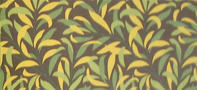
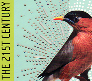
“I did not do this on purpose.” These were unlikely words to hear from Stefan Sagmeister, though he spoke them over his bashful child-like laughter. We were to discuss the recently published Worldchanging: A User’s Guide to the 21st Century which Stefan designed. His infectious laughter caught me as I looked up from the book sitting between us, and he stared at his t-shirt. Both the shirt and the book’s cover featured the silhouette of a bird on a field of pale blue.

Randy J. Hunt I think it’s perfect. It’s not the same bird is it?

Stefan Sagmeister [laughter] No

RJH Where did you get it?

SS Somebody just sells these shirts on the Lower East Side.

wc_pattern.jpg

RJH So explain to me, what Worldchanging is in your eyes?

SS I was very aware of the website as being my favorite website to go to for any of these questions. I always loved the fact that they had a positive outlook on things. And I very much loved the fact that it was obviously very well-curated and that there was a lot of changing information up there.

In a way it is the opposite of our own website. It’s never-changing. It has every three years something new on it.

Worldchanging is really daily-changing. It reads almost like a newspaper. I was aware of it because of TED, because I go to this conference. And I was aware of it because a friend of mine Ed Burtynsky, who is a very good photographer, loved them a lot and at one time asked us to design billboards with his photographs for Worldchanging.

So, when the publisher came to us and asked us if we would be interested in it, I was immediately very interested. I knew the site. I knew some of the content. In the beginning I was worried that it was going to be an unbelievable amount of work and we wouldn’t be able to get at least somewhat compensated for it. Abrams [the publisher] was very accommodating on that, so we were able to work out something where we wouldn’t loose shit-loads of money as you would normally do on projects like this. Actually, I think we came out even.

RJH How serendipitous that they came to you. What were their expectations for the book?

SS It was very nice. They really wanted our input as far as what kind of book this should be. When it came to us, it was wide open. It could have been a small book, a large book, a coffee table book, a paperback. Abrams really gave us a lot of leeway in shaping this book.

RJH That’s a great opportunity. As a publisher they’re known for illustrated or coffee-table books, right?

SS Absolutely. I knew fairly from the beginning, I think said so in the first meeting, if I know one thing it’s not going to be a coffee table book. It’s not going to be another one of these Tibor Kalman-esque books with double-page spreads of Japanese ski-domes and African villages with strange seating arrangements. Because, you know, I think this kind of book was very, very fresh when Tibor started them. By now I can’t stand it anymore. I mean every one of those books has the Japanese ski-dome and soonish the Dubai ski-dome. Curiosity around the world…Have you seen that?…How strange is it that in this small place in Uganda they still do things that way.

I think that is gone. And so is the big book.

RJH Was this a response at the time when the “print is going to die” theme was circulating? Was the intention to ensure that the book format would have a future by making an object of out it?

SS For one thing, I think if you do a book about ecology, to do something that’s as wasteful as a big book is stupid. This whole thing of the 1000 page war book was a graphic conceit of the ’90s that came, had a quick claim to fame, and is gone again. Even Bruce Mau doesn’t do big books anymore. I think that little thing had its moment. Looking back on it, I think the whole thing was stupid. Specifically because it led many people to lazy editing.

RJH Because you had to fill 1,000 pages?

SS Yeah, I have not seen many well-done. Irma Boom’s original big book, I never had much chance to see it in detail, I just flipped through it because it’s not commercially available, seemed to be pretty carefully done. But most big books well…well I don’t want to get side tracked. Most big books are crap.

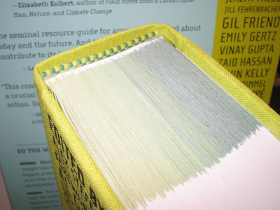
I think the form that we suggested to the publisher was one of a compendium. The one that would allow you to read it at various levels, that you could sneak in here or there or read it in one go if you so desire. The book from the very beginning that was always conceived on uncoated paper. It would have the weight of a novel, so that you can still actually read it in bed.

Also, from the very beginning what was important to me was that it was cheap enough to print that it would be possible for a mass book. It wouldn’t be much more expensive than a novel would be. By its design conceit it would actually be able to talk to the masses. That’s what I was utterly interested in. We will see a year from now if this will all work out or not, if we can do another book that preaches to the converted. You know, that talks to Ralph Nader voters. I had no interest in that whatsoever. I think these people have enough information out there. The challenge is really to get this information to a lot of people. We’ll see. It started very well. It started at number 10 or 12 on Amazon.

RJH They did a clever Amazon-jam to boost ratings. What a brilliant idea.

SS Yeah. I think it has since fallen to 200, which is not bad, and there has not been any media yet. I mean zero.

RJH I notice that two weeks since its release it’s made its way to the front window at Barnes & Noble. It’s earned the new release savings sticker!

SS I heard that Barnes & Noble really likes it. They offered to do various things with it, preferential treatment and all that stuff, so we will see. I would hope that, and you know I talked to various people about it, if they do spend energy on PR, that they spend energy on mass PR rather than design-y architecture PR. I would hope that this book is featured in those channels anyway. For this audience, it’s lovely if it’s repeated information to them, I mean there’s a lot of information in here…[Stefan flips through the book]…that I had no idea about. And a lot of very jargon-free, what-can-I-do-without-being-preachy kind of information.

RJH It seems more about getting to the point where you’re actually doing something. Its aim is to grow understanding to a level where real actions are being made, as opposed to proclamations of support.

SS I had a conversation with a friend of mine from Germany, who pointed that out too. In Germany, with the Green Party having been in power for the last decade almost, there is much more publications in that direction, and this was actually the first book that he knows of that drives that home very effectively. There is a choice to do something, and if you want to do something, here’s something you can do.

I managed to sit through an entire conference in Vancouver that was very greenish-tinted.

RJH The AIGA one.

SS Yes yes. Where I have to admit, after speaker number 6 told me to use recycled paper, I was like, “Fuck you.” [Stefan extends a thoughtful middle finger to the imagined speakers number 1 through 6.]

RJH There’s something bigger than recycled paper.

SS Yeah. And can you please come up with something different or something newer than using recycled paper? I mean, a more original idea. And somehow, somebody in this book talks about using recycled paper and it makes perfect sense. I think its all how you express an idea, even if its an old one. There are many many many new ideas in here.

RJH For the design audience, once they get inside, it’s a different experience for them than what they may be familiar with in your work. There’s not a design-y surprise inside.

SS Yeah, that is so.

RJH It’s very much information design. Is that part of the efficiency? To keep the size manageable, it needed to be dense too?

SS I think part of it. We wanted it to be dense. We didn’t want to spend a lot of money on a photo budget. It was clear that some things needed to be illustrated, but as I said before, I didn’t want this to be a photo book. I didn’t think that was what would drive this message. And there are plenty of them out there.

I wanted it to be informative. I didn’t want it to be about us. Let’s say…neither naked picture of me nor any handwritten elements. There is one kind of design-y conceit in there that is probably for “the converted.” Which is a trick we used, reversed, last year and we used different this year. When you leave this book lying around, the sun will imprint by changing the color of the book cover. This is actually newsprint.

wc_bird.jpg

RJH This is like the billboard project.

SS Exactly, this is like the reverse of the billboard. The billboard in Lisbon, goes dark and the image fades away in the sun. Here, the sun will actually leave its imprints.

What you have here, is a first edition. And…see how the slip case is actually a millimeter too wide. This will probably produce a very diffuse sun image. The production office already changed it, so we’ll get the perfect slipcase for the second run and it will be tighter.

And it works quite fast. You let this lie around for a week, and you’ll have the imprint in your cover. This is not a selling point of the book obviously. This is something that the “intiated, converted, and really interested” will find out when they own the book.

RJH So this, as the object on the shelf, is what the mass audience will see. What’s the thinking behind it?

SS We knew that the content was going to be practical and positive, very positive. Basically the content talks about what is the new thinking and what are the new ideas, techniques and processes, and products in science, design, engineering, and architecture that have a chance to have a positive impact on this world. That’s where the bird came from as a kind of new start, morning-glory kind of symbol. I, for sure, wanted it to be pretty. So prettiness was part of the design decision. I think this whole thing around it is a little bit code-y.

RJH It references the technology.

SS Exactly. And the trick behind it is fairly self-explanatory. Since it is about worldchanging, we wanted the sun to change the actual cover of the book. That fits nicely. The inside then, it has a couple of obvious things, a system that allows you to go from one set of chapters to another, so right when you open it up, you have a very, very rough table of contents, that then will tell you in a much tighter table of contents. So it’s fairly easy to navigate around. But you can also navigate from the bright green to the dark green and you can ignore it completely and just flip around.

wc_top.jpg

RJH I notice too this happens here in the margins, and throughout the book too, it’s really integrated with the website. It continues connecting back to the web resources. Is that because it was born there or because it would be silly not to?

SS It is that very often the web will give you a more elaborate solution to some of the questions, so it makes sense to then list where on the website you would find this. Where you would find more information about it. This is of course at the moment is brand new, if you happen to own this seven years from now, the web will give you much more updated information on that very same subject. So it also made sense again to reference it back to that. So there is you know, things that a book can do best and there are things the web can do much better. So it makes sense to cross-reference that.

RJH In the design profession, there is a sense of designers grasping for meaning, grasping for a sort of greater purpose, which you’ve talked about in your work in the post. Is there an obligation for a person and is there an obligation for a designer to participate in the world in this way?

SS Well, I’d say the obligation is there from the designer as a person. I don’t think that designers in general are more obligated to perform do-gooding than somebody who works at McDonald’s or the mayor of a city. It think it is as people that there is an obligation for us to live a full life. And I think from my point of view, living a full life includes doing no harm on one side and being aware of the world that you live in on various levels. On your immediate level, family and friends, on your society level, and on a humanity level. Humanity level being ecology and human rights and things like that.

I do think that if you want to live a full life, you somehow have to be aware of all of these levels. And for yourself of course, on an egotistical level. That is exactly the same for absolutely everybody.

RJH Do you think it is a folly or a trap that designers fall into? There seems to be this discourse about whether designers must do these acts of good-will, instead of a wider conversation about them as people.

SS I think the design profession was doing absolutely nothing for such a long time, that the discourse was necessary. In comparison, I have a friend who organized pro-bono time for lawyers. He showed me a list of what the law profession did after 9-11 in New York. And it was, I think, 9 tightly single-spaced pages of bullet points. But one of these bullet points that was one of dozens and dozens would have been like “organized 16 walk-in centers below Houston to advise small businesses of further steps to be done.” So this one bullet point needed 20 or 30 people to run and implement that one thing. In contrast, designers…

RJH …made a t-shirt.

SS Yeah, they made a t-shirt and put logos up on the AIGA website with towers in there that replaced the number 11. That was sort of the response of the design profession to this problem. I think we’ve got a lot of catching up to do with what a lot of other people do. I think the discourse doesn’t come from having a full plate.

RJH So we, as a discipline, are still apologizing in a way?

SS In general, yep. I think that there are many other people out there that do things, so I’m not concerned that the design profession suddenly is going into do-gooding, not-at-all.

RJH Do you have a favorite project in the book, something that you discovered in the design process?

SS It would be difficult to say. I don’t think that I should pick one.

I think that the content is very very worthwhile, in keeping with one of my favorite quotes from Kathy McCoy. I’ve quoted her many times, and she says that “design can never rise above its content.” In this case, it was very difficult to design a design that would rise to its content. And obviously if you design a book, that is very ritual, I also found in very true in the music industry. There is not a single iconic album cover out there that doesn’t have fantastic music. You know, it’s part of it. I would think that in this case, hopefully the cover does become iconic, but if it does so, it only will have done so because of its content. I hope that Alex [Steffen, the Worldchanging editor] gets invited to Oprah. I think that would be a proper venue for it.

Maintained through our ADV @ UnderConsideration Program
ENTRY DETAILS
ARCHIVE ID 2900 FILED UNDER Interview
PUBLISHED ON Jan.17.2007 BY Randy J. Hunt
WITH COMMENTS
Comments
felix’s comment is:

Brilliant. Well done. Now I feel like an incredible loser. Can't wait to see this bird cage acted out on Oprah. "You get a finch. You get a finch. You get a finch." Everyone gets a finch! (visual: birdseed drops from ceiling; cage opens- finches go wild! Naked women, naked Steffen, naked Oprah!)

PS- A little birdy told me Stefan really has issues changing type faces. I kid Stefan. I kid because I love.

On Jan.17.2007 at 04:56 PM
J Tyler’s comment is:

Great interview.

I have a strange issue with this book that I haven't seen anyone on any review comment on before, so I'll share:

I ordered WorldChanging because I wanted very badly to dig into the design and content, of course, and when I recieved it I was ready to spend a lot of time with its huge amount of information.

But about 1 minute into opening the book, I was struggling to read. The damn thing had such stiff binding that I could hardly open it enough to read the inner column text. Trust me, I tried very hard to read it, because I wanted to so bad, but I returned it the very next day, tired of fighting the book.

I checked the local bookstore then to see if my copy was a fluke, but sure enough every one of them had this beartrap binding.

It really sucks that the design (or production, whoever is to blame) kept me from reading such a great book.

Has nobody else noticed this?

On Jan.17.2007 at 09:38 PM
Randy J. Hunt’s comment is:

J Tyler, I did note that the book was difficult to open when I first got it, but I don't have that problem anymore. I think I must've just adjusted how I hold it.

On Jan.17.2007 at 11:36 PM
Andrew’s comment is:

J Tyler. I noticed that too. and, IMHO the margins are a little narrow (gotta work to keep my thumbs out of the way). but overall I think that these small issues are outweighed by all the good things.

On Jan.18.2007 at 12:35 AM
Randy J. Hunt’s comment is:

I just got a note back from Stefan. He said the tight binding was in fact a production problem with the first run of books and has been corrected in the subsequent runs.

J Tyler, now you've got reason to get the book again.

On Jan.18.2007 at 09:03 AM
Armin’s comment is:

Great interview Agent Hunt. Over the past few months – and I realized this more, when I read this – I've been thinking that design "coverage" has been shying away from case studies of individual projects and it's easy to forget how much work and thinking can go into any given thing. It's as if unless we are dealing with a major rebranding the process of designing can not be that complex, interesting or revelatory. There is so much to tell and learn from small projects and I'm glad Stefan took the time and energy to share with Randy and the rest of us.

Maybe you'll see more of this on Speak Up. Could be interesting.

On Jan.18.2007 at 12:11 PM
Tim Lapetino’s comment is:

Maybe you'll see more of this on Speak Up. Could be interesting.

I'd like that very much!

And I got this book several weeks back, and have been digging into the material. It's literally life-changing. And finding out that Sefan's studio designed it was just icing on the cake. Good work, all!

On Jan.18.2007 at 01:20 PM
Randy J. Hunt’s comment is:

I'm with you. Armin and Tim. Please, expect more.

On Jan.18.2007 at 02:41 PM
Samuel’s comment is:

Great interview! I too await more content like this on Speak Up.

On Jan.19.2007 at 12:19 PM
Stiven (sustainableday.com)’s comment is:

I have a suggestion for the second edition that I hope will be considered because it can help the use experience of the book rise to the level of the design and its content.

It has to do with the overall size and weight of the book. It’s pretty uncomfortable to read in bed or to hold open even on the table. Did you ever consider breaking up the sections into separate thinner books that will all fit into the slip cover? This would make it much more physically comfortable and physiologically approachable and also easier to take on trips. It would also open the great possibility of lending different sections of the book to different people and therefore become even more usable.

Great design communicates with meaning and emotion through an appropriate usage experience.

On Jan.19.2007 at 01:52 PM
Su’s comment is:

Stiven:
Wouldn't that make the book significantly more expensive both to produce and in terms of materials?

Whether it's (too) heavy is obviously subjective, and I'm not questioning whether you might think so, but on the other hand, trying to keep its weight down to that of "a novel" was specifically mentioned, so... Unfortunately, I can't remember my impression of its weight last time I saw one.

On Jan.19.2007 at 02:09 PM
pi skyy’s comment is:

Wow, Stefan Sagmeister broke even on this one. Way to go, Stefan! At least that's better than he probably did on all those AIGA invitations and the stuff he does for his girlfriend that we always see any time there's an article about him.

Maybe someday someone will write an article about what Stefan Sagmeister actually does for a living. Now THAT would be interesting.

On Jan.19.2007 at 07:38 PM
1 of 300,000,000 +’s comment is:

The secret to becoming a high profile designer that appears to always do cutting edge work:

Only show pro bono and experimental work. Never show bread and butter work. Otherwise you will look like the rest of the industry.

On Jan.19.2007 at 09:45 PM
Armin’s comment is:

1, that is quite the generalization you've got going on there. Care to share some examples of pro-bono and "experimental" work compared to "bread and butter work" of high profile designers that support your theory?

Plus, you'd be surprised at how little "experimental" work — if there is even such a thing — goes on. Good designers don't screw with their clients' end result just to try a new, crazy typeface combination.

On Jan.20.2007 at 09:03 AM
pi_skyy’s comment is:

1 of 300,000,000 was basically saying the same thing I was (though with less sarcasm). I don't think it would be possible for him to share any examples of whatever it is that pays Stefan Sagmeister's mortgage, because it hasn't been shared by the designer or the design media.

You're right though; there is very little of what he calls "experimental work" ("experimental" was probably the wrong term. "High Concept work" is more accurate). In fact, it probably accounts for no more than .1% of all graphic design being done. And if the design media wanted to devote .1% of their space to arty books with holes in the cover, that would be fine by me. But the real design for the real world – the other 99.9% – that's what I find the most interesting.

I once saw Stefan Sagmeister speak to a group of design students, and he as much as said that anything but High Concept work is not a worthwhile pursuit for graphic designers. His lecture was accompanied by a multimedia show featuring a lot of work he obviously made little to no money on and an art installation with foamy liquid running through some kind of contraption (*yawn*). If that's not trying to create a bullshit perception, I don't know what is.

On Jan.20.2007 at 02:40 PM
lorraine ’s comment is:

If you really, really look closely at the examples of outstanding design that are often reproduced in the history books (Meggs, et al), you might notice that many, many things from the 20th century fall into what would be called, in this discussion, "high-concept;" some even only existed as "comps" or rejected designs. Of course the history of this detail has not been very well developed, but if you have radar for this you can see it. I think what this says is that the very way our profession has valued itself is usually by the idea and its execution, and not really by how large the commission was or how widely the design was used. I for one am always puriently fascinated with how other designers "really" make their money, but that has been, at least up til this point, a subject that most people have separated from the cultural and social worth of the work.

On Jan.20.2007 at 05:37 PM
pi skyy’s comment is:

If you really, really look closely at the examples of outstanding design that are often reproduced in the history books (Meggs, et al), you might notice that many, many things from the 20th century fall into what would be called, in this discussion, "high-concept"

I don't disagree. Like I said, it's not just the designer's fault, but the design media as well. That includes history books, magazines and websites.

I think what this says is that the very way our profession has valued itself is usually by the idea and its execution, and not really by how large the commission was or how widely the design was used.

I'd say it's the design media's realization that a more romantic picture is more enticing to readers and sells advertising in their magazine. But you're right… that is where the emphasis is, unfortunately.

…how other designers "really" make their money… has been, at least up til this point, a subject that most people have separated from the cultural and social worth of the work.

And that's what's the most unfortunate thing: the fact that the arty little project that's precious to the designer and no one else is held up as something for everyone to aspire to. The things that are the most widely used (often the projects with the largest commissions) ARE the ones with largest potential for cultural and social worth, because they play the biggest role in our culture and society.

On Jan.20.2007 at 05:59 PM
lorraine ’s comment is:

Pi skyy, you are being very polemical here, as if it's an "either/or" situation, when I would maintain that it is a "both/and" situation. If ubiquitousness was the measurement of social and cultural importance, than the Coca-cola logo would rank as one of the most important design objects of all time. And it is, in terms of a specific history of design, one that would track the development of identity and branding in public communication, and a relationship of business to design and vice-versa. But if you use that same ruler when you turn to book design, well, then, the phone book becomes the most important artifact in design historical terms: and while I think the phone book is pretty important in a history of the distribuiton of technology, you'd be hard pressed to find an American phone book that was singular in its importance for its design and typography. There are so many lenses through which one can view things : and while I agree that it might be tiresome to always see "the design media" fall back on the trope of writing about designed things as the work of individual, artist-like designers (like Mr. Sagmeister), the opposite measurement that you describe doesn't quite account for the entire picture, either. Which is why design is so fascinating and frankly, maddening to describe.

On Jan.20.2007 at 08:18 PM
Roy’s comment is:

The whole point of this book is to raise hope and optimism, isntead of dwelling on problems. Let's not argue about what's experimental or bread and butter. It's great that Stefan inspires students with conceptually brilliant work - the mundane side of things will eventually show its head.

Keep the attitude positive, and spirits high. We need more of this and less complaining.

On Jan.21.2007 at 12:01 PM
Gunnar Swanson’s comment is:

Roy,

It would be a real shame to cut off this line of conversation so with all due respect, I hope people ignore you on this. Hope and optimism without recognition of problems is worthless drivel (as is despair and pessimism without consideration of solutions.)

We all find such discussions frustrating as they swerve from what seems to be “the point” to something else but this something else isn’t merely kvetching or low grade iconoclasm.

This is, in many ways, another view of the recent Design Observer discussion of The Graphic Glass Ceiling. That discussion and this one could easily be dismissed by pointing out that the very notion of a “famous” graphic designer is pathetic. The interesting part of both discussions from my perspective is that they touch on what we have collectively chosen to value. (Or what we have chosen to value collectively. Or both.)

So we can say that reality television isn’t about reality and that people who degrade themselves on the air so that their fifteen minutes comes a little earlier than it might have otherwise are pathetic and move on. That misses the important point that millions of us choose to watch them. (That mainly apropos of the DO glass ceiling discussion.) By dismissing the discussion we miss the chance to learn something about ourselves (apropos “the glass ceiling” and this thread.)

The same is true in saying that it is good that someone is inspiring young designers and stopping things there. Inspiring them to what? And what does it mean if we say that others should value our work then we show that we value things less central to what most of us think of as our work? Thanks to Lorraine for fielding what could be too easily dismissed as cynical grumbling and revealing an important issue.

This is slightly off topic and part of a conversation from another site but the glass ceiling conversation was long in the tooth by the time I found time to post so I didn’t comment there. Since that conversation about the dearth of female speakers at graphic design events prominently featured Lorraine Wild and Paula Sher, I wanted to publicly say what I believe I have mentioned to each of them privately: Most conferences have a talk where I find myself thinking “this is why I spent the money and time to be here.” Although several people have been central to many conferences, only two have made me have that particular thought at more than one conference. Lorraine and Paula are the two. Thanks again.

On Jan.21.2007 at 04:58 PM
pi skyy’s comment is:

…you are being very polemical here, as if it's an "either/or" situation, when I would maintain that it is a "both/and" situation.

lorraine, I didn't think I was stating it as either or. I'd just like to see the pendulum swing in the other direction. All I'd like to see is a genuinely inspiring, realistic portrayal of the field of graphic design by the media, instead of it constantly playing into certain designers' shallow quest for celebrity status.

It's great that Stefan inspires students with conceptually brilliant work - the mundane side of things will eventually show its head.

You might want to think about where you got the idea that the majority of graphic design needs to be mundane – because it wasn't from anything Massimo Vignelli or Paul Rand ever said or wrote. This may be your idea of the right way to inspire students, but it isn't mine.

Keep the attitude positive…

I do have a positive attitude. I love being able to do my small part in creating the world's visual environment. But having to either believe in myths to stay "positive", or reject them and be "negative" are two sides of the same coin.

On Jan.22.2007 at 01:51 AM
Jeff Gill’s comment is:

Why Mr Sagmeister is important to me
by Jeff Gill, age (thirty-) three


Mr Sagmeister has helped me not to look at at everyday work as bread-and-butter work. When I look at his work I am inspired to bring a certain spirit into my everyday work. For me it is not about having groovy clients with no money or a girlfriend who is a fashion designer. It is about choosing to look at the work I have with a spirit of -- what's the term? experimentation/a project people can look up to/high concept.

Two personal examples:

1. What could be more 'bread-and-butter' than the trade press? I designed a series of trade ads for an industrial tissue company that were highly effective and were, I was reliably told, the talk of the industry because of the way they looked.
I was inspired to create those ads by looking at things like Sagemeister's 'arty little projects', not by looking at the phone book.

2. A speciality food client asked me to design their trade show stand for the IFE in London. It was fabulous and involved many giant ornate picture frames painted red. Wonderful fun and very successful. What followed it was 2 years of flyers, trade ads and bits for the website inspired by that stand. Those things could be classed as very bread-and-butter, but they retained the fabulousness of the original concept. I'm pretty sure that there would have been no fabulouness if I had been dwelling on the 99.9% -- the work that most designers do.

The end.

-

Gunnar is that a useful answer to your question, 'Inspiring them to what?'

On Jan.22.2007 at 03:52 PM
pi skyy’s comment is:

I wasn't so much trying to knock the work that Stefan does (not to insinuate that I'm on a first name basis with him, it's just that I read that he prefers to be refered to as "Stefan." – kind of like "Elvis," I guess.) as I was trying to say that he's deliberately trying to create a false impression of what he does for a living in order to gain publicity. I find that tiresome.

At the very least, you have to admit that his "hip irreveranat designer" schtick is really played out.

On Jan.22.2007 at 05:44 PM
Frank Lin’s comment is:

Indeed much of the design shown in annuals is not closely indicative of the work being done by the rest of the industry –- it isn't because the talent or effort isn't there. The realities of being a service entity will not necessarily yield a patron-to-artist relationship, which a lucky few seem to have obtained. This limitation won't make me hate on Stefan nor will you find me worshiping him at an altar.

Obviously it is much easier and more profitable to display works which highlight such freedom, but I'd like to see more in-depth case studies involving the difficulties of getting even an "average" design approved for print!

On Jan.23.2007 at 10:16 AM
Armin’s comment is:

> Indeed much of the design shown in annuals is not closely indicative of the work being done by the rest of the industry –- it isn't because the talent or effort isn't there.

Actually: The design shown in annuals is indicative of the work being done by the rest of the industry and it is because the talent or effort isn't there.

Point 1: 99% of all annuals divide the selections by typical categories like packaging, direct mail, stationery, logos, brochures, posters, annual reports, etc. This, I would say, is very indicative and representative of what the rest of the design industry is doing, right?

Point 2: All these annuals are based on the premise that there was a client that needed something done for their audience and a designer or design firm created that something in one way or another. This, also, is indicative and representative of the way the industry works, right? (And, to stay on topic, not very different from the Worldchanging book or much of Sagmeister's work)

Point 3: Some designers or design firms have the opportunity to work with better, smarter, sweeter-smelling clients that have a better understanding about their audience that recognize the importance of letting the designer or design firm do their best job possible, leading to a more engaging something. Some designers and design firms take better advantage than others in this situation.

Point 4: The work that makes it into an annual is, arguably, the best in its category as determined by an X group of people who consider that all the ingredients from my point 3 came perfectly together and deserve to be highlighted. What makes most of these projects stand out is talent and effort. There is no question about it.

So, if annuals are "not closely indicative of the work being done by the rest of the industry", it is not the fault of annuals, but the fault of a large and fragmented industry doing subpar work. Like anything else (sports, pizza joints, music) there is better, there is worse and there is a giant median puddle in between.

On Jan.23.2007 at 11:23 AM
Jeff Gill’s comment is:

At the very least, you have to admit that his "hip irreveranat designer" schtick is really played out.

Or you'll come to Wales and beat me up?


I'd like to see more in-depth case studies involving the difficulties of getting even an "average" design approved for print!

Really? Why? I've gotten average design approved for print plenty of times. Don't we all know what that looks like

This isn't about Mr Sagmeister, really -- I'm just thoroughly puzzled. Why are you (pi, Mr Lin) getting excited about average design or even really good, but dull design (whatever that is). We're surrounded by the stuff!

Perhaps your lives are so thrilling that you need something to take the excitement levels down a notch.

I know I'm taking a jokey, sarcastic tone here, but I really honestly don't get it. Also, why this discussion on this article? Except for the cover and the slipcase, this seems like a pretty normal book.

On Jan.23.2007 at 11:34 AM
Frank Lin’s comment is:

Point 1: When I speak of work not being indicative, I’m referencing conceptual and aesthetic freedom as opposed to variety and category. Most of us probably don’t have as much freedom to do what Stefan does. If we did, this discussion about the artist/designer would be moot.

Point 2, 3: I don’t disagree with you. Annuals publish examples of great work, which can only occur if all the right factors are present as to provide the best environment for creativity to blossom. To assume any work which does not reach this realm to be merely the result of inferior qualities, may hold true for some, but cannot account for situations where designers are talented but placed in a limiting environment which at best yields a very appropriate result but lacks the panache to make it into CA.

Point 4: No disagreement here except for the last part; read the above.

I agree the industry is fragmented and there is quite a bit of subpar work being done. But to blame this entirely on subpar designers is overly simplistic and definitely very easy to do if you have the luxury of working for better clients.

If design is truly about the process of interaction between the client and designer, it appears we’ve been focusing too much on vanity.

On Jan.23.2007 at 01:10 PM
Randy J. Hunt’s comment is:

Jeff,
I think this discussion is here because I mentioned Stefan Sagmeister. One trick to get someone going: say something nice about a well-known designer and acknowledge their talent.

Pi Skyy,
In response to your concerns about what Stefan does for a living, I believe your conclusions are grossly out of alignment with what the case is likely to be. I cannot speak for Stefan, but having spent 4 months in a weekly course with him and subsequent coffee chats, I'd like to point out several things which have been overlooked in this thread. In this case I'm using examples specifically related to Stefan, but other similar conditions often exist for the designers we so easily criticize for their fame, success, or lack or portfolio examples that align with our own less-than-exciting projects.

Please note, I don't intend to imply that everything is as it seems in the design profession or that all designers everywhere are always capable do doing innovative work that fully retains their personal voice while addressing the project's/client's needs and titillating the design community. What I do intend to show is that under some conditions, it is quite reasonable for a designer to create this level of work as a significant part of their practice. Is Stefan (or any designer for that matter) showing us every project they've done? No. Well, actually in Made You Look he did just that, but I'm getting ahead of myself.

Here are some things I've learned directly and indirectly from Stefan:

  • Stefan, though he isn't keen on talks about "strategy" and "business," is no doubt a smart business man and makes sound financial decisions
  • Keep overhead extremely low. Stefan has, to my knowledge, never had more than 1 full time designer and 1 or 2 interns at any given time. It's easier to accept only the "best" projects, even if low-paying, when you don't have as much soaking up the cheddar. Add to that Stefan's ability to likely receive higher than average fees and already the formula is structure is starting to become clear. Also, his current designer Mattias Ernstburger is painfully talented. It must help to have an extremely proficient co-hort like him.
  • More of the previous: Stefan's studio space is connected but separate from his residence. I'm sure this helps keep cost down as well.
  • Stefan shares and presents many projects which he is compensated for. Several come to mind off-hand: SVA Subway posters, all of the music packaging work he used to do, the True Majority identity and campaign elements (certainly paid for by Ben Cohen of Ben & Jerry's), an Adobe piece, the identity for Seed Media Group and the redesign of their SEED Magazine, the Zumtobel annual report, and many of his "things i've learned in my life" pieces are commissioned works functioning more like artists commissions. As I understand it, these are not done pro-bono in most cases. The only pro-bono examples that come to mind are the AIGA posters, a few of the many pieces we've come to know his studio for. Please correct me if I'm wrong, but most designers show their best work in their book, to clients, and if/when they're lucky enough to share it with an audience.
  • Speakers fees. Some events pay them, others don't. When Stefan gets compensated for these, it's yet another check mark on the "better than a crappy project" list.
  • Stefan isn't going out of his way to deceive anyone or create a false sense of reality. His working methods are every bit as valid as someone who has graduated from school and started an entry-level position. Both try to make the best design possible under the circumstances and look for was to improve the circumstances. I'm confident good career design can benefit everyone.
  • He's had some good luck, is extremely talented, and knows how to take advantage of what comes his way.
  • Stefan may have created a rock-n-roll perception of himself (what pi skyy refers to as "hip irreveranat designer". This is certainly reflected in most everything we see about him. I've never experienced him doing that personally. I think there was a time he did, and now the design world's latched onto it. If you see the way his work has matured in the last 10 years, you'll see that this is a pretty myopic view of a thoughtful and engaged man. If anything, he's more in the school of intellectual jet-setter than image-maintaining rock-star.
  • Stefan's brother (I think, can't remember the relation for sure) is the owner/president/founder/somethingrather of a fashion retail chain in Europe. I'm sure if worse came to worse, there's a support structure to support risk-taking. I, for one, am happy for people with this luxury, not envious.
  • In Made You Look, Stefan discloses how much he billed for every project in the book. He also describes how he worked for Leo Burnett in Hong Kong at the height of money flowing through the design industry in that market. See "smart businessman" comments above. I wouldn't be surprised if the money he earned there helped lay the groundwork for a career of more creative freedom.
  • Prior to being one of his students, I'd seen Stefan speak to both professional and student audiences. Perhaps, pi_skyy, we saw him talk at very different point in his career.

It seems to me that there are several ways that designers have found to create the situation where they can take the risks involved in finding clients or convincing clients of the "all-star" work we seem to collectively:

  1. Own real estate
  2. Create recurring revenue from intellectual property
  3. Start a business using your design skills as one of the distinguishing factors. Sell it off.
  4. Keep overhead extremely low.

I hope we can agree that not every successful designer, or rather well-known designer, is somehow living in a fantasy world. Some may have a more intensely designed industry persona than others, but from my experience most people are more often-than-not genuine, strive to do great work, and enjoy sharing it with other people. One thing I know for sure, Stefan is not an empty, over-hyped phenomenon. He's a caring man, with a huge heart, and a damn amazing skill for using design to make people pay attention to things.

On Jan.23.2007 at 03:29 PM
Gunnar Swanson’s comment is:

Frank,

cannot account for situations where designers are talented but placed in a limiting environment which at best yields a very appropriate result but lacks the panache to make it into CA.

1) People have different opportunities but they also make different choices.

2) Important design skills include (1) doing good work under pressure that might make less skilled designers do less-good work and (2) the ability to manage a job in such a way as to allow good work to emerge.

On Jan.23.2007 at 09:08 PM
1 of 300,000,000 +’s comment is:

Highly conceptual work, in most instances, is about EGO.

Bread and butter work is always about the CLIENT.

On Jan.30.2007 at 09:46 AM
pi skyy’s comment is:

Bread and butter work is always about the CLIENT.

Just as importantly (even more so when it comes to my own outlook as a designer), it's about the real world that we live in. The real contribution that designers make to our society and culture is the creation of the things we see and use every day. To me, that's very exciting, not mundane.

If I thought my only way to optimism was to put my entire creative focus on the occasional no-profit project (because everything else I did had no more value than a phone book), I would find that to be very depressing.

On Jan.30.2007 at 01:28 PM