Speak UpA Former Division of UnderConsideration
The Archives, August 2002 – April 2009
advertise @ underconsideration
---Click here for full archive list or browse below
  
Typography, The Good and The Evil

I am a sucker for stories of courage and determination in the face of adversity, like that favorite man-tearjerker, Rudy, where the improbable becomes reality in a properly soundtracked climax. This emotional sappiness translates quite effectively when a design student’s thesis or senior project is so good that it gets published and sold on Amazon and other fine establishments. What can I say? It makes me happy.

Last year, Cristina Paoli’s Mexican Blackletter — her final project at LCC in London to receive an MA in Typo/Graphic Studies — was published by Mark Batty almost a year after she excitedly introduced her project on Typophile. And Paul Felton, a graduate of Staffordshire University, also stroke publishing gold with UK-based Merrell for his polarizing typography ditty The Ten Commandments of Typography/Type Heresy: Breaking the Ten Commandments of Typography, which also earned him a 2005 D&AD New Blood prize. A few weeks ago, strolling through the Cooper-Hewitt shop I was immediately attracted to its gold-foiled, cloth-bound hardcover, where I was then pulled in by the fight of Good Vs. Evil found within its off-white, thick, rich, uncoated pages.

Cover
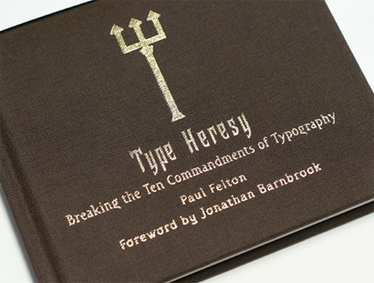
Image pilfered from Segura Inc. (its founder, Carlos Segura, is part of the evilness).

The book is divided in two parts: The Ten Commandments of Typography on one side and vertical orientation and Type Heresy: Breaking the Ten Commandments of Typography on the other. Being the good boy that I am, I started with Commandments, where the author starts with a preface and introduction rendered in mock Bible speak about typography, “In the beginning God created type. And the world was without form, and void, and darkness was upon the face of legibility.” And so forth. Cute, but not quite convincing nor overly funny. The book starts to get interesting when Felton chooses the “Twelve Disciples of Typography” as the evangelists of that which is good and acceptable typography. “From his race of men He chose twelve of the worthy to be His type disciples and to spread the laws of typography to others.”

The Twelve Disciples
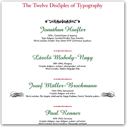
The Twelve Disciples of Typography. See full list as PDF, courtesy of Merrell Publishers.

“The Lord then spoke to His disciples,” continueth Felton, “and gave them the ten rules by which every typographer must abide, to gain passage to type Heaven.” I was very curious to read these ten commandments, since defining what good typography constitutes is a never-ending battle prone to end in “good typography is subjective”. Here then is what God intended:

1. Thou shalt not apply more than three typefaces in a document.
2. Thou shalt lay headlines large and at the top of the page.
3. Thou shalt employ no other type size than 8pt to 10pt for body copy.
4. Remember that a typeface that is not legible is not truly a typeface.
5. Honour thy kerning, so that white space becomes visually equalized between characters.
6. Thou shalt lay stress discreetly upon elements within text.
7. Thou shalt not use only capitals when setting vast body copy.
8. Thou shalt always align letters and words on a baseline.
9. Thou shalt use flush-left, ragged-right type alignment.
10. Thou shalt not make lines too short or too long.

Blocks of copy that act what they preach delicately illustrate each commandment, using, repeatedly, In the beginning God created type… as body copy. Whether it was decidedly intentional or not, this half of the book is rather boring, and the commandments do not feel too authoritative nor hard to follow. Very nicely typeset, though. Eager, I turned the book around to see some Evil typographically incarnate. Right from the start, Type Heresy is more interesting when Felton lists the 24 fonts he is going to use (as opposed to only unlucky 13 in Commandments). This second half feels a lot like 1995. And I’m liking it. It only gets better when the villain is presented, “Satan is the adversary of God. […] Followers of the Ten Commandments consider Satan to be a real being, created by God.” Many other evil traits are cast upon Satan, including its propensity to “bestow design accolades and awards upon one for a limited time.” The punchline, and a funny one, is, of course, David Carson and his Fallen Angels, a motley crew of anarchic designers and typographers.

Satan and his Fallen Angels
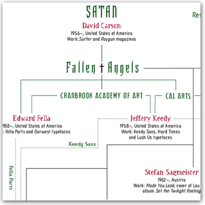
Satan and his Fallen Angels — a global, interconnected, evil enclave! See full chart as PDF, courtesy of Merrell Publishers.

Type Heresy then goes on to debunk each commandment with illustrated typography and it does so quite efficiently. Helped in large part by supporting body copy that aids the visual stylings. When pissing on Commandment 7 (Thou shalt not use only capitals when setting vast body copy), the copy snarkily reads: “THE TEXT MAY MAKE MORE OF A DEMAND ON THE READER BUT WHAT THE HELL IS WRONG WITH THAT?” There is more passion, focus and determination in Type Heresy than there is in Commandments. Perhaps this shows Felton’s preference, a Fallen Angel himself. But more interestingly, it speaks of a broad style divide in graphic design. The Good Vs. Evil. And we all know which one is which.

As a simplistic conclusion, Felton’s book, Commandments and protagonists are a more or less a representation of the graphic design manifestations of Modernism and Postmodernism. The Clean Vs. The Layered. The Ordered Vs. The Chaotic. The Rigid Vs. The Loose. The Accepted Vs. The Heretic. During the late 80s and early 90s this division was clear and heartily debated and the Fallen Angels in Felton’s book are (mostly) clearly of this era. (A bygone one at that, though). And other than Massimo Vignelli (very oddly missing from the Disciples… unless he… is… God?!) and Steven Heller there were not many vocal heroes in the battle for typographic properness. So how do you choose the Disciples? Yes, Matthew Carter and Jonathan Hoefler make pretty typefaces and are, in real life, real nice people, but they are not necessarily involved in typesetting, Erik Spiekermann is not necessarily a rule follower, and Eric Gill is not necessarily heavenly.

What I find clear in Felton’s engaging, publish-worthy and beautifully produced book is that it’s the villains, evil-doers and against-the-current swimmers that stand out, are more memorable and are easier to band together. I should know, since I originally intended to follow in the steps of Satan as a young designer and emulated his and the Fallen Angel’s every torn typographic statement. Maybe I wasn’t evil enough and I eventually learned all the Commandments by following the design of Cahan & Associates, VSA Partners, Pentagram, Risgby Design, Liska, SamataMason and other adherents to straightness and cleanliness. Today, as a Disciple I long for some Fallen Angels or villains that we can contrast with, but it seems that being typographically on the fringe is not as easy as it used to be, with more and more artists and non-designers being able to manipulate design in unexpected ways and receiving the necessary attention. I’m cheering for the improbable these days. I want to see a Good Vs. Evil debate in graphic design. Where are the Fallen Angels?

Maintained through our ADV @ UnderConsideration Program
ENTRY DETAILS
ARCHIVE ID 3481 FILED UNDER Discussion
PUBLISHED ON Jun.01.2007 BY Armin
WITH COMMENTS
Comments
Edrea Lita’s comment is:

Every new change in graphics has coincided with things going on with culture. But one of the most important paradigm shifts for designers these days (and one of the reasons post-modernism came into fruition) is because of a change in technology. Designing layouts (which was once more of a group effort) switched to a designing on the computer (which can sometimes be a one-person activity from start to finish). This more personal activity, mixed with the academic theory (semiotics, deconstructionism, etc) helped to set off the post-modernist era.
But since the mid eighties, there has really not been any real paradigm shift in technology, and much visual activity in the past few years has been spent trying to refine visuals that are a mix between computer and analog. Designers haven't really been taken out of their comfort zone, and so they keep the same process.
Armin, you asked where these fallen angels are. I think (coming from a person who has recently completed an education in graphic design) along with the industry, we need to start giving students an education in post-modernism rather than having them learn it themselves. I know a lot of people who don't even know this website, or even the existence of this discussion even exists.

Perhaps then we will start to see more new, rebellious, and sinful designers.

On Jun.02.2007 at 12:22 AM
Gunnar Swanson’s comment is:

[Assuming, once again, my role as Speak Up’s pedantic professor, grumpy old fart, and generalized scold:]

When did a goof become as good as an actual joke? This like the pseudo satire of The Capitol Steps where not-particularly-pointed reference and irrelevant form get combined for the entertainment of people who want to reassure themselves that they are in the know without actually having to know or think.

What’s up with the genealogy/organizational chart? Why merely goof on a form when there is such a great opportunity to teach, to comment, to analyze, to actually provide your readers some content? As is, it matches the bullshit greeking of the Genesis Goof of “In the beginning God created type. And the world was without form, and void, and darkness was upon the face of legibility.” It implies much more than it says and probably more than it means to say.

What would someone assume from the chart? I’d love to have people who don’t know a lot about late ’80s/early ’90s typographic politics to tell me what they think they know about influences or relationships after studying that bit of infogoof graphics.

And what do people who do know something about the era gain other than “Ha ha; it’s an org chart of evil and David Carson is Satan!”

Yuck, fucking yuck. Ha, the hell ha. Who cares? One of the worse things about that era of “evil” was the incredible volume of posing. This is posing fifteen years too late. The “bad boys” in their black leather stage costumes are made to look like Sha Na Na. Some of them may deserve that but the reading public deserves more.

One of the main battle cries of the “legibility wars” was Layers of meaning. Can we get as deep as one layer of meaning on this stuff?

On Jun.02.2007 at 09:19 AM
Gunnar Swanson’s comment is:

Some questions for Armin or anyone who has seen more than the PDFs of the cast of characters:

Does there seem to be some point in setting the names of Josef Müller-Brockmann and other great modernist typographers in cheesy wedding invitation type, centered, with arbitrary use of ornaments? Is this odd satire, ignorance, or deliberate misrepresentation?

Does the book show any understanding that some of the “disciples” design(ed) typefaces and some design(ed) using typefaces? It would seem that some of the confusion on the fallen angels chart comes from the same failure to distinguish. Who thinks that, say, Jeff Keedy’s fairly staid arrangement of weird type emerged from the same brimstone fumes as David Carson’s deliberately fanciful use of Franklin Gothic or Phil Baines’ seriously odd treatment of typefaces that seem to dwell on the disciple side of this nonsense?

Who or what are said disciples supposedly disciples of? Who, what, or where is God (or the Son or the Holy Ghost) in this theology? Genesis implies that God is eternal or at least preceded anything we should care about. (You have to talk to Mitt or L. Ron’s crews to get back story.) But many of the listed holy heroes were the antichrists of their times. Who do you think Beatrice Warde was nipping at if not Bayer and “the Bauhaus Boys”? Some imagined emanation of future Cranbrookery? (Get real; Scott Makela’s father was still a glint.)

In what Underworld does someone get to be Satan despite showing up after the Devil’s minions did much of their Evil? Is there no seniority in Hell?

On Jun.02.2007 at 11:11 AM
Armin’s comment is:

> Assuming, once again, my role as Speak Up’s pedantic professor, grumpy old fart, and generalized scold

Gunnar, I would block your IP address if you assumed any other role...

> Does there seem to be some point in setting the names of Josef Müller-Brockmann and other great modernist typographers in cheesy wedding invitation type, centered, with arbitrary use of ornaments?

No point, it seems, other than making them look angelical. And nice.

> Does the book show any understanding that some of the “disciples” design(ed) typefaces and some design(ed) using typefaces? It would seem that some of the confusion on the fallen angels chart comes from the same failure to distinguish.

No, and no acknowledgment either. This is one point I meant to touch upon in the review, but completely forgot. The reason why I think the Fallen Angels chart works a lot more is because most of the charted people in there work with type and have done all kinds of weird things to it – that some of them have done a few typefaces is a bonus. The disciples on the other hand are mostly type designers, rather than designers working with type. So, yes, there is vast confusion and not enough explanation.

> Who or what are said disciples supposedly disciples of?

No indication. Which is why I noted that maybe it was Mr. Vignelli. Jokingly, of course.

> Is there no seniority in Hell?

Gunnar, it's graphic design history we are talking about here... Who cares who did what first?

; )

On Jun.02.2007 at 11:35 AM
Gunnar Swanson’s comment is:

Armin—

The seniority thing wasn’t about historical accuracy. I was just confused because I had always assumed that Hell was a union shop.

On Jun.02.2007 at 11:55 AM
Michelle French’s comment is:

Gunar,

Are you inferring that Massimo isn't the ultimate God of Design? (Gasp!)

OK, I thought this parody was hysterical. Then again, I have been around a long time and get some of the gaps and gaffes.

Maybe it is a good teaching exercise. A “what is missing in this picture?”

And you know designers can't agree on enough to actually unionize. It would be like herding cats.

On Jun.02.2007 at 12:46 PM
Guillaume’s comment is:

Fraktur Mon Amour is another example of a student project being published (in Germany).

On the good vs. evil thing : I find it rather funny. It's everywhere again. in Helvetica - the movie, for instance. When I was in art school last year, some students also made it their favourite subject. The debate also comes up on Typophile.com very often, mostly being started by students. My opinion though is that it's entirely outdated. The reason it's so fancy again, is that current matters of graphic design haven't been theorized enough (yet). Young graphic designers have to delve into the past to find pre-baked theories to adhere to.

As Gunnar points out correctly, the good vs. evil comparison is an entirely false, and hardly funny one. Tsichold is a perfect example. His position-shifts attracted him a lot of criticism and got him to do two rather different things. Who's angel and who's devil has he been?

So, to answer the conclusive question "I want to see a Good Vs. Evil debate in graphic design. Where are the Fallen Angels?" :

It's not a matter of good vs evil. It's a matter of new vs old. Or rather of different aspirations, how they oppose each other. They're still here, but they are hardly put into words, and therefore fail at launching debates.

But, had there been more 80's-ish graphic designers today, still claiming they're the future, at least we would avoid this kind of superficial literature. And, had there been contemporary designers writing books, we would avoid that and outdated debates.

@ Edrea :

I don't agree. The technological evolution back then only helped graphic design join the post-modern movement, which finds its origins much earlier in other art fields.

> we need to start giving students an education in post-modernism rather than having them learn it themselves.

What do you mean? The history behind it, or the actual practice of post-modern typography? In the first case, well, isn't that already the case? In the latter, what about student's freedom? Since when are 'styles' taught at schools?

On Jun.02.2007 at 01:43 PM
debbie millman’s comment is:

Ed Fella was doing the heresy thing long before Mr. Carson.

On Jun.02.2007 at 01:51 PM
Gunnar Swanson’s comment is:

Michelle,

Back to my pedantic professor role: It isn’t a parody. It is a burlesque. A goof. A parody uses the form of the thing being attacked/having the mickey taken out of/being reconsidered as a tool to make the point. A parody of Jan Tschichold or Carlos Segura would use the form of Tschichold or Segura. If it used the form of wedding invitations or org charts, the point would need to have something to do with wedding invitations or org charts to come close to qualifying as parody. The form of the charts has nothing apparent to do with their point. (Wait. I could well be wrong since I’m not really clear what the point is.)

Not all mimicry is parody. Rich Little doing Richard Nixon voices isn’t parody unless he’s actually getting around to making fun of Richard Nixon rather than just showing off his lifelike imitation of death. If he did his Richard Nixon voice talking about watching Paris Hilton on television, that might be funny for its absurdity but would it be worth the equivalent of a book-length reading effort (let alone a book-length writing effort)?

I guess this is all proof that I’m a Modern boy, left behind by the post-postmodern era of form following nothing in particular and meaning even less. When Drenttel Doyle Partners did phony info graphic for Spy, they used the form of magazine charts to get to the particular subject matter but also to stick it to the inanity of most magazine charts. This stuff doesn’t say anything beyond the one-line semi-joke of “David Carson is Satan and we think Bezierbub and his minions rock. (But not Minion.)” Wait. No. Even those lame puns connected form with the subject.

Even though the “evildoers” were often attacking form-follows function Modernism, they didn’t, on the whole, abandon form as meaning. It does them a disservice to depict them as merely fun bad boys or, to quote Woody Allen, as “as an experiment to see if I could induce partial paralysis in my father’s face.”

So two pages to essentially say “if loving these guys is wrong, I don’t want to be right.” What an amazingly low signal to noise ratio. Especially since pretty much everyone got tired of saying that loving these guys is wrong sometime well before my students got to middle school.

On Jun.02.2007 at 02:12 PM
Michelle French’s comment is:

Gunnar,

Excuse me for my inaccurate choice of words.

On Jun.02.2007 at 08:39 PM
Edrea Lita’s comment is:

Guillaume,

What do you mean? The history behind it, or the actual practice of post-modern typography? In the first case, well, isn't that already the case? In the latter, what about student's freedom? Since when are 'styles' taught at schools?

It's not that I think students need to learn how to make a style that looks like it's post-modernism, or that it looks like it's from the bauhaus, it's just that in order to begin to even express what they want to say (whatever that may be) don't they have to know a style exists, how it works, and what it expresses? You can't just tell a baby to begin talking or express him/herself without exposing them to language. What I'm arguing is not about copying a style, it's about having choice, and being influenced that choice to make conscious decisions in design.

On Jun.02.2007 at 11:54 PM
Derrick Schultz ’s comment is:

You'll have to excuse my fuzziness when it comes to Christian mythology, but wasn't Satan once an angel of God? I dont remember Carson ever "fighting the good fight." Oh sorry, I'm probably one of those people looking for meaning in not only the structure, but also in language (and i aint talking visual).

There's a lot of confusion on the part of the Fallen Angels—the least of which has to do with type designers vs. typographers. The worst confusion is that some of the information is wrong and/or horribly miscommunicated by "bad" design.

On Jun.03.2007 at 03:20 AM
Ed McKim’s comment is:

So, Gunnar, does this make you the Catholic Priest in all this mess?

;)

On Jun.03.2007 at 12:01 PM
diane witman’s comment is:

This post and the following comments gave me another reason to love Speak Up.

On Jun.03.2007 at 02:16 PM
Gunnar Swanson’s comment is:

Ed—I used to share Massimo Vignelli’s penchant for black collarless shirts but I hope that I’m catholic in lower case.

Michelle—I wasn’t just correcting word usage to cement my image as pedantic jerk. I think the term “satire” grants too much to the sort of work in question. The distinction is also important for designers to understand because when people hear that satire is a “fair use” exemption from copyright infringement, they may believe that this kind of thing is protected.

Most importantly, discussions of the use and reuse of form tend to be confused and unproductive. Graphic designers should be experts in this realm but their discussions are as stupid and useless as most others. Edrea is certainly right that designers should be armed with knowledge of previous work. They also should have the tools to understand their work in relationship to earlier examples. Most lack the basic vocabulary to allow distinguishing plagiarism from copyright infringement or wholesale adoption of form for convenience from satire.

Guillame and Derrick have it right. The good and evil charts are patently false. They are misleading. Is that because of ignorance or a disregard for fact?

I know some of us seem to be ignoring Robert Sheckley/Thoth-Hermes’ advice and picking at the metaphor, risking a nasty scab. However, this should be important to graphic designers on a couple of levels:

As I said in an earlier post on this thread, one of the main battle cries of the designers being lionized as fallen angels was “layers of meaning.” The work was often a rebellion against the perceived sterility of Modernism’s one-dimensional clarity. The biggest putdown of something at CalArts at the start of the ’90s was calling it “a one-liner.” The irony of having a superficial joke as promotion for this work would be enough; having the joke imply so much that is just plain not true serves to obscure graphic design’s recent history rather than merely lose the opportunity to shed light on it.

Humor is a lot like graphic design. There is no reason it shouldn’t be smart and deep even when working on the most superficial level. (And, of course, there’s no reason it shouldn’t work on a superficial level even while being smart and deep.)

Form has meaning. It makes a statement. The one chart seems to make the statement that Holy Typography is vapid, pretty (or more like prettyish) but boring. The second seems to tell us that all an org chart says is “These guys are related” rather than how they are related. There is, apparently not supposed to be any thought beyond whether one follows a few rather arbitrary rules or not.

It doesn’t take graphic design and typography seriously as craft or analysis. If “make it neat” and “screw neatness” are the choices, why would anyone choose to hire an actual graphic designer, let alone one of biblical status?

On Jun.03.2007 at 05:01 PM
Peter Bain’s comment is:

Gunnar, you're spot on with the problems. I picked up the book for a few minutes, then put it back down and walked away. A joke, sure; thoughtful, not really.

Nice to see Margo Chase's riff on gothic in use though.

On Jun.03.2007 at 05:21 PM
Mauro’s comment is:

The Fallen Angels are all hiding here in China. Bad typography (both Roman and Chinese) is all over the place...

On Jun.04.2007 at 12:52 AM
Ricardo Cordoba’s comment is:

If In the beginning God created type, then maybe Johannes Gutenberg should get to be God in this theology... ;-)

On Jun.04.2007 at 08:19 AM
sheepstealer’s comment is:

Theology of typography. As much as I love the art of typography, I’m not sure I’m ready to quite give it religion-level significance... but maybe.

Gunnar, I’m not disagreeing with any of your comments. This idea has some flaws. But there is a major point that you're missing.

I don’t believe I'm speaking only for myself when I say that the skill and talent for using type well come from more than just learning the rules of typography. I think the skill and talent are developed as a result of love and passion for typography. And whimsical attempts to folklorize the topic of typography are always a good thing.

Look what this book has done. It’s allowed many people to read, ponder and decide for themselves whether they agree or disagree with the philosophies stated. It has restated some of the basics in a way that is memorable (although maybe a little overused) and easy to understand. It’s given us as Speak Up regulars an opportunity to read and contribute to something that moves the collective design consciousness forward. It has increased awareness of the names in type that every designer ought to know. And finally, I think a project like this helps spark in others the passion for typography. Because the part of the designer’s soul that holds typography is not a vessel to be filled, but a fire to be lighted.

I salute Paul Felton for creating this book. And Armin for Speaking Up about it.

On Jun.04.2007 at 05:11 PM
George E. Thompson’s comment is:

Ricardo said:

If In the beginning God created type, then maybe Johannes Gutenberg should get to be God in this theology... ;-)

I thought he was God. Doesn't everyone?

On Jun.04.2007 at 08:08 PM
Ricardo Cordoba’s comment is:

George, I was just taking up one of the questions brought up by Gunnar... and I was speaking in jest, because even though Gutenberg was the first to create movable type as we know it, he did not set down the "commandments" of typography mentioned in this book. So Gutenberg as God wouldn't make much sense even within the book's imperfect theology (or whatever you wish to call it).

On Jun.05.2007 at 12:28 AM
Armin’s comment is:

> Fraktur Mon Amour is another example of a student project being published (in German

Guillaume, thanks for the tip. I didn't know it was a student project. I saw that book while judging the TDC last year. Both Marian and I, blackletter enthusiasts, were swooning over it.

On Jun.05.2007 at 06:53 AM
Gunnar Swanson’s comment is:

Look what this book has done. It’s allowed many people to read, ponder and decide for themselves whether they agree or disagree with the philosophies stated.

I can’t speak to what the book has done because I haven’t had a chance to see the book. I have only been writing about the images of the list of “disciples” and “fallen angels.”

I am curious, however. Does the book seem to attribute the “ten commandments” to the philosophies of the twelve “disciples”? Does it make the differences in typographic beliefs and practices among the members of each group (differences between the various disciples and differences between fallen angels) clear?

the skill and talent for using type well come from more than just learning the rules of typography

Does anyone think that the disciples believe(d) this less than the fallen ones do/did?

I’m curious about how other people teach typography. Does anyone teach it as primarily learning rules, let alone solely learning rules? The closest I come to teaching rules is to stress typographic and linguistic conventions as necessary knowledge. The typical problems one sees with, say, English language punctuation don’t seem to be part of this Decalogue. Maybe there is a typographic Leviticus that tells what’s kosher.

Does anyone teach an absolute prohibition to [3] “other type size(s) than 8pt to 10pt for body copy?” God doesn’t notice x height variation?

It might be reasonable advice to suggest [1] that more than three typefaces in a document is likely to be confusing (visually and conceptually.) Is this taught as some sort of divine will rather than as a principle to be understood at Staffordshire University (or anywhere else)? I know that people have taught that way but I was under the impression that they were all dead by now.

Being dismissive of illegible typefaces [4] on the basis of a lack of broad utility doesn’t seem way out of line. Pointing out that a large quantity of all-caps text [7] does a disservice to the reader (and to all parties that wish the reader to read and understand) seems fairly mild. (A couple of the original Ten strike me as fairly obvious, too.)

Teaching about even spacing [5] seems basic. Teaching that evenness is a goal rather than a tool to advance reading ease and/or a certain aesthetic seems dumb but often a lesson’s goal is understood by student and teacher alike as something on a more ontological level.

Some of the choices that God (whoever He is in this instance) made are odd, indeed. Does “Thou shalt lay stress discreetly upon elements within text” [6] mean that blocks of text should be internally undifferentiated? (If so, see the paragraph on commandment 5/even spacing above.)

I suppose that a class on book typography or a design for journalism class might leave this rule as eternal. The latter might even enforce the rather curious call [2] for headlines always being large and at the top of the page. Does anyone outside an old guard journalism school (even the most typographically conservative faculty) really teach headline placement as some sort of categorical imperative?

Does “always align letters and words on a baseline” [8] mean that the baseline is straight and parallel to the bottom of the page? God may be in the details but he doesn’t seem to be on top of them in this case. I would have though that being divine and lawyerly at the same time would have been possible for Him. Depending on what this means, one wonders if El Lissitzky is on the wrong list.

One of the most interesting was the requirement [9] to use flush-left, ragged-right type alignment. Was the centered type of the disciples list heresy? What should we make of the fact that, for example, Jan Tschichold rarely employed rag right text, even in his New Typography days?

My favorite is the prohibition [10] on making lines too short or too long. You gotta love a heavenly tautology. Unless “too” meant “very” rather than “excessively,” this corresponds to the bit of theology I swore allegiance to when I became a minister of the Universal Life Church one 1970 autumn day in Sproul Plaza in Berkeley: “Whatever is right.”

Yes, Ed. Not a Catholic priest but a man of the cloth, nonetheless.

On Jun.05.2007 at 12:23 PM
Christina W’s comment is:

So Tschichold must be Paul, on the road to Damascus...

I'm surprised that there is no mention (at least, I assume from this discussion that there is no mention) of Bringhurst. It seems to me that any discussion of Ten Commandments could surely be drawn from The Elements of Typographic Style... though it would be hard to wittle the commandments down to just ten, ha ha! And typographic hell would be full of the poor souls who make free internet fonts, punished in a lake of eternal fire.

You know what would have been funny - to have MS Word defaults be "penance" for the typographic sins. "Do two posters and a brochure using default according to Word and your sins shall be forgiven." Cause, you know, penance should be boring and somewhat painful.

On Jun.07.2007 at 02:11 AM
Christina W’s comment is:

I guess that's the problem with post-modernism. From the purist's point of view, Good vs. Evil is pretty clearcut. But when you lose the high moral ground in a post-modernism free-for-all, "bad" becomes... well, what? Even horrible kitch is revered by someone...

On Jun.07.2007 at 02:15 AM
Gatis’s comment is:

Pard me, WTF ?!?!

On Jun.12.2007 at 12:19 PM
Christina W’s comment is:

Ok, strictly speaking about religious moralism - there are definite rules about what is "good" and what is "evil". The first part of the book, the "good" part, follows these rules. Black type on white paper set classically is good, for example, anything else would be evil. But the second part, the so-called "evil" part of the book, tends to be drawn from more recent times when good and bad aren't so clear cut. It happened in art history too - you know, surrealism and abstraction and all that came afterwards. You can't say something is "good" because it follows the rules perfectly. So it's harder for us to call the "evil" typographers bad; it's just not regarded as universally bad anymore. ie, Sketchy red lettering on blotchy grid paper is now able to be "good" - try getting away with that 200 years ago.

On Jun.15.2007 at 07:42 PM
Gunnar Swanson’s comment is:

It happened in art history too

more recent times when good and bad aren't so clear cut

try getting away with that 200 years ago

And try getting away with doing the work done by the “disciples” 100 years ago. This notion that there is some sort of eternal standard that people just got around to challenging twenty years ago is just plain false. Much of the work of the late ’80s/early ’90s formal revolution lionized as the work of fallen angels is based on the work of Renner and Bayer’s contemporaries. Renner and Bayer were part of a formal revolution that dwarfed the stuff being (overly-literally) mythologized.

The fetishizing of avant garde status may have been more intense in the 20th century than in much of history but the idea that nobody changed anything but their socks in the Art world until after World War I or in graphic design until after the invasion of Grenada is just plain silly.

Somehow people always think that the dilemmas of their own eras are murky while those of the past were clear-cut and that their own times are uniquely turbulent. You can’t cram all of “pastoral” into “past.”

On Jun.16.2007 at 04:22 PM
Christina W’s comment is:

Trying to argue that no one else ever challenged the status quo, that is silly. Not my intention.

But I will apologize for trying to answer the WTF and not looking back at the original article - the timeline that was in my head doesn't really mesh with the timeline used in the book... I was thinking more of the typography of, say, Baskerville, and how many people today wouldn't be able to see much of a difference between him and his contemporaries (maybe like explaining the difference between an Anglican and a Catholic); vs the lengths a designer has to go in more contemporary times in order to garner outrage, like David Carson. I'm arguing that there's a quantitative difference in the scale of change (qualitative is another matter entirely). And, bonus, we don't get shot at or thrown in jail for it... in North America, anyway, I guess.

Somehow people always think that the dilemmas of their own eras are murky while those of the past were clear-cut and that their own times are uniquely turbulent.

No, it's just late and the brain's not being very concise.

On Jun.17.2007 at 02:39 AM
Gunnar Swanson’s comment is:

It’s interesting how familiarity amplifies or dampens differences. Baskerville’s contemporaries famously complained that reading his type would make you go blind. Most current readers wouldn’t be able to tell Baskerville from Caslon five minutes after having the differences pointed out.

It was a common complaint among late ’80s/early ’90s CalArtians that people thought their work and the work of others on the fallen angels list all looked alike. They (rightly) saw a range of formal experiments. Others just saw generic oddness.

Someone who taught with me ten or twelve years ago complained that my students’ work all looked like mine. I couldn’t figure out what she was talking about (particularly since my students had seen very little of my work.) A friend pointed out that she had never seen type bleed off the edge of page before seeing my work so when any student violated her expectations of what type should do, it looked like Gunnar to her.

I would say that the work of the Italian and Russian Futurists was a more dramatic break from contemporary standards than that of the CalArts/Cranbrook/Studio Dunbar mafia or the CSM dissidents and David Carson’s work was even less of a break from what they had done. Their effect on contemporary standards was more dramatic, however.

On Jun.18.2007 at 08:48 AM
Gunnar Swanson’s comment is:

It’s interesting how familiarity amplifies or dampens differences. Baskerville’s contemporaries famously complained that reading his type would make you go blind. Most current readers wouldn’t be able to tell Baskerville from Caslon five minutes after having the differences pointed out.

It was a common complaint among late ’80s/early ’90s CalArtians that people thought their work and the work of others on the fallen angels list all looked alike. They (rightly) saw a range of formal experiments. Others just saw generic oddness.

Someone who taught with me ten or twelve years ago complained that my students’ work all looked like mine. I couldn’t figure out what she was talking about (particularly since my students had seen very little of my work.) A friend pointed out that she had never seen type bleed off the edge of page before seeing my work so when any student violated her expectations of what type should do, it looked like Gunnar to her.

I would say that the work of the Italian and Russian Futurists was a more dramatic break from contemporary standards than that of the CalArts/Cranbrook/Studio Dunbar mafia or the CSM dissidents and David Carson’s work was even less of a break from what they had done. Their effect on contemporary standards was more dramatic, however.

On Jun.18.2007 at 09:24 AM
Christina W’s comment is:

A more dramatic break from contemporary standards, you're probably right. I can't argue because I have a fairly vague recollection of that particular history class. Can we have a SpeakUp series on design history by Gunnar, please? I don't think I'm the first one to ask...

On Jun.18.2007 at 04:08 PM