


As a chronic internet prowler for all things graphic design, I invariably end in designers’, illustrators’, and type designers’ portfolios on a daily basis. I poke around briefly; see two, three or five projects, get the gist and, usually in less than 90 seconds, move on. Recently, on the blog of the German design magazine, Page, where I rely on the pretty pictures because I don’t really understand much, I landed on the web site of Alex Trochut. It was only after 900 seconds had passed that I realized I was still on the same web site — in part because I was mesmerized by the work and, in turn, I was engaged, surprised and sustained by its variety and intensity.
Alex Trochut is an independent designer and illustrator — although, don’t ask him to choose one over the other — in Barcelona, Spain who unknowingly had design in his genes. The grandson of, Joan Trochut, a printer/typographer — whose legacy is the development of a typographic system in 1942 called Super-Veloz [more on this later] — Alex is a graduate of Barcelona’s ELISAVA Escola Superior de Disseny, and his education is enriched by an Erasmus in Berlin, where he also did internships — yes, plural — with Moniteurs and Xplicit. His first job after school was back at Barcelona with Toormix, a design firm established in 2000, and after two years there he moved to Vasava, another young design firm, formed in 1997. (I bring up the dates because the work of both firms looks as if they had been in business for the past 25 years, showcasing a fresh maturity of a profession still making its impact felt in Barcelona.) The exuberance of Vasava’s work proved to be the perfect place for Alex to explore, refine and deploy his typographic prowess to then take his show on the road as an illustrative contractor delivering unique and unexpected work.
Typography and illustration have consistently combined to form fertile ground for a new breed of expressive graphic design. Exhibits A through E: Marian Bantjes, Ed Fella, Chris Ware, Si Scott and Ray Fenwick, to name a few. Each thriving in the blending of established character forms with their own invigorating talents — the work of Alex nicely fits in this category. Whether pimpin’ existing typefaces — like P22’s Constructivist in the pop-pink Estrella Levante poster or by blinging a range of 70s Letraset-ey typefaces for a hip hop festival (both shown below) — or inventing his own complex, interlocking, sinuously sexy letterforms — need I point to anything other than his lettering for Channel 4’s 3 Minute Wonder? — Alex’s work is refreshingly vibrant in its chosen sources and novel executions. So, to relieve my own curiosity, an intercontinental interview was irresistible. I also couldn’t help prod Alex for some of his sketches to see his process. Enjoy.

Click on images for bigger view in pop-up windows
Lettering for Channel 4’s 3 Minute Wonder show.
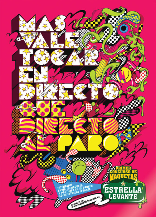
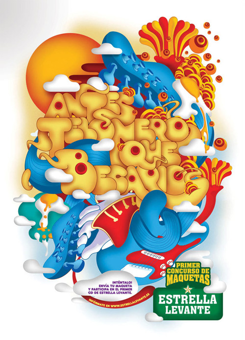
Posters for band contest, hosted by beer label Estrella Levante
Armin Vit: Your work thrives in its intense merging of typography, lettering and illustration. How did you arrive at this approach?
Alex Trochut: I guess it’s because I love type, and I also love illustration, so the work is just a reflection of this double and equal love. I like to feel close to graphic design but in an expressive way of seeing it — so doing expressive typography is where I find my place, and can still feel like a graphic designer.
Also, an important fact, is that I’m the grandson of Joan Trochut, a typographer and creator of the SuperTipo Veloz — a modular typographic and ornament system built in the 40s. [More on this below]. I believe that’s a big reason why I have always been attached to typography — I guess it’s in the blood — although I never met him, as he died before I was born, no one in my family followed his steps in graphic design, and I didn’t know much about type design until I got into design School. But once I started my graphic design studies I began to feel attracted to letters, and the way you can draw and contain precision and proportion in “abstract” shapes. Many teachers influenced my outlook, showing me the work of my grandfather, so I guess I was very attracted by the fact that I could share his same profession.
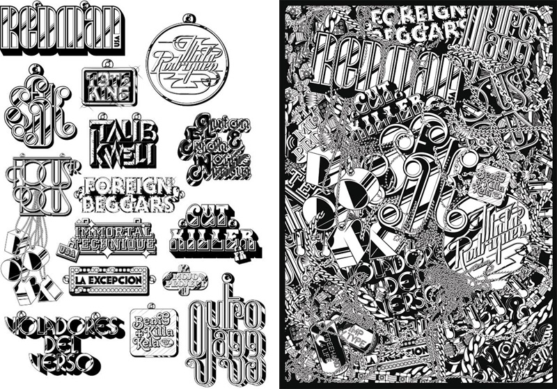
Customized 70s typefaces to promote the Cultura Urbana Hip Hop Festival, commissioned by Inocuo The Sign.
AV: One of the things that struck me about your work was your ability to use existing typefaces and manipulate them in a way that makes them feel unique, fresh and spontaneous. What do you look for in typefaces that you want to customize? Do you see something and instantly know what to do to it?
AT: When I look for a display type I like to see in it some kind of density, and a solid and connected structure from letter to letter. I really love all kind of 70s display fonts, I think that period was very free and complex in the creation of type. Once I have chosen the typeface, I type the text I need to design and try to look for relationships between the letters that compose it, and work again of this sense of denseness in the text block. I think this is the only thing that probably repeats in the choosing process, the rest is always changing, the way you add personality to the text, always balancing between being expressive and crazy and readable, form and content, is always changing, and trying to adapt as much as you can to visualize the content of the text through the visual level, and not only the meaning of the text itself.
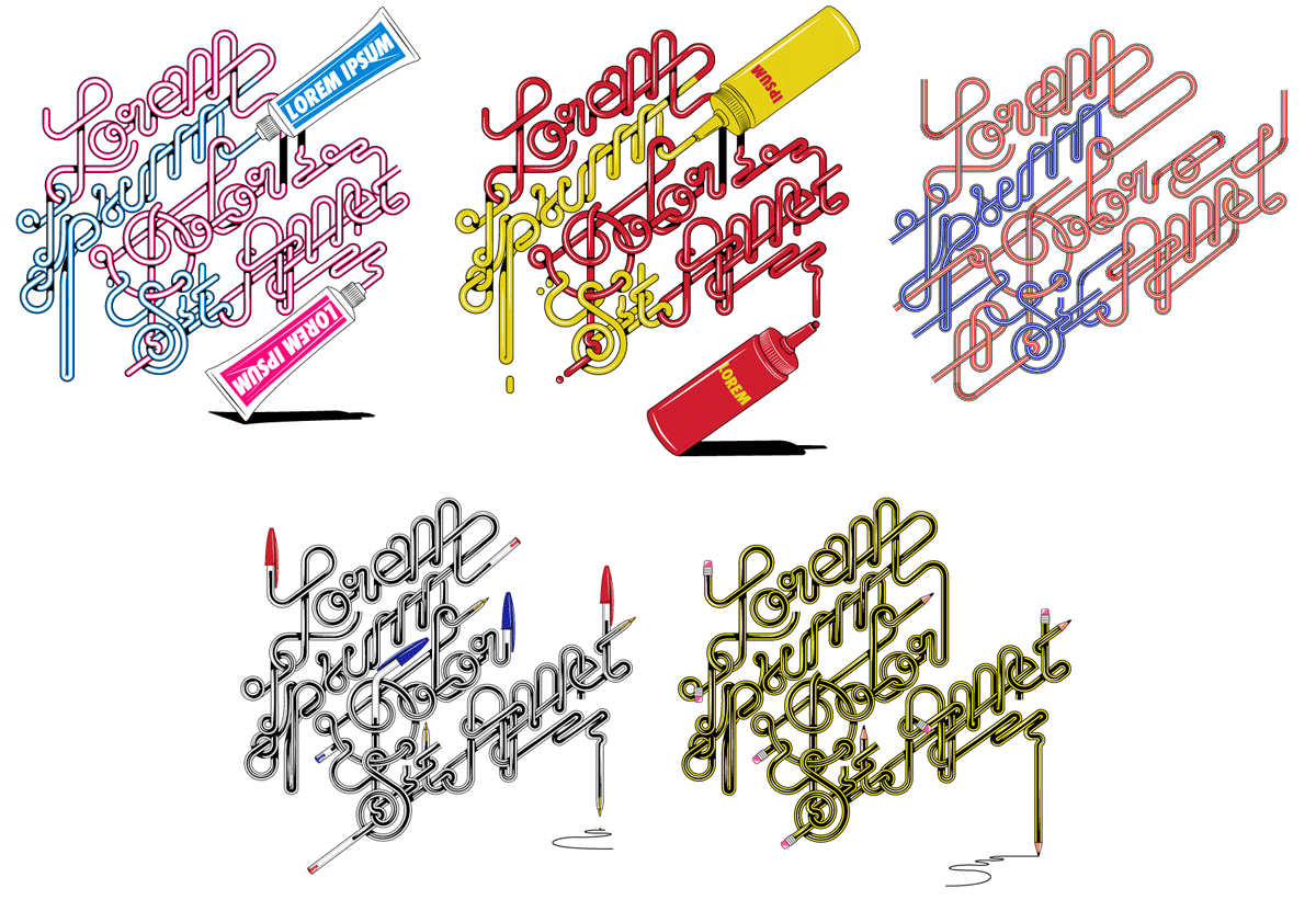
A series of tubular lettering of Lorem Ipsum.
AV: You have a lovely series of “spaghetti” lettering that takes the form of shoelaces, pens, pencils, straws. How did you arrive at this twisty style? Is it just too fun to resist doing it in all these variations?
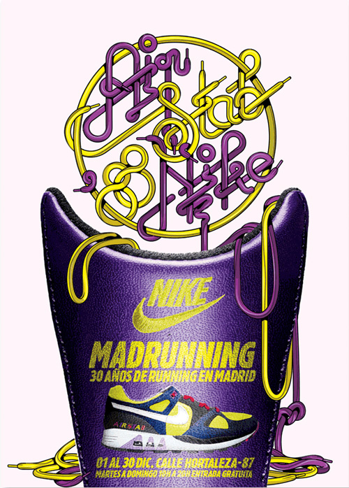
AT: I’m always looking for funny ways of writing and finding different ways to say things with letters, in the case of the Lorem Ipsum series, it was just an experiment at the beginning, a type exercise around tubular elements, then these could be many things so, yes, I just couldn’t resist to do series of five examples of “lorem ipsum dolor sit amet.” Actually, I found it would be cool to just focus on the shapes of the letters without any content, that’s why I chose the most famous “fake automatic text” to create a complex lettering like that, so that it was just fun for the eyes, no other reason. Of course, after doing it, it was a new lettering ready to be used in some project, and then the occasion came with the Nike Madrunning poster I did with the Vasava folks, made for a campaign based on the most charismatic sneakers of every decade, so we used the letters to build the text out of the shoelaces.

Cover and inside spread for the Sunday magazine of La Vanguardia, done at Vasava.
AV: How has your technique and ability to compose these type-illustrations evolved over the years?
AT: It’s just been a question of practice and challenge myself, trying to improve, to be a bit more compact in the compositions, and more complex every time, trying to fill in the blanks, thinking about type as a puzzle of abstract and geometric shapes… it comes down to a matter of hours and practice. In this field I think much more things can be done, we just need to look at the work that was done back in days, around the 70s.
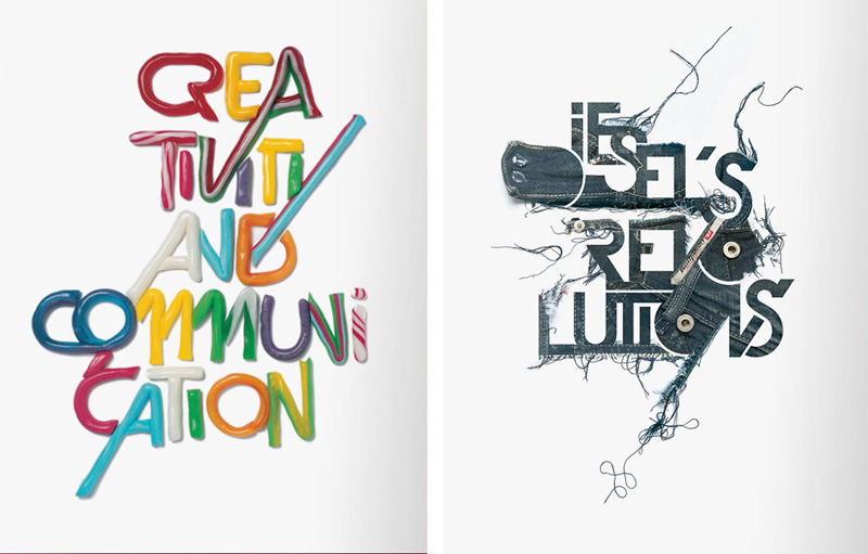
Illustrations for Diesel’s Fifty book, a celebration of its founder, done at Vasava.
AV: “More is more.” That’s something you don’t hear a lot these days, yet that is your philosophy. It would be easy for your work to fill inundated with visuals, but it feels very restrained and considered in that every element seems like it belongs there. How do you balance the desire for “more” without it becoming overwhelming?
AT: I have a terrible “horror vacui” tendency when I work, and I like it, but sometimes, I like when you find in a work evidences of many hours of detailed work behind it, but I also like control in the work, to see that the shapes keep some harmony between them and that there is not so much randomness, or elements that are there just to fill the space by chance. I always need to let my work rest for at least one night, and I look at it again in the morning and try to find the right place to everything — which usually means taking stuff out and not adding more elements.
So I believe in more is more, and, yes, I believe in control and consideration too.
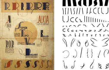
Joan Trochut’s Super-Veloz.
AV: When did you discover that your grandfather was in the printing industry and that he had designed a very comprehensive type system? What effect did this have on you?
AT: I always knew my grandfather was a creative person, when I was a kid my family always talked about him like the “artist” of our home, you could find many of his paintings around the house, and I always felt like he was more like a painter than a typographer — weird? Yes. I knew he designed letters, but as a child I didn’t associate this with graphic design… graphic design meant “computers ” to me, and the work of my grandfather was just something I never thought would have any connection with what I was going to study… All this was before I start studying at Elisava, then one day I went to a presentation by a duo of type designers from Barcelona called Typerware — formed by Andre Balius and JoanCarles Casasín — where they were showing the new things and projects that they were doing around type design, and they presented a version of SuperVeloz, I just couldn’t believe it, it was the work of my grandfather, they were talking about it 60 years later, and I nearly didn’t know anything about it! After that, I could understand his work much more. Not long after, together with Andreu Balius, we did a digital version of SuperVeloz that won a Type Directors Club award in 2005. I’m very proud we could rescue and revalue his work after all these years, and still win a big award like this — I 100% dedicate that to him.
AV: Most of our readers are in the U.S., so in the interest of curiosity, could you tell us a little about the graphic design culture in Barcelona?
AT: Barcelona is a very creative and active town, where many things are going on at the same time. Design can be a very stressful schedule in the week of events in Barcelona. It’s a small and condensed hot spot of shops, galleries, studios, agencies, and artists. But we also have a big congestion of designers, we are many and not so many jobs — or, at least, good jobs. The design culture in Spain is still very young, and it’s not easy when the clients don’t have an open mind.

Lettering for Spring-Summer 2006 catalog of fashion store Pull and Bear.
AV: Now that you are on your own, how do you see your career evolving?
AT: I’m not so sure what I’ll be doing in the coming years, but I hope I can keep learning and having the same fun that I’m having now.
AV: Thank you for your time Alex — and for sharing these sketches.

Contribution to SlipMad, an exhibition featuring customized DJ slipmats.
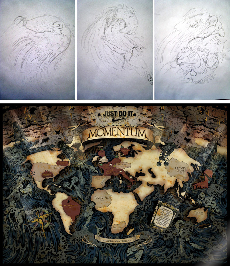
Illustration for Nike Momentum.
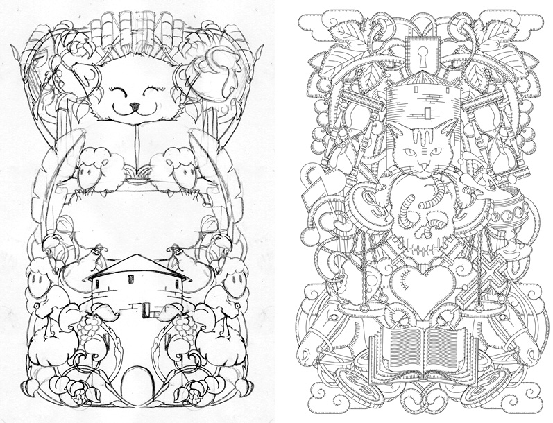
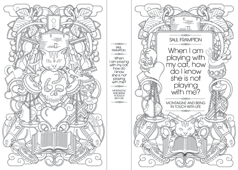
Illustration for Saul Frampton’s When I am playing with my cat, how do I know that she is not playing with me?. Full book jacket design here.
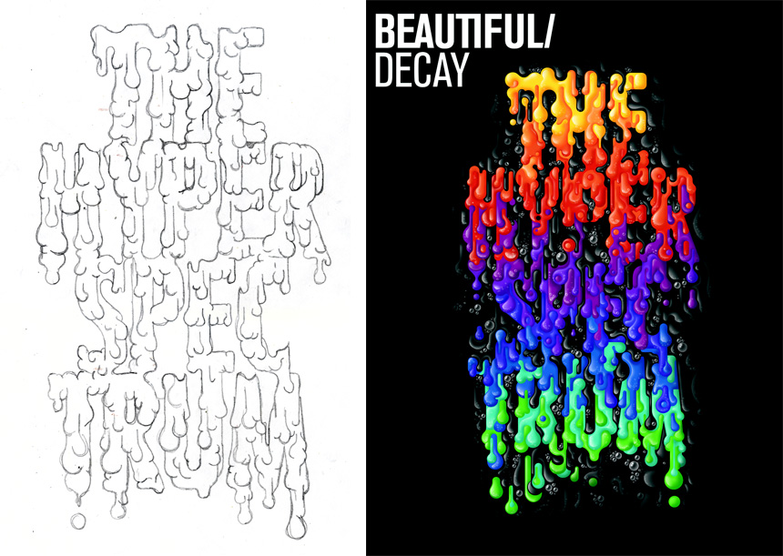
Cover for Baltimore-based Beautiful/Decay Issue T.
Great interview with a fascinating talent. Thanks, Armin!
On Sep.19.2007 at 12:51 PM