Speak UpA Former Division of UnderConsideration
The Archives, August 2002 – April 2009
advertise @ underconsideration
---Click here for full archive list or browse below
  
Booksourcing: Posters

As some of you might know, Bryony and I are working on a rather complicated book with the nice folks at Rockport titled, at the moment, Graphic Design, Referenced. We have tried to come up with an elevator pitch for it: It’s a 400-page book that contains the essential knowledge about graphic design that any graphic designer should know if stranded in a bar or dinner party full of graphic designers. From terms, to historic moments, to important work, to the most influential designers, this book is a cross somewhere between an encyclopedia, a Zagat survey, and Cliff’s Notes with more images than you can shake a stick at. Our latest outline includes over 400 entries and we are constantly revising it as we remember things that must be included or are sparked to include others based on something we’ve already included. The biggest peril of this project — aside from getting it done — is forgetting to include a particular person, project or topic, only to suffer the consequences once the book is published and designers start pointing out the obvious omissions. So, we would like to kindly ask for your help from time to time in helping shape some of the categories. We like to think that we are not asking you to do our job for us, but instead, building a collection of work referenced by as many designers as possible. And, for blogging posterity, these posts might be pretty amazing reference posts. Ready for the first one?

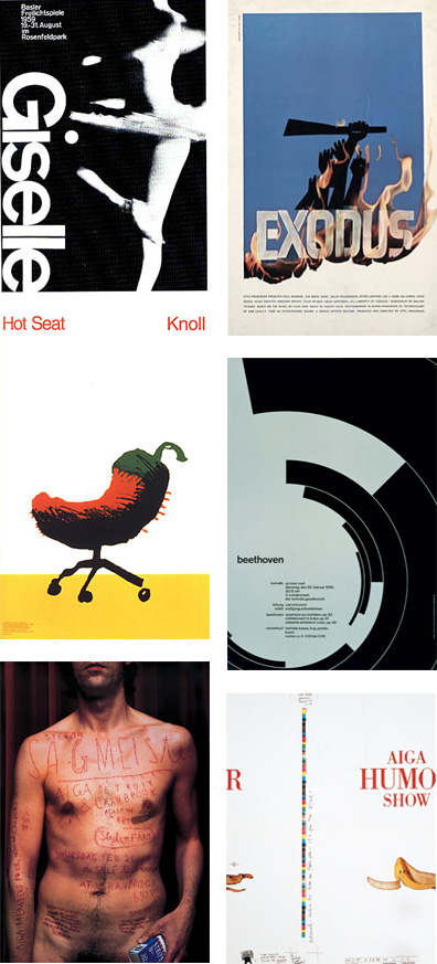
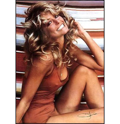
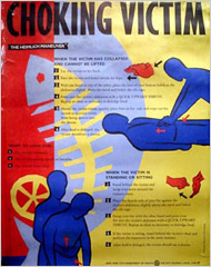
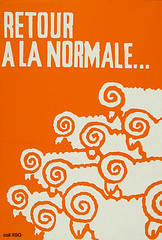
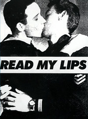
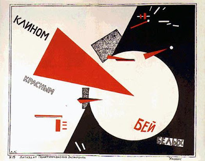
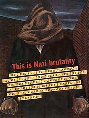
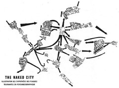
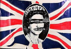
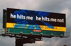
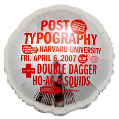
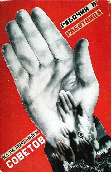
One of the chapters in the book is called “Practice”, where we will include landmark — yes, that kind of landmark — work in a variety of categories, from consumer product packaging, to identity, to typefaces, and to, the current matter for discussion, posters. Below is a very small sample of what we have so far, just to illustrate what we are looking for. Some of the inclusions are obvious and, to some, they might feel trite, but it’s still surprising when you reference a poster by Lester Beall or Saul Bass to design students AND professionals only to receive blank stares. What may be evident to some, is still a matter of discovery to others. All the posters (and all the work in this section) will be accompanied by one-paragraph descriptions so it’s not just a collection of pretty pictures. With all this said, we would like to invite you to lobby for what you think is the best and most relevant poster work done in the history of graphic design.

Maintained through our ADV @ UnderConsideration Program
ENTRY DETAILS
ARCHIVE ID 4208 FILED UNDER Discussion
PUBLISHED ON Dec.14.2007 BY Armin
WITH COMMENTS
Comments
neal s’s comment is:

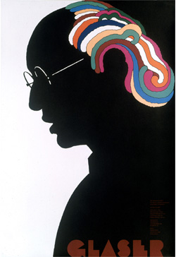
This one might border on being too obvious, but maybe not: what about Milton Glaser's Dylan poster?

On Dec.14.2007 at 11:04 AM
Doug Bartow’s comment is:

Have you considered launching a companion www site with the printed book to keep the content current and/or include any omissions (which are almost unavoidable)?

On Dec.14.2007 at 11:10 AM
Armin’s comment is:

Doug, yes, we thought about doing a blog to post questions like these, as well as being some sort of companion. But we've been pretty busy with client work to set up a blog for it. (Yes, we could set it up with a default template, but I would just have to customize it somehow). The idea of using it as a way to track the omissions is pretty nifty though, and would make a second edition (fingers crossed) easy to update.

Neal, yes too obvious, but impossible to not include. We've already written that one. And we're also including this nice homage by Woody Pirtle.

On Dec.14.2007 at 11:25 AM
Kevin Lo’s comment is:

not quite sure if these fit in, but just off the top of my head, and certainly "landmark" to me:

Peter Saville's FAC 1 Poster (homage, tribute, postmodern appropriation aside...)

Rodchenko and Mayakovsky's The Best Nipple as an emblematic example of the constructivist movement.

Yusaka Kamekura's Hiroshima Appeals, just because.

Barbara Kruger's Your Body is A Battleground among others.

Ken Garland's CND campaign, I don't think you can get much more landmark than that...

April Greiman's Self-portrait poster, more carson than carson...

Not sure if advertising fits into this brief, but Toscani's Benetton billboard/ad

Anything by Hatch Show Print

this is fun! more soon...

On Dec.14.2007 at 12:50 PM
Young Mr. Arvizu’s comment is:

The posters of Persian designer Reza Abedini immediately come to mind. As does the work of Cedomir Kostovic, one of my personal favorites...

On Dec.14.2007 at 01:31 PM
Armin’s comment is:

Mr. Arvizu, thanks for the link to Kostovic. I had forgotten about this poster, and I would have thought it was a Mirko Ilic poster.

Kevin, the CND campaign might fit in another category quite nicely.

On Dec.14.2007 at 01:40 PM
Inaudible Nonsense’s comment is:

I would think that El Lissitzky's work would be here. Perhaps he comes earlier, but so incredibly important in the development of the modern poster. I also am a huge fan of often forgotten designer Takenobu Igarashi -- who's work is in very close dialogue (although 60-70 years later) with El Lissitzky's.

On Dec.14.2007 at 03:05 PM
Inaudible Nonsense’s comment is:

One other suggestion:

I think you should call the book: Graphic Design, Illustrated or even The History of...

On Dec.14.2007 at 03:09 PM
Curtis’s comment is:

I'm not sure which would be considered their best or most iconic work, but A.M. Cassandre and Henri de Toulouse-Lautrec come to mind.

On Dec.14.2007 at 03:58 PM
m. kingsley’s comment is:

Makoto Saito
Kazumasa Nagai
Jan Lenica
and of course,
Tadanori Yokoo

But if you want LANDMARK, then there's always this classic from Julius Friedman.

Solipsistic AIGA posters be dammed. This poster had greater effect and higher visibility than most of what you probably intend to show.

On Dec.14.2007 at 04:07 PM
Armin’s comment is:

Mark, would you mind expanding on how so? I am not familiar with that poster.

On Dec.14.2007 at 04:24 PM
m. kingsley’s comment is:

Armin -

It was EVERYWHERE: from Graphis magazine to dorm rooms. I don't know how many times I went into people's apartments (often non-designers) and saw it in some junk-ass insta-frame -- which reminds me, it was ubiquitous in frame shops across (at least) the Northeast as well.

If graphic design is an act of communication or (at least) connection, then "Fresh Paint" had greater impact than every single example you show, except perhaps for the "Exodus" poster.

Friedman estimates that at one time, it was probably the biggest-selling poster in the country."

Which reminds me...

On Dec.14.2007 at 05:02 PM
Jose Nieto’s comment is:

Somebody mentioned Peter Saville. Let me put in a vote for that other British design associated with an independent music label: Vaughn Oliver.

Armin, you may want to check out this site for other leads: The Graphic Imperative.

If you want to include something not as obvious, I would check out the work of Lorenzo Homar, the most famous artist of the Puerto Rican poster tradition.

Finally, this is probably the most effective poster of the Vietnam era, designed by the Art Workers Coalition:

On Dec.14.2007 at 05:22 PM
b.king’s comment is:

I would think this would be pretty important. Cassandre, obviously. And I personally vote for this.

Too obvious?

On Dec.14.2007 at 05:24 PM
Armin’s comment is:

> It was EVERYWHERE

I like that poster, so I agree about its worthiness. But if we were to go by sheer impact and everywhereness, then we would likely have to include this:

On Dec.14.2007 at 05:43 PM
Jose Nieto’s comment is:

I almost forgot about Art Chantry. I remember this being very influential in its day:

On Dec.14.2007 at 05:57 PM
mitch’s comment is:

hmm... i tried posting this earlier today; ill give it another go:

a few that i would consider important are;

pretty much anything from the Stenberg Brothers (here, and here for examples)

bruno monguzzi's fausto gerevini exhibition poster

ralph schraivogel's posters (specifically this one and this one.)

On Dec.14.2007 at 07:00 PM
David Young’s comment is:

I'd vote to include Jacqueline Casey. Her work for MIT (which was closely aligned with the work of Muriel Cooper) was really fantastic.

from http://www.stepinsidedesign.com/STEPMagazine/Article/28555/0/page/6
Jacqueline Casey joined the Office of Publications (Design Services Office) at Massachusetts Institute of Technology (MIT) in 1955 under design director and fellow Massachusetts College of Art alumnus Muriel Cooper. When Cooper left to join the MIT faculty in 1972, Casey became director of the Office of Publications. Influenced by Swiss design, Casey is best known for the posters she created to publicize MIT events and exhibitions. Her high contrast, type-heavy compositions were intended to stand out on already cluttered university bulletin boards. She often used manipulated letterforms for primary text, and set the supporting information in smaller type.

Some links include:

- a flickr set
- a digital collection at RIT

Here's a sample poster:

On Dec.14.2007 at 09:01 PM
Paul Stonier’s comment is:

Here's another obvious one:

if Hatch Show Print has one. I'd say it'd be one of the Johnny Cash posters. Jim Sheridan would probably agree

I feel like Marian Bantjes needs to be in here too.

On Dec.14.2007 at 09:03 PM
Caren Litherland’s comment is:

Atelier Populaire, Retour à la Normale (Paris, 1968):

Gran Fury, Read My Lips (New York, 1988):

Luba Lukova, Sudan (New York, 1999):

On Dec.14.2007 at 09:57 PM
Jose Nieto’s comment is:

This is fun!

Here's a few more:

8vo

studio dumbar

why not associates

Philippe Apeloig

Willi Kunz

Anthon Beeke

On Dec.14.2007 at 10:44 PM
Chad K.’s comment is:

L.M. Lisitsky

Joost Schmidt

The Stenberg Bros.

On Dec.15.2007 at 12:06 AM
m. kingsley’s comment is:

Armin --

I fear you're missing the point. The "Fresh Paint" and Farah Fawcett posters connected with people. Ordinary people -- not a bunch of fawning graphic designers. More pubescent teenage boys stroked it to the Farah Fawcett poster than the combined number of graphic designers who fawned over every other poster presented so far.

Yes, the choking poster was everywhere. It was mandated by law. The only thing mandated about the Farah Fawcett poster was that every straight teenage boy finger his little weenie 'til the juice come out.

Dude. That's fuckin' power.

Or... you could say it's "seminal."

As for the rest of the list:
Stenberg Brothers -- yes
El Lissitzky (watch yer spellin' there, Chad) -- yes
Atelier Populaire -- most definitely
Gran Fury -- very important
Paul Rand -- belongs in another category
Philippe Apeloig -- a career based upon one poster, so yes
Willi Kunz -- great designer, wrong category

Marian Bantjes!?

On Dec.15.2007 at 01:32 AM
Derrick Schultz’s comment is:

All the posters (and all the work in this section) will be accompanied by one-paragraph descriptions so it’s not just a collection of pretty pictures.

Maybe its just me (or maybe my idea of one paragraph is different than yours), but that just sounds like "a collection of pretty pictures with a one paragraph description."

Kingsley, please write your own book on that topic and I will buy ten copies minimum (and I'm too young for Farrah!)

On Dec.15.2007 at 02:25 AM
Armin’s comment is:

Mark, I get the point. I just don't agree that posters made for the public in general -- specially those that show it-girls-of-the-moment with erect nipples -- are inherently better than a poster for "fawning" designers. A poster like Sagmeister's IS important and relevant to graphic designers; everybody knows it and everybody references it... Including you, even if it's just to make fun of it, or to segue into a rant about designers. And as far as I can tell, that poster connects people, it just happens that those people are graphic designers. To diminish its value -- or of other posters like it -- because it didn't hang on every horny teenager's closet (or every frame store in the Northeast) in the U.S. seems silly.

But as Derrick mentioned above, maybe there is room for an alternative book. It just won't be this one, and probably not authored by us. Wink wink.

On Dec.15.2007 at 08:35 AM
Michael Bierut’s comment is:

Mark, I know the Julius Friedman's "Fresh Paint" poster well, and have always liked it, but what exactly is it "communicating?" I always had the impression that it was designed to be a poster to sell in poster and frame shops. To me, that's more of a faux poster than a real poster with a purpose.

On Dec.15.2007 at 01:36 PM
m. kingsley’s comment is:

Armin --

I never said the Fresh Paint and Farah Fawcett posters were better, just that they're landmarks in poster design. But if you're going to suggest that Sagmeister's self-mutilation is important and relevant, then I suggest that it's not selected because of the masterful typography nor the "cleaver" idea. You chose it because it's provocative.

Now that we know the criteria, tell me: what makes Sagmeister's poster any more of a landmark than Farah Fawcett's? Because it was done for designers? Christ, what a circle jerk.

On Dec.15.2007 at 01:48 PM
m. kingsley’s comment is:

Michael --

Google tells me that Fresh Paint was commissioned by the Kentucky Arts Commission, probably as museum store merchandise. As I pronounced earlier, if design is at least an act of connection, then -- for some crazy reason that I probably will never understand -- that poster connected. Successfully.

Does design have to overtly communicate? No. But since Taste is a signifier of social/cultural/tribal grouping, then conveying Taste establishes context. And as we all remember from semiotics class, context establishes meaning.

Fresh Paint was a marker of people's Taste. Perhaps its widespread appearance in living rooms and frame shops was more an act of inclusion or establishing a status quo.

We all have portfolio pieces which fail to communicate in an overt manner, but this doesn't diminish their effectiveness. Specifically -- and to turn the question back at ya -- what is your Saks Fifth Ave. rebranding communicating other than the establishment of a certain taste?

On Dec.15.2007 at 02:07 PM
pedro vit’s comment is:

Would like to suggest any one of Istvan Orosz's posters
This one is a famous one:
http://www.mmakademia.hu/ab/5/50703.jpg

On Dec.15.2007 at 02:37 PM
Gunnar Swanson’s comment is:

Mark is, of course, right about the Farrah poster. For something more in the art/graphic design mode we might look to just later for pretty much anything by Patrick Nagel. Or do we want to make a distinction between "art prints" and "real" posters?

Maybe one distinction you're looking for (besides the perhaps-reasonable "is it important to graphic designers and mainstream graphic design thinking?" distinction that Mark decries) is whether it is an important bit of graphic designing (as opposed to important graphic design.) Ms. Fawcett and Bruce McBroom (the photographer) did all of the work on her poster.

On Dec.15.2007 at 04:14 PM
m. kingsley’s comment is:

Gunnar --

Somebody had to do the cropping on the Farah poster. So, props to the crops.

And somebody art directed that shoot, and set up the (Mexican?) blanket behind her, and chose the (divine) bathing suit, and so on... All acts of judgement, all acts of designing.

Whether they're graphic obviously matters less to me than their effect. To each his own.

On Dec.15.2007 at 04:35 PM
just for giggles’s comment is:

mark-

those "design choices" about the blanket and the bathing suit were made last minute without much thought about design - the bathing suit to show skin, the blanket was the photographer's (i think) that they through over a pick-up truck to hide it or something. but if by "connecting" to people, you mean appealing to the lowest common denominator (at least on the male side - this was probably more influential in giving women eating disorders than design ideas) through their hormones, then by all means, the farah poster was the great equalizer. armin, please include the best-selling issues of playboy in your book as well.

On Dec.15.2007 at 07:14 PM
Josh B’s comment is:

I know it's sort of corny, but I've always liked this one by Steff Geissbuhler

And there's plenty of stuff by Paula Scher to be considered, but I kinda like this one best

And what about movie posters? 99.99% crap to be sure, but a handful from the last century might qualify as landmark. Most recently this one comes to mind (yes it's silly, and stands no chance of being chronicled in the history of design, but it was so perfect for that movie).

On Dec.16.2007 at 02:35 AM
ps’s comment is:

(i take it this book is meant for US only and what were landmarks here.)

On Dec.16.2007 at 12:40 PM
Su’s comment is:

I have what may be a weird question: Do landmarks have to be positive? I don't mean good; that allows too much opening for judgement on technical points.

Everything above seems to be listed on the basis of praise. Just because it's the standard dead horse, let's take the Sagmeister poster: I get the impression people don't necessarily think of it poorly; they're just sick of seeing it. But I'm wondering if the concept of landmarks allows for inclusion of the colossal failure.

The idea and question are vague enough right now that I'm leery of throwing out an example that may be flawed, so I'll provide one from an entirely different arena: New Coke.

On Dec.16.2007 at 01:23 PM
Ruth B.’s comment is:

I think the Solidarnosc (Solidarity) posters are definitely classics- particularly ones reproduced in L. Weschlers book "Everything that Rises".

Also- the Paul Davis posters done for J. Papp's theater (e.g. Threepenny Opera) and Paula Sher's poster for "Bring In Da Noise".

On Dec.16.2007 at 08:22 PM
Pesky’s comment is:

My suggestion is take no suggestions but use your gut instinct. We can be here til the proverbial cows come home and nobody is gonna agree on inclusive work. It'll just muddy the waters, I think, unless you want a book-by-committee approach.

Do you want posters that were popular and ubiquitous or ones that were influential or ones that had exceptionally groundbreaking ideas....very different criteria each.

On Dec.16.2007 at 09:46 PM
m. kingsley’s comment is:

Giggles -- just because someone isn't laying out type, doesn't mean they're not integral to the process. On a photo shot, everyone has a role to play: from the client who just shows up for lunch (but approves the polaroids), to the hair dresser who has to show up early (and then wait until the end, just in case), to the photographer, to the art director, to the drummer's wife (who likes him in a certain hue of dingy grey).

And just because a decision was made last minute, doesn't mean it's any less viable.

Su brings up an important point, which is that a dispassionate selection is probably more productive than a dogpile of everyone's favorites. Unlike Michael, I'm not so much a fan of Fresh Paint, as an appreciator of its cultural position. But I'll argue (hopefully in an entertaining way) its inclusion in the design canon.

Criticism is the act of placing a work into context. If approached that way -- without applying value judgments to the effect of the work -- Armin and Bryony's project could yield interesting results.

In other words: considered thinking, yes -- gut instinct, no.

On Dec.17.2007 at 03:18 AM
Doug’s comment is:

Not sure if this name has been mentioned, but anything by McRay Magleby. Can't find any pictures, but his work for Brigham Young University (BYU) in the 80s was simply amazing.

On Dec.17.2007 at 10:59 AM
agrayspace’s comment is:

As a huge fan of the polish poster tradition, I would say you have to include some of the work by Starowieyski, Tomaszewski, Młodożeniec, Eidrigevicius, and others.

The agrayspace poster gallery

Some personal favorites that every designer should be able to reference.


On Dec.17.2007 at 11:36 AM
Angie Copolillo’s comment is:

Armin,
As a second-year graphic design student having just completed two semesters of GD History, a couple stood out to me (they might be in the wrong category; you decide):
-Paul Rand, 1940 cover for "Direction" mag. Gave a different meaning to Christmas presents when tied with barbed wire;
- Alvin Lustig, 1948 cover for "Anatomy for Interior Designers",
- Bill Taupin/Judy Protas poster "You don't have to be Jewish to love Levvy's (real Jewish rye)";
- Seymour Chwast's "End Bad Breath"; and,
- Gunter Rambow's 1988 "Sudafrikanisches Roulette" (hand wrapped in bandage with blood-stain shaped like Africa).

I did my best to not pull everything I saw, but I did reference these from Meggs' 4th edition. The ones I mentioned were ones that stuck out to me in class as examples of recolutionary work that had an impact on society.

I do have to vote for the "solidarity" logo, as well.

On Dec.17.2007 at 12:09 PM
Jose Nieto’s comment is:

That's a fantastic gallery, agrayspace -- thanks for putting it together.

On Dec.17.2007 at 12:56 PM
Josh’s comment is:

Damn. agrayspace got to the Polish before i did. I'd second that notion. Swierzy,Tomaszewski for sure.

I still don't get M. Kingsley argument. It seems argumentative just for the sake of it. Yes, there are many iconic posters that have been routinely seen throughout the years, but does that mean we should include the John Belushi Animal House era poster?

That will have continuous placement in every dude's house for the next hundred years, but is it an achievement in poster design? Is it representative of the craft and consideration that we wish all people knew about us?

Based on that argument we should have every single Pink Floyd and Bob Marley poster in this book and just shove the Sagmeister and Scher work out to the trash.

I don't discount the work of the photographer, key grip, lighting maestro who worked hard behind the scenes to create some of which M. Kingsley mentioned, but some are just photographs made into posters. How exactly are those related to the practice of design compared to the work of Armin Hoffman, Waledmar Swierzy, Milton Glaser, Paula Scher and countless others.

Though i would welcome a book titled "All The Posters You Love That Graphic Designers Hate". Like the ugliest record covers book. I think then the subject matter would fit into the context of the argument here.

On Dec.17.2007 at 03:01 PM
agrayspace’s comment is:

the purpose of the project I believe is what work should serve as reference points for designers. What are our touchpoints?

Animal House and Farrah. Um no.
Glaser, Starowieyski, Brockmann. Hell yes.

On Dec.17.2007 at 04:25 PM
Danny Tanner’s comment is:

Hofmann, Armin
Die Gute Form (Good Design), 1954

The poster features a headline, which also acts as a picture and can be read as words, symbols, or both. This poster is perhaps his quintessential contribution to the poster field.

Hofmann, Armin
Tell, 1963

Again, the type acts as a image, forming an arrowhead. An arrow shot at an apple=William Tell. Direct, Communicative, Beautiful.

Aicher, Otl
Olympic Games Poster Series

The beauty and cohesiveness of this poster series, along with the rest of Olympic materials (bulletins, directories, etc.) of 1972 is remarkable.

Treumann, Otto
Jaarbeurs Utrecht, 1954

This is just an example. If your not super familiar with his posters, get super familiar with them. They Rock. Interesting side note, Treumann designed the previous Wolters Kluwer Logo the UnderConsideration's Contributor Joe Marianek redesigned while at Landor.

Grapus
Mandela fights apartheid, 1989

Controversial poster which caused a legal battle in France.

Studio Dumbar (Bob van Dijk)
Holland Dance Festival, 1995

Studio Dumbar's Holland Dance Festival Posters are aspirational.

I'll stop now.

On Dec.17.2007 at 07:24 PM
Armin’s comment is:

> I have what may be a weird question: Do landmarks have to be positive? [SNIP] The idea and question are vague enough right now that I'm leery of throwing out an example that may be flawed, so I'll provide one from an entirely different arena: New Coke.

Su, that is a good question. I do think the answer is yes, the landmarks have to be positive. The only examples I can think on par of New Coke are rebrandings done wrong, like the thousands we've reviewed here and on Brand New. ACTUALLY, I think the Wolff Olins London 2012 Olympic logo would be a good example of this. And I do think we could include it as a landmark of controversy and global hatred.

> It'll just muddy the waters, I think, unless you want a book-by-committee approach.

Pesky, indeed, it would be somewhat lame to just take these comments and run them as is. This exercise has been tremendously helpful but in the end it is a mixture of our gut instinct and to keep refining the criteria and establishing what our point of view is, that makes this book ours as opposed to someone else's. For example, Kingsley's book might include Farrah's poster, ours won't ; )

Thanks to everyone for their contributions so far.

This afternoon I ran into a related link, Billboard's The 25 Best Rock Posters of All Time, and I find it interesting that music posters or gigposters haven't come up yet (other than the one mention of Art Chantry at the beginning)...

On Dec.17.2007 at 09:28 PM
Jose Nieto’s comment is:

Armin, I, for one, am pretty sick of gig posters by this point. But if one must, I would suggest the work of Aesthetic Apparatus. There's also Matt Brinkman and the whole Ft. Thunder scene that Dan Nadel seems to love so much.

Talking about interesting, it surprised me that Paula Scher took so long to come up; in fact, there are very few American poster designers from the last twenty years included in this thread. Where's Paul Sahre (especially his work for Fells Point Theater)? James Victore? Ed Fella? Jennifer Sterling? Katherine McCoy? Stephen Doyle (you have his AIGA Humor show poster in the intro, but still...)? Perhaps the work is too recent, to close to home. Or perhaps it's simply not as relevant in subject matter as the European work of the same period. As someone who came to the field in the mid-90s, it certainly loomed large in my world.

On Dec.18.2007 at 03:55 AM
G’s comment is:

With regards to gigposters...

Click here.

Unbelievable.

On Dec.18.2007 at 11:23 AM
pnk’s comment is:

On the gig posters side of things, I was trying to find *the* 60's era rock poster, but could not decide on one that would be the most iconic. A couple nominees would include:

Wes Wilson:

Bonnie MacLean

Stanley Mouse

On Dec.18.2007 at 12:19 PM
art chantry’s comment is:

jamie reid's 'god save the queen' 45 cover.
john van hammersveld's "endless summer" poster
gary panter's logo for the screamers
john pasche's logo for the rolling stones
any pinstriping by von dutch (or his personal logo)
ed roth's rat fink
harvey ball's happy face
harley earl's tailfin
doug fats's starbuck's logo
the beatle's sgt. pepper lp cover
john van hammersveld's "exile on main street" lp cover
andy warhol's "velevt underground and nico" cover
rick griffin's rolling stone magazine logo
the nike swoosh
charles anderson's work for french paper
wiliam golden's cbs eye
westavco inspirations by bradbury rhompson
the push pin graphic
raymond pettibone's logo for black flag
the movie titles for "seven"
the entire blue records campaign by reid miles
alex steinweiss' invention of the record cover


i could go on for years.

On Dec.18.2007 at 04:13 PM
art chantry’s comment is:

jamie reid's 'god save the queen' 45 cover.
john van hammersveld's "endless summer" poster
gary panter's logo for the screamers
john pasche's logo for the rolling stones
any pinstriping by von dutch (or his personal logo)
ed roth's rat fink
harvey ball's happy face
harley earl's tailfin
doug fast's starbucks logo
the beatle's sgt. pepper lp cover
john van hammersveld's "exile on main street" lp cover
andy warhol's "velvet underground and nico" cover
rick griffin's rolling stone magazine logo
the nike swoosh
charles anderson's work for french paper
wiliam golden's cbs eye
westavco inspirations by bradbury thompson
the push pin graphic
raymond pettibone's logo for black flag
the movie titles for "seven"
the entire blue records campaign by reid miles
alex steinweiss' invention of the record cover
the beatles white album
enron logo by paul rand


i could go on for years.

On Dec.18.2007 at 04:15 PM
Joe Moran’s comment is:

Anything by Anton Stankowski or Norman Rockwell would be good, too.

And movie posters … my heck … don't leave out Wizard of Oz, Gone with the Wind, or -- gasp -- Casablanca!

VR/

On Dec.18.2007 at 05:04 PM
Julie’s comment is:

What about Rosie? Not sure if someone already suggested her.

img

On Dec.18.2007 at 05:54 PM
Curtis’s comment is:

The work of Michael Schwab should be considered as well.

On Dec.18.2007 at 07:44 PM
Joe Moran’s comment is:

BREAKING NEWS: Another arguement for Farrah Faucett posters. Ha!

VR/

On Dec.18.2007 at 10:11 PM
Henrik Tandberg’s comment is:

Sure you have these, but Herbert Matter and Wolfgang Weingart please

On Dec.19.2007 at 03:33 AM
Jim’s comment is:

To me, The Landmark of the (western) modern poster is Lucian Bernhard's Preister matches poster of 1905. This poster may have changed everything in the way we expected advertising to look to how it does today. Especially when you consider the context. (and besides, his is such a good story.)

On Dec.19.2007 at 06:22 PM
Michael’s comment is:

Posters by Uwe Loesch

On Dec.19.2007 at 10:50 PM
Tselentis’s comment is:

Ralph Schraivogel
Jean Benoit-Levy
Studio Cyan

Are not as recognized in the states, but are all key poster designers in the EU.

On Dec.20.2007 at 09:23 AM
53feet’s comment is:

This idea of finding the landmark poster's is interesting, and I'm not sure the best way to go about it. I've never actually seen 95% of these posters listed in poster form. Sure, I've seen Bass, Muller-Brockman, Sagmesiter, Hoffman, Kunz, Beeke, and Dunbar posters... in a book or a gallery, but never on the street nor on a wall. So, in many ways, I feel unqualified to do anything but regurgitate what's already in design history books (which there's a lot of that going on), but if I stop to think about the most iconic image/poster of my generation, one I've seen in public places, it's Shepard Fairey's OBEY sticker/poster series (printing since 1989).

The OBEY image is something you have a real chance of seeing, unlike PUBLIC THEATRE poster's you'd only see if you were in certain parts of NY or the Kunz architectural posters that you'd only see if you happened to be at Columbia University. It would be nice if their were more icons of culture and less icons of design, but if you're just going to show us posters we've already seen in history books, don't forget about Wim Crowel.

On Dec.20.2007 at 09:39 AM
Ella’s comment is:

Be brave. Include work that is vital to now, not just worn by history!

Ralph Schraivogel

Inkahoots

Jonathan Barnbrook

Martin Woodtli

On Dec.20.2007 at 05:24 PM
Ahrum Hong’s comment is:

Off the top of my head:

Not exactly a poster designer, but I'm not sure where else you'd stick John Heartfield.

Behren's AEG poster (I'm pretty sure it's in Meggs).

Lissitzky's "Beat the Whites With the Red Wedge."

Hatch Show Print, though I'm not sure which of their works would best suit the "landmark" distinction.

Stenberg Bros. "Man With the Movie Camera"

Yokoo.

Heinz Schulz-Neudamm's "Metropolis"

Saul Bass's "Vertigo"

On Dec.20.2007 at 05:53 PM
md’s comment is:

Is the target audience uninformed designers?

It seems to me that anything completely obvious and/or in Meggs should be avoided.

My suggestion for inclusion is a series of posters talked about in a Dot Dot Dot issue. I can't remember the name of the designer right now, but it was for a corporate client, and the series eventually showed people positioned so they spelled out "nazi". The company sued the designer and lost and went bankrupt.

Thats landmark.

On Dec.21.2007 at 12:29 AM
Henrik Tandberg’s comment is:

The guy´s name was Ernst Bettler. Issue 9 if I remember correctly.

I agree with md. Lots of obvious examples here (like mine:-)) All the posters you need are pretty much in Richard Hollis´ " a consise history" anyway, right? So maybe a different angle...

On Dec.21.2007 at 05:32 AM
Michael Bierut’s comment is:

md and Henrik, Ernst Bettler's inspiring story is, alas, fictional.

On Dec.21.2007 at 06:52 AM
Caren Litherland’s comment is:

This doesn't strike me as book-by-committee at all. I imagine that Armin and Bryony have very strong ideas about what should be included. Opening up the discussion seems generous to me and I find the various responses fascinating.

Not so long ago, something like this would have been unimaginable or at least highly impractical. But one of the things made possible or at least facilitated by the internet is the opening up (and speeding up, too, probably) of the process of canon formation. It used to be that a book like this would simply appear. It would work its way into curricula and become part of the discourse around a given discipline. The authors might solicit input from those in their immediate circle but, in this case, A + B are opening it up to, theoretically, anyone in the world who has an opinion and access to the internet. So the chances of including something that might once have been overlooked/forgotten/slipped-through-the-cracks/not-known-about increase radically. Instead of dismissing this exercise as somehow lame or misguided, why not participate?

That people mention iconic works already included in Meggs et al. is to be expected: those things are (probably, in most cases) there for a reason. I know how problematic that last statement ("there for a reason") is. On the one hand I understand and applaud and share Mark Kingsley's impulse to question and bust open the canon to include something like the Farrah poster. But since communication is such an important part of graphic design, I also have to ask myself what that poster communicates beyond vacuity, commodification and puerile masturbatory fantasy. Still, proposing its inclusion is what this thread is all about, it seems to me. It's a way of asking: what is graphic design? (And providing from the outset a working definition of what graphic design is, as a discipline and body of knowledge, is a necessary part of a project like this.) It's a way of asking: what is the "canon" and what should be included in it? Canons are forever mutable and open to debate. That's what this thread is.

For what it's worth, I agree with others' mentions of Victore (particularly "Racism" from 1993), Abedini, Paul Sahre's Fells Point work, "Bring In Da Noise"... Also with the work referenced by aGrayspace.

Others to be considered imho:

Ben Shahn/Office of War Information, This is Nazi Brutality (1942)


Guy Debord, Naked City (1959)


Jamie Reid, God Save the Queen (1977)


Class Action/Sheila de Bretteville, He Hits Me... (1995)


Catherine Zask, Droits de l'homme (2001)


Post Typography, Harvard Balloon (2007)


Brian Roettinger, Poster for SCI-Arc (2007)

On Dec.21.2007 at 06:03 PM
Armin’s comment is:

Exactly what Caren said above.

On Dec.23.2007 at 10:33 AM
m. kingsley’s comment is:

Caren --

The requirement that design "communicate" something is a fable perpetuated by insecure neurotics. Even if to do nothing more than to re-establish the status quo and certain tastes, the Fresh Paint and Farrah posters were 1) printed, 2) omnipresent, and 3) cultural markers.

Armin asked for landmarks and I simply offered two examples.

Graphic design operates at the borders of culture, taste, art, language, business, et. al. It's a messy business -- made messier now that everyone with a computer has the same tools as a professional designer. Thinking there could even be the possibility of a design canon is a delusion because for any situation, there are a multiplicity of engaging responses.

But there is history and from that, landmarks can be identified. Such a selection will reflect the prejudices of the selector. Shouldn't we try to be as inclusive as possible? Life's more interesting that way.

Also your dismissive comments about the Farrah poster communicating "vacuity, commodification and puerile masturbatory fantasy" do nothing to minimize its historical or sociological effect. Ludwig Hohlwein did great posters for the Nazis. Doesn't make them any less good. Doesn't mean you shouldn't know about them.

Besides, masturbation isn't necessarily a bad thing. 95 percent of the world does it, the other 5 percent are just good liars.

On Dec.23.2007 at 07:50 PM
md’s comment is:

I agree with Caren about some of the posters being suggested are iconic and in Meggs "for a reason." I also agree the opportunity to be involved in this selection process is rare and welcome.

I just wonder who the book is targeted at? People who would already know about those posters or people who haven't explored the history of graphic design yet?

Weingart, Rand, etc are all pretty well known to informed designers and the book would prove less interesting if it is rehashing what we already know, wouldn't it?

(Also, I'm amazed and embarrassed that the Dot Dot Dot story wasn't true)

On Dec.23.2007 at 09:11 PM
Armin’s comment is:

To answer the question about who the book is targeted at: It's a mixture of both newbies to design as well as seasoned professionals. The former we are targeting by including the basic knowledge and references that they must know so that they can hold a conversation on par with other designers; and the latter by showing some unexpected work in other areas that has not been published before as well as being a rather kooky collection of all things design.

We are indeed rehashing some things we've all already seen (specifically when it comes to posters and other important work), but whenever we can we are adding a little extra layer, like the Dylan poster where we have the Glaser homage by Woody Pirtle as well as another homage that few designers know of (even Steve Heller was surprised by it, but you'll have to wait for the book to see it).

There are a few big differences between our book and Meggs' and Hollis':

- Ours is image-driven, where every single entry has one or more images (and this applies to things like "grid" or "color" or whatever else), so it's about visualizing terms and things;

- ours is not a historic book, we are not claiming any academic cred, this is a practical book that looks at graphic design from a conversational and referential point of view;

- other than the "landmark" section (which is just one fourth of the book) the work we show is fresh, international (we have some lovely beer packaging from Norway, a corporate identity from Finland, a book from Germany, environmental graphics from Barcelona, and counting) and illustrative of any given topic;

- and as far as I know it's the only book that will give the same preferential treatment to Robert Brownjohn, engraving, Template Gothic, motion graphics, the crystal goblet, and RGB, among hundreds of others.

**

And, indeed, we are opening up the process not to make this book into a published wiki, but to get insight and points of view that we would otherwise miss. We have a strong direction in which to take the book, but we would be foolish to believe that we have all the answers. And as this thread has proven, the discussion about what constitutes important work and the differing opinions is fascinating. So we are really looking forward to seeing what other opinions come in for the other disciplines we will be including.

On Dec.24.2007 at 09:27 AM
adam’s comment is:

in reference to the earlier conversation about whether of not to include the likes of the farrah faucet or the "fresh paint" posters in the collection of integral "design" posters, i refer to a definition of design given by peter saville... "graphic design is about communicating a clients message to an intended audience" (sorry, i paraphrased a bit because i dont have debbie millmans book in front of me). but you get the point, i hope.

art is not necessarily design is not necessarily art.

On Dec.26.2007 at 05:29 PM
Greetings from Buenos Aires’s comment is:

Are you including hand painted posters?

Are you including TDR? Where do you think all those arrows and postively angled repetitive lines came from in the 90s? I'd consider their work landmark because every billy that had an autechre album picked up the style, which is now ubiquitous in motion and interactive design by people who have never heard of Warp Records let alone their studio of record.

Or how about the most recent 'hand-drawn' poster 'movement'?

On Dec.27.2007 at 06:57 PM
Armin’s comment is:

> Are you including hand painted posters?

If they are one-off posters, probably not, they would have to be produced in large quantities.

And The Designers Republic will definitely be included, but in another section.

On Dec.29.2007 at 09:18 AM
Pedro Marques’s comment is:

I would suggest the inclusion of at least one cuban poster from the 60's or 70's. The ones produced by ICAIC are amazing silkscreen pieces. I particularly like the work of Ñiko (of which I own the "Frenzy" poster: http://pedromarquesdg.wordpress.com/2007/09/26/odores-a-tinta-de-havana/), Reboiro or Azcuy. There's also a very strange poster on Guevara made by Rafael Morante in the early 80's (http://pedromarquesdg.wordpress.com/2007/10/10/che-icone-maleavel/).

On Jan.02.2008 at 05:46 AM
Pedro Marques’s comment is:

I've been slowly collecting Victor Moscoso's "Neon Rose" posters and they pack a visual wallop. I think they are still very interesting because of Moscoso's use of found imagery (instead of à-la-Art-Nouveau illustration, which dates pretty badly a lot of the psychadelic poster by now) and superb use of color in print (the Death and Transfiguration skull overimposed on George Washington face). The poster catalogued as NR-12 (Chamber Bros + Matrix concert) has iconic written all over it.

On Jan.02.2008 at 05:58 AM
Pedro Marques’s comment is:

The correct links:
- Ñiko's poster for Hitchcock's "Frenzy":
http://pedromarquesdg.wordpress.com/2007/09/26/odores-a-tinta-de-havana/

- Rafael Morante's surrealist poster of Guevara:
http://pedromarquesdg.wordpress.com/2007/10/10/che-icone-maleavel/

- Moscoso's iconic poster:
http://pedromarquesdg.wordpress.com/2007/08/09/cartazes-polacos-em-gaia/

These are non-comercial links, referring to posts on my own blog. Thanks and congratulations for this terrific way of book editing! Hope it sets a trend.

On Jan.02.2008 at 08:07 AM
Kevin M. Scarbrough’s comment is:

I suspect will quickly become required reading for design students tired of facing the icy stares following the dreaded phrase, "You want to be a designer and you've never heard of _____?"

So excited!

On Jan.05.2008 at 09:40 PM
Mark Notermann’s comment is:

Modern Dog deserves a mention. Their work is often seen with rock posters, but they cover a much larger social terrain, and have that rare ability to address serious issues and make you laugh deep and from the gut. Check their website.

Yet as much as I love their irreverence, one of my personal favorites is this one for pure visual impact:


This month will also see the release of a retrospective: Modern Dog: 20 Years of Poster Art.

On Jan.07.2008 at 02:55 AM
Josh’s comment is:

Jeff Kleinsmith of Patent Pending Industries has some pretty classy
gig posters, as well.

Kleinsmith uses a mix of offset and screen printing
for the Queens of the Stone Age:

Interpol gets the monochromatic touch:

Smokey the Bear wants you to see The Fire Theft:

Built To Spill:

Aesthetic Apparatus screamed long and hard over their
"Shining" poster, I'm not sure if Kleinsmith screamed as long over his
NxNW poster.

And with Jesse LeDoux, Kleinsmith reinterprets Bob Thomas' marching
bears for Built to Spill:

On Feb.04.2008 at 05:21 PM