Speak UpA Former Division of UnderConsideration
The Archives, August 2002 – April 2009
advertise @ underconsideration
---Click here for full archive list or browse below
  
Let the (Logo) Games Begin

This Friday, more than 10,000 international athletes will descend upon Beijing, China to compete in the Games of the XXIX Olympiad. The 17-day games will feature 302 events across 28 different sports, and will draw an unparalleled number of viewers from television, on-line, and mobile devices worldwide. The competition will feature the first digital broadcast of the Olympics, and will boast the largest number of host cities, highest number of doping tests and most merchandise-ready mascots (five) in Olympic history. In the spirit of that global competition, I set up a similar challenge among a few players in a space that many SpeakUp readers follow with a passion similar to that of the sports-obsessed: online logo design.

There has been much written, both positive and (mostly) negative, regarding the impact of inexpensive online logo design companies on our industry. The customer testimonials on many logo design sites, crafted to give you a warm fuzzy feeling inside, share numerous success stories of local churches (et al.) getting a new logo in just a few days without having to fleece the flock to afford it. The other end of the argument, of course, speaks to the devaluation of the design process altogether, particularly in brand development and identity design, which many consider the pinnacle of our field. Diluting a process that traditionally takes weeks or months of research, development, strategy and design down to 2-3 business days for a fraction of the fair market value is certainly a cause for concern for working designers everywhere. But is this really an epidemic poised to shake identity design as we know it to the core, or simply an updated version of the desktop publishing vs. graphic design argument from the late ‘80’s that caused similar rumblings, and died quickly thereafter? I will take a begrudgingly open-minded approach to this challenge to try and answer the previous question, and will defer judgment until the competition’s results are neatly delivered to my inbox.

---

The Challenge: Hire four online logo design companies, give them the same visual identity problem to solve, then critique the results.

The Kitty: Spend less than $1,000 USD total on all four companies, getting as many distinct variations as possible.

The Players: But how to choose? Simply googling logo design returns 11.7M hits in a mind-boggling .13 seconds. However, companies that play in this online space must successfully manage their search engine optimization, or SEO, to ensure that they appear at or near the top of search engine results consistently. Their business development depends upon it. Acknowledging this, I chose the top four non-sponsored returns from my Google search. The contestants, in search results order, are: the Logo Loft, Logo Design Pros, LogoBee and the notorious thousand-pound gorilla of online logo companies, Logoworks.

The Task: Invent a fictional client in need of a new logo. It should be fun, fast, colorful and kick-ass…rollerderby, of course! It’s a ‘sport’ familiar to most, but not so actively followed by the masses to make for an easy identity job without a modicum of research into the history and aesthetic of what is known in the biz as flat track derby. I found a rich collection of active clubs on the Women’s Flat Track Derby Association www site. There’s also a great Q & A section on the official rules for rollerderby, which are much more complex than I ever imagined. e.g. Q: “When do referees stop the jam-in-progress for a jammerless jam?” No, I’m not making this stuff up.

The Client: Troy, NY (id29’s hometown) was one of the original nine cities that in 1871 formed the National Association of Professional Baseball Players, which survives today as Major League Baseball’s National League. Although Troy’s team only lasted two years, they did sport a winning record (28-25,) and I discovered with some amazement that the domain name was available—perfect for my fictional upstart rollerderby team—the Troy Haymakers Flat Track Derby Club.

Let the games begin.

---

No. 1
The Logo Loft
Representing Montgomery, Alabama USA
$99.00

What makes the Logo Loft different? According to their site, “Any logo designer is capable of interpreting and fleshing out your logo design ideas, but what truly sets the Logo Loft and it’s [sic] logo designers apart from the competition is our dedication to your satisfaction…According to the Graphic Artists Guild you’ll pay $2,000 to $10,000 for a corporate logo design at a traditional logo design firm. With the Logo Loft you save thousands on your new logo design! Complete corporate identity for only $99.” Wow! Why pay $10,000 when you can get the same thing for $99? Excited, I pored over the numerous options that the Logo Loft offers as packages: anywhere from one to five designers working on as many as six custom logos. The more expensive options feature “unlimited revisions,” which, as a design firm principal, makes my skin crawl. Given my budget, I opted for the Logo Loft’s Starter Package for $99: One designer, one custom logo design delivered in four business days and, of course, their 100% satisfaction guarantee. All of the Logo Loft’s packages—as well as most of their competitors—promise final electronic file delivery in vector and pixel-based formats, and offer upgrade packages for www design, letterhead, business cards, etc…

The online order process was amazingly simple. In addition to collecting my credit card info at the start, the Logo Loft asked only a few optional questions such as: What colors would you like to see in your logo, what colors to avoid and what companies have logos that you like? There was a series of checkboxes to select a “feel” for my new logo such as high tech, formal/corporate, artsy, industrial, kids, etc… I chose “other” and text entered, “Sports. Fast paced. Violent. Entertaining.” For color preferences, I chose ‘blood red’ and suggested avoiding pastels. A no-brainer.
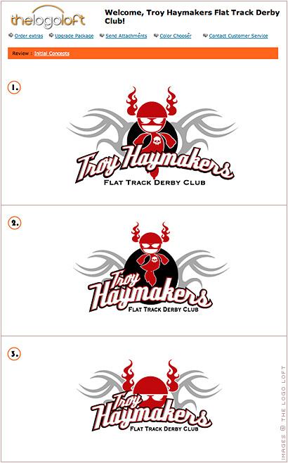
the logo loft

Logo Loft critique:
The Logo Loft sent me three slight variations on a single design. My initial reaction was, “what is Marvin the Martian doing in my rollerderby logo, and why does he have condoms for feet?” Unfortunately, the illustrated figure floating over the gray tribal ‘tattoo’ art is far too masculine for a woman’s flat track derby club. The emphasis should be tough *and* feminine. This is a critical piece of information for this job that I didn’t explicitly disclose during the ‘client briefing’ process. I was interested in seeing how much research these companies would actually do in advance of beginning the design process. The Women’s Flat Track Derby Association site is very easy to find online, and the members’ page links directly to more rollerderby club sites that you would normally want to visit in one sitting.

The color palette of blood red, black and gray feels on target, and the stylized and outlined retro-script face that “Troy Haymakers” is set in is both strong and memorable enough to probably do most of the heavy lifting for this mark all on its own. This text works better in a single arched measure (version one) than it does stacked. The “Flat Track Derby Club” text, set underneath in two different weights of Copperplate Gothic doesn’t quite integrate with the script, and the tension between the “D” in “Derby” and the bigger of the two condom feet (version one) is visually problematic. In addition to Troy’s involvement with the genesis of Major League Baseball, the city was an integral part of America’s 19th-century Industrial Revolution, particularly in the collar- and cuff-making industries. Is the inclusion of Frederic Goudy’s Copperplate Gothic here—which utilizes that Victorian display type aesthetic—a well thought out reference to that rich history? I’m hoping that it is, and I will give the use of that typeface here the benefit of the (considerable) doubt and deem it ‘spot on’ for this identity. Well played, Logo Loft! Variation three is the strongest of the group, focusing on the central typographic elements, and downplaying the illustrations. Opening this version in Photoshop and erasing the illustrative elements altogether would improve it considerably. Overall, there are some serviceable typographic parts here, but the conceptual disconnect caused by the tribal art and stylized cartoon character make all three variations weaker as a whole.

---

No. 2
Logo Design Pros
Representing Wilmington, Delaware USA
$198.00

Logo Design Pros’ web site is incredibly similar to the Logo Loft, featuring multiple “100% guarantee” animated bursts and stock photographs of attractive female customer service reps wearing headphone mics poised to help upon mouse over—much like the ubiquitous Mac Warehouse girl from back in the day. Memories. What does Logo Design Pros offer above and beyond their competition, you ask? How about Unlimited Concepts! Simply purchase package three for $498, and they will “provide an unlimited number of entirely new concepts for your logo design, created by other designers, if you aren’t satisfied with the initial concepts.” Whoa, they have upped the ante from the Logo Loft’s “unlimited revisions” above. Unlimited new concepts? The image of a hamster endlessly spinning in a wheel immediately comes to mind. “Logo Design Pros offers the lowest and cheap [sic] prices for custom logos to be found on the net.” Unfortunately, I found that statement to be less than believable, as I had to lay down a whopping $198 for their least expensive option, the Startup Business Package. However, for this price I have been promised four logo samples created by two designers. I chose to be patient and wait the 2-3 days as advertised, rather than pay a $100 up-charge for 24 hour delivery.

If you thought the requested client information to begin the design process for the Logo Loft was extremely thin, Logo Design Pros has simplified this process even further, requiring only: A name for the logo, a brief description of the business and an optional question, “what type of overall feeling would you like to project with your new logo? (corporate, fun, high-tech, etc…) Leave this field blank if you would like us to make this determination.” The idea that Logo Design Pros could somehow determine the appropriate overall feeling for a new visual identity with only the business name and a brief description seems ludicrous to me, and totally at odds with the idea of offering unlimited concepts. I think I hear the hamster wheel again. Sufficiently scared, I throw them a bone, and offer, “all women, rough, fast-paced, raw, exciting, dynamic, LIVE action!” This is perhaps the shortest client brief in history.

logo design pros

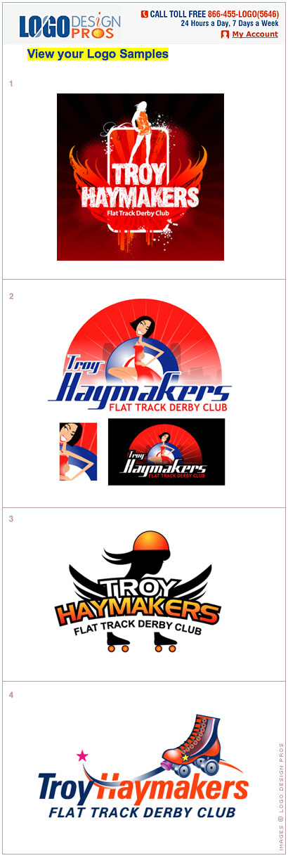
Logo Design Pros critique:
Logo Design Pros hit their deadline, and delivered four versions of my new logo exactly on the third business day after I placed the order. There was no indication separating the marks between the two designers that were advertised to work on this job, but it was visually obvious that versions one and two were from the same artist. More like visual ‘treatments’ than logos or discrete identities, both remind me of over-stylized clip art and miss the mark entirely by focusing on wafer-thin and leggy fashion models over the rough-and-tumble look that defines rollerderby athletes. Version one is unusable altogether as it depends on a black background for legibility. Version two looks like a stock illustration for a débutante’s ball. I’m not sure what the point is of including a detailed close-up or the knock-out version, but it does serve to reinforce the point above about the lack of usability of version one.

The typography is neither inspiring nor memorable, and looks timely (and already dated) to my eye. Versions three and four do a better job of marrying illustration and letterforms in a more traditional ‘logo design’ sense. However, version three seems disjointed with the floating skates below the text, and the illustration bears a striking resemblance to that used in the Minnesota Roller Girls logo—from the simple orange/yellow gradated wordmark and linear helmet to the two black swashes of hair on the left. Coincidence? I certainly hope so. The fourth version features Adrian Frutiger’s Univers-Condensed Bold Oblique, usually a solid choice, but a star with stripes and the use of red and blue on a white ground immediately makes me think of a political banner destined for a metal sign holder and a front yard somewhere in November.

Finding suitable images on the internet to use as reference material for illustration purposes is nothing new for designers. For identity design, where originality and distinctiveness are paramount, this practice can be a slippery slope if done hastily and without care. To me, the image in version four looks a bit too much like the stock vector roller skate drawn by Gesche Wendebourg available for public download on istockphoto.com. Convincing me that the yellow stars on the sides of both skates were developed independently of one another might be possible, but would make for a difficult argument. Not terribly impressive work on the whole from Logo Design Pros in these four variations—but I do have two more to go!

---

No. 3
LogoBee
Representing Montreal, Quebec, Canada
$249.00

Bringing some international buzz to the competition is Montreal’s LogoBee. Self-described as a “multiple award-winning logo design company… LogoBee, Inc., has been providing its customers with high quality logo design for over eight years…winning top honors at the Summit Creative Awards and American Design Awards.” Following the latter link, I found they did win a second place prize in the 2006 Winter Semi-annual American Design Awards. The awards page is rather thin on content all around, with no indication what the mark is—or who it is for—but it is well drawn nonetheless. Can LogoBee bring that level of visual goodness and originality to my upstart rollerderby club? After the entries above, I certainly hope so.

LogoBee’s different packages are easier to understand than most. The Google link where I originally found LogoBee had a coupon code for $20 off, and it worked (shocker!) I selected the “Special Package” for $249 (plus save a cool Jackson with the code.) This package gives me six logo design samples and 6 revisions. I’ll have to wait five business days after my payment with LogoBee—not quite as fast as Logo Design Pros’ 2-3 business day guarantee—but hopefully the results will be less “stock-a-riffic.”

Immediately after my LogoBee order was placed and my credit card was charged, I got a personal email from Karina, my project coordinator. Karina gave me her email address and a phone number (with extension) and invited me to view some logo samples from their site, noting what I liked about some, but didn’t like about others. Furthermore, she had some specific questions for me regarding the look and direction I wanted, such as: Who are your clients? What is your business’ history? What kind of fonts do you like? Would you like something more serious and traditional, or modern and artistic? She gave me a personal URL that I could use to view my logo samples when they were ready. Trying to the keep the playing field level, I responded with the same information I gave the Logo Loft and Logo Design Pros.
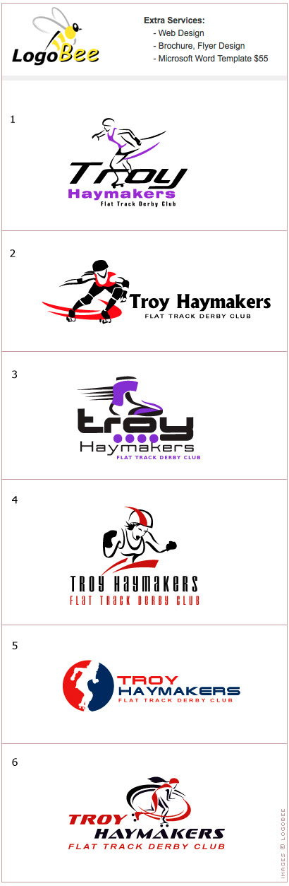
logobee

LogoBee critique:
Like clockwork, my custom URL was populated with 6 variations of brand new Troy Haymakers’ logos in five business days. Unlike Logo Design Pros submissions, the six logos from LogoBee were most likely designed by one staff artist. I have no problem with that—the package I bought didn’t advertise more than one designer. However, the majority of the marks feature very similarly styled illustrations of skaters with colored swashes designed to indicate movement and speed. From the quality of the drawings, it’s reasonable to assume I didn’t get the same designer who won the American Design Award in 2006. Fair enough.

As interchangeable as some of these marks appear, what really struck me in all six was a lack of typographic quality in general. As an obsessive type-nerd who has aced the Rather Difficult Font Game numerous times, it’s a rare day when I can look at six separate logotypes and not recognize the primary typeface used in a single one. I don’t think I’ve ever seen any of these fonts before, and that surprised me. One easy way to tell cheap (or free downloadable) fonts from properly drawn typefaces is by looking at the kerning pairs in use. Professionally produced faces have had their kerning pairs fined-tuned by font designers. The huge space in version five between the “A” and “Y” in “HAYMAKERS” is indicative of an inexpensive typeface without font metrics that would normally include character widths and kerning pair information. Regardless of the origin of the font, that gap should have been optically adjusted by the designer long before I ever saw it. Typography 101. Visually, the symbol used in version five is the most appealing to my eye. However, it’s also the least original design on the page. Based upon the same convention of a silhouetted figure splitting a red and blue field as Major League Baseball’s and the NBA’s logos, this illustration also shares a good deal formally with the aforementioned Women’s Flat Track Derby Association mark.

If I were forced to move forward with any of these designs, it would probably be with a revised version of one of the original illustrations with much improved typography. Perhaps removing the bratwurst from the right hand of the skater in version four would improve it significantly. Perhaps not. Either way, caveat emptor on paying for a logo package that features six discrete variations, especially when four of the six are as interchangeable as these.

---

No. 4
Logoworks
Representing American Fork, Utah, USA
$299.00

If your were even remotely involved in the online design community three years ago, it would have been impossible to ignore the firestorm of blogging brimstone and treacle that was launched at—and defended against by—Logoworks in 2005. Rather than retell the entire saga blow-by-blow, I will point you to a few of the existing sites that somehow seemed to weather what I understand was a storm of cease-and-desist letters: here, here and right here. On April 24, 2007, HP announced it had acquired Arteis, “a privately held company that operates Logoworks, a leading distributed web-based graphic design service provider.” This was big news in the blogosphere, as many of Logoworks critics felt this legitimized what they considered less-than-honest business practices regarding authorship in identity design. Regardless of where your opinions may lie on this subject, Logoworks is the biggest player in this business space, boasting over 100 employees, 45,000+ customers and a 98 percent satisfaction rate on their about us page. Why choose Logoworks over their competition? Here are 10 reasons, including a few comical tidbits from that page I couldn’t help but call out:

• The other guys: Most design companies expect you to go to them for multiple meetings, or they flat out ignore you.
• Then there are ad agencies that require time-consuming live meetings, where you are charged for their time.
• Some design companies are limited to a small in-house design team, or do not have any freelance designers. If they cannot afford a large team in both areas, they limit their creativity and flexibility.

I direct the small in-house design team here at id29, and I can say unequivocally that the last statement above couldn’t be farther from the truth. Increasing staff size limits flexibility on almost every level in a design firm, and employing a large global stable of freelancers is a sure way to dilute your design process, not increase your creativity. As far as our need to actually meet clients face-to-face, we are guilty as charged. We operate under the somewhat antiquated notion that actually getting to know our clients might help us better understand their communications needs, and, as a result, do a better job defining and articulating their message in an engaging and compelling way. Crazy, I know.

I’ve spent $526 to date so far in this competition, and in my quest to keep the budget under $1000 total, I selected Logoworks’ $299 Silver Package: four original logo concepts, two designers, two logo revisions and zero time-consuming live meetings. To Logoworks credit, their process for obtaining relevant client information before beginning the design process is much more thorough than their competition. No doubt being the industry leader has helped them hone this process to a point that minimizes false starts and client complaints, and maximizes their customer satisfaction rate. That’s just good business.

Once my payment cleared, I was directed to their “7-question wizard” which is a well-developed series of web pages created to collect as much information about my visual preferences as possible. The questions are richly illustrated, and lead the customer through a series of tests, such as: Color wheels designed to gauge preferences, typographic samples which offer different font styles (serif, sans serif or script, etc…) and a ‘logo traits’ page which asked me to make preferential selections from a series of paired logos, such as Mountain Dew (youthful) vs. Coca-Cola (traditional/classic.) After about 10 minutes, the “wizard” determined my rollerderby club’s profile to be a “strong, confident and sophisticated business.” Sophisticated? Perfect, if I were TAG Heuer or BMW.
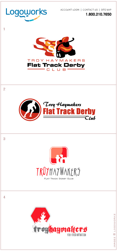
logoworks

Logoworks critique:
Oy! After investing a solid ten minutes with the wizard, I expected much more from the initial round of marks from Logoworks. I’m having a hard time imagining how anyone could defend any aspect of these designs as strong, confident or sophisticated. After I praised their online briefing process, the designers at Logoworks apparently decided to abandon those survey results altogether. Version one features a childlike untied roller skate, that would look more at home in Disney/Pixar’s Cars than it would on the back of a rollerderby uniform. Version two looks a lot like LogoBee’s version 5 (above,) but not nearly as well drawn. The use of black is a welcome addition to this convention, but the red-stroked exterior circle effectively kills the dynamic created by the figure’s negative space extending out of its circular bounds. Questionable typographic choices in these first two versions are made worse by the wrong hierarchy altogether in the nomenclature. The emphasis should be placed on “Troy Haymakers,” not “Flat Track Derby.” Somebody didn’t get the memo. Fortunately, versions three and four got the club name correct as “hierarchy one,” and “Troy Haymakers” is read first. Unfortunately, versions three and four exist. Like any Olympic competition, to the victors goes the hardware—however, there’s no room on the medal platform for Logoworks this time around.

---

Closing Ceremonies:
There’s a brilliant interview from 1993 with former NEXT Chairman, Steve Jobs on working with Paul Rand to design the NEXT identity. Paul Rand was a master of semiotics, and an iconic American identity designer until his death in 1996. Jobs asked Rand if he would come up with a few options. Rand replied, “No. I will solve your problem for you, and you will pay me…if you want options, go talk to other people.” Jobs goes on to describe the “refreshing” clarity with which Rand spoke of the designer-client relationship—it was obvious that he had given this subject deep thought for many years.

It would be unfair to compare the designs above with the work of Paul Rand, but what interested me in the interview was how Rand’s singular method to solving NEXT’s identity problem was totally at odds with how these online logo companies approach the same situation. Rather than focusing on clearly understanding the client’s business and needs, the general solution put forth seems to be simply providing more and more sketches until something visually clicks—or the client’s budget is depleted.

For smaller groups or organizations with extremely tight purse strings, these companies might provide some level of solution to their quick identity needs. They might find themselves redesigning in a year or two, but hopefully they’ve been successful enough in twelve months time to budget another $199 for identity design. A better approach for businesses in this situation would be to contact their local AIGA chapter, and inquire about freelance designers (or even student members.) Sitting down with a graphic designer and outlining your business’ history, objectives and aspirations usually doesn’t take a full-day working session. For $825—the amount I spent above—a single solution that was original and spoke to my demographic in an engaging and memorable way would be well worth it. As far as the pending demise of identity design as we know it caused by online logo companies taking over the world, note to working designers currently reading this: Don’t quit your day jobs.

---

Doug Bartow is a founding Principal and the Design Director of id29, conveniently located above the brewpub on the Hudson River in historic downtown Troy, NY. id29 has been meeting face-to-face with happy clients since 2003, and has done identity work for AOL-founder Steve Case, Scholastic’s Harry Potter, Pitney Bowes and MASS MoCA to name a few. You can send general greetings—or cease-and-desist letters—to doug@id29.com ::

Maintained through our ADV @ UnderConsideration Program
ENTRY DETAILS
ARCHIVE ID 5099 FILED UNDER Branding and Identity
PUBLISHED ON Aug.06.2008 BY Doug Bartow
WITH COMMENTS
Comments
minus five’s comment is:

This was better than the Olympics could ever hope to be. I hope Coca-Cola decides to sponsor you and that you will consider donating these fine pieces of design to those companies who simply can't afford the silver package.

On Aug.06.2008 at 11:50 AM
Stacy R’s comment is:

Very interesting article.
I think that a few of the logos have promise (although with alot more rework) but overall the designs you got were pretty lame.

Logos are not super easy to do (at least that has been my experience) especially when the only interaction you have had with the potential designer is a fill-in-the-blank form of what you would like to see from the final product.

I am glad someone finally did a "real" study of these companies out there instead of just blatently saying they suck and put real designers out of business.

I could see where a small company or one person operation just starting out could benefit from a $198 logo, but would hope after they start making money would upgrade to having someone spend more than 2 days thinking about their company, clients, etc.

On Aug.06.2008 at 11:51 AM
Pesky’s comment is:

I saw it on Craigslist.com and they were willing to pay $12 for the whole package. (Ok, I'm lying thru my teeth.)
This is design-by-bottomfeeders. No one's saying it's good or bad, it just is the future trend for such stuff. Too bad for the rest.

On Aug.06.2008 at 12:09 PM
clatterframe’s comment is:

Is the deck stacked? How many "competent" designers hit the nail on the head with the initial round of comps?

On Aug.06.2008 at 12:12 PM
D’s comment is:

re: Is the deck stacked? How many "competent" designers hit the nail on the head with the initial round of comps?

It probably is unusual to hit the nail on the head on the very first round, but I believe that the point here is that these 'agencies' (if you can call them that) are more like clip art machines than actual design houses. Rather than taking the time to research the client and find a design solution, they skipped out on critical steps of the process and produced a collection of low-budget, weak marks.

On Aug.06.2008 at 12:31 PM
D’s comment is:

On another note, I would like to extend a 'bravo' to Doug Bartow for such a thorough, excellently written review. The experiment was well thought out and the follow up was brilliantly executed. Thank you!

On Aug.06.2008 at 12:35 PM
Dave Werner’s comment is:

This was a great experiment - what a perfect idea.

Back in school, I joined Arteis on a friend's recommendation. Having just taken a logo design class, I thought it would be good practice. But after sending out several conceptually-based marks with painstaking typographic care that got rejected, it seemed like a waste of time. I started "winning" and getting paid more ("more" being a relative term) with less effort (just add gradients and drop shadows!). Sadly, now there's a pizza place somewhere in Ithaca, NY with a generic slice of vector pizza gracing their menus and signage. I guess, as this article proves, you do get what you pay for.

I quit after a couple of weeks. It actually was good practice though - with more time and revisions, I did get a few portfolio pieces from the experience.

On Aug.06.2008 at 12:38 PM
clatterframe’s comment is:

In the end, I think it's simply a niche market. Paying peanuts for a crappy logo is nothing new--it's just easier to do these days, with an added emphasis on commodity rather than craft. One thing that desktop PCs have done is democratize design--now anyone can set type or draw perfect circles, or so the thinking goes. But can they, really?

I think we all understand that the music isn't in the piano. So, while outfits like Logoworks may seem monstrous, I don't think they pose a serious threat to dedicated identity design.

On Aug.06.2008 at 12:45 PM
jj’s comment is:

I thoroughly enjoyed this article - a crafty little experiment.

On Aug.06.2008 at 12:54 PM
Christina W’s comment is:

Great article! Thanks for spending your own hard-earned clams for collective enlightenment. I guess after the Logo Loft I was expecting things to move on an upward trend (ie, show the worst ones first), but sadly it was all downhill from there. Which would be fine if you were competing in, say, the Bobsled event.

On Aug.06.2008 at 01:33 PM
darrel’s comment is:

Fun post! Gotta admit, for what you paid for these, some aren't bad. You do get what you pay for (Logoworks aside, which was a total rip-off).

Next challenge: do the same thing with the even sadder logo-contest sites!

On Aug.06.2008 at 01:39 PM
Niki’s comment is:

I had a lot of fun reading this article. Though now I'm curious...as a Design Director of a reputable design firm, what would have you created?

On Aug.06.2008 at 03:04 PM
clatterframe’s comment is:

Since the Ghost of Rand is invoked here, may I just point out that deep thought and big budgets are also capable of producing absolute dreck. Hasn't BRAND NEW taught us that?

On Aug.06.2008 at 03:05 PM
TDee’s comment is:

Great article and well written. As a long term sufferer of terrible logo design, I knew that $1000 was in for it when many of the samples resembled something out of my Illustrator canvases.

"Diluting a process that traditionally takes weeks or months of research, development, strategy and design down to 2-3 business days for a fraction of the fair market value is certainly a cause for concern for working designers everywhere."

That says it all.

On Aug.06.2008 at 04:38 PM
Farkle McBride’s comment is:

Tastes like chicken.

On Aug.06.2008 at 04:47 PM
Jocelyn’s comment is:

How dare you use online logo companies that base their work in pricing projects for $299? Projects that should be thought, researched, and done right.

This is why people get what they get; why everything is filled with ugly hurry-do-it-quick design, and the reason why good designers that invest time in their work can't sell a proper project.
Well done.

On Aug.06.2008 at 05:03 PM
B.McGuigan’s comment is:

Yes, I am also interested in what id29 would have come up with. I agree that all of these examples are very istock-alicious, but the post would have been better with a "and this is what we came up with" at the end.

On Aug.06.2008 at 05:05 PM
Jinna’s comment is:

Was there a final logo from id29? Aside from curiosity, it would be helpful to see a final logo so that doubters can really understand the difference in how professionals develop ideas and products versus these clip-art machines.

On Aug.06.2008 at 05:14 PM
clatterframe’s comment is:

I've already said too much... yet I can't help myself.

Were we really enlightened? Did we learn anything new that we didn't already know back in 2005 when the whole HOW/Logoworks debacle happened?

This is shooting fish in a barrel. For considerably less than $1,000 you can substantiate the same conclusions.

If any serious designer truly feels threatened by any of those haymaker logos (and, by extension, the factories that produced them), it's time to find something else to do.

On Aug.06.2008 at 05:17 PM
stacey’s comment is:

I wish you'd have tried 99designs.com, which has open contests for logo design, with only the winning designer being paid. It's a depressing business model (for the designers) and I wonder what the process is really like.

On Aug.06.2008 at 06:31 PM
Josh B’s comment is:

Wow. I had no reason to expect any better from any of these companies, and yet I'm still floored at how bad these are. They're really, truly awful.

What gets me is that not one of them has any reference to what a haymaker actually is (I mean the boxing term, not the farm equipment). If you're not going to research the client, then at least open a dictionary.

I would love to see any of the companies or the actual designers respond to this critique. Let's hear their side. Better yet, let's get a look at their process - if they have one.

On Aug.06.2008 at 06:53 PM
Noam Almosnino’s comment is:

As the old saying goes... "You get what you pay for." Great article.

On Aug.06.2008 at 07:01 PM
Dave’s comment is:

While Gutenberg probably put a lot of calligraphers, illuminators and letterers out of work, I hardly think any of these cut-rate shops is the modern equivalent that will spell doom for the "pinnacle of the field."

Logoworks and its ilk don't really compete with the id29s of the world, but rather with other $200 jobs that will probably be done in MS Word.

On Aug.06.2008 at 09:01 PM
Sergio’s comment is:

I knew someone who worked at logoworks/arteis for a time. After seeing some the absolute crap that gets produced or forced to be produced I can sleep well at night knowing the logo design industry is not going down the tubes! And after hearing some project brief and revision stories I'm pretty sure we would not want half the clients they get. They other half are just cheapskates and would probably stiff you on the bill! :P

Excellent article.

On Aug.06.2008 at 09:35 PM
Prescott Perez-Fox’s comment is:

ok Doug, did you come up with a logo of your own? Maybe rescue the best bits of these logos and Frankenstein something together. I'd be interested to see what you could do with these logos which is generally quite undercooked.

I think that the wordmark from the first company could exist by itself. Why overcomplicate things? (although typically, yes, sports teams do use an illustrative mark or some mascot ... at least in America)

On Aug.06.2008 at 11:05 PM
Tselentis’s comment is:

Gasp. I am speechless. The entire process Doug went through strikes me as suicidal, ambitious, and courageous. BTW, that first one from Logo Design pros gushes sex, to the point of upsetting me. Did you ask for a Vegas strip club showcard? No, I don't think so, but they delivered something akin.

On Aug.07.2008 at 12:01 AM
alon’s comment is:

wow!

On Aug.07.2008 at 04:07 AM
pesky’s comment is:

Logo Bee's # 5 looks VAGUELY familiar....hmmm, where have I seen that look before? Another sport maybe? No, maybe somewhere really obscure...

:::laughing:::

On Aug.07.2008 at 08:00 AM
Jeope Wolfe’s comment is:

Logo Loft did nail the femininity of the team; those flames emitting from Marvin Condom-Toes' ears definitely scream pigtails to me.

On Aug.07.2008 at 12:03 PM
Doug Bartow’s comment is:

What gets me is that not one of them has any reference to what a haymaker actually is (I mean the boxing term, not the farm equipment).

Good catch, Josh. That surprised me as well. There's so much common ground between rollerderby and sweeping left hooks, it seemed like low hanging fruit for the taking.

. . . . . . . . .

ok Doug, did you come up with a logo of your own?

Nope, I spent my free time for the month (and my entire allowance) on the writing portion of this story. That seems to always take me longer than design does. However, if a local rollerderby club actually forms, I'm in, gratis...

. . . . . . . . .

Is the deck stacked? How many "competent" designers hit the nail on the head with the initial round of comps?

Not sure I understand that question. I included every actual sample sent to me by the 4 companies involved, no curating on my part, whatsoever. Apart from my critique (above,) you'll have to decide who hit the nail on the head.

. . . . . . . . .

I wish you'd have tried 99designs.com, which has open contests for logo design, with only the winning designer being paid.

I have never seen that site before, but their business model makes me nauseous.

. . . . . . . . .

On Aug.07.2008 at 04:28 PM
Darryl Brown’s comment is:

What is that flesh-colored lump on the woman's back on no. 2 from Logo Design Pros (2nd group down)?

On Aug.07.2008 at 05:09 PM
Mark Jaquette’s comment is:

that 'lump' growing in her back is a 'spam blister' -
because it was developed too fast
in the logo/meat processing plant!
CHURN 'EM OUT! CHURN 'EM OUT!

On Aug.08.2008 at 02:03 AM
darrel’s comment is:

"I have never seen that site before"

Oh man, then maybe we shouldn't have mentioned it. If you think the logo sweat-shops are annoying, there might be a definite need for an expose on the logo-contest site trends.

Some others:
http://www.worth1000.com/cdir.asp?display=jackpot&filter=f.format_id=4
http://brandingcontest.com/

and there are many others...

On Aug.08.2008 at 11:04 AM
Pesky’s comment is:

At Grrrrrrrrrreat Logos, we strive for the quickest logos at absolute dog cheap prices - $10 each - and ONE hour turnaround. Our trained professionals have the cutting edge skill and design sensitivity to provide you with trademarks and branding identities that will literally bite the competition.

Image below shows our senior designer, Rex, producing one of dozens a day.


On Aug.08.2008 at 01:35 PM
darrel’s comment is:

I would hire rex. Yea, every logo has a dog in it, but hey, $10!

On Aug.08.2008 at 01:56 PM
Niki’s comment is:

Want to hear the non-designer perspective? I showed this post to my boyfriend and his reaction was - "The Logo Loft ones are pretty kick ass!"

Who's to say the fictional roller derby team wouldn't react the same way. Are we exhibiting elitist designer feelings here?

*I* know these logos have flaws, but the client doesn't. And frankly, until this post shows an example of what the difference some care and little more money makes, then the point is moot to the people that count - your clients.

On Aug.08.2008 at 03:08 PM
Colin’s comment is:

This is great. Totally entertaining, and worth the $850 bucks. I laughed, I cried, I hugged my Illustrator CS3 box. Let's throw together some dough and have you do this again next month. I'd love to catch responses from these companies or their designers.

On Aug.08.2008 at 08:52 PM
Colin’s comment is:

Niki said:

"*I* know these logos have flaws, but the client doesn't. And frankly, until this post shows an example of what the difference some care and little more money makes, then the point is moot to the people that count - your clients."

Right, the client doesn't know they have flaws, nor the implications of those flaws. That's the saddest part of it all!

No matter how kick-ass your boyfriend thinks some are, he has no clue how much they cost to reproduce, nor the emotional response from a wider sample (wider than, well, just himself). I hope you aren't saying that what it boils down to is that you don't just need a cheap logo-shop, you need a guy saying, "this one's pretty kick-ass," to round out the service.

On Aug.08.2008 at 09:02 PM
Pesky’s comment is:

Our kick-ass logos here at GrrrrrrrrrreatLogos are not expensive at all ($10 per chop: the dog gets $1 and I get $9), and clients don't seem to mind that all our logos are with dog icons. I mean, add an Addidas swoosh underneath and it looks just fine.

On Aug.09.2008 at 08:23 PM
Pesky’s comment is:

Our clients never seem to mind what the damn icon is as long as it's fast and cheap. So dog icons seem to be a big hit for us regardless of the company. I mean, for $10.00 beggers can't be choosers, right?
All this art talk just makes Bruno (pictured above)nervous. He never graduated from a design school but his former owner did. Now the kid works at Starbucks and Bruno makes about $2500 a week.

On Aug.09.2008 at 08:43 PM
Niki’s comment is:

To Colin -

Nope, that's not what I'm saying at all. I'm just saying while this post was entertaining, Mr. Bartow is preaching to the choir. OF COURSE we're all going to be in agreement that these logos are inferior to options that could have been made with more time, talent, and money. Its our instinct to be defensive about our livelihood.

When I first read the post - I laughed. Then the more I thought about it, the more it bugged me. Are we so elitist as a profession that we can get away with calling something inferior without providing a fair comparison? Shouldn't we take client satisfaction into account? If our clients are satisfied with something inferior, isn't it our responsibility to show them why and how it can be better?

Its all fun to poke and make fun - but I'm just asking for a fair comparison.

On Aug.11.2008 at 03:29 AM
Jay ’s comment is:

Thanks for doing this. I have always been curious about the results.

However, I think that the $99. logo is a step up for most. "Most" being that group of people that needs a logo and turns to the person in the company that has the biggest clip art collection and knows how to use Microsoft's "word art" feature. Or maybe the local quick-print shop.

IMHO, this is more likely to be the customer for a $99 logo than someone that would contact a designer.

On Aug.11.2008 at 11:04 AM
David Smith’s comment is:

Buy cheap, get cheap.

Amazing.

On Aug.11.2008 at 12:40 PM
Sean’s comment is:

doug, would you do a version for us!? pleease, show these design companies up

On Aug.11.2008 at 01:53 PM
Pesky’s comment is:

Sean, why don't you do one too, since you're challenging/volunteering someone else to come up with a logo?

Like dueling banjos....

On Aug.11.2008 at 03:27 PM
r0ck3rgurl’s comment is:

I have seen the image on the 1st of the Logo Design Pro's...meaning the chick! I've seen SO many flyers with that exact chick in it. Didn't somebody teach this designer not to use clipart for a logo? Well, aside from the fact that it totally missed the mark...

On Aug.11.2008 at 04:47 PM
Neuehaus’s comment is:

ha, this is so cool. I'll bookmark it.

www.neuehaus.com

On Aug.12.2008 at 01:25 PM
Joe Szczepaniak’s comment is:

Niki, there's nothing "elitist" about having standards. Are you an ice queen cause you don't slep with every guy who would want to? Of course not! Designers are trained to know what will be effective, nt just what looks good or what satisfies the client's untrained eye. That's nto elitist, its called "integrity".

On Aug.12.2008 at 02:46 PM
Diane’s comment is:

I think this was a good exercise, and not just in a "Ha-ha! Look what they came up with!" way. I think it's a reminder to everyone in this profession to do your research, know your client and present the best solution.

Are they putting their best foot forward on these designs? Absolutely not. Can we strive to give our best in everyday practices? Definitely.

Given the time constraints and the low-budget, you will get what you pay for. And the designers on the other end are just trying to make a living. I think all if not most designers begin in a similar place but grow and learn from experiences (as Dave Werner even admits above in the comments) and we move on and come up with a better process and in turn give better solutions.

Great article.

On Aug.12.2008 at 02:50 PM
clatterframe’s comment is:

OMG! alert the internet forums! These guys are ruining the field of fine art portraiture:

Your Photo, Painted (for as low as $120)

On Aug.13.2008 at 05:48 PM
Pesky’s comment is:

GrrrrreatPortraits.com

The quickest portraits at absolutely cheap prices - $99 each - and ONE hour digital output turnaround.(Art on canvas takes too long but this "traditional" service is offered at a higher fee.)

We will provide you with a fairly almost-OK likeness (since this art is produced by canine artists we cannot guarantee resemblance. This is A-r-t not photography.)

Image below by our our senior painter, Rex, who produces dozens a day.

On Aug.14.2008 at 04:11 PM
Simonmc’s comment is:

This argument has been discussed to death. There are no designers of any worth going hungry because of online logo design companies. The market is totally different and attracts small businesses that have very tight purse strings. Joe Flint the plumber for instance is not going to get himself a Rand logo (God rest his soul). For a start Joe Flint the plumber is not NEXT and does not have a big budget. He just wants to look better than Mike Fish the plumber who lives down the road from him. For that he will take a design that looks better than Mikes. He can't design to save his life so a couple of hundred bucks seems like a fair price to pay. He is not looking to be the biggest plumber in the States so branding his business as a megalith is not needed.

The issue here is that designers all over the world think these logo design companies are taking their business. I don't believe this for a second. I don't attract massive businesses at The Logo Company and my design process is not as indepth as a designer working for a studio or an upscale freelancer. This is obvious to my clients who are paying for a well thought out design that represents their business. I'm not a massive fan of many of the logos that you bought from my competitors but lets face it with a shed load of cash on marketing spend you could make a brand from quite a few of them. I have seem some great designs come from online logo design companies as conversely I have seen some really poor ones come from so called real designers.

If you are a good enough designer you will have food on your plate, if not Mike needs a mate.

On Aug.15.2008 at 05:44 AM
Pesky’s comment is:

No this hasn't been discussed to death. And to stop the discussion with dismissive comments is disingenuous. No one is discounting the small business logos. I may joke about it, but in all seriousness, the factory output of design is not so much a threat as a trend.
Like stock images and the real growing threat of the Orphan Works Bill before Congress (which is an unprecedented copyright infringement for those who can't play the game), it becomes necessary for us to look at trends and where they are heading. Getty and Corbis didn't become huge by being considerate of small business designers. They swallowed up images and intend on taking over the whole image bank. Being mindful of trends is part of watching out for our livlihood.

It's also a race-to-the-bottom in pricing. Joking at the low quality level is just nervous laughter. But no one is threatened by a company that wants to use that as their criteria, but there's a tipping point to that: devaluation. It is just one of those things about the changing face of Design.

No we're not elitist (whatever that actually
means), we're insisting that there's craftsmanship in what we do - which is, as I see it, the whole point of Bartow's exercise.

On Aug.15.2008 at 08:15 AM
Doug Bartow’s comment is:

Well said, Pesky.

The issue here is that designers all over the world think these logo design companies are taking their business. I don't believe this for a second.

You don't? Surf on over to The Logo Loft and read their list of featured clients (right on their home page): Microsoft, Gillette, Oreck, Whirlpool, GE, Oprah, Procter & Gamble, Intl. Paper.

Do you think the agencies who represent these corps—and the other designers and/or freelance designers who work with them regularly—are unaffected when Whirlpool hires an online logo company to do work for them? I don't. Regardless of the scope of these projects—some may be B2B or internal—designers who work with these clients are losing business to these online companies. Awareness is the issue here. Ignoring this trend is akin to handing Nero his fiddle...

On Aug.15.2008 at 08:49 AM
Simon’s comment is:

@Pesky: If you followed the many sagas they have had over the years at how design you would agree that this subject has been done to death. You need to face up to this challenge. Online logo design studios are here to stay. HP made sure of that when they bought logoworks. Yes, they will always be at the bottom end of the market. They are by nature the bottom feaders of the industry. I know where my market is and I know who my customers are. Of course there will be some overlap from time to time and businesses like mine will attract projects from big names but believe me these projects are very few and very far between. They usually consist of a small autonomous team within a large company that does not understand that the corporate brand policy exists to protect their brand. This though does not happen often and you will rarely if ever see these internal team logos used to market the company externally. (exept of course by online logo companies looking for Kudos).

Why is it that Open Office which is a great alternative to MS Office is not used in the mainstream by so many yet has obvious and many advantages over MS Office. It's because of marketing. The trick is not to lower your price to compete, it is to market yourself better. If that is what you sell your services on. Very few people buy stuff on price alone so as long as you offer value above what is offered by online logo companies and you market yourself well then you will always be in work.

On Aug.15.2008 at 10:05 AM
Amber’s comment is:

I have here in my hands, a copy of my local paper, which is advertising a design contest for the Sioux City Roller Dames, an all girl roller derby team. They need a logo for the league. You will not get paid in cash but will win 4 free tickets a game in October and 2 season passes. (I know you would make the sojourn to Iowa to see the games!)

How often will you get the chance to go toe to toe with these online logo design companies? Also, how often will a roller derby team competition just fall in to your lap?

Let me know if you are up for this challenge as the deadline is September 22. I would be more then happy to give you all the details!

On Aug.18.2008 at 09:38 AM
Giorgio’s comment is:

Hi there..these are really famous low price logodesign companies. Even in my country ( italy ) there's now something similar ==> creazione logo by logopro.it. I have called them, make and order and get what i wanted. i have payed 299€ for a silver package but at the end they did more samples and more revision until i was satisfied..

Sorry for my english. but i think that these sites are good because you know first the price ( i didn't want to spend more than 300€ ) and they are cheaper that the graphic companies i have here around my area.

On Aug.18.2008 at 12:38 PM
darrel’s comment is:

"Very few people buy stuff on price alone"

That sort of goes against the very logo companies we are talking about (not to mention things like Wal-Mart)

On Aug.18.2008 at 12:51 PM
Mpenny’s comment is:

As one of the broke businesses (part time) looking for an impressive logo, I would "invest" $99 to see what the online companies come up with. I've tried to create a logo and stink at it. Can't afford a real design firm and for the 3 times a year I need the logo, would it be worth it. It would take me that year or more to recoup that cost. There is a niche for everyone...

On Aug.20.2008 at 02:56 PM
Robert’s comment is:

As someone who's actually shopping around for logo design, as opposed to a designer, I thought I'd bring a different perspective here. I can understand the value of good design. And yes, frankly, a lot of these logos look like crap. But your article fails to answer one important question - what would you have done that's so obviously better? You take delight in pouring some snark on these designs, but don't show an outside reader - such as myself - what a sample of your work would look like so that we can SEE how it's obviously better. Where's YOUR logo for the Troy Haymakers Flat Track Derby Club?

On Aug.21.2008 at 05:20 PM
Terry Byrne’s comment is:

What a great experiment, I would have loved to have had the money to do it myself but alas no such luck. I have to agree there is a niche for everyone and as much as I am against this type of cheap and fast design sullying the market place, I also think that it has it's right to be here (as long as they don't rip off other designers logos, now that gets me really angry). If a client can only afford to spend a small enough amount of money that these places are the only viable option then so be it. I only hope that the next time around they will have learned the lesson that spending a bit more on good design is well worth the expense in the long run. If only all clients were to designers as Steve Jobs was to Paul Rand. But thats never gonna happen!

On Aug.26.2008 at 08:54 AM
Staniel’s comment is:

You can get a great logo for under $500...maybe even under $100. A lot of major companies today had their first logo and in some cases their current logo created for less then $500.

Most designers know that Nike paid only $35 for the logo they still use today.

The VW logo was created during an office logo design competition. The winner took home a one time payment of 100 Reichsmarks (about $400).

The logo marks for Adidas, Chevy, Mercedes Benz, and many more successful companies were created by their owners for free. No logo designer was hired. These logo marks are still the foundation for their current logos.

On Nov.13.2008 at 09:07 AM
Vanessa’s comment is:

I thought this was an excellent article, but I really would have liked to see the projects carried to completion with each of the companies -- taking advantage of all the revisions and redesigns offered in the purchased packages.

Of course, it's really telling to see what each came up with as their first crack out of the box, but it would be interesting to see if in the end anything decent could be forced out of them. Even if the designs were cleaned up, a lot of these would be functionally inadequate -- I wonder how much these companies charge to create the multiple versions that are needed to cover one color printing, dark backgrounds, embroidery, etc.

On Nov.14.2008 at 12:18 PM
Logo Reviews’s comment is:

An excellent resource for comparing logo design firms. It is just too bad that so many consumers who really need this solid advice have trouble finding sites like this as the SEO power of the big logo firms is so great that thet hog the search engine results for themselves (for just about any keyword that a logo shopper would use).

Excellent report - must have cost you a lot to pay for all those logos!

On Feb.17.2009 at 01:55 AM
binocle’s comment is:

Aaarg my eyes ;-)
What a bunch of ugly awful crappy cheapy logos...

Very nice article.

I would advice to a small firm with 1000$ budget to choose one designer willing to work for that price, and who will certainly make better.

These kind of cheap "logos" design firm just don't have any visual culture and provide the first boring thing you can think of.

On Feb.18.2009 at 07:05 AM
Panasit ’s comment is:

I think the writer try a little too hard to criticize logobee's logos. The works need to be developed further, but they are not bad in anyway. The only thing bad about them is their company's logo.

On Feb.18.2009 at 08:55 AM
Erik’s comment is:

Wow great article! I recently read an article in Forbes (about crowdspring) that got me thinking about this stuff again. Anyway, I always have wondered about the quality of work these places provide your post offers some nice insight.

Love the Paul Rand quote too. That's a good one.

On Feb.18.2009 at 12:18 PM
Jessica’s comment is:

@Doug
"However, if a local rollerderby club actually forms, I'm in, gratis..."

Hellions of Troy split off from Albany at the end of last year and it looks like they could use some help:
http://hellionsoftroy.com/

Also I think the condoms in the first option are supposed to be roller blades, which any self respecting derby girl laughs at as "fruit boots" and shows yet more research-fail.

On Feb.18.2009 at 03:27 PM
JP’s comment is:

Does the head chef at The Ivy complain that MacDonald's sells cheap food? Does Hugo Boss walk down the street and curse under his breath every time he passes a Primark? Do highly payed attorneys spend their time try to sue websites which offer "Will & Divorce Packages for only $99"?

Of course not. That's part of how the free market works. If you have the money, and understand the importance of something, you pay the professional. But if you have a dinky start-up website with the budget of a 12-year old's weekly allowance, then you go to Logo Bee.

Certainly this is just another example of "you get what you pay for". But to say that the business model of identity-for-a-tenner will kill the industry, I disagree. I see it as a healthy adjustment. If these types of services didn't exist, then small penniless companies would be forced to design their identities themselves! Or worse yet, get their workmate's cousin's friend who has a pirated copy of Photoshop to do it for them. The world, and the web, would be a much uglier place indeed.

On Feb.22.2009 at 05:04 AM
J’s comment is:

OK. These are not just unbelievably BAD, but they are created with stock imagery. The first two concepts from the Logo Design "Pros" feature downloadable illustrations from istockphoto.com. Not only is it just bad design, but that's just bad policy.

Taking another crappy designer's crappy design and putting some crappy font you downloaded for free from dafont.com over the top of it and charging your client $200 is just unbelievable.

As an independent designer it irritates me beyond words that small businesses are so shocked at industry standard prices because of these kinds of businesses. I would LOVE to see the brilliant work that comes from an actual designer as a comparison. This is a PERFECT example of getting what you pay for.

On Feb.24.2009 at 05:00 PM
MBA’s comment is:

Allow me to offer some new perspectives:

I remember when the first desktop laser printers came out and everyone was talking about how these little boxes would wipe out the printshops ... yet most of those printshops are still here. Only the shops that refused to fully embrace laser technologies became obsolete. Graphic artists used to use pen and paper. Today there is still a place for hand drawn artistry, but the most common tools are tablets and mice because they simplify the work and save costs.

It seems most of the discussion here is centered around the idea that "Anyone who uses one of these bargain design houses is an ignorant fool!" yet I believe the discussion ought to be focused on (A) "How can we show those fools how ignorant they are?" and (B) "How can we embrace this new business model to benefit our industry?"

As a youth in the 80's I went to my local printshop to submit an order for 200 copies of my community club's 8-page newsletter. I proudly showed the owner my photo ready masters which had been laserprinted at 300DPI from my MAC-128. He cringed at the "low" resolution and showed me what "real" printing looked like. Today he has two 600DPI laserprinters in his shop for customers to use. He also has offset presses and a full color 9600DPI printers for his more demanding clientelle.

Sometimes I don't need high resolution, sometimes 300DPI is just fine. Case in point... Right now I am president of a group of unemployed volunteers trying to help each other find work (a "job club" for professionals) and I have been forced to take a "crash course" in logo design as the group seeks a logo for use on the club's business cards and website.

As a software designer I can clearly grasp the value of the creative process. I can't draw a straight line but I can empathize with what a logo designer does in researching the company to help create a logo that "fits right".

On the other hand, as an unemployed professional running a small non-profit I cannot justify spending $1,000 of our members' limited cash for a logo. We will use a bargain design house BUT we (the club as a whole) will do our own analysis of our organization and we will present a set of specifications that clearly define our needs and wants. That is the time consuming part and we will do it ourselves to save money because we simply have no other options.

And maybe that is the new business model you should explore too... Instead of complaining that certain customers are cheap fools, HELP those customers to do some of the hard work at home, for a discount.

When they first come to see you provide them with do it yourself guides based on the questions you would ask them face-to-face. Free your time to focus on creating the actual designs from the detailed spec list that they will hand you.

If they still want your face-to-face guidance then that is charged at traditional pricing. Give them options or lose them to shops that will.

PS: The female figure in the Logo Loft samples which was refered to as "Marvin the Martian" is obviously borrowing heavily from the "PowerPuff Girls" concept. I am guessing you don't have any young female children. :)

"Marketing is getting people to walk through your front door. Sales is getting them to buy something after they walk inside." - source 1unknown

On Mar.23.2009 at 09:16 AM