


With the increasing number of typefaces entering the market these days, more and more type designers are finally getting some of the recognition they deserve. In light of this, I thought it would be interesting to reach out to one of the younger designers over at the Font Bureau whose name might not be as well known (yet), and get some insights into her process, the industry and all things letter-centric.
Christian Palino: Hi Dyana, thanks for taking the time to answer a few questions for us… You’ve been with the Font Bureau since graduating from RISD, can you describe what prompted you to pursue a career in the pursuit of typography?
Dyana Weissman: Looking back, I can see how I was always headed in this direction, lots of little things that add up. My mother was a graphic designer, and had a giant typeface specimen book lying around. I think it was from the days of photocomposition. And I was such a nerd back then (that hasn’t changed) that I would seriously just waste the day looking through it instead of playing outside like a normal kid. And then when I got to RISD, one of my favorite teachers urged me to go into FAV (Film Animation Video), saying it was the best major for me. He may have been right, I did love movies, but my brother had majored in FAV at RISD so I was thinking to find my own path. I took a typography course for winter session and that really cemented my love of type. The day I brought Bringhurst back to my dorm, I was so excited I went right back into nerd mode and devoured it when I could have been running around Providence. When I took Cyrus Highsmith’s Typeface Design summer intensive class the summer of 2000, that was when I knew I wanted to be a typeface designer. I was presented with challenges that when, I solved the problem, I felt this great feeling of accomplishment, that I hadn’t been feeling in graphic design in awhile. It just felt right.
I still love movies though.
CP: Could you describe the process you use to design type? Are there any general principals or rules you follow in your creative endeavor?
DW: The process really depends on the project. Since a lot of what I do as a staff designer (as opposed to a senior designer) is expand upon existing faces, the process is usually to adhere to the rules of the faces that already exist. Often the clients will call for a custom design that has to break those rules a little, but I have to figure out what has made that typeface the way it is and how to get it to where the client wants it without ruining the integrity of the original face. Know the rules so you can know how to break them well.
If I’m working with something from scratch, I like to use my hand as much as possible. I really believe that to know something, to know a design, you’ve got to draw it first. There’s a stronger connection between your head and your hand than your head and a computer.
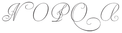
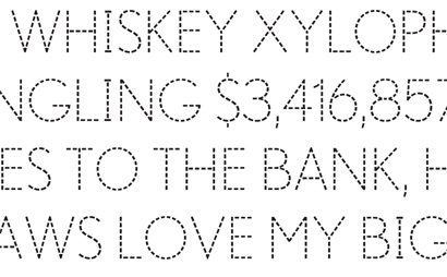
For instance, while working on Materot (above), I had to fill in characters that didn’t exist in the specimen I based the typeface off of. There was no K for example. Now, to perfectly mimic Materot’s work, I’d have to do copper engraving, but since that isn’t likely, I tried a calligraphic approach. By drawing some of the existing letters by hand first, I really got to understand the lettering, and from that understanding, I was able to extrapolate the rest of the character set.
I’m a big fan of using your hands when you can, though. The computer is only a tool. And yes, a medium, but relying on it too much can produce some very boring typefaces. There is beauty in flaws — to err is human, after all, and I think people respond more to the human element these days — there are way too many sans serifs that are out there look like they have no soul, no life, whatsoever.
That reminds me of another good rule. A lot of graphic designers will ask me if there some mathematical formula to kerning. There really isn’t. It’s what looks good. Just do what looks right, not what is mathematically correct.

DW: Expanded the Benton Sans family into an Ultra for Toyota via Saatchi & Saatchi, then later that was expanded into a customized, rough font.
CP: Kerning by sight leaves a lot to subjectivity — do you think that one needs to have experience drawing or crafting type in the real world to have an understanding of how kerning affects legibility? Is there a certain kind of experience that helps achieving “good kerning” more of an objective endeavor?
DW: I agree, kerning is very subjective. What looks like the right kerning to me might look too loose to someone else, and vice versa. I know I’ve had some designs come across my desk where I’ve thought, “Really? The designer wants the V that far from the o? Oooookaaay…” but both of us are right, in my opinion. But in that particular case, it’s their font, and good kerning would mean something consistent with what exists in the font.
So to become good at kerning, at least for graphic designers, I don’t think someone would have to have experience drawing a typeface, not the glyphs themselves. But looking at a string of letters like we do when we’re spacing or kerning, that would definitely help. A designer should just look at the words or sentences together, and try to find a good rhythm between the positive and negative spaces. Something consistent with good color; nothing that pops out at you. And then just do that a lot. The best experience is more experience.
DW: Made a version of Baskerville for Northeastern University via Korn Design.
CP: Experience — well put. One of the practices I’ve often used for words or short phrases is turning them upside down in print.
DW: That’s a good trick. We use that at other stages as well — making glyphs and spacing, for instance.
CP: What inspires you the most? Are there any typography designers or movements that you find particularly inspiring?
DW: I know I’m just jumping on the bandwagon here, but I’m loving Marian Bantje’s lettering projects lately. It’s like what I do to kill time, only done with way more love and focus. For instance, I will draw letters in spilled sugar, but only as a compulsive little habit. When she does it, it’s a well-thought out, huge, beautiful design. She must have so much fun doing what she does.
Something else I found inspiring recently was Alejandro Paul’s talk at TypeCon this past year. He was talking about how everyone in South America only uses two typefaces, probably because of a lack of good design education. His point wasn’t just about Argentina and South America, but everywhere. That if the people know they have more choices out there, they will be more enthusiastic and make better designs. And even though this is something I already knew, it was a good reminder. At that point I was preparing for TypeCamp in British Columbia, and I liked the idea of similar design conferences around the world — I know there is another one being set up in India — I am very interested in education.
Working with an amazing group of individuals at TypeCamp was a very inspiring experience. It was great to meet people from all over the world, with different levels of experience, and just get together and do our thing. It felt so good to pass on what I knew, and it was wonderful to hear their feedback after the experience was over. One attendee had decided that she wanted to change her major from archaeology to graphic design, and focus on typography and teaching. That I was a small part of her making a big decision about her life felt amazing. I know she’ll go on to inspire people herself.
DW: Made a font for learning handwriting for TouchMath.
CP: Alejandro definitely cites a common scenario across the world… I’m always amazed by the amount of usage that Futura and Bodoni get throughout the italian landscape. I’m reminded of Massimo Vignelli who said “In the new computer age, the proliferation of typefaces and type manipulations represents a new level of visual pollution threatening our culture. Out of thousands of typefaces, all we need are a few basic ones, and trash the rest.” Do you feel that its better for designers to have a diverse selection of typefaces to produce effective and inspiring designs?
DW: Yes. On one hand, making a terrible typeface available to legions of uneducated designers means I will eventually be subject to its terrible design, but without diversity things would be sooo boring. And it’s kind of fun to trash bad design every now and then. Privately on IM.
But more seriously, it’s better to have a range of things to pick from than just a few. I see what Vignelli is getting at — in a perfect world everyone would agree on good design, our eyes wouldn’t be assaulted, and everyone would be happy. But that’s not how it is. Because across human cultures we have such a diverse spectrum of likes and dislikes, to suggest that only a few typefaces are enough sounds, at worst, narrowminded, fascist, and elitist. “You can only use this type.” Who’s to say what works in Mexico is going to work in Norway? Or who’s to say what’s good, even? Like I said, I hate most sans serifs, and if I had my way, we’d all be reading slab serifs all the time. But even as I type that, I realize how terrible that sounds. Can you imagine a world of only slabs? Ew.
What makes a terrible typeface might inspire something beautiful. A font might have the worst kerning imaginable, but the glyphs might be revolutionary. And so it’s absolutely necessary that it is out there, to challenge and inspire other designers.
Further, can you imagine a world where we all just stopped making fonts and just used the same typefaces over and over again? Say we stopped in 1931, when Massimo was born. Then we’d be stuck with something like Arnold Bocklin for everything. It’s not a bad typeface, it has its uses, but to be limited to it, it would really lose its impact. Now when you see it, you think, “ahh, Paris,” or “oh, the 1900s.” Not “everything I ever read.” As time marches on, things change. Music changes, art changes, and even typefaces change. If we only had a few basic songs or a few basic paintings and trashed the rest… that would stink. If anything threatens culture, it’s that kind of thinking.
CP: Where do you see type design going?
DW: It’s hard to say. It seems reliant on the applications used to generate it. In my degree project I hypothesized, that with the advances of the internet, type can become time-based. While it’s difficult to read something that’s moving, I came up with a few different ways type could change over time, as you are reading it. Such as a typeface that wears away, like the letters on a gravestone, which was relatively simple, or letters that morph from one glyph into the next, which would have been ridiculously complex. LettError has great stuff, where typefaces change as they are affected by wind, But I don’t know that that kind of technology will be available to all typeface designers any time soon. Right now, making type more dynamic onscreen is left up to other designers and flash (or whatever you kids use these days), and maybe it’s better that way.
Type will change as the technology changes. Not just the technology to create it, but everything that happens around us. A few years ago I thought I would never use anything but RoboFog (a version of Fontographer), that I would never cancel my cable TV. But now I’m using FontLab, and I can download movies to Xbox. New technology has made things obsolete. People advertise for free on Craigslist; newspapers are losing ad revenue and readers to the internet. I’m sure they never saw it coming. So who knows what the future holds?
I can guess, at least, that with technology changing and giving us more and more options we should see some really interesting typefaces coming out. Especially if technology and knowledge become available to more people, we’ll have more opportunities for something revolutionary. With the economy the way it’s going I don’t know if so many people will have time to devote themselves to type, but I have no doubt we will see amazing things in the future.
DW: I was visiting Oslo and went to some fort and I saw these old medicine bottles. I usually hate sans, but there was something about these I liked. What you see here and what I have in mind have a lot of distance between them, but, it’s part of the process. This is not a Font Bureau release.
CP: And for the Lipton/Pivot-esque finale…
1. What is your favorite word?
DW: Anomaly.
2. What is your least favorite word?
DW: Grundle.
3. What turns you on creatively, spiritually or emotionally?
DW: Feeling appreciated.
4. What turns you off?
DW: People with too big a sense of entitlement. Anyone who thinks they are worth more than others.
5. What is your favorite curse word?
DW: A nice, simple, “shit” works for me.
6. What sound or noise do you love?
DW: Rain.
7. What sound or noise do you hate?
DW: Teeth scraping.
8. What profession other than your own would you like to attempt?
DW: Film critic.
9. What profession would you not like to do?
DW: Anything in retail, ever again.
10. If Heaven exists, what would you like to hear God say when you arrive at the Pearly Gates?
DW: “You didn’t miss anything.”
Christian Palino is a regular contributor to Brand New.
I met Dyana in 2002, and it was partly her enthusiasm about typography and design that made me realize that it's what I wanted to do. It's great to see her work acknowledged here.
Great interview!
On Feb.07.2009 at 01:15 PM