ADV @ UNDERCONSIDERATION Peek here for details
BROWSE
Dimensions (Width × Height × Depth)
Folded: 4 in × 6 in
Flat: 14 in × 6 in
Page Count
–
Paper Stock
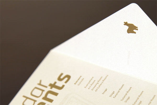
Cordenons Stardream Dolemite 81 lb text
Number of Colors
1 Spot (PMS 871)
Varnishes
–
Binding
–
Typography
Klavika (highly modified version)
Aphrodite (for swashes)
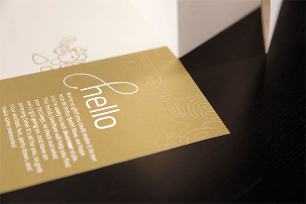
A birthday or anniversary is a good excuse to celebrate and of course, print something special. If only we could count on unlimited budgets for such occasions.
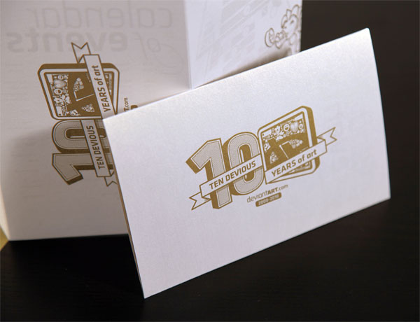
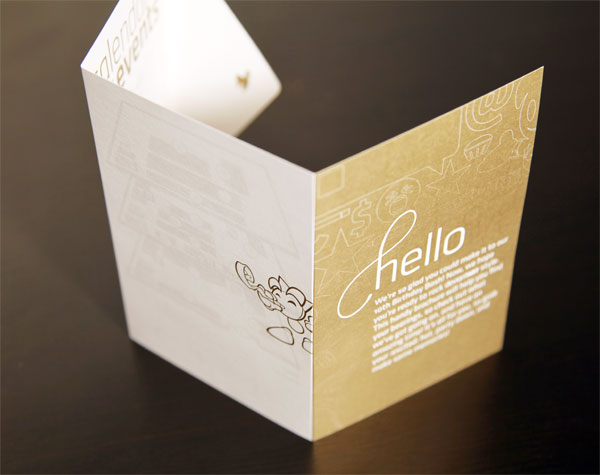
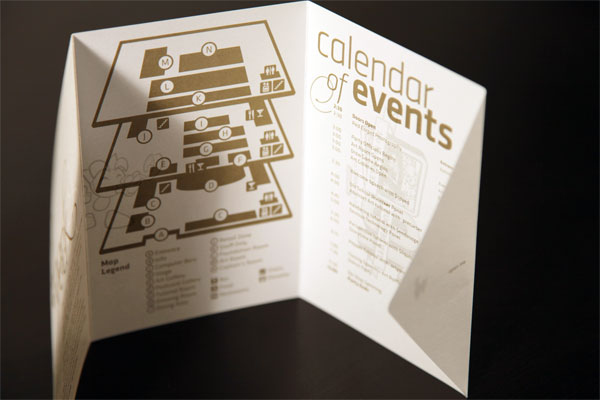
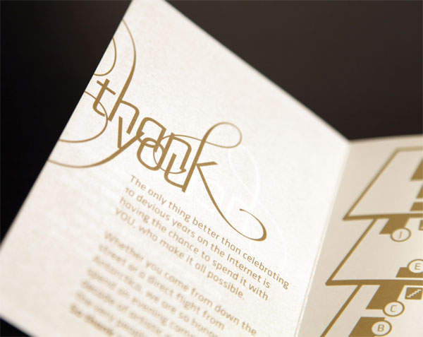
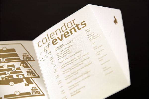
At deviantART we have a pervasive urban/textural style to a lot of our branded work, and considering this booklet was a special party invitation I wanted to do something that would stand out. We all knew it needed to be a keepsake, since our community loves attending events and would want to remember our 10th birthday for a long time.
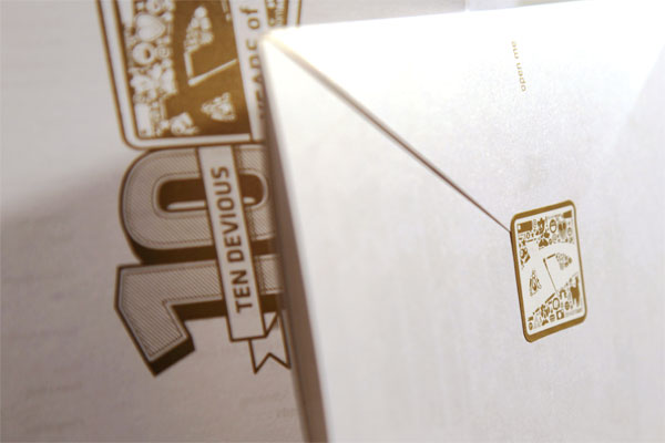
I was inspired by formal events such as weddings, and I designed this booklet using a favorite paper that fit the bill perfectly. The typography on this project was something new to me; blending script flourishes and blocky sans-serif forms, but it ended up quite unique and looked pretty good. I knew I couldn’t use gold foil for the entire booklet. It’s got quite a bit of fine detail in the typography, and producing foil dies for every single panel would’ve been a costly nightmare. So I opted for metallic ink that would still give off a very fancy vibe without requiring the production of dies. In retrospect, I think I could have gotten away with the cost of one little die for that and had a nice foil to it, but then again it could have made people feel like the rest of the booklet was cheaper because it didn’t use all foil.
Even if the project ended up being a single color job, there were some challenges to be faced along the way, and into the last stages of production.
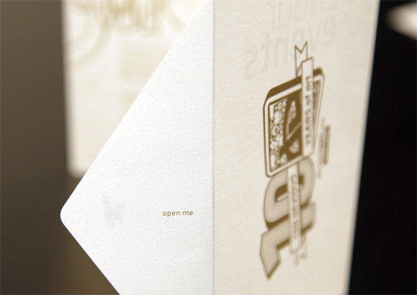
Working with a printer can be challenging no matter what. There are always staff members at the press with whom you’ve never worked before, and sometimes you’ll get vibes from people where they seem confused. This job was no exception. Some people knew exactly what I was having them do, others looked at me quizzically when I explained things to them. If any lesson was learned, it was to always hand a self-made dummy booklet to the printer even if they say they understand how something is to be folded. When everything was printed and it was time to fold the booklets, I got a call from the printer the day of and had to drive down just to re-explain the way things were supposed to get folded.

DeviantART Event Booklet
Production Method
Design
DeviantART
Design, Concept, Creative Direction: Ryan Ford
Design aids: Zack Isaacs and Mario Luevanos
Printing
Coastal Press
This post was published in the original layout of FPO so all images are smaller. Project descriptions as well as production lessons are quoted in the main content area.


About
FPO (For Print Only), is a division of UnderConsideration, celebrating the reality that print is not dead by showcasing the most compelling printed projects.
FPO uses Fonts.com to render Siseriff and Avenir Next.
FPO is run with Six Apart’s MovableType
All comments, ideas and thoughts on FPO are property of their authors; reproduction without the author’s or FPO’s permission is strictly prohibited
Twitter @ucllc
Sign-up for Mailing List
Mailing list managed by MailChimp
Thanks to our advertisers
About UnderConsideration
UnderConsideration is a graphic design firm generating its own projects, initiatives, and content while taking on limited client work. Run by Bryony Gomez-Palacio and Armin Vit in Bloomington, IN. More…
blogs we publish
Brand New / Displaying opinions and focusing solely on corporate and brand identity work.
Art of the Menu / Cataloguing the underrated creativity of menus from around the world.
Quipsologies / Chronicling the most curious, creative, and notable projects, stories, and events of the graphic design industry on a daily basis.
products we sell
Flaunt: Designing effective, compelling and memorable portfolios of creative work.
Brand New Conference videos / Individual, downloadable videos of every presentation since 2010.
Prints / A variety of posters, the majority from our AIforGA series.
Other / Various one-off products.
events we organize
Brand New Conference / A two-day event on corporate and brand identity with some of today's most active and influential practitioners from around the world.
Brand Nieuwe Conference / Ditto but in Amsterdam.
Austin Initiative for Graphic Awesomeness / A speaker series in Austin, TX, featuring some of the graphic design industry's most awesome people.
also
Favorite Things we've Made / In our capacity as graphic designers.
Projects we've Concluded / Long- and short-lived efforts.
UCllc News / Updates on what's going at the corporate level of UnderConsideration.

Related entries
Modern Era Booklet
Passover Haggadah
Neenah Paper CLASSIC® Rebrand
Legion Paper Artist Pads
Procter & Gamble Singapore Management Guide