ADV @ UNDERCONSIDERATION Peek here for details
BROWSE
Client
Self-Promotion
Quantity Produced
1,000
Production Cost
$283
Production Time
1 week
Dimensions (Width × Height × Depth)
3.5 in × 1.75 in
Page Count
–
Paper Stock
Chipboard
Number of Colors
2 Spot
Varnishes
–
Binding
–
Typography
–
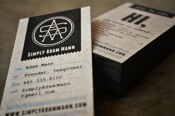
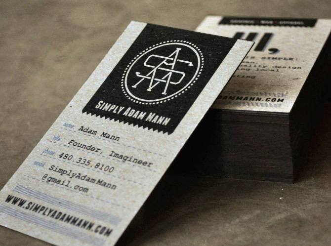
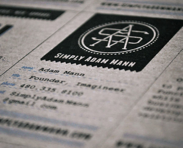
Friendly and professional. Refined, yet accessible. Authoritative, but fun. That is how you say, “I’m the Mann,” without having a chip on your shoulder. Portrait orientation and a bold, enigmatic emblem present themselves here more as badge of honor than a business card.
These are my personal cards marking the beginning of my venture into graphic design, so I not only needed them to show my design style, but also attention to detail and materials. Chipboard was the chosen stock based on it’s thickness, affordability and color. It even has tiny specks of blue that match the color of the titles on the card.
I painted the edges of the cards myself to save cost. Stacking about 100 at a time I used matte black spray paint to cover the edges. I made sure to place a very heavy weight on top so there would be no bleeding between the cards. Once they were dry, they snapped a part very easily.

This post was published in the original layout of FPO so all images are smaller. Project descriptions as well as production lessons are quoted in the main content area.
Post Author
Kelly Cree

Kelly Cree
Writer for UnderConsideration LLC.
More: Online / On Twitter
Date Published
February 8, 2012
Filed Under
Business Cards
Offset
Tagged with
chipboard
DIY
offset


About
FPO (For Print Only), is a division of UnderConsideration, celebrating the reality that print is not dead by showcasing the most compelling printed projects.
FPO uses Fonts.com to render Siseriff and Avenir Next.
FPO is run with Six Apart’s MovableType
All comments, ideas and thoughts on FPO are property of their authors; reproduction without the author’s or FPO’s permission is strictly prohibited
Twitter @ucllc
Sign-up for Mailing List
Mailing list managed by MailChimp
Thanks to our advertisers
About UnderConsideration
UnderConsideration is a graphic design firm generating its own projects, initiatives, and content while taking on limited client work. Run by Bryony Gomez-Palacio and Armin Vit in Bloomington, IN. More…
blogs we publish
Brand New / Displaying opinions and focusing solely on corporate and brand identity work.
Art of the Menu / Cataloguing the underrated creativity of menus from around the world.
Quipsologies / Chronicling the most curious, creative, and notable projects, stories, and events of the graphic design industry on a daily basis.
products we sell
Flaunt: Designing effective, compelling and memorable portfolios of creative work.
Brand New Conference videos / Individual, downloadable videos of every presentation since 2010.
Prints / A variety of posters, the majority from our AIforGA series.
Other / Various one-off products.
events we organize
Brand New Conference / A two-day event on corporate and brand identity with some of today's most active and influential practitioners from around the world.
Brand Nieuwe Conference / Ditto but in Amsterdam.
Austin Initiative for Graphic Awesomeness / A speaker series in Austin, TX, featuring some of the graphic design industry's most awesome people.
also
Favorite Things we've Made / In our capacity as graphic designers.
Projects we've Concluded / Long- and short-lived efforts.
UCllc News / Updates on what's going at the corporate level of UnderConsideration.

Related entries
KitchenAid Limited Edition Cards
Black Sheep Studio Business Cards and Promotional Items
Seegno Business Cards
Fracas Productions Business Cards
Elegante Press Business card