ADV @ UNDERCONSIDERATION Peek here for details
BROWSE
Client
Eighties Bangs
Quantity Produced
200
Production Cost
£180 (US$275.83)
Production Time
Approx 2 weeks
Dimensions (Width × Height × Depth)
2 in × 3.5 in
Page Count
–
Paper Stock
GF Smith Colorplan in Ebony 540gsm
Number of Colors
2: Holographic Foil & White Foil
Viewing the 1980s through the lens of 2012, we get to keep all the best parts—holographic foil and chubby fonts. If there is a massive holographic foil shortage this year, I blame Eighties Bangs for re-sparking the movement.
Eighties Bangs is a video editing firm based out of Los Angeles, CA and New York, NY. In designing their business card, the purpose was twofold. The first objective was to illustrate the company name, Eighties Bangs, in a style that was true to form, reminiscent and memorable. Simultaneously it needed to remain restrained enough to be suitable and professional in contemporary settings. After sifting through type of the era, a custom fatface was designed that would resonate with the decade without aligning the firm to any one specific product of the past. In the printing, the light reflective holographic foil served the dual purpose of cueing the eighties and connoting video light emitting from a black screen.
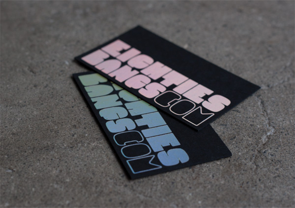

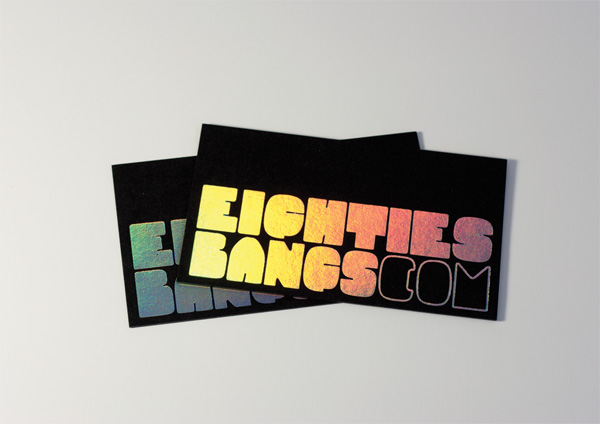
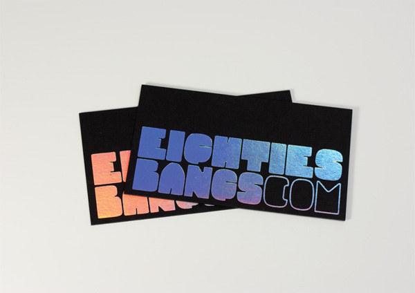
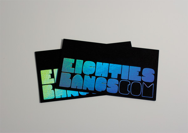
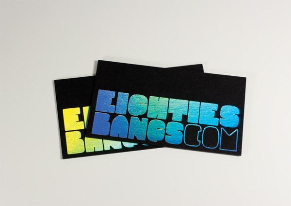
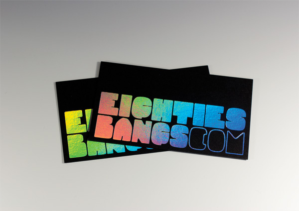
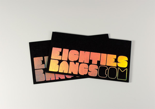
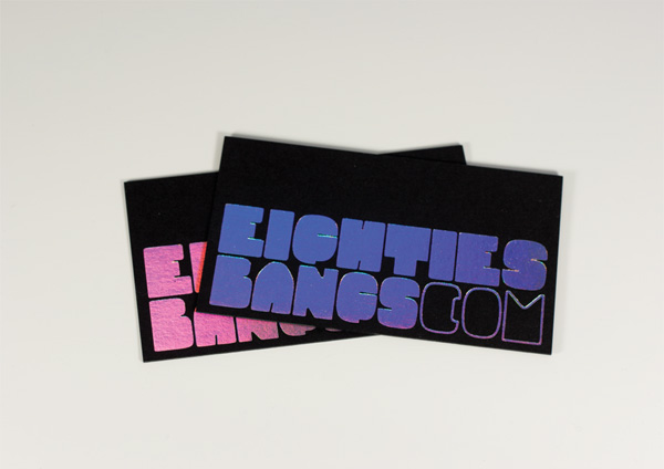
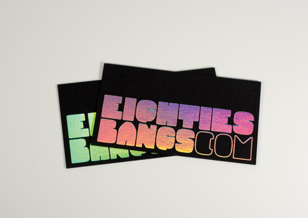
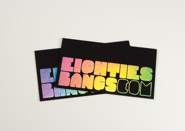
Eighties Bangs Business Cards
Production Method
Foil stamp
Design
Samarskaya & Partners
Printing
IST Printing
This post was published in the original layout of FPO so all images are smaller. Project descriptions as well as production lessons are quoted in the main content area.
Post Author
Jessica Mullen

Jessica Mullen
Writer for UnderConsideration LLC.
More: Online / On Twitter
Date Published
February 22, 2012
Filed Under
Business Cards
Foil stamp
Tagged with
business card
custom lettering
foil
holographic


About
FPO (For Print Only), is a division of UnderConsideration, celebrating the reality that print is not dead by showcasing the most compelling printed projects.
FPO uses Fonts.com to render Siseriff and Avenir Next.
FPO is run with Six Apart’s MovableType
All comments, ideas and thoughts on FPO are property of their authors; reproduction without the author’s or FPO’s permission is strictly prohibited
Twitter @ucllc
Sign-up for Mailing List
Mailing list managed by MailChimp
Thanks to our advertisers
About UnderConsideration
UnderConsideration is a graphic design firm generating its own projects, initiatives, and content while taking on limited client work. Run by Bryony Gomez-Palacio and Armin Vit in Bloomington, IN. More…
blogs we publish
Brand New / Displaying opinions and focusing solely on corporate and brand identity work.
Art of the Menu / Cataloguing the underrated creativity of menus from around the world.
Quipsologies / Chronicling the most curious, creative, and notable projects, stories, and events of the graphic design industry on a daily basis.
products we sell
Flaunt: Designing effective, compelling and memorable portfolios of creative work.
Brand New Conference videos / Individual, downloadable videos of every presentation since 2010.
Prints / A variety of posters, the majority from our AIforGA series.
Other / Various one-off products.
events we organize
Brand New Conference / A two-day event on corporate and brand identity with some of today's most active and influential practitioners from around the world.
Brand Nieuwe Conference / Ditto but in Amsterdam.
Austin Initiative for Graphic Awesomeness / A speaker series in Austin, TX, featuring some of the graphic design industry's most awesome people.
also
Favorite Things we've Made / In our capacity as graphic designers.
Projects we've Concluded / Long- and short-lived efforts.
UCllc News / Updates on what's going at the corporate level of UnderConsideration.

Related entries
KitchenAid Limited Edition Cards
Black Sheep Studio Business Cards and Promotional Items
Seegno Business Cards
Fracas Productions Business Cards
Elegante Press Business card