ADV @ UNDERCONSIDERATION Peek here for details
BROWSE
Dimensions (Width × Height × Depth)
7 in × 9 in
Page Count
36
Paper Stock
Cover: Neenah Oxford Road, 80 lb Cover
Interior: Cougar Opaque, 60 lb Text
Number of Colors
2 Spot
Varnishes
–
Binding
Side stitched, with wrap around cover. 4 staples.
Typography
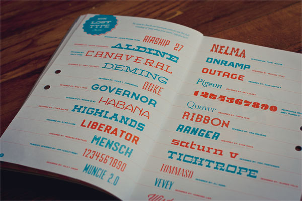
All from Lost Type:
Ribbon
On Ramp
Muncie
Mensch
Ministry
Airship
Deming
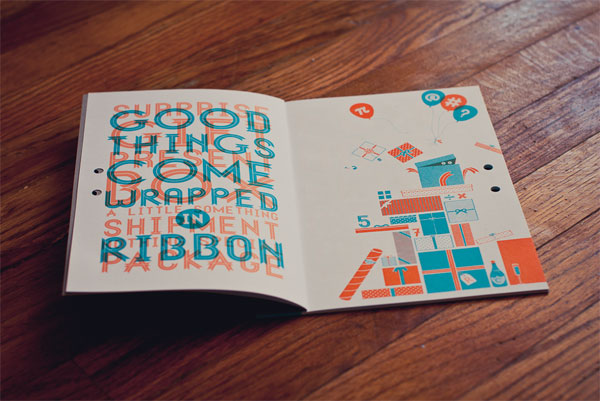
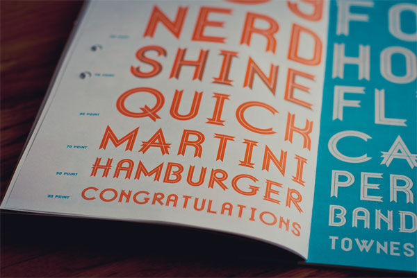
Ribbon, designed by Dan Gneiding, is a lovely and cautiously ornate typeface sold by Lost Type under their “pay what you want” model. Except that if you pay $30 or more you get one of the most fun and nicely crafted type specimens I have seen in a while. Printed in two vibrant colors, Dan and his guest designers bring to life Ribbon in a way that makes you pay not just what you want but what Dan deserves.
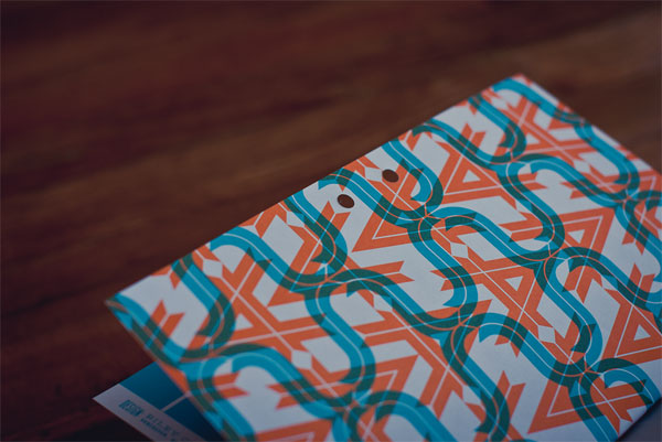
There were a few cost saving devices which, when used in a unique way, ended up adding character and value to the book, not taking away.
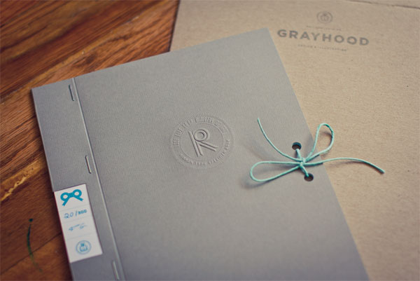
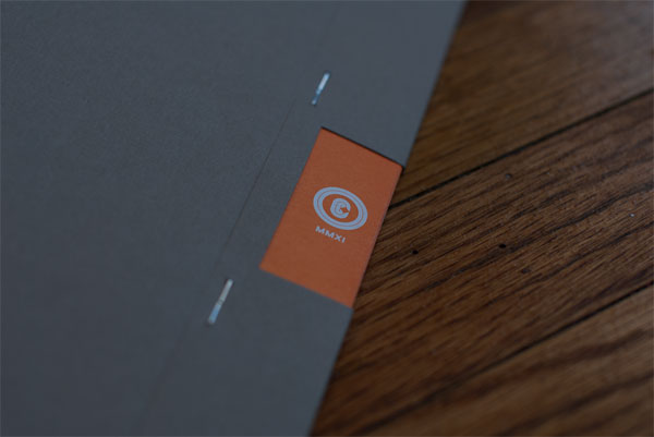
Most notably is probably the binding. Side stitching with staples can end up looking like a last minute business meeting had out. Elongating the ‘spine’ and having a die-cut window wrap around the edge turned what could have looked like cheap binding into a more considered, deliberate solution. It also allowed for an orange bleed to be printed on each page hidden in the spine which creates the illusion of edging in the die-cut window.
The cover was left unprinted and hand embossed after the books were printed and bound. We used an custom plate in an extra long reach desk top embosser.

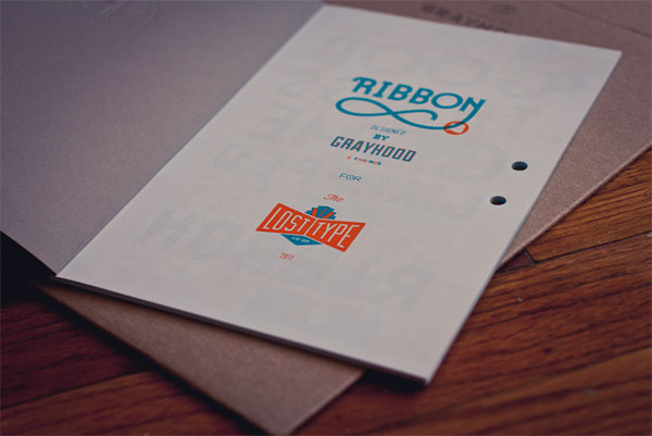
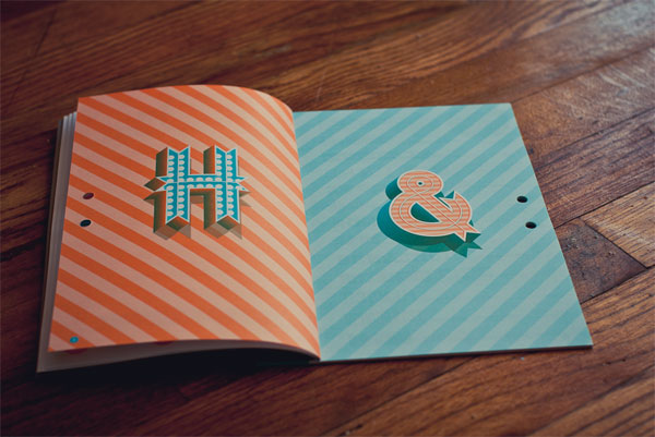
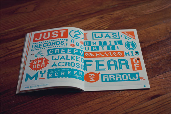
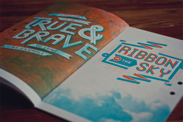
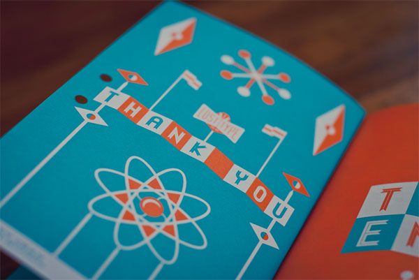
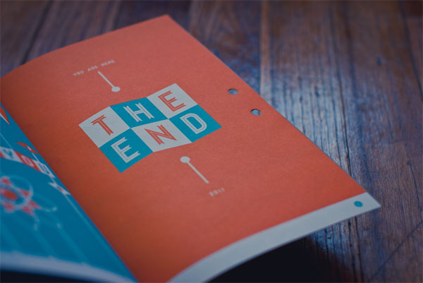
Ribbon Type Specimen
Production Method
Offset
Design
Dan Gneiding, Art Direction and Design
Guest Designers: Linda Eliasen
Mauricio Cremer
Chaun Osburn
Jim Leszczynski
Olivia Verdugo
Elysse Ricci
Andy Rementer
Namik Schwarz
Lachlan Heywood
Riley Cran
Ryan Katrina
Printing
Printing: Kalnin Graphics
Embossing: Dan Gneiding with a desk top embosser
Embosser: Stamp Connection
This post was published in the original layout of FPO so all images are smaller. Project descriptions as well as production lessons are quoted in the main content area.
Post Author
Armin

Armin Vit
Editor of FPO and co-founder of UnderConsideration LLC.
More: Online / On Twitter
Date Published
February 1, 2012
Filed Under
Booklet
Offset
Tagged with
booklet
offset
saddle-stitch


About
FPO (For Print Only), is a division of UnderConsideration, celebrating the reality that print is not dead by showcasing the most compelling printed projects.
FPO uses Fonts.com to render Siseriff and Avenir Next.
FPO is run with Six Apart’s MovableType
All comments, ideas and thoughts on FPO are property of their authors; reproduction without the author’s or FPO’s permission is strictly prohibited
Twitter @ucllc
Sign-up for Mailing List
Mailing list managed by MailChimp
Thanks to our advertisers
About UnderConsideration
UnderConsideration is a graphic design firm generating its own projects, initiatives, and content while taking on limited client work. Run by Bryony Gomez-Palacio and Armin Vit in Bloomington, IN. More…
blogs we publish
Brand New / Displaying opinions and focusing solely on corporate and brand identity work.
Art of the Menu / Cataloguing the underrated creativity of menus from around the world.
Quipsologies / Chronicling the most curious, creative, and notable projects, stories, and events of the graphic design industry on a daily basis.
products we sell
Flaunt: Designing effective, compelling and memorable portfolios of creative work.
Brand New Conference videos / Individual, downloadable videos of every presentation since 2010.
Prints / A variety of posters, the majority from our AIforGA series.
Other / Various one-off products.
events we organize
Brand New Conference / A two-day event on corporate and brand identity with some of today's most active and influential practitioners from around the world.
Brand Nieuwe Conference / Ditto but in Amsterdam.
Austin Initiative for Graphic Awesomeness / A speaker series in Austin, TX, featuring some of the graphic design industry's most awesome people.
also
Favorite Things we've Made / In our capacity as graphic designers.
Projects we've Concluded / Long- and short-lived efforts.
UCllc News / Updates on what's going at the corporate level of UnderConsideration.

Related entries
Modern Era Booklet
Passover Haggadah
Neenah Paper CLASSIC® Rebrand
Legion Paper Artist Pads
Procter & Gamble Singapore Management Guide