ADV @ UNDERCONSIDERATION Peek here for details
BROWSE
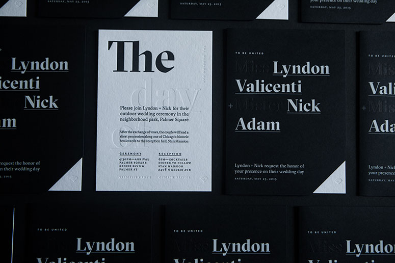
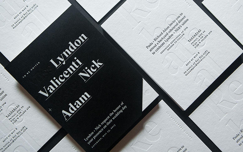
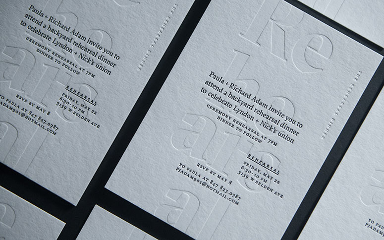
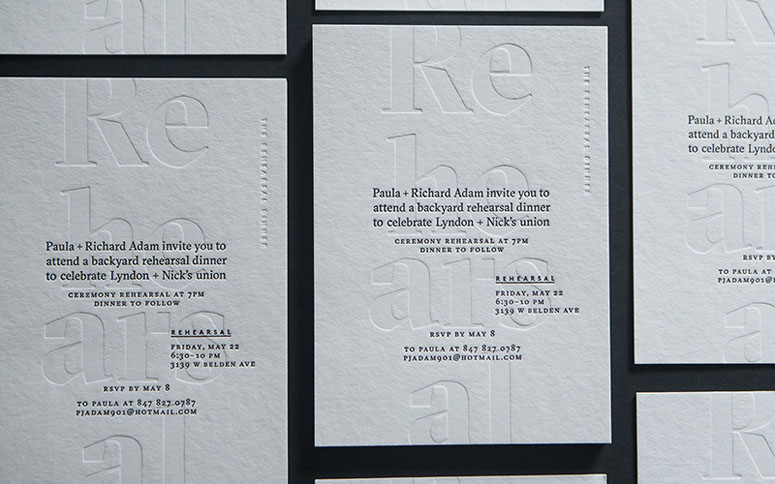
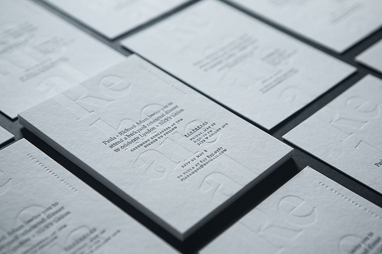
Lyndon & Nick’s Wedding Materials
Production Method
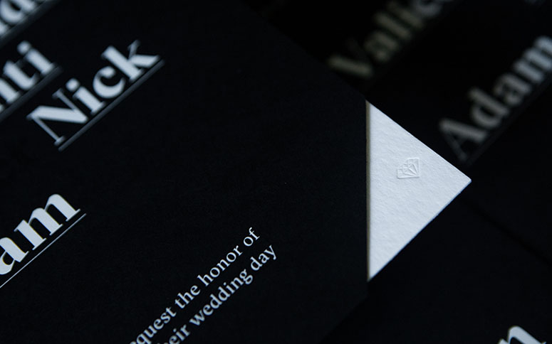
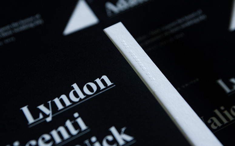
Emboss
Engraving
Foil stamp
Letterpress
Design
Nick Adam
Printing
Artistry Engraving
Rohner Press
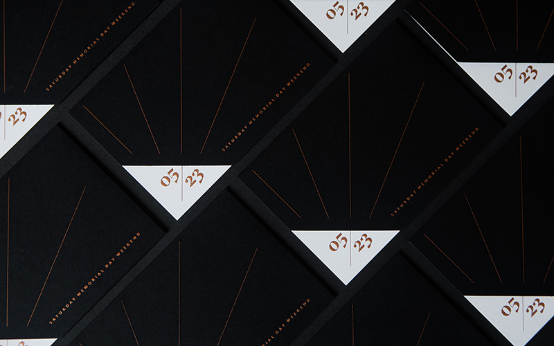
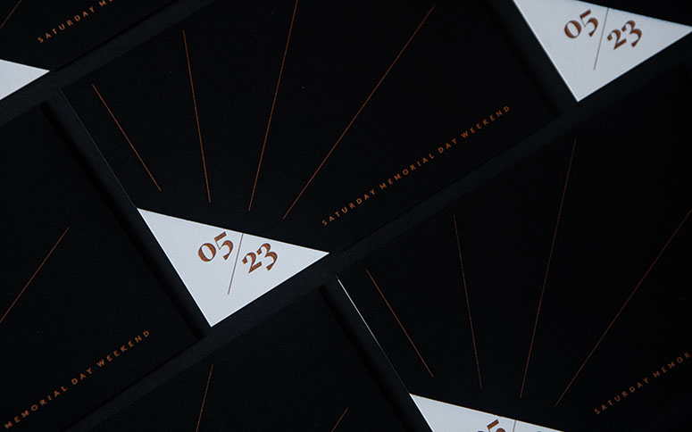
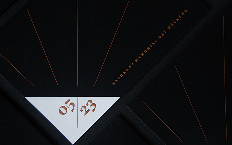
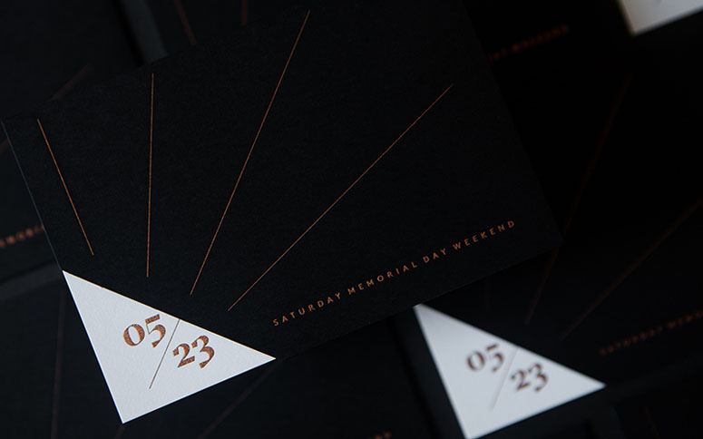
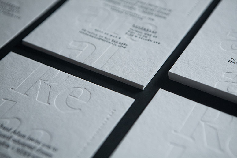
Every detail of this project is thoroughly thought out and considered as you can read on the sidebar, and I can vouch for the pleasure received in touching theses materials—the level of thinking about each detail is extended to each materials and printing technique with beautiful artistry.
Client
My Soon to be Wife
Quantity Produced
300 cards and sleeve,
600 of each envelope
Production Cost
$5,000
Production Time
2 weeks
Dimensions (Width × Height × Depth)
–
Page Count
–
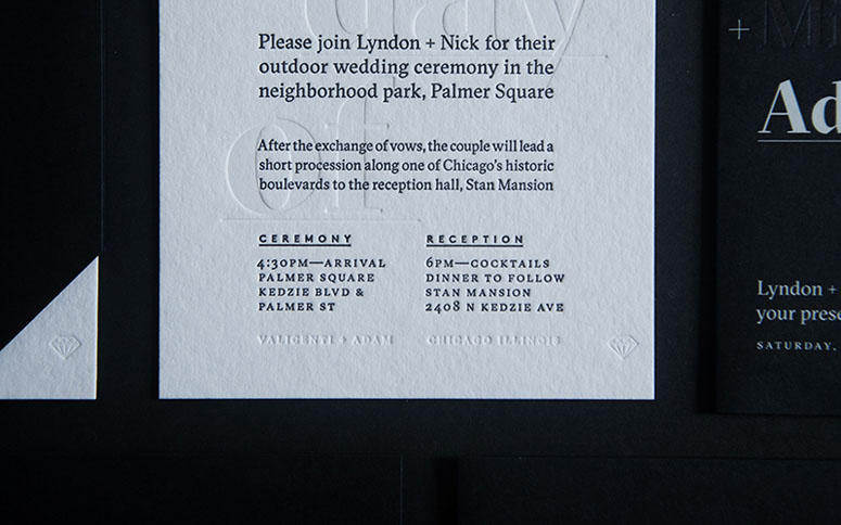
Paper Stock
222 lb
110 lb
80 lb
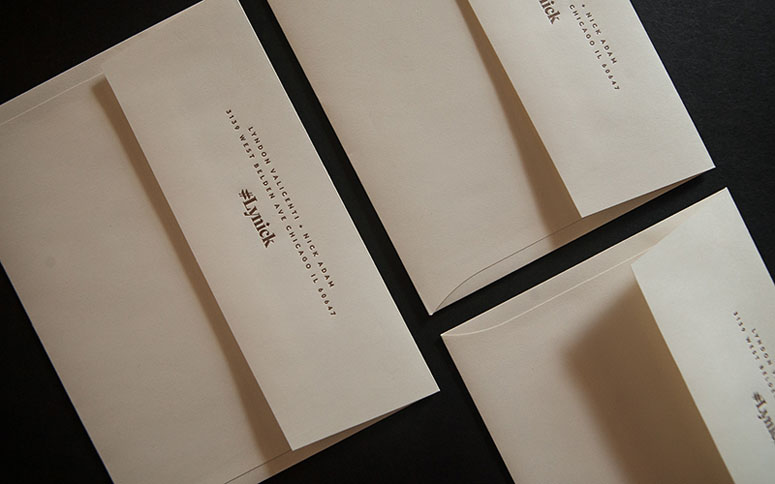
A6 & #4 BARONIAL Envelopes
Number of Colors
3
Varnishes
–
Binding
–
Typography
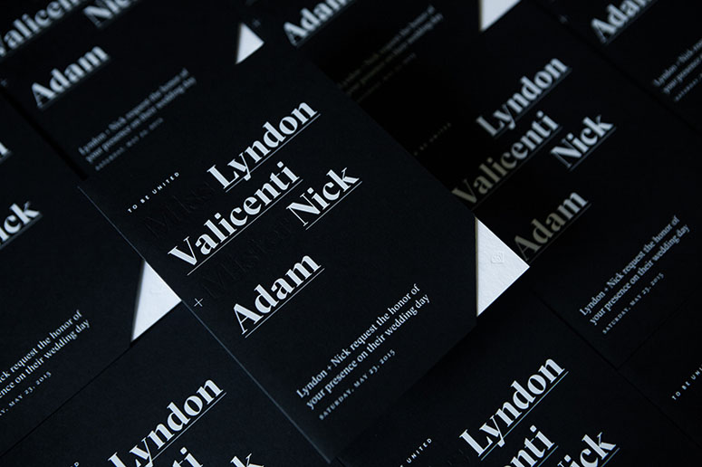
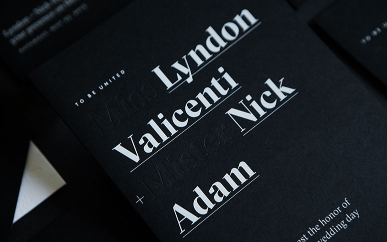
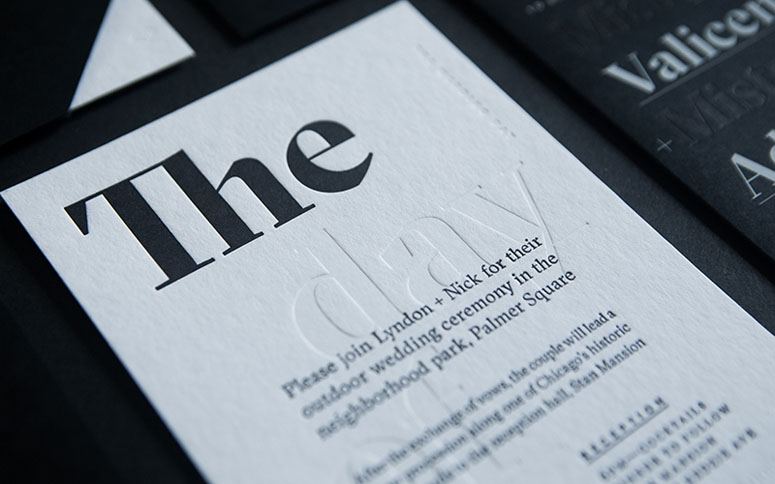
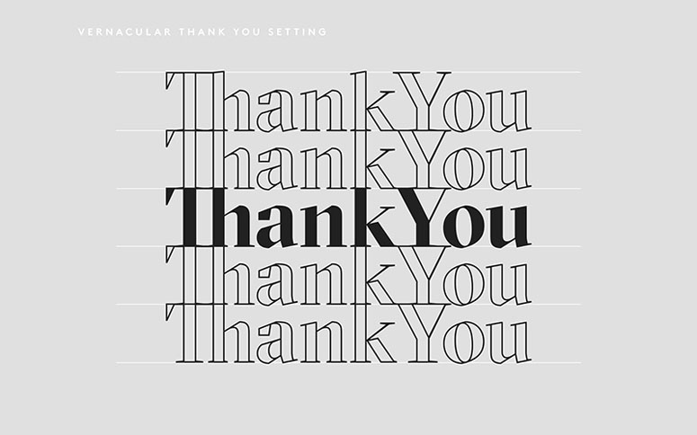
GT Sectra
LL Brown

Project Description
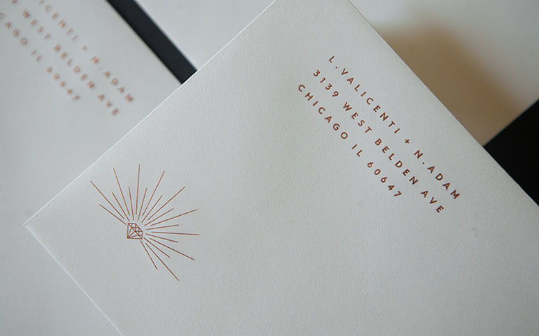
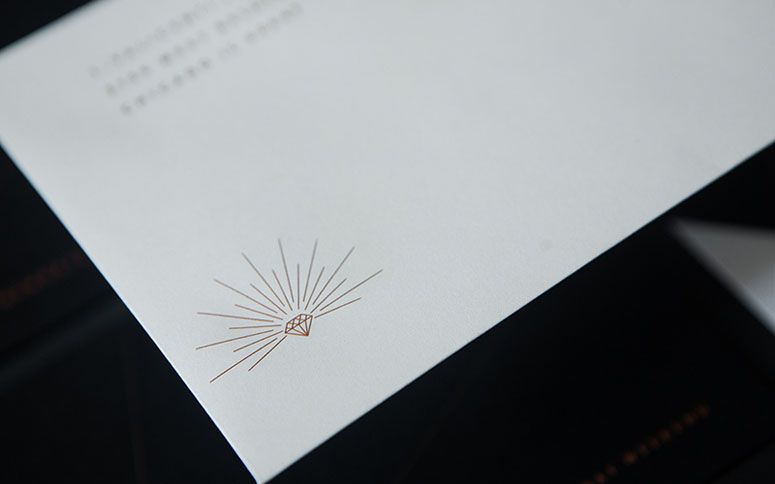
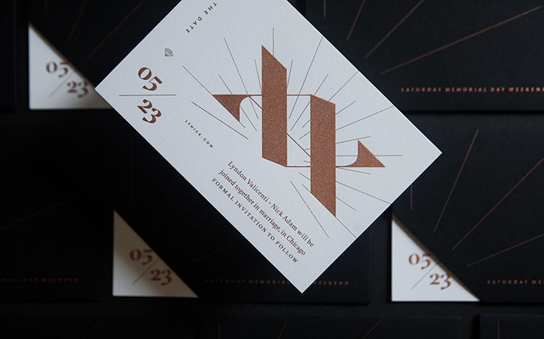
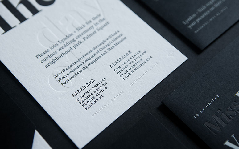
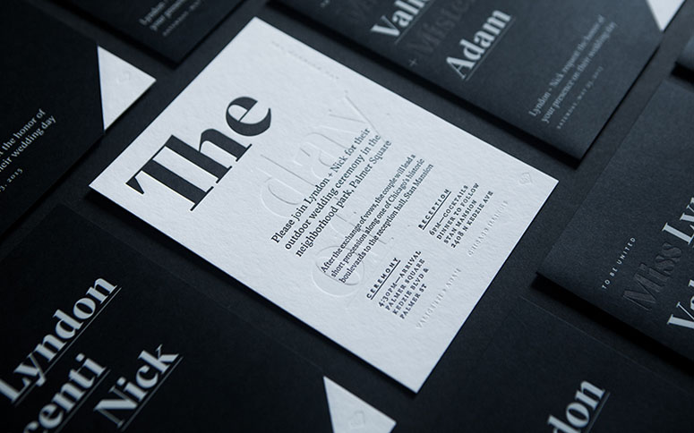
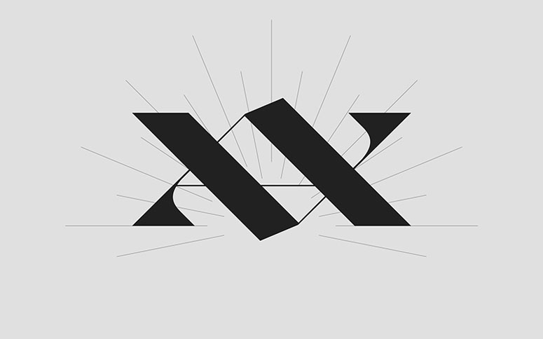
With my wife and I having moderately wild pasts (known all too well to our families), the objective for our materials was to set the right tone. Our ceremony would take place outdoors, assembled in a circular form, in Chicago's Logan Boulevard and would end with a Balkin marching band leading attendees a quarter-mile to the reception. While the ceremony wasn't not traditional, it was important to communicate to guest the attire was formal, and the vibe was classy. While fun, this was not to be confused with an outdoor picnic. Tone was set through style & production being at the height of what's achievable.Symbols have always been important to my wife and I. Be that, the peace signs from Lyndon's hippy years of high-school, and this is true today with her crosses that adorn our home's hallway. For myself, the encapsulated A was omnipresent as I was an early-teen 90's punk rocker, today it's the stacked double V that I set to baseline for every project to rise to.
Each of these symbols find strength in the ideals they represent and their numbers they exist in. They too find strength in certainty of their structured forms. Beautiful, rigid, sacred geometry.
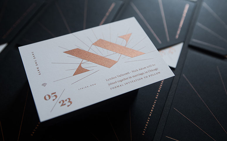
Wanting to capture our moment by illustrating equality and difference, the formal approach was in a manner not dissimilar to the yin-yang. Form informing form, complementary differences united â marking a moment of coming together or becoming joined.
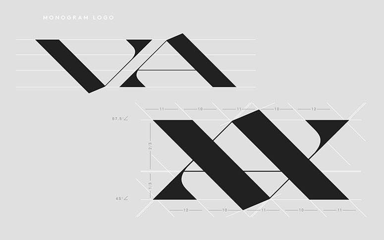
The uppercased initials of our last names (V + A) are like mountains and valleys, near mirrored reflections of each other. They inform each other — the ups and down, highs and lows are an honest portal of every relationship.
These historical ties of these forms span most of recorded time, religions, and cultures. Their symbolic meanings date to Neolithic-Agrarian â the basis for the development of civilization.
The letter V has represented the chalice, an ancient symbol of femininity. The symbol's meaning is form based, the open-air negative space of the V acts as a container. This is likened to the chalice where wine is held, as well, like the uniquely female part of anatomy where new life is carried.
This V upturned, reveals the figure A or more accurately the Alphe (sans-crossbar) holds meaning that too is inverse of the V. This form represented the blade symbolizing masculinity. The upward triangle is not unlike sharpened daggers and swords, or the uniquely male part of our anatomy. The symbol's founding value comes from the power a sword takes, rather than the life the chalice gives.
When placed on top of each other these two forms take on new meaning, new form. Released is the six-pointed star, the Seal of Solomon. A symbol balanced in structure and ideals, a symbol that stood to mean perfection by the the union of two.
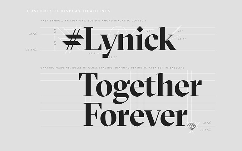
The primary type and structural inspiration for the monogram is Grilli Type's GT Sectra. It's roots are based on broad-nib calligraphic form, for this work that was an enjoyed nod to classic wedding invites and the evidence of human's hand in symbol making. Balancing contemporary characteristics with classy articulation the type was perfect for both long and short form text. The qualities of the display setting were perfect for bring drama and importance to headlines.
The secondary type, used solely for detail titling is LL Brown from Lineto. LL Brown complements GT Sectra through its formal geometric cues that yield hard angles analogous to the monogram and hairline illustrations. Compared to historical relatives LL Brown's geometry is simple and pure.
Production Lesson(s)
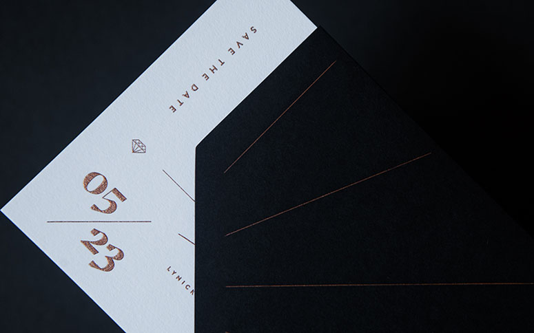
I left the "I" out of marriage... not conceptually, I misspelled marriage on the Save the Dates. And I sheepishly had to say, I fucked up—it was completely my mistake, I was rushing so hard and asked not have any proofs. And while I had to pay for a second run, what was most costly was the time I lost, and embarrassment of having a one of my partners redo work because of my issue.Believe me, I get tight timelines and doing much at once. I learned the hard way on this one. I must spell check. Then proof and spell check again and then proof and approve.

Post Author

Bryony Gomez-Palacio
Editor of FPO and co-founder of UnderConsideration LLC.
More: Online / On Twitter
Date Published
August 10, 2016
Filed Under
Emboss
Engraving
Foil stamp
Letterpress
Wedding materials
Tagged with
blind emboss
custom sleeve
die cut
engraving
foil stamp
GT Sectra
letterpress
LL Brown
metallic
PMS


About
FPO (For Print Only), is a division of UnderConsideration, celebrating the reality that print is not dead by showcasing the most compelling printed projects.
FPO uses Fonts.com to render Siseriff and Avenir Next.
FPO is run with Six Apart’s MovableType
All comments, ideas and thoughts on FPO are property of their authors; reproduction without the author’s or FPO’s permission is strictly prohibited
Twitter @ucllc
Sign-up for Mailing List
Mailing list managed by MailChimp
Thanks to our advertisers
About UnderConsideration
UnderConsideration is a graphic design firm generating its own projects, initiatives, and content while taking on limited client work. Run by Bryony Gomez-Palacio and Armin Vit in Bloomington, IN. More…
blogs we publish
Brand New / Displaying opinions and focusing solely on corporate and brand identity work.
Art of the Menu / Cataloguing the underrated creativity of menus from around the world.
Quipsologies / Chronicling the most curious, creative, and notable projects, stories, and events of the graphic design industry on a daily basis.
products we sell
Flaunt: Designing effective, compelling and memorable portfolios of creative work.
Brand New Conference videos / Individual, downloadable videos of every presentation since 2010.
Prints / A variety of posters, the majority from our AIforGA series.
Other / Various one-off products.
events we organize
Brand New Conference / A two-day event on corporate and brand identity with some of today's most active and influential practitioners from around the world.
Brand Nieuwe Conference / Ditto but in Amsterdam.
Austin Initiative for Graphic Awesomeness / A speaker series in Austin, TX, featuring some of the graphic design industry's most awesome people.
also
Favorite Things we've Made / In our capacity as graphic designers.
Projects we've Concluded / Long- and short-lived efforts.
UCllc News / Updates on what's going at the corporate level of UnderConsideration.

Related entries
Elegante Press Business card
Erin and Brian Wedding Invitation
Mr Cup 2017 Letterpress Calendar - The Creative manifesto
Devon & Mike Wedding Invitation