|
JUNE 12 |
OCTOBER 16 |
NOVEMBER 13 |


• Opposites Attract ’08 Home
• OA’08 has been organized by UnderConsideration LLC and is hosted by the Art Directors Club
• OA’08 is run with Six Apart’s MovableType 6.1
• With a few individual entry exceptions, OA’08 is programmed to be W3C compliant and is valid XHTML 1.0 Transitional
• Syndicate / RSS Feed
Disclaimers
• All comments, ideas and thoughts on OA’08 are property of their authors; reproduction without the author’s or OA’08’s permission is strictly prohibited
• OA’08 reserves the right to delete any comment deemed offensive or unnecessary
Contact
By all means, please

May 28, 2008![]()
Additional Notes about these Opposites
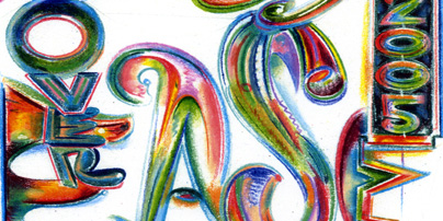
Finding an opposite for Ed would appear to be the simplest of chores, given his highly individual style that yields remarkable new typographic compositions unlike anything else. Pretty much everyone from Bill Cahan, to Kyle Cooper, to Doyald Young, to Mike Perry is a potential opposite — and out of everyone we decided Post Typography would be the best fit.
We looked for someone that was young, with a vested interest in typography and pushing it beyond its typical boundaries, and someone that displayed a conscientious stance on doing things differently out of belief rather than for style — not that any of the designers mentioned above are only stylists. In our minds, Nolen and Bruce fit this criteria through their work: Which always feels accessible and something that designers can strive for, but that always displays an incisive edge, in concept or execution, that sets Nolen and Bruce apart.
To put it in a less wordy way, and as our initial gut reaction: Ed’s and Post Typography’s work is amazing, it makes us jealous that they can do it so effortlessly, and there is surely some opposite modus operandi going on here.
![]()
Filed in Fella/PostTypography • Link