Speak UpA Former Division of UnderConsideration
The Archives, August 2002 – April 2009
advertise @ underconsideration
---Click here for full archive list or browse below
  
Flip the Logo, who Cares?

I’m not an expert on airplane livery design nor an expert in airline branding for that matter, but I know something is not right when I see it. Generally, I don’t make a post here on Speak Up about one single detail of something that caught my attention, yet this was quite baffling to me. Perhaps this is not as big a deal — or worse, common practice — and I’m just making a big hubbub out of nothing.

Last year Northwest Airlines’ logo was redesigned by TrueBrand. In good rebranding fashion, any wit that the old logo (by Landor) had, instantly disappeared. The surviving element is the abstracted compass pointing to the Northwest accompanied by a, dare I say it, terrible wordmark. But this is really not the intention of this post. A few weeks ago while airport-hopping between Chicago and Mexico I noticed something I had never seen done before.

Northeast Airlines

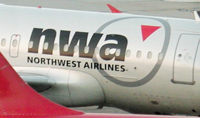
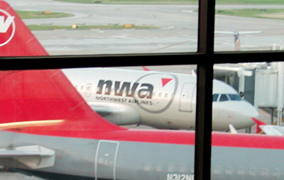
Now, like I said, I’m no expert… but what the hell just happened to the logo? The compass and arrow have been flipped and are now positioned to the right of the “nwa” wordmark. It’s not viewable in the picture, but the airplane is facing to the right and in this picture we can see that the logo, when placed on the left side of the airplane, is correct.

Not only is the changing of the logo preposterous but it blunderingly changes the whole meaning of the logo as the compass points to the Northeast — no strategy document or research can back this one up. Slap me silly and call me a brand consultant, but this is simply wrong.

Maintained through our ADV @ UnderConsideration Program
ENTRY DETAILS
ARCHIVE ID 1985 FILED UNDER Branding and Identity
PUBLISHED ON Jun.15.2004 BY Armin
WITH COMMENTS
Comments
Tom Gleason’s comment is:

HAHAHA!"changes the whole meaning of the logo as the compass points to the Northeast"

I hope they made a lot of money on that.

On Jun.15.2004 at 12:20 PM
.sara’s comment is:

Hee. I would guess the thinking was to keep the compass at the same point on both sides of the plane -- why, though? why not just have the "a" in the logo line up with the edge of the compass on the other side? (Which would work for both sides, of course.)

Oopsie. Wonder who'll get canned for approving that one.

On Jun.15.2004 at 12:29 PM
dru’s comment is:

I noticed the logo transition a while back and the one thing that drives me nuts is the placement of the arrow in the circle. If it is supposed to be a compass where in the heck is it attached. It sure as heck isn't the center of the circle. Bother's the living out of me.

On Jun.15.2004 at 12:31 PM
Jonathan Baldwin’s comment is:

Ooh goody - a chance to bitch about someone else's work! ;-) thank the lord none of my efforts are anywhere to be found unless you look real hard...

It's an ugly logo - quite amateurish IMHO, and very 1980s.

The large lettering looks like it has bullet holes in it thanks to the windows (what's going on with the "a"?).

The "compass" looks nothing like a compass and when I look at it I actually think the arrow is pointing down. As dru pointed out, it just doesn't work as a compass.

Why have "nwa" and "Northwest airlines" together anyway? At least in the old logo there was something of a pun. I'm not a fan of initialising company names, it only seems to work with "big" organisations like the BBC and IBM and terrorist organisations.

Quick fix: drop the "nwa", make the compass more of a compass and flip it back again. Or just modernise the old logo...

On Jun.15.2004 at 12:55 PM
Valon’s comment is:

I think the image that Armin took can be placed on this months "Word It>Oops"...perfect fit.

I would be curious to flip through the Style Guide of the new nwa logo. I am sure TrueBrand specified the meaning behind the arrow and its use, or am I?!

On Jun.15.2004 at 12:59 PM
Kevin Lo’s comment is:

Aren't NWA part of the original gansta rap scene? "Niggaz With Attitude" if I remember correctly.

On Jun.15.2004 at 01:05 PM
Darrel’s comment is:

No wonder NWA fares are so high...they're always getting lost since they can't understand a simple compass.

On Jun.15.2004 at 01:10 PM
Patrick’s comment is:

I suppose it comes from the rule that flags on moving vehicles should be positioned as if flying from a flag pole. For example, the US flag is supposed to be backwards on the right side of a bus since it would blow to the left, with pole attached to the stars side. The Army does the same thing on soldiers' right shoulder patches (check out the last sentence), which I find a little weird - as ambassadors in foreign lands, some people's first view of a real US flag might be on a soldier's uniform. Okay, who am I kidding - everyone knows our flag and loves/hates it already.

The nwa logo is the the most absurd case since, as you pointed out, flipping the orientation kills what little meaning is left in the mark - that it pointed northwest. (Leaving the bad deign and nomenclature of the logo aside.) Giving them the benefit of the doubt - that they intended to do this - it could be a functional decision because if they put the normal logo in the place you show, the circle might hit the wing (hard to tell - not seeing how much room is to the right of the door). But they could have come up with a left type / right circle option that kept the triangle in the right place.

On Jun.15.2004 at 01:14 PM
Armin’s comment is:

> (hard to tell - not seeing how much room is to the right of the door)

Here is a not-so-good image showing more of the plane. With one of the old planes in front of it.

On Jun.15.2004 at 01:23 PM
JonSel’s comment is:

This has bugged me since I first saw it. But, it looks like a typical transitional identity. Meaning: it's around for 3-5 years and then the "Northwest" will probably be dropped. Everyone knows them currently as "Northwest." Remember when they were "Northwest Orient" ? The transition to initials eliminates the confusing name, since they fly to many more places than the American northwest. The spelled out name is simply to bring along existing name recognition until that moves to "nwa", at which point they can drop "northwest" and the compass point will simply be a generic compass point.

So that was the brand consultant in me speaking. From the graphic design side, I love the silver plane (way better than American's silver planes), but the type, the boring logo...blah.

On Jun.15.2004 at 01:27 PM
vibranium’s comment is:

I will never be able to look at this logo and NOT think of Dre, E, and Cube.

On Jun.15.2004 at 01:31 PM
Steve Mock’s comment is:

That's right, Kevin. 'Twas my first impression as well.

Anybody over there at TrueBrand� do basic research?

On Jun.15.2004 at 01:35 PM
Per Torberger’s comment is:

Totally agree — the logo is ugly, harder to read (I mean, how many meanings can NWA have?), the compass isn't a compass …

As Patrick pointed out (I think) — the reason for having the compass on different sides is probably that the "arrow" always should point forward — like "always moving forward". Which of course renders the "compass" meaningless.

Imagine the crew: captain "hey, where are we going again?" Steward "Wait … still going forward, captain" capt: "Good, good…"

On Jun.15.2004 at 01:35 PM
Alan’s comment is:

There's a San Francisco Chronicle article on the NWA/Gangsta rap connection in regards to this rebrand.

PDF download off of the TrueBrand site:

http://www.truebrand.com/press/sfchronicle_4-13-03_legal.pdf

On Jun.15.2004 at 01:35 PM
Kiran Max Weber’s comment is:

way better than American's silver planes

No paint saves fuel. Via Marketplace:

The national average price of a gallon of regular unleaded fell under 2 bucks today. It's the first nationwide drop in gasoline prices for the year. This admittedly small dip is probably small consolation for those of you on the road today. What's more, prices for jet fuel remain -- sky high. The big airlines are doing a number of little things to pinch pennies.

Listen to the full report by clicking on Paying for those Friendly Skies...

The connection to the rap group should have been an automatic red triangle eh flag when they thought of the abbreviation. Leaves a bad connotation.

On Jun.15.2004 at 01:38 PM
Michael B.’s comment is:

Patrick is right. It's an accepted convention to "flip" the elements in a livery on opposite sides of a vehicle. On Saul Bass's design for United, the logo leaned forward on the starboard (right) side and backwards on the port (left) side. In the new redesign, the same tradition is maintained. This also helps align it with the aircraft's tail.

Why this (traditional but, in this case, not particularly relevant) logic was used to countermand the (more relevant) "arrow pointing northeast" logic on the NWA planes is anyone's guess (along with why they bothered changing the Landor/Willi Kunz logo in the first place).

On Jun.15.2004 at 01:51 PM
Armin’s comment is:

> It's an accepted convention to "flip" the elements in a livery on opposite sides of a vehicle.

Thanks Michael, that is why I preceded the post with "I’m not an expert on airplane livery design nor an expert in airline branding for that matter."

On Jun.15.2004 at 02:14 PM
Michael Holdren’s comment is:

I initially thought they moved the "compass" because if it remained to the left of "nwa" it would have to go over the wing, which some people would think that might look funny. But the other argument (flag and United flip) makes for a more sound argument except... that would require more forethought than I'm prepared to give credit for. However, if the same people at Northwest who selected and approved this logo, would probably also have approved switching sides of the compass when applied to the plane.

And yes, I agree with everyone else's comments in regards to the lack of luster this new logo emanates... every single one.

On Jun.15.2004 at 02:25 PM
pk’s comment is:

it's bad enough that the thing now says "niggaz with attitude," but it also has what looks to be a gay pride triangle next to it. and with that color red, it'll turn pink in almost any photography. the hell were they thinking? this is completely amateurish.

On Jun.15.2004 at 02:35 PM
mwb’s comment is:

as i sit and work this has definitely put a smile on my face

On Jun.15.2004 at 03:05 PM
tim’s comment is:

I've just shared this with a couple of co-workers, and their jaws dropped when they scanned the "nwa". Soul Plane!

JonSel wrote The transition to initials eliminates the confusing name, since they fly to many more places than the American northwest.

Was the name really that confusing? Do they have market research to bear this out? Just curious.

On Jun.15.2004 at 03:28 PM
Aaron Salmon’s comment is:

Maybe the plane only flies towards west... around the world! Then if you were looking at the plane while you were facing south it would be correct.. kind of... =)

The logo is horrible in the first place, I would have stuck with the word Northwest instead of going with the abbreviation, NWA. of course to me it also means niggaz wit attitudes. BUT the 'Northwest' spelled out was much stronger in today's airline market with Southwest, Spirit, United. Besides it's too close to TWA. =)

The travesty here is the fact that you can just willy nilly change the logo. whether or not the arrow is pointing wrong, the meaning and flow of certain design elements (in this case the huge fucking compass or rather an odd little triangle) will change drastically by just slapping the same elements in a different order or arrangement.

On Jun.15.2004 at 03:28 PM
James’s comment is:

The transition to initials eliminates the confusing name, since they fly to many more places than the American northwest.

I hope this wasn't their only reason for switching to NWA. Was it really that confusing? Does British Airways only fly to places within the United Kingdom?

On Jun.15.2004 at 03:45 PM
davek’s comment is:

I think the only thing that can really help determine the correct usage for this identity is to conduct a large number of well moderated focus groups.

The best design decisions are made be committee!! preferably by people who are experts in marketing. Even the most poorly designed logo can be saved by a really good marketing campaign and inconsistent usage.

On Jun.15.2004 at 05:00 PM
JonSel’s comment is:

Was the name really that confusing? Do they have market research to bear this out? Just curious.

I'm only going by what I've read, but it makes some sense. From TrueBrand's press release: John Diefenbach, a TrueBrand Partner, says, "NWA runs a straightforward, cost efficient and streamlined business. Our goal was to express the global scale of this carrier, while, at the same time, create a highly efficient cost saving design in keeping with the way NWA runs its business". I think the key to this is "global." The name "Northwest" simply connotes "regional."

Does British Airways only fly to places within the United Kingdom?

The difference is that BA is the United Kingdom's flag carrier, meaning they represent an entire nation. The name "Northwest" spoke to a geographic region, not a country.

On Jun.15.2004 at 05:28 PM
Rob’s comment is:

NWA runs a straightforward, cost efficient and streamlined business. Our goal was to express the global scale of this carrier, while, at the same time, create a highly efficient cost saving design in keeping with the way NWA runs its business". I think the key to this is "global."

Well, gee, tell me if I'm wrong but that logo in no way says "global", no matter what side of the plane it is on. It seems to me someone was a little timid to let go of any part of the old look and left enough pieces to leave nothing short of a weak and confusing mark.

the old identity was so much stronger and the compass, as others have mentioned, is really not there any more. and maybe that was there intent but i too would love to know what the 'arrow' now represents. also, i personally feel that the type in the word mark is too bulky and heavy leaving a visual competition between it and the gray circle.

On Jun.15.2004 at 06:05 PM
Patrick C’s comment is:

Meh! Crappy.

The new arrow always reads "down" to me no matter which side of the logo it is on. NWA was a rap group (and a big one at that), but many people may not know that. But for my generation the idea of the "gansta" airline will always be funny.

Changing the orientation of the "compass" (a weak ass compass at that) ruins the logo and, to my mind, is inexcusable. Is it a compass or a watch?

I can see the point, to an extent, that they did not want to come across as a regional carrier. But NWA does not roll of the tongue as easily as IBM. Maybe it needs time. Northwest seems friendlier to me.

Sucks.

On Jun.15.2004 at 06:40 PM
Shahla’s comment is:

Even if it is traditional to do this on vehicles and such, it doesn't make sense with a logo that's visually linked to the name of the company. Northwest's logo needs to show said orientation on the compass -on both sides of the plane.

In this case we're not talking about word slant or a gazelle. . .

And really, what was wrong with the whole word logotype? If they did away with the uppercase N (and cut W) which created the equilateral triangle as pointer tip -why not change the compass pointer to a more elegant graphic?

On Jun.15.2004 at 07:06 PM
Deanna’s comment is:

This thread has given me a much needed laugh. Aside from the gangsta reference, I too see it as a down arrow and I'm nervous enough about plane travel that this would wig me out and I'd choose another airline. I'd think at least a couple of people in a focus group would have the same experience, no?!

On Jun.15.2004 at 07:19 PM
Tan’s comment is:

Ugh. The pain is back. I shed a tear when this rebrand originally happened. I know I always seem to protest rebrands, but the old NW logo really was one of the most perfect logotype ever created.

This unfortunate application is just final proof that TrueBrand didn't really care about the execution of this mark. It's incredibly unrefined. The positioning, scale, stroke width — almost nothing is uniformed or in purposeful relations. And compare the uneven kerning between "Northwest" and "Airlines" — just awful.

I bet few passengers see it as a compass anymore — it looks more like a hand on a clock.

Ugh. It's just embarrassing — not just to the dimwits at TrueBrands that did this, but to all designers. The fact that a branding firm among us actually took money from a client for this work damages the credibility of the entire profession.

On Jun.15.2004 at 08:21 PM
mGee’s comment is:

The transition to initials eliminates the confusing name, since they fly to many more places than the American northwest.

I will never be able to look at this logo and NOT think of Dre, E, and Cube.

First... um... lets not forget Ren. :)

Actually that's all part of the transition, after all this transitioning to the initials "nwa", some 'genius' will have a 'brilliant' idea and change "nwa" to "NWA" and switch to the font Minstral.

On Jun.15.2004 at 10:52 PM
sheryl’s comment is:

Is it a compass or a watch?

My first impression was that the airline was "gay friendly", and that a new character had been designed (along the lines of the copyright symbol, registered trademark, and the TM).

Now all gay-friendly companies can use the "circle triangle" after their tradenames! Design away my friends!

On Jun.16.2004 at 08:08 AM
Brady’s comment is:

Armin,

I wish I could search the comments of past posts. (I thought authors could with MT?)

I pointed out to DesignMaven (some time ago) how bad this redesign was - most importantly for this particular reason.

Can you help a guy out? I feel as though I have looked at every post to find it and to no avail. I want to go back and re-read what I posted before I become redundant.

Thanks.

Speaking of Maven, where has he been?

On Jun.16.2004 at 08:14 AM
Darrel’s comment is:

This seems way to forced to get people to use the term 'nwa' solely. FedEx changed their name BECAUSE they wanted to match what people were calling it...same with KFC. This seems to be trying to go against popular preference.

Northwest is what we've always called it and always will call it. They should embrace that. I'm not sure that 'northwest' literally says 'regional' any more than Best Western, Sothern Comfort or North Face does.

On Jun.16.2004 at 09:27 AM
Michael Holdren’s comment is:

From John Diefenbach himself in reference to the similarities of the NWA acronym:

“There’s no problem unless that particular band has a fleet of aircraft,” said Diefenbach. “We were definitely aware of the band. From a legal standpoint, there is no issue.”

That quote can be found at TrueBrands own site as a press release here.

Where on this entire world can that be considered a good argument for a logo redesign?

On Jun.16.2004 at 10:24 AM
Feluxe Socksmell’s comment is:

nice journalism Arm. hope you dont mind if i lift and paste. whats odd is that they meant to do it, and that is definately navigation with attitiude.

word up to the north, west and east.

On Jun.16.2004 at 11:35 AM
Matt Waggner’s comment is:
I'm not sure that 'northwest' literally says 'regional' any more than Best Western, Sothern Comfort or North Face does.

You know, I wonder what the idea of the northwest has to offer them... I mean, I can't think of a part of the country that has fewer connotations than the northwest. (Don't get me wrong, I know some WA state people, fine folks all.) Midwest Air, Rocky Mountain Air, Bible Belt Airways... whether you'd fly them or not, those all seem to suggest something in a way that "Northwest" really doesn't.

On Jun.16.2004 at 01:13 PM
Jason’s comment is:

Okay. Call me a skeptic, but this is a PhotoShop joke of somekind. Right?! They couldn't have done this.

On Jun.16.2004 at 02:45 PM
Jerry Reyes’s comment is:

They just kept the upper-left triangle of the old logo, which is precisely part of the reason the new mark is unresolved. The facts that it is equilateral and not aligned with the center is what lends it to be read as pointing down. (I sure see it that way.)

…while, at the same time, create a highly efficient cost saving design in keeping with the way NWA runs its business". I think the key to this is "global."

I think the key to this is “fart it out and send the invoice”.

On Jun.16.2004 at 02:54 PM
Miss Tiffany’s comment is:

Is it possible that they simply could not trademark "NWA" alone so they had to keep "Northwest Airlines" as part of it?

On Jun.16.2004 at 04:51 PM
Armin’s comment is:

> Midwest Air, Rocky Mountain Air, Bible Belt Airways...

Hooters

On Jun.16.2004 at 05:34 PM
Tan’s comment is:

My table is now in its upright position.

On Jun.16.2004 at 06:34 PM
Monib’s comment is:

Regarding the downwards direction of the arrow; I also mentioned this some time ago on the Identity Works site. I see that issue as being just as critical as this forwards/backwards discussion. There is a review of the ID here: http://www.identityworks.com/Reviews/2003cases/nwa.html

On Jun.16.2004 at 08:14 PM
Armin’s comment is:

Nice Tan. Real nice.

Monib, I saw that suggestion you made on Tony Spaeth's site a while ago and not only is it more accurate it helps the new logo step away from the shadow of the old logo. By making that tiny element different the whole logo looks a bigger shift.

In the past few months my attitude towards rebrandings has changed from always-skeptical to always-willing-to-listen, but this atrocity of a logo makes it really hard to give anyone the benefit if the [graphical] doubt…

On Jun.16.2004 at 09:04 PM
Justin’s comment is:

I bet few passengers see it as a compass anymore — it looks more like a hand on a clock.

Actually, they want to convey to the customers the average lateness of all their flights. When they park on the left side, they're 15 minutes early. When they park on the right, they're 15 minutes late.

Usually they park on the right side.

NWA is a fixture here in minneapolis. My friends and I have always joked about them as being totally out of touch. I completely agree that the old logo was many, many times better. If they wanted to save on paint costs, why didn't they just stop using so much grey?

On Jun.17.2004 at 12:34 AM
Cash Nexus’s comment is:

Another example of logo redesign without regard to the thought-provoking beauty and simplicity of the original. The right-leaning N, the brilliant "compass point" completing the W... now that's a logo. Reminds us of the great - and simple - logos of the past; Southern California Edison's old logo remains one of my favorite in this same vein.

Damn the Torpedoes! Screw history! Newness for newness sake! Redesign, redesign, redesign!

On Jun.17.2004 at 04:00 AM
Elizabeth Boyle’s comment is:

Perhaps this is my lack of sleep talking at this point, but I think it might have been more effective for them to reverse the entire logo (on the plane) instead of just the mark.

I'd photoshop it in for example, but I haven't had my coffee yet.

On Jun.17.2004 at 07:14 AM
DesignMaven’s comment is:

Armin:

Shame on you. What a way to smoke me out of my retreat!!!!!

I've been marveling the Presidential Plane. (last week) Designed by Raymond Loewy 1963. Pondering, should it be revitalized and what Consultancy

I would love working with on this project.

A no Brainer. MB I don't mean Milton Bradley. Last name is actually a Foreign Country. If that doesn't ring a Bell. My Big Bro., Renowned Partner at PentaBrand.

Down to Business:

Brady Bone:

Pointed this out last year. When I named Northwest Revitalization. Design of the Year 2003.

http://www.underconsideration.com/speakup/archives/001679.html#001679

I stick to my Guns. You can read my explanation of why I selected it as Best of the Year.

Actually Clarance Lee's Identity for North West Orient esthetically is better than both Landor and TrueBrand.

Michael B. you're absolutely right. Referencing the Tail Fin alignment.

Joe Finocchaiaro was with Landor at the time of

Revitalization of Northwest in the 1990s.

Joe is actually responsible for creating the ingenious Compass Design along with Willi Kunz.

The arrow of the compass forms the "W" ajacent to the "N".

http://www.joefino.com/index.html

Agreed the 1990s Identity should have been left alone.

Brief History:

John Diefenbach has Branded more airlines than anyone currently living.

Starting in the late sixties or early seventies with Walter Landor Associates.

John Diefenbach was President of Landor and Chief Operating Officer. Later became CEO. John Diefenbach is responsible for Branding every Airline Landor was commissioned to revitalize in the 1970s, 1980s, early 1990s until he formed Diefenbach Elkins Davis Baron. Now FutureBrand. John Diefenbach has Branded every Airline Diefenbach Elkins Davis Baron revitalized until he became Partner in Wolff Olins.

A short list at Landor, Hawaiian Airlines, Tai Airlines, US Air, Singapore Airlines, Alitalia, North West Airlines 1990s.

For Diefenbach Elkins, now FutureBrand. John Diefenbach Branded, LanChile, Iberia, South African Airways, Saudi Arabia Airlines.

click here for larger version

Only Australian Identity Designer/Consultant Ken Cato comes closest to John Diefenbach.

Ken Cato, has revitalized eight (8) Airline Identities.

Load these links into your Browser to find out more about John Diefenbach.

John Diefenbach's Bio:

http://www.metrostate.com/library/stories/00/dec/sanjosemercurynews.htm

Present Employment: Board of Directors, Chalone Wine Group.

http://www.chalonewinegroup.com/about/about.htm

Proper Solution:

Initially when Brady Bone pointed out the technical problem with nwa's Identity Brand Revitalization.

I thought the issue would've be resolved. Most Airline Identity aficionado's are familiar with Compass Airlines Identity Design. Which I always thought was the model for both North West Identity Designed by Joe Finocchiaro at Landor and Willi Kunz.

At the same time the model for TrueBrand's revitalization.

Please click the links below to see the solution the TrueBrand's Identity Problem.

Compass Airlines Designed in 1989 by Austrailian Identity Designer Brian Sadgrove.

The Economy of Design Elements within this Identity Solution to Compass Air is well done and appropro !!!!

Which is why I liked the revitalization to nwa. Apparently the Powers That Be at TrueBrand had no one minding the store.

Click Here to view the photos Compass Airlines

Below is a photo of John Diefenbach when he was with Landor in the early days circa 1970s

and the eighties.

A short Bio of Mr. Diefenbach's Partner Vince Carra' formerly of Luxon Carra' Vince Carra' was

Design Director at SAUL BASS and Associates. Credited as Design Director for United Airlines.

Vince Carra', Partner at TrueBrand also created Identities for US Airways, and Air Lingus while at Luxon Carra'.

TAN:

Ugh. It's just embarrassing not just to the dimwits at TrueBrands that did this,

but to all designers. The fact that a branding firm among us actually took money from a client

for this work damages the credibility of the entire profession.

TAN, You should read John Diefenbach's statement (link provided) on Naming Consultants Embarassing the Identity Profession.

John Diefenbach:

Excerpt from metrostate link above.

"It's a wild, dangerous game that's going on,'' lamented John Diefenbach, a partner with brand consultants Wolff Olins.

Picking a name has become "part hokum, part academia, part process,'' with the end results all too often being "the embarrassment of my profession,'' he said.

Hey, Diefenbach was CEO at Landor before you left Private Practice to join Grip and Landor.

He's had more jobs than a friend of mine name Reggie Sparks. Apparently Diefenbach left TrueBrand after the nwa DEBACLE.

Word is he maybe coming back to LANDOR. Your words are forever edged in CYBERSPACE!!!!!!

Big YELP and LAUGHS !!!!!!!!!!!

You know I got your BACK!!!!!!!

Let me know what you think of Compass Airline Identity Design 1989.

Which is how nwa aesthetically is supposed to look.

David W.

Could you let me know what John Diefenbach's exact years were at Diefenbach Elkins and FutureBrand.

Before you ask. Yes, I considered FutureBrand for revitalization of the Presidential Plane.

You didn't get it because FutureBrand already has a MONOPOLY on Airline Revitalization.

On Jun.17.2004 at 08:35 AM
Feluxe Socksmell’s comment is:

NWA- Best Redesign of the Year (2003)

Ouch.

Maven, I wasnt going to lay into you for saying Verizon's logo was "growing on you"... but I think you have been sipping from the branding trough a little too long my friend.

Bad design is bad branding is bad business.

These moneyshots in suits with big smiles dont impress anyone...

On Jun.17.2004 at 09:33 AM
Tan’s comment is:

Well said Felix.

I appreciate all of the info, Maven, but the fact still stands that I think the new mark is horribly executed.

I actually don't have that much problems w/ the name — I think people here have made it a big deal, but it's a non-issue I think. What I find embarrassing is the wordmark and backwards application on the plane. No real designer would defend that screwup.

I'm surprised that it was done under Diefenbach's watch, but you know, it just goes to show that everyone's human.

The Compass mark is ok I guess. But the type is horrible — what was it that Goudy said about tracked-out lower case italics? Something about sheep?...

And as always Maven, your knowledge of design history and branding never ceases to amaze me.

On Jun.17.2004 at 10:49 AM
Joseph’s comment is:

You know this is . . . i mean . . . sometimes its just . . and then . . . what they should . . . its a case of . . . what it comes down to . . . OH MY GOD! IF I DID THAT, I WOULD FIRE ME.

On Jun.17.2004 at 11:49 AM
Feluxe Socksmell’s comment is:

I'd never heard of John Diefenbach.

If he were such a genius brander he wouldve

changed his name when he saw the light.

Even I was smart enough to go from Pete (my middle name) to Felix (first) at age 23. My first boss was Stan Rabinowitz. You'd know him by his re-branded name Stan Richards, AIGA hall of famer and owner of the Richards Group- probably the best ad agency in the Southwest for the past 20 yrs.

sorry to get off topic.

On Jun.17.2004 at 11:58 AM
Armin’s comment is:

> I wish I could search the comments of past posts. (I thought authors could with MT?)

Brady, I completely missed your comment. Sorry. The comments are not searchable, they could be but that makes the search feature very, very slow. I also remember we talked about NWA before, but I can't seem to find it either. I must be getting old.

> But the type is horrible — what was it that Goudy said about tracked-out lower case italics? Something about sheep?

Heavens! that is tracked out like 500.

> Well said Felix.

I never thought I would hear those words coming from you Tan.

On Jun.17.2004 at 01:28 PM
s-n-DoubleO-p D-o-DoubleG ya C’s comment is:

Time to get the homies togizzle for some high altitude shizzle on our new chartered fleet.

we'll be g'd up airmail blizzle all the way to Compton Michigan, nizzle.

NWA in full effizect.

ps~ R.I.P. Eric Wright a.k.a. Eazy-E

On Jun.17.2004 at 05:15 PM
Kevin Lo’s comment is:

straight outta lowcash

On Jun.17.2004 at 05:53 PM
DesignMaven’s comment is:

Felix:

I'm appalled. I'd like to see your Money Shot (piano keys) when Bill Gardner founder of Logo Lounge informs you he want to do a Feature on BIG and showcase your work

in Logo Lounge 3.

You'll take your picture Butt Naked and so will I.

Design is BIG BUSINESS. You put your best foot forward. Given a choice. When Bill

Gardner proprietor of Logo Lounge or Commarts request to Feature BIG's Identity Designs. You gonna take your photo - op in Jeans/Coveralls or a Brioni, Ermenegildo Zegna, or Luciano Barbera Suit ???

I'll go one step further. Purely Hypothetical. DUBYA, request your presence at the White House to discuss Brand and Identity Revitalization of Air Force One.

Given your choice of attire to impress Mr. President. What would you wear ???

Of Course I'm Breaking your balls. It's a NO BRAINER.

My point, they're a lot of people that have never seen a picture of Walter Landor or John Diefenbach. Let the photo benefit those that can appreciate the esthetic. And gain something from it. You stated you never heard of John Diefenbach.

Alas, you learned something.

From the recent comments posted on this site in reference to John Diefenbach's work. Most people

like yourself knew nothing of Diefenbach's Track record in Branding and Identity Design.

Yes, Diefenbach is a LEGEND.

When the issue was raised in reference to nwa's Brand Revitalization. Only Brady Bone recognized the execution flaw!!!!!

Brought it to the community of SU.

I only acknowledge Brady Bone for acknowledging

the flaw.

Tony Spaeth is a trusted friend and mentor. Although, I don't agree with his every word.

Nonetheless, I respect him. Not even Tony Spaeth recognized the flaw. Until it was pointed out to him by Monib.

Not to spite Armin for raising the issue!!!!!!

I don't make excusses for anyone. The problem lies with TrueBrand's Creative Director, Design Director, Project Manager, Marketing and Communications Teams. Who ultimately oversee Communication and Marketing Strategy, Design Implementation and Rollout.

I haven't read one statement on SU referencing

the apparent likeness to Compass Airlines. Designed two years before Northwest Airlines.

Landor neither TrueBrand's Identity Revitalization was Totally ORIGINAL

Which is why I emphatically stated Clarence Lee's Identity for Northwest Orient is esthetically the Better Design. Totally Original. Nothing in circulation resembling Clarence Lee's Identity Past or Present.

Most important, No one has referenced TrueBrand's Identity is exactly the same as Landor's minus the "N" forming the "W" in the Compass. The oval has been grayed. The band widened. The arrow given a little more prominence.

Yet, it does not read Northwest. Essentially, it is identical. Minus the type.

Felix, if this tome sounds if it's not my usual BANTER.

It isn't !!! MY GRANDFATHER'S NAME WAS PETE. You RAT BASTARD !!!!!

I LOVED THAT MAN !!!!!!!!

I ain't mad at cha !!!!!!

Peace and Love

Maven

Tan:

As pre-usual, many thanks.

Typography like Mathematics is a universal language. Certainly they're Do's and Don'ts.

Each Culture uses type to their understanding or lackthereof.

Admittedly, I've adopted Massimo Vegnelli's Philosophy of the Five Typeface Rule.

Let not forget. You're not so young, you don't remember.

There was a time approximately twenty years ago

or longer.

One could get away with using HELVETICA exclusively.

Headline and text.

Ahhhh, Those were the days!!!!!!!!!

Felix:

You gotta talk to me about Verizon. Sounds like there's more than meets the eye. Like you got shafted on Brainstorming or Pitching Ideas.

I'm not crazy about the Design. Verizon is is eloquent compared to dated Identities such as Krispy Kreme, FCC, and Auto Zone.

Fucking, Auto Zone been around since 1973.

So has FCC, Federal Communication Commission.

http://www.autozone.com/servlet/UiBroker?UseCase=L001&UserAction=viewHomePage

I can almost live with Krisp Kreme. It's go to go.

My three year old daughter can do better than Auto Zone and FCC.

On Jun.17.2004 at 08:34 PM
Mr. Jones’s comment is:

I'm getting on the wagon a little late as I think everything that needs to be said has been said. However, I could not call myself a designer if I didnt comment on how horrible this logo is. The clock-compass-gay-symbol...even if I overlook these things the logo still blows. Does anyone know how much NWA paid to turn a good logo into crap?

I'd be interested to see the rejected designs.

Remember when air travel used to be cool, chic, mysterious, and even luxurious? Why can't a new mark bring back those qualities.

On Jun.17.2004 at 09:38 PM
Feluxe Socksmell’s comment is:

wavy mavy:

nuthin again taking a picture. i guess if you wanna appear to conduct business an accountant thats your perogative. then again that photo is 30 yrs old. even i remember those days when ties were mandated.

ps- dont go crappin on the krispy kreme logo.

people love bad when its served honestly

On Jun.18.2004 at 07:44 AM
DesignMaven’s comment is:

Felix:

You're more than a HANDFUL.

I haven't stopped laughing. You made my Day.

I'm almost inclined to make the trip to New York

to hear Armin lecture.

School's about to let out for summer break.

Presently, I'm playing MR. MOM for couple of weeks.

Let's rid the world of these Identity atrocities.

Armin's pet peave is Home Depot.

Your pet peave is Verizon.

My pet peave is Auto Zone, FCC, and Krispy Kreme.

Let's put some Speak Up Branding and Identity Teams together to rid the world of these EYE SORES.

Ecologically, the environment will be a better place.

I don't think Pro Bono will kill anyone of us on SU.

Picture that Money Shot in Time Magazine. With Debbie, Marion, Pk, Armin, TAN, Brady, Graham, David W., SAM, M. Kingsley, Peter S. Tom G. You and myself.

Donating our Time and Expertise for a worthy cause.

Check your EGOS at the door!!!!!!!!!

On Jun.18.2004 at 09:15 AM
Maya Drozdz’s comment is:

Last name is actually a Foreign Country.

Call me naive, but since when is Bierut a foreign country?

On Jun.18.2004 at 11:30 AM
Tan’s comment is:

>Presently, I'm playing MR. MOM for couple of weeks.

you mean, there are Maven Jrs out there? Getoutatown!

I'm curious, what do your sub-brands all think of their Dad's fixation on brands? Any of them show signs of the same love yet?

On Jun.18.2004 at 11:59 AM
Brett’s comment is:

Hi all. I'm not a professional logo designer, but do have an eye for design, so I enjoy reading this site: I thought I'd toss my $0.02 into the ring. . . I've got to agree with pretty much all the critiques of nwa (NWA?) but thought one thing had been left out.

I work across the street from an airport and wanted to point out that nwa is failing to get their money's worth from their cruddy new logo. From even a relatively short distance away, the grey circle fades from view, leaving an indistinguishable black blob of text and an apparent bird strike of red blotchiness in [either right or left] corners above said black blob. The old logo still said Northwest from distances too far to read because the whole logo's shape said 'part of NorthWest'. Now there is too little visual information to stand out from a distance.

I didn't even know they were NorthWest planes until I dropped a friend off at the airport and saw the planes parked close enough to read the name and see them parked with the older logo'd planes.

Someone got away with murder when that logo was accepted.

On Jun.18.2004 at 05:03 PM
DesignMaven’s comment is:

Tan:

Believe it or not my kids know Bass and Rand.

At least their faces.

I test them on Identities. Such as AT&T, UPS,

Pizza Hut, Safeway, Radio Shack, Warner Books, Lawry's United Airlines, Nabisco.

I try to make it fun. And not push it on them.

Traveling I'll ask them if they remember who did EXXON, Shell, BP or MERIT.

I've been in love with symbols since I was a Toddler.

Sometimes they put me through the test. And ask me who did Sean John, Rocca Wear, or Phat Pharm.

You know how we do, immediately try and change the subject. Can't tell them you don't know. I just tell them they were created inhouse by a staff designer.

Now that you mention it. Whenever, I'm at the computer. My three year old daughter ask. Daddy are you writing Arnie and Tam?

I've been accussed of devoting more time to SU than my family. When I'm not Designing or writing on SU I'm reading the post and learning.

Speak Up is addictive. I'm under careful watch.

To be Forewarned by my family is to be Forearmed!!!!!!

On Jun.18.2004 at 08:43 PM
Arnie’s comment is:

> I test them on Identities. Such as AT&T, UPS,

Pizza Hut, Safeway, Radio Shack, Warner Books, Lawry's United Airlines, Nabisco.

I try to make it fun. And not push it on them.

Traveling I'll ask them if they remember who did EXXON, Shell, BP or MERIT.

Ha! That's awesome… and there I thought Michael Jordan would be too hard pushing his kids on basketball.

On Jun.18.2004 at 10:15 PM
Tam’s comment is:

>I've been accussed of devoting more time to SU than my family.

Amen bro. Same in my casa.

If our wives ever got together, Arnie would be in some deep shit.

On Jun.19.2004 at 10:20 PM
DesignMaven’s comment is:

TAN:

One Day it's Bound to Happen!!!!!!!!!

Maya Drozdz:

If I'd said Democratic Occupied Territory. Nobody

would've Gotten it.

Brett:

Welcome to the site!!!!!!

Feel Free to Chime In Anytime !!!!!!!

One Rule of Speak Up. Remember, When entering the site carry your Gun in Condition One. Cocked and Locked. Make sure you're wearing Body Armour.

Half Cocked, Doesn't work hear.

All the Authors have Silver Bullets.

Meaning you can get Annihilated.

Those of us that don't have Silver Bullets have a

GOD from Mount Olympus watching over us. His name is Michael Bierut, who provides DEVINE INTERVENTION.

Always bring your "A" Game. Because, sometimes Michel B. is with us in Spirit. Unable to respond.

You know the ole saying. "He doesn't always come when you call him. He's always there when you need him".

HAVE LOTS OF FUN POSTING!!!!!!!

On Jun.21.2004 at 07:10 AM
DesignMaven’s comment is:

Armin:

I'm amazed at how much children learn Especially when they're interested in your work.

I don't think they would be as interested if not

for the computer.

My allegiance is with PENCIL TO PAPER.

I'd by lying if I told you the computer has not made me a little lazy.

Meaning, my life and career more comfortable.

Yet, my production output is THREE-FOLD.

On Jun.21.2004 at 07:24 AM
Shahla’s comment is:

Michael's name is spelled with the "i" before "e" as it follows a "B" : ) and if misspelled it is the capital of a tiny foreign country.

...and I'm the one usually getting my name misspelled (like in June's word-it with a playful layered spoof)...

On Jun.23.2004 at 04:13 AM
phil’s comment is:

Strange yes, but stranger still is using the letters NWA - that's the old rap group Niggas With Attitude. First thing I though of when I saw it.

P

On Jun.23.2004 at 12:15 PM
Lorenzo Morales’s comment is:

Oops!

Monday, June 21, 2004 Posted: 6:37 AM EDT (1037 GMT)

ST. PAUL, Minnesota (AP) -- A Northwest Airlines flight that was headed to Rapid City, South Dakota, landed a few miles off course at Ellsworth Air Force Base, and passengers had to wait in the plane for more than three hours while their crew was interrogated.

read on (I think it occurred on Saturday, June 19)

See what happens when one flips the logo? I believe that nwa has been jinxed from flipping the logo on their jetliners or at least the pilots that were navigating that plane.

What a coincidence and talk about an Oops...

On Jun.23.2004 at 01:16 PM
steve manning’s comment is:

Let's not forget the Song Ailines logo, which depicts something in a tailspin hurtling towards the ground:

http://www.snarkhunting.com/2003/11/ingredient-branding-naming-airlines.html

On Jun.24.2004 at 03:50 PM
david’s comment is:

i know this comment has been made before but i thought i would cast my vote also...

redesign=horrible

On Jun.28.2004 at 11:55 AM
Alec Millard’s comment is:

Wow that is awful! I wonder how much money they spent to have that poorly redesigned. Not only is the wordmark lousy but half the time the arrow points northeast? I hope someone got fired over that. On top of that, as Brett said above, you can't even see it from far away!

Whoops!

On Oct.20.2004 at 12:38 PM
Jameson’s comment is:

That is horrible. It makes me feel better about my design skills as a student knowing that a "professional designer" created that logo. How could no one in that company notice such a thing? I wonder just how much NWA spent on that logo. Whatever it was I hope it was a good deal.

On Oct.21.2004 at 11:53 AM
Drillin4Oil’s comment is:

Speaking of Northwest logos, what was the old Northwest Orient logo of the 1970's supposed to represent? It was never on the tail of the airplanes, only on the sides of it after the typeset and on the ticket jacket. Was it a bird's head backed by the sun? I still can't figure it out.

On Jun.22.2007 at 04:36 PM
Drillin4Oil’s comment is:

Speaking of Northwest logos, what was the old Northwest Orient logo of the 1970's supposed to represent? It was never on the tail of the airplanes, only on the sides of it after the typeset and on the ticket jacket. Was it a bird's head backed by the sun? I still can't figure it out.

On Jun.22.2007 at 04:39 PM
art chantry’s comment is:

armin -

great catch. that's really a "stupid designer trick", isn't it?

by the way, i didn't read this whole thread, so i don't know if anyone credited the ORIGINAL designer of the northwest airlines logo. his name is bob pearlman and he did a great number of airline logos during (and after) the time he worked for boeing as one of several house designers. boeing made a regular practice of supplying graphic identities for airlines that bought their craft. it was a sort of "bonus" for their customers to sell their airplanes. many designers in the seattle area wound up designing airline graphics (for instance, i did the very short-lived "grenada airlines" identity. it survived a couple of months before the reagan administration bombed their entire airline and airport into oblivian.)

bob was one of the most prolific and one of the best of those boeing guys doing airline graphics. i wonder what he thinks of the stupid flip?

ya know, you nyc guys never bother to figure out that a lot of ubiquitous and even famous and important design work was created outside of nyc. there is authorship, schools of thought and spectacular histories that go ignored because it didn't happen in nyc. that's another stupid designer trick, if you ask me.

if you don't believe me, tell me who designed the starbucks logo. or who put the "m" on the m&m's. or who designed that lightning bolt/skull logo for the grateful dead. (i could go on and on). i dare you.

but, i digress....

kudos to good ol' bob pearlman for that great northwest airlines logo.

death rays to whoever was stupid enough to blindly flop it on the twa logo. moron!

On Jun.25.2007 at 02:23 PM
art chantry’s comment is:

i just went back and read more of this thread. there are some serious contradictions here, somewhere. i WATCHED bob pearlman design that logo.

what gives here?

On Jun.25.2007 at 02:33 PM
art chantry’s comment is:

i just went back and read more of this thread. there are some serious contradictions here, somewhere. i WATCHED bob pearlman design that logo.

what gives here?

On Jun.25.2007 at 02:34 PM
art chantry’s comment is:

i just went back and read more of this thread. there are some serious contradictions here, somewhere. i WATCHED bob pearlman design that logo.

what gives here?

On Jun.25.2007 at 02:35 PM
art chantry’s comment is:

i just went back and read more of this thread. there are some serious contradictions here, somewhere. i WATCHED bob pearlman design that logo.

what gives here?

On Jun.25.2007 at 02:36 PM
art chantry’s comment is:

also, i screwed up bob's name in my entry above. his last name is spelled "perlman", i believe. i gotta go check on it.

but, he did the original nw logo with the 'arrowhead' in the nw 'corner' of the circle. that was his, definitely. i watched him draw it out in a sketch and then it became the logo. i remember being very impressed with the simple beauty of the solution.

but, heck, i was much younger, then.

On Jun.26.2007 at 03:50 PM
SKoT’s comment is:

Not only was the point of the Landor's logo to point northwest, but the point of the compass also helped make the letter 'W' when it was beside the letter 'N'. This logo has definitely been bastardized.

On Jan.13.2008 at 01:19 AM
david’s comment is:

Joe Finocchaiaro is spelled, Joe Finocchiaro, he was never an employee of Landor but was an independent contractor. Joe Fino and Don Kline created the NW Compass symbol. Willi Kunz was not involved.

Art, formerly the airline was Northwest Orient Airlines. Arrows were very popular devices as were wings in the history of graphic devices for flight. Northwest has had many circles, and previously one can see an Arrow pointing NW on a vintage luggage tag : you can use google images "Northwest Orient" to see it. It's also quite possible that Perlman coincidentally drew a similar idea. As, I've said an arrow and a circle were in use in many variations over the years with this airline. Just as maple leaves appeared on AirCanada planes prior to the early '90s Diefenbach Elkins repositioning.

Michael, respectfully, it is expected practice, to flip unless the ID and the word-mark are palindromes.

I've worked on a couple: Pepsi Concorde, British Airways, USAir, Air Canada, Air New Zealand, Grupo Iberia (Iberia Airlines, Viva, Binter, Viasa, Ladeco, Aerolineas Argentinas), Univers Airlines (KLM, Swiss Air, Austrian Airlines.

It is not my experience that John Diefenbach micromanages designers. He may not be familiar with old school rap, but he does know the airline industry very well.

On May.13.2008 at 04:35 PM