Like Halley’s comet or the launch of new iPhone ads, it is a momentous occasion when you wake up to a buzzing design (and online) community eager to talk about a logo. The last sighting of something like this was four years ago, with UPS. How times have changed since then; now dozens of blogs are on it and hundreds of non-designers are intrigued. I even woke up to fifteen e-mails with the same subject line: Olympic logo of London 2012.


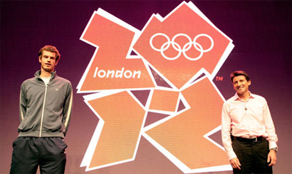
Tennis player Andy Murray (left) and Sebastian Coe.

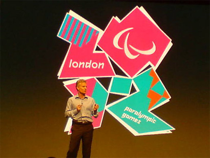
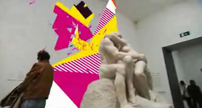
Introducing the Paralympic Games logo.

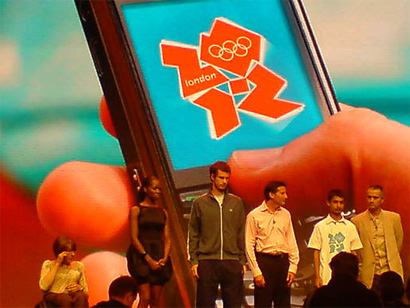
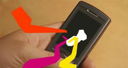
Demonstrating that something will happen on your cell phone.

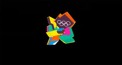
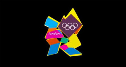
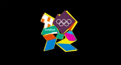
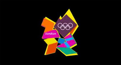
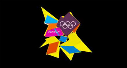
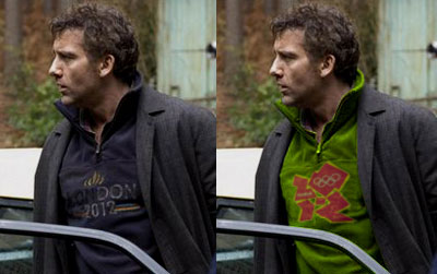
This morning, the London Organising Committee for the Olympic Games, headed by Sebastian Coe (head of the London bid in 2005 and former Olympic athlete), unveiled the identity of their 2012 games at the Roundhouse center (nice logo, by the way). Designed by Wolff Olins at an expenditure of £400,000 (almost $800,000) the logo has been met with expected ambivalence, and, in some unavoidable cases, hatred — actually, so far, in 11,550 cases. A petition is already under way to either redesign the identity or go back to the bid logo. MetaFilter, a mob that you love to hate and hate to love, is questioning the expense. The news has also gotten BuzzFed. In a BBC vox pop, Londoners expressed their dissatisfaction, “No, I don’t like it. I don’t like pink color,” said a woman wearing a dark pink sweater. And, for a laugh, you can read this handy collection of blog quips gathered in an articled titled “The London 2012 logo: the blogosphere is angry”. So what’s the big deal?

Part of the problem is that the logo comes with too much hyperbole, rhetoric, metaphors and inflationist meanings. A few choice clippings from the press release:
The powerful, modern emblem symbolises the dynamic Olympic spirit and its inspirational ability to reach out to people all over the world.
London 2012 will be Everyone’s Games, everyone’s 2012. This is the vision at the very heart of our brand. It will define the venues we build and the Games we hold and act as a reminder of our promise to use the Olympic spirit to inspire everyone and reach out to young people around the world.
The new emblem is dynamic, modern and flexible reflecting a brand savvy world where people, especially young people, no longer relate to static logos but respond to a dynamic brand that works with new technology and across traditional and new media networks.

And Wolff Olins was eager to add their own monumental spin on their own, unbearable web site:
Echoing London’s qualities of a modern, diverse and vibrant city, the London 2012 emblem is unconventionally bold, deliberately spirited and unexpectedly dissonant.
The emblem’s form is inclusive. It can talk to anyone. It has incredible flexibility, yet is consistent. Behind the emblem is a dynamic grid from which comes a distinct visual language. A palette of colours, lines and shapes that create energy, inspiration and interest across every application.

Interestingly, Wolff Olins and the Committe have managed to find a way to deploy all these intentions, and more, unto their (I think) catchy promotional video, (which you can see here in its entirety):


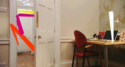
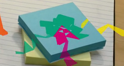
The games will be everywhere. Even in your Post-its!


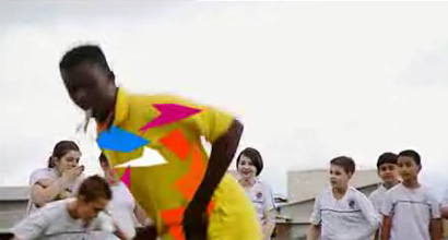
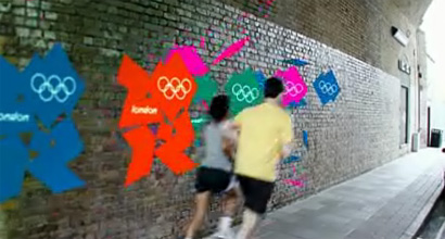
And they will be for everyone!

Clearly, both London’s Organising Committee and Wolff Olins are pleased. One praise that I actually found relevant, more so than the self-inflicted, was by International Olympic Committee President Jacque Rogge [bold emphasis mine]:
This is a truly innovative brand logo that graphically captures the essence of the London 2012 Olympic Games — namely to inspire young people around the world through sport and the Olympic values. Each edition of the Olympic Games brings its own flavour and touch to what is now well over a century of modern Olympic history; the brand launched today by London 2012 is, I believe, an early indication of the dynamism, modernity and inclusiveness with which London 2012 will leave its Olympic mark.
This is where I think the London 2012 identity succeeds. Whether you like it or hate it, the work is extremely unique and memorable. More so than any of the last Olympic Games [pop up] and I would even go as far as comparing it with the 1968 Mexico Olympic program in terms of a radical approach. What Wolf-Olins has been able to create is a visual language that can be implemented across all media without succumbing to boring repetition and, again, whether you like it or not, this is an extremely complicated thing to achieve. Much more to do it in an exciting way. Yes, slowly, I am throwing praise of my own to this identity. I really don’t “like” the basic logo, I feel it’s clunky and ugly (maybe sexy-ugly) and I still have no idea why that loose hyphen is there, smack in the center, but the way it is used and supported by its own unique language is highly rewarding for me.


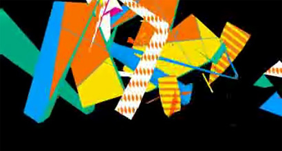
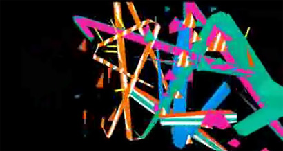
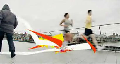
Closing seconds of the promotional video, showcasing the range of executions of the identity.

The influences (intentional or not) of the new identity are clear and evident. And timely. And fun.
Money for Nothing, Dire Straits, 1985.
MTV’s launch in 1981.

Aren’t trends supposed to circle back around every 30 years? The 2010s will mark three decades since the 80s so Wolff Olins may even be ahead of the curve. The Committee has five years to build this brand, and, if Speak Up and Brand New are still around, I think this will be one of the most interesting case studies of brand building and improved perception through consistent and relentless execution. I believe, despite any ensuing boo’s, that this is some of the most innovative and daring identity work we have seen in this new millennium, and the lack of cheesy and imagination-impairing gradients gives me hope that identity work can still be resurrected on a larger scale. What I fear is that we will all see Halley’s comet first, in 2061, before we see any more risks in identity design.
Jump to Most Recent Comment
Andy’s comment is:
Personally, the only thing I see in this logo is quite accurately depicted in the graphic on the below link.
www.demomac.com
In all seriousness, anything attempting to be "street" or attempting to connect with youth in a condescending tone will always be rejected by its target purely because of the nature of its inception.
On Jun.04.2007 at 07:03 PM
Edrea Lita’s comment is:
In all seriousness, anything attempting to be "street" or attempting to connect with youth in a condescending tone will always be rejected by its target purely because of the nature of its inception.
I disagree with this. I don't see the olympic games identity as being condescending. I agree with Armin that the logo itself seems a bit clunky and (working with metaphor here) if it were an olympic athlete, say a figure skater, it would surely fail in the area of gracefullness. But the video really tells of the underlying vibrancy and energy that captures the attention of viewers and is the drive for many athletes.
Everything about it is memorable, but I think the one thing that seems the most disturbing, is the fact that is keeps many of the stylistic features (geometric shapes, neon colours, etc) of designs launched in the 1980s (like MTV) while not contributing enough to be unique. If someone showed me this logo (assuming I didn't know what 'london 2012' meant) I would probably think it was from 30 years ago. Perhaps when the brand is developed more, the brand will seem more up-to-date.
On Jun.04.2007 at 08:05 PM
Drew’s comment is:
I was actually more disappointed with the execution of the motiongraphics in the logo-reel-thing . . .
The logo's shapes lend itself to really dynamic animation but it seems a little TOO erratic for me . . .
On Jun.04.2007 at 08:08 PM
Andy’s comment is:
I think i agree with Armin here. My first thought upon seeing the identity was probably "what on earth is this thing?" but the supporting language that accompanies the mark helps to reinforce it's brandable qualities. The way it lends itself to time-based media is impressive despite it's over-all form at a stand-still.
Even though i understand it less than i have the other olympic logos in the past, i'm still impressed by what they managed to do across such a broad range. Everything from the motion, to the web, and what i assume will be signage, merchandising, and who knows what else.
On Jun.04.2007 at 08:17 PM
Bjorn’s comment is:
I shall begin by saying I love the new logo! There are so many times, that we, as designers wish for something that is outrageous and exciting and rude and garners attention. By the outcry/petitions/more outcry of the general public, dare we say this logo have not achieved that?
The range of applications is amazing, the logo is exciting, not boring like the China "seal", nor like the common Chicago "brushstroke" seen here.
As the committee has rightly put, this logo needs to be able to survive the 5 years before the actual games, and the barrage of the China 2008 Olympics media frenzy, to come out still looking fresh and exciting.
Of all the cities that are "would-be" hosts of the Olympics, only London have the balls to pull something like that off, and they have.
Von Glitschka’s comment is:
A few weeks back the 'International Olympic Committee' (IOC) put the kibosh on Chicago's Olympic logo design thus making themselves an international design by committee.
For those who may have missed this here was a pull quote from an article about the nixed Chicago Olympic logo.
"The edict was included in IOC rules published Wednesday to govern the 2016 selection process. It states that candidate city logos “shall not contain the Olympic symbol, the Olympic motto, the Olympic flag, any other Olympic-related imagery [such as] flame, torch, medal, etc.”
Of course this then begs the question.
Would "Any other Olympic-related imagery" include figures of athletes? What does "etc." mean? Saying "Olympic-related" could mean anything. If so what the hell are they suppose to use for imagery?
London obviously followed this inane art direction and the result is a wet crumpet design solution.
On Jun.04.2007 at 08:39 PM
marian bantjes’s comment is:
Well I'm glad you came out in favour of it Armin, however tentatively, because I thought I was going to have to wrastle you over this one. I confess, on my first look at the logo I laughed out loud (thanks!), but at the same time appreciated it for its wackiness. It's pink (sometimes), it's blocky, it's got piles of attitude: both cute and freakish at the same time.
But that video is brilliant, and if they can pull this off it's a terrific system. I don't see it as an attempt at being "street" at all; I see it as being "other". It is decidedly flying in the face of all the swooshy, soft, representative logos out there. But the way it acts as a placeholder for "whatever" is what makes it. It's very Santa™, so I gotta love it for that.
Which is not to say I love it unconditionally. I'm uneasy about the shifted white shape underneath, and both "london" and the olympic rings look like they were plopped in as an afterthought, but as an argument, these details are uninteresting to me.
Lucky London.
On Jun.04.2007 at 08:40 PM
felix’s comment is:
A coked up Cyndi Lauper in drag called ... wants her gay logo back.
Well, I can't speak for Ogilvy's BIG (and neither can they, they aren't allowed to blog!) but the first thing that came to mind was an iteration of Ogilvy's NYC2012 that hasn't been seen outside that office; it also involved this jagged ribbon like swoosh. I'm sure they aren't happy with this accident.
The loose hyphen is not a hyphen- it's part of the numeral 2... other than that, excellent review Armin.
richard’s comment is:
I am surprised as Wolff Olins is usually quite smart about their design. When I first saw this it reminded me of the PBS Kids show ZOOM, www.pbskids.org/zoom/
On Jun.04.2007 at 09:29 PM
m.kingsley’s comment is:
"and I still have no idea why that loose hyphen is there, smack in the center..."
Armin, it's part of the second "2" in "2012" as it pokes out from behind the zero.
Kudos to Wolff Olins and the unerring confidence of the London Organising Committee. If people feel so strongly about it, then you've done your job. And I often say that it takes a strong man to like pink.
On Jun.04.2007 at 09:29 PM
Flaherty’s comment is:
Hmmm, xtra Chunky. Certainly not your run of the mill logo. At first I was thinking it too complicated, maybe it's growing on me.
Same with the low tech vid technique, at first I thought it was cheap, second viewing it's more interesting for some reason.
I can understand people not liking it.
Danny Tanner’s comment is:
This seems entirely style driven.
It's "meaning" feels entirely contrived and forced, but it's memorable.
I suppose if someone made a disco ball the olympic logo, or for that matter pooped on my living room floor, I would remember it too.
Memorable doesn't equal good.
Clarence Yung’s comment is:
Style as rhetoric? It seems like the most interesting part of the logo is how different it is in comparison to a traditional Olympic identity or branding idea. The style seems a little too much of a riff on the 80's, overstyled if you will (jagged linearity AND fluorescent color -- seems too much of a conscious decision to use a manner and method similar to the designers of New Wave records in the 80's). Yet there is something very interesting, something radical about going so counter to the easy, almost corporatist identities of the past games. It's obvious that the identity serves as radical rhetoric, even while wrapped in miles of PR-speak. And it works to an extent -- the hatred, the commentary, it gets people talking about the games, even if they're not getting the overt message. Ultimately, one gets the sense that Coe and Co. have more tricks up their sleeves to liven up the traditionally-staid games.
As said by previous posters, it is interesting in terms of performativity (eye-catching, weird, almost panopticonic?), but I don't think that's what makes or breaks this identity. It's how style is used as overt rhetoric (which in and of itself is radical in a time when it seems that any style is OK).
On Jun.04.2007 at 10:00 PM
Prescott Perez-Fox’s comment is:
I feel like I'm caught in a episode of "3-2-1 Contact"
On Jun.04.2007 at 10:32 PM
Jerry Kuyper’s comment is:
"Designed by Wolff Olins at an expenditure of £400,000 (almost $800,000) the logo has been met with expected ambivalence, and, in some unavoidable cases, hatred..."
This is precisely the type of loose comment that we criticize the business press for making. Was it $800,000 for the logo or $800,000 for the strategy, planning, presenting and refining the logo? Did it include the animation, the design system and standards? Depending on the answers it could move from being ludicrously overpriced to a real bargain.
"What I fear is that we will all see Halley’s comet first, in 2061, before we see any more risks in identity design."
In investing there is the classic risk and reward pendulum. Perhaps we should ask our clients to chose from a similar scale. Do clients and their audiences really want risk or do designers want to do risky design?
I recently reviewed over 6,000 logos as a member of a jury. Let me assure you designers are taking extraordinary risks with their clients and their businesses. They are risking clarity of concept, legibility and in many cases, common sense.
Personally I find the animation to be fascinating although the dive splash segment leads me to believe the designer thinks a cannonball would be an award winning dive. I think the animation would be even more effective if it concluded with a more refined and legible logo. Let's not forget the logo has to work in numerous still applications as well.
"The emblem’s form is inclusive. It can talk to anyone"
Given the numbers of people with differing languages, alphabets and writing systems that live in London and will attend from every part of the world, I find the lack of legibility troubling. Not only do I struggle with ZOR (or 2012) but I can barely read London at one inch on their official site.
Don't believe me, ask your mom what she sees in this logo.
On Jun.04.2007 at 10:33 PM
richard’s comment is:
I am surprised that this came from Wolff Olins, not as the chosen designers but for the results. Then again, perhaps i just am too common to recognize the genius, but from previous comments, it sounds like I am NOT alone.
First look it reminded me of the kids show ZOOM, www.pbskids.org/zoom/
On Jun.04.2007 at 10:35 PM
Edrea Lita’s comment is:
I don't mean to be crass, but a number of people I've talked to today pointed this out... doesn't the logo kind of look like a person kneeling into a guy's crotch? (the woman is on the right). Perhaps I'm just looking at it too hard.
On Jun.04.2007 at 10:42 PM
marian bantjes’s comment is:
I really don't think legibility matters here. If it was wayfinding, yes it would be a problem, but in this context* all people need is to recognize it, and they'll have no trouble doing that. 2012 is the most abstracted part and the least important: it's impossible for me to believe that anyone in the world would accidentally miss the London Olympics because they didn't realise they would be held in 2012. The shapes both look and act like a puzzle and give that aha moment when you see the numbers. And given the numbers of people with differing languages, alphabets and writing systems that live in London and will attend from every part of the world, I think this identity will serve them well in that they don't need to read it. With something as heavily promoted as the Olympics, in all honesty anything would work. You throw it at people long enough and hard enough and they'll recognize it and even buy the t-shirts, no matter what it looks like. The interesting part of this as an identity is how they'll be able to play with those shapes, and after 5 years probably any irregular triangular multicoloured graphic in London will come to signify the Olympics—which could also be a fun puzzle for savvy bootleg marketers there.
*Note to young designers: be aware, however, that when designing an identity for your local hair salon, or any business that won't be massively and relentlessy promoted as the Olympics, a design such as this could indeed be irresponsibly disasterous.
On Jun.04.2007 at 11:08 PM
marian bantjes’s comment is:
Edrea: Actually, I think it looks like Mother Theresa.
On Jun.04.2007 at 11:11 PM
joel’s comment is:
I know its terminally uninsightful, but Vanilla Ice and Run DMC are the last things I want to think about when I see the Olympics.
Brendan’s comment is:
Quite possibly thee worst LOGO ever created for a major mainstream event.
On Jun.04.2007 at 11:24 PM
Von Glitschka’s comment is:
I am starting to think this design is in violation of the IOC own rules of design engagement?
"The edict was included in IOC rules published Wednesday to govern the 2016 selection process. It states that candidate city logos “shall not contain the Olympic symbol, the Olympic motto, the Olympic flag, any other Olympic-related imagery [such as] flame, torch, medal, etc.”
Wouldn't this 'shard' logo violate the "shall not contain the Olympic symbol" clause?
The more I look at this logo, the more it reminds me of those pre-continental drift maps where they try to fit all the land masses together....but with over-satured colors of course.
On Jun.04.2007 at 11:27 PM
Jay Neely’s comment is:
The best review of it I've seen so far is the reddit headline: London 2012 Olympics Logo resembles Lisa Simpson giving head.
On Jun.04.2007 at 11:47 PM
nic’s comment is:
It's antilogocentric!, ok, a day has passed and the logo is still hideous to me but, what is behind the campaign and sustaining the logo... seems to be, really, really, intelligent. This seems to be a hard-core deconstructivist campaign that is actually working (!)... in fact -Acting- and not merely -seeming- transgressive.
There's the -I believe- wrong impression that Design is an activity that revolves around -pretty[ness]- as a notion, as opposed to being the space-creating social practice that it, in fact is. Humpf!, so, an active and realistic expression of deconstructionist theory actually acting as a form of design and in fact developing and enhancing social space and open-ended meaning?; Not resting beat on a safe and detached canvas or lying dead as an intellectual manifesto?. You know, but instead actually performing it's pragmatic/programatic charms in front of our eyes??. That sounds really promising.
Frank’s comment is:
I don't get this logo.I really don't get it.Admitted i didn't read the rethoric nonsense that "explains" the logo but it doesn't matter because a logo that *needs* that much of detailed explanation is a bad logo anyway.
I don't care if Wolff Olins made it or a 15 year old kid after school - this is a bad logo and anything paid above $80 for this crap is money burned.
Is my mum really supposed to look at this logo and have the slightest idea what it's for ?
Really - don't fool yourselves y'all; just because a star agency did it, it doesn't mean it *has* to be good.
In fact, it's awful.
On Jun.05.2007 at 12:05 AM
artMonster’s comment is:
Looks like a tangram, perhaps Tangerine Dream can do the music...
On Jun.05.2007 at 12:07 AM
Daniel’s comment is:
Ugh...
I suggest Banksy designs the logo! Actually, he'll probably do that all by himself and for free, if he hasn't already
On Jun.05.2007 at 12:12 AM
Rob’s comment is:
I certainly saw echoes of ZOOM, a PBS show that started in the 70s. So, if the goal is to relate the Olympics via this mark to the 12-16 set, the great they've got a good head start. And sure, I'll applaud the guts it took to put it out there but...
I still believe ledgibility does matter. And this mark has little. And even more so, I think it does nothing to promote the Olympic spirit. To quote brand guru Tony Spaeth, "it's pure attitude, designed to intrude and degrade." And to me, it borders on the antithesis of the Olympic spirit. And instead of talking about the Olympics, we and it seems a large part of the world, are discussing the merits of the logo.
So far, I feel there is a major element missing and that's an emotional connection. Having viewed the web site, the video and studied the logo for to many hours, I still get no emotion out of the whole visual presentation. The ribbons, mimicking the flow of the Thames, are neat but they don't sing. At least not yet.
Yes, we can applaud the gutsy move it took to put this out as the face of the London Olympics 2012. But to declare it a successful solution will take time and in the end, economic results.
On Jun.05.2007 at 12:27 AM
Su’s comment is:
Add me to the list of people who said, "What the hell is that thing?" on first view. I don't think I like it, but I also think it's going to be a bit like the VH-1 logo redesign. (And wasn't that a fun thread...) You haven't really seen it in proper use yet. It'll settle in and people will learn to accept it. Is that a good thing? Not for me to decide.
And instead of talking about the Olympics, we and it seems a large part of the world, are discussing the merits of the logo.
*sigh*
If a logo design gets unveiled and a designer makes a post at his design blog for a bunch of designers to comment on, exactly what else do you think is going to happen? Go discuss The Olympics In General someplace the Olympics are being discussed. If you look real hard, you might also find an economist crabbing about the expense, and some lonely person in their comments wanting to talk about what the logo looks like.
Joe Moran’s comment is:
Off with their heads!
Pink ?!?
VR/
On Jun.05.2007 at 12:52 AM
Su’s comment is:
Oh, and Von Glitschka, the violation you cite I think only applies to applicants for the games. London has been awarded the location, and can now make use of the various symbols.
On Jun.05.2007 at 12:55 AM
Mark Notermann’s comment is:
I'll add a YES vote to the noise, for reasons well enough stated previously.
Von G— There is a big difference in rules governing candidate cities from host cities. That probably explains the discrepancies.
On Jun.05.2007 at 01:12 AM
thinsoldier’s comment is:
I have to disagree about it being more memorable than past logos.
http://www.underconsideration.com/speakup/archives/london2012_pastlogos.html
I clearly "remember" the Beijing Logo and it isn't even 2008 yet.
On Jun.05.2007 at 01:21 AM
Nerg’s comment is:
It's a mess, the ugliest thing I've seen in ages. We could have produced a wonderfully inspirational piece of artwork or some delight ful typeography. Instead we got this
http://nergalicious.wordpress.com/
On Jun.05.2007 at 01:59 AM
Von Glitschka’s comment is:
Mark & Su said "There is a big difference in rules governing candidate cities from host cities. That probably explains the discrepancies."
Gotcha. I read through the mind numbing IOC doc and it never said anything about that but you're probably right.
I just love how large branding agencies wrap layer upon layer of psycho-babble around poor design in order to sell it as 'Innovative'.
No really you'll accept the brand equity and be enlightened when you see it delivered in all it's animated glory zipping around Southampton or the London Bridge.
If the original AOL logo and the Colorform brand had a fling this would be their rebellious and ugly love child.
On Jun.05.2007 at 02:35 AM
Jeff Gill’s comment is:
My nine year-old son will love this, as I would have when I was nine. That's a good thing.
On Jun.05.2007 at 04:26 AM
Christian Palino’s comment is:
Great review Armin – and I have to admit that I had the same reaction. At first, I laughed when I saw it. Then the reflection upon its strengths and uniqueness worked its way in.
Given the many, many logos we see these days – for new products and services and redesigned products and services – most of them look like some other logo and/or have adopted the trendy styles of the moment. The 2012 olympic's logo has its own vision and its own, unique voice – more than we can say for almost every other new logo.
Regardless of aesthetic taste, whether you like the visual language or not, this olympic logo works extremely well (as seen in some of the iterations in video, etc) at creating a memorable, unique mark that sets itself apart from other olympic logos and other brand projects in general. I am in agreement that the legibility of 2012 is entirely irrelevant for the olympic logo – its not information that needs to be communicated in the logo mark as it is everpresent.
Well done. Its great to see design work getting through for the masses that doesn't have to make them all happy, warm and fuzzy because what they are looking at is familiar and uninventive.
Mark Notermann’s comment is:
Von, I didn't see Su's post...sorry for the redundancy.
-----
Not as if there's any need to fuel the fire, but the audience has been invited to join in the branding festivities. If this sort of thing strikes a nerve for you, does it make a difference whether this is a competition or simply a gallery?
Marcus’s comment is:
Aren’t trends supposed to circle back around every 30 years? The 2010s will mark three decades since the 80s so Wolff Olins may even be ahead of the curve.
It's because this theory of culture exists that it does become true. For almost a decade our media has been trying to force us back to 80's styles. Yes some of these examples of 80's bad taste that we were laughing at post 80's, are creaping back in to fashion because of the fickle world that fashion is. All because somebody has said "80's will be all the rage this year"... every year for the last 10 years!
Why go back to tacky 80's design that has for so long been laughed at and regarded as poor? It looked like that then because it was all that the wonderful new technology of the time was capable of!
On Jun.05.2007 at 04:41 AM
Mark Thomas’s comment is:
It's memorable because it's spectacular crap.
On Jun.05.2007 at 05:15 AM
Armin’s comment is:
> This is precisely the type of loose comment that we criticize the business press for making. Was it $800,000 for the logo or $800,000 for the strategy, planning, presenting and refining the logo
Jerry, you are absolutely right. My bad. In my head I did have it registered as $800,000 = Design fees + production + research + launch knick-knacks + web design + event. I missed to point that out.
And thanks to everyone for noting that the hyphen is part of the 2, I did realize that, it's just a little too broken to be part of that 2.
> And even more so, I think it does nothing to promote the Olympic spirit.
What is the Olympic spirit? Hope? Courage? Brotherhood? Excellence? I really have no idea. The Olympics are a big ass event that needs an audience. The audience is changing and so must the Olympics.
On Jun.05.2007 at 06:33 AM
Al Woods’s comment is:
Oh dear.
First impressions were I seriously hated the logo, it looks like a really crappy first attempt at graffiti. I used to do graffiti when i was way younger and our earlier attempts at pieces didn't look that far from this logo. Out of proportion, ugly, clumsy and uncool.
Admittedly, when i read this article I could see the reasons for the direction and the stills form the video looked pretty good. Then i watched the video and they messed that up too, apart from a few cool parts like the runners being chased at the beginning and the fragmented footprints. Its just too controlled in parts, it should be way more insane and explosive to capture the energy they are supposed to be aiming for.
I read a great comment about it looking like "a logo designed for young people, by old people, that don't understand young people". Too true.
Love flat colours, love the energy angle but the pay off with the logo just sucks.
There are so many great graffti artists that would have created a much better version of this logo and would have jumped at the chance for a commission. We all try to achieve a look with certain designs but something of this profile should have been left to the professionals.
On Jun.05.2007 at 06:51 AM
steve’s comment is:
Lisa Simpson giving head indeed. Here's a variant of the logo that makes it abundantly clear:
http://www.flickr.com/photo_zoom.gne?id=530097549&size=o
Nathan Philpot’s comment is:
I like it. It is something none of us expected.
On Jun.05.2007 at 09:04 AM
Jill Paulson’s comment is:
"The new emblem is dynamic, modern and flexible"...maybe so, but it's just plain ugly!!
On Jun.05.2007 at 09:15 AM
Tselentis’s comment is:
Eeeeek. Cue VH1's 'I love the 80s' theme!
On Jun.05.2007 at 09:24 AM
Unnikrishna Menon Damodaran’s comment is:
indeed pink is very appealing.
a casual pen tool (Adobe Illustrator) zig and zag
excercise of a beginner can make a logo.
why not?
may be this is going to be a trendsetter for the event logos.
let me see the brief, Wolff Olins.
On Jun.05.2007 at 09:29 AM
Nic’s comment is:
I'm totally for the campaign; I say that design is not there to make us feel better about life, or to provide the public [or the design community] with the cozy and reassuring feeling that aesthetic joy goes hand by hand with things 'making sense', neither is art. I'm curious though to see if the polemic here moves on, to the aesthetics of ""-bad-"" design. Academically this might look like an ok push for a post-structuralist mesh aimed at inciting socially significant meaning, but , If judged with the tools of graffiti, looking at it from a skater-philosophy view-point, comparing it to things by Jeff Koons, or Frank Gehry, Basquiat... even. [even more that those guys are now "celebrities"] in badness.
I think that THERE, this guy can be fried. I am too for Bansky's logo.
Steve’s comment is:
Nothing to get overly excited about.
Any 5 year old given enough encouragement and few crayons could have come up with something similar, probably better.
In all honesty I don't know what was wrong with the logo used to win the event. It said everything.
I think you have spent far too much money on something that isn't going to be appreciated when it could have better been used elsewhere.
On Jun.05.2007 at 09:34 AM
AL’s comment is:
I like it, too. It's crazy, it's positive, it's bold and memorable. It's the 2012 logo :)
On Jun.05.2007 at 09:35 AM
Mark’s comment is:
What to say, what to say.
Well at first this logo was hideous to me, but now after seeing the possible influences that went into it, it's making more sense.
Certainly evokes the 80's (BTW I've think the song Money's For Nothin' would be a perfect soundtrack for this logos promotion it just fits.) a decade I've sort of lived in, I was born in 1987 late 80s I remember pretty well.
What comes across to me from this logo is like it or not it is innovative, it takes every logo cliché you've ever thought about the Olympics and logo design and throws them out the window.
Funny how this logo also evokes a decade which was also innovative in terms of music,fashion, and design. The 80's was a huge period of change everything old was out, new was in.
I find this actually refreshing for todays era which since the late 90's and the Millennium hasn't been really innovative since. Most of todays culture has been about the same old rap music, "bling, bling", techno, or some type of metal music that mainly involves people screaming on top of their lungs, Mtv and Vh1 have become a channel for reality shows that make zero sense at all, and kids are supposed to now be into adult fashion culture before they have any clue what being an adult really means. (aka Bratz, Boyz, and some other franchises similar to this)
So yeah, you may disagree with me but I think the designer should be given credit for at least taking a risk, and kudos for them for evoking a decade that at least made more sense and brought in new ideas.
However I this more as a promotional logo rather than a representational logo for the games, if it becomes the representational logo it might perhaps change the games image to be more accessible to everyone, rather than an a few exclusive people in a demographic.
On Jun.05.2007 at 09:40 AM
C-Lo’s comment is:
Very 1984. Looks like it can be used anywhere, but would you want to use it? I would, but not for the Olympics. Maybe for a retro concert or something, but def. not the olympics. It looks like I'm watching Max Headroom. Now the lines following the people in moderation was good. I liked that, but cut out 75% of the boops and blips sounds please. the runners were good, the diver had entirely too much going on. That was ruined for me.
Only after it was mentioned do I see the girl "slobbin the knob" as it were.
Overall, A D+ . Barely adequate in some circles, failing in others (most apparently)
On Jun.05.2007 at 09:43 AM
ThorNYC’s comment is:
"powerful, modern... dynamic... inspirational... dynamic, modern and flexible... dynamic... new... modern, diverse and vibrant... unconventionally bold, deliberately spirited and unexpectedly dissonant... inclusive... incredible flexibility, yet is consistent... dynamic... create[s] energy, inspiration and interest"
The last time I read language like that it was in The Emperor's New Clothes. Hey!
And in addition to being dynamic, it's ugly.
On Jun.05.2007 at 09:44 AM
Joe Schwartz’s comment is:
When this was brought to my attention by one of my students, I immediately made everyone stop, found the logo and flashed it up on everyone's computer. Asking what they thought, the immediate reaction was of disgust. Some of the students didn't see the "2012" right away, some were repelled by the use of color and some noticed the departure from an Olympic color scheme. After they heard how much was spent, laughter ensued. If my students are typical of the youth-oriented target audience that was sought, this did not pass the focus-group analysis.
Through my time at the NBA as Senior Art Director I know how much goes into the research, development and trademarking of symbols such as this. I disagree with some of the comments that the supporting media only serves to enhance this logo's value. If the symbol cannot stand on its own and accurately represent the games and the host, it wasn't worth the time, effort or certainly the money. Ten years of working on NBA All-Star Game logos with Tom O'Grady taught me that - it's Logos 101. After our departures in 2002, the change in approach that the NBA took became obvious in that they reverted back to the typical, stale logos that were prevalent before Tom took the reins in 1989.
While some may claim that the London 2012 logo is a visual challenge to the viewer and thus will spark interest and discussion, it does not seem to be a viable solution to the problem that was presented. The use of colorful TV spots, bleeding edge animation and the typical sale of Olympic products will only serve to mask the fact that this solution was not worth the $800,000 that was spent. It is the design world's equivalent to watching the movie "Jackass" - a good deal of money spent on something not worth spending money on.
On Jun.05.2007 at 09:47 AM
Darrel’s comment is:
Seems that too many graphic designers are doing the unspeakable: judging the logo out of context of the broader identity system and marketing campaign.
The logo, itself, it OK. Mechanically it has some issues. Aesthetically some folks will like it, other's not. But in the context of the campaign, it seems to work quite well.
I also think the hatred being spewed at it isn't really a bad thing. It shows that the logo has garnered attentions. A blander logo likely would have received little push back but also would have likely been a poorer solution.
On Jun.05.2007 at 09:57 AM
Mark’s comment is:
Even though I like the logo, I hate how it's animated in the brand video, it's nightmarish,freaky,a plainly unbearable to watch.
I had to scroll down several times because it was too garish and bright. bright colors and flashing too much is torturous to my eyes.
ouch ouch ouch.
NOT SUITABLE FOR ANYONE PRONE TO EPILEPTIC SEIZURES!!!!!!
looked like a bunch of computer glitches, they could possible tone down the colors and flashing a little bit more.
ech, ad sends the wrong message.
On Jun.05.2007 at 09:59 AM
Frank’s comment is:
I believe the "hyphen" represents old London, what's often called "The Square Mile" that's right at the heart of the city.
What most people think of as London is officially several cities, notably London and Westminster, and I'm not sure, but the other numbers may represent those other districts as the square represents the Square Mile.
On Jun.05.2007 at 10:00 AM
Darrel’s comment is:
"It is the design world's equivalent to watching the movie "Jackass" - a good deal of money spent on something not worth spending money on."
A rather poor analogy given the success of the Jackass franchise.
On Jun.05.2007 at 10:00 AM
diane witman’s comment is:
Al Woods: I agree with your entire post!
The logo at first glance literally made me gasp! I'm sure there are plenty of good reasons that they took this route, but what about the every day person who doesn't give a crap about why something was designed? The general public is going to be completely confused by this choice and left feeling even more disinterested in the Olympics.
I think this logo will be laughed at, possibly be embraced by those who loved legwarmers, endless clouds of Aqua Net hairspray, and MTV. Trends, trends, trends.
I give Wolff an A for effort but he as alienated the general public. And has he or his team even thought about the demographic who actually watch the Olympic games? I'm in my 20's and the Olympics are not in my top 5 list of things to watch. Usually it's people sitting around in elder care establishments or left on tv's at restaurants.
I just don't think this was a great direction. Good luck to them, I hope they can pull it all together and build something amazing and maybe even nab some viewers.
On Jun.05.2007 at 10:00 AM
agrayspace’s comment is:
By popular design standards of the day, formally and conceptually this is a disaster. Though it just may confirm a suspicion I have had for a while.
A brand is all about execution, repetition and experience. A stinky moldy cheese that has no right to call itself gourmet food can have a postive brand image if its supported by enough user experiences in which its shortcomings are exploited to make it distinctive and memorable.
I think Armin is right. This just may be the most compelling brand building experiment we have seen in a long time.
On Jun.05.2007 at 10:18 AM
Nic’s comment is:
This is to complement Diane Witman's comment. They have a program to expose the "logo problem". On their website they have something like a -wordit- open for whoever to mess with the idea of the logo. Also it says that there will be a campaign to look for the logo on whatever streets or something. It seems that they are precisely looking hard, for that very young audience, those for whom this would be the first Olympics. Plus, and there's where I begin to object with their paternalistic approach, it is stated that the logo is not finished and that it will change. They are presenting this as -the brand of the people in that cheesy post-marxist English style. ... Yuk! to that.
ummm... Where's Pesky's comment?
Don Whelan’s comment is:
What a minefield with this one! Like most, I despised and derided the new logo at first sight. As a logo, an aesthetic expression, it's a joke. Undeniably ugly. Utter garbage. But the video does explain it, and makes clear the clever vision and plans of the agency and of Sebastian Coe.
The possibilities a logo and a treatment like this presents for the overall branding of an event are astonishing... It is the culmination of the road down which Atlanta's Iconologic has been tirelessly shepherding the IOC for over a decade. (I am speaking mainly of the essence of the video, and to my knowledge, Iconologic has not been involved in London's design execution.) In the sense of the visual feast that the Olympics have steadily become since Los Angeles, and especially since the Games of the 1990s, London -- if this new branding experiment goes forward -- will put to shame all previous efforts. The Look of the Games will be everywhere and on everything, and this mark (the video, more so) will set forth an endlessly interchangeable and flexible palette of color and shape, adaptable to just about anything imaginable. In terms of the mechanics of brand extension to multiple surfaces and "screens," it is a triumph of design. The mark we see today is obviously not a final, concrete symbol. The branding of an Olympics is thorough and multifaceted, disciplined in its omnipresence. The Look evolves and proliferates over the seven years from the awarding of the Games to the Opening Ceremony, and the mark itself becomes merely a primary character in an ensemble cast.
If you haven't been to an Olympic Games, I can assure you that being there is one of the most incredible and overwhelming visual and sensory experiences possible without serious chemical alteration. There is an unmistakable sense of being at an enormous, momentous event, one that the whole world is watching. Part of this is the excitement that comes with knowing where you are, the crowds surging around you, the languages, the buzz. But the way a city is dressed up for the event, with art and graphics - The Look - is fantastic in its scope and dynamism. Here are some (fairly poor) recent examples of environmental design at Olympic Games, starting with Iconologic's first involvement, in Atlanta. (If anyone can contribute earlier examples, especially from L.A., it would certainly add to the conversation.) 1996 | 1998 | 2000 | 2002 | 2004 | 2006 Every surface seems to be part of the event, especially at the venues, but throughout the city as well. It's quite thrilling, and it has been expertly executed and, moreover, appropriate to the ideals of the Movement, to this point.
As Marian suggested, the text legibility of the new London mark itself is irrelevant to the event, and probably to the promotion of the event as well. Jerry, I agree that "London" is absurdly small. But I also think that all anyone has to do is see the type once, and they will forever know the shapes and colors as London 2012. It's unmistakable, just as the concentric lines of Mexico '68 are (brilliant correlation, Armin).
It may very well appeal to the younger set: "punk kids", living in the crazy visual overload of snowboarding and graffiti. To a degree, this is spot-on for the purpose: the Olympics are a celebration of the Youth of the World and the future promise they represent, and if kids aren't interested in the Games, then we'll just be cheering on yesterday's athletes as they go gray. As every Olympiad closes, the IOC President declares: "I call upon the youth of the world to come together in City, Country, in four years time..."
But... Is this ugly, jagged, aggressive, violent visual direction right for what the Olympic Games are and are supposed to be? Is a graffiti aesthetic an appropriate symbol for our best aspirations as humans? Is this really where we want our global society to go? Jagged shards of color soaring through the sky, like so much shrapnel? There's no grace or beauty to it. Just video games, action-packed, quick-cut explosions of kinetic energy, "full of sound and fury, signifying nothing," to borrow from a particular well-known Englishman. Where is the poise of the gymnast, the strategy of the 10,000 meters, the patient dance before the release of the fencer's lunge? All we see here is the landing of the shot put -- pure force, no balanced spin before the throw. Tell me, Wolff Olins, where we find the hope of the athlete's family for his dreams to come true? That feeling we all get in the pit of our stomach as we cheer on a swimmer and watch improbable victories occur?
This is the Olympics as pure MTV-style entertainment (it's clearly a deliberate aesthetic descendant of MTV), with no greater meaning, no striving for anything more. The designers and the organizing committee wanted something that would leap well beyond the realm of anything that's been done for a Games before, and, by gum, they've gotten it. The problem is they may just have jumped off a cliff with it, guns blazing all the way down.
On Jun.05.2007 at 10:27 AM
Jon H’s comment is:
There's a lot of discussion about the London 2012 logo being ugly. There seems to be an assumption that it should be beautiful, or elegant, just because it's a high profile logo. If being 'ugly' is a conscious design choice then there's nothing wrong with that.
I don't love the 2012 logo but I admire what has been done with the brand and I understand why the logo looks the way it does.
The logo is loud, brash and ugly because London is loud, brash and ugly. It would have been easy to create a brand filled with the stereotypes of tourist London but the designers have created something that feels closer to the real London. The London of Brick Lane, Smithfield and Brixton.
The 2012 Olympics are London's. They're not England's or Britain's or the UK's. Wolff Olins have created a brand (and by brand I mean the visual system, tone of voice and concept, not just the logo) that embodies the noise, brashness and energy of London. It's two fingers up to the dry corporate design we've seen at recent Olympics.
They've also create a brand which is considered so it works well on-screen and in motion. It will adapt and change over time and the way it works with corporate sponsors is innovative (this can be seen in the Lloyds TSB sponsorship advert that ran in this mornings papers). All these things are positive steps forward.
The London 2012 logo has balls. In an age of safe, all inclusive corporate design, that can only be a good thing.
On Jun.05.2007 at 10:31 AM
Jared’s comment is:
Memorable? So is September 11th. It is not an accomplishment to create an identity that is memorable when that lasting impact is accomplished by a horrendous visual assault.
But the telling sign of this identity's failure is all the hullabaloo surrounding it. Promotional videos and inflated prose about how vibrant and exciting it is smack of The Emperor's New Clothes.
I'm not buying it.
On Jun.05.2007 at 10:36 AM
Don Whelan’s comment is:
In the interest of accuracy, I need to add that Iconologic did not design any of the previous Games' marks, but in their advisory role ("brand consultants") with the IOC they have influence over the greater graphic execution of Olympic Games - the Look of the Games - hence my attribution of the visual trend to them.
On Jun.05.2007 at 10:49 AM
Nic’s comment is:
About Don's final paragraph and the lingering questions about the lost Apollonian synchronized virtues of the Olympic ideals. What is the purpose of participating in a totally post-hierarchical forum like this, made of mostly non orchestrated threads, to make the point about hierarchy and orchestrated linear achievement? I don't like this myself [either] but, we are becoming mass! without this phenomenon open-source, wikipedia, my-space and you-tube wouldn't exist and function. We are headed there, and the agency in charge seems to know that.
On Jun.05.2007 at 10:54 AM
Jürgen Siebert’s comment is:
Another »rare positive view« from Germany:
http://www.fontblog.de/london-2012-will-doch-nur-spielen
Don Whelan’s comment is:
Nic: I agree with you in that the overall campaign is probably right for the times, robust, and actually pretty fascinating in its potential ... but I'm not convinced by the aesthetic, and neither are many English, it seems. I just wonder if there was another way to go about it. Jon H also makes a good point about brashness and London, and while it's very important to convey a locality's characteristics in an event like this, the undertaking does not necessarily come out rosy on that basis alone. Witness Atlanta's legacy. Sub-par mark, lovely graphics, but torpedoed in history by the aesthetics of things largely outside ACOG's control (street vendors, a bomb, etc.).
Still: London's mark doesn't say much on its own other than "I'm in your face," which is great for Ultimate Fighting but maybe no so great for the modern Olympic Games.
On Jun.05.2007 at 11:10 AM
Jake’s comment is:
This really just looks like some kind of 80's American "rock 'n roll" Trapper-Keeper or something you would glimpse in the opening credits of Saved By The Bell...
It's definitely better as a single color, but way to jagged for me.
On Jun.05.2007 at 11:11 AM
Al Woods’s comment is:
I think one major thing we can see here is individuals opinions changing slightly, the more we look into it and discuss it, the more the 2012 direction seems to make sense.
Take part of Don's comment: '...video games, action-packed, quick-cut explosions of kinetic energy, full of sound and fury, signifying nothing...'
This is actually what makes the now interesting, this is what youth wants. Quicker, harder, faster, brighter...no time to think too hard about it, quick fix disposable pick up and play lifestyles. We look at it this way and the IDEA is perfect.
Conversely, no matter how much we discuss it and over analyse the reasons and the boardroom bullshit that makes the money men blind to what is in front of them...the simple fact is, purely from a 'does it actually look good' stand point, the logo just looks shit.
Going back to the pitch logo with the bland London text and the Olympic ribbons flowing through them, this could have been developed further wih some success i reckon. If you've seen the BMW crazy flowing lights ad on tv you can imagine these ribbons being created from light, swirling and flowing through the city in ways that project the movements of the different Olympic events. Obviously this would have cost a fortune but would have been way more appealing to the greater audience and have a feeling of quality to it.
Everyone digs a cool lightshow.
On Jun.05.2007 at 11:24 AM
Leo’s comment is:
Horrendous. Typifies the hipper-than-thou race over the cliff of absurdity that has thoroughly infected every aspect of art and design. The more obscure, inaccessible, ugly, and off-putting any piece or image, the more the self-perpetuating art insiders can smugly congratulate themselves on their exclusive, inward-looking cult and scorn ordinary people who simply want something nice to look at. The incredibly tiresome and dreary ritual paeans to the all-pervasive cult of diversity (with not the slightest reference to the rich history and culture of the great city of London or of the great English people), as well as to the older cults of pointless freneticism and youth-worship, are predictable. Sad a city and people are so ill-served and ill-represented. In a way, however, it does show its time and place - think of London's recent "art" exhibits such as the one consisting of the empty room with a light going off and on, or of the pile of garbage meant to be seen as "art" but inadvertently carted away by a janitor possessed of unfashionable common sense.
On Jun.05.2007 at 12:14 PM
Sheepstealer’s comment is:
A logo should be a signpost that leads to a brand. So what is the “Brand” of The Olympics?
Hard work, world unity, precision, grace, excellence, achievement, energy, competition, sportsmanship.
Well, at least the logo has energy.
But here's what's going to happen. It's going to wind up connected to videos, shopping bags, tshirts, motion graphics, medals, those little bio-videos that show us the hardships of the athletes' younger lives. Then, by association it will gain ALL of the attributes of The Olympic Spirit.
Sure, she's a dog at first glance, but once you get to know her personality, you won't be able to help but fall in love with her.
On Jun.05.2007 at 12:27 PM
Leanne Johnson’s comment is:
It's far too dated already. Everyone and their dog are jumping on the '1980s are back in fashion!' bandwagon here in the UK and it's reached saturation point already. In 5 years time, this logo will not be trendy, and cool and new (not that it is already) so they've missed the boat on that one.
But my biggest gripe with it is - it says nothing about Britain. Nothing about sports. It's too reliant on this 'dynamic' trend and nothing else. Take away its elements and there is no clue it is for the Olympics, for sports, or for London. It almost looks like they've copied the animated parts from Queen's 'It's a Kind of Magic' video.
(and re: the cost - people need to know just how much a proper branding costs, and stop moaning about how 'your nephew does the same for £100'. They don't)
On Jun.05.2007 at 12:37 PM
Coudal’s comment is:
Here's what we're thinking about this issue at Coudal Partners.
On Jun.05.2007 at 12:39 PM
marian bantjes’s comment is:
I am stunned that anyone claiming to know an iota about design would think that the development of a logo involves drawing a shape and asking for $800,000. If you think [the fee] = [1 visual representation] get thee back to school.
I am equally stunned that anyone would think that some shapes are worth more than other shapes. As though, if this logo had some swoops or swirls it would be OK. Tell it to the square or the circle.
I'm unconvinced of the notion that the logo should or even can embody the "spirit" of the games in some "uplifting" way. Or that it could convey all of the various sports involved. I think we've seen enough human figures with arms uplifted.
As for the criticism that it is "the 80s" ... PUHLEEEZ, does this mean that designers are forever locked out of using hard edged shapes and bright colours for fear of looking like "the 80s"? That's a vast set of iconography you just whiped off the visual table for a completely idiotic reason.
What this logo represents to me is a system of action. It has asymmetrical shapes which, while static, seem to move (bullshit blowjob graphics aside; you can find the smut in anything if you look for it). But more importantly, as perfectly evidenced in the video, the shapes will transform and change and create a look for the games that will be immediately recognizable.
What the $800,000 buys is this energetic system, and the thought and trial and error and late nights that went into coming up with a system. The system is the most important thing for something of this size with this much publicity and the thousans of different types of surfaces and uses it needs to accomodate.
If this were just a logo and their plan was to slap it on everything in sight, the job would only be 1/10th done. But it's not: it's a flexible system of shapes which stand out, have energy and vibrancy, and coalesce into a unique, identifiable logo.
What more do you want for less than a mil?
On Jun.05.2007 at 12:48 PM
Doug B’s comment is:
As of Tuesday 6/5 at 1pm EST USA, there are already 25,500 signatures on an online petition to change the logo, after only one day, here.
note: I am not going to click on the shameless Coudal link above.
On Jun.05.2007 at 12:49 PM
Coudal’s comment is:
How is pointing to a parallel continuation of the discussion shameless Doug? It's not as if we designed the logo, we just dig it.
On Jun.05.2007 at 12:57 PM
marian bantjes’s comment is:
Follow Coudal's link. Read every word.
On Jun.05.2007 at 12:58 PM
Kraeg’s comment is:
Andy wrote:
I think i agree with Armin here. My first thought upon seeing the identity was probably "what on earth is this thing?" but the supporting language that accompanies the mark helps to reinforce it's brandable qualities. The way it lends itself to time-based media is impressive despite it's over-all form at a stand-still.
Unfortunately Andy, your first thought is probably similar to what most people will experience. However, unlike you, they won't have the accompanying justification to explain it. A logo doesn't work if it has to be described.
Whether it translates well to other medium or not, first and foremost, it is an iconic representation that should resonate with both the product and the audience. Judging by the reactions, it accomplishes neither.
On Jun.05.2007 at 01:17 PM
Doug B’s comment is:
How is pointing to a parallel continuation of the discussion shameless Doug? It's not as if we designed the logo, we just dig it.
Sorry, I just assumed that the 3rd-party web advertising on your page (link) to was a 'revenue stream' for you...
On Jun.05.2007 at 01:18 PM
jack’s comment is:
I concur (you should always read coudal)
and on matters of olympic logos at least it's got kahunas-isn't the result of some endless soul destroying focus groups and I think it says a lot about London.
It says London doesn't care what you think. It's gonna make the olympics fit the image of the city, not the other way round.
The more everyone slags it off the strong it becomes.
On Jun.05.2007 at 01:22 PM
Coudal’s comment is:
No problem Doug. For the record, the third-party web advertising on our page is a 'revenue stream' for us.
On Jun.05.2007 at 01:22 PM
Edrea Lita’s comment is:
I had to scroll down several times because it was too garish and bright. bright colors and flashing too much is torturous to my eyes.
ouch ouch ouch.
NOT SUITABLE FOR ANYONE PRONE TO EPILEPTIC SEIZURES!!!!!!
Isn't that funny how new-looking things can do that to you? (Eg. Bodoni's sparkling type, and bright white polished paper... or the work done at the Bauhaus–a very large departure to what was seen at the time). There are two kinds of visual shock (Good and bad). This logo, along with its identity has sparked something good. Maybe 25 500 people have signed a petition, but that's a very small group of people compared to the entire world, or the people that have seen the logo at least.
Doug B: Why not read the link? A debate requires both an open mouth and an open ear.
On Jun.05.2007 at 01:32 PM
Edrea Lita’s comment is:
Doug B: My apologies, the site only added the bottom few comments after I had already posted.
On Jun.05.2007 at 01:35 PM
Doug B’s comment is:
No sweat, Edrea.
"Blog" means never having to say you're sorry.
(trademark)


Speak Up is run with Six Apart’s