
![]()
![]()
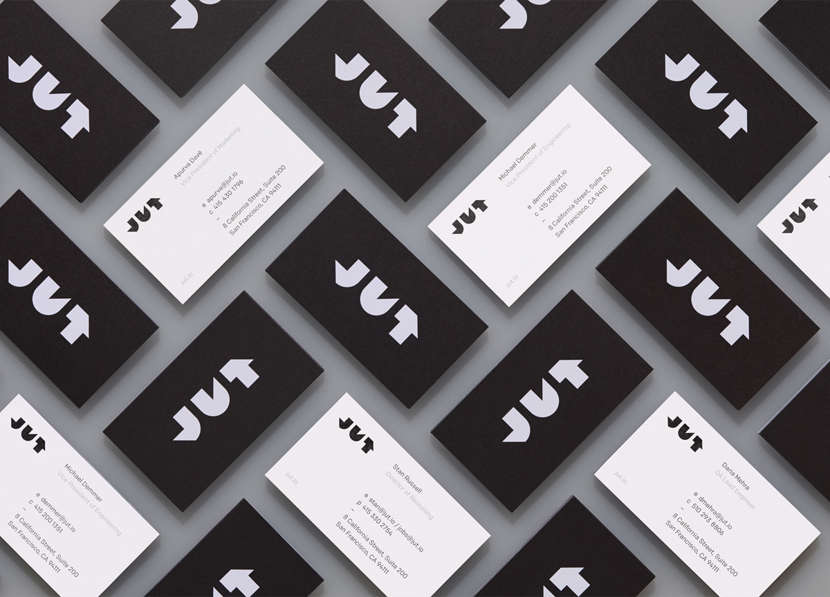
CLIENT
An open-source data analytics platform for Enterprise IT based in San Francisco, CA. They’re solving the problem of disconnected analytics resources for huge corporations.
BRIEF
Create an identity to stand out visually from the sea of sameness in the enterprise IT world. The identity needed to be bold and impactful, and speak to the products with confidence and stability.
APPROACH
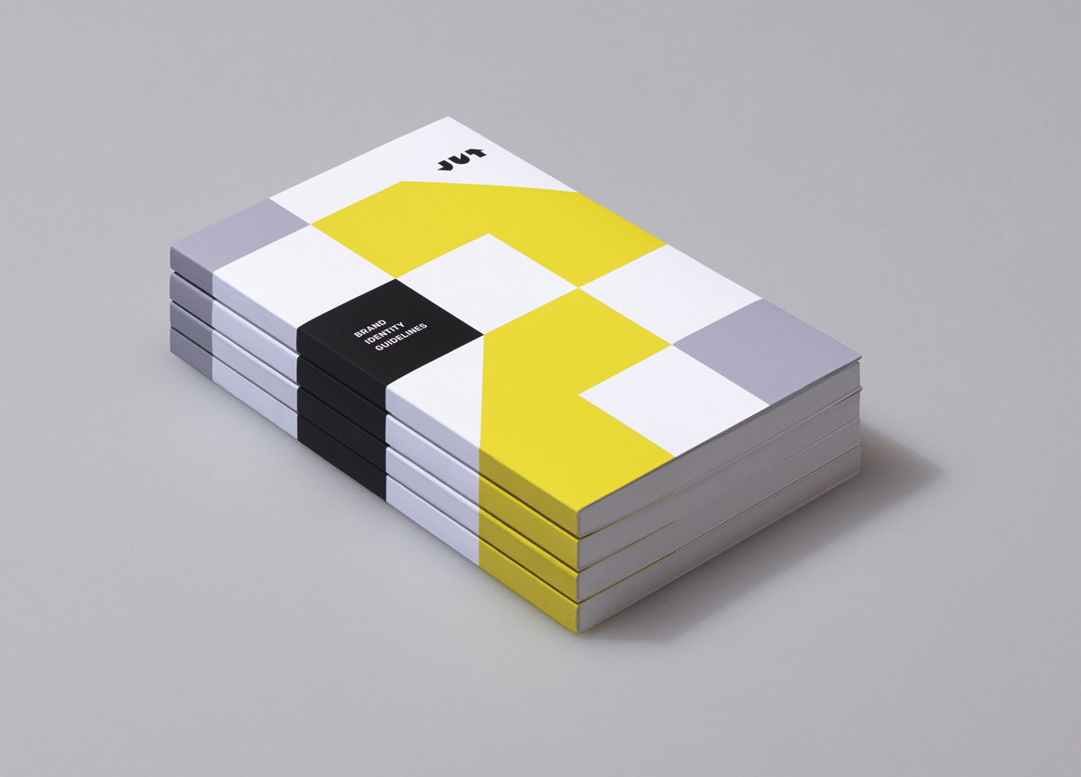
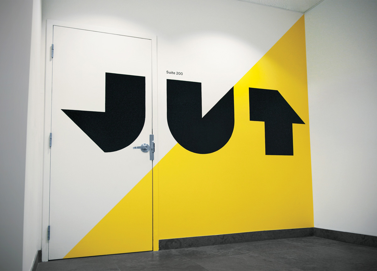
The logo is constructed from basic shapes derived from pie charts and infographics to speak directly to Jut’s product offering. The bold weight and heavy presence of the logo are meant to stand out from the overly friendly competitors and signal that Jut is different. The color palette is decidedly simple, using bold black and white with pops of yellow and silver as highlights.


