Speak UpA Former Division of UnderConsideration
The Archives, August 2002 – April 2009
advertise @ underconsideration
---Click here for full archive list or browse below
  
Paul Rand’s Final Logo?

David Weinberger: “This is Rand’s final logo.”

You: “Rand? Paul Rand? I’ve never seen it before.”

David Weinberger: “Yeah, no one has.”

Well, lots of people have obviously seen it, but virtually no one knows it was designed by Paul Rand or that it was his final logo. In fact, Rand designed this logo in 1996, for a company that wouldn’t launch until 1999, three years after his passing.

In 1986, fresh out of the Army as a paratrooper, Doug Evans showed up on Paul Rand’s doorstep in Easton, Connecticut and asked to be his apprentice. Doug’s only background in the visual arts was as a graffiti artist in New York City subways during his youth but he knew he wanted to get into graphic design. He had heard and read about Rand and considered him to be the greatest designer in the world.

Rand, not quite sure what to do with Evans, tested him by having him do yard work. He soon graduated to helping find and choose props for ads and eventually, actual design, typesetting, and other production work. Doug Evans ended up working part time for Rand, contributing to work for some of Rand’s highest profile clients such as IBM, Cummins, NeXT, Enron and others. To this day, Doug is still amazed at Rand’s willingness to work with him since Rand freely and frequently told Doug that he thought he was a terrible designer. Rand even suggested Evans, who didn’t have a college education, pursue other fields.

In 1996, Evans, an avid entrepreneur, had an idea for an online print outsourcing company. He discussed the idea with Rand and, for a fee, Rand agreed to help name the company and design the identity as well. Paul Rand did not do free work for for-profit companies. It probably wasn’t full-priced though, considering the company didn’t exist yet and Doug would be doing the typesetting and mechanicals himself.

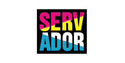
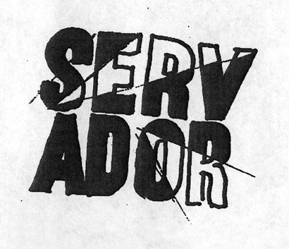
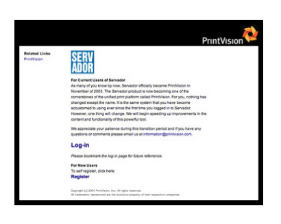
The duo started the process trying to name this yet-to-exist company. While at first, they were using names of various Greek Gods, Rand eventually decided that a new, coined name was necessary. Rand named the company, “Servador,” and apparent combination of “service” and “vendor.”

Evans swears that Rand was a joy to work with but also recalls moments of stress and tension. If Doug wasn’t a hundred percent present and prepared for meetings, he was in “deep trouble.” There were faxes at two in the morning and follow-ups at seven. One stated, “Since I haven’t heard from you, you must be either dead or indifferent.” That was sent less than a half hour after the previous one.

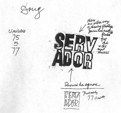
The entire process took about four months. The work started quickly, and was intense at times, then slowed and then quickened toward the end. Doug was allowed to give opinions although they were generally not taken into consideration.

The goal for the logo was to have a single, bold expression that would separate itself from its surroundings. Dozens of sketches were created. Rand disliked the visual combination of letters in the very name he created, so he broke the name into two lines. Usually when creating a new identity with a new name it is critical to ensure the legibility of the name. You are asking people to recognize a new brand and sometimes even learn a new word. Make it legible and don’t make them work too hard. Don’t break the word. Rand, an amazing visual communicator, sometimes did play with legibility as seen in his logos for NeXT, Okasan, as well as some of his posters and covers.

RandFinal_1b.jpg

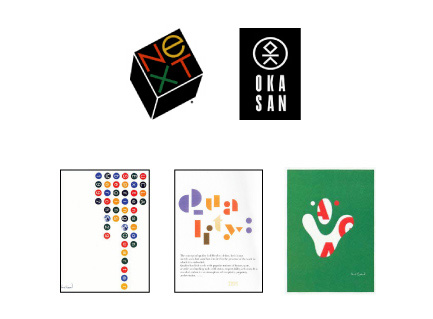
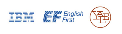
Rand strove to unite letters as well. He found unique graphic ways of bringing together letters that happen to be sitting together in a word. At that he was a master, as seen in his logos for IBM, EF and Yale University Press.

RandFinal_2.jpg

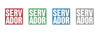
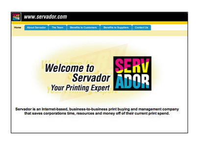
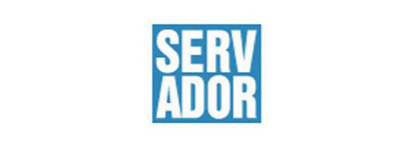
Paul Rand’s logo for Servador was simple and powerful. It was staged inside a box for impact and Rand used a shining light for the purpose of uniting the top and bottom letters. The use of Cyan, Magenta, Yellow, and Black was an obvious nod to the printing industry. As part of the original program, solid red, green, blue and gray versions were also available for use.

Paul Rand passed away in November of 1996, shortly after the design was completed. Servador is, possibly, Paul Rand’s final logo.

RandFinal_3.jpg

RandFinal_4.jpg

Click on sketches for a larger image

ServadorRandSketch1_sm.jpg

ServadorRandSketch2_sm.jpg

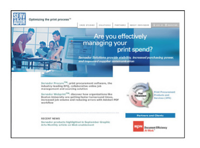
Servador launched in 1999. From the Servador’s original website: “Servador is an Internet-based, business-to-business print buying and management company that saves corporations time, resources and money off of their current print spend.”

RandFinal_5.jpg

Eventually, to distance themselves from perception of the old-technology printing industry, the all-blue version was adopted as the primary logo for Servador. Even Paul Rand couldn’t escape the secret power of the Blue Square.

RandFinal_6.jpg

RandFinal_7.jpg

After a few years of success and partnerships with companies such as Adobe, Servador found itself in troubled times. The faltering stock market, 9/11, and increased competition all were taking their toll. Adding to its capabilities by acquisition, Servador was also trying to meet the demands of a changing business. In late 2002, a decision was made to restructure and rebrand Servador. Doug Evans would also step away from the company he built.

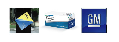
Doug Evans’ friend, and COO at the time, Mike Tardif was a printing industry expert who had previously set up digitally based print production departments at large advertising agencies. Tardif, given the responsibility of leading the rebranding, brought in Mark Landry, a former FutureBrand Creative Director, as the identity consultant. Mark has designed identities for Bausch & Lomb, Dex Media, GM and Tupperware as well as directing countless other identity and design programs. Coincidentally, Mark also once collaborated with Paul Rand on a project.

RandFinal_8.jpg

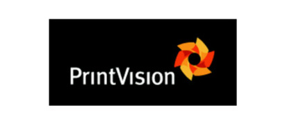
The name Printvision had already been chosen when Mark became involved. The idea was about the future of workflow management for printing needs.

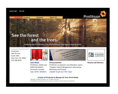
From the PrintVision website: “PrintVision was founded as a print technology company dedicated to bringing internal and external visibility into print procurement. We do this by providing a software platform with a suite of products to manage all of your print needs. From desktop on-demand printing to a copy center, to the most complex commercial print buying programs, PrintVision makes the job of printing easier and cheaper.”

While Mark looked at many ways of expressing the idea, the final mark was constructed of images that were inherent in the name. The revolving paper symbolizes print management as it flows through an organization while the overall shape is both an eye and a sun, speaking to vision and vitality. Whether or not the undotted I’s are necessary, Landry has managed to get a few relevant images into a single cohesive expression.

RandFinal_9.jpg

RandFinal_10.jpg

RandFinal_11.jpg

In November of 2003, Servador officially became Printvision, making not a single wave in the design community.

Click here for Part 2 of Paul Rand’s Final Logo

Maintained through our ADV @ UnderConsideration Program
ENTRY DETAILS
ARCHIVE ID 2430 FILED UNDER Branding and Identity
PUBLISHED ON Sep.26.2005 BY David Weinberger
WITH COMMENTS
Comments
hudson’s comment is:

This may be the "last to launch"-- and I could be incorrect-- but wasn't his "last designed" logos actually the USSB Satellite logo and the Enron Logo (Enron developed 1996, launched 1997)?

I recall him in the bloody halls of O&M with Rick Boyko just before his death. They were building the Enron brand.

On Sep.26.2005 at 08:20 AM
David Weinberger’s comment is:

There were a few at the end there, but Doug Evans has told me that Servador was the last logo that Rand designed.

On Sep.26.2005 at 09:29 AM
Mr.Frankie L’s comment is:

Wow, great story David.

Thanks!

On Sep.26.2005 at 09:38 AM
Mr.Frankie L’s comment is:

Even though single color versions of the logo

were availible, when they decided to employ the blue

supplementary logo as the main one, it's like

replacing the ozone layer from the atmosphere

with regular oxygen.

On Sep.26.2005 at 09:49 AM
DesignMaven’s comment is:

Great Editorial Dave. I'd seen this Identity and wasn't PRIVY Rand Designed it.

"Doug Evans showed up on Paul Rand’s doorstep in Easton, Connecticut".

"Rand, not quite sure what to do with Evans, tested him by having him do yard work".

"To this day, Doug is still amazed at Rand’s willingness to work with him since Rand freely and frequently told Doug that he thought he was a terrible designer. Rand even suggested Evans, who didn’t have a college education, pursue other fields".

Rand actually didn't live in Easton Connecticut. I'll let it go because I don't want to divulge where Rand actually lived in Connecticut.

The yard work was Rand's Test and measuring stick for one's conviction and dedication.

You can tell a lot about someone when you divert their ATTENTION from their intended MISSION. To actually relegating them to getting their hands dirty. Frank Lloyd Wright and many other GOD's did the same.

More importantly, Rand told everybody they were terrible Designers and they should be doing other work.

Again, to test one's dedication, personal conviction and intestinal fortitude.

Just ask, Rand's long time apprentice World Renowned Photographer and Designer Jayme Odgers.

Great keeping this quiet and tying Rand to the Blue Square, Great Analogy.

Servador had more IMPACT when it was broken up with the beam of light. Understand the change because of advances in technology.

DM

On Sep.26.2005 at 09:50 AM
Darrel’s comment is:

Very nice story, though the printvision stuff was sort of a down-beat ending. ;o)

On Sep.26.2005 at 10:40 AM
JonSel’s comment is:

In November of 2003, Servador officially became Printvision, making not a single wave in the design community.

I don't think the huge outcry over the UPS change was solely because it was a Rand mark. It was a cultural icon for over 40 years. People associated more than just a basic service with it; it was embedded in their lives. Servador was hardly such.

I admire Rand's ability to keep it simple at all times. While Servador wasn't his best, it has all the hallmarks of his imprint.

I was really prepared to see some serious gradient action in the new PrintVision mark. It's a little complex and I might argue that the overlap sections aren't necessary, but it's not a bad mark.

Interesting story, Dave. Thanks for sharing.

On Sep.26.2005 at 11:02 AM
Armin’s comment is:

I am just amazed that despite the incredible documentation of Paul Rand's work there is, in 2005, one more logo to add to his legacy.

This logo, in its "shining light" version, is a perfect example of how a somewhat-simple type treatment — which would otherwise simply be another somewhat-simple type treatment — can be transformed into a very intelligent logo by adding a layer of interpretation and execution. It's easy to say "I love it" knowing that it's a Rand logo, but I really love it. That simple twist inside the type is what smart identity design is all about.

Thanks for the research Dave. You definitely found a diamond in the rough — and by rough I mean all the below-average identity work done in the past couple of years. It's refreshing to see simple work done well.

On Sep.26.2005 at 12:38 PM
marian bantjes’s comment is:

Allright, I'll bite. This may all be true, but my spidey sense is tingling ... here's what we all might say if this were not a "Rand" design.

The kerning needs adjusting between the SER, and a touch extra space would be welcome between the AD so they don't look like they're touching at smaller sizes.

Why do the strokes of the V narrow in the counter, while the strokes of the A do not?

There is something about the lack of uniformity in the bowls that really bothers me, and why is the counter of the O slightly larger than the counter of the D? What about those gaping holes around the E?

In the version with the "beam of light", I'm unhappy with the way it intersects the S at the top and the apex of the A: it looks imbalanced.

Finally it reads "survey-dor".

Rand? or not-Rand? Either way, I'm not impressed.

On Sep.26.2005 at 01:17 PM
Alan’s comment is:

I'm with you Marian. I find the full color one especially off-putting.

I wonder why there isn't more critical response to some of Rand's work. Certainly, he deserves all the adoration and appreciation that he gets, but doesn't he deserve a healty critical response as well?

I'd love to hear what everyone thinks of the EF identity. I've never thought that it measured up to much of his other work. Maybe it's because I grew up in California, but it looks to me like an epicenter marker rather than evoking global travel and education. That, and the fact that it's so difficult to reproduce well, made me realize that even the great ones have an off day.

On Sep.26.2005 at 02:01 PM
steven heller’s comment is:

Just a few items worth adding:

During the year-plus I researched my book on Paul Rand, I never found a hint of the Servador logo, not in a job bag nor flat file. (These files are now preserved in his archive at Yale.) This does NOT mean Rand did not do it. He actually made a lot of logo scribbles that never came to fruition. Nonetheless I spent a lot of time in the studio after he passed away and saw almost everything he saved. Moreover, Marion Rand does not recall seeing or hearing about the logo either.

One of his last logos was USSB, which was originally designed with other initials (then the name was abruptly changed). BUT the very last, only a couple of months before his passing, was Enron. I remember his explanation for the outline E shape as being pipelines leading into the company (which was a broker for gas and energy).

I do remember hearing that Rand was working on perfecting another logo from his hospital bed. Originally, my recollection was that it was the logo for the Norwalk Cancer hospital where he died, but he had finished that a few months earlier. Also shortly before he died the Westport., Ct., library mounted a exhibit of his logos, which included the Enron mark. After Enron, Marion Rand does not recall any other commissions.

One thing is certain: He wouldn't shun a logo challenge no matter how large or small. So anything might have gone under the radar.

On Sep.26.2005 at 02:10 PM
David Weinberger’s comment is:

Steve,

Doug Evans actually had three companies for which Paul Rand designed the logo. Although two of them were undocumented, the third, Computer Impressions, is the last on the timelime in "Paul Rand: Modernist Designer" by Franc Nunoo-Quarcoo, I believe. To me, this is strong evidence, along with Doug Evans not being a liar and having two other people confirm the story, that this is true.

On Sep.26.2005 at 03:07 PM
Mr.Frankie L’s comment is:

Is it possible, Paul Rand came up with the

prototypes and Doug Evans finished it?

If so, that could explain some of the flaws

as pointed out by Marian.

I do find it odd that Rand's wife did not

know about Servador. Surely, she would

have seen him working on it.(?)

...

I wanted to add something about the

characteristics of Mr.Rand's designs:

The style of his work has been copied and

proliferated by countless designers. However,

most of them fail because a good logo isn't

good just because it is simple or geometric.

In fact, his style wasn't a style -- it was

a philosophy. This misunderstanding reveals

why so many people cannot seperate his work

from the generic.

He didn't subscribe to the post-modern

ethos--his logos don't tickle us with

nostalgic charm and/or pop visuals

relevant for today.

Instead, Paul's work was frank, deceptively

simple, smart, and witty -- in an intellectual

manner.

His designs are shaped by the formal qualities

of aesthetics; not by trends, smoke&mirrors,

and "dancing girls".

That is why I think it can be difficult

to underestimate his work.

To paraphrase him (loosely):

A logo is great because

the company it represents is great.

And

vice versa.

With that said, the quality of design

is important because of the importance

of craft.

(feel free to correct me, if I'm off)

On Sep.26.2005 at 03:13 PM
Mr.Frankie L’s comment is:

ahem (correction)

*That is why I think it can be EASY to

undestimate his work.

On Sep.26.2005 at 03:17 PM
Shahla’s comment is:

Yes Alan, it stood out as a rule-breaker to me. Everything about it in fact. E and F in italics! weakened by concentric (subtractive) lines!!

If what is being said here about him is true, he may not have thought of English First as a �strong’ company or agreed with the �slogan’ aspect of the name. Maybe it was Rand’s �tobacco company’ job. David could’ve not included that one here.

But I'm glad he did.

Great topic, David.

Precise comments, Marian.

I like the segue to PrintVision because your post is also about Servador, the client. Personally, I would have preferred to see the 4-color version continue. Animating the light beam (poured inks) into a motion logo for their website, to me, is more fitting than flying orange papers about (like falling leaves) and ending up with a logo that makes you wish it were more like a kevlar pinwheel for halloween instead of flimsy gift-wrapping tissue paper.

On Sep.26.2005 at 04:58 PM
Shahla’s comment is:

And also, have the ripples of David’s wave reached Mark Landry? Which came first? The transparent paper or the copy for the website?

PrintVision was founded as a print technology company dedicated to bringing internal and external visibility into print procurement.

On Sep.26.2005 at 05:19 PM
Michael Surtees’s comment is:

I'm not sure why anyone (or designer) would have cared that Servador the company or logo became PrintVision. Did the Servador mark really want to be loved, or was it created for the utilitarian purpose of identifying - nothing more, nothing less. The story of Doug is interesting, but after working with Paul for a number of years as was mentioned above, why wouldn't you want to design the identity for your own company? What brought Doug back to where he learned his craft.

On Sep.26.2005 at 09:33 PM
DesignMaven’s comment is:

For the Record:

I don't think Paul Rand Crafted any of his work in later years. Most all the crafting was commenced by his only full time employee Bert Jackson.

Paul Rand instructed what he wanted as all MASTERS. And Ultimately oversaw Production

and Execution.

That has nothing to do with Doug Evans Legitimacy and Claim.

Only factually stating when you buy a Paul Rand, Saul Bass or any Designer or Professional Service

you cannot expect the Designer to Labor endlessly over the Design. The work after a certain point in Development and Concept is relegated.

Regardless of the outcome the Designer is still responsible

for Excellent or Shoddy work. The work bears his or her imprint.

When you hire an Attorney you purchase the Services of the Law Firm. If the case is not a High Profile case you can rest assure the owner of the Firm or Legal Consultancy will not represent you in Court. The work is commenced by someone on the team usually a junior or senior. Not the name or owner of the Consultancy or Firm.

Side Bar:

I'm not taking sides with David or Steve.

Only to impart Factual Information from my personal experience.

I recently had a very Fruitful Conversation with Jenny Bass, Saul Bass' Daughter. I was talking to her about Mr. Bass' Career and work in Television Graphics among other things. I named a very short lived television series titled Under Suspicion A Detective Drama which aired circa 1994.

Created by Jacqueline Zambrano. Starring Philip Casnoff, and Karen Sillas.

The Title Designers were Saul and Elaine Bass receiving full credit.

The Title Sequence was reminiscent of Bunny Lake Is Missing. The opening credits were revealed by ripping paper to expose the names of the actors and actresses.

Jenny Bass emphatically informed me Saul Bass and her mother Elaine Bass did not create it.

I was awe struck and didn't argue with her. Who, the Hell was I to tell her what her Father and Mother worked on. Although, I have the documentation of the Videos with Saul and Elaine Receiving Credit for the work.

These things happen because so much work is commenced if you don't have accurate records and are privy to information work get lost and unidentified.

To add insult to injury the imdb Internet Movie Database does not list Under Suspicion as a Saul Bass Credit either. And I have written them a Gazillion times to add the Television Series to its Database and give Saul and Elaine Credit. They emphatically will not do it. I offered to send the video with Bass Credits as Title Designer.

Realistically, again not taking sides. David, although, your evidence is more than likely true and Doug Evans is not a liar. The weight of the Argument and Acknowledgement of Inclusion or Exclusion of Servador Identity will have to come from Marion Rand and/or Steve Heller. Marion being the Spouse and Steve being the Foremost Historical Authority Living on Paul Rand.

DM

On Sep.26.2005 at 11:50 PM
DesignMaven’s comment is:

Follow UP:

The Internet Movie Database (imdb) list Alien as a Title Sequence that Saul Bass created. The information is emphatically wrong. Alien was created by R. Greenberg Associates.

Go Figure, so much for Accuracy.

DM

On Sep.27.2005 at 12:08 AM
Steven Heller’s comment is:

postscript:

Computer Impressions is indeed documented in my Paul Rand book. It is a very unassuming logo, a simple CI in a bold gothic.

I just want to reiterate that Rand could have designed this logo under the radar. He sometimes sketched as people spoke, it was his way of talking. And since Doug Evans was making a movie about Paul (which as far as I know was never completed), it is very possible that this transpired.

History and biography are about the details. Some details are never uncovered, some are uncovered years after documents are written. This is why there are so many biographies of Mao or Sinatra.

Whether this is or is not Rand's final logo is inherently interesting. But if it is, Marian B is right to turn the discussion towards a critique of the work. The fact that it was created is one piece of a puzzle; analyzing its quality, beauty, effectiveness is what will determine whether it is important to later generations, or not at all.

On Sep.27.2005 at 06:09 AM
Armin’s comment is:

> In the version with the "beam of light", I'm unhappy with the way it intersects the S at the top and the apex of the A: it looks imbalanced.

To get into the geeky discussion... This "imbalance" is a detail that I really really like, as it indicates that the "light source" is coming from somewhere and it just happened to pass through the logo. Were it to be prefectly balanced, I think the light source effect would be too forced.

> What about those gaping holes around the E?

No argument there!

I actually dislike the little angled cut-off on the inside of the right feet of the "Rs".

> Finally it reads "survey-dor".

In Canada maybe... Wait, wait, an emoticon is in order ; )

> Why do the strokes of the V narrow in the counter, while the strokes of the A do not?

My guess is that this was a completely hand drawn logo, done with french curves and rulers, colored with gouache… giving way to this inconsistencies. Today, this logo could be beautifully "restored" with a simple Univers Bold Condensed and optical kerning in InDesign if one were so inclined to let technology have its way.

I still think it's a great logo. Rand or not. Final or not.

On Sep.27.2005 at 09:04 AM
Mr.Frankie L’s comment is:

Armin,

Interesting point about it being done by hand.?

Steve,

Do you know if Paul designed the entire logo

by hand (including the letters) then had an

assistant scan it into the computer and digitize it?

There is beauty in hand-crafted work, however

often times it doesn't look the same when it goes

thru the computer.

On Sep.27.2005 at 09:47 AM
DesignMaven’s comment is:

The knowledge that I shared was not meant to lambaste anyone in particular. Just sharing the working methodology of Design GOD's.

I assume everybody was aware all the work coming from Paul Rand's Studio was created by Hand. With the exception of Camera Ready work.

The Rand's did purchase Apple Computers, however they never learned to use them.

All the typography Mr. Rand needed to spec he did himself with a haberule and type specing wheel. The actual typeset was performed by his Lifetime printer and/or typesetters at:

http://www.mossbergco.com/digital.asp

That Identity is a Classic and as Effervescent as the day it was Designed.

To The Man with the Golden Arm.

Good Call on the Hand Drawn Letterforms, I thought everybody is aware

Mr. Rand didn't use computers.

DM

P.S. Can somebody Ping TAN at Wang Dang Doodle.

I'm interested in his thoughts. He's mysteriously MIA.

On Sep.27.2005 at 12:10 PM
Sheepstealer’s comment is:

When I look at the voices who have previously added to this thread I'm going to say that the authorities of whether this is or is not a “Rand” have spoken.

But I'm pushing authority aside. I'm going to go with my gut.

To me the brilliance in Mr. Rand's work is not in what it is, but what it is not.

- It is not flashy

- It is not tricky

- It is not trendy

so far, all evidence that this might be a Rand piece.

- it is not visually flawed — something that I personally observe about Rands work is that it is always flawless. I can punch no holes in it.

I don't feel like this is the case for Servador. Kerning, type choice, space between type and edges of the blue box are all visual flaws.

That's my “Thin-Slice” gut check.

Not Rand. Gets one vote from Sheepstealer.

I hope I'm wrong because this is a great story and I find myself hoping that it happened.

DM, I'll ping Tan. I'd like to hear from him on this as well.

On Sep.27.2005 at 08:44 PM
feelicks sockwl jr’s comment is:

Looks like a dead ringer for Rand.

The coloring and the break & stack schtick

tells me he probably phoned it in (literally).

On Sep.28.2005 at 09:49 AM
KP’s comment is:

David has put together a strong case for an interesting argument and done so in a forum that is usually reserved for off-the-cuff review and criticism of contemporary design. It's nice to see a considered, researched—dare I say scholarly?— effort on SpeakUp's pages.

With that said, I have to wonder what you're thinking, Sheepstealer. If we ignore the idea of "Rand Authorities" for the moment and just consider that some contribitions on this thread come from direct experience with and/or serious investigation of the facts of Paul Rand's life and work—well, why should we consider a loose list of aesthetic evaluations in reckoning Rand/not Rand?

It is a practice in the field of art history to determine provenance using aesthetic methods, usually as a finishing touch when the archival record runs thin. But there's too much in the way of current, direct experience to start voting based on gut-check.

When someone writes in 2045 about a logo we've never seen and calls it Paul Rand's final(?) logo, then it will help to have a visual consistency countdown. But we'll still need a tighter list than the one you provided.

On Sep.28.2005 at 10:52 AM
Sheepstealer’s comment is:

I have to wonder what you're thinking, Sheepstealer.

Here's what I'm thinking. It's my interpretation that some of the participants in this thread who should know for sure, or who have access to the information that would substantiate the accuracy of this article, were coming down with a solid vote of "this might be a Rand logo.” I have to support DM and say that it seems like Marion Rand and Steven Heller should have known of Servador.

And, ike I said before, I hope the story is true. If so we've found another artifact for the design world to treasure.

Please don't take my gut check as a difinitive statement on the validity of the logo or the article. It simply is what it is. A gut check.

On Sep.28.2005 at 02:27 PM
Tan’s comment is:

Intriguing thread. Sorry I've been notably missing — I've been stuck in the inner tunnels of the coal mine and have just come up for air.

Here's my 2 cents.

First, the authenticity question is off the mark a bit. I trust David's research and sources, as well as Steven Heller's account. So to me, the question isn't of authenticity, but how much of the mark did Rand execute personally, and whether or not the mark is actually finished. Personally, I think Rand was the creator, but not the finish carpenter.

Now, on the mark itself. I think it's a strong monogram. It has weight and presence. The type does have flaws, as Marian has deftly pointed out — but it's a well-executed arrangement of a difficult word that's still legible and correctly pronounced.

Concept-wise, the beam of light is a Rand signature, and its execution is consistent with the Yale/Swiss approach to typography. But it doesn't have any real wit beyond its utilitarian representation.

But personally, I don't think it's a dynamic mark, and definitely not one of Rand's best. That's the trouble with logos — a mark can be visually strong, conceptually correct, but still be boring. That's the case here, and one of the reason why I also think this logo might be unfinished work.

But we will never know for certain.

Nice writeup, David.

On Sep.28.2005 at 03:21 PM
Tan’s comment is:

...and it's WONGDOODY, Maven. Careful, the other incorrect spelling might send you to porn if you look it up. Though from our past conversations, I don't think you'd mind that too terribly.

Back to the wonderful world of meetings...

On Sep.28.2005 at 03:31 PM
Joseph’s comment is:

I love this profession. It's like a governmental structure. It's never right. It's never wrong. Some people say the logo is not up-to-par because of this and that and this rule and didn't line up this. What's great is that in this profession rules are good guidelines and should be followed as much as they should be broken. Breaking the rules is all the fun and when done right, it can break boundaries.

If this is a Rand,then I applaud his not make the apex of the A symmetrical to the V. I agree with his philosophy that everybody is a crappy designer. He'd probably say the same about himself.

Oh well. The logo has very trite aspects but yet, it's still fresh. Simple. Lovely.

On Sep.28.2005 at 04:27 PM
Isaac B2’s comment is:

Awesome article, but I wish I'd never seen the Servador logo; it leaves a bad taste in my mouth, as I'm a huge fan of Rand. Even if he did make the Cummins and Enron logos.

On Sep.28.2005 at 04:56 PM
JonSel’s comment is:

I agree with his philosophy that everybody is a crappy designer. He'd probably say the same about himself.

Actually, I doubt Rand would say that at all about himself! I only heard him speak once, at his last lecture at Cooper Union, but it was quite clear the man knew his genius.

On Sep.28.2005 at 05:32 PM
DesignMaven’s comment is:

TAN:

Many thanks for Chiming In.

Your line of thinking is in tact with mine.

I believe Mr. Rand Conceptualized and Developed the Identity. He certainly didn't craft and execute the Logo.

This definitely is not the work of

Bert Jackson, Paul Rand's Right

Hand Man since 1956.

Yet, the Identity meets the criteria for Good Identity Design.

Who says an Identity has to sweep us off our feet or be Beautiful? Beauty is in the Eye of the ...

If and Identity meet these Criteria its successful.

1. Memorability: self explanatory.

2. Livability: will it be around 10, 20,30 years or longer.

In the case of Servador it didn't last. However, as I stated earlier the Beam of Light Identity had more IMPACT than the monotone. At the same time, a much STRONGER Identity than PrintVision. I'll take Substantive Design any day over Trendiness.

3. Usability: Can the Identity be implemented in all media? Does the Identity have the same visual strength in one color or two color as it does in full color? Can it be reduced to the size of a dime for advertisement? Yet blown up to the size of a whether balloon for storage tank. Without loosing any quality.

4. Propriety: is it professional?

Does it properly address the Goals and Aspiration of the entity?

TAN, I was being funny about the name. Of course you understood that. My version does have a nice RING.

Joseph:

"I agree with his philosophy that everybody is a crappy designer. He'd probably say the same about himself".

It actually wasn't a philosophy. More a measuring stick of ones stick-to-it-ness, and intestinal fortitude. Design is a very Tough and often UNCARING business. Mr. Rand was a very complicated man in the respect he did not readily embrace anyone. You had to prove yourself to him. An awful lot of people made the Pilgrimage to YALE to Study and Pick up on the Rand Magic.

Understandably, people are out to get whatever they can get by HOOK or CROOK.

Studying at Yale, the contacts, association, connection automatically opens doors. Studying with Rand and having him personally give you a reference opened more doors.

This wasn't unique to Paul Rand. At Yale also were Alvin Lustig, Herbert Matter, Bradbury Thompson. All whom were equally as gifted as Mr. Rand. All possessed the same contacts in the industry and same amout of clout.

As JonSel stated,"it was quite clear the man knew his genius".

Truer words were never spoken. At the same time, Mr. Rand would always iterate there were BETTER Designers than him. Namely, Armin Hoffman, and Adolph Mouron Cassandre (others).

On Sep.28.2005 at 09:25 PM
ben...’s comment is:

I think it is interesting that at a certain point in one of these 'GOD's' (as Maven would call them) career they could pretty much crap on a sheet of paper and everyone would claim it was a glorious logo design.

“Even if it is true that commonplace advertising and exhibitions of bad taste are indicative of the mental capacity of the man in the street, the opposing argument is equally valid. Bromidic advertising catering to that bad taste merely perpetuates that mediocrity and denies him one of the most easily accessible means of aesthetic development.”

Okay?

On Sep.29.2005 at 07:45 AM
Rob Bennett’s comment is:

I'd just like to thank David for taking the time to dig up all this information about the logo, and I don't doubt it's authenticity.

And while I can see the hand of Rand in this mark, and it can be described as conceptually strong, I'm with Tan on this one looking somewhat unfinished.

On Sep.29.2005 at 11:59 AM
Tom G’s comment is:

Coincidentally or not, this article and the discussion surrounding it bring up many issues concerning "fact" and "bias" in history that no wikipediaphile should ignore.

On Sep.30.2005 at 07:12 AM
Steve Mock’s comment is:

Funny you should mention that, Tom.

I had imagined this post - by a known practical joker (IBM april foo, Armin?) - to be coincidentally timed with the unveiling of the design encyclopedia to later illustrate the perils of posting conjecture or biased material as fact. (Who is Doug Evans?) The punctuation in the title indicates David is not sure?

OR

I had imagined this post was coincidentally timed with the release of stop being sheeps, to gently remind us sometimes gullible Rand worshippers to stop being sheeps.

But that's just crazy talk.

On Sep.30.2005 at 09:51 AM
David Weinberger’s comment is:

The punctuation in the title indicates David is not sure?

Steve, just to clarify: The question mark and a few other changes were added by Under Consideration's upper management and were not part of my original post.

Who is Doug Evans?

Steve Heller knows who Doug Evans is. I imagine that if he was more of a household name, we wouldn't be having a conversation about authenticity.

But that's just crazy talk.

I assure you and all Speak Up readers that this piece was based on two-plus years of on-and-off research and three different sources.

On Sep.30.2005 at 10:00 AM
Armin’s comment is:

> The question mark and a few other changes were added by Under Consideration's upper management and were not part of my original post.

The "question mark" was my editorial decision. I don't doubt David's research but I don't think anyone, except Rand himself, can even begin to claim what his final logo was. It is not a matter of subjectivity — do I believe David? Do I trust Doug Evans? Are crabs immortal? — but a matter of editorial responsibility; I can't stand behind the claim that this was Paul Rand's final logo because no one knows, specially now that this logo has surfaced as Rand's, and has raised questions about who executed Rand's logos towards the end of his career and raised doubts about how complete the documentation of his work is. Whether this is Paul Rand's final logo or not is an interesting question and one that we don't have an answer to, which is why I much preferred having this is a question, rather than fact.

On Sep.30.2005 at 10:17 AM
feelicks sockwl jr’s comment is:

a question, rather than fact. -Arm

you mean questionable not factual?

Arm,

I think its pretty ballsy for you to interefere with an editorial of David's. This isnt the history channel. Two years of research? Give him a break! Its a fairly thorough story and the question marks can be inserted by us- the readers. His case is substantial.

On Sep.30.2005 at 02:06 PM
Steven Heller’s comment is:

Armin's decision to put the question mark in David's headline is an editor's perogative. Granted the blog is an unconventional editorial venue, but as its manager/founder/chief, Armin still has editorial duties, and this fits squarely in that mode.

Incidentally, Armin contacted me to get my opinion on the logo. And I told him exactly what I wrote above. Whether I'm right or wrong, given my proximity to Rand's work is enough to raise red flag.

Perhaps in addition to David's three sources, my response and Mrs. Rand's increduality might have at least been mentioned in passing (presuming Armin passed on the info). Citing our misgivings wouldn't necessarily invalidate David's conclusion, or Doug's* voracity, but it would add more dimension to the story.

(*I met Evans when he was working on an unfinished film about Paul)

Since Armin was aware that a question existed, he wielded his editorial pen (or mouse) in a responsible manner. That said, an editor will always confer with a writer before doing something that might change the meaning of the story. Editors do not always discuss final headlines with authors (believe me I know), but it is nonetheless considerate to do so.

Of course, the blog method of commenting allows other arguments or speculations to surface, but nonetheless in serious research it is reasonable to cite as many sources - even the contradictory ones - as possible to get the entire story on the table.

David did a good job of bringing this to light. But there may be more to the story that he could have addressed before publishing his results, particularly since the basic premise is that this was Rand's final logo (or was it?).

On Sep.30.2005 at 09:15 PM
feelicks sockwl jr’s comment is:


the question isn't of authenticity, but how much of the mark did Rand execute personally

I'd concur with that. With 3 sources there has to at least be an association- its his. But that depends on how much of aas well as what the meaning ofhis is.

El Producto, anyone?

On Sep.30.2005 at 10:23 PM
david e.’s comment is:

This story is fascinating — not so much for the logo (yawn) as for the fact that someone with no graphic design education could knock on Paul Rand's door and say "I want to be your apprentice." and actually get to work for him.

What I really want to know is, did Doug Evans go on to do anything else in graphic design? If not, what is he doing now?

On Oct.07.2005 at 06:48 PM
Lou Danziger’s comment is:

I don't want to comment on the quality of the logo being discussed as I have not seen it.

During the last ten years of Paul Rand's life I was probably closer to him then almost anyone I know of and in frequent contact primarily via phone. He would always discuss what he was working on and I never heard him mention this mark. He would also generally send a slide or a fax. Furthermore and definatively, if his wife Marion didn't know of it, it didn't happen!

On Oct.09.2005 at 08:09 PM
DesignMaven’s comment is:

Mr. Danziger:

Thanks for your comments.

I posted a TRIBUTE to you on AIGA Journal

a few weeks back.

Scroll down to you see my moniker.

http://journal.aiga.org/content.cfm?ContentAlias=%5Fgetfullarticle&aid=1245018

I continue to live by your Credos incorporated with thy own.

I couldn't get you to enter a discussion about PAUL RAND a year ago. Curious to know what brought you out of the woodwork this time around.

Don't Answer!!!!

Kids, one of the most Historic Significant Designers of our time.

DM

On Oct.09.2005 at 08:57 PM
feelicks sockwl jr’s comment is:

Lou-

scroll up and click on "entry title" if

you want to see the mark.

this wasnt a big, signifigant job. it couldve taken him

a few minutes so I doubt there was much

evidence... we all wish saul bass's wife hung out on

the phycho set.. and been a lawyer.

On Oct.10.2005 at 11:48 AM
Armin’s comment is:

For ease of viewing:

On Oct.10.2005 at 12:06 PM
steven heller’s comment is:

Last word?

This a.m. I received a call from David and Doug Evans about the logo mystery.

First, it was designed by Rand. The sketches in Doug's archive are original, and the notations are choice Randisms. I recant my doubts.

Second, it was not the "last" logo because that was, in fact, designed for Doug Evans' consulting firm and was fine-tuned by Rand while he was in his hospital bed.

I do recall him telling me on the phone that he was working on a logo days before he passed.

Third, that there was never a job bag or invoice, or that Marion Rand has no memory is due to the simple fact that this was a private arrangement between Doug, who acted as Rand's "agent" in the last year - pairing him up with Enron and USSB - and Rand, who did not charge him for any of the work.

Fourth, this is a minor story, but a fascinating one. It shows how difficult it is to provide an accurate history. From my perspective there was no evidence to support the claim, from David's perspective there was. I never saw the sketches or faxes because nothing was filed. Also, Rand's regular typesetter was not involved so there is no trace-back there either.

Doug set the type on this and made the various refinements according to Rand's wishes.

I'm convinced this was Rand's work. David good for you.

On Oct.12.2005 at 10:26 AM
David Weinberger’s comment is:

Thanks for the comments, Steve. In the next few days, I will post the sketches we have for Servador and then a separate post on Paul Rand's actual Final Logo.

On Oct.12.2005 at 12:11 PM
David Weinberger’s comment is:

The post has been edited and now includes the original Paul Rand sketches. Enjoy!

On Oct.17.2005 at 03:08 PM
Armin’s comment is:

That first sketch looked kind of scary...

Well done Dave. I'm proud to devote a couple hundred kilobytes of server for some Rand sketches.

On Oct.17.2005 at 09:27 PM
feelicks sockwl jr’s comment is:

Interesting that Rand had not upgraded - in 1996- from typesetting to his own computer. Excellent work! THx Steve and Dave! Next up: Lustig's last book cover?

On Oct.19.2005 at 03:19 PM
DesignMaven’s comment is:

I just got an email from Super Lou Danziger this discussion was ongoing. And the Original Rand Sketches were posted.

Dave, I never Doubted you. And as Steve earlier alluded; this is one that flew under the Radar.

Apparently Mr. Rand didn't send this to Mr. Danziger his Lifetime Friend for perusal.

Great work Dave!!!!!

I'm going to One up you and Call you on this and Raise the Stakes.

Next up, SAUL BASS' Revitalization of Raymond Loewy's Air Force One.

That I'm bringing into Fruition.

Dare to Dream!!!!

DM

On Oct.19.2005 at 10:53 PM
A. Lenhart’s comment is:

I stumbled on this site and all the information about Rand, Evans and Servador. Someone earlier asked how Doug Evans managed to become Mr. Rand's apprentice with no design background - the person who asked this has obviously never met Doug Evans! I had the great pleasure to work with Doug at Servador for a number of years. I still have not met another person who I can say has the vision, dedication and creativity of Doug - and I doubt I ever will. I learned more from Doug than any other person in my 10 year graphic arts/printing career and I will be forever grateful.

The same person asked, What is Doug Evans doing now? I too wonder that. Doug, please let us all know! (and have you eaten anything cooked or processed recently?)

- Alicia Lenhart (arlenhart@yahoo.com)

On Nov.03.2005 at 08:12 AM
Just taking an interest in your discussion’s comment is:

What Marion failed to inform you of is a logo that Paul was working on for Optima cards that was rejected by them right before his passing. They gave him six figures upfront just to see his creation.

On Jan.11.2006 at 03:11 PM