Cummins, Gonzaga University and Vonage

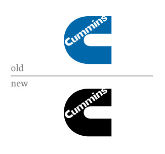
Cummins (a Paul Rand mark)
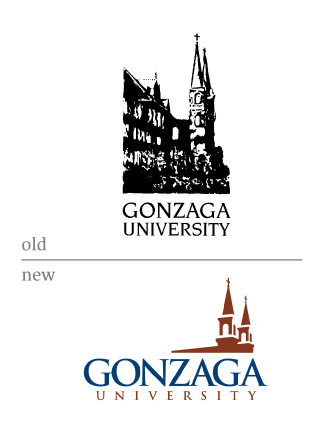
Gonzaga University
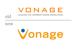
Vonage


Cummins
The Cummins color shift is more the visual manifestation of an organizational change. It's very similar to what GE did in the mid 80s with Landor. Same logo, but the brand architecture – the way subsidiaries and divisions were defined and named – was the major shift. Can't beat the good ol' power combo of black and red.
(And you totally shouldn't have mentioned that it is a Rand mark, just to see how objective people are in their comments.)
Gonzaga
A good, clean update. Nothing groundbreaking in the typography or iconography. Universities (save for The New School) rarely try for something different. Cornell even got smacked down for going the modern route a few years back.
Vonage
I'm glad they ditched the Bank Gothic typeface, since it wasn't uniquely theirs, but I can't say I love the little person icon. Haven't we seen that a thousand times already in the last 5-8 years alone? On one hand, it feels personal and human, and less about technology. On the other hand, it's pretty generic.
I love corporate press releases and how they often are just massaging the corporate ego. Do any of their customers really care that their VoIP rechnology is "award-winning" ?
On Jun.26.2006 at 05:59 PMYou guys missed the new Anaheim Mighty Ducks identity, now sans Mighty. That's one mean looking webbed-foot-D.
Now they just need to get Emilio Estevez back in as head coach.
On Jun.26.2006 at 06:01 PMWhat defines "rebranding" vs. "redesign" or "new logo" ? Is there a difference? I see Cummins somewhat in the camp of rebranding, because they are making major organizational changes that truly affect how they do business. Does Gonzaga count? Even their press release says, "the heart and soul...have not changed. ... Only the image has been refreshed." I question Vonage as well. They recently had an IPO, definitely a good reason for a new, updated identity. But what about the brand is changing?
On Jun.26.2006 at 06:08 PMGreat question Jon. The same was raised about St. Pauli Girl last time. We could call it Recent Redesigns or Recent Rebrandings and probably be right most of the time. I do find the differences interesting though. Does a design change fundamentally change the brand even if there hasn't been a strategy or brand architecture change? Maybe? Sometimes?
One thing is definite—A single title for the column sure makes it easy for me.
On Jun.26.2006 at 06:26 PMI love the Cummins approach and couldn't be happier. A super-tough red/black palette (look at the site) and a gracefully saved classic mark make for a good close to the "working day."
On Jun.26.2006 at 07:02 PMIt seems to me that the GONZAGA logo needs some serious work. It looks as though it is an initial exploration and not the finished piece. I think it has potential. The shapes that make up the building don’t seem to be working well together, maybe simplifing the whole thing to become a stronger element could work. I’m thinking that the letterforms could use some attention as well. I bet you could make the Z and the A a ligature and take away the outside spur of the G.
On Jun.26.2006 at 07:07 PMCummins: was never my favorite Rand logo, but it's kind of refreshing to see a rebrand that doesn't consist of adding bevels and a metallic shine to the old mark.
Gonzaga: My dad's alma mater -- the new logo is an improvement on the old one, certainly, but is pretty undistinguished. Maybe if they chose something less familiar than Trajan?
Vonage: Reminds me of the Cingular logo (orange man with dot for head), perhaps that's intentional.
On Jun.26.2006 at 08:14 PMCheck out the horrifying redesign of Baskin Robbins...
On Jun.26.2006 at 08:20 PMDavid,
To me, rebranding usually has little to do with the visual state of an organization. The visuals are the outcome of serious strategic consideration concerning the entire corporate entity. The brand lives throughout the entity, not just its logo or website.
You pose an interesting question about whether visuals can fundamentally alter the brand without strategic consideration. I'd say to some extent, they can, but I'd think it's mostly short term. A new logo can certainly signify a revitalized company, or a new brand direction, but it can't "BE" that brand direction. For the most part, if there's no strategy change, then the brand itself hasn't changed. What a revised visual system (logo, or whatever) is really trying to do in that instance is align perceptions with the brand itself.
This is why I try not to use the term "brand" much in my work. Clients often bring it up. "We need to develop a brand." My thought is always, "Ok, so develop it." Call me when you know what you want to be, then I can create something that visually embodies that.
On Jun.26.2006 at 08:37 PMthe only "new outfit" here of any relevance
would be Vonage, and the "V" is out of character with the accompanying type. The only new identity
thats really got my uniform in a twist lately is
the 06 world cup logo redesign
which happened earlier today after the referee nearly
handed autralia a pass to the quarterfinals.
i don't know who redesigned it, but he must be incredibly
handsome and talented.
I really appreciate Vonage's nostalgic move with the new logo. I loved playing Pac Man growing up, and that power pellet's getting totally munched by that V.
On Jun.27.2006 at 08:11 AMCummins: I like the black better. Though it may be a bit overdone on their website. Not much more to say than that.
Gonzaga: Really like the new logo. Very clean. Good colors.
Vonage: Actually liked the old logo more. Didn't get the V was a person until I read the comments. The new version feels liek it has less personality. It blends in to the rest of the new rounded san serif logos out there.
On Jun.27.2006 at 09:48 AMI appreciate the Cummins rebrand and feel its been a long time coming. I did A BUNCH of work on the Cummins agency team early in my career and the blue in the logo really got in the way. It wasn't a good fit. Cummins made a distinct shift about 12 years ago in their product lines and started making everything red. Their engine lines were distinctly red and now that is essentially what they are known for. The blue just didn't mesh. So while not groundbreaking in execution, it fits their brand better to make a slight color adjustment. I remember a lot of white logo on red/black and blue logo only when we had to in a field of white.
On Jun.27.2006 at 10:08 AMSteven, that's great background info on Cummins. It makes the rebrand seem all that more correct.
Some props should also go to the design firm that decided the logo didn't need to go.
On Jun.27.2006 at 10:27 AM"For the most part, if there's no strategy change, then the brand itself hasn't changed."
Hmmmm. I'm pretty sure i disagree. What's your definition of "brand", Jon? Sorry if this is getting too deep. Oh, and what's your definition of "strategy?"
On Jun.27.2006 at 10:41 AMCheck out the horrifying redesign of Baskin Robbins...
Been there, done that...baskin robbins
Cummins:
A nice fresh look, making a classic logo even more classic by putting it in the black/red color combo.
Gonzaga:
I work with university logos everyday, and this one doesn't really strike me as spectacular. It follows the same format of: 1. pick the "keystone" building on campus 2. modernize it by making it an indistinctive "building-like" shape 3. throw the univesity name next to it and VOILA! logo. I agree that the type could have used some tweaking. But its definitely an upgrade from the old. One of the more inspired versions of a logo of this nature is the Cooper Union using three renderings of their Foundation Building (don't have a picture readily available).
Vonage:
They totally "Cingularized" it
That Vonage logo is horrific and looks like it was designed by one of those $50 For A Logo companies.
On Jun.27.2006 at 11:06 AMA little information on the Cooper Union Foundation Building
Also, I think the Ducks logo is an apt candiate for Rebrandings 13
On Jun.27.2006 at 11:23 AMYeah, pretty average bunch.
Gonzaga is an improvement. But now they're just up to average, rather than surpassing it.
Cummins - yeah, at least they didn't ruin a nice mark.
Vonage - V-man. gross.
Ok, maybe I am going to be the only one to say it....
What would everyone say about the Cummins logo if Paul Rand would not have designed it? It isn't the most amazing logo when compared to other logos like Westinghouse, ABC, or UPS. Also, changing the color from blue to black isn't much of a leap. I agree that the color change is helpful, but a rebrand?
From the nostalgic point of view, I am happy they didn't ditch Rand's work. But, if that same logo came from $50 LogoDesign.Com would it be held in any regard?
_
The Gonzaga logo is better. It seems they were in need of some help. The type is muddled, and it is definitely a homogenized university logo. Overall it is still an improvement.
_
I am 100% in favor of getting Emilio Estevez back as the head coach of the Ducks.
_
The Vonage logo could have been better. I liked the first version best...but remove the Bank Gothic, and use something less ubiquitous.
Great, now I have that Vonage jingle in my head...."Woo Hoo" by The 5,6,7,8s.
On Jun.27.2006 at 01:28 PM...the 06 world cup logo redesign which happened earlier today ....
Felix, this logo is genius.
Don't let anyone see it, though. You might get a red card.
On Jun.27.2006 at 01:34 PMThe Vonage logo amazes me.
I can't believe they actually went for a logo that appropriates so much from a competitor (Cingular).
The "person" mark resembles Cingular so strongly that when I initially saw the logo, I thought, "how are they associated with Cingular?" Then I realized they aren't, and that this logo is just very similar. Then I realized that's no good. It makes Vonage feel like a street-vendor designer rip-off. This can't be what Vonage wes after.
The orange is obviously a carry-over from the previous logo, but it only works against them when it happens to already be Cingular's signature color. Things just get worse once the logo starts using the same idea as Cingular's...
But hey, at least it's not beveled!
On Jun.27.2006 at 03:27 PMWell I'll go ahead and say it. On first sight the Cummins 'C' reminds me of a plumbing fixture.
Until you see it next to the engine, that Cummins logo is U-G-L-Y. Then it becomes a thing of beauty.
Do I need to wash my mouth out with soap now? :D
On Jun.28.2006 at 12:45 PMVonage = good riddance of Bank Gothic...the new one is good, but why blue? Everyone chooses blue.
Gonzaga = Much cleaner.
Cummins = What the hell?!? What's with the re-coloring? I guess they didn't want to get chastised the same way UPS did when they changed their logo (did Rand or Bass do that one?). What's sad is that they probably paid someone for the "new" logo.
On Jul.01.2006 at 06:50 PMCummins: Changed the color called it a new logo, okay.
Gonzaga: Not bad at all
Vonage: about time they stuck out more glad they changed it.
On Jul.23.2006 at 01:38 PMPlease let me know various branding strategies given by various companies
On Jun.30.2008 at 12:00 AM
er, not seeing any red in that cummins logo. i'm pretty sure it's just a black version of the "old" one, non?
On Jun.26.2006 at 05:35 PM