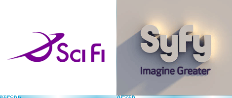
At its Spring upfront — basically when networks present their new programming, sell big chunks of advertising and announce any major changes — the 16-year-old Sci Fi Channel announced that on July 7 it will change its name and identity to Syfy. The reported driving reason for the change was the fact that “Sci Fi” was not something that the channel could own or copyright as it describes a genre that anyone else can use as a descriptor. But by changing its name to something that is phonetically identical yet spelled like a 3-year-old text messaging, it can become wholly ownable and mutated (pun intended) across different ventures like Syfy Games, Syfy Films and Syfy Kids.
Continue reading this entry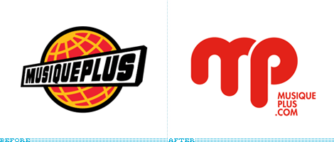
Here is another one dating back from late September — apologies for playing catch-up on a lot of these recently, but the Q4 of 2008 was pretty hectic around here — the redesign of the French-language Canadian music channel MusiquePlus, which has been on the air since 1986. The new logo was designed by Montreal-based Sid Lee. The old logo was interesting in that it had that kind of cartoony, global, broadcasting feel or it could very well be the logo of one of those record stores where the sales people are all stuck up and get annoyed if you don’t know this or that band. But I digress. The new logo is certainly simpler and easier to read on screen but… why is it melting? I want to want to like it because I enjoy single-weight monograms like this one. But the ITC Bauhausesque “mp” looks a little cheesy and cheap. If the idea was to join the “m” and the “p” the loop of the “p” doesn’t really connect; a lot more custom work was needed on this one, much more than adding rounded endings and elongating the stems. Nonetheless, it’s a change in the right direction, even if not properly executed.
Thanks to Nick Alexander for the tip.
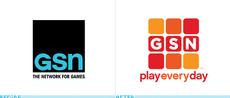
I’m a passive fan of game shows on TV: If one of them is on and there is nothing else, I’ll happily watch. But not complicated things like Deal or No Deal, I like simple things like Wheel of Fortune, The Price is Right, Family Feud and even that crazy 10,000 Pyramid show. I vividly remember when a channel, devoted solely to game shows, debuted in 1994. I couldn’t believe it. And I watched it. Couldn’t believe that either. But here we are, fourteen years later, and the Game Show Network is still on, even after different guises (abbreviated to GSN) and efforts to expand its programming with reality shows, it’s all back to basics with good, old fashioned fun.
Continue reading this entry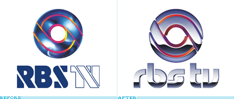
Guest Editorial by Guilherme Machiavelli
In the southern areas of Brazil, Rede Globo’s — the biggest media conglomerate in the country, previously reviewed here — regional programme is broadcast mainly through RBS TV, a minor television network. In the past week, RBS unrolled its new identity, designed by Globo’s very own Hans Donner. And, well, the path chosen was the same the designer had taken in its many previous works: metallic glows everywhere, gradients and unreadable lettering. The symbol has suffered few changes, consisting mainly in added glows and bevels — perhaps the only decision that came close to logical, since the chrome globe is instantly recognized in the southern states. The lettering, though, was not so lucky. Not only the cryptic glyphs are hard to read, the bottom half disappears in most uses, from website banners to the network vans. The rebranding is, supposedly, aiming to express the modernization of RBS TV (adopting now digital transmission), while maintaining the network’s tradition and quality of information. A very ironic result for that aim, considering that Donner repeats the same techniques and solutions ad infinitum to all his work since the eighties. And, perhaps, this says more about RBS than the company might have wanted.
Continue reading this entry
It may or may not come as a surprise, but I’m a die hard Metallica fan. Well, was. At the beginning of my teenage years with the release of the Black Album in 1991 I was immediately hooked and bought every album that had come before it — Kill ‘em all became a thrashy favorite. When they played in Mexico in 1993, me and my friends had seats in the first ten rows and through some Heavy Metal miracle I was handed a pass to be transferred to the “snakepit,” a hole in the middle of the stage where even crazier head-banging occurred — the amazing Live Shit: Binge & Purge set came from the five shows they played there. Then it took five years for the next release, Load, which didn’t quite catch my attention and its sequel ReLoad felt even more out of touch from Metallica’s true sound — it didn’t help that, by now, the cast had all gotten haircuts that made them look like they should be playing for Jethro Tull. After ReLoad I lost track, in part because Metallica did not seem to fit in my post-‘99 life (work, girlfriend, no more mullet) but to this day, when I need to haul-ass on a production task I will crank the vintage Metallica, and it does still sound good. Clearly, all this has nothing to do with the logo — well, I did draw it extensively on my school notebooks and ripped jeans — but it felt rather therapeutic to get it out there.
Continue reading this entry
Britain’s UKTV is a network of nine channels providing every kind of content from gardening to drama, while providing a range of those channels with +1 timeshifts, meaning the same programming runs one hour later from its original. I mention this since the logo above is the new name and identity for what used to be UKTV Gold +1, and is one of three channels getting a new name and logo to be broadcast this coming October.
Continue reading this entry
Guest Editorial by Guilherme Machiavelli
In 1965, soon after the military coup d’état in Brazil, a media conglomerate was founded and, in the following years, experienced an spectacular growth. This conglomerate, called Rede Globo or, more simply, Globo, became the most influential broadcasting network in Brazil (and, one could argue, in Latin America). (More on Wikipedia). Its socio-cultural importance has been commented often not only inside the country and the continent, but even in other parts of the world, such as England, with BBC’s highly polemical “Beyond Citizen Kane”, a documentary that even now, 15 years after its first british transmission, has not been officially exhibited in Brazil, due to pressure made by the brazilian corporation itself.
Continue reading this entry
On June 4th, Discovery Communications launched Planet Green, the “first and only 24-hour eco-lifestyle television network,” and with original programming on TV and a robust online presence Planet Green demonstrates that there is more than just gloomy, end-of-the-world content surrounding the environment. The new identity, designed by New York-based Open, is a green circle paired with a heavy-duty (and beautiful) sans serif designed by Chester Jenkins of Village. The logo, to some, may seem like an over-simplified or easy solution, but with a name like Planet Green, I doubt there was a more perfect — and most importantly, ad hoc — solution. And unlike the recent circle logo from Euronews this one doesn’t feel pretentious nor operate on pure quirk — the quirk actually comes from things like their green or greener press web site and the on-air graphics by Thornberg & Forester. How does such a simple and effective logo come to be in the twenty-first century? I asked Open’s proprietor and recent winner of the Cooper-Hewitt’s National Design Award for Communication Design, Scott Stowell, a few questions. Oh, and before anyone cries foul, this logo was designed before the We logo but both happened to be released at similar times.
Continue reading this entry
Lifetime, the “the leader in women’s television,” launched a new identity recently, appearing magically on air without much celebration — not even a change of the logo on their web site and, less cordially to Brand New, without a press release. The nerve! So, what we have to go by — and I’m pretty proud of being the only place online to have a straight up shot of the new logo — is a photo I took of a poster in the subway announcing some show I can’t remember but that luckily showed the logo on a white background that I could isolate for the graphic above. So, there is not much we know about this, other than, well, it’s a channel for women, and the new logo replaces the lameness of a logo they released a mere two years ago.
Continue reading this entry
Long gone are the days of A&E being a fly-over channel, with its snoozing biographies and re-runs of Murder, She Wrote. Now, perhaps at the other extreme, it broadcasts fare like Gene Simmons Family Jewels and Dog the Bounty Hunter. While neither incarnation of A&E has ever been my cup of tea, the transformation of the channel has been quite remarkable, and to punctuate the evolution, the channel has recently updated its 12-year-old logo. The old logo had an interesting execution to it, with the “E” being angled to match the “A” and knocking out the “&” from the übertight kerning that, even if not perfect, yielded a nice counterspace with the “E.” The new logo is much more purposeful in the integration of the “&” creating a unit out of the three letters. I like the all sans serif approach better — as the old serif “&” did make the logo feel more academic or historical — and the blending of the “&” and “E” is very well resolved. I am not convinced by the “bridge” extended between the “A” and “E”, but I’m willing to be convinced that that was the best option to resolve the white space left between the two letters. On screen, the new logo looks great, and the few broadcast graphics and animations that I have seen are smooth and fresh — I also spent some time watching the Gene Simmons show and, unfortunately, it convinced me to keep flying over A&E. A refreshingly simple press release can be read here.
Previous Page | Next Page(Total Number of Pages in Entertainment: 4)


