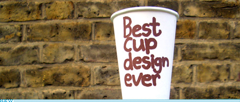
This is a slightly off-format entry, I have to admit. It’s not a redesign, it’s not about a logo, and it’s not quite about packaging, at least not mass consumer packaging. But it is about branding at a relatively micro level, which may speak more directly to the kinds of clients the majority of us work on from day to day. So, this is a peek at the work that UK-based designer and illustrator Jim Smith has created over the past decade for Puccino’s, a coffee retailer with franchise locations around the UK that has differentiated itself through humor and an off-beat attitude. And it has been the cups, in-store graphics and myriad little packages that have fully given Puccino’s its unique brand through a consistent style, approach and tone of voice. Following is a brief interview with Jim who has just designed six, brand new cups.
Continue reading this entry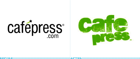
Whether you want to sell thongs, mugs or mousepads showcasing your clever graphics and copywriting CafePress is the place for you — that is if you don’t mind sub par or, at best, par quality products. It’s actually kind of amazing that this on-line venture is almost ten years old, founded in 1999. It recently changed its low-key logo for a rather bold statement: A distressed, grunge, do-it-yourself attitude that seems to contradict the actual product. When I see the new logo I think of silkscreen printing, letterpress or some other form of hands-on printing and production approach which, in my very limited experience with CafePress, is far from its actual production values. As a logo it’s not bad — although it’s faddish and painfully unoriginal — but the biggest problem is appropriateness: It’s not.
Thanks to Darrel Austin for the tip.
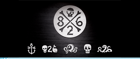
Established in San Francisco in 2002 by renown writer Dave Eggers and educator Nínive Calegari, 826 is a unique organization that tutors and provides workshops for kids ages six to eighteen on writing and ultimately on creative expression. The San Francisco building where the classes took place, located at 826 Valencia Street (hence the name 826), was zoned commercial and the logical thing to do was to set up a pirate supply storefront which, according to David Byrne, is “definitely one of the top five pirate stores.” And in that same spirit, the 826 chapters in New York and Los Angeles are flanked by retail stores like the Brooklyn Superhero Supply Co. (designed by Sam Potts) and Echo Park Time Travel Mart (designed by Stefan Bucher), respectively. With a wide range of fictional products these stores have lent themselves to truly unique design experiences not just for the visitor but for the designers involved, as they are able to craft this made-up world encouraged by the sense of exploration that accompanies the centers.
Continue reading this entry
Update #2: A good branding samaritan has sent in the official logo for Best Buy and the appropriate images have been updated, so the above image is the official logo. The logo is set in a modified version of Klavika.
Update #1: The above logo is not the official logo, I apologize for the confusion. At JasonNessa.com where I got the logo from, clearly states “The replicated logo above will give you a very close look of what the new logo looks like, but NOT the exact look.” which was my oversight. Nonetheless there is something odd going on as the logo on the backdrop and the store sign are indeed different.
Founded in 1966 as Sound of Music and renamed to Best Buy in 1983, the consumer electronics giant is one of the largest and most ubiquitous retailers of its kind with its low prices, khaki-and-blue-polo employee uniforms and slightly deafening store experience. With more than 1,000 locations worldwide Best Buy opened a 45,000-square-foot in Minneapolis’ Mall of America on August 6 and, more thrilling (at least for me) than the August 8th performance and autograph signing by New Kids on the Block, is the new logo that adorns the entrance to the store.
Continue reading this entry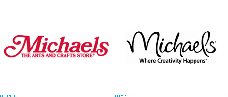
I am not into crafts, not because I have any of the sometimes insulting preconceptions about it but because I’m just not good at it. Unless preceded by the command key, there is no copying and pasting for me. Nonetheless I love going into craft stores, there is something pretty incredible about all the collected, individual materials, knickknacks and doo-hickeys arranged in neat bundles or stacks begging to be put together — and, perhaps, there is no haven more crafty than Michaels. Established in 1973, it grew to sixteen stores by 1984, went public and was operating 500 stores by 1995, became a private company again in 2006, and is now celebrating the opening of its 1,000th store in San Antonio. To mark the milestone and thirty-five years in business Michaels is also introducing a new logo.
Continue reading this entry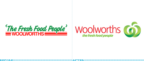
Woolworths, the largest grocery store chain in Australia has recently rebranded its 21-year-old previous logo and is preparing a rollout of the new identity across 780 stores, including the transformation of the Safeway stores (owned by the same parent company) in Victoria. So, having little to offer on the brand as I’ve never had the pleasure of setting foot in Australia, much less a Woolworths, let’s turn to some press releasing and explanations by Hulsbosch who designed the identity.
Continue reading this entry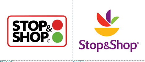
Giant Food and Stop & Shop, two sister companies that represent a pair of the nation’s largest regional supermarkets have shed its previous identities for a bowl of fruit — or a plant — or, um, a multi-colored flower thingy. In any case, gone is the Giant-on-your-side G and the stop lights.
Continue reading this entry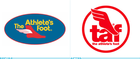
While Foot Locker (despite its horribly crowded stores) and Champs are the most ubiquitous and “cool” sporting good stores across the nation, the lesser prominent The Athlete’s Foot has always felt, at least to me, like the ugly duckling of the industry. Never quite shiny, nor the music loud enough and, if I remember correctly, they had a dopey running track going around all their stores. In an effort to position itself better, The Athlete’s has been trying to implement “next generartion” stores that their franchises are encouraged to adopt. Coupled with a new retail presence is a new logo and a push to be known for the odd acronym of “TAF.”
Continue reading this entry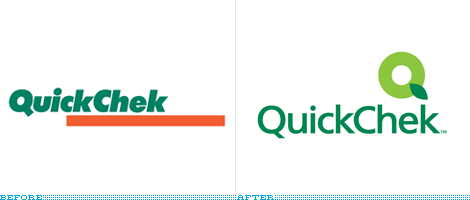
One conglomerate tier (or two, or fifteen) below Walmart is another recent client of New York-based Lippincott, Quick Chek, a chain of more than 100 convenience stores located in and around the state of New Jersey founded in 1966. Last month Quick Chek unveiled a new identity, and private-label developed product packaging developed by Lippincott that help emphasize the store’s commitment to fresh food, including their brewed-every-twenty-minutes coffee. The old logo felt like a bland and blunt New Jersey convenience store that looked more like a companion to a gas station, while the new logo and identity definitely improve the store’s appearance and its products, with a look more aligned with a sandwich or fresh produce shop. I really like the new icon, and how it has a little depth by using two colors to form the letter Q. The typography is forgettable, nothing to worry about but nothing to praise either, maybe a geometric sans would have added some interest. Overall, this is a great visual upgrade for a modest chain of stores that will likely benefit from the added differentiation that its design will provide it, specially against the innumerable amount of convenience stores peppered through the state. A few more images below.
Continue reading this entry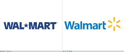
In what has to be the most under whelming unveiling yet — and a bad case of stolen thunder — for one of the largest retailers in the world, Walmart (unhyphenated as a single word from now on) just uploaded a formal, band-aid of a press release to their web site confirming the logo change that surfaced over the weekend when The Wall Street Journal reported that the Memphis and Shelby County Division of Planning and Development had received documents from Walmart with the intent of opening a prototype store there. An artist rendering on those documents showed a new sign over the facade of the proposed store.
Continue reading this entryPrevious Page | Next Page
(Total Number of Pages in Retailers: 4)


