ADV @ UNDERCONSIDERATION Peek here for details
BROWSE
Client
Alyssa and Josh
Quantity Produced
150
Production Cost
$200
Production Time
2 days
Dimensions (Width × Height × Depth)
8.5 in × 5.5 in
Page Count
–
Paper Stock
French Paper Mod-Tone, Gray
Number of Colors
Front: 2 Spot (PMS Orange and Rubine Red)
Back: black
Varnishes
–
Binding
–
Typography
Burbank by House Industries, Copeland Milo by Photo-Lettering, Metro by W.A. Dwiggins, Alternative Gothic, Champion by H&FJ, and some limited custom lettering
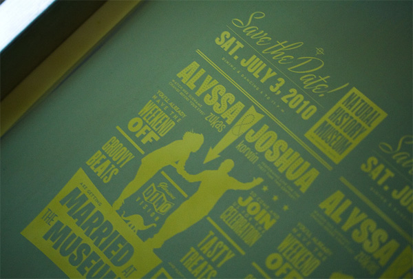
When it comes to designers designing their weddings, we know we are in for a treat. What kind of treat? the outcomes are as varied as the kinds of flowers you can use in a bouquet. Alyssa and Josh have been relentless as far as the details and style of wedding they dream of, and have started sharing some of the details through their Save the Date postcard.
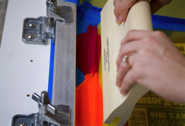
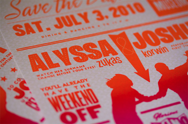
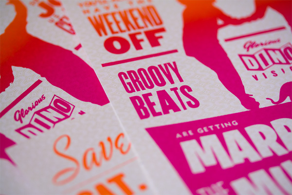
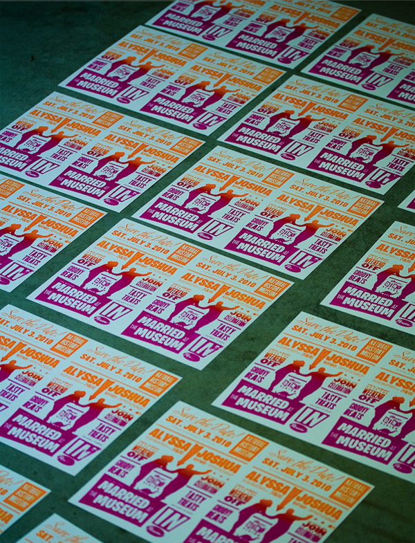
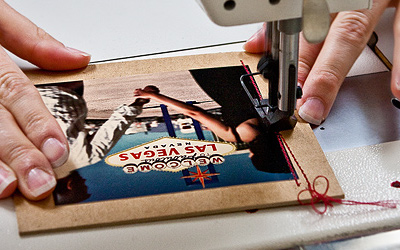
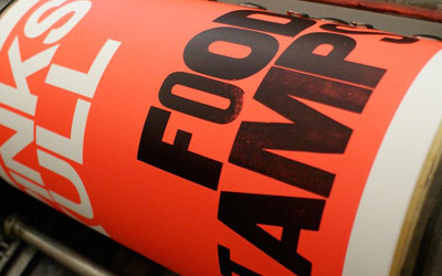
We’ve been scouting inspiration from far and wide, and one of the first ideas that hit us was to create a “gig poster” or a vintage-style handbill to inform our potential guests of the basic logistics in advance of the invitation. We decided it would be an adventure to silkscreen the invitations ourselves using the “split fountain” technique, usually reserved for the background of boxing posters.
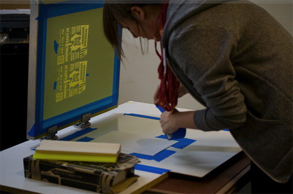
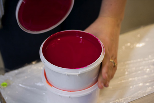
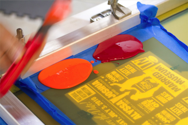
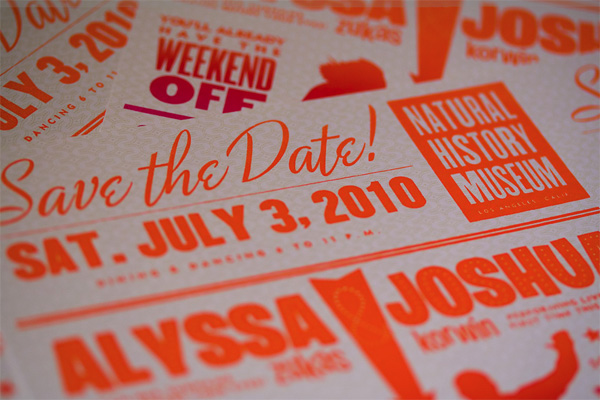
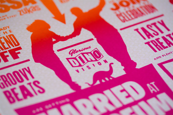
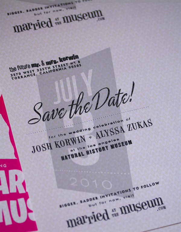
The process was remarkably smooth. We’d both done some screenprinting on t-shirts before, but neither of us had any hands-on experience with serigraphy on paper. We designed the card to be printed without bleed, 2-up on an 8.5” by 11” letter-sized page, allowing us to make a single cut towards a finished product—we printed the back side on the cheap using our inkjet printer. Using a Photoshop mockup of the design, we determined that Pantone Orange and Rubine Red would make a nice, yummy “Tequila Sunrise” gradient. Our comp wasn’t far off the mark, but the real-life result was far better than the digital version.
The right side of the screen had some imperfections in the emulsion which led to some interesting artifacts, while the left side was nearly perfect. I think the variation between different prints is one of the beautiful and lively aspects of hand-printed serigraphs. So even though we sacrifice a bit of legibility, I think we’ve really hit the mark with our attempt at creating a vintage, imperfect look.
Call me sentimental, but I think Alyssa and Josh are embracing the printing process very much like the life of a couple should be embraced. Making it personal, making it unique, embracing the imperfections and getting their hands dirty while sharing a laugh or two.
Have a great wedding (and marriage)!

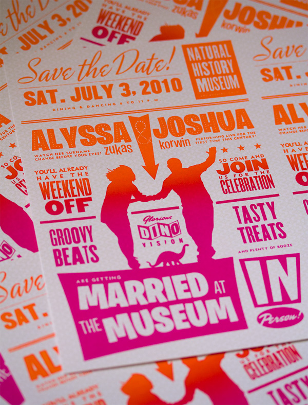
Alyssa and Josh Save the Date Postcard
Production Method
Design
Josh Korwin and Alyssa Zukas
Printing
Josh Korwin and Alyssa Zukas
This post was published in the original layout of FPO so all images are smaller. Project descriptions as well as production lessons are quoted in the main content area.
Post Author
Bryony

Bryony Gomez-Palacio
Editor of FPO and co-founder of UnderConsideration LLC.
More: Online / On Twitter
Date Published
November 18, 2009
Filed Under
Postcard
Tagged with
DIY
french paper
self made
silkscreen
split fountain


About
FPO (For Print Only), is a division of UnderConsideration, celebrating the reality that print is not dead by showcasing the most compelling printed projects.
FPO uses Fonts.com to render Siseriff and Avenir Next.
FPO is run with Six Apart’s MovableType
All comments, ideas and thoughts on FPO are property of their authors; reproduction without the author’s or FPO’s permission is strictly prohibited
Twitter @ucllc
Sign-up for Mailing List
Mailing list managed by MailChimp
Thanks to our advertisers
About UnderConsideration
UnderConsideration is a graphic design firm generating its own projects, initiatives, and content while taking on limited client work. Run by Bryony Gomez-Palacio and Armin Vit in Bloomington, IN. More…
blogs we publish
Brand New / Displaying opinions and focusing solely on corporate and brand identity work.
Art of the Menu / Cataloguing the underrated creativity of menus from around the world.
Quipsologies / Chronicling the most curious, creative, and notable projects, stories, and events of the graphic design industry on a daily basis.
products we sell
Flaunt: Designing effective, compelling and memorable portfolios of creative work.
Brand New Conference videos / Individual, downloadable videos of every presentation since 2010.
Prints / A variety of posters, the majority from our AIforGA series.
Other / Various one-off products.
events we organize
Brand New Conference / A two-day event on corporate and brand identity with some of today's most active and influential practitioners from around the world.
Brand Nieuwe Conference / Ditto but in Amsterdam.
Austin Initiative for Graphic Awesomeness / A speaker series in Austin, TX, featuring some of the graphic design industry's most awesome people.
also
Favorite Things we've Made / In our capacity as graphic designers.
Projects we've Concluded / Long- and short-lived efforts.
UCllc News / Updates on what's going at the corporate level of UnderConsideration.

Related entries
Younite Promotional Cards
Latitude Postcard
Oh Christmas Cards
The Department Postcards
Tinta de Verano - Solar Prints