ADV @ UNDERCONSIDERATION Peek here for details
BROWSE
Client
Self-promotion
Quantity Produced
1,250
Production Cost
–
Production Time
3 Weeks
Dimensions (Width × Height × Depth)
8.75 in × 5.75 in
Page Count
–
Paper Stock
Neenah Esse Pearlized Latte 105 lb Cover, Smooth
Number of Colors
6/2 Spots
Gold and Holographic Foils
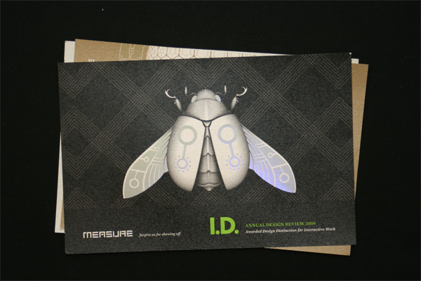
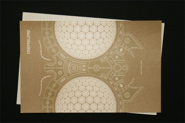
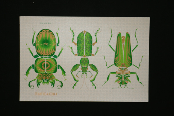
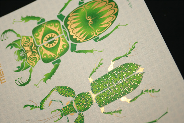
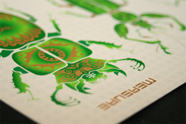
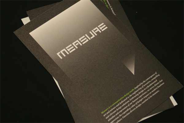
As an excuse to get in touch with clients and peers, design firm Measure created a set of three postcards with a critterly theme that brings attention to their web site and their recent achievement of being featured in the I.D. Design Annual.
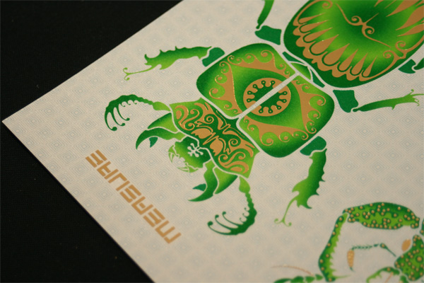
The bugs for the most part are a result of our interest in design in nature and the collaboration of science and art. As a visual metaphor they acted as gilded specimens to promote the portfolio on the website, a highly developed and complex eye to invite the audience to take a closer look, and a showy display to announce our recognition in the I.D. Design Annual.
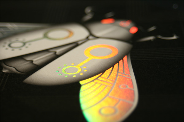
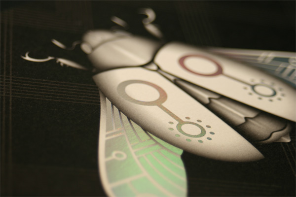
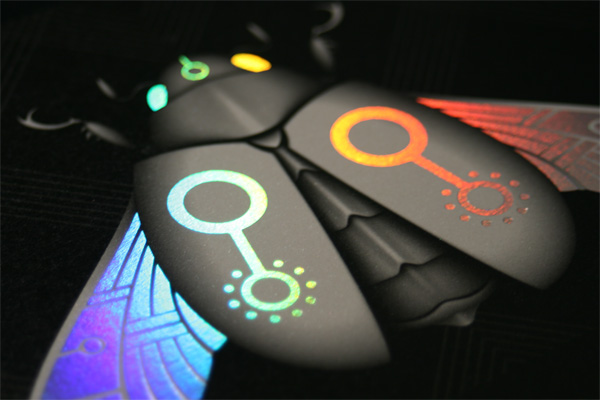
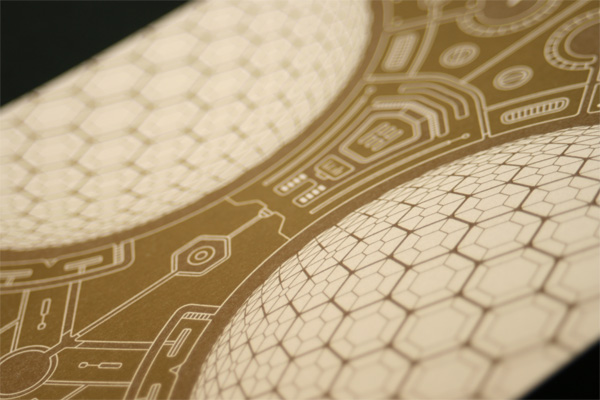
While all three postcards share bugs, each one has a different visual effect, from the simple offset printed close-up of a fly’s eyes, to the gold gilded spots on the three bugs, to the groovy holographic moth. The latter two are certainly the more eye-catching, especially as the foils react against the light, shining differently at each angle. But according to Measure, it was the paper that brought the three postcards together.
The paper was an experiment that turned out to be what I consider the real success of the production end. We used Neenah Esse Pearlized Latte Smooth. The intent was for the pearlized finish to subdue the foil just a bit by bringing some subtle bling to the printed surface and also use the finish to create depth in a flat piece. The paper has a very hard surface and because the inks go down with minimal water on this particular sheet, they get a great richness and vibrance to them. On the backs we used the black to help control where the pearlescent would punch through and add a sense of depth to the piece. The light green ink against the black resulted in a subtle optical illusion that the type was floating above the surface. It was a slow process with several passes in the press to allow for drying on this sheet, but it performed brilliantly.

Measure Postcards
Production Method
Design
Measure
Design and Illustration: Chad Johnston, Chris Malven and Austin Van Laar,
Printing
Offset: Holm Graphic Services
Foil: Feiereisen, Inc.
This post was published in the original layout of FPO so all images are smaller. Project descriptions as well as production lessons are quoted in the main content area.
Post Author
Armin

Armin Vit
Editor of FPO and co-founder of UnderConsideration LLC.
More: Online / On Twitter
Date Published
February 18, 2010
Filed Under
Postcard
Tagged with
foil stamp
holographic
offset
self-promotion


About
FPO (For Print Only), is a division of UnderConsideration, celebrating the reality that print is not dead by showcasing the most compelling printed projects.
FPO uses Fonts.com to render Siseriff and Avenir Next.
FPO is run with Six Apart’s MovableType
All comments, ideas and thoughts on FPO are property of their authors; reproduction without the author’s or FPO’s permission is strictly prohibited
Twitter @ucllc
Sign-up for Mailing List
Mailing list managed by MailChimp
Thanks to our advertisers
About UnderConsideration
UnderConsideration is a graphic design firm generating its own projects, initiatives, and content while taking on limited client work. Run by Bryony Gomez-Palacio and Armin Vit in Bloomington, IN. More…
blogs we publish
Brand New / Displaying opinions and focusing solely on corporate and brand identity work.
Art of the Menu / Cataloguing the underrated creativity of menus from around the world.
Quipsologies / Chronicling the most curious, creative, and notable projects, stories, and events of the graphic design industry on a daily basis.
products we sell
Flaunt: Designing effective, compelling and memorable portfolios of creative work.
Brand New Conference videos / Individual, downloadable videos of every presentation since 2010.
Prints / A variety of posters, the majority from our AIforGA series.
Other / Various one-off products.
events we organize
Brand New Conference / A two-day event on corporate and brand identity with some of today's most active and influential practitioners from around the world.
Brand Nieuwe Conference / Ditto but in Amsterdam.
Austin Initiative for Graphic Awesomeness / A speaker series in Austin, TX, featuring some of the graphic design industry's most awesome people.
also
Favorite Things we've Made / In our capacity as graphic designers.
Projects we've Concluded / Long- and short-lived efforts.
UCllc News / Updates on what's going at the corporate level of UnderConsideration.

Related entries
Younite Promotional Cards
Latitude Postcard
Oh Christmas Cards
The Department Postcards
Tinta de Verano - Solar Prints