ADV @ UNDERCONSIDERATION Peek here for details
BROWSE
Client
Giuseppe Profilio
Quantity Produced
250
Production Cost
€200 (US$271)
Production Time
1 week
Dimensions (Width × Height × Depth)
32 mm × 78 mm (1.25 in × 3.07 in)
Page Count
–
Paper Stock
Colored paperboard 600 g/m2
Appli self-adhesive paper 120 g/m2
Number of Colors
1 Spot (Black)
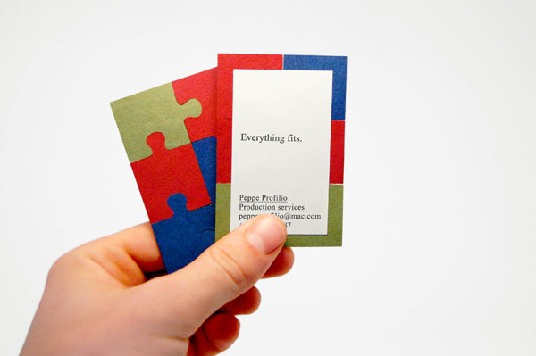
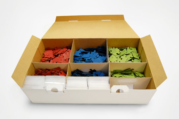
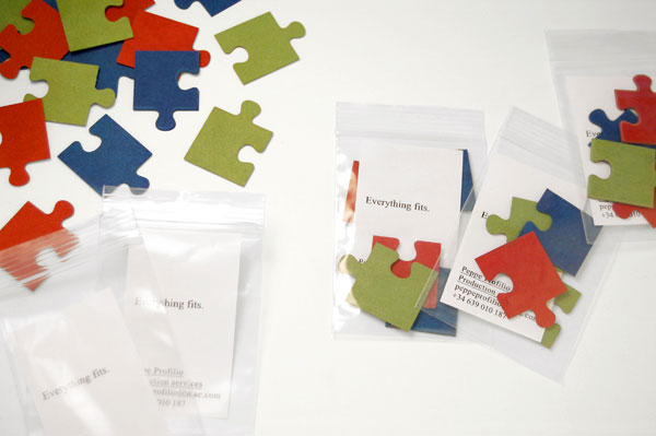
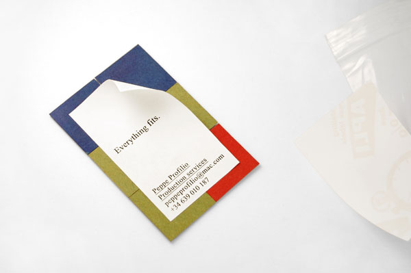
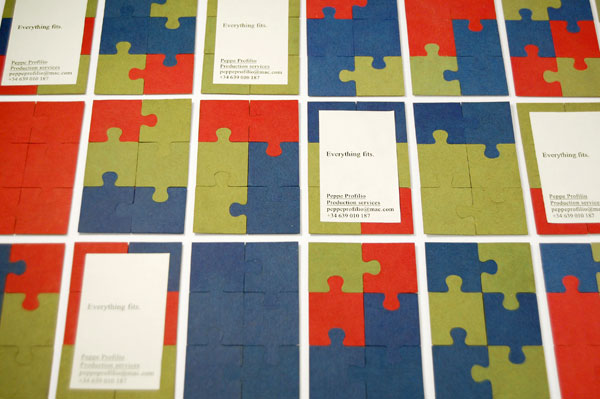
Giuseppe Profilio, a film director, came to Joan Massó for a set of new business cards. He did not need a large amount produced, and he was looking for something that spoke clearly and directly about his methodology and approach to his work. Inspired by the slogan Everything fits, Joan provided an in-the-moment experience for his client, who is able to assemble his business card while having a conversation with the receiver. Giuseppe carries the pieces in small plastic bags that he unveils and assembles on an as-needed basis.
Furthermore the cost of the business cards was kept modest by printing the labels in a single color, and using colored stock for the puzzle pieces — red, green and blue, as in the on-screen colors RGB.

This post was published in the original layout of FPO so all images are smaller. Project descriptions as well as production lessons are quoted in the main content area.
Post Author
Bryony

Bryony Gomez-Palacio
Editor of FPO and co-founder of UnderConsideration LLC.
More: Online / On Twitter
Date Published
March 9, 2010
Filed Under
Business Cards
Tagged with
assembly
business card
digital
experience
laser die-cut
puzzle


About
FPO (For Print Only), is a division of UnderConsideration, celebrating the reality that print is not dead by showcasing the most compelling printed projects.
FPO uses Fonts.com to render Siseriff and Avenir Next.
FPO is run with Six Apart’s MovableType
All comments, ideas and thoughts on FPO are property of their authors; reproduction without the author’s or FPO’s permission is strictly prohibited
Twitter @ucllc
Sign-up for Mailing List
Mailing list managed by MailChimp
Thanks to our advertisers
About UnderConsideration
UnderConsideration is a graphic design firm generating its own projects, initiatives, and content while taking on limited client work. Run by Bryony Gomez-Palacio and Armin Vit in Bloomington, IN. More…
blogs we publish
Brand New / Displaying opinions and focusing solely on corporate and brand identity work.
Art of the Menu / Cataloguing the underrated creativity of menus from around the world.
Quipsologies / Chronicling the most curious, creative, and notable projects, stories, and events of the graphic design industry on a daily basis.
products we sell
Flaunt: Designing effective, compelling and memorable portfolios of creative work.
Brand New Conference videos / Individual, downloadable videos of every presentation since 2010.
Prints / A variety of posters, the majority from our AIforGA series.
Other / Various one-off products.
events we organize
Brand New Conference / A two-day event on corporate and brand identity with some of today's most active and influential practitioners from around the world.
Brand Nieuwe Conference / Ditto but in Amsterdam.
Austin Initiative for Graphic Awesomeness / A speaker series in Austin, TX, featuring some of the graphic design industry's most awesome people.
also
Favorite Things we've Made / In our capacity as graphic designers.
Projects we've Concluded / Long- and short-lived efforts.
UCllc News / Updates on what's going at the corporate level of UnderConsideration.

Related entries
KitchenAid Limited Edition Cards
Black Sheep Studio Business Cards and Promotional Items
Seegno Business Cards
Fracas Productions Business Cards
Elegante Press Business card