ADV @ UNDERCONSIDERATION Peek here for details
BROWSE
Dimensions (Width × Height × Depth)
170mm × 240 mm × 6mm (6.69 in × 9.44 in × .23 in)
Page Count
48
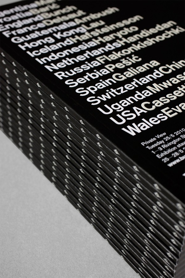
Paper Stock
Arctic 170g/m2
Number of Colors
Cover: 4 spot inks
Interior: CMYK
Varnishes
–
Binding
Perfect binding
Typography
Berthold Akzidenz Grotesk
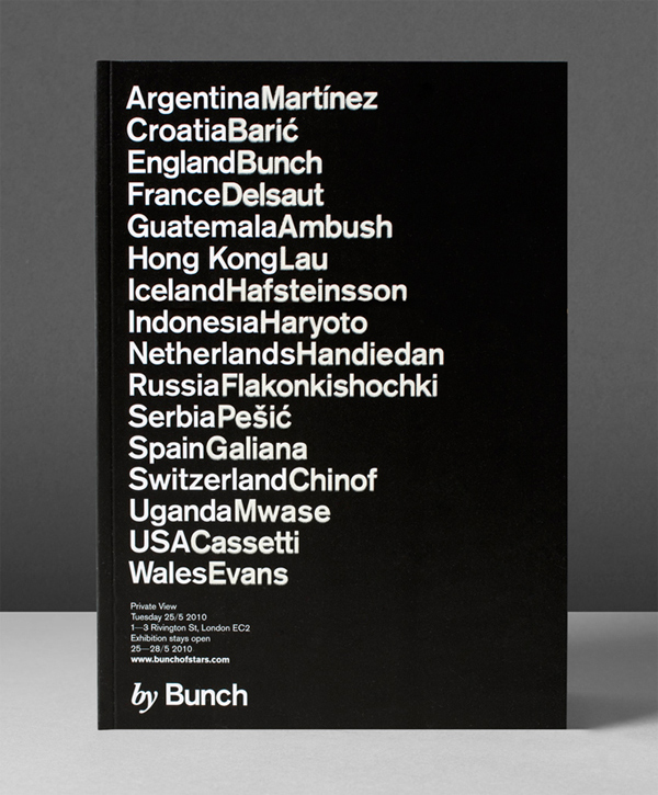
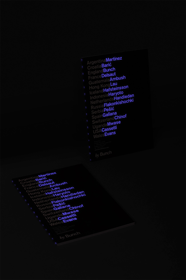
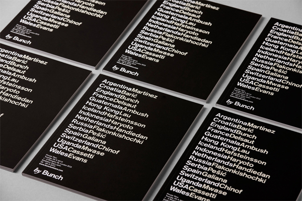
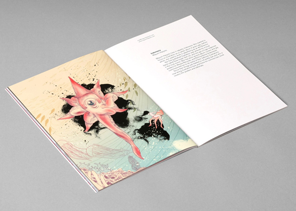
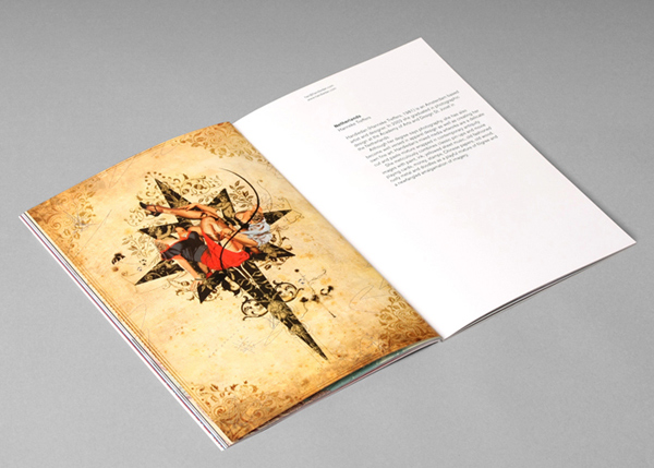
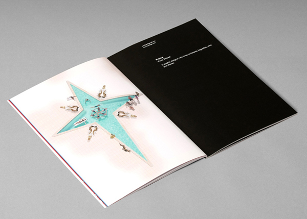
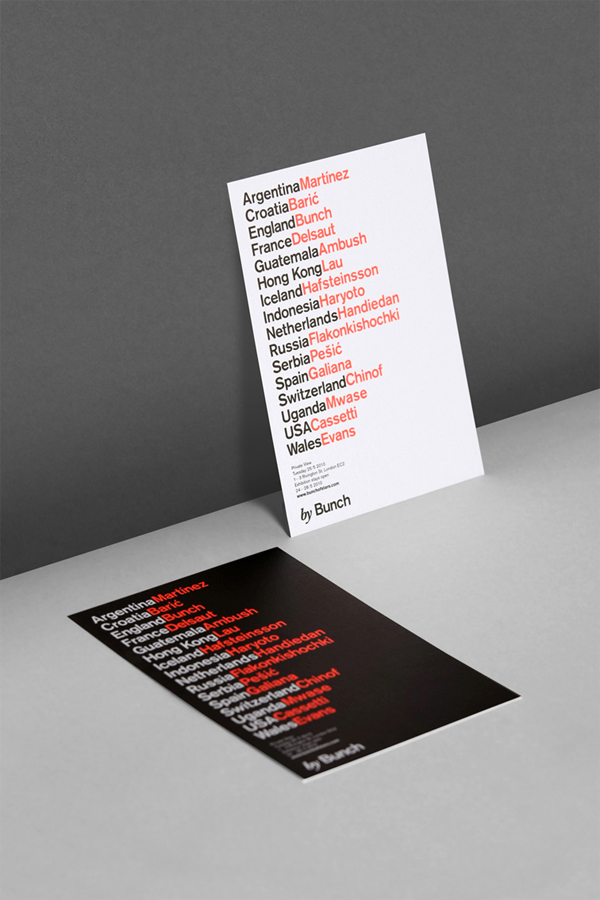
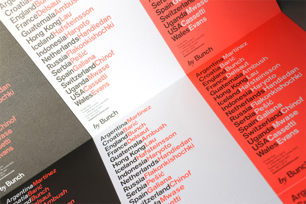
In 2008 Bunch created the identity for The Star of Bethnal Green, a pub in London, that consisted of a long-tailed star and each month they illustrated it in a different way for 12 months. After that first year passed, they started inviting artists and illustrators from around the world to take a stab at the star. Last month, Bunch celebrated these contributions with a show at Red Gallery with 16 of the stars, and produced an array of materials around the event, from posters to t-shirts, but the star of this effort is a 64-page brochure with a glow-in-the-dark cover that, obviously, is a nod to the theme. Denis of Bunch shares some brief insight into what you can expect from phosphorescent ink printing:
We could choose different glow colours which was really exciting. We chose blue in the end. The printer did only one coat through the screen which made you really feel the type under your fingers, almost like braille. Apparently if we were to do two or three coats, the thickness of coat would end up being 1mm or more…
Mmmmm … 1-millimeter-thick phosphorescent ink.

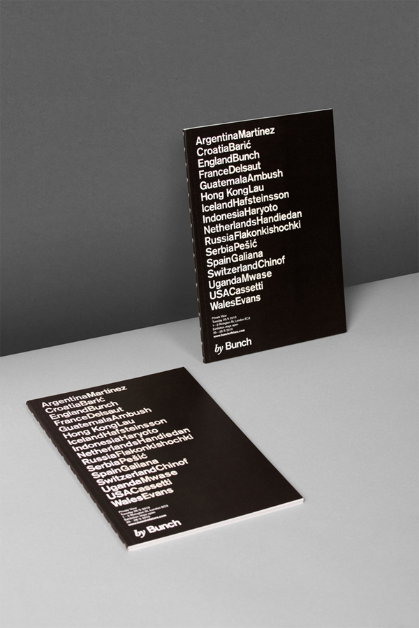
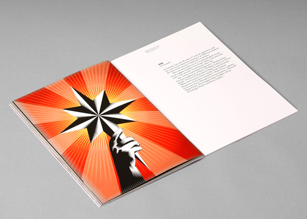
The Star of Bethnal Green Brochure
Production Method
Design
Art direction and design: Bunch
Illustration: Catriel Martinez, Stefan Chinof, Dalibor Baric, Victor Delsaut, Ambush Studio, Chester Lau, Siggeir M. Hafsteinsson, Mayumi Haryoto, Hanneke Treffers, Andrew Flak
Printing
Cerovski
This post was published in the original layout of FPO so all images are smaller. Project descriptions as well as production lessons are quoted in the main content area.
Post Author
Bryony

Bryony Gomez-Palacio
Editor of FPO and co-founder of UnderConsideration LLC.
More: Online / On Twitter
Date Published
June 3, 2010
Filed Under
Brochures
Tagged with
brochure
CMYK
offset
perfect bound
phosphorescent


About
FPO (For Print Only), is a division of UnderConsideration, celebrating the reality that print is not dead by showcasing the most compelling printed projects.
FPO uses Fonts.com to render Siseriff and Avenir Next.
FPO is run with Six Apart’s MovableType
All comments, ideas and thoughts on FPO are property of their authors; reproduction without the author’s or FPO’s permission is strictly prohibited
Twitter @ucllc
Sign-up for Mailing List
Mailing list managed by MailChimp
Thanks to our advertisers
About UnderConsideration
UnderConsideration is a graphic design firm generating its own projects, initiatives, and content while taking on limited client work. Run by Bryony Gomez-Palacio and Armin Vit in Bloomington, IN. More…
blogs we publish
Brand New / Displaying opinions and focusing solely on corporate and brand identity work.
Art of the Menu / Cataloguing the underrated creativity of menus from around the world.
Quipsologies / Chronicling the most curious, creative, and notable projects, stories, and events of the graphic design industry on a daily basis.
products we sell
Flaunt: Designing effective, compelling and memorable portfolios of creative work.
Brand New Conference videos / Individual, downloadable videos of every presentation since 2010.
Prints / A variety of posters, the majority from our AIforGA series.
Other / Various one-off products.
events we organize
Brand New Conference / A two-day event on corporate and brand identity with some of today's most active and influential practitioners from around the world.
Brand Nieuwe Conference / Ditto but in Amsterdam.
Austin Initiative for Graphic Awesomeness / A speaker series in Austin, TX, featuring some of the graphic design industry's most awesome people.
also
Favorite Things we've Made / In our capacity as graphic designers.
Projects we've Concluded / Long- and short-lived efforts.
UCllc News / Updates on what's going at the corporate level of UnderConsideration.

Related entries
Carta de Exploración Brochure
Paperless Post Wedding 2017 Promotion
Karipidis Winery Brochure
Neenah “Fresh Takes on Classic Type on CLASSIC® Papers” Promo
Faculty of Architecture, Art & Design Brochure