ADV @ UNDERCONSIDERATION Peek here for details
BROWSE
Client
Self: Alyssa Zukas and Josh Korwin
Quantity Produced
200
Production Cost
$550
Production Time
3 days
Dimensions (Width × Height × Depth)
6 in × 6 in
Page Count
–
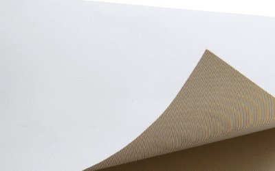
Paper Stock
Invitation: Topkote dull, 95 lb cover
RSVP: Finch opaque, 100 lb cover
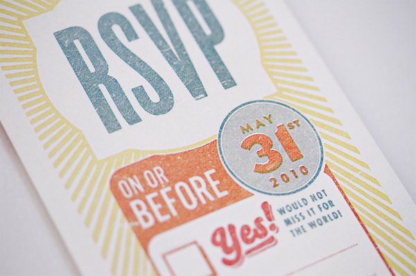
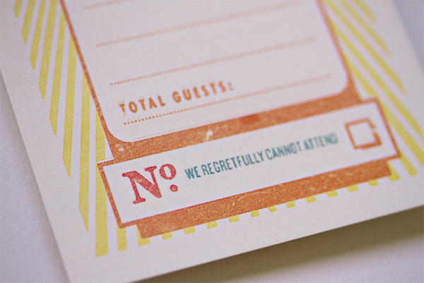
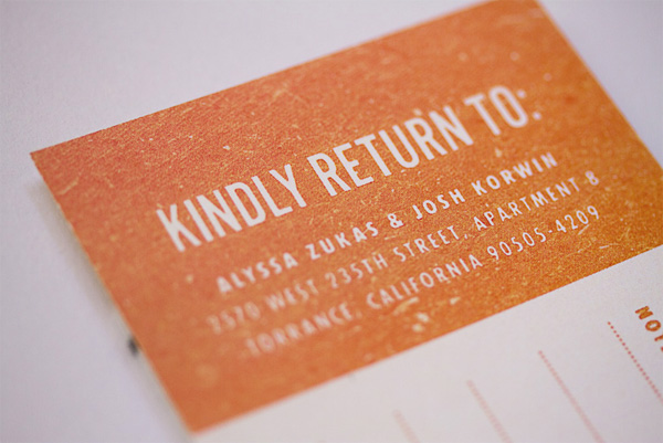
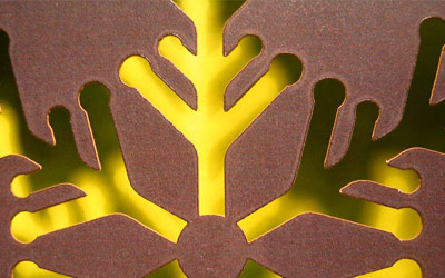
Number of Colors
CMYK + spot block printing inks
Varnishes
–
Binding
–
Typography
Compacta
Akzidenz Grotesk
Back in November Alyssa and Josh sent out their wedding save the date, which we covered in FPO. While they were still unsure of the full wedding concept, music seemed to be an important and viable direction.
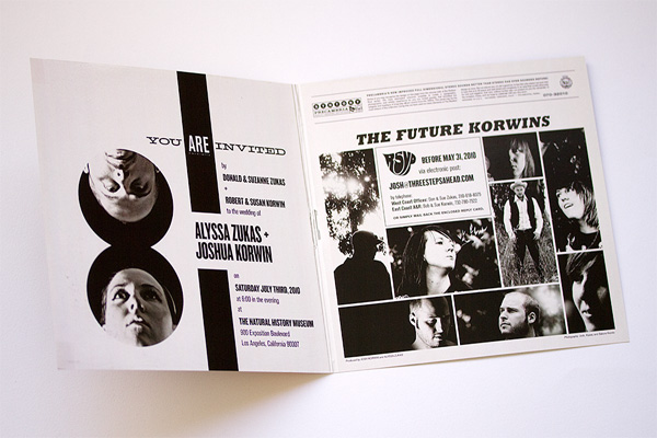
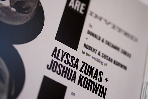
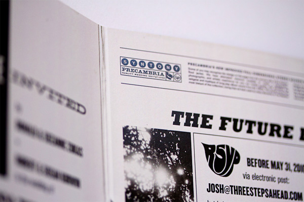
When we came up with the idea of the “gig poster”-as-save-the-date, we’d tossed around the idea of making the entire invitation set feel like music ephemera; LPs, fan club documents, badges, etc. The idea of a gatefold LP album cover felt like a natural choice for the invitation. But the size would be an issue, as we weren’t planning on mailing 12 × 12-inch envelopes. So we went with a half scale; 6-inch-square, folded, instead of 12-inch.
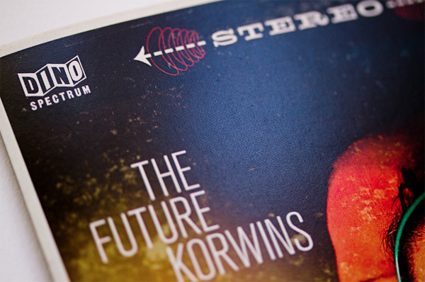
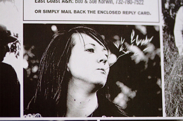
The design of the front cover came first. We were inspired by albums designed mostly in the 1950s through early ’60s, especially “floating head” style covers. I pored obsessively over the typography for weeks, but in a single marathon post-midnight photography session, we finally had the perfect cover portrait. Most of my experience is in panoramic photography and object photography, so I was initially intimidated by the notion of trying to pull off convincing mid-century portrait photography. We pretty much made it up as we went along. Working with a black sweatshirt as our backdrop, we used a small clamp light as our key light on the left, and, next to her face, Alyssa held up an adorable battery operated blue LED nightlight that we got at IKEA. I would set the timed shutter release, and then run back behind Alyssa, and crouch to get my head in the right position. It took a few tries to get the positioning right, but with the proper underexposure, we were able to achieve the half-lit Robert Freeman cover portrait look with plenty of negative space for copy. But by themselves, our floating heads weren’t enough to fill the cover with color. So I took another shot of our lighting setup—sans Alyssa and me—deliberately out of focus. That gave us a great colorful bokeh effect that we would overlay on top of our portraits to produce the final effect. To simulate the “big foreground portrait, small background portrait” effect, we photographed a vintage caketopper in similar lighting conditions, and overlayed that image into some of the negative space in Photoshop. Voil�.
I believe that any couple who can have this much fun with their wedding invitation (and wedding planning) is in it for the long haul. If you want to read more about the design and process, as well as the other pieces please do so in theirblog.
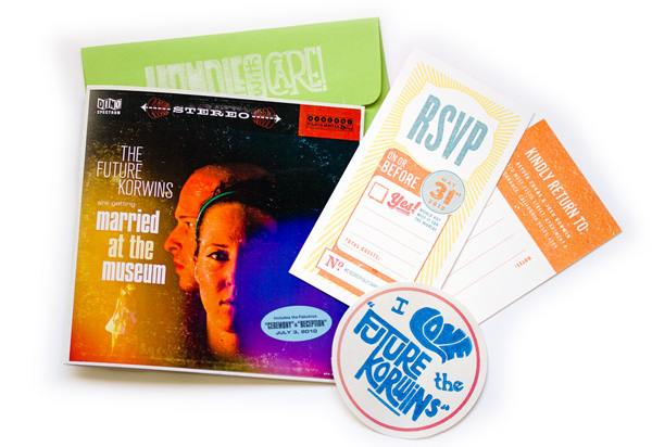


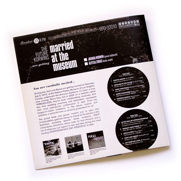
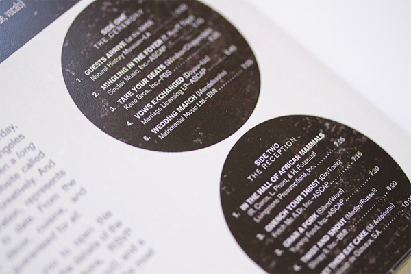
Alyssa and Josh’s Album Cover Wedding Invitation
Production Method
Design
Alyssa Zukas and Josh Korwin
Printing
Alyssa Zukas and Josh Korwin at Classic Litho Printers
This post was published in the original layout of FPO so all images are smaller. Project descriptions as well as production lessons are quoted in the main content area.
Post Author
Bryony

Bryony Gomez-Palacio
Editor of FPO and co-founder of UnderConsideration LLC.
More: Online / On Twitter
Date Published
July 15, 2010
Filed Under
Wedding materials
Tagged with
CMYK
digital
DIY
finch
linocut
PMS
topkote
wedding invitation


About
FPO (For Print Only), is a division of UnderConsideration, celebrating the reality that print is not dead by showcasing the most compelling printed projects.
FPO uses Fonts.com to render Siseriff and Avenir Next.
FPO is run with Six Apart’s MovableType
All comments, ideas and thoughts on FPO are property of their authors; reproduction without the author’s or FPO’s permission is strictly prohibited
Twitter @ucllc
Sign-up for Mailing List
Mailing list managed by MailChimp
Thanks to our advertisers
About UnderConsideration
UnderConsideration is a graphic design firm generating its own projects, initiatives, and content while taking on limited client work. Run by Bryony Gomez-Palacio and Armin Vit in Bloomington, IN. More…
blogs we publish
Brand New / Displaying opinions and focusing solely on corporate and brand identity work.
Art of the Menu / Cataloguing the underrated creativity of menus from around the world.
Quipsologies / Chronicling the most curious, creative, and notable projects, stories, and events of the graphic design industry on a daily basis.
products we sell
Flaunt: Designing effective, compelling and memorable portfolios of creative work.
Brand New Conference videos / Individual, downloadable videos of every presentation since 2010.
Prints / A variety of posters, the majority from our AIforGA series.
Other / Various one-off products.
events we organize
Brand New Conference / A two-day event on corporate and brand identity with some of today's most active and influential practitioners from around the world.
Brand Nieuwe Conference / Ditto but in Amsterdam.
Austin Initiative for Graphic Awesomeness / A speaker series in Austin, TX, featuring some of the graphic design industry's most awesome people.
also
Favorite Things we've Made / In our capacity as graphic designers.
Projects we've Concluded / Long- and short-lived efforts.
UCllc News / Updates on what's going at the corporate level of UnderConsideration.

Related entries
Herbst & Spungen Wedding Invitation Suite
Erin and Brian Wedding Invitation
Daniela & Rui Wedding Invitation
Benjamin & Catalina Wedding Announcement
Devon & Mike Wedding Invitation