ADV @ UNDERCONSIDERATION Peek here for details
BROWSE
Dimensions (Width × Height × Depth)
5 in × 7 in
Page Count
–
Paper Stock
Invitation: Crane's 110lb Lettra, Flourescent
Envelope: Crane's 32lb Lettra
Number of Colors
2 spot inks, PMS 875 metallic and handmixed PMS 5115
Varnishes
–
Binding
–
Typography
Cantoria (Ron Carpenter for Monotype)
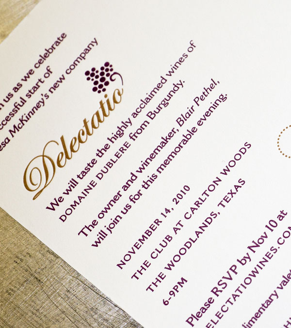
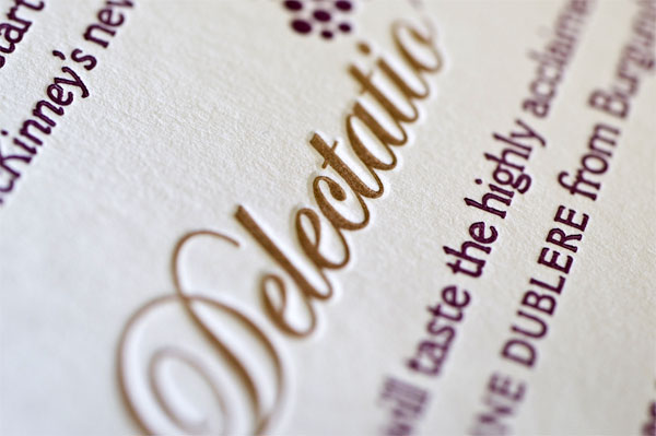
It makes sense to use letterpress printing when inviting guests to a wine tasting, thus continuing to delight the senses with tactile and visual stimuli. With this invitation, Jennifer Blanco encountered a recurring challenge, and that is the use of metallic toned typography—one where the metallic aspect of the ink is not so readily apparent. Sometimes this is a nice surprise, but for her it was a bit of a letdown. Perhaps you have some experience and found a solution to this?
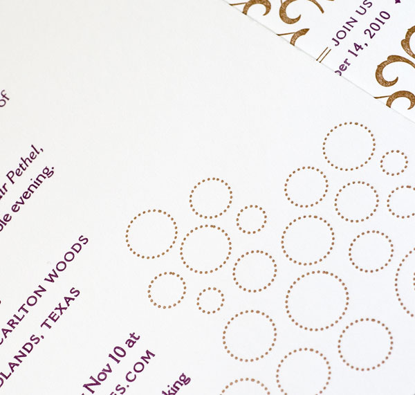
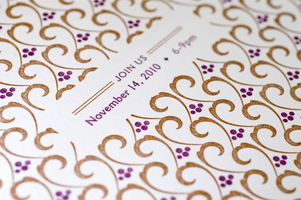
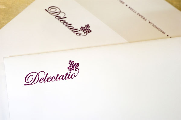
Delectatio Wines, a new wine importer based out of Texas, was having an event to announce their launch with a wine tasting. The occasion would be even more special because one of their winemakers from Italy would be in attendance. To grab more attention and have more impact, they wanted to really print something less ordinary. We recommended letterpress. Inspired by a lovely photo of bronze capped wine bottles from their website, a bronze metallic ink was used highlight the Delectatio burgundy (5115) brand color. An pattern based from their logo was also created as an additional element to compliment the brand and invite, as well as showcase the printing technique.
The biggest challenge with the printing portion was getting the metallic ink to be more rich. While up close you can see it is in use, it would have been even better if it were more apparent. I’m not sure that there is much to be done aside from either printing on a dark color or double inking.
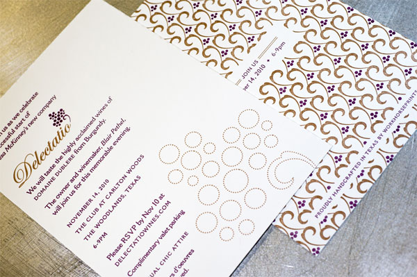

Wine Tasting invitation
Production Method
Design
Spindletop Design: Jennifer Blanco
Printing
Workhorse Printmakers
This post was published in the original layout of FPO so all images are smaller. Project descriptions as well as production lessons are quoted in the main content area.
Post Author
Bryony

Bryony Gomez-Palacio
Editor of FPO and co-founder of UnderConsideration LLC.
More: Online / On Twitter
Date Published
January 12, 2011
Filed Under
Invitations
Tagged with
crane
invitation
letterpress
metallic ink
PMS


About
FPO (For Print Only), is a division of UnderConsideration, celebrating the reality that print is not dead by showcasing the most compelling printed projects.
FPO uses Fonts.com to render Siseriff and Avenir Next.
FPO is run with Six Apart’s MovableType
All comments, ideas and thoughts on FPO are property of their authors; reproduction without the author’s or FPO’s permission is strictly prohibited
Twitter @ucllc
Sign-up for Mailing List
Mailing list managed by MailChimp
Thanks to our advertisers
About UnderConsideration
UnderConsideration is a graphic design firm generating its own projects, initiatives, and content while taking on limited client work. Run by Bryony Gomez-Palacio and Armin Vit in Bloomington, IN. More…
blogs we publish
Brand New / Displaying opinions and focusing solely on corporate and brand identity work.
Art of the Menu / Cataloguing the underrated creativity of menus from around the world.
Quipsologies / Chronicling the most curious, creative, and notable projects, stories, and events of the graphic design industry on a daily basis.
products we sell
Flaunt: Designing effective, compelling and memorable portfolios of creative work.
Brand New Conference videos / Individual, downloadable videos of every presentation since 2010.
Prints / A variety of posters, the majority from our AIforGA series.
Other / Various one-off products.
events we organize
Brand New Conference / A two-day event on corporate and brand identity with some of today's most active and influential practitioners from around the world.
Brand Nieuwe Conference / Ditto but in Amsterdam.
Austin Initiative for Graphic Awesomeness / A speaker series in Austin, TX, featuring some of the graphic design industry's most awesome people.
also
Favorite Things we've Made / In our capacity as graphic designers.
Projects we've Concluded / Long- and short-lived efforts.
UCllc News / Updates on what's going at the corporate level of UnderConsideration.

Related entries
“An Evening onboard the HMS Victory” Invitation
Rainforest Alliance 2017 Annual Gala Invitation
The Nelson-Atkins Museum of Art Invitation
Victoria and Sasha Wedding Invitation
“Fast & Four” Skateboard Deck Invitation