ADV @ UNDERCONSIDERATION Peek here for details
BROWSE
Client
Kambala
Quantity Produced
120
Production Cost
AU$19 (US$18.95) per item
Production Time
7 days
Dimensions (Width × Height × Depth)
–
Page Count
4
Paper Stock
Splendorgel Digital
Number of Colors
–
Varnishes
–
Binding
–
Typography
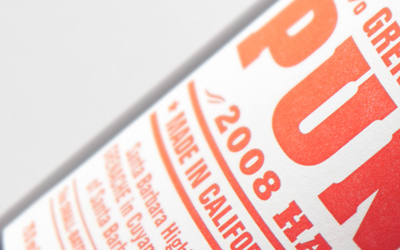
ITC Officina
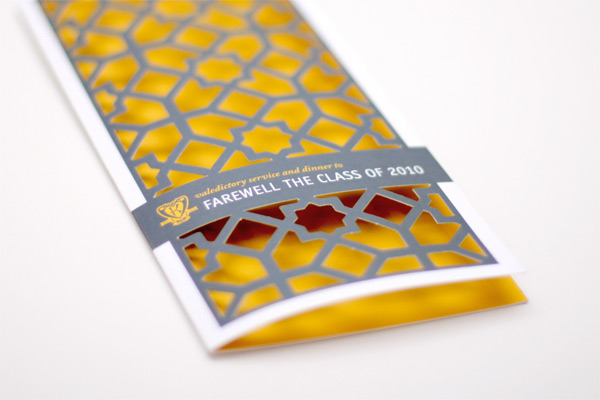
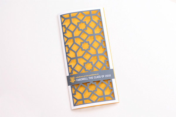
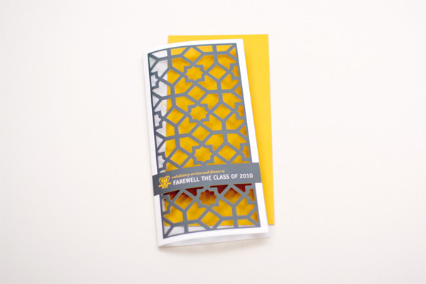
There’s a sense of notoriety and delicacy about die-cut paper that mirrors the realm in which this project lives. For graduating students, their education is a symbol of accomplishment and confidence, yet their future is still uncertain. Like the paper itself, there’s a balance between what has been seen and what is to be seen.
The purpose for this project was for a special invitation for Year 12 students (last senior year). We had to come with an original idea to make this invitation unique and memorable. As the other invitations sent out during the year utilize the same template it was imperative that this invitation had a point of difference; to do that we thought about going beyond the printing machine and play with finishes. Another requirement of the brief was that the design could not reveal too much about the theme of that night (which was something arabic). The final request from the client was to have content displayed on the inside of this invitation, which wouldn’t have complimented the die cut; fortunately we had a 1 page insert of a list of all the girls of that special year, which we printed in a yellow solid on the back. This allowed for the die cut to sit against a bright surface and created better visibility of it’s intricate design.
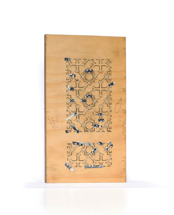
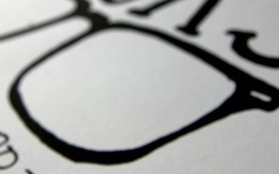
There are many things that you can achieve through using a die cut, but you must consider that the more complicated your die is, the more expensive it will become! There is also a limit of complexity you can design, for example in this project we wanted to have the pattern smaller, but we had to enlarge it so the die maker could keep all his hairs at the end. It is important to remember, when you die cut a two side print remember that there is content on the other side — easy to forget when you eyes are glued to the screen.

This post was published in the original layout of FPO so all images are smaller. Project descriptions as well as production lessons are quoted in the main content area.
Post Author
Lauren Dickens

Lauren Dickens
Former intern at UnderConsideration LLC.
More: Online / On Twitter
Date Published
February 9, 2011
Filed Under
Invitations
Tagged with
die-cut
indigo
invitation


About
FPO (For Print Only), is a division of UnderConsideration, celebrating the reality that print is not dead by showcasing the most compelling printed projects.
FPO uses Fonts.com to render Siseriff and Avenir Next.
FPO is run with Six Apart’s MovableType
All comments, ideas and thoughts on FPO are property of their authors; reproduction without the author’s or FPO’s permission is strictly prohibited
Twitter @ucllc
Sign-up for Mailing List
Mailing list managed by MailChimp
Thanks to our advertisers
About UnderConsideration
UnderConsideration is a graphic design firm generating its own projects, initiatives, and content while taking on limited client work. Run by Bryony Gomez-Palacio and Armin Vit in Bloomington, IN. More…
blogs we publish
Brand New / Displaying opinions and focusing solely on corporate and brand identity work.
Art of the Menu / Cataloguing the underrated creativity of menus from around the world.
Quipsologies / Chronicling the most curious, creative, and notable projects, stories, and events of the graphic design industry on a daily basis.
products we sell
Flaunt: Designing effective, compelling and memorable portfolios of creative work.
Brand New Conference videos / Individual, downloadable videos of every presentation since 2010.
Prints / A variety of posters, the majority from our AIforGA series.
Other / Various one-off products.
events we organize
Brand New Conference / A two-day event on corporate and brand identity with some of today's most active and influential practitioners from around the world.
Brand Nieuwe Conference / Ditto but in Amsterdam.
Austin Initiative for Graphic Awesomeness / A speaker series in Austin, TX, featuring some of the graphic design industry's most awesome people.
also
Favorite Things we've Made / In our capacity as graphic designers.
Projects we've Concluded / Long- and short-lived efforts.
UCllc News / Updates on what's going at the corporate level of UnderConsideration.

Related entries
“An Evening onboard the HMS Victory” Invitation
Rainforest Alliance 2017 Annual Gala Invitation
The Nelson-Atkins Museum of Art Invitation
Victoria and Sasha Wedding Invitation
“Fast & Four” Skateboard Deck Invitation