ADV @ UNDERCONSIDERATION Peek here for details
BROWSE
Client
Olli Salumeria Americana
Quantity Produced
2,000
Production Cost
$1,560
Production Time
2 weeks
Dimensions (Width × Height × Depth)
2.5 in × 2.5 in
Page Count
–
Paper Stock
Crane Lettra Flo White 110C duplexed after printing to make 220C
Number of Colors
2
Varnishes
–
Binding
–
Typography
VIP
Engravers Gothic BT
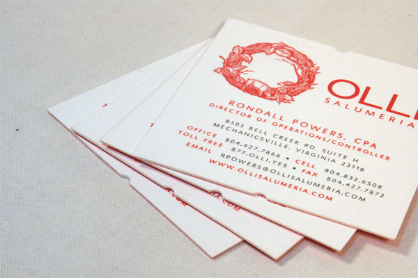
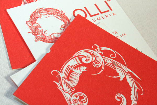
I was surprised to learn that these cards were designed for a salami shop. Not the greasy meat slab aesthetic I would have expected. Instead, the detail on these cards is impeccably clean, and if these cards are a reflection of the quality of their meat, then my mouth is watering just thinking about it.
The concept behind the identity for Olli Salumeria is to bridge the values of old-world salumiere craftsmanship (the craft of making dry cured salame) and the contemporary value of living well by eating well. The company didn’t want to be associated with the standard deli case red-green-and-gold Italian themed labels that are typical of cured meats. They wanted to appeal to a younger demographic and convey a fresh, optimistic approach to dry-cured meat. The idea isn’t to be a foodie company appealing to small cult-following of foodies, but to rather convert young people (and older ones too) who are looking for new experiences and want to enjoy life by eating well and living a balanced life.
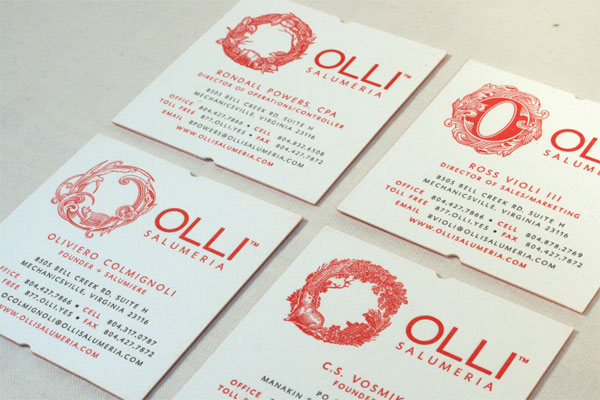
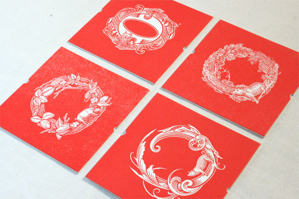
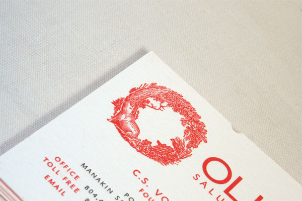
We designed a brand identity with the help of the skilled scratchboard artist, Roger Xavier where we had the brand made up of various ‘O’s built out of ornate elements or scenes. Every ‘O’ contains a little pig. We use the different ‘O’s on the different products in their range and throughout their marketing material to keep things ever-changing and just plain fun. Who says you can’t have four logos?
The cards were printed on Crane Lettra White 110C, duplexed after printing to make 220C (100% cotton stock). These heavy cards were die-cut in a square shape with little vintage label/ticket shape notches on top and bottom.
We specified a bright red (GOE 21-1-7) from Pantone new-ish GOE guides that (unfortunately) many printers (still) don’t reference. We love these books for their organization and breadth of colors (way more than the standard Coated/Uncoated books!) Since Studio on Fire didn’t have these guides on hand, we sent them a couple chips to custom match the red (we describe it as Ferrari red). We just couldn’t justify specifying a standard red - the new red is a very ‘true’ red that doesn’t have an equal. The resulting color was terrific, and Studio on Fire outdid themselves on maintaining incredible levels of detail in the artwork.
The client got a lot of enthusiastic feedback on their cards where they debuted at the San Francisco Fancy Food Show in January 2011.


Olli Business Card
Production Method
Design
Design: Yael Miller
Art Director: Yael Miller
Creative Director: Reuben Miller
Illustrator: Roger Xavier
Printing
Studio on Fire

This post was published in the original layout of FPO so all images are smaller. Project descriptions as well as production lessons are quoted in the main content area.
Post Author
Lauren Dickens

Lauren Dickens
Former intern at UnderConsideration LLC.
More: Online / On Twitter
Date Published
May 12, 2011
Filed Under
Business Cards
Tagged with
business card
crane lettra
letterpress


About
FPO (For Print Only), is a division of UnderConsideration, celebrating the reality that print is not dead by showcasing the most compelling printed projects.
FPO uses Fonts.com to render Siseriff and Avenir Next.
FPO is run with Six Apart’s MovableType
All comments, ideas and thoughts on FPO are property of their authors; reproduction without the author’s or FPO’s permission is strictly prohibited
Twitter @ucllc
Sign-up for Mailing List
Mailing list managed by MailChimp
Thanks to our advertisers
About UnderConsideration
UnderConsideration is a graphic design firm generating its own projects, initiatives, and content while taking on limited client work. Run by Bryony Gomez-Palacio and Armin Vit in Bloomington, IN. More…
blogs we publish
Brand New / Displaying opinions and focusing solely on corporate and brand identity work.
Art of the Menu / Cataloguing the underrated creativity of menus from around the world.
Quipsologies / Chronicling the most curious, creative, and notable projects, stories, and events of the graphic design industry on a daily basis.
products we sell
Flaunt: Designing effective, compelling and memorable portfolios of creative work.
Brand New Conference videos / Individual, downloadable videos of every presentation since 2010.
Prints / A variety of posters, the majority from our AIforGA series.
Other / Various one-off products.
events we organize
Brand New Conference / A two-day event on corporate and brand identity with some of today's most active and influential practitioners from around the world.
Brand Nieuwe Conference / Ditto but in Amsterdam.
Austin Initiative for Graphic Awesomeness / A speaker series in Austin, TX, featuring some of the graphic design industry's most awesome people.
also
Favorite Things we've Made / In our capacity as graphic designers.
Projects we've Concluded / Long- and short-lived efforts.
UCllc News / Updates on what's going at the corporate level of UnderConsideration.

Related entries
KitchenAid Limited Edition Cards
Black Sheep Studio Business Cards and Promotional Items
Seegno Business Cards
Fracas Productions Business Cards
Elegante Press Business card