ADV @ UNDERCONSIDERATION Peek here for details
BROWSE
Client
Self-promotion
Quantity Produced
15
Production Cost
Roughly $100
Production Time
About a Week
Dimensions (Width × Height × Depth)
7 in × 9 in
Page Count
–
Paper Stock
French Paper, Speckletone, Starch Rain 100 lb Cover
Chipboard
Number of Colors
2 Spot (Black + Metallic Silver)
Varnishes
–
Binding
–
Typography
League Gothic
Toronto Gothic
Bello Script
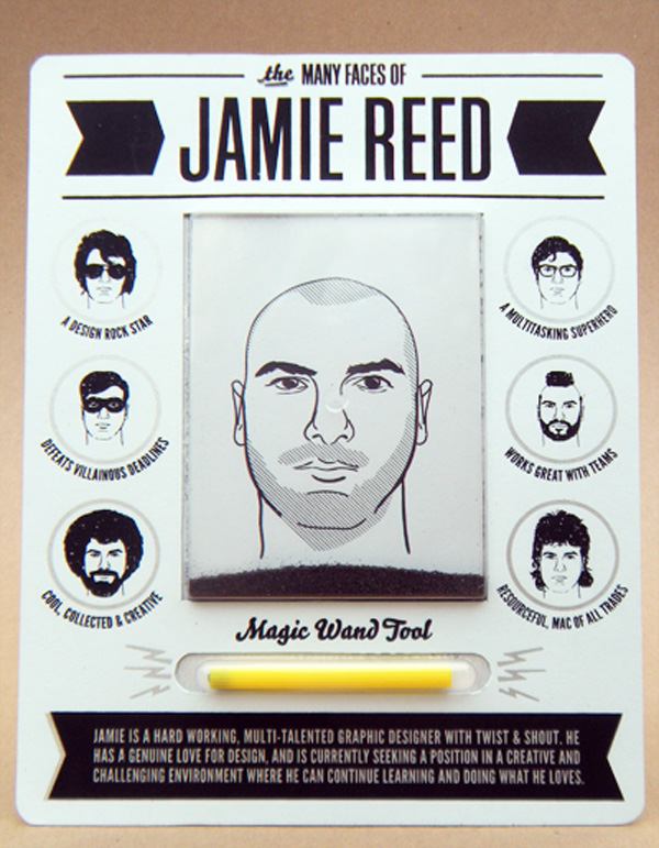
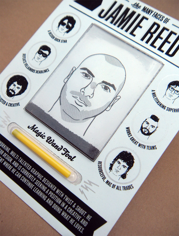
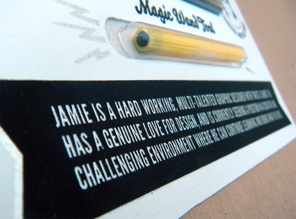
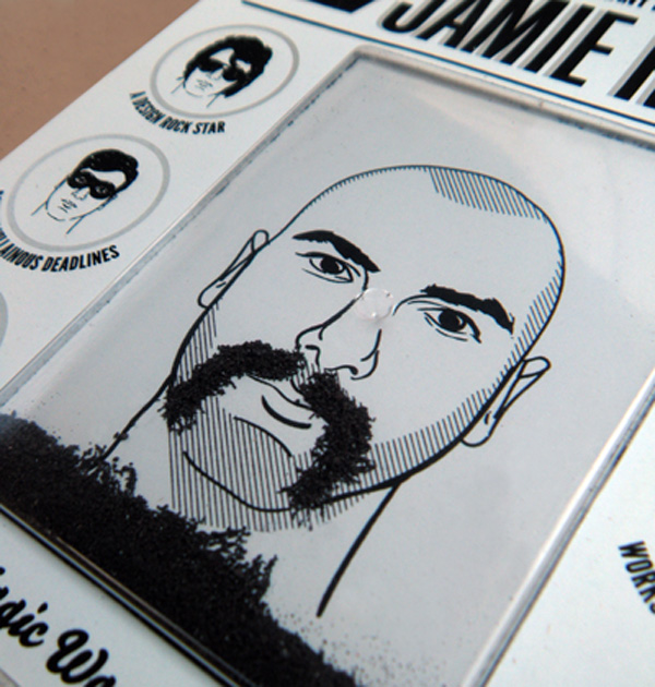
I generally don’t like gimmicky designer promos, unless the gimmick goes the full monty and becomes something that gets my undivided attention for more than one minute (but no more than 5, that’s the cutoff for procrastinating on fun things that come in the mail). Seeing Jamie’s Wolly Willy promo is like getting a shot of childhood adrenaline, you just have that immediate connection with it and I’m sure (or at least assume) that potential employers would have a similar reaction and give him a bit more attention than to a resume that came in a plain envelope. The final piece looks amazingly finished, like something you could buy at Urban Outfitters. It’s hard to tell this wasn’t mass produced, especially because of the touch of silver silkscreen, it gives that extra production oomph. Although he picked good personalities as examples to line the package, I wish there was a Carrot Top.
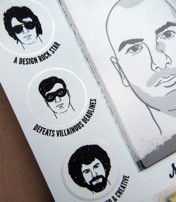
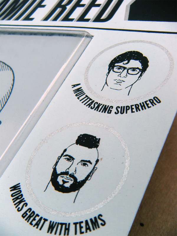
If you’re not familiar, Wooly Willy is a cheap magnetic toy that lets you create hairstyles by moving metal filings around with a magnet wand. I used to play with them as a kid and remember drawing beards, mustaches, mo-hawks, then quickly shaking it clean to start again. More recently (now slightly older, with a shaved head resembling “Willy”) I saw one in a toy store and thought that it might work as a unique self-promo. The concept was pretty simple, essentially the different faces you could create would represent a character trait or ability of mine as a graphic designer.
A resume disguised as hours of fun, how could that NOT work? I included my portfolio and resume, but more importantly it was a great way to show a little personality, something not easily picked up on from a standard cover letter. I hoped it would be memorable and engaging — something that wouldn’t be thrown away, and perhaps even displayed.
I used recognizable pop culture icons that I thought best illustrated my personality and work habits and tried to keep the message fun and conversational. One of the hardest parts of this project was thinking of the reference characters to use, I went back and forth between using “real” people or just doing generic characters (like a gunslinger or superhero). After much deliberation and many suggestions from friends, I decided on Elvis, Robin, Bob Ross, Superman, Mr. T, and MacGyver. I would like to note however that Chuck Norris, James Bond, Telly Savalas and Burt Reynolds nearly made the cut.
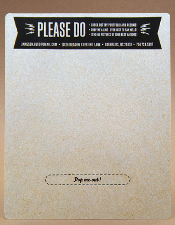
The final piece was sent to potential employers in a padded envelope with a more formal resume and portfolio on a CD.
Fortunately I screen print in my free time, so the printing went off without a hitch and best of all, aside from the materials, it was free. Unfortunately there was a lot of hand work involved on the back end, so keeping everything clean and crisp was top priority.
There were several parts that needed to be glued: the front blue sheet to the plastic cover, inserting the magic wand and metal filings, then finally aligning everything and gluing the front and back chipboard sheet together. Looking back, a dry run would have definitely been helpful during assembly. I ruined one or two before I got into a rhythm of putting everything together. Since I was making such a small quantity I tried to be pretty careful from that point on.
There weren’t any huge “A-ha” moments, but one thing I did was to use a quarter-inch corner punch to round off the edges. It’s a really inexpensive way to give everything a finished look, it also kept the corners from being bent in the mail.

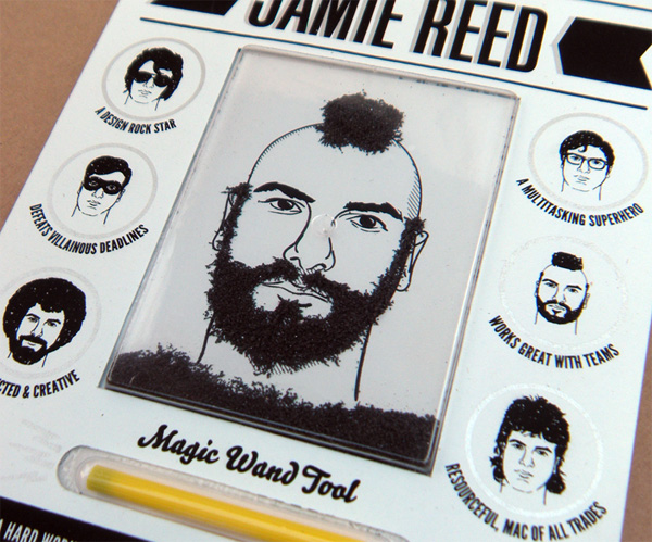
Jamie Reed’s Magnetic Toy Promo
Production Method
Design
Jamie Reed (a k a HumanShapedRobot)
Printing
–
This post was published in the original layout of FPO so all images are smaller. Project descriptions as well as production lessons are quoted in the main content area.
Post Author
Armin

Armin Vit
Editor of FPO and co-founder of UnderConsideration LLC.
More: Online / On Twitter
Date Published
June 3, 2011
Filed Under
Self promotion
Tagged with
chipboard
french paper
magnets
silkscreen


About
FPO (For Print Only), is a division of UnderConsideration, celebrating the reality that print is not dead by showcasing the most compelling printed projects.
FPO uses Fonts.com to render Siseriff and Avenir Next.
FPO is run with Six Apart’s MovableType
All comments, ideas and thoughts on FPO are property of their authors; reproduction without the author’s or FPO’s permission is strictly prohibited
Twitter @ucllc
Sign-up for Mailing List
Mailing list managed by MailChimp
Thanks to our advertisers
About UnderConsideration
UnderConsideration is a graphic design firm generating its own projects, initiatives, and content while taking on limited client work. Run by Bryony Gomez-Palacio and Armin Vit in Bloomington, IN. More…
blogs we publish
Brand New / Displaying opinions and focusing solely on corporate and brand identity work.
Art of the Menu / Cataloguing the underrated creativity of menus from around the world.
Quipsologies / Chronicling the most curious, creative, and notable projects, stories, and events of the graphic design industry on a daily basis.
products we sell
Flaunt: Designing effective, compelling and memorable portfolios of creative work.
Brand New Conference videos / Individual, downloadable videos of every presentation since 2010.
Prints / A variety of posters, the majority from our AIforGA series.
Other / Various one-off products.
events we organize
Brand New Conference / A two-day event on corporate and brand identity with some of today's most active and influential practitioners from around the world.
Brand Nieuwe Conference / Ditto but in Amsterdam.
Austin Initiative for Graphic Awesomeness / A speaker series in Austin, TX, featuring some of the graphic design industry's most awesome people.
also
Favorite Things we've Made / In our capacity as graphic designers.
Projects we've Concluded / Long- and short-lived efforts.
UCllc News / Updates on what's going at the corporate level of UnderConsideration.

Related entries
E.A.S.E. Stationery Set
End of Work iPad and Notebook Cases
Cranky Bucks Promotion
Pizza Box Promo Mailer
Bryan Patrick Todd Mailer