ADV @ UNDERCONSIDERATION Peek here for details
BROWSE
Dimensions (Width × Height × Depth)
210 mm × 270 mm (8.3 in × 10.6 in)
Page Count
180
Paper Stock
Mixed coated and uncoated, 250 g/qm, 130 g/qm, 70 g/qm
Number of Colors
Cover: 6 HKS colors
Interior: CMYK, 2 HKS colors
Varnishes
Interior: Drip-Off
Binding
Adhesive
Typography
Korpus by Michael Mischler
Nik Thoenen for Binnenland
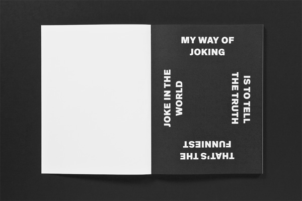
My most potent chemistry lesson came the day the HCl (hydrochloric acid) ate my sweatshirt. In that moment, I learned the value of explosions over carefully followed instructions. Though perhaps only as functional as a garbage can fire, experimental typography is no less beautiful and exciting. That spark — the moment when letter, consumed by concept, combusts — that’s enough to make you want to blow s#it up.
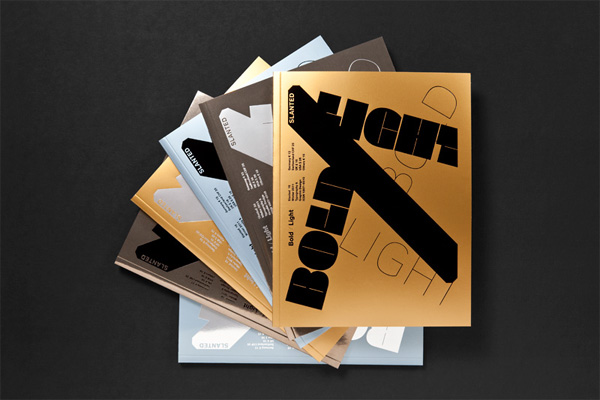
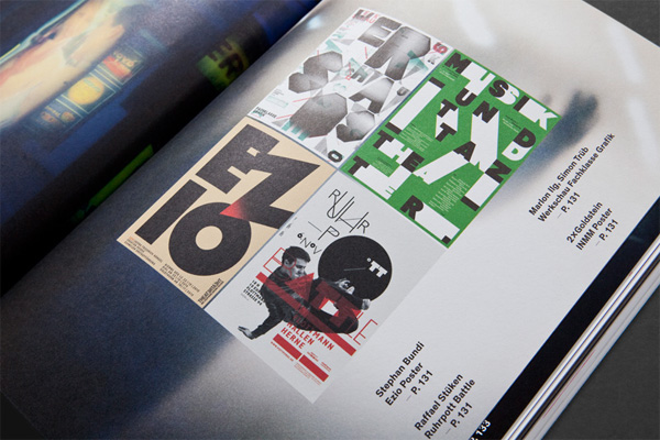
Slanted #15 – Experimental deals with experimental design strategies in typography and graphic design. This issue presents projects incorporating the accident into the design process, works based on mistakes and inaccuracy, fonts that derive from a concept or a system — in the end work that experiments or goes unconventional ways in design.
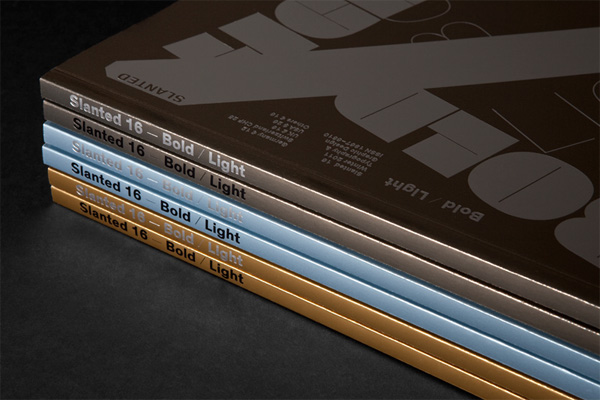
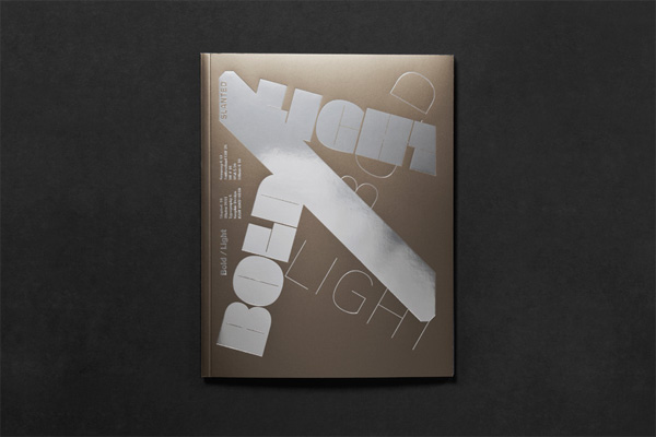
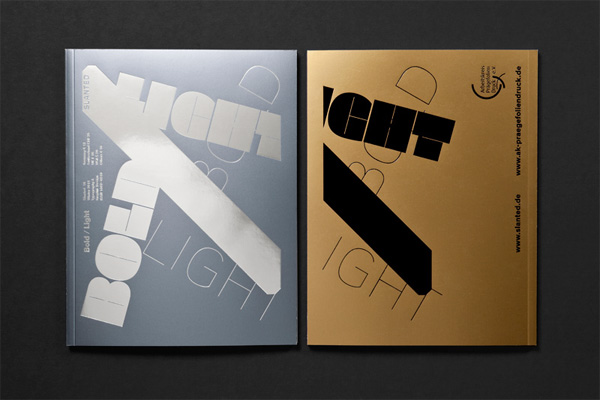
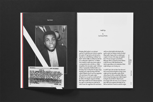
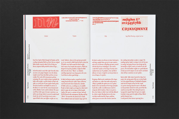
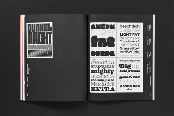
Inaccuracies sometimes lead to new precision — as in this issue’s text font. The typeface Korpus has been designed by Michael Mischler and Nik Thoenen of Swiss font label Binnenland. It is based on a careful analysis of inaccuracy occurring in the print image of early 20th century fonts. This issue’s cover is realized in an old-fashioned, experimental procedure, too: its print sheet has been produced in rainbow printing using HKS colors.

Slanted Magazine
Production Method
Design
Art-Direction: Flo Gaertner, Lars Harmsen
Editors: Flo Gaertner, Lars Harmsen, Julia Kahl, Michael Schmidt
Design: Julia Kahl
Editor in Chief: Lars Harmsen
Managing Editor: Julia Kahl
Assistance: Anja Neidhardt, Ina Doncheva, Julian Müller, Sarah Schmitt, Tobias Dahl
Printing
E&B Engelhardt and Bauer, Karlsruhe, Germany
This post was published in the original layout of FPO so all images are smaller. Project descriptions as well as production lessons are quoted in the main content area.
Post Author
Kelly Cree

Kelly Cree
Writer for UnderConsideration LLC.
More: Online / On Twitter
Date Published
November 16, 2011
Filed Under
Magazines
Tagged with
drip-off
German
HKS
magazine
typography


About
FPO (For Print Only), is a division of UnderConsideration, celebrating the reality that print is not dead by showcasing the most compelling printed projects.
FPO uses Fonts.com to render Siseriff and Avenir Next.
FPO is run with Six Apart’s MovableType
All comments, ideas and thoughts on FPO are property of their authors; reproduction without the author’s or FPO’s permission is strictly prohibited
Twitter @ucllc
Sign-up for Mailing List
Mailing list managed by MailChimp
Thanks to our advertisers
About UnderConsideration
UnderConsideration is a graphic design firm generating its own projects, initiatives, and content while taking on limited client work. Run by Bryony Gomez-Palacio and Armin Vit in Bloomington, IN. More…
blogs we publish
Brand New / Displaying opinions and focusing solely on corporate and brand identity work.
Art of the Menu / Cataloguing the underrated creativity of menus from around the world.
Quipsologies / Chronicling the most curious, creative, and notable projects, stories, and events of the graphic design industry on a daily basis.
products we sell
Flaunt: Designing effective, compelling and memorable portfolios of creative work.
Brand New Conference videos / Individual, downloadable videos of every presentation since 2010.
Prints / A variety of posters, the majority from our AIforGA series.
Other / Various one-off products.
events we organize
Brand New Conference / A two-day event on corporate and brand identity with some of today's most active and influential practitioners from around the world.
Brand Nieuwe Conference / Ditto but in Amsterdam.
Austin Initiative for Graphic Awesomeness / A speaker series in Austin, TX, featuring some of the graphic design industry's most awesome people.
also
Favorite Things we've Made / In our capacity as graphic designers.
Projects we've Concluded / Long- and short-lived efforts.
UCllc News / Updates on what's going at the corporate level of UnderConsideration.

Related entries
Elbow Grease Magazine
Best of Local Magazine
nomad Magazine
ARCMTL + LA SERRES - Objets flottants Arts vivants Edition
Unfiltered Magazine