ADV @ UNDERCONSIDERATION Peek here for details
BROWSE
Client
START (National Consortium for the Study of Terrorism and Responses to Terrorism)
Quantity Produced
3,500
Production Cost
–
Production Time
3 weeks
Dimensions (Width × Height × Depth)
10 in × 12.5 in
Page Count
48 + cover; including 4-page gatefold
Paper Stock
Mohawk Options 100 lb cover and 100 lb text
Number of Colors
Cover: 4 Spot + Clear Foil Stamp
Interior: CMYK + 1 Spot
Varnishes
–
Binding
Perfect-bound
Typography
Whitney by Tobias Frere-Jones: Hoefler & Frere-Jones
Interstate by Tobias Frere-Jones: Font Bureau
Terrorism never looked so compelling after a glance at START’s biennial report. Infographic eye candy turns serious research into easily digestible bites, ideal for a busy Congressman requiring food for thought on the run. I dare say this report is the bomb!
[Ed.’s Note: We received this report at the office and the photo of the cover does not do this justice. It has one of the best uses of clear foil stamp I’ve seen (and touched). The foil is a pattern of triangles that falls on top of the printed triangles, amping up the texture and look of the cover. Really nice. — Armin]
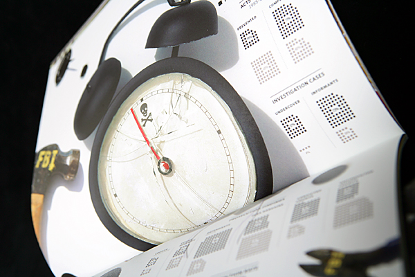
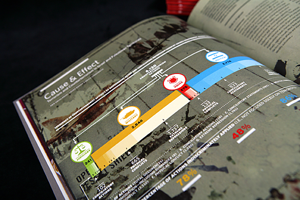
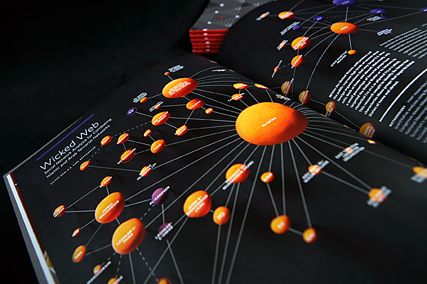
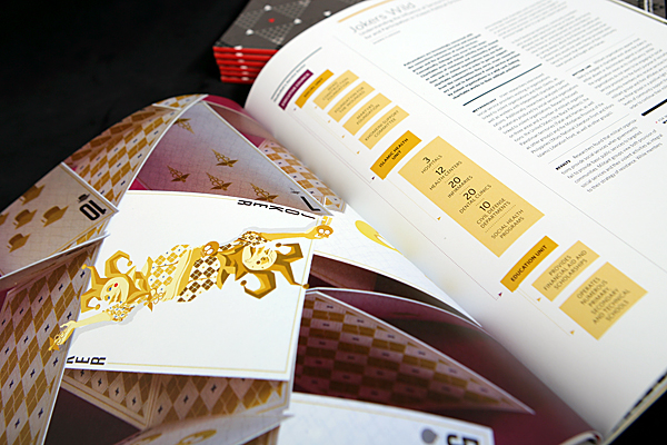
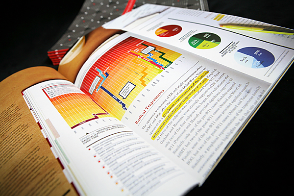
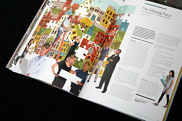
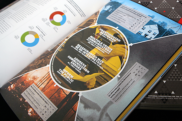
This project highlights the research of START (National Consortium for the Study of Terrorism and Responses to Terrorism) over a two year period. 10 projects are featured and the data from the research is presented in a visual and/or conceptual manner. The audience is Department of Homeland Security and Congressional officials who would be interested in the material, but would not have a lot of time to read lengthy research papers.
Inspired by Wired magazine (Scott Dadich era) and Edward Tufte, we tried to make overly dense material accessible to a lay audience.
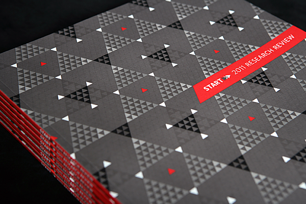

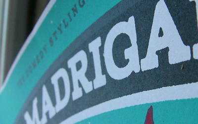
START Biennial Report
Production Method
Offset
Design
University of Maryland University Publications
Art Director: Joshua Harless
Design / Infographics: Brian G. Payne, Catherine Nichols, Patti Look, Joshua Harless
Photographer: John T. Consoli
Illustrators: Johanna Barthmaier, Brian G. Payne, Christie Liberatore, Patti Look, Michele Rosenthal
Printing
Mosaic Print
Production Manager: Kathy Lambird
This post was published in the original layout of FPO so all images are smaller. Project descriptions as well as production lessons are quoted in the main content area.
Post Author
Jessica Mullen

Jessica Mullen
Writer for UnderConsideration LLC.
More: Online / On Twitter
Date Published
December 5, 2011
Filed Under
Annual Reports
Offset
Tagged with
annual report
CMYK
foil stamp
gatefold
offset
perfect bound
spot ink


About
FPO (For Print Only), is a division of UnderConsideration, celebrating the reality that print is not dead by showcasing the most compelling printed projects.
FPO uses Fonts.com to render Siseriff and Avenir Next.
FPO is run with Six Apart’s MovableType
All comments, ideas and thoughts on FPO are property of their authors; reproduction without the author’s or FPO’s permission is strictly prohibited
Twitter @ucllc
Sign-up for Mailing List
Mailing list managed by MailChimp
Thanks to our advertisers
About UnderConsideration
UnderConsideration is a graphic design firm generating its own projects, initiatives, and content while taking on limited client work. Run by Bryony Gomez-Palacio and Armin Vit in Bloomington, IN. More…
blogs we publish
Brand New / Displaying opinions and focusing solely on corporate and brand identity work.
Art of the Menu / Cataloguing the underrated creativity of menus from around the world.
Quipsologies / Chronicling the most curious, creative, and notable projects, stories, and events of the graphic design industry on a daily basis.
products we sell
Flaunt: Designing effective, compelling and memorable portfolios of creative work.
Brand New Conference videos / Individual, downloadable videos of every presentation since 2010.
Prints / A variety of posters, the majority from our AIforGA series.
Other / Various one-off products.
events we organize
Brand New Conference / A two-day event on corporate and brand identity with some of today's most active and influential practitioners from around the world.
Brand Nieuwe Conference / Ditto but in Amsterdam.
Austin Initiative for Graphic Awesomeness / A speaker series in Austin, TX, featuring some of the graphic design industry's most awesome people.
also
Favorite Things we've Made / In our capacity as graphic designers.
Projects we've Concluded / Long- and short-lived efforts.
UCllc News / Updates on what's going at the corporate level of UnderConsideration.

Related entries
2016 RUFA Annual Report
True Grit: Concho 2016 Annual Report
National Arts Council Annual Report 2014
CREATIVE REGION Annual Report
Intertain Annual Report