ADV @ UNDERCONSIDERATION Peek here for details
BROWSE

CMYK process colors don't show well on dark papers. Or they don't show at all. It depends on how brown/dark is your paper. Well, probably you can see areas printed with black, but you can't really see magenta, cyan and -- above all -- yellow. In general, screen printing is a good way to show light colors on black papers. But this is not always the best way, it depends on what you have to print. If you have a lot of tones and shades and very complicated graphics, screen printing is probably not the best way to go. You could print a white substrate on paper before printing light colors. There are solid whites inks for single sheet offset, for instance, and you can print them also twice (or double hit) to have a good white background to print light colors on. Or, finally, you can use white foil stamping.
Depending on the paper, your colors will vary significantly. Highly saturated colors may not be possible to reproduce accurately. My advice for printing light colors on a dark stock would be to go with a coated sheet if possible and stick to spot colors. If a coated sheet is not possible, try a double hit of ink or even foil stamping, as Maurizio says above. Foil stamping will, however, give you a different feel to the finished piece, shiny and metallic, which may be not be the desired look you're going for.
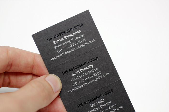
We've had particularly good success printing with spot metallic offset inks on dark stock. Especially silver. The printing we did on the back of the Astronaut's Guild cards, above, are black foil stamped and silver offset on a black card stock. Another way to print on dark stock (if the artwork allows for it) is to use engraving. Engraving inks are water based and fully opaque, allowing any ink color to show as intended no matter the color of the substrate.
Most offset inks are transparent and are influenced by the brightness of the paper on which they are printed. There are exceptions. The first exception is opaque ink. Opaque ink is not truly opaque, but is more accurately described as "more opaque" than transparent inks. Another exception is metallic ink. The base metallic inks (silver, gold, and copper) are truly opaque and I've had great success over the years printing on dark stocks using these inks. A metallic silver rule reads more white on a dark paper than opaque white does on the same stock. There are occasions when I've used silver to create a brighter more opaque foundation on top of the dark stock in order to achieve brighter ink colors when overprinted. This was the case in the "Typefaces of the World" published by Scribble on Everything and featured here on FPO.
For best performance, consider dry-trapping the inks by overprinting them on a separate pass. In this case ink drawdowns aren't an exact match, but will go a long way towards simulating the look you can expect on press. If you are looking to work with 4-color process images and wish to maintain a bright white in the highlight range, you may want to simulate the look of the dark paper through process or PMS colors. Although much can be done with coating and/or varnish to create a unique look and feel, nothing quite replicates the actual uncoated paper surface. I've also worked with foils and they offer another opaque solution that may work, depending on the design. When working in this arena one of the things that's missing is the ability to see how things will look on a proof, but the results are usually worth the risk because of how well the design can be executed when you get to press.
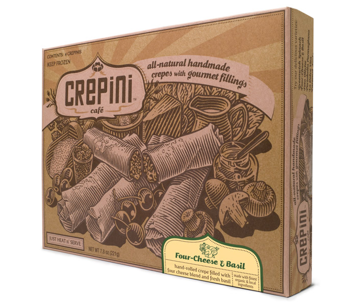
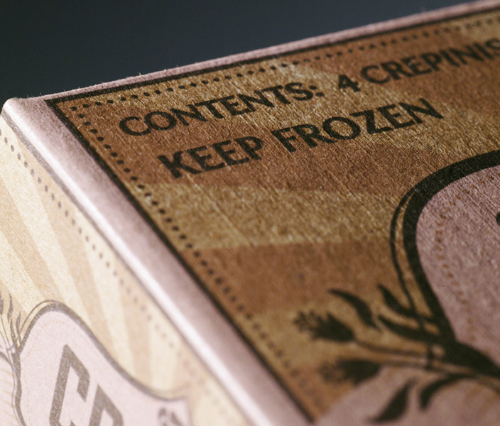
Some inks are naturally more transparent or opaque. I once printed on kraft paper with one of the inks being lighter than the paper -- Crepini Cafe, shown above. This ended up printing well, but I think it was necessary to include the darker colors to set it off properly. The printer did a bunch of ink draw downs until we got the color and opacity right. It as a more labor intensive but worth it.
When you mentioned uncoated brown paper, it made me think of the Whole Foods brown paper grocery bags that I collect whenever I forget (or am too damn lazy) to bring in my own reusable bags from the car. Which lead me to think about two other things: flexography and environmental stewardship. Flexography is the method used to print bright colors on brown kraft grocery bags, and corrugated boxes and disposable paper cups and plastic bags, and other un-optimum surfaces. Inks used in flexographic printing are formulated so that the ink stays on top of the substrate and hardens to a solid before having time to soak in or spread out. Solvent-based flexo inks can be made out of some pretty nasty stuff, like ammonia and alcohol used for quick drying. These days, in most countries, I don't think it's even legal to print with these solvent-based inks without certified equipment that captures the VOC emissions made by the evaporation process. Then there's water-based inks and UV curable inks, which dry with heat and with UV (ultra-violet) lamps requiring less of the toxic chemicals, but much more energy. Why am I talking about this? I guess just to raise consciousness and to express my appreciation for the environmental watchdogs and innovators and the printers out there, all trying to do the right thing, while keeping up with our ever brighter, more spectacular and wildly diverse dreams and inventions for print reproduction. God bless us, everyone.
Post Author

Armin Vit
Editor of FPO and co-founder of UnderConsideration LLC.
More: Online / On Twitter
Date Published
June 4, 2012
Filed Under
Ask the Experts
On Press
Paper
Tagged with


About
FPO (For Print Only), is a division of UnderConsideration, celebrating the reality that print is not dead by showcasing the most compelling printed projects.
FPO uses Fonts.com to render Siseriff and Avenir Next.
FPO is run with Six Apart’s MovableType
All comments, ideas and thoughts on FPO are property of their authors; reproduction without the author’s or FPO’s permission is strictly prohibited
Twitter @ucllc
Sign-up for Mailing List
Mailing list managed by MailChimp
Thanks to our advertisers
About UnderConsideration
UnderConsideration is a graphic design firm generating its own projects, initiatives, and content while taking on limited client work. Run by Bryony Gomez-Palacio and Armin Vit in Bloomington, IN. More…
blogs we publish
Brand New / Displaying opinions and focusing solely on corporate and brand identity work.
Art of the Menu / Cataloguing the underrated creativity of menus from around the world.
Quipsologies / Chronicling the most curious, creative, and notable projects, stories, and events of the graphic design industry on a daily basis.
products we sell
Flaunt: Designing effective, compelling and memorable portfolios of creative work.
Brand New Conference videos / Individual, downloadable videos of every presentation since 2010.
Prints / A variety of posters, the majority from our AIforGA series.
Other / Various one-off products.
events we organize
Brand New Conference / A two-day event on corporate and brand identity with some of today's most active and influential practitioners from around the world.
Brand Nieuwe Conference / Ditto but in Amsterdam.
Austin Initiative for Graphic Awesomeness / A speaker series in Austin, TX, featuring some of the graphic design industry's most awesome people.
also
Favorite Things we've Made / In our capacity as graphic designers.
Projects we've Concluded / Long- and short-lived efforts.
UCllc News / Updates on what's going at the corporate level of UnderConsideration.

Related entries
Ask the Experts #11
Ask the Experts #10
Ask the Experts #9
Ask the Experts #8