ADV @ UNDERCONSIDERATION Peek here for details
BROWSE
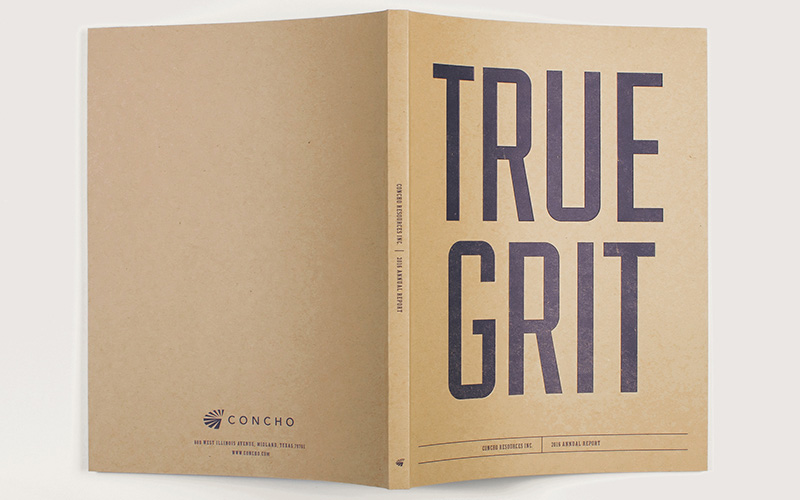
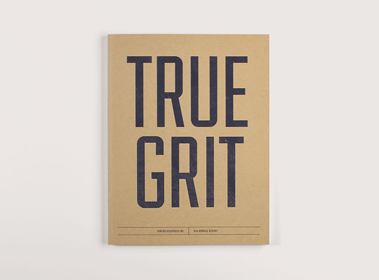
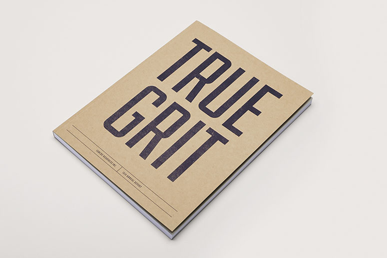
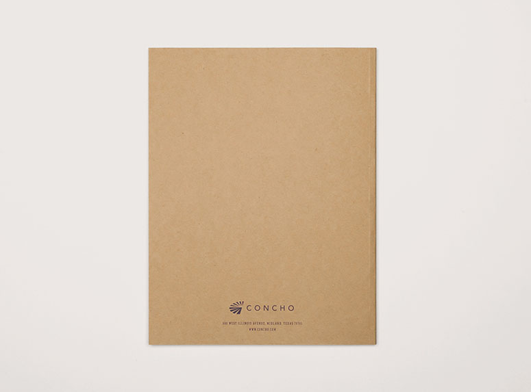
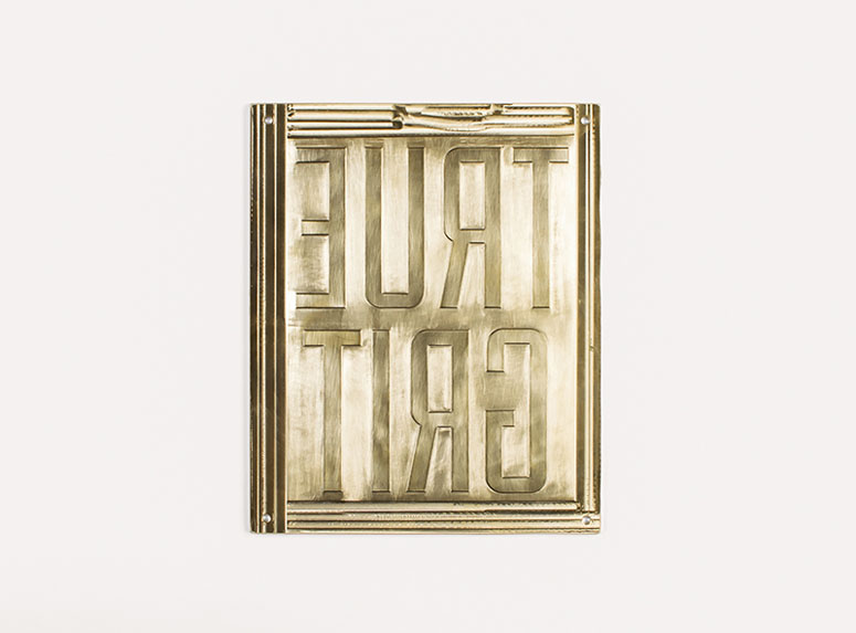
True Grit: Concho 2016 Annual Report
Production Method
Offset
Design
Squires & Company
Creative Director: Michael Beukema
Designer: David Broderick
Printing
Millet the Printer
A unique metaphor is used in this Annual Report to convey spirit and message, not just content. Beautifully crafted using two unexpected colors for the interior, and a solid deboss on the cover this is one annual report I’d much rather read printed than online.
Dimensions (Width × Height × Depth)
8.25 × 10.75 × 0.5 in.
Page Count
164
Paper Stock
Mohawk / Loop / Jute Antique Vellum / 110 DTC
Neenah / Classic Crest / Natural White Eggshell / 80 T
Domtar / Cougar / Smooth / 70 T
Number of Colors
2
Varnishes
–
Binding
Perfect Bound
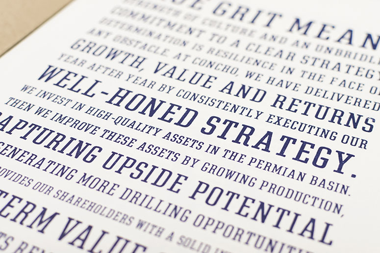
Typography
Fairview
ITC American Typewriter Medium
LTUnivers 430 Basic Regular
LTUnivers 510 Compressed Medium
LT Univers 530 Basic Medium
LTUnivers 630 Basic Bold
Rough Egyptienne
Project Description
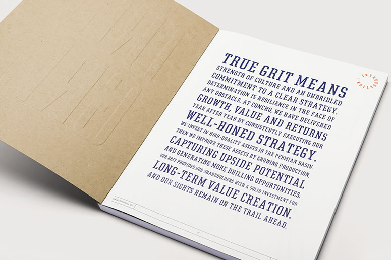
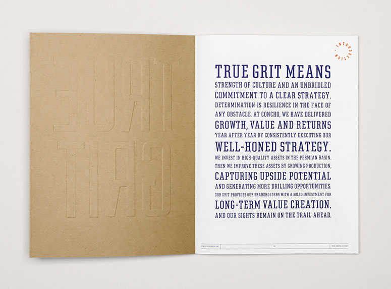
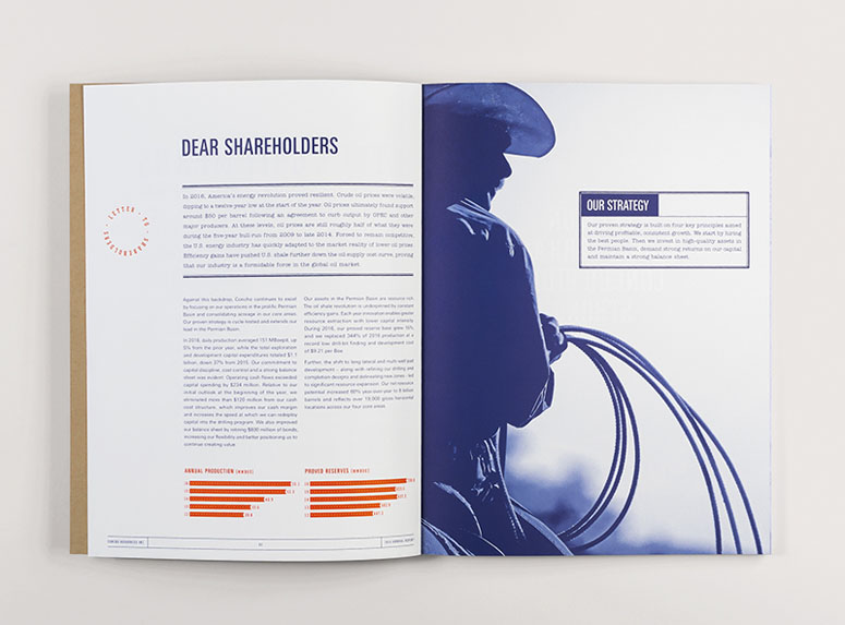
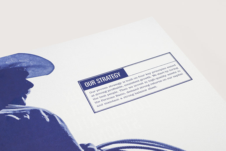
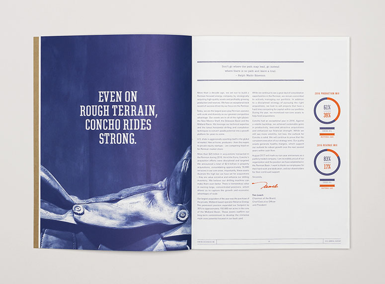
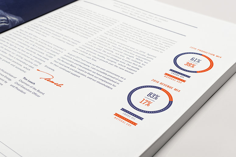
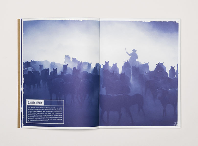
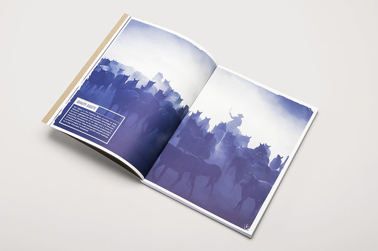
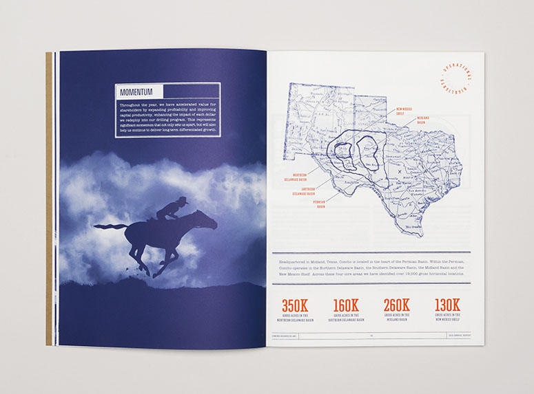
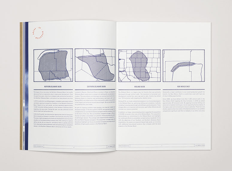
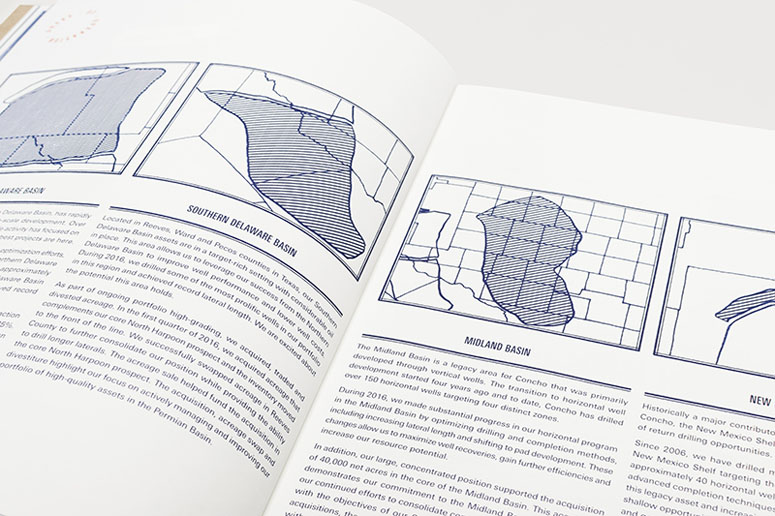
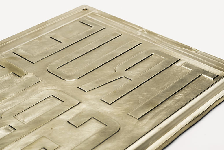
At the end of 2016, Concho Resources approached us to design their next annual report. The project goals were to create a solution that was metaphorical, communicated their strength during the industry's downturn, and maintained the tone of a relatively small independent company. "True Grit" was inspired by idea that Concho's success is due to their determination to stick to their strategy, regardless of the obstacles in their path. The metaphor of a lone cowboy visualized their independence and ability to forge ahead, while resonating with their west Texas headquarters.To allow this concept to live within Concho's more modern brand, we juxtaposed western visual language with contemporary references: the registered deboss is a nod to cattle brands, circular stamps were inspired by old Western Union telegrams, condensed typography refers to old southwestern signage, and the diffused monotone imagery had a dustiness that reinforced the idea of grit.
Production Lesson(s)
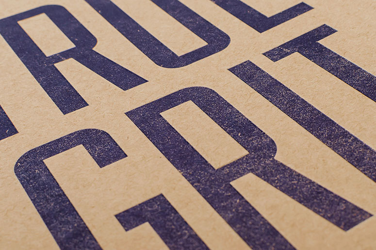
This project really reinforced how establishing constraints can introduce opportunities. For example, using a single ink on the cover allowed us to print a significantly more detailed texture in the title because we didn't have to worry about registration and additional inks plugging up. The limited color palette also brought a lot of unity to the piece overall, allowing us to mix type treatments more liberally. Lastly, it was a study in how materials can make the piece. We're lucky to have great paper reps that we work closely with, who put together several different dummies before finding the right combination of sheets.
Post Author

Bryony Gomez-Palacio
Editor of FPO and co-founder of UnderConsideration LLC.
More: Online / On Twitter
Date Published
May 22, 2017
Filed Under
Annual Reports
Offset
Tagged with
annual report
deboss
Fairview
ITC American Typewriter
LTUnivers
offset
perfect bound
PMS


About
FPO (For Print Only), is a division of UnderConsideration, celebrating the reality that print is not dead by showcasing the most compelling printed projects.
FPO uses Fonts.com to render Siseriff and Avenir Next.
FPO is run with Six Apart’s MovableType
All comments, ideas and thoughts on FPO are property of their authors; reproduction without the author’s or FPO’s permission is strictly prohibited
Twitter @ucllc
Sign-up for Mailing List
Mailing list managed by MailChimp
Thanks to our advertisers
About UnderConsideration
UnderConsideration is a graphic design firm generating its own projects, initiatives, and content while taking on limited client work. Run by Bryony Gomez-Palacio and Armin Vit in Bloomington, IN. More…
blogs we publish
Brand New / Displaying opinions and focusing solely on corporate and brand identity work.
Art of the Menu / Cataloguing the underrated creativity of menus from around the world.
Quipsologies / Chronicling the most curious, creative, and notable projects, stories, and events of the graphic design industry on a daily basis.
products we sell
Flaunt: Designing effective, compelling and memorable portfolios of creative work.
Brand New Conference videos / Individual, downloadable videos of every presentation since 2010.
Prints / A variety of posters, the majority from our AIforGA series.
Other / Various one-off products.
events we organize
Brand New Conference / A two-day event on corporate and brand identity with some of today's most active and influential practitioners from around the world.
Brand Nieuwe Conference / Ditto but in Amsterdam.
Austin Initiative for Graphic Awesomeness / A speaker series in Austin, TX, featuring some of the graphic design industry's most awesome people.
also
Favorite Things we've Made / In our capacity as graphic designers.
Projects we've Concluded / Long- and short-lived efforts.
UCllc News / Updates on what's going at the corporate level of UnderConsideration.

Related entries
2017 Brand New Conference Program
Severe(d): A Creepy Poetry Collection by Holly Riordan
Um Caminho para Santiago CD Package and Diary
BOYCO Classpack® Book
Antes de Perder la Esperanza Book