no.
by armin
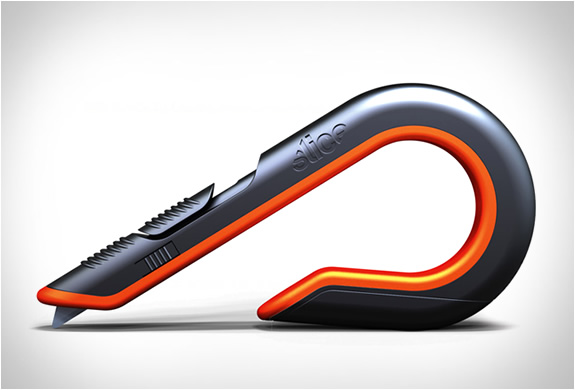
Hottest. Box cutter. Ever.
10.18.2011


Chronicling the most curious, creative, and notable projects, stories, and events of the graphic design industry on a daily basis.
• Plamen
• Doug Bartow
• Josh Berta
• Niki Blaker
• James I Bowie
• Ricardo Cordoba
• Diane Zerr


• Quipsologies, is a division of UnderConsideration, chronicling the most curious, creative, and notable projects, stories, and events of the graphic design industry on a daily basis.
• Quipsologies uses TypeKit to render P22 Underground, Skolar Web by TypeTogether, and Coquette by Mark Simonson.
• Quipsologies is run with Six Apart’s MovableType 6.8.8
• All comments, ideas and thoughts on Quipsologies are property of their authors; reproduction without the author’s or Quipsologies’s permission is strictly prohibited
• Search through our archives (starting with Vol. 45 September 2010)
UnderConsideration is a graphic design enterprise that runs a network of blogs, publishes books, organizes live events, and designs for clients.
online
Brand New / Displaying opinions, and focusing solely, on corporate and brand identity work.
FPO (For Print Only) / Celebrating the reality that print is not dead by showcasing the most compelling printed projects.
Brand New Classroom / Providing a space for critique and opinions on student identity work.
Speak Up (2002 – 2009) / Discussing, and looking for, what is relevant in, and the relevance of, graphic design. Archives Only.
Word It (2003 – 2010) / Encouraging creative diversity in the community through monthly, one-word challenges. Archives Only.
publishing
Flaunt: Designing effective, compelling and memorable portfolios of creative work / 2010, self-published.
Graphic Design, Referenced: A Visual Guide to the Language, Applications, and History of Graphic Design / 2009, Rockport.
Women of Design: Influence and Inspiration from the Original Trailblazers to the New Groundbreakers / 2008, HOW Books.
The Word It Book: Speak Up Presents a Gallery of Interpreted Words / 2007, HOW Books.
live events
2010 Brand New Conference / A one-day event on the development of corporate and brand identity projects by some of today’s most active and influential practitioners from around the world.
graphic design
Department of Design / Designing corporate and brand identities and full development of printed and digital matter for clients.

Quip’d by a representative of UnderConsideration

Quip’d by a contributing Quipsologist

Submitted by our readers and Quip’d by UnderConsideration


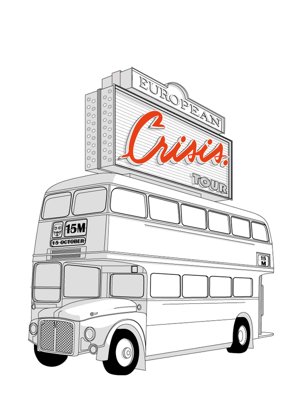
Philippe Nicolas has created a series of illustrations as a tribute to the “indignant” protesters forming around the world, starting in Spain.
10.18.2011
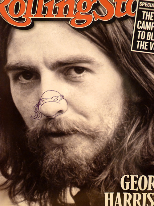
This is just too funny: Teenage Mutant Ninja Noses. They’ve been hiding under our, um, noses all this time.
10.17.2011
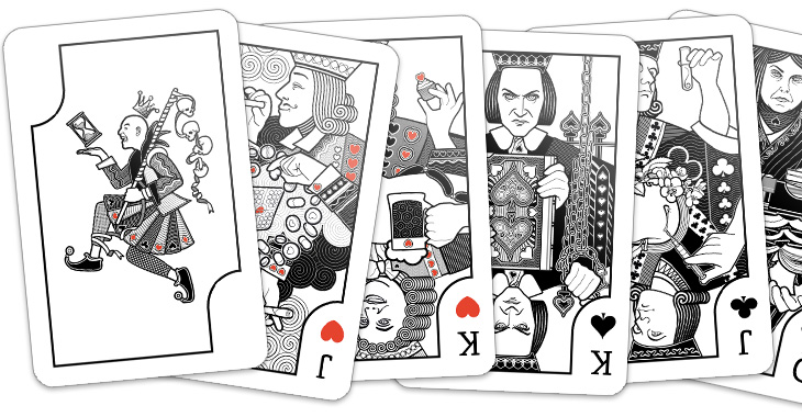
The Ministry of Type hasn’t been posting on his blog much. That’s because he’s been buried underneath a pile of projects, including a deck of playing cards with each court representing an obsession of his.
I love the corner effect on the Joker, forming the J.
10.17.2011
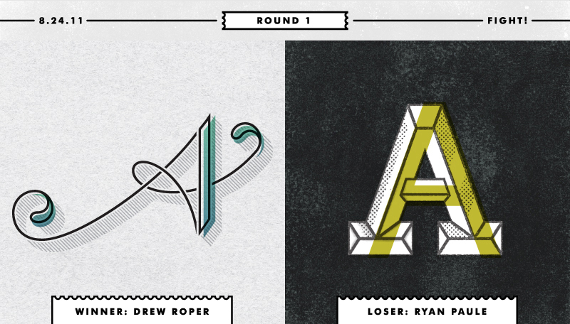
Type Fight is a project to distract Drew Roper and Ryan Paule from their day-to-day grind. They hope to design the same character each week and pin them against each other in the typographic ring to battle it out for best looking letter.
Your vote decides the winner!
10.17.2011
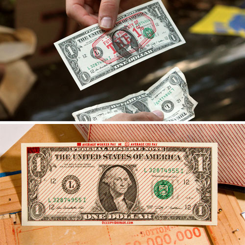
Not sure if this is entirely legal, but I guess stamping dollar bills is one way to get your political views across.
10.17.2011
“Never Forever Never for Now” by The Luxury of Protest is a “quantitative visualisation of the transient nature of empire. The visualisation graphs all known empires, colonies and territorial occupations from 2334 BCE to the present day. Each empire occupies a slice of the pie graph with a known start (+) and end (×) date. Each slice is assigned a transparency value of 10% allowing for concurrent empires to be visualised — the more empires that occupy the same period of time in history, the whiter the graph. As history progresses, humankind’s competition for wealth, resources and the relentless drive toward conquest and occupation can be clearly seen in the graph.” Great concept. Great execution.
10.17.2011

I have no idea why, but beatbox master Esalaah does some improv beatboxing inspired by the logos of David Brier.
10.17.2011
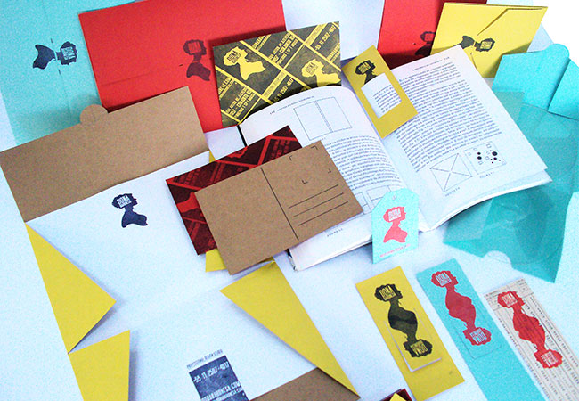
This identity for Sao Paulo, Brazil-based Dona Baronesa relies solely on rubber stamps. I love the patterning, might have to steal that.
10.17.2011