
Follow-up
Noted Oct. 17, 2018 by Armin No Comments on Follow-up: New Logo and Identity for Marketo by Focus Lab
Industry / Software
For full Access
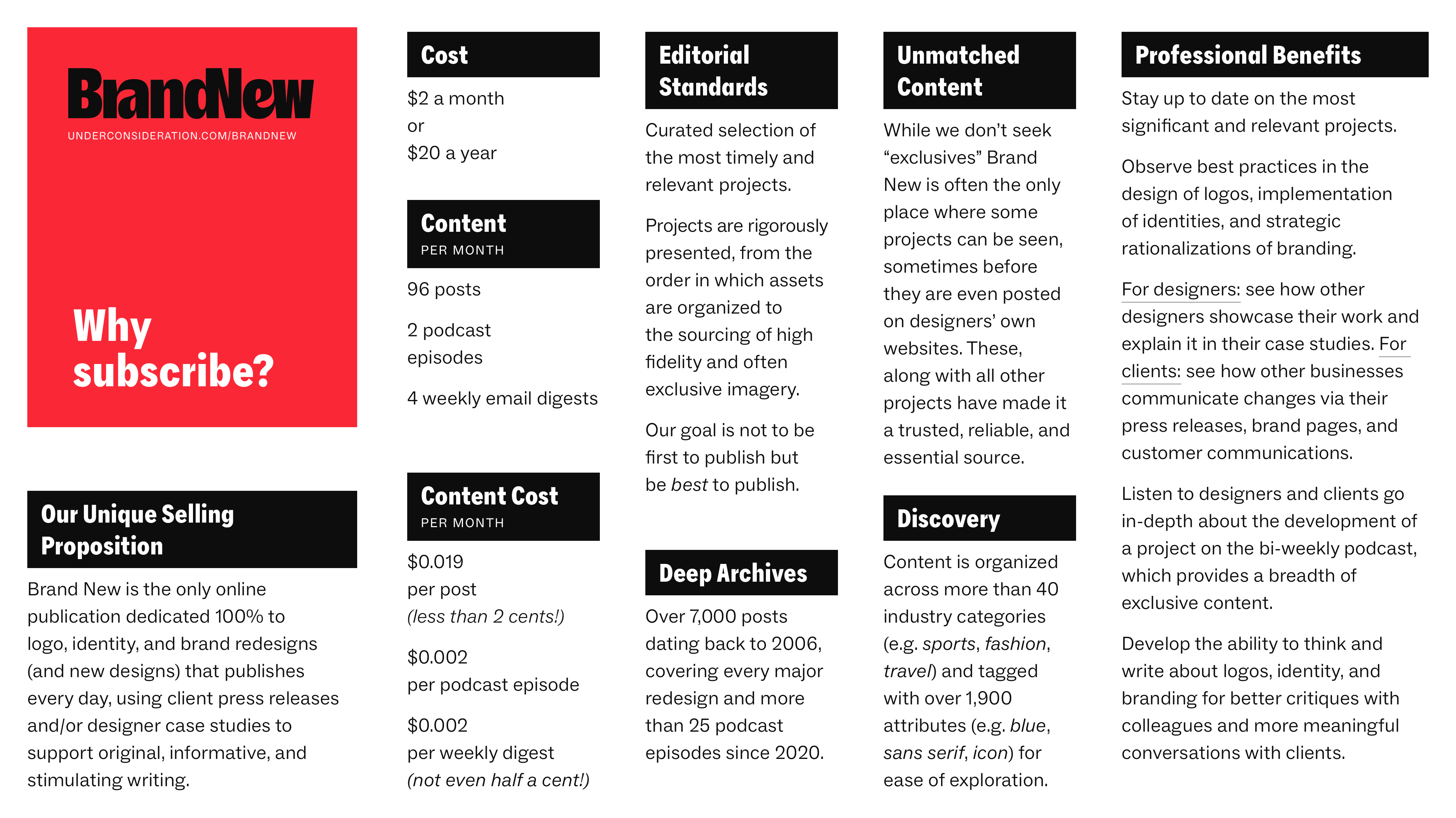
Subscribe to Brand New
Subscription includes
Full content.
Polls and comments.
Full RSS functionality.
The Follow-up podcast.
The weekly newsletter.
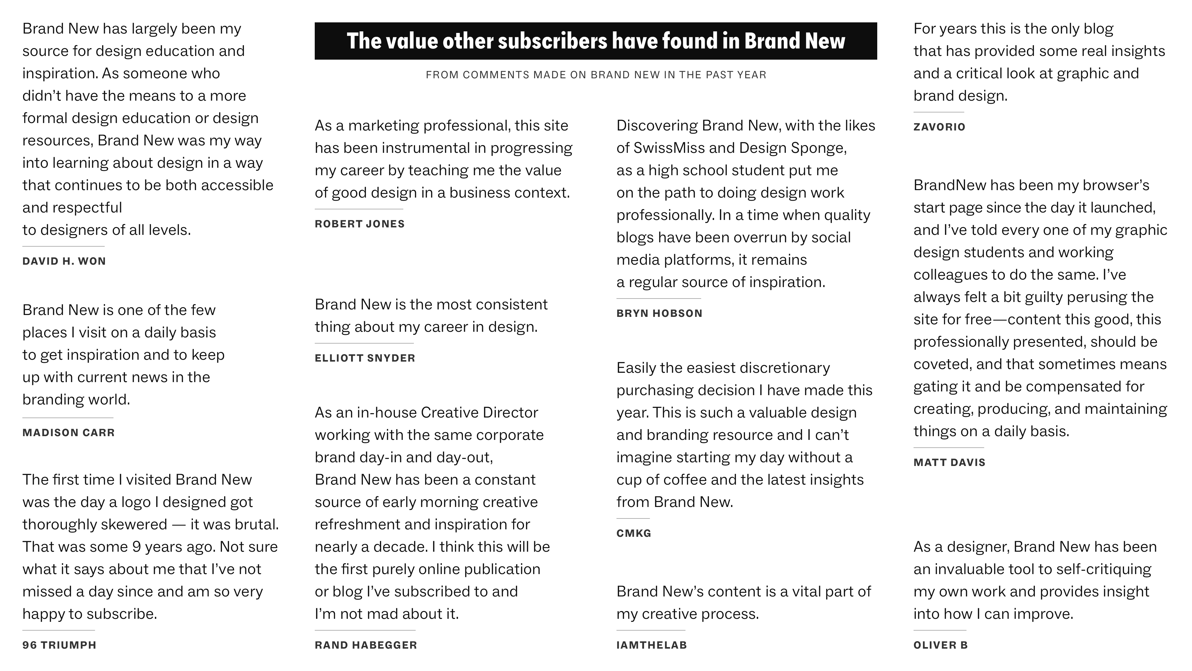
NEED SOME CONVINCING?
Whether it’s you, your boss or manager, your significant other, your parent, or your HR department that needs some objective reasons to the value of a subscription we have put together a 2-page PDF to help!
Already subscribed?
Log in.
DID YOU WORK ON THIS PROJECT?
If you worked on this project (as a designer or client) you can register for a 1-day subscription here — no credit card required (so you can ignore the footnote at the link that says you will be charged $1.00 USD monthly). Good for 24 hours and one-time use only.
CAN’T AFFORD THE SUBSCRIPTION?
For anyone that can genuinely not afford the subscription cost we will happily provide a free subscription. No questions asked. No reasons required. You tell us you can’t afford it, we will honor your request. Email us!

SUBSCRIBE