

NOTE: This is an archived version of the first incarnation of Brand New. All posts have been closed to comments. Please visit underconsideration.com/brandnew for the latest version. If you would like to see this specific post, simply delete _v1 from the URL.
![]()
Lifetime, the “the leader in women’s television,” launched a new identity recently, appearing magically on air without much celebration — not even a change of the logo on their web site and, less cordially to Brand New, without a press release. The nerve! So, what we have to go by — and I’m pretty proud of being the only place online to have a straight up shot of the new logo — is a photo I took of a poster in the subway announcing some show I can’t remember but that luckily showed the logo on a white background that I could isolate for the graphic above. So, there is not much we know about this, other than, well, it’s a channel for women, and the new logo replaces the lameness of a logo they released a mere two years ago.
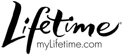
The new logo is actually pretty interesting, as it is a departure from most of the current branding on cable. It’s a little messy, it’s personal, it’s not offered as a tight little package and it looks pretty great on screen. This logo makes much more sense as an evolution of the older logo (shown below) than the stale wordmark they created last, which I have always considered more appropriate as a logo for a prescription medicine. The style and final execution of the new logo can be debated, but I think conceptually it has the right attitude and feel.
![]()
Lifetime logo from 1995 – 2006.
Since there is not much else to share about this logo I thought it would be fun, and an ad hoc opportunity, to share some logo explorations that we did back in 2005 when I was at Pentagram. We were approached by Lifetime to do explorations (paid, of course) when they were looking to replace the italic wordmark they had used for more than ten years. These never went beyond the first round of ideas, so they are not finessed or fully conceptualized. And I am in no way showing them as a better alternative to the new logo, just sharing.
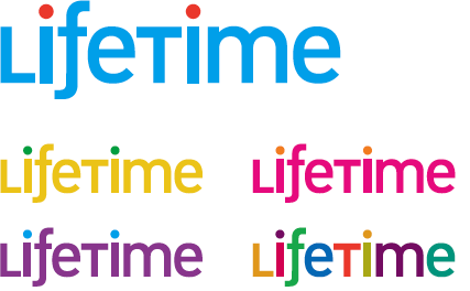
I complain a lot about logos that mix upper and lowercase, but here I gave it a try, and I was trying to mimic the flowy “f” from the previous logo in a sans serif typeface. And then lots of pretty colors.
This one was Michael Bierut and our intern at the time, Ross Channing, going for a very stylized “L” icon that could also be read as an infinite symbol. More pretty colors, just muted.
The idea on this one, by Elizabeth Holzman, was that Lifetime could be rendered in a bunch of signatures that would represent its viewers. The colors were simple black, blue and red, your typical ballpoint pen colors.

This is one of the logos that earn me the notoriety of designing “girly”. I enjoy loopies, and this one is candy-colored. The “f” is probably huge, but something that could have been fixed.
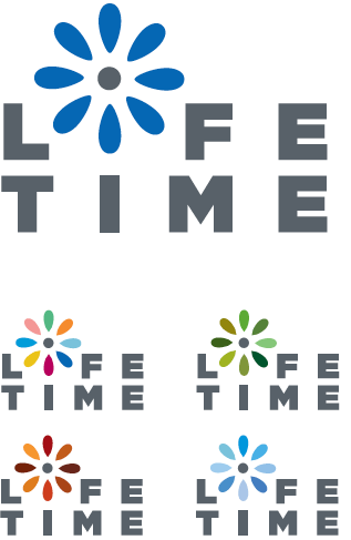
This one was my favorite. Using a flower was probably a cliche, but that’s why I paired it with Gotham Ultra, so that it wasn’t just a pretty flower. And since it was a flower, the idea was that the colors would change with the seasons.

And to keep things more current, our animated GIForialist, Von Glitshka, would like to share some of the explorations he and a few colleagues presented to Lifetime for this round.
Designed by Von Glitschka.
Designed by Jeff Pollard.
Designed by Paul Howalt.


Jump to Most Recent Comment
Ricky Irvine’s comment is:
Your crop of the identity on the poster is pretty funny, and can have a multiple of meanings juxtaposed with the image that it is.
Also, there is a bit of congruency with the new logo and the one designed by Jeff Pollard, no?
On Jun.05.2008 at 09:48 AM
Armin’s comment is:
Ricky... Yes, I didn't realize I had managed to capture and frame the cleavage so well.
On Jun.05.2008 at 09:51 AM
Harris’s comment is:
I don't see the poster crop, so I'm missing the joke. I noticed the new logo a few days ago on a subway poster, and wondered when it would be mentioned on this site. I think the letter "i" is too narrow.
On Jun.05.2008 at 10:00 AM
Ty’s comment is:
I'm enjoying seeing all of the concepts you and Von and others came up with. I love the flower identity, its flexibility is similar to the Peacock. I'm sure it would look great in motion and fluid color on the tube.
As for the new logo, I also like it, and I appreciate that the typeface is custom (at least as far as I can tell, because if it's not, I want it).
On Jun.05.2008 at 10:01 AM
Armin’s comment is:
> I don't see the poster crop, so I'm missing the joke.
Harris, second link in the first paragraph.
On Jun.05.2008 at 10:06 AM
Harris’s comment is:
Nice, although now that I see the logo larger, I don't like that the "t" goes into the dot of the "i," and the "i" is still too narrow.
On Jun.05.2008 at 10:40 AM
Jeffry Pilcher’s comment is:
I agree: the "i" is too diminutive, the photo crop is funny.
I like the makeover. The old wordmark was very dull, and lacked any personality.
On Jun.05.2008 at 10:48 AM
Joseph Rueter’s comment is:
I don't know which Life Time to have now. This one the athletic one http://lifetimefitness.com/
On Jun.05.2008 at 11:11 AM
Darrel’s comment is:
Flat black! That's actually rather innovative these days.
Nice update.
On Jun.05.2008 at 12:22 PM
Jeff A.’s comment is:
Noticed this last night while my wife watched a Lifetime movie. The line-weights unfortunately are inconsistent, those "i's" are way too narrow. Overall I like the mark however and appreciate that it's a custom wordmark.
I'm liking some of the pitches as well. Some great variety of concepts. Any word on who did the final mark?
On Jun.05.2008 at 12:26 PM
Brad’s comment is:
I think I like every single one of those concepts more than the final chosen logo.
On Jun.05.2008 at 12:32 PM
ScottS’s comment is:
I like this one quite a lot actually. I'm a big fan of logotypes, especially those with a custom, handlettered look such as this. I immediately saw the letters as being written in lipstick or an eyeliner brush. I think it's a clever approach that lends a more unique and feminine personality than the former logo. Jeff Pollard's concept shown above is my favorite of the bunch. Looks like could have been a fun project.
On Jun.05.2008 at 12:33 PM
Darrin Crescenzi’s comment is:
@ ScottS
EXACTLY! The hand done feel of this has so many feminine allusions that are absolutely spot-on. The inconsistent line weight that seems to be driving most commenters nuts is the biggest selling point for me.
I really, really like this.
On Jun.05.2008 at 12:56 PM
Meredith’s comment is:
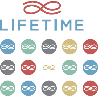
The new identity is reminiscent of European logotypes, including the Tour de France logo
![]()
And the Eurovision Song Contest logo.![]()
griffin’s comment is:
Will more US companies follow Spain's lead, where design begins and ends with the napkin sketch?
![]()
Logo Critic’s comment is:
Compared to the old logo (and the 1995 Times New Roman logo), this is a welcome change.
Also, I think the lower ones were too cliched. I'm a fan of the "flower" mark, probably because I like simple 2D elements. Beats the '95 logo (which I can easily replicate in Microsoft Word).
On Jun.05.2008 at 02:41 PM
David B.’s comment is:
Griffin,
FYI: Joan Miro is the patron saint of Spain. :)
On Jun.05.2008 at 03:12 PM
Evan Rowe’s comment is:
There really is something to be said about a well-done wordmark using hand-lettered type. It can be considerably more dynamic and engaging, and in an era such as the current one where most word marks or logos are trying to be extra flashy or extra "web 2.0-y," this is a very refreshing change.
Hopefully we'll start to see some more of this as designers wake up and realize the aforementioned aesthetics are becoming stale.
On Jun.05.2008 at 03:29 PM
felix sockwell’s comment is:
well done.
thx for sharing Armin. A refreshing creative post in leu of a bland press release. The chosen script (btw- since we're into crediting noe... who did that? Its nice.) is best but I like that flower design you singled out. Kinda surprised you hired a bunch of dudes to design an elegant mark... where is Bantjes!
On Jun.05.2008 at 04:13 PM
Joachim’s comment is:
It's a good upgrade, but two things that bother me: The narrow i's, as many have pointed out, and the sans serif typeface below appears really dated. I love to see wordmarks crafted by hand, and it's refreshing to see that.
Also, the logo griffin's posted is fantastic. It almost looks like it was made in a few minutes, but it also looks as if it was carefully crafted.
On Jun.05.2008 at 04:54 PM
Alfonso’s comment is:
I'm really enjoying Bierut and Channing's 'L'. An elegant execution, even at a first draft.
As for the new logo, I noticed it a few weeks ago, flipping through channels, and I find it very appropriate and refreshing. I'm particularly impressed by how in some respects it's so close to the original italic serif logo, yet the final execution still manages to feel like anything but that dated logotype. The programming is still mostly bullshit, but at least the new logo conveys something more spontaneous and exciting. It'd be nice if the programming followed suit.
On Jun.05.2008 at 04:56 PM
Craig’s comment is:
Is it just me or do all of these logos look more at home on a packet of sanitary napkins?
It doesn't look very TV to me.
On Jun.05.2008 at 06:41 PM
Evan Rowe’s comment is:
@Craig
Perhaps there is a certain important connection you have just implied that you're overlooking...
On Jun.05.2008 at 07:27 PM
Geoff’s comment is:
My first thought on seeing it in the subway was that there was a very purposeful "subliminal" message in there: the "e" is really part of the "f" and the second "i" is attached to both the "t" and the "m". What you're left with is "Lift Me"...which sounds exactly like the kind of tagline a women's network would use.
On Jun.05.2008 at 08:17 PM
Kosal Sen’s comment is:
It's a beaut! Jeff Pollard's version rocks, too. This is a breath of fresh air in TV identities and logos in general. Great update.
On Jun.05.2008 at 09:47 PM
Von Glitschka’s comment is:
I should point out that Jeff Pollard, Paul Howalt and myself presented over '40' concepts in all. Each having various formats and color palettes.
Concerning Ricky Irvine's comments: The mark Lifetime went with was never seen by any of us until the last few weeks. We were also unaware of Pentagrams work either. The final Lifetime mark came after the one Pollard created, so he in no way gleaned from anything they ended up with.
And Evan is correct the direction and distinct demographic for Lifetime is fully Female hence the heavy nod towards a more feminine driven aesthetic to the marks we presented.
Von
On Jun.05.2008 at 11:19 PM
Todd G’s comment is:
My initial thought:

Similar visual weights/styles, but clearly different personalities behind them...
On Jun.06.2008 at 12:01 AM
Mongoose’s comment is:
It takes it in a good direction, I think: Improved from the past logo dramatically, legible.. though unapologetically girly. But Lifetime's always been a girly network, and there's no shame in playing to that rep. I like very much that the rightward slant is kept a part of the logo. I give it a B, because the F-E and T-I junctions, while cute, are a bit tricky to read.
As far as the work-ups of the others, I very much like the flower workup, except I'd have run it as 8-wide over 4/4. The 'time' jumps out a bit quicker than the 'life', and you don't want to be Time Life. The Infinity-L is nice, though reminds me of publishing and Martha Stewart more than TV channels.
On Jun.06.2008 at 03:05 AM
orangetiki’s comment is:
Honestly im a fan of the final logo that Lifetime is actually using. It's very legible, and reminds me of a signature. Maybe one in a diary or a very personal letter. Again keeping with that "personal memories" that is synonymous with Lifetime TV and where their programming is headed. A close second is the "girlie" one with the "loopies" Sure a little rough, but it was a first go and the addition of colors is very welcome. Von G's works well also.
On Jun.06.2008 at 11:26 AM
Bendy’s comment is:
Mmmmm... reminds me of the handwritten-esque script McDonald's tried to push a few years back.
I really like the idea for broadcast execution, BUT it just falls short of how good it really could have been. At least they took a step in a good direction!
On Jun.06.2008 at 02:56 PM
2fs’s comment is:
Points off for furthering the annoying "my-" meme (although at least it's relegated to the URL rather than being part of the image).
On Jun.06.2008 at 05:30 PM
Mr Posen’s comment is:
I'm underwhelmed. Sigh*
MichalkaManiac’s comment is:

Paul’s comment is:
really liking the execution.
On Jun.07.2008 at 09:28 AM
Daniel Campos’s comment is:
It's incredible how the people absolutely love web 2.0's logo. (Von Glitschka).
Very such, I think!
On Jun.09.2008 at 09:41 AM
Paul Lloyd Johnson’s comment is:
No offence but all these logos remind me of the thing you find on the back of a greeting card not a TV channel logo. Especially the one they are using!
On Jun.10.2008 at 07:21 PM
jayparry’s comment is:
way too messy
On Jun.10.2008 at 08:17 PM
Paul C’s comment is:
I like the idea about the signatures in ballpoint pen! Interesting!
New logo is alright, although i did find it to be slightly invasive...I mean it is kind of HUGE.
On Jun.10.2008 at 08:45 PM
dk’s comment is:
The new one is a welcome change, but it looks like the Hallmark Channels younger sister.
On Jun.11.2008 at 08:55 AM
milan’s comment is:
kudos to the bierut/channing notion. that thing is kinda' great.
On Jun.19.2008 at 11:15 PM
Epgfmyzl’s comment is:
nice site,
On Dec.02.2008 at 09:24 PM
Rjrmprbp’s comment is:
Nice day,
On Dec.03.2008 at 03:28 PM
Anonymous’s comment is:
LifeTime
On Apr.28.2009 at 06:13 AM
Comments in Brand New, V1.0 have been closed.


