

NOTE: This is an archived version of the first incarnation of Brand New. All posts have been closed to comments. Please visit underconsideration.com/brandnew for the latest version. If you would like to see this specific post, simply delete _v1 from the URL.
![]()
Like most major airlines this century, Delta Air Lines has had it rough: A number of restructurings, route changes, personnel cuts, the precipitous (and, I imagine, costly) rise and fall of its low-fare carrier Song, and eventually its filing for bankruptcy. But as has been apparent in the last two or three years people are back in the air and flying their butts off, crowding every possible plane at every possible hour, so it’s no surprise that Delta (and United before it) have been able to slowly exit from such sad, demoralizing state. On April 30, Delta emerged from bankruptcy protection as an independent carrier and what better way to celebrate than in style? With a new logo and new livery design, courtesy of New York-based Lippincott Mercer.
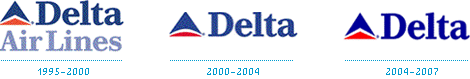
Delta’s Flip-Flop-Flippin’ Identity!
Much like its financial and structural state, Delta’s identity has been fleeting (pun intended) for the last decade or so — and, actually, throughout its history with a whopping 19 logos in 78 years — with two major identity changes, costing tons of money, I presume. But what makes these changes even more embarrassing, at least to my eyes, is that the changes were nothing more than flip-flop-…flip, with the “Widget” (yes, that’s what the triangle is officially called) going from pointy to round to pointy. How a blunder like that happened, I can only imagine. Unless I am mistaken, Landor held the account through these years. (Not that that explains anything… Or maybe it does.)
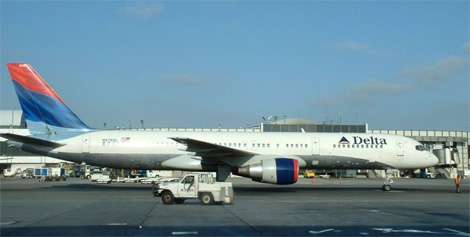
The “Flowing Fabric” Tail Design
One element, recently, that I thoroughly enjoyed was the floaty fabric Delta was using in their livery as well as their advertising and most other promotional materials. It was the one design element found throughout most of the airline industry that was able to capture the sense of flight. And do so on brand. Apparently though, that was somewhat costly, as the tail of the planes needed eight different colors (four shades of blue, two shades of red, one white and a clear coat) and plenty of man power to paint. The new design cuts back to four colors and — thank heavens — it cuts to the point with a clean, sharp, no-bullshit new logo.

New Livery, Nicknamed Onward and Upward.
There are three things I like about this new Widget: 1) It’s a triangle. No one was dumb enough to suggest or ask that it would be otherwise, and if so I’m glad someone was smart enough say no; with the propensity to change for change’s sake it is encouraging to see an organization and design firm acknowledge brand equity where there is one. 2) It’s red. Organizations, specially those coming out of the red numbers, are dead-afraid of red. This is red. And nothing else. I love that. 3) Isn’t it amazing just how much dimension you can achieve with a sophisticated change of shade of the same color? It goes to show that you don’t need all those extraneous shadows and highlights that are the biggest malady in branding today. One single design gesture completely changed the meaning of the Widget. To me, this new Widget means a stance. Delta is back and it’s solidly on the ground, ready for launch. There is one fourth thing I like: The typography. Sweet and simple. It complements the Widget without pretense and with plenty of confidence. One could label it as boring, but what else could this be? Yes, a hundred other things, but this one is as good as any. It has no useless elements, which is exactly what Delta needs to portray at the moment. A swift, agile and lean organization ready to take to the skies.
And considering that Lippincott reportedly showed around 100 logos and worked with a 78-Delta-employee committee — called the Delta Brand Council — it is a miracle that such a straightforward, on-target identity survived, with plenty of white space unscarred. Perhaps a reflection of Delta, as Connie Birdsall, Creative Director at Lippincott, shares with the timely Tony Spaeth, “The process was incredibly smooth and they have been just about the best people I have ever worked with.” Surely there were bumps in the road, but that won’t stop Delta from taking off with an incredibly concise and precise new identity.
More information about the new identity can be found here, and in this nice bullet-pointed PDF.


Jump to Most Recent Comment
Inkblot Robot’s comment is:
A very nice update for Delta. They manage simplify their logo even further and create a much stronger and effective mark. I am very impressed with this redesign.
On May.02.2007 at 10:30 PM
Bobby Henderson’s comment is:
I'm not really sure if I see this new design as an improvement. The only problem I had with the old design is the "Delta" type looked a little dated (it made me think "70's" for some odd reason). The new type is plain, but the wide tracking will make the word "delta" more legible from farther distances displayed on a plane fuselage. That would come in handy with people watching planes take off in the distance from an airport terminal.
On the note of the livery graphics, particularly those on the vertical stabilizer fin, the old graphics were not painted. They were really large format digitally printed graphics on special aircraft grade vinyl. I'm not sure if the new plane graphics are painted or applied in vinyl. But with the use of solid color either method wouldn't be too difficult.
On May.02.2007 at 11:38 PM
Bone’s comment is:
This proverbial "phoenix-out-the-ashes" story will be one for MBA programs everywhere.
The new identity is appropriate and timely punctuation.
I am thoroughly impressed with Delta and what they have been able to achieve by determined insistence on rebuilding what had become a marginal airline into what could become the best major airline around.
Best of luck.
- Bone
On May.03.2007 at 12:36 AM
marko’s comment is:
That plane looks fierce. I love it. It makes me think they're fast, efficient and professional and all that whitespace is so much less goat herding onto the plane like their old one. The colours are love. It's really great.
On May.03.2007 at 01:02 AM
Devon Shaw’s comment is:
The slight color variation on the triangle gives it a strong three-dimensional impression, which accentuates the effectiveness of the graphic and metaphorically implies a stronger, bolder company. I'm quite pleased with the richer colors -- I've never been a fan of pastels or 'washed' palettes -- and the typeface is a welcome, sturdy change.
The old logo was in dire need of some drastic action and the facelift is a triumphant step forward. I'm awed.
On May.03.2007 at 01:59 AM
Christian Palino’s comment is:
The re-branding is a success. The changes to the mark, the typography, the spatial relationships – all improvements that are now working well together.
One note regarding the livery application. I find the tail graphics unsettled, having something to do with the centered placement, angle of rotation of the mark and the cropping. This application of the mark significantly changes its implied meaning. If in the lock-up, when sitting upright, the mark has a stance that is grounded and stable, on the tail application it sacrifices that sentiment – and in this case, not for something better. It seems to me that the livery study missed some iterations and could have been more inline with the updated logomark.
On May.03.2007 at 03:23 AM
docflo’s comment is:
I'm not surprised that they kept the triangle. The greek letter delta is a triangle after all.
On May.03.2007 at 04:20 AM
Ricky Irvine’s comment is:
It seems to me that the new typography connects some to the company's typographic roots (according to this page).
I like it!
On May.03.2007 at 08:03 AM
Kenneth Sundqvist (Evil Oatmeal)’s comment is:
A widget is an interactive component, nothing else. Please.
The triangle is a (non-interactive) graphical element (component,) and just calling it the triangle would have been so much better.
I use the term widget almost every day, and the term is so far quite well focused. Please don't blur its meaning. I really don't want to have to say "interactive component that you can do things with, like a button or a menu, you know" to my future colleagues just because they think a widget is another word for thingy.
Please, please, please.
And the logo is nice. The fully red triangle is very refreshing.
On May.03.2007 at 08:15 AM
Leanne Johnson’s comment is:
The new logo is nice - simple and to-the-point. The new colours sit much nicer than the old ones - the blue is more dominant - and the typeface is much more modern. Nice job.
I agree with Kenneth though - it's a triangle, NOT a widget. Even calling it 'the icon' would be much better.
On May.03.2007 at 09:07 AM
Joe M’s comment is:
Wouldn't it be great if Delta actually made red airplanes that look like the widget? Why couldn't LM at least push some positive, tangible meaning into that thing.
Regardless, the widget has always been a flying eject button. Not a pleasant association unless you're operating a VCR or 10 billion other electronic devices on which that symbol means "finished.."
![]()
Armin’s comment is:
Leanne and Kenneth, according to the "logo museum" link I included above, the term "widget" was introduced back in 1959. Although I would guess that it was with the 1995 redesign that the term was introduced and applied back. Either way, both predate whatever "interactive components" you are thinking of. And look it up in the dictionary too, you might take back your plea. There was language before computers.
On May.03.2007 at 09:49 AM
Ben Thoma’s comment is:
I know everyone is loving this, but it looks to me like Delta just got Web 2.0'ed. Seems colder to me, more Transformer-like, and I definitely will miss the tail section's colored, flowing fabric.
On May.03.2007 at 10:19 AM
Patrick Senecal’s comment is:
I think its well done. The combination of the new type and mark makes me think alot of this:
![]()
Madphill’s comment is:
It's a little to CITGO for me.
On May.03.2007 at 11:31 AM
Paul Riehle’s comment is:
I feel the letter space might be a bit too wide for this situation, but other than that I think its a well done update. Brings the brand up to date, that is for sure.
On May.03.2007 at 12:04 PM
L.Vazquez’s comment is:
An employee committee of 78? Woah.
On May.03.2007 at 02:10 PM
Paul’s comment is:
Delta emerged from bankruptcy protection as an independent carrier and what better way to celebrate than in style?
Yes, what better way to celebrate coming out of bankruptcy than with yet another slight modification to your logo, which will again cost millions of dollars?
This seems like a terrible waste. Also, as a Bostonian, the only thing I can think when I see this is Citgo
On May.03.2007 at 03:11 PM
Mark’s comment is:
Why chose red isn't that color a bit intense?
ands whats with the different shades on the left and right,it's forcing it's 3D look a bit too much.
The tail design looks forced and overly simple (whats with rotating the logo) it's a bit to intense to my eyes.
Please explain what was wrong with the previous tail design,I thought it was brilliant and clever. (plus it's a bit more calming and made me a bit more comfortable about flying)
What the heck happened to Song airlines? I thought they were doing fine business before.
The previous design was contemporary this new one looks a bit dated and bare to me.
(that tail for some reason makes me think of Canadian Airlines)
I think they played a bit safe on this one.
too much like Citgo's logo,ech.
On May.03.2007 at 04:38 PM
felix’s comment is:
Love it.
great job, L&M.
On May.03.2007 at 04:41 PM
marcel’s comment is:
I like it, the darker red and and blue looks more confident. Sans serif is cleaner, spacing is a tad wide.
On May.03.2007 at 06:45 PM
Dale the Somewhat Merciless’s comment is:
I am such a fan of this.
On May.03.2007 at 07:31 PM
Ty Wilkins’s comment is:
"Δ often denotes a difference; δ can represent a small change or amount."
Δ = Delta = Change = Travel = Minor Logo Adjustments
On May.04.2007 at 12:47 AM
Andrew’s comment is:
Joe M's comment comparing Delta's logo to the eject icon wins hands down for best post.
As far as the redesign...I don't like it. It will all change again in a few years anyway.
Ty Wilkins’s comment is:
Congrats on the beautiful brand new baby girl!
On May.04.2007 at 01:29 AM
travtravle’s comment is:
Many speculate that NWA and Delta could possibly merge. Upon exiting bankruptcy, Delta has revealed a completely redesigned aircraft paint scheme. Has anyone else found it interesting that Delta's "widget" logo is now red (NWA's color) and that on the aircraft tail it points to the Northwest (just like NWA's logo)? If you place photographs of both company's paint schemes side by side, you can see the resemblance. Both "arrows" point to the Northwest on aircraft left (the captain's side). The opposite side, or aircraft right, is a mirror image pointing to the Northeast. Hmmmmmm? During bankruptcy, Northwest outsourced most of it's mechanics and customer service agents. The only mainline Northwest employees remaining can be found in Northwest Hubs and Gateway stations, minimizing the impact of combining employees and seniority lists in the event of a merger. Pinnacle Airlines, a regional parter for Northwest, has just signed a deal to do business for Delta in Salt Lake City, one of Delta's hubs. Pinnacle may also be extending that contract to operate flights out of Atlanta. Pinnacle currently operates flights out of all Northwest hubs. This new agreement with Delta will enable Pinnacle to operate from all of Delta's hubs as well. Both Delta and Northwest are working closer together now more than ever due to their membership in SkyTeam, where Delta was a founding partner. KLM, Northwest's main alliance partner in Europe, has now completed a merger with Air France, Delta's main Europian partner. It seems that a merger of Delta and Northwest is highly possible. Which name of the two will remain? I am not sure.
On May.04.2007 at 09:13 AM
EnergonCube’s comment is:
Why chose red isn't that color a bit intense?
Frankly, for an international airline, the whole "red, white, and blue" stripes in old the logo is simply too U.S.-centric. In trying to appeal to a global audience, the move away from this scheme was smart. Furthermore, red is lively, powerful, and energetic -- exactly the traits one would want to see from a company emerging from bankruptcy.
I think they played a bit safe on this one
Seriously? They just emerged from bankruptcy! I'm surprised the logo isn't more subdued than what it is now. When your investors have millions, possibly billions, riding on the business, flashy isn't going to win them over. C'mon... Identity design isn't just about looks. It's about business.
On May.04.2007 at 09:26 AM
Prescott Perez-Fox’s comment is:
Somehow, this is what I first thought of...
![]()
300 cities worldwide, without detection!
On May.04.2007 at 10:09 AM
John Colucci’s comment is:
I really liked it. I think its something unique and gives them a stronger presence. Enough with red and blue, this gives them something warmer.
On May.04.2007 at 02:02 PM
Dutchess’s comment is:
I'm sad this is where they took Delta... It's lost all of it's personality. It's looks generic, and low budget. I really wish they'd gone with a contemporized serif instead. Also, I agree with the fabric tail comments - it's lost its sense of movement and excitement. The updated colors are nice, though.
On May.04.2007 at 02:54 PM
Alex ’s comment is:
I really like the redesign as it simple and straightforward, modern and unfettered. All things one likes to experience when traveling
On May.04.2007 at 04:05 PM
Danny Tanner’s comment is:
The whole "widget thing" when used in application, such as on the tail of the plane just feels like Northwest Airlines when they were good (before the newish down pointing nwa logo), except this one is pointing northeast. It should never, ever, ever get turned and point at things. Only point straight up. After all their name is "Delta," not "crooked triangle."
On May.04.2007 at 07:41 PM
The Brand Man Speaks’s comment is:
I enjoyed reading the lively banter of the commentators. I tend to agree the new logo signals a leaner, better, stronger more efficient airline.
As a Brand Strategy guy, I beg to differ with one respondent's comment that Delta has already become a better airline as it worked its way out of financial difficulty.
I fly Delta frequently out of necessity, not choice and I find the experience remains to this day one of the worse among all carriers, not just the legacy brands.
Thus, in my opinion, the new brand look will be meaningless if the rest of the branding components don't follow suit (soon) to reflect that visual image.
Unfortunately, Song had it right and Delta threw away a brand that truly was a pleasure to fly--and not because it was performing...a story for another time...
On May.06.2007 at 08:08 PM
logo killer’s comment is:
Let's not forget that this is an extremely unfocused organization. HOW MANY DESIGN AGENCIES HAVE THEY HAD IN THE PAST 4 YEARS? Landor, BIG and now the venerable Lippincott.... known for their breakthrough creative.
This is simply another example of an airline that looks no better than the many banks they have branded in the past 4 years.
Its a sad day when people think that a generic serif type is good design.
On May.07.2007 at 09:57 AM
logo killer’s comment is:
If I'm gonna attack... I might as well do it corrrectly.
I meant to say "Its a sad day when graphic designers applaud a truly generic san serif type as good design when it truly is nothing more than incredibly boring and generic san serif type. Perhaps its a reflection of the airline??? Anyone here really WANT to fly Delta?
On May.07.2007 at 11:05 AM
Josh G’s comment is:
This redesign is definitely looking polished, though the type seems to be a little too tracked out. The livery looks fantastic. Great application of the mark, clean and simple. Ultimately, the new mark has renewed my interest in the brand, I would even seek them out for a flight. But the key to the success of this redesign will of course be transferring this fresh new look to fresh business practices.
"Unfortunately, Song had it right and Delta threw away a brand that truly was a pleasure to fly--and not because it was performing...a story for another time..."
I'm glad someone brought up Song. It was a pleasure for the customer yes, fantastic design and all, but the failure of Song is sadly directly related to Andy Spade's horribly misdirected launch commercials. Not because they couldn't deliver their service offerings. Spade's commercials felt more like an advertisement for anti-depressants rather than a sexy lifestyle brand. Poor customer connection + poor sales = the best of your service offerings integrated into the best of Delta's service offerings.
Check out FRONTLINE: The Persuaders for a more in-depth look at Song's birth.
On May.09.2007 at 08:35 AM
Von K’s comment is:
I like the revised Widget. The sense of depth given by the two reds isn't forced at all--quite the opposite. It would have been so easy to use (and these days probably sell) gradients/bevels/etc. This gets the job done very nicely, while showing restraint.
The type reminds me of the 50s & 60s, naturally. The "airy" letterspacing compliments the sturdy forms nicely, giving an impression of trustworthiness, precision and nimbleness.
The sans doesn't look generic to me at all. Arial is generic, this is not Arial. For me, it's associations are all positive--I'm thinking of the golden era of commercial flight, when flight was a symbol of prosperity and innovation.
The logo tilted to the right and cropped on the tail-fin is great. It's size, too big to fit on the fin, shows that Delta is still formidable (and thereby dependable). The tilted Widget implies upward, forward movement--both positive connotations.
It's a shame about Song. I really liked the airline and the identity. I think Delta has got something good here, though, and it looks like they're getting a good start to using it right.
On May.09.2007 at 01:10 PM
disgruntled designer’s comment is:
blech, first thought was that it is totally citgo and you know what... it is. everything about it says cheap gas to me. and normally i love sans, sans for everything, but this is just a bit too stale for my liking. at least there's a loverly drop shadow to liven everything up. it could really use a swoosh. and maybe some drop shadows. and a more prominent gradient fill using two complimentary colors. maybe they could have just taken their widely successful verizon logo and substituted the mark for the check.
On May.09.2007 at 09:09 PM
Mark’s comment is:
I think the logo didn't have to be in two shades,it just adds more unnecessary effects to the logo,it doesn't really make the logo any better and from far away, it meshes in with the shape making looking like a solid triangle erasing any semblance of the dynamic space created between the two wing shapes. Thats what made the logo iconic that sharp triangular peak between the shapes. It was so immediate like it cut into the logo itself,almost alluding to a third pair of wings in the negative space (the effect is more noticeable on their plastic cups)
The previous logo was more simple two colored winged shapes one large blue one and one smaller wider one on the bottom,the logo was straight forward no embellishments such as shading,or 3d effects etc.
Clean and simple.
This new one is not so simple you have the triangular shapes, and this time their in two different shades of red, annoyingly colored like two separate halfs put together. Now instead of seeing the whole logo immediately you have to navigate your eye around the abrupt color scheme to finally recognize the dynamic peak shape created by the two shapes,making it secondary in importance.
Point is, the logo has lost it's sense of dynamic interaction with the negative space,and lost it's effectiveness of "the peak" created by the two shapes by distracting the viewer with the half & half shaded color scheme. Sigh.
The typeface is simple and modern but the logo has been embellished with effects,making the symbol and the name look like they're competing for attention and not quite working as a whole.
It would have been much more striking to see the logo in one solid color of red,then it wouldn't be looking like it's standing still.
Frank’s comment is:
It looks soo citgo.
No matter how nice it has been executed or not, just for the confusing similarities it now shares with the citgo logo is reason alone to call it a bad logo.
I'd really think citgo was bought up by Delta or other way around.
On May.11.2007 at 08:14 AM
Mark’s comment is:
the picture shown above with the new scheme is a photo shopped image,to show how the color scheme actually looks like in real life you need to see actual pictures to get a better idea.
heres some links I've found showing some newly painted planes
On May.11.2007 at 08:43 AM
Charles’s comment is:
I think Delta's new livery looks great. Elegant yet simple. The only US airline that has a livery as nice as US Airways.
On May.17.2007 at 01:33 AM
R Williams’s comment is:
I am a huge fan of the new look! It does in fact also look more of what Delta's liveries have looked like over the years, and so in gaining a new look L+M actually also took Delta back to its roots. The following link shows Delta's first use of the "widget" - the trangular logo in use today. ("Widget" is what Delta's employees have called the logo for years). The first use of the logo was on a DC-9 and was angled to represent the new speed of travel in the dawn of the jet-age. That is why the sign on top of the Delta hangar complex at Hartsfield-Jackson Atlanta International airport reads "FLY DELTA JETS". Anyway click the link to see the original use of the widget logo:
Delta's first jet, a McDonnell Douglas DC-9
On May.19.2007 at 08:12 PM
R Williams’s comment is:
Ooops! - I should have said that the DC-9 was "one" of Delta's first jets -- apparently the DC-8's preceded the DC-9's (go figure!) but the point was to show the historical use of the "forward leaning" "Widget" logo, anyway.
All the best.
On May.20.2007 at 02:03 AM
Armin’s comment is:
A few more images of the Delta brand. My attention span may not be what it used to be... I just noticed that when the Widget is not upright, but at an angle it creates a nice horizontal line. Wakey wakey Mr. Vit.
On May.20.2007 at 08:42 AM
Mark’s comment is:
Okay,now that I've seen all the aspects of the rebranding. The image makes more sense to me now.
It's not exactly that bad and is clean,modern,and sleek.
It's going to take a lot of time to get used to.
(It's clever what they're doing with arrow device within the widget.)
No gradients,drop shadows,or swooshes needed lets less Citgo each time I look at it.
On May.20.2007 at 12:49 PM
Hollis’s comment is:
I was in Atlanta this past weekend and Delta updated its ticketing area on an angle similar to the tail livery. It felt open and spacious, beautiful. I was really impressed by the environmental space but The Brand Man Speak's comment earlier about "now Delta has to deliver" is right—or I smell logo number twenty.
On May.24.2007 at 12:09 AM
Bjorn’s comment is:
One word. Beautiful!
On Jun.02.2007 at 12:45 PM
cristina’s comment is:
It looks good. Very modern.
On Jun.20.2007 at 11:42 PM
Nuno Coelho’s comment is:
does the typeface need to be that spaced?
On Jul.16.2007 at 06:14 AM
Anonymous’s comment is:
Well at first I was in doubt of the new logo chage, I will definitly miss the flowing fabric located on the tails of the aircrafts and at Delta counters, it was very stylish and sophisticated, but the new brand does give a sense of stability. Ohh and for the brainyacs out there, the reason why the ''triange''/''widget'' (whatever), is facing upward because it symbolizes Taking to the skies, like moving forward...DUH!!!
On Jul.16.2007 at 10:29 PM
P.S.’s comment is:
Hi
Only my personal opinion but was beginning to really like Delta esp. internationally but this is too slick for my taste. What ever happened to friendly, this is like the cool guy who get lots of chicks but is really a jerk. I don't want to fly with that guy!
P.
ps. The Citgo thing just confuses things further - is it cool and slick or is it a gas station!
On Aug.01.2007 at 01:20 AM
JOE’s comment is:
I love how they have your own personal TV with Dish Network!!! VERY VERY GOOD!!!
On Aug.08.2007 at 05:39 PM
Larry Miller’s comment is:
To me it reads
A D E L T A
Besides I can't see it in the air as I no longer fly or own a red cape that works.
What Delta needs is a good ad campaign not superficial graphics.
I will admit that the prior Delta was a badly lettered pastiche of Bookman, Clearface, and perhaps Century OS Bold. But at least it had character, it had dirt under its fingernails. The new one is like the fingertips of guys who have never done labor, never held a hammer, never skinned their knuckles diving for a groundball. Feh!
On Aug.14.2007 at 10:36 PM
David Carvalho’s comment is:
Citroen ?!
On Dec.26.2007 at 11:40 AM
Wood’s comment is:
Well i think that deltas old panit is better. I think that the clors are better in the old paint.
just my two cent's
Nashville’s comment is:
Interesting to read all the comments. As an employee I can say that "Widget" is the word used by all of us for decades.
The Widget has a history of being tilted in all directions, just never upside down. Look at our former logos.
The flowing fabric, a.k.a beachtowel/russian flag look was actually painted on, and I read somewhere that we'll save gallons of paint by changing to a simpler logo.
If you just think it's a waste of money, then I don't think you know much about marketing, and how important it is to your business.
We're very proud of our Widget here at Delta, and I'm glad to see it back on the tail where it belongs!
Thanks all.
On Jul.03.2008 at 05:23 PM
JoJo’s comment is:
You want polished...endearing, timeless.
The sophistication that was launched with the Pan Am Blue Globe still resonates today.
To compare this generic (Delta) yawn to that (Pan Am) level of creative masterpiece is sad to see how uninspired we are today.
There is nothing visionary or inspiring about it. It reminds me of a...Third World logo on the cheap.
Airline logos are about uniqueness, adventure, skill and memory association...there is none of that there.
On Jan.07.2009 at 10:41 PM
Daniel’s comment is:
It looks like a rip-off of the new US Airways livery to me...
On Feb.01.2009 at 04:41 PM
Justin Hill’s comment is:
Citgo should sue the pants off of Delta Airlines.
On Feb.02.2009 at 05:32 AM
Comments in Brand New, V1.0 have been closed.


