

NOTE: This is an archived version of the first incarnation of Brand New. All posts have been closed to comments. Please visit underconsideration.com/brandnew for the latest version. If you would like to see this specific post, simply delete _v1 from the URL.
![]()
If you hate and mistreat animals, please stop reading now and go bang your head against a brick wall. If, on the other hand, you love animals and are offended and saddened when hearing stories of cruelty or mistreatment of our often furry companions on earth, I have a great logo to cheer you up. The Humane Society of the United States (HSUS), “the nation’s largest animal protection organization with more than ten million members and constituents”, now serving animals for more than 53 years, recently updated their previous bureaucratic-looking identity for a lively, all-encompassing new identity full of proud fauna.
![]()
The overall identity, collateral and advertising job was done by the Chicago office of Euro RSCG, and the rendering of this American Animal Kingdom was executed by California-based Michael Schwab, one of the best “minimalizers” in the industry. The new logo is further explained, with little hyperbole for a change of pace and welcome objectivity, by HSUS’ President and CEO, Wayne Pacelle:
There are three elements of this logo worth spotlighting. First, there are 18 different animals in the logo. These are animals of all types, visually demonstrating that we work to protect all animals — not just predators, or dogs and cats, or farm animals. Your HSUS is there for all animals.
Second, the animals collectively represent a map of the United States. This configuration conveys the national reach of our work. The industries that do harm to animals — factory farming, the fur trade, animal fighting syndicates, puppy mills — are of a national and global scope, and they cannot be successfully challenged at a local level alone.
Third, you won’t see images of injured or bloodied animals. While we work to fight against abuse and exploitation, and while we expose the consequences of human — caused cruelty when we must, we imagine a world where animals are healthy and alive. We celebrate the lives of animals, and that’s our goal — to prevent cruelty and to see them healthy and well.
There is something extremely right about this logo and a lot of it is due to how straightforward this is: It’s animals and it’s the U.S. Nothing more, nothing less. The balance of black and white in the shapes is enough to render the map of the U.S. and not make it feel gimmicky or forced. The choice and placement of the whale, dolphin and cougar (or tiger?) are a reflection of the careful consideration that (I assume simply by looking at it) went into the making of this logo. The combination of static and stationary animals also gives this logo variety and tension (of the good kind). And the typography, in its simplicity (although one could, perhaps pointlessly, argue the choice ad nauseam), is a perfect complement to the map. Of course, this is not, by any means, the most original or groundbreaking logo.
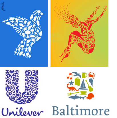
Left to right, top row: Luba Lukova’s Peace poster, Lincoln Center Festival 2005’s identity; bottom row: Unilever Logo by Miles Newlyn for Wolff Olins, Baltimore Logo by Landor.
Many before have done this, to varying desgrees of success, in slightly different ways. This logo, to me, is a reminder that borrowing ideas can simply be the beginning of a great result. HSUS’ logo is, in premise, no more different than those above but, in its context, it thrives: The logo visually fulfills the mission and name of the organization — and it does so in a beautifully integrated way that rises above mere lumping of objects together (like the Lincoln or Baltimore logos, which feel slightly gratuitous). There is something for everyone to care about in this logo — and for an organization committed to household pets, farm animals and wildlife, this is no easy task. So if you like animals (and this logo) and you are happy and you know it, clap your paws.


Jump to Most Recent Comment
John Blackburn’s comment is:
Looks like a mountain lion. I really enjoy your site!
On Jun.09.2007 at 06:38 PM
Inkblot Robot’s comment is:
This redesign is really interesting! They went from a very governmental type logo to something that is both fun and reserved. Not too mention right on message.
On Jun.09.2007 at 06:54 PM
Chris Stout’s comment is:
I do like this, particularly the arrangement of the animals (more or less) near their actual habitat (dolphins in Florida, cattle in the Dakotas, etc.).
A couple of other animal-focused logos using a similar technique that I'd previously run across:

(for the Tennessee Aquarium)

Audrée Lapierre’s comment is:
A very nice logo, it is a huge improvement too.
On Jun.09.2007 at 07:48 PM
felix’s comment is:
fantastic.
I'd expect nothing less from the Oklahoma master Micheal Scwab (now living beneath pigeon's toes). He makes it look easy. The spacial proporations allowed here are pure poetry.
btw, yours truly went to the same school as Sir Scwab (East Texas State University) and actually learned to draw on the same drafting table he used while he was there (each student is given a small, shared room to bunk in and even smaller room to work in).
The man is bananas. I love where he put our beloved ETSU on the map: dangling beneath a monkey's balls. No accident.
Currently I reside in the Goose's black ass. Again, no accident.
On Jun.09.2007 at 09:19 PM
Danny Tanner’s comment is:
I can't help but thinking that "of the united states" does not need to be represented by the graphic mark. Their audience is in the U.S., and everyone just refers to them as the humane society. Is it necessary to reinforce that the organization is limited to the U.S.? Does it imply the organization don't care about animals outside the U.S.? I'm also just tired of amalgams. However, It IS a pretty mark.
On Jun.10.2007 at 02:17 AM
Splashman’s comment is:
I like it. Some very careful selection, sizing and placement of the animals -- like perfect kerning. Even at small size and low-res (e.g., the "after" image), it works very well. Even if the concept doesn't give me goose bumps, it's very well executed -- which is more than I can say for about 98.7% of the logos out there. Kudos to the designer.
@Danny, the HSUS is located in and serves the United States; in my opinion, it is perhaps not necessary but certainly appropriate that the logo reinforce that fact. The HSUS has an international arm called Humane Society International (with their own logo, natch), and there are local chapters of the HSI in many countries.
Even if the HSUS didn't have an international arm, I would answer your last question with another question: Do the cops in Seattle care about a crime victim in New York? (That's rhetorical, by the way; no snarky answers, please.)
On Jun.10.2007 at 03:04 AM
Frank’s comment is:
Great idea, like it a lot.
The only thing one could argue about is the placement and size of the type but it's great to see a logo update with an actual *IDEA* behind it that even more, works.
On Jun.10.2007 at 07:37 PM
Shane’s comment is:
I am really enjoying this logo. I liked it even before I saw that Michael Schwab helped. I enjoy the simplicity of it.
I don't really have anything else to add, because I felt what was already written was well said, and I agree with it all.
On Jun.10.2007 at 09:22 PM
Corey Buckner’s comment is:
Although I think the concept is very clever; I just don't like looking at it. It's a great idea but it doesn't please my eyes which I think is way more important than any amount of smarts regarding the conceptual layout.
I don't like it.
On Jun.11.2007 at 12:18 AM
Xavez’s comment is:
That is one sleek logo+brand. Great typography.
On Jun.11.2007 at 05:24 AM
Kevin Cannon’s comment is:
Corey - You may not like it, but is it effective. Personal taste aside, it is a strong effective logo that has accurately met the creative brief.
On Jun.11.2007 at 05:36 AM
henry’s comment is:
great logo. succint, effective and with multiple layers of meaning:)
anyway thanks alot for the site.. really enjoy my regular dose of brand new
On Jun.11.2007 at 06:01 AM
Tony Goff’s comment is:
Very nice, I love the typography and the logo is quite clear and well designed. Makes a refreshing change from the previous entry on this site which did pretty much everything wrong.
On Jun.11.2007 at 06:16 AM
Mauro’s comment is:
As rightly mentioned in the post, the idea is not new but it is well implemented. My only doubt (as for other logos that exploit a similar visual approach) is flexibility: how do you manage this kind of logo at small or very small sizes?
On Jun.11.2007 at 07:56 AM
Bill’s comment is:
HUGE improvement! I second Mauro’s comment though, the practicality of the logo seems to be lacking a bit. Doesn't mean it's bad, just curious to see how it looks in applications. It looks a little clunky on the website... http://www.hsus.org/
On Jun.11.2007 at 10:06 AM
Design’s comment is:
Although an improvement, still bland and expected.
On Jun.11.2007 at 10:31 AM
Prescott Perez-Fox’s comment is:
This is sharp, I can foresee clever uses across a variety of media.
On Jun.11.2007 at 10:53 AM
Kaz’s comment is:
@Chris Stout: Yeah, the habitat of the chicken is particularly right, it looks intently to Kentucky, looking for fried friends? lol
About the logo, it's an improvement, but still, it's a little cheesy with all those animals.
On Jun.11.2007 at 11:16 AM
stock_illustration’s comment is:
I'd love to see some color applicatioins with this design...there are alot of great possibliities.
On Jun.11.2007 at 11:49 AM
RussD!’s comment is:
Sure beats the London 2012 logo. ;)
But seriously. I like the logo alot. However, I'm curious to see how readable it is from far away. Does the logo still work when scaled down to a tiny size? This may be a weakness.
And second, I personally think it would have been more cohesive for it to look more "MC Escher-ish", like the Tennessee Aquarium logo; where the animals fit into each other....might not have translated as well though.
Regardless, it's great to see such imaginative work for a national government type organization.
On Jun.11.2007 at 11:56 AM
Kurt Cruse’s comment is:
Are there departments dedicated to specific animal within the society? If so I wander if they will treat the logo in the same style as the Bahamas logo is treated when referring to individual islands.

Tony Goff’s comment is:
In regards to Bills comment...the site does look pretty bad especially with the lovely new logo which has obviously been switched out on the homepage. Now would be a great time to have a redesign and open it up with less clutter.
On Jun.11.2007 at 12:15 PM
rynot’s comment is:
the southwest needs more bacon.
On Jun.11.2007 at 04:42 PM
Justin’s comment is:
The new logo is definately a refreshing look compared to the previous generation. It adds a much needed humanane aspect to the logo that was non-existent before. True, some may like it more, some may like it less, all attributed to personal taste, but when an identity meets the creative brief criteria, and the organization delivers on its new promise of intent, the two will marry and I believe you then have a successful brand identity.
On Jun.11.2007 at 05:17 PM
Galih Prasetyo’s comment is:
Nice logo..I like it a lot!
On Jun.12.2007 at 04:10 AM
Mark’s comment is:
Cute and clever, however I don't like being located in the vicinity of a gooses ass (lol just kidding) I live in Connecticut BTW.
interesting that some (emphasis on 'some') of the animals are located in areas where they can be found natively.
BTW, Good job at the statement at the beginning Armin, you've introduced the subject in such an excellent and appropriate way.
On Jun.12.2007 at 08:56 AM
Mr. One-Hundred’s comment is:
Just a coincidence?
Go to the “Gallery” section and click “Next Image” 2 times and 2 times more.
On Jun.12.2007 at 10:44 PM
disgruntled designer’s comment is:
don't forget the nyc ballet's romeo + juliet which also uses the same little figures in their posters.
On Jun.13.2007 at 07:33 AM
disgruntled designer’s comment is:
as for the logo, euro rscg not only has a really catchy name that just rolls off the tongue, but their own logotype looks like ernst & young's. and though i think these minimalist character drawings are interesting, i think they are way more fine arts than they are practical identity solutions. this one in particular looks like little slabs of meat and that's all i'm reminded of. not necessarily the result that people hoped for. and what can you say about a logo that uses frutiger? i would rather stab myself in the ear repeatedly than see frutiger in all caps. it looks better than the original but all-in-all that's not a vastly difficult task. why couldn't they just use single animal elements for the identity? a system of those could have been really great and playful.
btw, i wish someone would kill off part of the west coast–the pigeon that is. seeing them just makes me angry. i don't believe in animal violence except against pigeons.
On Jun.13.2007 at 07:41 AM
Jon Dascola’s comment is:
i dont mind the logo, i just dont like where the chimps hand is. i have this nervous apprehension for the dog about to get neutered. maybe that is a subtle message they are trying to convey.
or maybe im just reading into it too much.
On Jun.13.2007 at 12:36 PM
alba’s comment is:
How about a little bird flying on the lower left for Hawaii?
On Jun.13.2007 at 02:32 PM
Anonymous’s comment is:
How about a little bird flying on the lower left for Hawaii?
That observation just reminded me that they completely forgot about Hawaii and Alaska!
Do they not work in those areas? just asking why those places weren't included.
On Jun.13.2007 at 03:31 PM
C-Lo’s comment is:
(Over)Used like a Chevy Cavileer with 200,000 miles on it, but it works.
On Jun.13.2007 at 03:42 PM
Mark’s comment is:
How about a little bird flying on the lower left for Hawaii?
That observation just reminded me that they completely forgot about Hawaii and Alaska!
Do they not work in those areas? just asking why those places weren't included
Sorry, I forgot to put my name in the previous comment, it was mine BTW
On Jun.13.2007 at 03:47 PM
Splashman’s comment is:
Um, Mark? Maybe I've forgotten -- what's the purpose of a logo, again?
Reminds me of an identity job I did a long time ago, for a Navy engineering division (after which, I swore I'd never work for the government again). Despite the XO's assurances that there were only three stakeholders to satisfy, after a grueling 4-month development process he sent the final design out via e-mail to every darn person in the entire division (230+) and asked for feedback. Crash and burn. A relatively simple logo (unusual for a Navy division) was soon replaced by a mess. In order to make sure no one got "left out," it was eventually decided that we simply had to include representations of the aircraft, surface ship, undersea and facilities (buildings) communities. Not only that, the aircraft had to be recognizable as an F-18, the surface ship had to be recognizable as a Nimitz-class carrier, etc. I became a monkey overnight, doomed to produce whatever they told me to. Worst. Job. Ever.
On Jun.13.2007 at 04:52 PM
Splashman’s comment is:
For those wondering about this logo's use at small size, I'd like to point out that the illustration on the HSUS's home page is about 125 pixels wide, and virtually every animal is recognizable. Not too shabby.
I printed those 125 pixels at a half-inch wide (smaller than you'd ever want it, I think), and at normal reading distance, I couldn't distinguish many of the species, but could immediately tell they were animals. Mission accomplished, IMHO.
On Jun.13.2007 at 05:02 PM
diane witman’s comment is:
The animap looks awkward next to the type. I've been struggling with this in my work as well. The animap used should work well with the type, but this looks like the map was placed to the left without too much thought.
I too would like to see how this works in different applications. The logo looks uncomfortable on the website.
I like it but can see the problems the designers may have had with it and that they may face in the future.
On Jun.14.2007 at 10:48 AM
Von Glitschka’s comment is:
Excellent.
On Jun.14.2007 at 12:14 PM
Darrel’s comment is:
I guess we're free to beat our pets in Alaska and Hawaii still!
Nice logo. Could use a hamburger and a side of bacon somewhere in there too...provided that Humane Society is wanting to emphasize that sector more so than crazy cat lady stories.
On Jun.14.2007 at 12:21 PM
Mark’s comment is:
Never mind, I realized it would look horrible and awkward with extra states (Alaska and Hawaii), it wouldn't work quite as well.
about it's placement perhaps the symbol should be centered above the name?
Good or bad were it applied on other printed media such as vehicles it'll look like cow spots.
However I can't wait what the vehicles will look like. (imagine the lower logo being the current one, it would look great, even unique!)
http://www.aspca.org/images/content/pagebuilder/602647.jpg
another application the new logo will hopefully be used on.
http://i12.photobucket.com/albums/a228/mortaljive/HumaneSocietry.jpg
I'm glad they haven't resorted to calling themselves by initials, IMHO initials in this case would reinforce the image of a cold governmental organization and distills the true meaning of the organization.
Plus with initials it's common to forget what each of the letters stand for, Especially when theres more than three of them.
On Jun.14.2007 at 12:22 PM
Mark’s comment is:
Okay, to demonstrate how awkward it would look like to add Hawaii and Alaska to the logo I give you this example:
http://www.rehabjobs.org/images/stateslinks_02.gif
remember this is a LOGO not a map of the United States!
Logos do not have to be realistic.
On Jun.14.2007 at 12:36 PM
guy’s comment is:
I think it's unoriginal and the type is bad. Looks like a logo obviously done by an ad agency.
On Jun.14.2007 at 01:16 PM
guy’s comment is:
I think it's unoriginal and the type is bad. Looks like a logo obviously done by an ad agency.
On Jun.14.2007 at 01:16 PM
Frank’s comment is:
Honestly as said i like the general idea of the logo but the more i look at it the more i get irritated by the placement of the type.
It really looks out of balance; also i think it'd be better if the logo icon would be a bit smaller.
On Jun.14.2007 at 09:29 PM
cheetahboy’s comment is:
I think this is a tough one. Despite the simplicity of the animals, this is still a pretty complex logo. And the animal map creates more questions than it answers.
> Why try to represent "all animals" (of the USA) by selectively only picking 19 of them and why were these ones chosen?
> Why are there 3 dogs when there could have been one dog and two additional animals represented.
> Why are there 3 birds?
> but for me, the biggest quesiton is what is a chimpanzee doing on this map?? As Webster's defines it as "an anthropoid ape (Pan troglodytes) of equatorial Africa."
> Why are the mountain goat and bulldog (I think) 3/4 views when all other animals are a side view (except the american chimp)?
Once the viewer starts to over analyze a logo, it's appeal can only be diminished.
On Jun.15.2007 at 02:10 PM
Darrel’s comment is:
"remember this is a LOGO not a map of the United States!"
Tell that to Alaska and Hawaii. No wonder they always have rumblings of seceding. I would too when they've been forgotten for so long (not to mention the extra S&H they're always paying...). ;o)
On Jun.18.2007 at 11:05 AM
sukisouk’s comment is:
"remember this is a LOGO not a map of the United States!"
"Tell that to Alaska and Hawaii."
perhaps you are not from those states ^^
hawaii you don’t need since it is too small to be seen in that animal resolution. and alaska should be in it’s place, like that:
[URL=http://img78.imageshack.us/my.php?image=usazi3.gif][IMG]http://img78.imageshack.us/img78/1038/usazi3.th.gif[/IMG][/URL]
anyway, pretty-but-boring logo.
were it’s elements taken from a clipart cd? ^^
Anonymous’s comment is:
ups
the pic

Tim’s comment is:
> Why are there 3 dogs when there could have been one dog and two additional animals represented.
And only 1 cat. It's catscrimination, dammit! :)
On Jun.24.2007 at 01:00 AM
Johanna Abzug’s comment is:
Yeah, and there are no reptiles or amphibians that I see..
On Jun.30.2007 at 03:24 PM
Mark’s comment is:
I see two cats a mountain lion and a domestic one.
:)
On Jun.30.2007 at 05:10 PM
Armin’s comment is:
Test / Please ignore.
On Jul.01.2007 at 06:21 PM
Pedro’s comment is:
two snaps in a doggie style formation...
love it.
message is clear.
execution is perfect.
nice job.
Mia’s comment is:
Nice! Although everyone can nitpick the selection animals to infinity, I just wanted to point out the majestic pigeon... Not that I wish pigeons any harm but are they really tasked with protecting flying vermin? ;-)
I won't wonder too long whether it was intentional to put in so many animals that make some sly references... the beaver, the rooster (ahem) etc...
On Jul.05.2007 at 06:06 PM
Geoff Handy’s comment is:
This is Geoff from The Humane Society of the United States. I've enjoyed reading through the posts, and since some have posed questions for which we have answers, I thought I'd weigh in:
1. Because "humane society" is not a trademarked term, we have an obligation to include "of the United States" in our mark. Although we run many programs for local animal shelters, we don't have legal or contractual affiliations with local humane societies. So that's why we included it in the logo.
2. We spent years trying to develop our acronym ("HSUS") into something recognizable, but abandoned that concept a few years ago since our research among donors and others showed it just wasn't working. So we were left with having to develop a logo that would accommodate all seven words.
3. It's true, we're a little embarrassed about having shoehorned this new logo into our existing website. We have begun a redesign process to more fully define the new branding, but decided that we did not want to wait for all to be perfect before introducing the logo.
4. We are, in fact, "calling out" individual animals from the logo to represent our specific campaigns. In fact, the animals were chosen specifically to represent our various campaigns. Imagine the chimp from the logo pulled out, with the words "Chimps Deserve Better" represented below the image. That will be how our campaign to end the use of chimpanzees in research will be visually represented. For a working example, see the concluding screenshot of the video on this page: http://humanesociety.org/stoppuppymills (instead of watching the full vid, you can use the scroll bar to go to 4:04 on the video)
5. We too were concerned about how the logo would look in small size. But I have to say it looks fantastic on a business card (and on a mug), so we're very happy with it in that regard.
Thanks to BrandNew for profiling it and to all who have posted thoughts and critiques.
On Jul.06.2007 at 06:33 PM
Dave’s comment is:
I Don't like it.
In addition to its unoriginality, i think when this is on a business card people are going to be squinting and wandering what these funny shapes are.
On Jul.07.2007 at 03:35 AM
B’s comment is:
---

Janette’s comment is:
I love it! Says it all.
On Oct.26.2008 at 03:15 PM
Pedro Rocha’s comment is:
It's only cool because it's about animals, and animals are cool. If it was about product, we'd be saying that it was stollen from unilever:)
Cheers,
Pedro
On Oct.26.2008 at 05:08 PM
Mazury4x4’s comment is:
logo :)
On Nov.25.2008 at 05:35 AM
Comments in Brand New, V1.0 have been closed.


