ADV @ UNDERCONSIDERATION Peek here for details
BROWSE
MarketReach Business Cards
Production Method
Digital
Foil stamp
Laser-Cut
Offset
Silkscreen
Design
ARTOMATIC
ARTOMATIC (strategy, concept and production)
CLINIC (graphic design)
Printing
Various
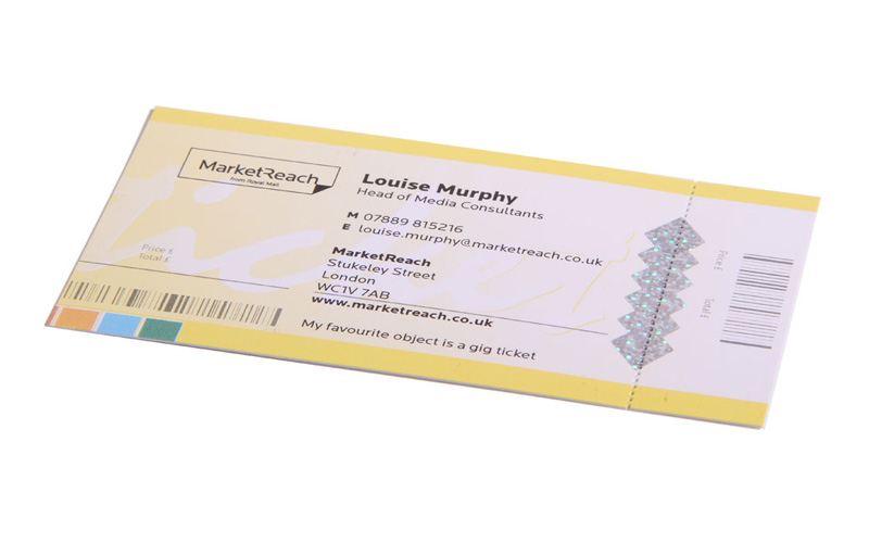
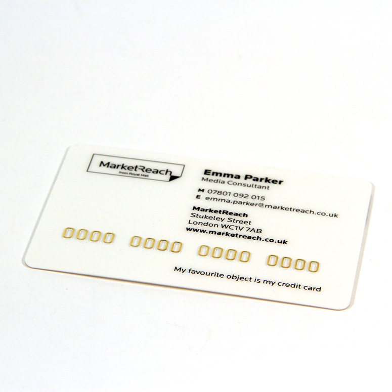
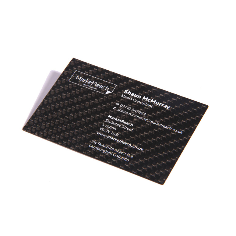
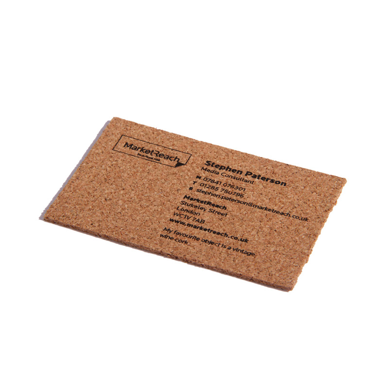
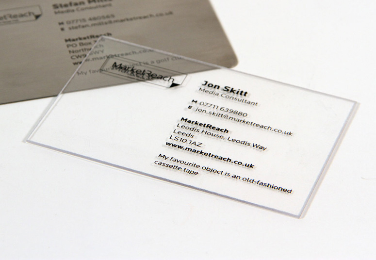
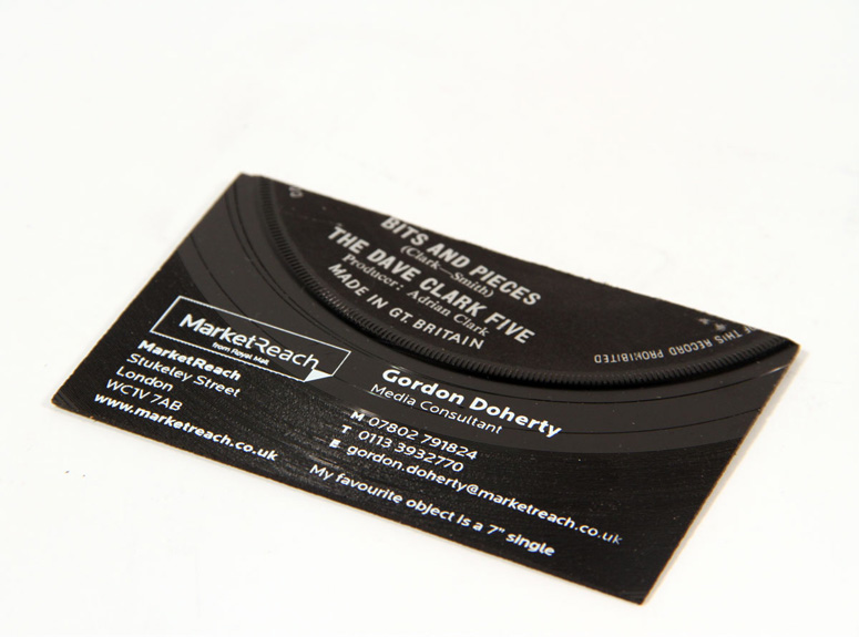
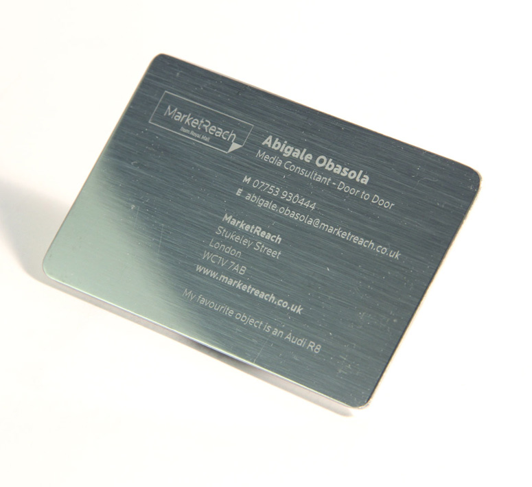
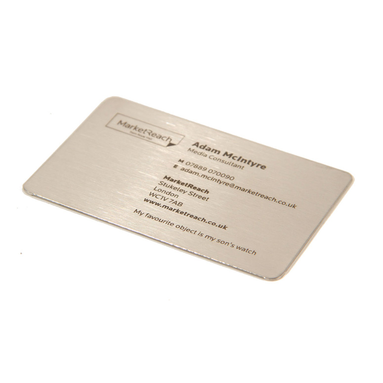
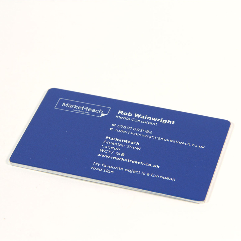
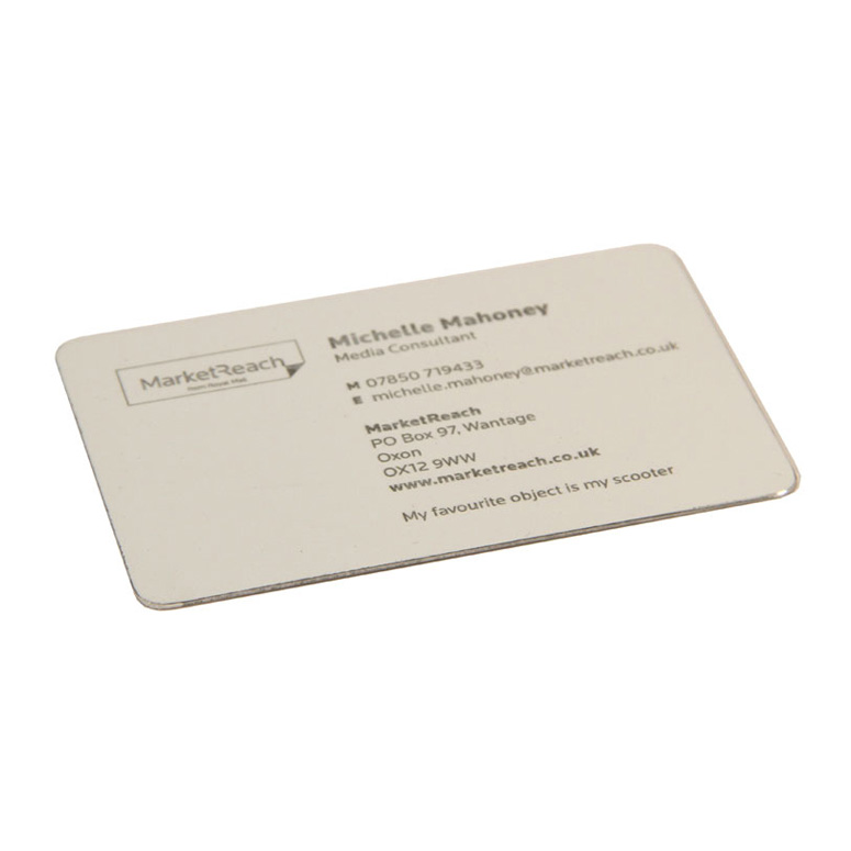
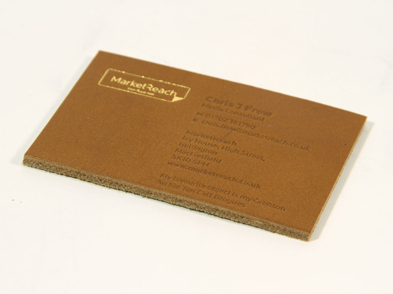
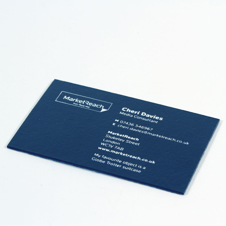
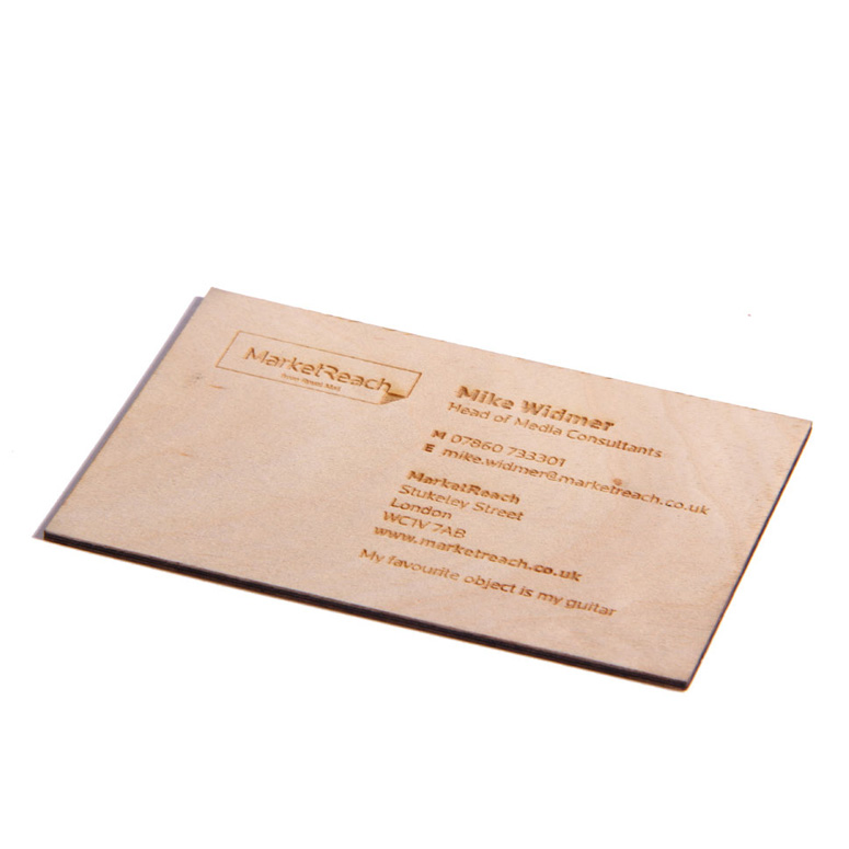
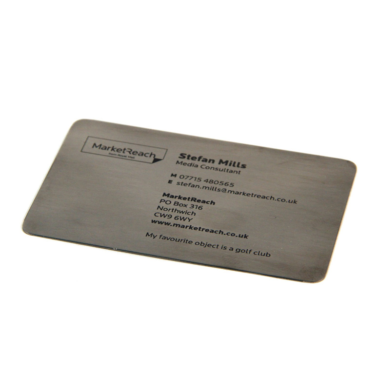
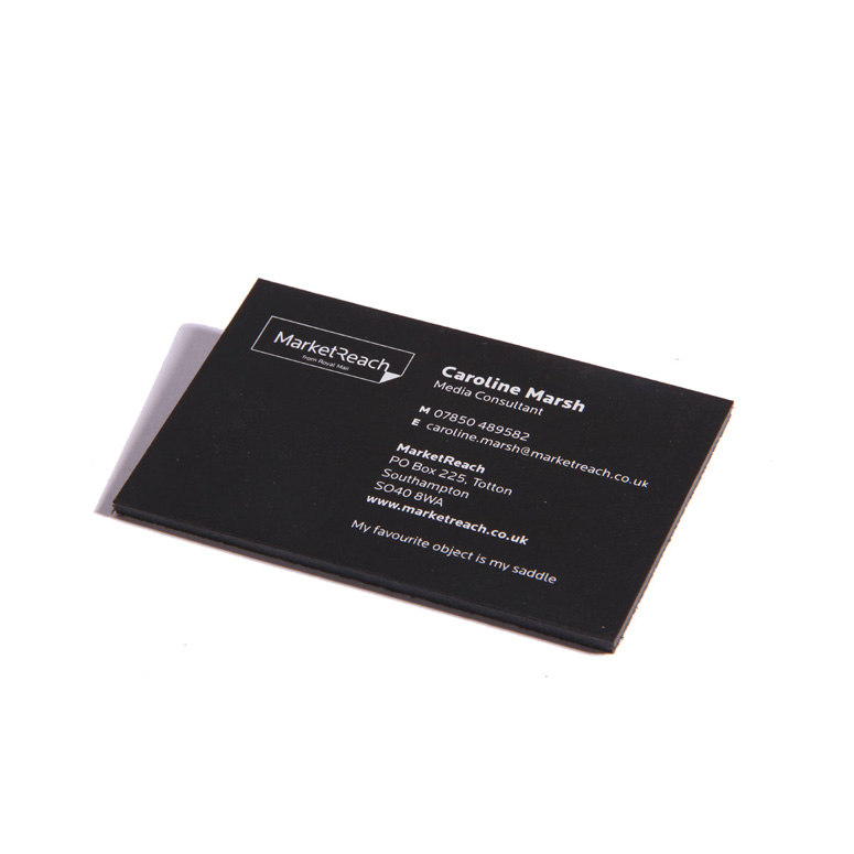
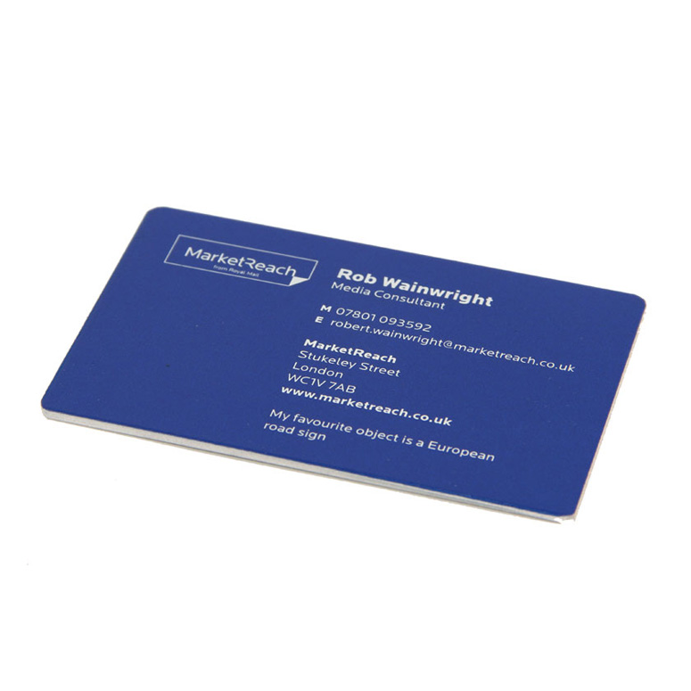
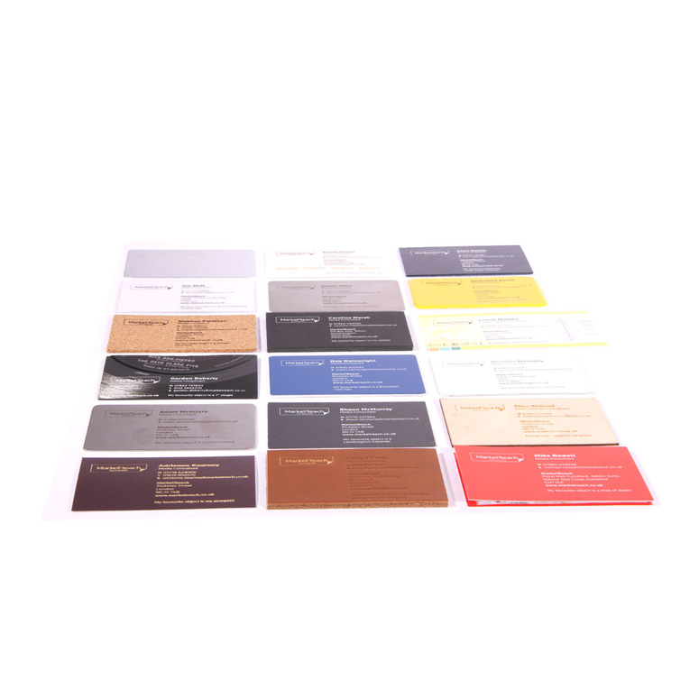
Market Reach is managed by a group of marketing professionals, planners, builders, consultants, and leaders that offer marketing solutions. Take a close look. These business cards get more personal than any other. The consultants were asked what their favorite object was, and as a result, each consultant had a card that matched the material of the object they favorited. What would your card look like?
Client
MarketReach (aka Royal Mail media service)
Quantity Produced
150
Production Cost
–
Production Time
6 weeks
Dimensions (Width × Height × Depth)
–
Page Count
–
Paper Stock
leather (tan and black) / 200gsm card / real maps of Spain / Vulcanised fibre board / aluminium (powder coated and polished) / stainless steel / titanium / carbon fibre / veneered plywood / aluminium road sign / passport cover material / cassette cases
Number of Colors
one (mostly)
Varnishes
–
Binding
–
Typography
–
Project Description
Royal Mail have launched a new mail media business: MarketReach.Their brief to ARTOMATIC—and CLINIC, who did the graphic design—was to create a set of business cards that would break the ice for MarketReach's media consultants meeting new clients with a new proposition in a market that's so often fixated by all things digital.
Our insight was People Buy People.
ARTOMATIC asked each consultant what brought them joy. We then identified a physical object that represented their passion and a material that referenced it (and that could work as a business card).
The corporate graphic design talks about the robustness of MarketReach, while the materials speak with a completely different voice about the personality of the consultant.
On some of the cards, the connections between the materials and their interests are obvious, others less so. But, the objective is to stimulate conversations, so it's ultimately down to the consultant to explain the connection—with a twinkle in their eye because it's their passion.
Production Lesson(s)
our starting point was a personal interview with the consultants which informed directly decisions about what material would best tell the story. From there, it was an exercise in finding suppliers and convincing them (on the phone since this required a fair amount of persuasion) to produce things outside of their normal capabilities.We were prepared to take some risks with the project in trying things that didn't work on the way to finding things that did. Because of the creative freedom we enjoyed—and because we had the trust of the client—we weren't required to get much approved along the way, which would have made the make-it-up-as-we-went-along approach unworkable.

Post Author

Jessica Mullen
Writer for UnderConsideration LLC.
More: Online / On Twitter
Date Published
March 15, 2013
Filed Under
Business Cards
Digital
Foil stamp
Laser-Cut
Offset
Silkscreen
Tagged with
business card
digital
etching
foil block
laser-cut
offset
screenprint
waterjet cutting


About
FPO (For Print Only), is a division of UnderConsideration, celebrating the reality that print is not dead by showcasing the most compelling printed projects.
FPO uses Fonts.com to render Siseriff and Avenir Next.
FPO is run with Six Apart’s MovableType
All comments, ideas and thoughts on FPO are property of their authors; reproduction without the author’s or FPO’s permission is strictly prohibited
Twitter @ucllc
Sign-up for Mailing List
Mailing list managed by MailChimp
Thanks to our advertisers
About UnderConsideration
UnderConsideration is a graphic design firm generating its own projects, initiatives, and content while taking on limited client work. Run by Bryony Gomez-Palacio and Armin Vit in Bloomington, IN. More…
blogs we publish
Brand New / Displaying opinions and focusing solely on corporate and brand identity work.
Art of the Menu / Cataloguing the underrated creativity of menus from around the world.
Quipsologies / Chronicling the most curious, creative, and notable projects, stories, and events of the graphic design industry on a daily basis.
products we sell
Flaunt: Designing effective, compelling and memorable portfolios of creative work.
Brand New Conference videos / Individual, downloadable videos of every presentation since 2010.
Prints / A variety of posters, the majority from our AIforGA series.
Other / Various one-off products.
events we organize
Brand New Conference / A two-day event on corporate and brand identity with some of today's most active and influential practitioners from around the world.
Brand Nieuwe Conference / Ditto but in Amsterdam.
Austin Initiative for Graphic Awesomeness / A speaker series in Austin, TX, featuring some of the graphic design industry's most awesome people.
also
Favorite Things we've Made / In our capacity as graphic designers.
Projects we've Concluded / Long- and short-lived efforts.
UCllc News / Updates on what's going at the corporate level of UnderConsideration.

Related entries
KitchenAid Limited Edition Cards
Black Sheep Studio Business Cards and Promotional Items
Seegno Business Cards
Fracas Productions Business Cards
Elegante Press Business card