ADV @ UNDERCONSIDERATION Peek here for details
BROWSE
Banned Books 2014 Poster
Production Method
Die-cut
Letterpress
Design
Spindletop Design
Laura Tait
Josh Higgins
Travis Smith
Printing
Workhorse Printmakers
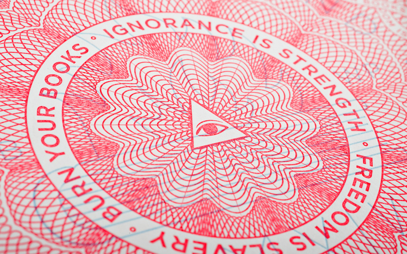
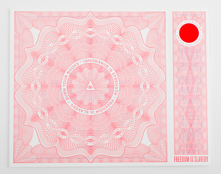
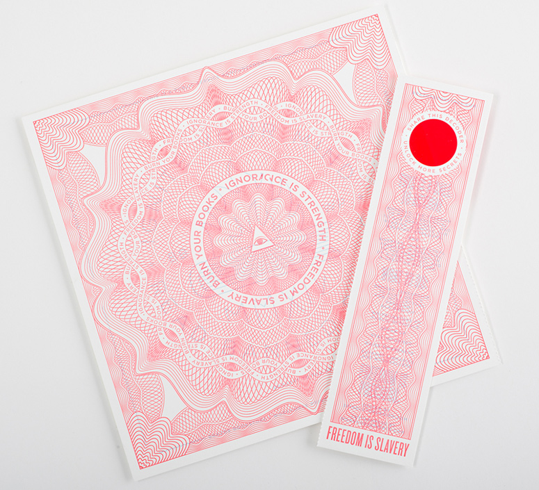
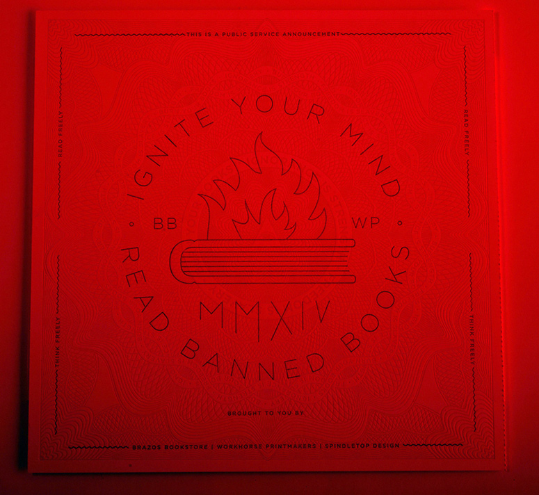
As part of an ongoing collaboration with Houston independent bookseller Brazos Books, Workhorse Printmakers and Spindletop Design created 2014’s Banned Book Week ephemera with an on-site print aspect in mind. On the day of the event, attendees printed subversive secret messages atop pre-printed, die-cut, and scored propaganda posters with attached bookmarks that they could then use to decode each other’s messages.
Dimensions (Width × Height × Depth)
–
Page Count
–
Paper Stock
160 DTC
Number of Colors
2
Varnishes
–
Binding
–
Typography
Gotham
Knockout
Project Description
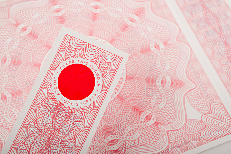
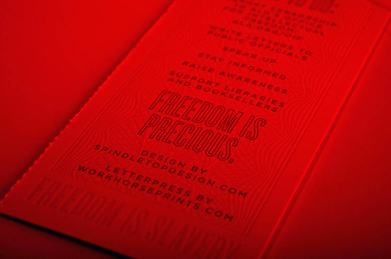
Banned Books Week is an annual event celebrating freedom of speech and the freedom to read. Usually held the last week of September, Banned Books Week seeks to bring together the community for a discussion on the value of open access to information and the cultural value it provides. Brazos Bookstore, a beloved Houston independent bookseller, partners yearly with Workhorse Printmakers and Spindletop Design to host an event and create printed ephemera which focuses attention on the cause and serves to enthuse lovers of print and reading.For this year's event we drew inspiration from classics rooted in government censorship (1984, Fahrenheit 451) and created a small propaganda poster which seemed to promote censorship on the surface, but held a subversive secret message. By tearing off the perforated bookmark on the right of the piece the viewer could use the attached red lens to reveal the antithetical message below. Additionally, the bookmarks were printed with a call to action and resources which could only be viewed by using another co-conspirator's bookmark.
The finished piece was letterpress printed in two stages to allow printing onsite at Brazos Bookstore using Workhorse's Challenge 15MA proof press moved in for the event. The pieces were die cut, scored, and printed with the red in advance. On the day of the event attendees printed the secret message, in light blue, which was obscured by the preprinted red.
Production Lesson(s)
Getting the correct ink colors for the print and secret message required a bit of experimentation. If the red was too dark the lens wouldn't cancel it completely but if it was too light the secret message would be too apparent. In the end we mixed a very light blue, just enough to be prominent through the lens, as a starting point, added opaque white to the red, and reduced the ink on press until the desired balance was achieved.Designing a piece to incorporate an onsite printed component is always an additional challenge. Since these needed to be trimmed, scored, and die cut prior to the second color being printed onsite we had to work with a piece which wanted to pull itself apart during the last color run. To add to the difficulty we had to grip from the bookmark side to accommodate the gripper margin of the Challenge Proof Press. Extra care was needed in make ready so that the paper wasn't stretched from excessive impression which would have also helped tear the perf during printing.

Post Author

Kelly Cree
Writer for UnderConsideration LLC.
More: Online / On Twitter
Date Published
February 3, 2015
Filed Under
Die-cut
Letterpress
Posters
Tagged with


About
FPO (For Print Only), is a division of UnderConsideration, celebrating the reality that print is not dead by showcasing the most compelling printed projects.
FPO uses Fonts.com to render Siseriff and Avenir Next.
FPO is run with Six Apart’s MovableType
All comments, ideas and thoughts on FPO are property of their authors; reproduction without the author’s or FPO’s permission is strictly prohibited
Twitter @ucllc
Sign-up for Mailing List
Mailing list managed by MailChimp
Thanks to our advertisers
About UnderConsideration
UnderConsideration is a graphic design firm generating its own projects, initiatives, and content while taking on limited client work. Run by Bryony Gomez-Palacio and Armin Vit in Bloomington, IN. More…
blogs we publish
Brand New / Displaying opinions and focusing solely on corporate and brand identity work.
Art of the Menu / Cataloguing the underrated creativity of menus from around the world.
Quipsologies / Chronicling the most curious, creative, and notable projects, stories, and events of the graphic design industry on a daily basis.
products we sell
Flaunt: Designing effective, compelling and memorable portfolios of creative work.
Brand New Conference videos / Individual, downloadable videos of every presentation since 2010.
Prints / A variety of posters, the majority from our AIforGA series.
Other / Various one-off products.
events we organize
Brand New Conference / A two-day event on corporate and brand identity with some of today's most active and influential practitioners from around the world.
Brand Nieuwe Conference / Ditto but in Amsterdam.
Austin Initiative for Graphic Awesomeness / A speaker series in Austin, TX, featuring some of the graphic design industry's most awesome people.
also
Favorite Things we've Made / In our capacity as graphic designers.
Projects we've Concluded / Long- and short-lived efforts.
UCllc News / Updates on what's going at the corporate level of UnderConsideration.

Related entries
Black Sheep Studio Business Cards and Promotional Items
Herbst & Spungen Wedding Invitation Suite
Cranky Bucks Promotion
Seegno Business Cards
“Miniature Views” Promotion