Monday April 29, 2024
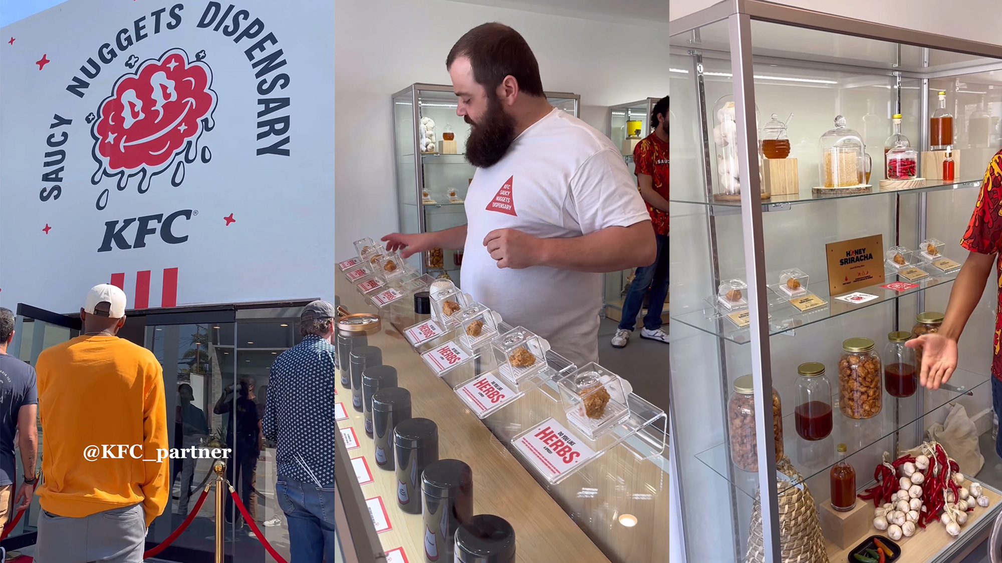
Friday April 26, 2024

Thursday April 25, 2024

Wednesday April 24, 2024
Tuesday April 23, 2024

See more What’s the difference?
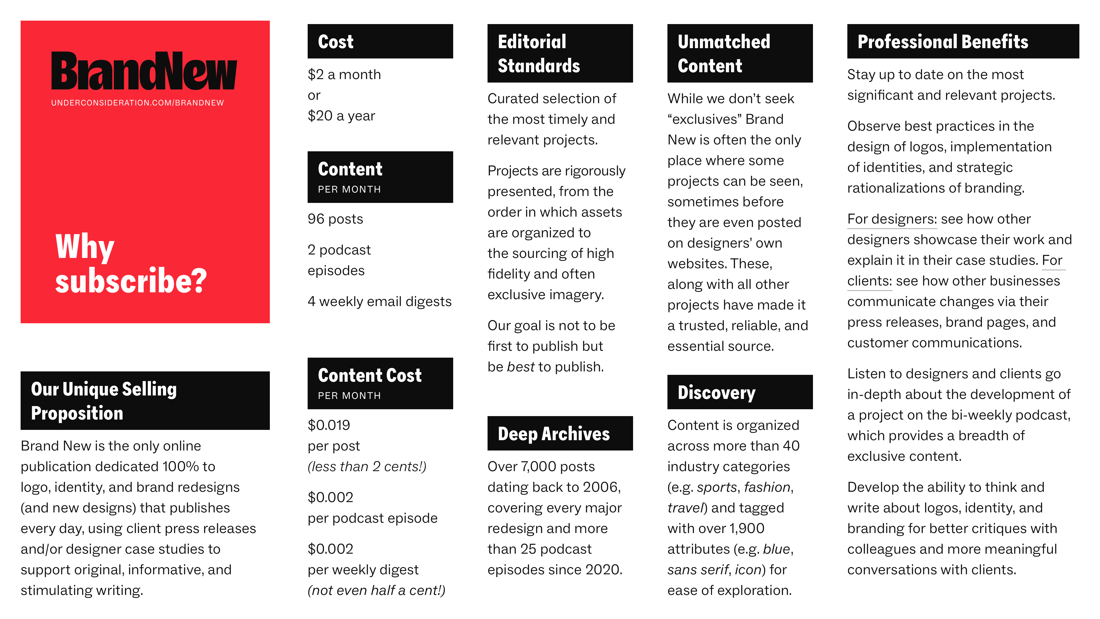
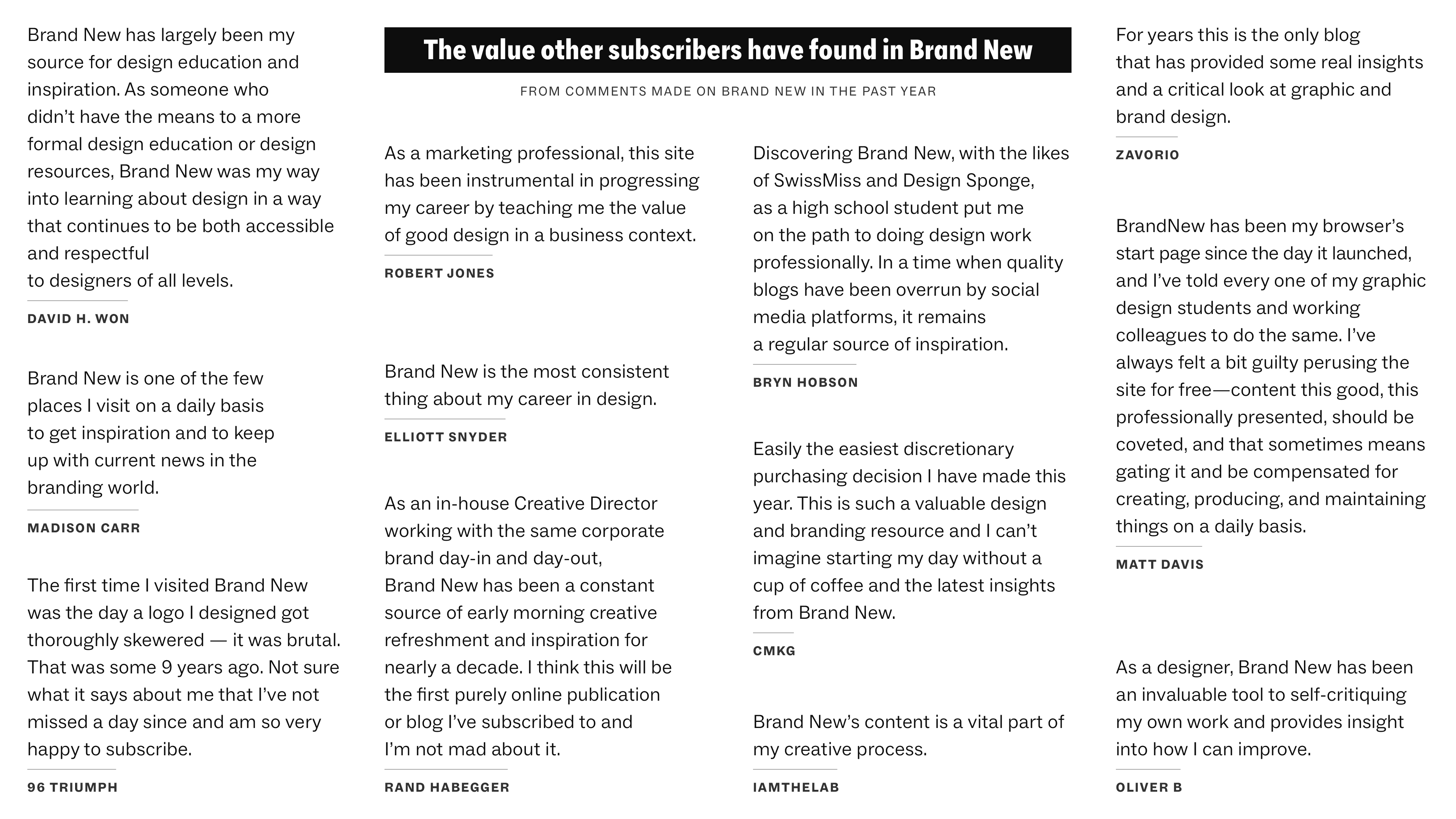
Why Subscribe?
A 2-page PDF with some objective reasons to the value of a Brand New subscription is available for download.
↓
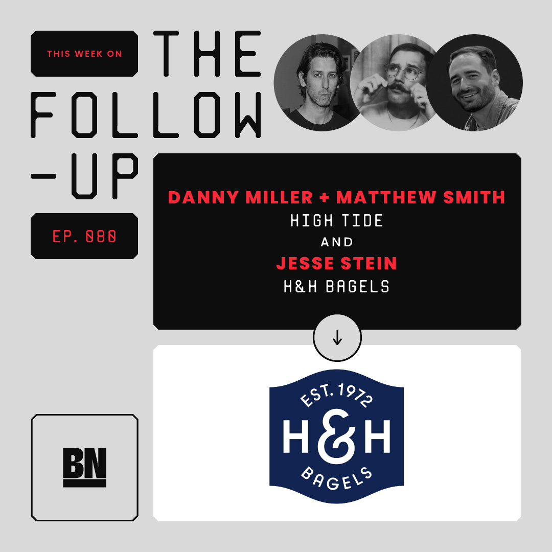
The Follow-up
Announced


SUBSCRIBE