

NOTE: This is an archived version of the first incarnation of Brand New. All posts have been closed to comments. Please visit underconsideration.com/brandnew for the latest version. If you would like to see this specific post, simply delete _v1 from the URL.
![]()
Of all the juicyjuicetastic drinks out there, I can only recognize Snapple. Even as I write this I couldn’t name off the top of my head other brands of juice drinks promising “100% Natural!”. But I know Snapple. When I want something more than water but less than soda, I go for an iced-tea lemon snapple or whatever other thing they might have — they all taste the same, except the red- or pink-colored ones, those taste like pomade. And I can spot a Snapple in a deli fridge among all the other finely-designed, colorfully-labeled bottles: I can do a quick scan for that weird sun that shows up in the iced teas, or the checkered or otherwise patterned cap, or, of course, the angled logo — but, unfortunately, it looks like all those recognizable traits and quick identifiers (for me at least) will soon be gone. In their place, a very slick look will replace this idiosyncratic brand, blurring the distinction between it and all those other nondescript bottles. Sigh.
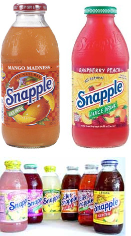
The old bottles (above) weren’t particularly well designed to be honest, they had the look of a locally grown product with labels by the local artist who had been given free reign with 4-color printing. As the flavors and varieties of Snapple grew, the look became inconsistent and erratic with different styles of illustration, photography and typography in each bottle. But, as a whole, they managed to create a recognizable mess. Now, as Snapple expands into white teas, black teas, red teas, green teas AND tea blends, water, and more flavors, a new set of designs are being rolled out, although I’m not sure if any of these will now, or in the future, replace the current bottles. But, typically, with a new logo — designed by New York-based CBX — chances are that anything sporting the old logo will be displaced.
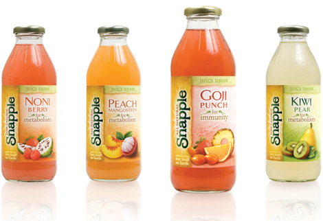
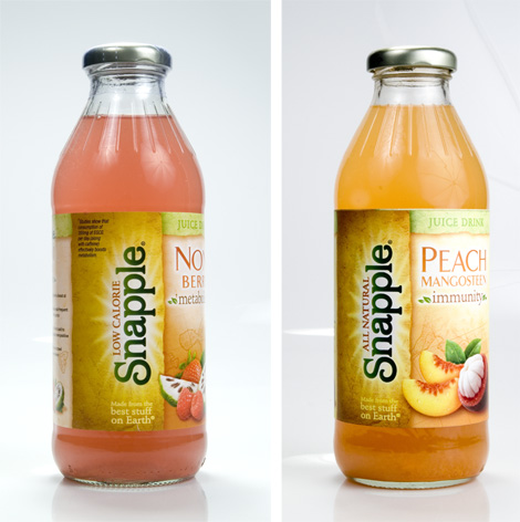
As I mentioned earlier, these bottles and the logo are slick — this is half compliment and half condemnation. Everything is very well considered and composed, from the textures in the background, to the fruit imagery, to the typography, but in everything that they have gained in execution they have lost in attitude. And, as I see it, these new bottles are perhaps a bigger reflection of an overall slump in the delivery of the Snapple we have grown accustomed to.
![]()
But more tellingly is the negligence towards the angled logo; not because it was superb identity design but because it implied a set of meanings and intentions, and discarding that logo indicates a move from the idiosyncratic and offbeat into the mainstream and bland. CBX shared with me that consumers did not see any equity in the angle of the logo (at 20 degrees, in case you were wondering) but I find that hard to believe — I am not calling them liars, I just literally find it hard to believe — as the Snapple logo has played a prominent role in the advertising, from the big logo hanging behind the Snapple Lady ads in the 90s, to the caps of Snapple bottles opening in the beginning of ads in the early 00s, to the big close-up of the caps in those weird Snapple-with-wigs ads from a couple of years ago. So the angle is gone. I don’t lament it, or the loss of the old logo. I do worry about the disconnect between the brand that Snapple has built upon irreverence and this new look is anything but. If the idea is to change Snapple into a new tame version, then, woohoo, this succeeds, but it’s hard to conceive of Snapple in another way. But then again, if their latest ads are any indication, they might be changing after all. And not for the best.
Ads listed chronologically as well as unintentionally from funny and awesome to unfunny and lame.


Jump to Most Recent Comment
Gregg’s comment is:
WOW. WOW. The new bottles are certainly "prettier". The old branding with slanted type, red rule, and cheesy graphics was what stood out in the store.
On Dec.20.2007 at 10:15 PM
David’s comment is:
Could not agree more. I think it's really important for drinks claiming to be "natural" to have a folksy kind of appeal, and the old branding succeeded very well at that. Now, it is kind of blending in with all the Lipton Iced Tea bottles, and it seems that even the shape of the bottle has changed.
Everything about the old branding screamed "I am young and edgy, but I know what I'm doing." Now, it looks like a grown up that's dumped its rebellious nature and has just decided to blend in with everybody else. And honestly, that's a damn shame.
On Dec.20.2007 at 10:26 PM
Kingsley’s comment is:
This is a beautiful update for this brand. The package design is refreshing and I think the bottle design is smart and screams premium. The brand will certainly stand up to Honest and all the other new players in the bottled tea category of today.
On Dec.20.2007 at 10:31 PM
Craig’s comment is:
The new branding looks pretty classy and, well, average. The new bottles look a lot more like a premium brand and that may come to hurt them in the future. I really wonder if the consumer will be put off by the premium look, in their mind they might be thinking "if something looks like a premium brand it will usually come with a premium price" and go right past Snapple. It certainly opens up the non premium drink market, I wonder if Coke or Pepsi will try to create a new product to take some shine from Snapple.
On Dec.20.2007 at 10:42 PM
Chris’s comment is:
Shame, I actually liked Snapple's old look and feel. While it wasn't particularly well-designed, it did give me a country/farm fresh natural feeling with it's clunky graphics. It seemed to have some graphic personality that reminded me of the Ben and Jerry's brand. The new packaging seems to be an effort to "clean up" the bottle while falling horribly short. It'll be especially evident when stores stock them next to Vitamin Waters and Sobe Life Waters.
On Dec.20.2007 at 11:11 PM
K. West’s comment is:
That's a shame. The old logotype was actually still pretty spunky and had a sort of classic, fun appeal to it. If anything, they should have geared the rest of the bottle art MORE TOWARDS that classic look instead of trying to look like the new Shopko's house brand of sugared-tea.
Lame.
On Dec.20.2007 at 11:39 PM
Dale H.’s comment is:
Wow. I *hate* this anemic "update." As I see it, a big part of Snapple's brand equity is/was "happy" even at the risk of "goofy."
They just screwed that up. This new design is dreary, low-energy, soft to the point of being forgettable. Yes, it's arguably more professional, but that doesn't make it good.
The old logo had an infectiously upbeat quality...thanks in no small part to that optimistic upward angle (see graphology 101).
Now we have an annoyingly sideways logo that's too powerful vis a vis the inexplicably wimpy type they've chosen for the individual flavors ("KIWI PEAR"). It looks like they've decided they need to go more feminine, more new-agey. This seems likely to alienate kids and families. I really don't get it.
On Dec.20.2007 at 11:52 PM
Dale H.’s comment is:
PS. For a much better example of how to take folksy, amateurish packaging to the next level without losing your brand, see Celestial Seasonings.
On Dec.20.2007 at 11:57 PM
Prescott Perez-Fox’s comment is:
I did an identity re-design for Snapple a few years ago. Obviously, the outcome was very different.
http://www.perezfox.com/snapple/
This one is awesome and welcome because Snapple was ailing big time. I'm glad they updated their packaging and logo, although I don't see the quirkiness (Snappletude?) into which Snapple was born all those years ago in Greenwich village.
Armin, great post, I couldn't have said it better myself. And when I get a minute, I will in fact try.
On Dec.21.2007 at 12:15 AM
Ray ’s comment is:
Snooze-fest! I don't understand this change at all. The packaging is extremely recessive and certainly does not have the same impact as the prior versions.
And what's with all of these boring, faux 3D, gradient logos coming out of the food and beverage industry lately? Designers really need to get away from there gradient mesh tools and start looking at solid form and shape.
On Dec.21.2007 at 12:37 AM
Andi’s comment is:
I think the new brand is beautiful and well designed. It would look great on shelves at a Whole Foods or Fresh Market type of store.
But I think Snapple has really embraced it's kitschy -ness over time. And I mean that with a lot of respect. They did a good job of taking something that could be bad and make them look old, and kept it fresh and silly. When I think of Snapple, I think of the Snapple Lady (first commercial linked) and I think that's a good thing. I think the rebrand is a bad idea. I think they could take half the bottles of each flavor, slap the new label on it, and people would think it was a completely different beverage.
As I said, I think the new branding is really well done and beautiful, but not Snapple-icious.
Adrian’s comment is:
Aaah what a shame. The new identity is so..."fill your chi-serious about healthy drinks" instead of the happy, youthful attitude the old Snapple had. I'm all for a more consistant brand, really, but I think they went a little overboard here. When I look at the package, it's prettier, but it also took every bit of visual joy there as out of it. Swing and a miss in my opinion.
On Dec.21.2007 at 02:26 AM
WORK, Oslo’s comment is:
WTF? They went MinuteMaid™ on our ass. Next is probably that Ben and Jerry's goes Dreyers.
On Dec.21.2007 at 03:03 AM
Kaz’s comment is:
It's like they have to comply with the standard desing for these drinks, they all do the same.

It's just sad.
On Dec.21.2007 at 05:12 AM
John Mindiola III’s comment is:
wow. et tu, snapple? from irreverent to irrelevant. if you wanna display premium, do it with differentiation, not assimilation.
On Dec.21.2007 at 08:53 AM
Tom’s comment is:
Yes, it's beautiful. But why take the FUN out of Snapple? Are their new products going to sell for twenty dollars exclusively through Pottery Barn?
On Dec.21.2007 at 10:04 AM
JasonP ’s comment is:
What a disappointment Snapple has lost its flair. The Snapple's old logo meant something to its customers. I'd like to meet some of the individuals in the focus group.
The only plus is that back in the late 1980's I received a free Snapple t-shirt with the logo across the front of the shirt. The t-shirt just got so much cooler!!
On Dec.21.2007 at 10:30 AM
Mark’s comment is:
I thought I saw a new Snapple logo in the deli the other day.
I like the new logo it's very clean and simple.
However I can't say the same for the design, it's so commonplace with every other juice drink out there, picture of fruit, that 'home grown' farmed look, the sun rays in the back ground, ech.
Why is the logo tilted so much to 90 degrees? It seems to make it less important.
The logo shows more difference from the previous one horizontal, not vertical.
I don't want to tilt my head to read the company name. >:(
On Dec.21.2007 at 10:40 AM
Glenn ’s comment is:
Goodbye to the Snapple we all knew and loved. You were a good friend.
On Dec.21.2007 at 11:08 AM
diogo’s comment is:
Here in Portugal we don't have Snapple. So...ignoring all the history of this brand... i would by the new juices. They look healthier.
On Dec.21.2007 at 11:25 AM
C-Lo’s comment is:
The letters itself reminds me of that ungodly web 2.0 style. But the execution is actually very appealing albeit conformist. I will miss the old style though simply because it had some warmth to it. It kept in touch with the "struggling drink company" and being offbeat. As if it were the "punk rock" of the drink industry. Now it's a sharp design, but again a little close to other drink label designs; losing some of that shelf appeal, which is where the design needs to stand out most.
On Dec.21.2007 at 11:28 AM
gorckat’s comment is:
@Kaz- I totally thought of orange juice when I saw the vertical Snapple labels.
Doesn't Minute Maid or some other big brand OJ have some kind if similar label?
Looking at the new label, as an Snapple Iced Tea lover, actually makes me think it'd taste worse. I know its irrational, but the new logo screams 'corporate managed taste not allowed to cost more than X cents to produce per bottle- consistency over quality'. Even though they were probably already at that point, it didn't feel like it popping the top of an iced tea.
On Dec.21.2007 at 11:36 AM
andrew miller’s comment is:
Well executed but poorly advised.
In other words, I agree with everybody.
On Dec.21.2007 at 11:59 AM
LimitedTimeOffer’s comment is:
Personally I absolutely find the numerous different product lines easier to distinguish with the new labels. So in that measure, mission accomplished.
That said, I find the 90º logo irksome married with a commonplace and characterless font design. This is a brand with a great fun personality, how did they manage to filter it out of the design process?
On Dec.21.2007 at 12:00 PM
Joe S’s comment is:
I like the new logo, but only in a way that I wish the original never existed so that they wouldn't be losing out on all that brand equity. The old logo looks likes 1967, though. And not in a good way. It looks like old baseball team logos (which I happen to hate).
On Dec.21.2007 at 12:28 PM
Jw’s comment is:
Ugh... those new bottles are terrible. Makes me think of the hygiene aisle in the grocery store. I won't be drinking any of those, thank you.
On Dec.21.2007 at 12:56 PM
Mike’s comment is:
This one hurts a lot. I was recently mulling over the unfortunate end of the charming Snapple Lady commercials and thinking "at least they still have their kooky branding."
I don't go out of my way to eat or drink sugary stuff. But two brands that always win me over are Dunkin Donuts and Snapple, despite of (and honestly probably because of) their "unsophisticated" design compared to their slick, yuppie-centric competitors. At least this will cure me of my flavored water habit.
On Dec.21.2007 at 01:15 PM
Kevin’s comment is:
I agree, Mark. I believe that it would have been an easier transition if the logo was used horizontally rather than vertically. Loosely retained color and flourishes aside, futility won out and the logo still missed the mark when incorporated into the new labels.
On Dec.21.2007 at 01:56 PM
Audrée Lapierre’s comment is:
they make it look all 'healthy" but this juice only taste like sugar... doesnt fit
On Dec.21.2007 at 02:03 PM
Hyun’s comment is:
Aren't these simply a new line of flavors? Their original line are still using the same graphics.
On Dec.21.2007 at 02:04 PM
Tactful Cactus’s comment is:
I agree with a previous commenter who called the new design "anemic." This is one of those times when the brand probably would have been better of just keeping what everyone already knows, as cheesey as it may be.
On top of that, it seems like a *really* unwise decision to place the logo vertically on the bottles. Rotate that bottle 15 degrees clockwise, and you can't see the logo at all!
On Dec.21.2007 at 02:42 PM
TheUprock!’s comment is:
I actually don't mind the logo update so much, but the bottles' label redesign isn't really doing it for me. I won't go so far as to conjecture that they're going to lose a lot of brand equity, but I do think this hurts them in terms of brand positioning.
On Dec.21.2007 at 02:57 PM
craig shully’s comment is:
It NEVER makes sense to make your brand name less readable.
On Dec.21.2007 at 03:09 PM
felix sockwell’s comment is:
not that my Snapple redesign, was any better but... well, OK, it was.
This is depressing. I hate branding. I quit.
On Dec.21.2007 at 03:24 PM
H. Michael Karshis’s comment is:
I'm outta here too.
HMK
On Dec.21.2007 at 04:09 PM
JD’s comment is:
gone are the days of coming in from a day at the park, kicking my feet up and watching sports while drinking a snapple. Now I feel like I need to be in the hot tub with cucumbers over my eyes. Blech. It's well-designed, but that doesn't mean crap if you are missing your target demorgraphic completely. They are trying to reinvent the brand, and it just ain't workin' for me.
Now I'm not an expert in the fruit drink industry, so don't quote me on what's selling and what's not, but it's sad to see snapple try and conform into this trend.
On Dec.21.2007 at 06:31 PM
L.Vazquez’s comment is:
Felix: Yours is a hell of a lot better than theirs.
I wouldn't go so far as to say that I hate this redesign... I don't feel positive about it. Its not a good move.
I was a teen in the early 90s when Snapple became big. Honestly, I much prefer the old logo.
You know what... we should be their focus group.
L.
On Dec.22.2007 at 11:47 AM
rickyaustin’s comment is:
Maybe I'm too young - but Snapple never said 'quirky' to me. It's just another drink on the shelf with slightly-outdated packaging that I never picked up. I don't have much familiarity with the brand at all.
With that said - the update is a positive for me.
Initially, the logo redesign didn't do much for me. But when it was implemented on the bottles, I like them much better.
It may have lost 'quirkyness' - but I never knew about the Snapple 'quirkyness.' I may even try some Snapple now.
On Dec.22.2007 at 02:56 PM
Adeline’s comment is:
The appearence and the logo don`t make the brand, it just the packaging. The brand means much more than that for the people who usually chose to drink Snapple. It is what Snapple has to offer to them...
On Dec.22.2007 at 04:11 PM
disgruntled designer’s comment is:
unnecessary. i like that the old logo was all

it totally fit the cheesy approach to their brand.
take note armin, they blimpie has a new logo too.
On Dec.22.2007 at 10:45 PM
disgruntled designer’s comment is:
sorry, extra "they" there.
On Dec.22.2007 at 11:01 PM
Kevin M. Scarbrough’s comment is:
Brands start off quirky and weird to get attention. Then they turn tail and go corporate and become "premium", "high end".
What the hell is wrong with being quirky from start to finish?!
On Dec.23.2007 at 01:29 AM
Von Glitschka’s comment is:
This doesn't even inspire me to make fun of anything so yeah I'd second the motion regarding the design looking "Anemic."
Couldn't they have just upgrade the old mark and infused some sophistication into it there by retaining a modicum of equity that gave the backward nod to their history and former personality of the brand? Growing up is fine, just be honest about it. This seems like a purposeful denial?
You know those movies where you have a snooty upper class social circle and someone new comes into it. Even though they are as rich as the others in the group, the existing group members look at the new person and label him/her as "New Money." Well, that's the vibe I get from this new logo and package. Everyone knows where they came from but now they are sporting a new look that seemingly wants to forget it's entire history previously. Just seems a bit dishonest of sorts.
On Dec.23.2007 at 03:06 PM
Mark’s comment is:
What was wrong with Snapple in the first place?
Not boring enough?
sad.
On Dec.23.2007 at 06:50 PM
Mark’s comment is:
please explain what was so necessary to dump all of it's history.
I didn't see anything wrong with Snapple.
On Dec.23.2007 at 06:52 PM
diane zerr’s comment is:
I'm not as disappointed with the logo as I am with the new bottles. I could even warm up to the new logo but the bottles are so ... ho-hum. No logos on the bottles, no catchy graphics, bored, totally bored.
On Dec.23.2007 at 09:57 PM
altoption’s comment is:
Here's how my seven-year-old daughter summed it up: Snapple is a fun fruit drink. That new one is boring.
On Dec.24.2007 at 05:08 PM
Etienne’s comment is:
When I first saw the new logo I liked, except for the fact that it's not slanted anymore... I don't know how CBX does their research but I think there were some bad decisions taken.
Frankly, the new logo looks like it was done straight in order for it to fit the new label layout. And the whole "pop" style of their labels has totally changed 90 degrees to this new style. I even liked the fatter bottle style...
If someone told me Snapple had changed their identity and I had not seen it, I would've thought they just refined their slanted logo and unified all the bottle labels under the same wacky colorful style. Kind of a silent make-over that would make you look twice at the bottle as it looks fresh again with the same style but this time refined perfectly.
On Dec.25.2007 at 09:10 AM
Fuzzyman’s comment is:
The new bottle label looks almost medicinal. Maybe that is what they're shooting for, something that says, "I'm good for you!" What they've lost is something that says, "natural, homespun, out of the ordinary, and real."
On Dec.26.2007 at 06:18 AM
Monostereo’s comment is:
The redesign looks to cater to a very specific audience - healthy, feminine, upscale, etc. One bonus of this for the brand is that despite their tagline 'Made from the best stuff on Earth' I don't think I ever associated the brand with being particularly healthy. Perhaps this is because the ingredients include 'high fructose corn syrup', which is not particularly healthy stuff. With the new packaging I might not bother to read the ingredient list and just assume that the stuff is good for me.
http://www.mayoclinic.com/health/high-fructose-corn-syrup/AN01588
On Dec.26.2007 at 02:35 PM
Drew Pickard’s comment is:
I'm not sure I even care since those wonderful people went and combined my two favorite fruits into one drink . . .
PEAR & KIWI
In the same bottle!
Now that sounds tasty.
On Dec.26.2007 at 07:27 PM
Inaudible Nonsense’s comment is:
Snapple seems so 80s. As a beverage whore. And with all the better designed (and actually more natural -- no high fructose corn syrup) with other brands, I haven't had a Snapple in ten years or more. Nantucket Nectars and Vitamin Water is all I drink anymore.
On Dec.27.2007 at 12:04 AM
stefano picco’s comment is:
the old one was cooler :(
On Dec.27.2007 at 11:31 AM
adam’s comment is:
well, now snapple is prepared to exist on the web with its smooth, curved and gradient-filled logo at least.
im not sure i really like the new logo, but i do like the new packaging/labels from a purely visual perspective. with that being said, from a marketing/branding perspective, now the labels blen in with every other "hip, modern" drink on the shelves.
On Dec.27.2007 at 05:02 PM
designiscandy’s comment is:
Not a Snapple fan, but love the new look. The old logo had a cheesy, 70s feel that doesn't jive with the 'fresh, all natural' messaging of its branding. Horrible typeface and for the most part, slanted typestyles belong in the 70s, back where they came from. Don't get me wrong, cheesy/70s sometimes is exactly what the doctor ordered... but not the case here. I give it a thumbs up, like the new face, like the balance of the mark. I think they were smart to keep it typographic, adding a mark would have been too much, and too much of a departure from the existing brand. When evaluating logo redesigns, I often ask myself: "Would I enjoy working with that logo on a stationery/packaging/print ad/web site?" The answer is yes in this case. Also, can you post a picture of their new labels as well? I think it helps to see the new logo in context and perhaps is fairer way to evaluate the mark.
On Dec.27.2007 at 07:42 PM
designiscandy’s comment is:
Sorry, label images weren't loading when I first read the post... but now that I can see them, I'm more convinced than ever that this is the right move for Snapple... the brand was tired and dated, this is a much-needed, well-executed improvement. Bravo, Snapple!
On Dec.27.2007 at 07:46 PM
Mark’s comment is:
I guess designiscandy likes boring and monotonous :P
On Dec.28.2007 at 09:01 AM
Josh’s comment is:
Ugh. I second and third much of the comments as i'm very late to the game here.
I don't get the vertical placement of the identity. It seems subversive to negate proper hierarchy to promote what looks like a natural theme, but is contrasted by the product itself. The identity itself looks like an apple orchard who actually hired a designer vs. hand lettering on some rotted plywood from the garage.
Any smart shopper is going to the know the difference between what looks like natural and what is natural. Why does natural have to be so boring all the time?
In contrast what Joel Templin and Hatch did with the potential and eventual versions of Pepsi's Fuelosophy product are downright genius.
I don't necessarily get distraught over identity changes, but without romanticizing too much the previous identity could have been put to much better use and re-envisioned at much less cost.
Here's to those that are better salesmen than I.
On Dec.28.2007 at 12:09 PM
TheUprock!’s comment is:
@Inaudible Nonsense: Vitamin Water is not better than Snapple. Check the sugar content in a whole bottle of Vitamin Water.
On Dec.28.2007 at 12:35 PM
Keb’s comment is:
Okay. Web 2.0 seems to have flooded the entire logo market.
My question is this: At what point will the web 2.0 style become dated. Isn't a logo supposed to transcend trends? Isn't it supposed to last more than a few years? This is akin to the "swoosh" logos of the late 90's. Who wants to look at a look and say "wow, that's so 2007" in 5 years?
I am fine with updating logos that need it, but business people really need to learn the difference between a corporate identity and an ad campaign.
On Dec.28.2007 at 02:04 PM
designiscandy’s comment is:
"Mark’s comment is:
I guess designiscandy likes boring and monotonous :P"
^and being rude and snarky contributes in what way to this conversation...? The least you could do is be man enough to post your own opinions. Something tells me you don't have any.
On Dec.29.2007 at 09:43 PM
Mark’s comment is:
It was my opinion, thats all.
I didn't see any reason why Snapple should end up looking like all the other juice drinks on the shelf , it seems to me that would hurt them rather than help them.
I was looking at it from my point of view, I couldn't understand why someone would applaud a company for blending in with the rest of the crowd,I mean how is that going to help them stick out and get noticed?
Yes I understand the need for refreshing the brand, but when it ends up with them copying everybody else on the shelf, it gets to the point where nothing catches the eye.
This one justs looks a little too 'safe' for me.
They've could of done better.
But we'll see what results from this.
On Dec.30.2007 at 09:21 AM
Mark ’s comment is:
I apologize, I shouldn't have made such a snide remark about you, my point of view influenced that remark and I shouldn't have made that judgment about you.
On Dec.30.2007 at 09:40 AM
Mark ’s comment is:
I was also stuipidly thinking you wouldn't respond to that remark when I made it.
I'm sorry.
On Dec.30.2007 at 09:43 AM
Mark’s comment is:
Also making stupid and idiotic remarks (like I just did) contributes nothing to this conversation.
On Dec.30.2007 at 09:47 AM
Randy’s comment is:
I first started drinking snapple when I saw them advertising on the howard stern show. Back when it was really low budget tv show. I still pick it up every now and then, its kinda like a cult drink like Jolt.
The new packaging looks like everyone else. I cant say I'll be back. Sorry Snapple
On Jan.03.2008 at 08:11 PM
Same Snide’s comment is:
I can accept all this talk about making an eye catching logo, but some of the more elaborate commentary is downright laughable, e.g.
"But more tellingly is the negligence towards the angled logo; not because it was superb identity design but because it implied a set of meanings and intentions, and discarding that logo indicates a move from the idiosyncratic and offbeat into the mainstream and bland."
Do people really think these sort of thought processes are going on inside the head of potential beverage consumers? "My, what an idiosyncratic logo. It's just the sort of subversive beverage brand to slake my countercultural thirst."
Snapple's rise was owing mostly to the fact that there was a void in beverage options. They put their name out there, consumers liked the new option and drank it up. Unfortunately, for Snapple a range of options soon followed, and there was a subsequent drop-off in their business. This had nothing to do with their logo and only a tiny smidgen to do with their commercials.
They should have left the logo alone, because it's their brand identity. They waste money on the redesign and waste more money attempting to get the word out that their labels different. What's the point?
If they want to increase their market share the best way to do it is to improve their product. A good start would be to make truly healthy beverages on top of the corn syrup laden concoctions that are their bread and butter. This would give credibility to their tagline, "made from the best stuff on earth."
Paul C’s comment is:
Well, at first glance i'm not a huge fan of the re-design. It looks fine, but i think a route like "Celestial Seasoning", that Dale H. pointed out, although not incredible by any means would have retained the "folksy" integrity snapple has been known for. Oh well, maybe i'll warm up to it when i see it in action....if i can find it in a sea of clone bottles. : [
On Jan.09.2008 at 04:55 PM
Paul C’s comment is:
Well, at first glance i'm not a huge fan of the re-design. It looks fine, but i think a route like "Celestial Seasoning", that Dale H. pointed out, although not incredible by any means would have retained the "folksy" integrity snapple has been known for. Oh well, maybe i'll warm up to it when i see it in action....if i can find it in a sea of clone bottles. : [
On Jan.09.2008 at 04:57 PM
alex’s comment is:
You know at first I liked the redesign of the bottles. They definitely are pretty and aesthetically "better" looking. But watching those old ads made me remember what Snapple used to be all about. Especially when they had the Snapple lady as their spokesperson. Honestly that is why people liked Snapple, I never liked the drink very much, but it was a craze at the time. The new design is almost like when you move from your first car, that crappy Volkswagen that breaks down every week, to the new-ish Japanese car that lasts forever. Maybe that new Honda is a little sleeker, but it just doesn't have the personality that the diesel smoke machine did. You won't miss the Honda when it's gone, but you will forever remember that rusty unreliable friend, who only let you down because he was on his deathbed.
On Jan.11.2008 at 01:51 PM
Michelle M’s comment is:
this is a horrible design job. FULLY forgetting the target audience. with this rebranded look and logo it to me and their new target consumers are the middle-aged. the spunky look was a little off but after this many years? it can only be called authentic. tea is suppose to be a oldschool sort of drink. and this new look makes it look artificial.
On Jan.14.2008 at 07:03 PM
A7’s comment is:
looks like very other drink that is out on the market.
On Jan.16.2008 at 02:47 AM
Edzo’s comment is:
This design ALMOST would make me pick it up and buy it... but then I'd remember how awful Snapple is and get a Sobe.
On Jan.22.2008 at 06:47 AM
Mark’s comment is:
On a positive note the bottle caps of new bottles still have the old logo on them :)
I saved a Snapple Iced bottle with the previous design on it, it'll become rarer and rarer to find.
On Feb.02.2008 at 01:03 PM
Andres Lloyd’s comment is:
organonymal precompensation vajrasana plexodont laquear quebracho cyrtoceratitic crinatory
http://www.assael.co.uk/ >Assael Architecture
http://www.k12.nf.ca/fatima/cmhome.htm
Yeison Agudelo’s comment is:
umm it looks better on the bottle
and the bottle is very much like
the other bevreges of its kind
kinda disapointing
Anonymous’s comment is:
nantucket nectars now uses the same bottle as the snapple premium teas.
what a shame...
Barclay D.’s comment is:
i think snapple is a company like ben & jerry's ice cream. they have fun with they design of their product. they look at little crazier compared to the other brands. it works. snapples new look has them fall back into the mess of juice drinks. it looks like like every other healthy drink.
its a great new look, but i m going to miss the corky labels with the fruits and suns talking to me, saying their are the best thing on earth.
On Mar.19.2009 at 01:18 PM
Zoe’s comment is:
New Snapple is now made with sugar as opposed to HFCS. I did have some trouble spotting it on the shelf at the supermarket, which was interesting. The store I was in had both the old bottles as well as the new. The only reason I saw the new ones was because they were next to the old. Had the old bottles not been there, I would have thought this was another product, not Snapple. I am kind of sad that the old logo & packaging have gone, but the product does taste better with sugar as opposed to corn syrup. It is still very sweet, but doesn't have that cloyingly stick to your mouth sweetness that beverages with HFCS often have.
On Mar.25.2009 at 04:07 PM
yourmomsuckscock’s comment is:
the new peach snapple tastes way better 2. I always found the old ones to have a wier kool-aid kinda after taste to them. Great job snapple, your news stuff is not only better for people, but taste way better 2.
On Apr.12.2009 at 05:42 AM
Qudans’s comment is:
Agree with Same Snide. The new redesign looks like it came from a focus group. i.e., in delivering on expecatation, nothing more, which
is regrettable because it now looks very generic.
KrisBelucci’s comment is:
Hi, good post. I have been wondering about this issue,so thanks for posting.
On Jun.02.2009 at 01:32 PM
Comments in Brand New, V1.0 have been closed.


