

NOTE: This is an archived version of the first incarnation of Brand New. All posts have been closed to comments. Please visit underconsideration.com/brandnew for the latest version. If you would like to see this specific post, simply delete _v1 from the URL.
![]()
The statement from Richard Maddocks, Chairman of the Australasian Writers and Art Directors Association, AWARD for short, states in part: Let’s be clear. AWARD is not a committee, a board or an institution. AWARD is a community. […] AWARD is as strong, dynamic and powerful as the people who participate in it. AWARD evolves as the community that forms it evolves. Based on the latter two principles, Interbrand Australia created a new, living identity that reflects the evolving and dynamic nature of the organization.
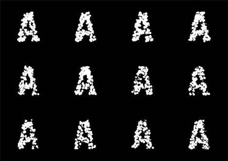
The logo is comprised of numerous dots, each dot representing a member of the organization. The logo taps into the AWARD membership database to recreate itself whenever needed, be it online in the web site designed by Deepend or for print purposes. Interbrand Australia’s Creative Director, Chris Maclean, further explains:
Controlled by a complex algorithm, the dots converge, diverge, bounce and swarm — behaviour that you would expect of a creative organism. Together, the dots form the shape of an ever-morphing “A” for AWARD.
The dots come in three different sizes to represent membership levels. The smallest dots represent the students of AWARD School; the largest dots represent members who have received accolades from AWARD; and, the medium sized dots represent all other members. An individual career can therefore be tracked all the way from a student to an awarded professional.
As time goes by, the logo will evolve with the population of the membership and as each member’s career progress.
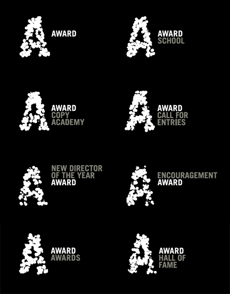
In the printed world, the logo retains its dynamic nature, appearing in a different configuration on every application. This is made possible by an online logo-generator. A unique logo is automatically and instantaneously downloaded every time new artwork goes to print.
I am getting addicted to these living identities — like last month’s Namics — and I wonder if there will be a day, much like the day when a cell phone without a GPS map is obsolete, that a logo that doesn’t live in real time will be obsolete. But you don’t come here for my futuristic predictions, so let’s get to the design. Static, it’s hard to discern that the “A” is made of dots and not just of rounded debris, which is not entirely bad, but I wonder if allowing a few of the dots to stray on their own would help make it clear that these are a bunch of dots, not just a distressed “A.” However, online, the logo is amazingly convincing and engaging, bringing the concept to life, and I guess that will always be the challenge of bridging the ease of portraying real time online with the hardship of translating it to print, but it’s nice to see that AWARD is taking advantage of digital printing to move this living identity concept forward.
Without sounding like a lame criticism of the organization, it’s kind of advantageous that AWARD does not have thousands of members, because they would probably end up with an unrecognizable blob. In the end, this is a great identity for a creative organization and it’s nice to see a client that allows the boundaries of identity to be pushed a little.


Jump to Most Recent Comment
Dale Campbell’s comment is:
Next to the actual word "award" I feel the "A" is easily recognized, but on it's own it seems to lose a little.
I think the overall concept is pretty bold and daring.
Very creative.
Keep well,
Dale

Claudia’s comment is:
I.L.O.V.E.I.T!!!!!
On Jul.09.2009 at 08:16 AM
ScottyM’s comment is:
Logo = fine. Interesting, but perhaps a production nightmare.
Deepend's work for both the AWARD site and especially their own site = poor.
Crazy tech guys with no common sense take note:
Please allow me, the consumer, to wait for 15-20 seconds while your site loads up all its crap. I really don't want to "buy" anything from you, anyway.
And then make me wait 10-15 seconds more while your site dynamically shifts from pretty visual message to pretty visual message ... leaving a blank screen in between.
Thanks for making me wait so long on the high-speed Interweb ... glad to do so.
I'm gone. Thanks again,
ScottyM
On Jul.09.2009 at 08:19 AM
yael’s comment is:
I really like this new paradigm for logo design. A logo design is often seen on the web before being seen anywhere else - sometimes only on the web at all. I've been giving out less and less business cards these days. It almost seems like a waste to print more than 50 at a time. I guess it depends on your audience and business model. As a designer who's client relationships are initiated online 90% of the time, I should probably be considering this.
On Jul.09.2009 at 08:58 AM
Dan’s comment is:
/agreed ScottyM...
That site took me minutes to load, its not even done as im typing this. Deepend's site makes me feel like I'm surfing the web on a 28.8 dial up modem.
On Jul.09.2009 at 08:58 AM
Sand’s comment is:
Hurray for B/W Logos!
I like the idea of living/breathing logos but the moving dots on the website really distort the letter A, at times looking like a 'q' or 'p'
For what it's worth, the logo looks great static (based on the after pics) and would probably look cool with a little grayscale dot-overlay action. Or if you want to jazz it up further, instead of having different sized circles, have different shapes representing the membership levels (triangles, squares, etc.)
On Jul.09.2009 at 09:39 AM
Matthew R’s comment is:
God I hate Flash.
On Jul.09.2009 at 09:53 AM
Anderson Wilson’s comment is:
These "dynamic" logos are simply an excuse for creative mediocrity or laziness (but it's something that designers exchange high fives over in celebration of their "cleverness").
On Jul.09.2009 at 10:01 AM
Bryan Redeagle’s comment is:
The logo looks wonderful, but I agree that the dots tend to hug one another. If they spread a bit, you can see their dots, and it might better hold the "A" shape together better.
As for the site, I guess they never saw "Web Pages that Suck" and Flanders' many resources on the negatives of "Mystery Meat" navigation. It took me too many clicks to find the menu. And after I found the menu, I found it hard to read with it at all different angles.
I do like Deepend's website though. It's very vibrant, and it loaded quick for me (which is surprising considering my internet connection).
On Jul.09.2009 at 10:11 AM
Steven Hoober’s comment is:
I have the same feeling about this as the Namics one. Doesn't feel like a mark, as the mark changes. How can you recognize it at a glance? I have to characterize the wordmark next to it a the logotype, and the A as some sort of branding-related treatment.
I can easily imagine a fixed logo mark (pick the best of the radom dot patterns) and then when you want to waste our time online, or have multi-page print documents, can do neat things like dots coming in and forming the (always recognizable) mark.
Maybe I'm just old. Now you kids git off my lawn with your new-fangled haircuts and transistor radios and ad hoc logos.
On Jul.09.2009 at 10:13 AM
Ethan Allen Smith’s comment is:
Living or "dynamic" identities are brilliant. It's such a fantastic change from the CorelDRAW logos of the early 00's. It also helps kill the LogoWorks-style laziness that is epidemic in the industry right now.
Added note: This is another example of just how backward-thinking and oblivious the designers over at MTV are.
On Jul.09.2009 at 10:13 AM
Impossibly Stupid’s comment is:
"I wonder if there will be a day . . . that a logo that doesn’t live in real time will be obsolete"
Oh, goodness, let's all hope not. Isn't the whole point of a logo to give people a simple way to identify a brand? I don't want to have to disambiguate some complex jumble of word or pixels every time I see something to know whether or not it's who I think it is.
I mean, consider this screensaver, which was making a logo dynamic way back in 1999! The logo itself, though, has remained the same. Just because a designer can envision billions of different combinations for the basic elements of a logo does mean that the user should always be confronted with billions of different versions.
No, I say this is just a phase that less sophisticated designers are latching on to instead of exercising a critical eye. It's just like in 1984 when everyone found out that a desktop computer could do desktop publishing, so they stuffed all 23 fonts that they had access to into every single document they wrote. It is a fad that will be embarrassing in retrospect.
As to this logo, I think that the A is indeed already the "unrecognizable blob" you feared it could have been. It only kinda-sorta-sometimes looks like an A, and even then only when printed next to a proper A. The underlying idea might be fine, but they need to tweak their "complex algorithm" to create a more approachable reference mark.
On Jul.09.2009 at 10:18 AM
fsaputra’s comment is:
The 'A' looks gross... Creative for the sake of being creative never works for me. Visually, it looks disgusting, like an oddly-shaped fungus...
On Jul.09.2009 at 10:36 AM
Ethan Allen Smith’s comment is:
@Impossibly Stupid
Actually, I would argue that the logo itself is part of a "phase." Logo-centric design is a fairly recent development, as design goes. Adidas was making shoes for more than 50 years before they introduced the Trefoil and Levi's was sewing jeans for the better part of 6 decades before adding the red tag. Even Rolex's ubiquitous crown was trademarked 10 years after the company started making watches.
Wilson, Apple, Disney, Toyota, Kodak, Reuters, none of these companies had a specified logo when they started building their brand.
Building a brand is a fluid, evolving process. There are false starts and wrong turns. There are leaps and quick steps. Sometimes a brand identity will be built by the organization, sometimes it is built (and destroyed) by consumers. The Beatles didn't need a logo to become an international sensation, I'm not sure why AWARD would.
Moving away from the static, stoic, and simplistic logo designs of the last 25 years is an intelligent step forward. It adds to the recognition that "brand" is a completely different concept than "logo."
On Jul.09.2009 at 11:06 AM
Violet’s comment is:
I don't like it. I hate the way the A looks. Like someone said it reminds them of fungus... same here.
On Jul.09.2009 at 11:24 AM
Martin’s comment is:
Well, I am really curious how and if it really works.
Due to my thesis on this topic I’ve been researching a couple of ›living‹ identites in the past few month. The more complex they were the shorter they lived. Most of the organisation turned back to a static mark quite fast after they realized their new identites created a lot of additional work. From one/one communications’ identity for ›House of Science‹ (1) in Bremen to Total Identity’s living diagram logo for innovation centre ›TIS‹ in Northern Italy (2) to Rhizome.org’s fancy IP address logo (3) — all of them are static again. Sometimes the programmer left, sometimes the algorithm didn’t work anymore, but most of the cases the logos turned out to be a toyish time-sink that steal the time form the real communication intentions.
But if it seriously work in print, I am very keen to see how …
1: House of Science Bremen
2: Techno Innovation Südtirol (TIS)
3: Rhizome – The World's First Generative Logo?
Gardiner’s comment is:
Like someone else sort of implyed above, concept does not trump execution, and most importantly meaning. Even if the directive is that of something coarse, bold, erratic or even ugly.
Outside the branding of the AWARD website, this mark is all kinds of wrong and easily misinterpreted. If the goal here is to update and promote a clearer sense of the purpose of AWARD in any marketed space, this mark misses its mark entirely.
The furthest thing communicated by this execution is the idea of a growing community. Online, it's more like a lava lamp, the notion of the endless shuffle. In static form, it's off-target:
The first thing I sense is the idea of disease, the visual sensibility of bacteria. Why go this route causing such a tremendous disconnect from the implied benefits of the acronym AWARD, and ultimately to the visual plague we see demonstrated here.
It's an illustriously bad design, and while the idea of a growing morphing identity has a lot of merit, the execution here should not be heralded as innovative or even good. Interbrand or not, I feel this does a tremendous disservice to promoting the cause and purpose of AWARD.
And furthermore, showcasing this as a good example of identity work is just disturbing.
Petri dish culture anyone?
On Jul.09.2009 at 12:05 PM
Martin’s comment is:
PS: Michael Johnson just created another new dot typography mark for a mall in Cardiff, Wales called ›St. David’s‹. In that one the dots don’t change their position and number in the logo itself, but for the location’s pictograms and headline font:
On Jul.09.2009 at 12:05 PM
John Blackburn’s comment is:
Dynamic logos like those for Saks and Namics are great, but this one feels half-baked and mildly nauseating.
On Jul.09.2009 at 12:13 PM
jM’s comment is:
It makes me itchy.

Yotam’s comment is:
Coincidentally --
http://www.johnsonbanks.co.uk/thoughtfortheweek/index.php?thoughtid=472
Bill Dawson (XK9)’s comment is:
"AWARD [is] strong, dynamic and powerful... AWARD evolves...."
I feel that this identity program is not true to AWARD's stated self image.
Is it strong? IMO, no.
Is it dynamic? Only in that it's consistently inconsistent.
Is it powerful? Here I feel "A" is for "anemic."
The A does not "evolve." The dots coalesce into incomplete versions of the same gothic letterform. It's never solid. It's never clear. It's never powerful.
This is an example of an abstract intellectual concept unrealized by the actual end result.
Good idea, bad execution.
On Jul.09.2009 at 01:38 PM
Mark’s comment is:
Very dynamic and original idea.
The only problem I have with it is the dark gray type on a black background. It's very hard to read in that combination of colors, I have to look over it again just to read it.
On Jul.09.2009 at 01:50 PM
Ethan Allen Smith’s comment is:
@Martin
You've got to go back way further than that in logo history. Branding with logos used to be extremely fluid. Fiat, Texaco, Boeing, Peugeot, Buick, Nestle, Pepsi, Bell, the logos for these long-lived companies used to change dramatically and often, usually because they were hand drawn, but mostly because the "logos" were based on an idea rather than a specific design. A Shell gas station in San Francisco might have been using a completely different mark than one in Baton Rouge, but there was no conflict of identity.
McDonald's is a perfect example. Originally, the "golden arches" were never intended to be part of any "logo." Instead, it was a unique architectural feature which drew specific attention to the chain. The arches weren't turned into a logo until the 60's. And even then, the logo has gone through several iterations.
With the introduction of the computer and the push for global brand recognition, logo and wordmark development came to a crashing halt. Companies who may have drifted through 10, 20, or 50 different versions of their mark have made almost no updates or changes since the 90's.
This trend of finding organic ways to present a logo, instead of being a new or modern invention, is simply an innovative way to create a global brand while rediscovering the freedom we used to have as designers to make fluid changes.
On Jul.09.2009 at 02:16 PM
Tim Gengler’s comment is:
I'm still of the mindset that a logo should be memorable and relatively easy to draw. The motion logo makes that tough and, in my mind, makes a company seem unstable and unsure rather than dynamic.
Until I see an instance where every frame of animation can be paused and give you a beautiful logo, it's just another gimmick. You might as well give it a metal texture and add blinking lights and reflections, because it's all just piling flash on an otherwise generic and/or unimpressive design.
That's not to say the circle idea is bad. The web site executes the idea well (at the expense of a tremendous load time). But, even then, having the logo in motion on there seems like overkill.
On Jul.09.2009 at 02:46 PM
Impossibly Stupid’s comment is:
@ Ethan Allen Smith
I think what is getting confused here are the baselines for brand, logo, and dynamic. Nobody is disputing that brands can exist before/without logos. Nobody is disputing that a brand identity/logo can change over time (heck, isn't that what this site is all about?). What seems to be the matter at contention is whether or not this level of constant change serves the purpose of either a logo or to strengthen the brand.
I am still of the opinion that, just like color should gracefully degrade to black and white when possible, dynamic should gracefully degrade to static when possible. This treatment doesn't appear to do that. Seriously, it wouldn't take much to apply an aesthetic/algorithm that uses the same circles but places them in starting positions that better highlight the overall shape of the A. Let them wander from there if you must, but there's simply no good reason to take whatever random puke the computer spits out and call it the level of quality that represents the AWARD brand. Shoddy decision making by all parties involved.
On Jul.09.2009 at 03:42 PM
Martin’s comment is:
@Ethan Allen Smith: Of course—and so does even today every interpretation of a Chrysler or Volkswagen logo look different from each other: from the implementation on the car’s radiator to the workman’s boilersuit to the company’s letterhead.
But when it comes to planned interation it seems to me that the logo’s variation is in its infancy.
It may wonderfully work if you brief hundreds of designers, animators and filmmakers over the years to let them draw their variation as MTV did, but leaving it to whether software or employees wasn’t too sucessful until now.
The well-working examples are those indestructibly implemented such as Ruedi Baur’s international font system for ›Cité Internationale Universitaire de Paris‹, which randomly replaces latin letters by ancient and foreign ones programmed in Open Type:

Or Total Identity’s logo for ›fiftytwodegrees‹, a business innovation center in Nijmegen, Netherlands which uses only encapsulated post-script to always refresh the logo when it’s loaded and displayed again:

With systems including information from databases it seems to be far more difficult, ’cause its fault-prone (see samples giving above) or at least laborious (see Sagmeister’s Casa da Musica tool).
So I’d very like to know how the A with its online logo-generator »is automatically and instantaneously downloaded every time new artwork goes to print.«
On Jul.09.2009 at 03:47 PM
Rodrigo Müller’s comment is:
AMAZING!
On Jul.09.2009 at 05:16 PM
Wendy ’s comment is:
I don't like the way all the dots seem to be floating around randomly. It doesn't imply any interaction between the dots, and the "A" is horribly deformed most of the time.
I would have constructed a grid of interconnecting lines (evoking a network) in a clearly defined shape of an "A", perhaps in a different, more muted color than the dots, then had the white dots travel along the grid lines. And all the dots would be smaller (but still somewhat overlapping perhaps)so as to distinguish them from one another and not to obscure the grid lines.
This would serve the purpose they seem to be striving for, but in a more coherent and visually pleasing way. As the organization grows, the dots could become proportionally smaller so as to still fit them all on the grid.
My opinion, for what it's worth.
On Jul.09.2009 at 07:03 PM
mP’s comment is:
The all ebola black is a little too EMO for my tastes.
Where is the fun, aren't AWARDs events celebratory?
On Jul.09.2009 at 07:36 PM
ken c’s comment is:
VariDot trend.
John Mindiola III’s comment is:
If the dots represent a community, then why are some dots larger than the others?
On Jul.09.2009 at 07:54 PM
Armin’s comment is:
John, read the second paragraph in the quote.
On Jul.09.2009 at 09:31 PM
Sean’s comment is:
Amazing
I was just came here after reading about Johnson Banks new identity

As for AWARD - I like it - on its own no big deal - as a full brand identity is when it comes into is own, which is how all logos should be viewed.
On Jul.09.2009 at 10:02 PM
sean’s comment is:
Sorry for the below average grammar with my last post - early morning - no coffee yet.
On Jul.09.2009 at 10:05 PM
Ben’s comment is:
This ridiculous obsession with Flash is at a fever-pitch with agencies here in Australia at the moment.
On Jul.09.2009 at 11:46 PM
TOM’s comment is:
Its a rip off of Droga5's Million identity.
http://farm4.static.flickr.com/3280/2715330250_d77165f3d4_o.png
On Jul.10.2009 at 01:19 AM
ScottyM’s comment is:
Hey Deepend,
22 seconds to load your homepage. Different location, with different high-speed connection ... same results.
Nice. Flash. Welcome to 2002.
PS, on topic, the three most recent logos presented by readers above ^^^ are all very nice, and a clear step (or two) above the quality of AWARD.
Joachim’s comment is:
It looks like popcorn or cotton. From a micro-level, the concept works, but seen as a whole, there's no strength. That's where the concept fails.
As for the website. Terrible usability. All I see are floating dots and it communicates nothing to me.
On Jul.10.2009 at 11:50 AM
Anonymous’s comment is:
Mark’s comment is:
"an original idea."
Not true Mark.
VariDot Trend 09: ![]()
Mark’s comment is:
I apologize I am mistaken, some other companies beat them to it.
On Jul.10.2009 at 02:41 PM
TOM’s comment is:
The Million project has won a black pencil at this years D&AD.
Its not a great idea stealing work that everyone in the world sees.
Why would a studio try to promote a concept that isn't their idea??? I'd hide it under the carpet...
On Jul.11.2009 at 12:27 AM
Ruggomatic’s comment is:
I think this is a sterling example of progressive thinking. Whether it reverts to a static logo in two years is another matter, but this as an original concept that pushes a boundary.
On another note, people who leave poorly-thought and negative comments on posts should think twice before linking their (often terrible) portfolio websites to their user names..!
On Jul.11.2009 at 07:02 PM
Chris Maclean’s comment is:
I'm the creative director at Interbrand Australia, responsible for the recent rebrand of AWARD. There's certainly been a lot of debate about this project and I thought I'd answer some of the questions that have arisen.
One of the primary objectives in this project was to produce something that challenges the concept of corporate identity. An organisation such as AWARD should always be actively encouraging creativity and looking beyond traditional approaches.
On top of that the brief was very clear that the idea should be about community, participation and involvement. We have created a living identity that includes every member of the AWARD community in real time. Each interacting with one another in new ways every time the logo appears. We answers al three elements of the brief.
A lot of care and dedication was needed to ensure that the idea is real. There was of course talk of 'simulating' the idea rather than executing it for real. The decision was taken early on that unless it was real, it wasn't an idea at all. So we build an EPS logo generator which lives online. It's a simple URL click and a new piece of EPS art opens Illustrator automatically. I'd give you the URL but I doubt the server would cope with the amount of hits it would get.
The type lock-up is a separate illustrator file which you can control layer visibility (from InDesign too) to get the right subrand, position left or right, and colour of the logo. All in one file.
The logo on the website is also running to live data. One technical consideration meant we needed to simplify the animated version by means of a ratio to keep lower grade computers happy. The web work and digital implementation was done by Deepend.
The logo is alive and it is working.
There have been some comments about its similarity to other projects including the million project. The notion of dots is not new and never will be. There have been a few ideas using dots. For AWARD dots was an execution of the idea of a 'creative organism'.
The original thought was actually of fractals and their expression of infinite beauty. The concept therefore was to create a fractal from smaller parts which was controlled by a simple formula. This was the idea we realised and the blobby (or fungal aesthetic, as people are calling it) was very intentional. It is a fractal of the AWARD community.
In the end, we've set out to do exactly this — cause a debate on design and branding. Whatever we did would have met with criticism either way, we always knew that the creative industry could never agreed on what is good design. Our intention was to spark creative debate, to contribute to the discussion on what identity should be and to think sideways for a moment. Something I think we've managed to achieve.
On Jul.12.2009 at 01:59 AM
Clinton’s comment is:
I think the identity works and is a solid idea - yes, it's fiercely contemporary - some might say "trendy" (if their intention is negative), some might say cutting edge (if they intend positive).
I think the fact you can point to other logos with similar ideas of ranbomness/generation AND ALSO logos of similar aesthetics means that this logo / identity system is of it's time - which isn't a bad thing.
Rather than get into the semantics of how it fulfilled a brief or how this or that problem was solved, it's important to step back and evaluate design on it's own merit - ie. a more formal/classical method of critique.
On this score one could argue the "logo" isn't particularly strong (the trade gothic could have been customised for instance) - BUT WHY should the evaluation criteria stay the same from 50 years ago????
Corporate identity in the 60's - which the thinking/critique of many in these comments seems to be stuck within - was about standardisation, trust and conformity. Exactly what the masses needed after a great depression and 2 world wars - the safety and calming embrace of McDonalds style homogenization.
But what's happened over the last 15 years is the MySpace/Facebook/Youtube/Twitter -isation of our culture, our society and with it, branding. Reality TV didn't exist in the 50's and 60's because the masses dominated the individual. Thus top-down branding systems were the rule.
Now we cut, copy and paste - we make our own platforms and design our own brands. People want bespoke not mass produced. Logos can and MUST adapt to this shift. The TATE logo by Wolff Olins a few years back previewed this future.
The 2012 Olympics identity sparked much the same debate - ugly, can't read it, bad composition bla blah blah - would you prefer Helvetica? Come on!
Bear in mind this logo is also aimed at an incredibly brand savvy audience who'll get the idea straight away and are cluey enough to make the leap.
Also at the end of the day - it says AWARD right next to it in trade gothic. Derrr....
On Jul.12.2009 at 09:03 PM
Aaron’s comment is:
"Ruggomatic’s comment is:
I think this is a sterling example of progressive thinking. Whether it reverts to a static logo in two years is another matter, but this as an original concept that pushes a boundary."
Hilarious.
Ruggomatic, you might want to read the logo trend post just before yours.
Smugness and ignorance often walk hand in hand.
On Jul.12.2009 at 10:11 PM
Ruggomatic’s comment is:
Sorry Aaron,
I really don't know how to reply to that comment - you clearly contribute to these posts only to sling mud. It's a real shame, considering so many others have constructive criticism to offer.
Curiously, I also noticed you don't have a portfolio site linked to your user name... probably a wise choice.
On Jul.13.2009 at 08:15 AM
Glenn Sakamoto’s comment is:
This is your brain.
This is your brain on drugs.
Any questions?
On Jul.13.2009 at 10:49 AM
Comments in Brand New, V1.0 have been closed.


