

NOTE: This is an archived version of the first incarnation of Brand New. All posts have been closed to comments. Please visit underconsideration.com/brandnew for the latest version. If you would like to see this specific post, simply delete _v1 from the URL.
![]()
Since moving to the U.S. in 1999 I have eaten a lot of burritos. A lot. As delicious as they are, they are highly responsible for my irresponsible weight gain as I went from college, home-cooked meals and almost daily basketball practice to join the workforce, eat take-out and lounge around watching TV. And burritos. So, I think I know burritos. And one of my favorite all-time burritos comes not from a hole-in-the-wall restaurant in a distant neighborhood but from a fast-food chain with more than 800 locations across the U.S.: Chipotle. They are invariably fresh, tasty, well-packed and properly packaged. Aside from the upstanding quality of the burrito they serve, Chipotle stood out as a comfortable and eccentric setting to enjoy a burrito, with its funky art, weird furniture and aluminum siding decor. And, even, its Papyrus-like logo stood out from the fast-food norm. Actually, I didn’t even notice when they switched away from it and into the circle logo shown in the image above, which has evolved into a new identity designed by San Francisco-based Sequence.
![]()
Chipotle logo, original.
Way back in August of last year I received an e-mail from an insider with some snippets of the new identity taken from a set of brand guidelines being distributed to employees at the time. That was more than eight months ago. This should help shed light on how long in advance these identities are regularly developed, and they are not just whipped out from a magic hat in two months. But I digress. At the time, there was no news about the redesign, and I’ve made it a policy to not “leak” logos, it’s not what we are here for and it’s a disservice to the product or organization and the designers. So I sat, and I sat, and I sat, (and I ate some more burritos), and finally the new identity is beginning to be rolled out by Chipotle.
![]()
![]()
New York location in the works, spotted by Flickr user (and designer) shalin1.
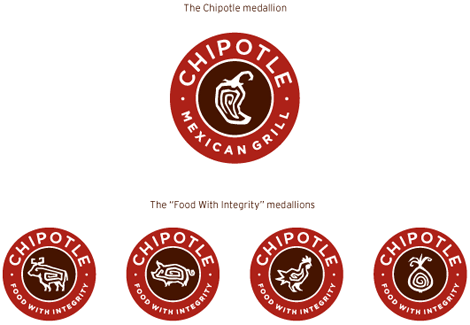
As an extension of the previous medallion, this is on the surface an improvement, but as it relates to the experience of eating at Chipotle, it is not. The previous use of Bank Gothic, while odd, matched the industrial look of the restaurants and felt more hard-core than the new rounded sans serif with the weird low middle bar on the “E” that makes it look needlessly retro. I have not much positive things to say about the old drawing of the chipotle pepper, it wasn’t very appetizing or discernible but at least it didn’t look like the dingbat companion to the 1990s’ Fajita. The new pepper feels too much like clip-art but, on the flip side, the “food with integrity” medallions are actually quite nice, fun and cohesive.
To be perfectly honest, as long as they maintain the quality of the burritos they can draw the chipotle pepper any way they like, and if the ambience of the locations does not change to some 1950s diner decor, I will keep volunteering my waistline to their business.
Thanks to an unnamed employee for first tip and to JJ at Graphicology for finding the design firm who did it.


Jump to Most Recent Comment
Robb Irrgang’s comment is:
I kind of love this. the middle bar of the E kind of makes me go huh but overall, I was always annoyed that the retail locations of Chipotle were so well designed (compared to other fast food establishments at least) visually yet the typography was like nails on a chalkboard.
On Apr.30.2009 at 12:10 AM
b.r.o.o.d.y.’s comment is:
Cool. This is good stuff. Love the small icons, the color choice and the typeface. Simple, orderly, and memorable. Truly an exciting rebrand.
I mean, I've never even heard of this restaurant and I would like to go just by looking at its graphic style.
On Apr.30.2009 at 12:10 AM
Covarr’s comment is:
Their name makes me mad. You couldn't trademark Jalapeno, Habanero, Parsley, or Tomato like that.
On Apr.30.2009 at 12:30 AM
Casey’s comment is:
I sure like it. I'm just happy the move from Papyrus wordmark. And the color choice is superb.
On Apr.30.2009 at 12:50 AM
Jonathan’s comment is:
We just got a bunch of new Chipotle locations here in Jacksonville, and seriously, the awful and confusing typography has been the only thing keeping me from the place... Its nice to see that this change will happen.
The chili pepper is kinda dangerous territory I think (Chilis), I wouldn't have gone there, but I can respect a gutsy move like that I guess. The new typography is pretty solid, the middle bar of the E doesn't bother me because its on the same line as the H. I do wish the M lined up with the line of the P though, that kinda bugs me.
Could have possibly been nice to play off the aluminum interiors, but really, this is a solid redesign. Kudos to Sequence.
On Apr.30.2009 at 12:50 AM
Charlie’s comment is:
Hooya and Freeb!rds is better.
On Apr.30.2009 at 12:56 AM
tez’s comment is:
As an impartial audience... no chipotle where I live. Its not a bad, update far better than others we've seen recently. But for me it looks a tad design by formula. I will say though that with the previous identity, I wouldn't have stepped foot in the door given the "chili" graphic look unnervingly like a suspended turd. As far as that goes the new graphic devices are a resounding success. However I prefer the old colour scheme of red, black white and grey/silver. and as sad as this may sound for some reason I prefer the bank gothic typeface. the new one looks a little to coffee house for me and not burrito house.
On Apr.30.2009 at 12:58 AM
Ross’s comment is:
The evolution is a logical one that I think is well executed. The pepper in the middle before had looked a bit too much like clipart, I think the new one is much better. I even like the new text. Simple yet effective
On Apr.30.2009 at 01:41 AM
Andrew’s comment is:
I'm far from an impartial audience. I'm from Colorado, so Chipotle has been around me for many years. I at lunch there at least once a week every week in high school, and I'm well out of college now.
I think the new branding sucks. the new ads look like a mix between Taco Bell and McDonalds. The logo looks painfully generic and "nice" for a company that is all about attitude. This article sums up my thoughts on the matter well: http://thedenveregotist.com/editorial/4103/chipotles-new-advertising-gives-us-indigestion-part-one
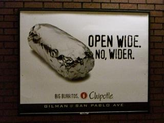
But they moved from a look that was simple, in your face and had awesome copy like:
OPEN WIDE. NO, WIDER.
BURRITOS SO BIG, YOU WANNA RIDE ‘EM.
OURS GO TO ELEVEN.
to this lame attempt at attitude? yawn. I'll still eat there - it's cheap and good - but I won't chuckle at the great ads or t-shirts they have (had) for sale.
On Apr.30.2009 at 01:46 AM
V as in Victor’s comment is:
I'm a big fan of the font itself. It looks like a modified version of Avenir, which I probably use a little too much myself. It's clean and modern but has a nice flair to it.
I do have a problem with the kerning across the top of the circle though. The closeness of the L and the E are a little too close for comfort compared to the rest of the word.
On Apr.30.2009 at 01:48 AM
dg3’s comment is:
Looks better, but it's still 5-10 years dated.
On Apr.30.2009 at 01:53 AM
John Mindiola III’s comment is:
Dammit. I loved the tense juxtaposition of the handdrawn logo and the Bank Gothic type. I loved how it was only in B&W. This new look? Hmm. I want to love, I do, because they have an EXCELLENT product. But, this moves seems so, I don't know, chain-like. And I know, they have 800 stores, and will probably scale to 8000 in the next five years, but I liked how unnusual they're look has been, inside and out. Now, it feels like a regular ol' fast-food joint.
As far as the mechanics, there's much left to be desired here. The badges are great, but the logo lockup has no circles at all, just some personality-less rounded rectangles. And the hourglass created between the rounded rectanlges? Yikes. A nice trim line would have been good here. The H and E with the sagging arms, that's to be expected. It's very Latin or Aztecan, but it comes off as a half-hearted attempt. In fact, one thing I enjoyed about Chipotle's identity and store decor was how NOT Mexican they appeared. I hate when some Mexican restaurants put all this crap on the wall to prove to you how Mexican they are. Please. And Applebees, which I also enjoy, is the worst at the crap-on-the-wall phenomenon.
All in all, I want to like it. I mean, it hits on many cylinders (color choices are smart), but it feels like all the personality and uniqueness have been sucked out (save the animals in the badges). Will it stop me from going to Chipotle? Heck no. This isn't the Pepsi rebrand for crying out loud.
On Apr.30.2009 at 01:54 AM
The_Lurker’s comment is:
This reminds me a whole lot of Von's stuff.
http://artbackwash.blogspot.com/2008/06/finishing-strong.html
On Apr.30.2009 at 02:06 AM
Quinn’s comment is:
I like it a lot. Especially the use of symbols, and the color scheme chosen. Also, good execution into horizontal format... So much better than the "papyrus-esque meets welcome to vegas sign" old logo...
On Apr.30.2009 at 02:27 AM
Quinn’s comment is:
*Edit: sorry, make that "National parks" sign. Thats what I was thinking of....
On Apr.30.2009 at 02:27 AM
Lymnaffem’s comment is:
Here you can find everything you need
For real
On Apr.30.2009 at 02:30 AM
Adam Loves Chipotle...but NOT the new branding!’s comment is:
I have also live in colorado all my life. The image of the burrito rapped in foil as a stand-a-lone is very powerful and anyone who's eaten there knows exactly what it is. I do NOT like their new ad campaigns. First off, I can understand Chipotle wanting to advertise their new dishes on their menu, but c'mon! how can you go from something as simple and powerful as this (not the best typography but it works)
 and they even get festive
  (which by they way, on Halloween, if you wrap yourself in tinfoil, Chipotle will give you a FREE burrito!) and then you change to this
  . Horrible, VERY STOCK, and PLAIN font and typography (if i didnt know better, id think the food would be plain too). Sad day for such good food :( On the plus side, the new colors are more appetizing and I love the "food with integrity" medallions. I dont like the new font chosen or the crappy kerning on the "CHIPOTLE" on the medallion. ANY WAY... if you havent tried Chipotle, I highly recommend it and i truly believe they put crack in the burritos.
Rodrigo Müller’s comment is:
nice icon work, nice type choice, nice color palette. love it.
On Apr.30.2009 at 03:31 AM
Koodoz Design’s comment is:
Love the type. Love the icons. Love the colours. An all-round (no pun intended) nice rebrand.
Never got to try this fine establishment whilst in the U.S, as it always looked too gourmet and expensive for a backpacker on a shoestring. Would love to try it next time I visit!!
On Apr.30.2009 at 03:54 AM
Paul’s comment is:
Holy smokes. Well... I like the logo, on its own, okay. It's inoffensive and feels a little more corporate-y.
But when I checked out Andrew's link and saw the ad campaigns around this new logo, I was really disappointed. To me this says that Chipotle is running scared from Qdoba so much so that they want to *be* Qdoba, spreading themselves a little thinner from what was a very focused menu of burritos, salads, and tacos.
I feel they're sacrificing the soul of the brand for something more bland.
On Apr.30.2009 at 07:23 AM
Allen’s comment is:
The original type isn't Papyrus, pretty sure it's Bergell.
It always used to bug me a bit since I found it so recognizable (I've always thought of Bergell as a bit cheap-looking, though I have used it myself on rare occasions). Personally I think that if you're going to go with hand-drawn type in such a prominent logo you should actually hand-draw it.
Papyrus would have driven me nuts, though. Can't stand that one :)
I'm with you on the preference for the Bank Gothic, too, and for pretty much the same reasons. though I do think the new sans is easier to read. And, clip-art-looking or not, the new chile is much better (and the other stylized icons look quite good).
On Apr.30.2009 at 07:33 AM
Erik at Logo Critiques’s comment is:
I miss Chipotle. Since I move to SW FL the closest one is about 2hrs away. Anyway, the new logo is alright. It doesn't blow me away or anything. I haven't put my finger on it yet, but something about it bothers me a little. Maybe is just getting used to the color. The old logo being black fit nicely with the industrial design of the stores. The rusty reds are working ok, but for me the black was better.
On Apr.30.2009 at 07:46 AM
JJ’s comment is:
I don't miss the bank gothic or the ugly pepper. And the new look isn't perfect (maybe a bit too middle-of-the-road), but I am more scared about where they are taking the brand in terms of their advertising and marketing, which includes a possible menu expansion. That's when it's going to get ugly. I hope the agency/ studios/ people involved can prevent this from happening.
On Apr.30.2009 at 07:55 AM
Jacob’s comment is:
"The previous use of Bank Gothic, while odd, matched the industrial look of the restaurants "
My very first thought. But it's still quite handsome--and, like the rest of the chain, a breath of fresh air in the fast food industry.
On Apr.30.2009 at 08:41 AM
Fish’s comment is:
Thank god for the ditching of the Papyrus-like font! Love the new iconography/medallions. Not so sure it is fitting into the current funky art, industrial environment though. And that sign defiantly doesn't look like it will be rusting on the building.
On Apr.30.2009 at 08:45 AM
thehappyhuskie’s comment is:
Wow! How appropriate! A co-worker (and fellow designer) and I were eating at Chipotle on Tuesday, lamenting on why we liked the logo (the old one now) and why we did not.
We came to an agreement that while the logo (old one now) was not bad, the spacing and balance of the overall design was not good. Not to mention, I felt it was a little to industrial for a burrito place.
This new one, I think, corrects that. The typography, and icon work, while as previously pointed out has a retro feel, I don't mind it. I think it comes across as friendly, organic and comforting.
While I wasn't a fan in the past of their burritos...I think I might stop in a little more now.
On Apr.30.2009 at 08:45 AM
Efrencast’s comment is:
I like the new colors and pepper. I don't like that much the typeface. The old one worked better for me.
There's one Chipotle just around the corner where I work.
On Apr.30.2009 at 09:01 AM
Andy’s comment is:
The Gotham typeface strikes again, this time with retro-ish lowered bars on the E and H. I like the quirky retro quality it has, unlike others. Anything would be better for me than the assortment of Bank Gothic and various grunge typefaces that used to overload the packaging, decor and merchandise, and honestly, this fits the decor in my opinion. I never saw it as 'industrial,' but more along the lines of one of those local artists with all the metal sculptures you'd find on a Santa Fe artwalk or something, and this logo fits that decor for me. Anyway, I saw an unfamiliar business card with this new logo on it at the local Chipotle a few weeks ago and I picked it up. Seeing the colors on paper, they are beautiful (rich espresso brown and what could only be described as burnt red, redder than Texas orange, but with the same smoky tinge). I'm filing this one away in the 'winner' drawer.
On Apr.30.2009 at 09:02 AM
Andy’s comment is:
Funny thing is, that Chipotle just installed a brand new storefront facade a month ago... with the old logo! Strange.
On Apr.30.2009 at 09:04 AM
camcanada’s comment is:
I agree that the elements have now removed themselves from the industrial feel of the servicescape, but I have to give a Thumbs up for getting away from Bank Gothic and Papyrus.. pleased, am I.
Now if only we can get all pharmacies to abandon Bank Gothic...
On Apr.30.2009 at 09:07 AM
john’s comment is:
I look forward to Andrew Sabatier's analysis. Will he find this burrito to be looking to look and not to see? Or is it looking to eat and not to look at people looking at me who is looking to eat? I don't know, I get confused. Does Andrew Sabatier eat burritos? Perhaps this is a burrito that is destined for greatness!
On Apr.30.2009 at 09:17 AM
john colucci’s comment is:
I first saw this in a Sunnyvale, CA location a couple months ago. I am a Chipotle addict. I like the branding, only thing to me is I feel the Chipotle warped rectangle is an identity all its own, and the font I liked as well, for the wordmark, not the Bank Gothic use. Ill miss it a little :-(
On Apr.30.2009 at 09:32 AM
Tom’s comment is:
How can you not love the new pepper?! It's a HUGE improvement. The old pepper didn't look like anything, it was a blob from more than twenty feet away. Thank goodness they've got a peppery looking pepper that can be easily identified. Also the other medallions are sweet.
On Apr.30.2009 at 09:36 AM
Joe Moran’s comment is:
Can remember when store No. 1 opened on Evans Ave. next to DU in Denver. Chipotle and Zuma were the big burrito kings in town. Zuma was a little more gourmet but Chipotle had the awesome lime rice (which some people don't like for some strange reason).
From a corporate identity standpoint, don't really understand the rework. They have done an excellent job stamping their "look" throughout all the locations with the corrugated tin and constructed mayan artwork on the walls. The menus were simple and printed black on tan. And the ads were clever and said “Chipotle.” The Web site was/is fun, too. Not sure why the need for change was deemed necessary now. Chipotle -- the “brand” -- was working nicely.
Of course, at the end of the day, the food is the most important thing for a restaurant. If the quality and taste stay the same, they can change their name to Bob’s Burritos for all I care and put in black and white porcelain tiles on the floor and pictures of donkeys on the wall.
The downfall of Zuma (later Quodobo) was their inability to be consistent with ingredients and taste when they expanded. Chipotle didn't have that problem.
Reading about the upcoming menu change, and seeing the new logo, I’m a little confused and scared. Looks like they’re trying to go after that 2% that didn’t like Chipotle at the expense of the 98% who would drive 100 miles to eat there. Like the new circle treatments with the pigs and chickens, but why the whole logo redo for a few new icons?
Hope they don’t go “crap-ass vanilla” at the expense of their base -- and their 10-year established image.
VR/
On Apr.30.2009 at 09:40 AM
John Mindiola III’s comment is:
I don't think the old typeface was Papyrus or Bergell. I think it was actually custom-made. Anyway, they've stripped away it and Bank Gothic. If they eventually strip away the other grunge font they're still using on packaging, their web site, etc, then it'll be a complete RubyTuesdays overhaul. Yikes.
On Apr.30.2009 at 10:11 AM
John Mindiola III’s comment is:
And speaking of typefaces, I really wish they'd lose the Gill Sans they're using on their menu boards. Yuck. Why does everybody hate Helvetica so much?
On Apr.30.2009 at 10:12 AM
felix sockwell’s comment is:
strong idea. weak execution, especially details within the "medallion". it never hurts to bring in a specialist!
On Apr.30.2009 at 10:16 AM
Nathan McKinney’s comment is:
Interesting, In the Kansas City area, this is the logo we are used to seeing.

I have always hated this logo. Both of the logos above are an improvement, but I've always thought the branding of the Flying burrito company much better. (Not to mention better burritos).
http://www.sibanate.blogspot.com
On Apr.30.2009 at 10:21 AM
Cam Hoff’s comment is:
I like it.
On Apr.30.2009 at 10:22 AM
Von K’s comment is:
The old pepper was pretty bad. The new pepper is better, but I agree w/ Armin about it looking like a dingbat for Fajita. If the style was a more clean, straightforward pepper, would it look to bland? Or maybe too much like the Chili's pepper?
The Bank Gothic always bothered me. I think the new type would look nice as metal letters in-store. It'd work with the existing interior.
The rounded corner boxes just look like interstate road-signs to me--camping / gas / chipotle ahead. Or the buttons on a McDonald's cash register.
I agree that, though things are working overall, something of the brand's soul has evaporated with this refresh.
On Apr.30.2009 at 10:23 AM
Aaron’s comment is:
The Obamafication of my burrito is complete!
Seriously, Gotham jumped the shark about 6 months ago, once it became clear the presidential race was turning into a landslide. Gotham + a circular logo is really uncalled for.
I've got nothing against Gotham itself--it's a wonderful, clean, readable typeface, and I think it is an improvement over Bank Gothic, which screams "late 90's" to me.
But Gotham is now EVERYWHERE. Choose it, and your new logo is immediately generic. There are lots of great sans typefaces out there. Surely one of them could have done the job better than the typeface everyone else is using?
I'll also miss the Papyrus-ish signage--it was a nice earthy contrast to the industrial Bank Gothic mark. I think they're doing themselves a disservice going to a single logo that's neither earthy nor industrial. It just disappears in today's brand landscape.
On Apr.30.2009 at 10:37 AM
Astro’s comment is:
a type face keeps you from eating at a restaurant?
On Apr.30.2009 at 11:07 AM
Doug Bartow’s comment is:
The Obamafication of my burrito is complete!
Shirley, you jest. The principal font used in the redesign is from the Neutra family: either one the *numerous* weights available, or a slightly modified version of Neutra-text Bold. Click on the House Industries logo below for clarification.
On Apr.30.2009 at 11:12 AM
altoption’s comment is:
I was liking the swirls inside the pepper and garlic -- read "spicy" -- until I saw them in the animals. Looks like the digestive tract. Yuck.
On Apr.30.2009 at 11:24 AM
Anonymous’s comment is:
I like the circular solution. It is approachable and has energy. However, the horizontal rounded rectangular version is a bit bland.
Overall, a nice upgrade.
On Apr.30.2009 at 11:32 AM
James’s comment is:
Oh I love Neutra one of my favorite fonts will be lost. oh well. I do think that the redesign is going to blend in with the corporate branding surrounding it, but i think that is most likely intentional.
On Apr.30.2009 at 11:35 AM
Mike Hamm’s comment is:
I can't help but think of the Starbucks logo when I see this.
On Apr.30.2009 at 11:57 AM
M.’s comment is:
It absolutely echos Starbucks - was just coming to say that very thing. Nice, incremental work by Chipotle.
On Apr.30.2009 at 12:08 PM
Lauren ’s comment is:
The new color choices are deviating from Chipotle's industrial shtick. I think the rounded rectangles are too.
Any other fast-food restaurant has those red, button-dimpled, padded vinyl seats while Chipotle has the plywood chairs, concrete floors, exposed ceilings, and the custom steel trash bins. It's not a warm and fuzzy place with happy meals, which this rebrand leans towards.
The new pepper at least has some life in it :)
I really really hope that signage is just a bad photo. If the letters really get that round and thick it will be too bad. I hope it's just the photo.
On Apr.30.2009 at 12:21 PM
Eric Davis’s comment is:
I'm with M. First thought was, "Hey Starbucks!" Then, "Hey Chilis!" I feel they missed the mark. Mexican Grill? Are the moving to more of a sit down restaurant with a hostess to great you? I see a disconnect here and too much identifying with other food vendors.
However, the direction is smart, stamping their seal of quality on chicken, beef, etc. but there has to be another way.
On Apr.30.2009 at 12:30 PM
Captain Bringdown’s comment is:
A 'seal' as a logo, yeah haven't seen that approach before.
This is a big 'whatever' for me.
On Apr.30.2009 at 12:45 PM
Josh’s comment is:
I thought their previous mark was not a totally high standard of identity design, but their taste and their mission is their brand. Sure its a bit more cosmopolitan/borish, but its executed nicely with Obama's typeface and as long as the food doesn't change I will be a fan no matter what.
What is also odd about Chipotle is that when you go there for some reason you are super excited to eat there. I have no idea why, but I never walk into a Jack In The Box with the same feeling.
Now I wish they would just kill all these Taco Del Mar locations here in Seattle. They are better than Qdoba, but all the Chipotles are in the suburbs and being stuck with just average food like TDM is just not fair.
On Apr.30.2009 at 12:57 PM
Oliver’s comment is:
I'm rather indifferent to the new look, and actually didn't mind the old one so much in the context of the store. The new one seems rather derivative, and generic.
My real issue lies in Chipotle's food. Armin, coming from California (the land of authentic Mexican burritos that isn't Mexico) I can say that without a doubt, Chipolte is the worst burrito around. Especially their carnitas. Go to the taco truck, man. Cheaper, and better! Who's with me?
Sorry I'm off topic. My post will probably be deleted, but I had to get that off my chest!
On Apr.30.2009 at 01:15 PM
Melissa’s comment is:
@Doug Bartow
FINALLY someone mentioned Neutra face. Sheesh.
On Apr.30.2009 at 01:18 PM
Joe G.’s comment is:
I am eating a spicy chipotle chicken burrito right now, from Quesada.
Now, take a look at the Quesada logo, it'll make Chipotle's seem much nicer! Overall, I think Chipotle's improved their logo, but I agree that the chilli has a very 90's clip-art feel to it.
On Apr.30.2009 at 01:33 PM
Glenn Sakamoto’s comment is:
An excellent redesign. The circular logo is perfect. Not in love with the horizontal version, tho.
On Apr.30.2009 at 01:59 PM
Nathan Derksen’s comment is:
> Their name makes me mad. You couldn't trademark Jalapeno, Habanero, Parsley, or Tomato like that.
The trademarked name isn't "Chipotle", it's "Chipotle Mexican Grill". Quite trademarkable. As far as I've been told from a couple of company registrations I've done, the trademarked name is one thing, the logo is quite different. They don't need to match, you can use even just one word from the official name in the logo, as I've seen with Tomato Fresh Food Cafe (logo just has Tomato: http://www.tomatofreshfoodcafe.com/)
On Apr.30.2009 at 02:25 PM
jRod’s comment is:
Well, oddly enough my girlfriend took me to this place for the first time a couple of months ago. I immediately noticed how well built the place was. The logo worked really well with the decor and I was glad to see that they did move too far from the original concept so they won't have to change the look of the existing stores.
all in all, i like the new one better but the pepper still needs work. both are a little lackluster and the new one feels like it was clip art.
On Apr.30.2009 at 02:32 PM
jRod’s comment is:
amendment to my comment: the pepper works well as it was built along with the other icons used in the logo. my bad... i missed it earlier.
On Apr.30.2009 at 02:33 PM
Matt’s comment is:
im with Altoption on this one, i don't see a nicely stylized pepper or anything else in the other icons, I see a shriveled up something disgusting or other. Not very appetizing to me, but then again, I always refused to eat at Chipotle cuz everyone was doing it, and still haven't eaten there. So it's no surprise to me I one of the few that don't like the new icons... or the new color scheme, too soft especially after hearing about all this metal and industrial stuff inside the stores.
On Apr.30.2009 at 03:04 PM
Patch’s comment is:
Chipotle is completely worthless compared to mission burritos, and the ubiquitous gotham matches that level of taste perfectly.
On Apr.30.2009 at 04:03 PM
Oliver’s comment is:
@ Matt and Patch:
I agree completely with both of you about Chipotle being rubbish. You just can't get it through most white people's heads though. Then again, Mexican food is something I hold near and dear to my heart.
It's funny though, whenever I go to a Mexican food truck/restaurant/etc, and the design is too slick, I am immediately suspect of their quality of food. Maybe that's because the best Mexican food I've ever had has come from street vendors, etc, much of it in Mexico.
On Apr.30.2009 at 04:31 PM
Fungus’s comment is:
I love Chipotle.
The redesign is nice, clean, simple, completely balls-less and totally unnecessary.
Why, why, why?
On Apr.30.2009 at 04:43 PM
Scott J’s comment is:
I have held this brand in very high esteem for quite a while. There is a simplicity to the brand that few others have been able to capture, from the 'matter of fact' application of plywood furnishings to the absolute purity of the menuboards. Nothing but a pane of glass between me and what I'm about to eat, no secrets. There is an honesty to their communications that pours out personality. Who else besides Chipotle could show a lump wrapped in aluminum foil and make it iconic? This being my very humble opinion, the former identity, with all of it's typographical quirks and inexplicable black carrier is a far superior identifier for their brand than what I see here. The pepper is possibly easier to read, but smacks a bit of Taco Bell. The iconic black and white replaced by a more of a 'Southwestern' appeal also leaves me cold. While this new identity has it's positives in terms of design, it just doesn't fit the brand that is so different with so many touchpoints in a very crowded category. The photographic 'tray liner' execution would not look out of place in any fast casual type of establishment, and I think that's sad. What's next? Fries?
On Apr.30.2009 at 05:17 PM
Deane Nettles’s comment is:
The old pepper was ugly, The swirl inside the new icons could have been reduced to highlights or shadows, to give more volume to the shapes (reducing that digestive tract feel). Would've enjoyed giving the project to a calligrapher to update original Chipotle logo, perhaps creating a font for use in the menu. What if circles were not concentric? What if logo middle was black (or corrogated steel), white area brushed aluminum, neon behind the aluminum to make it glow (even though EVERYONE does that)...
On Apr.30.2009 at 05:25 PM
Paul Riehle’s comment is:
Hello Gotham, nice to see you again.
Anyway the chili is so much better than the old one, old one looked like a dried up pile of poo, New one has a much better style and character to it.
On Apr.30.2009 at 06:59 PM
Fungus’s comment is:
Ah, character.
The strange choice of Bank Gothic and the almost-Papyrus had character. The dried up raisin, or poo, or whatever you want to call it had character. The plump foil with snarky phrases had character.
The new logo, "branded extensions" and advertising looks like a big pile of beige Camry.
On Apr.30.2009 at 08:07 PM
Quinn’s comment is:
"Pepper in some fun!"... oh wait.
(Side note - thats the stupidest tagline ever)
On Apr.30.2009 at 10:50 PM
EGray’s comment is:
I was just enjoying some tacos from Chipotle the other day and thinking about their logo and how much I liked it and thought it fit well
I really like the medallions with the chicken, onion, etc. But I dont think Chipotle needed a re-brand.
To paraphrase from the other article that was posted: No one ever says, man I want a burrito but Chipotle is so expensive. I actually dont mind paying extra for their quality ingredients.
On Apr.30.2009 at 11:45 PM
Joe Moran’s comment is:
This just in from the Chipotle… (Yes, I'm on their e-mail list.) Now I'm really confused.
VR/
On Apr.30.2009 at 11:46 PM
Randy’s comment is:
I loved their old look and feel, as someone pointed out above, the new promotional material is poor and lacks the visual punch a large foil wrapped burrito had.
As for the logo, I enjoy the typography, but as a whole, I dislike it.
I really hope they don't change the interiors, I love the metal and the mayan sculptures.
On May.01.2009 at 10:25 AM
Andy’s comment is:
@ Melissa, James, Doug Bartow
For those recently posting about the typeface: you had me second guessing myself, so I did the overlay and it is, in fact, Gotham and not Neutraface. In fact, it's not even really that similar to Neutraface if you're looking with a eye for detail. The crossbars have been manually lowered on the logotype, fooling you into thinking it is a Neutraface logotype, but still, the rest of the identity (Mexican Grill, Food With Integrity) is done in Gotham, straight up, including the business card that I grabbed last time I was in there.
On May.01.2009 at 11:01 AM
Sienna Hughes’s comment is:
The old identity was all over the place. There was no cohesiveness, and the font was horrible. The new pepper and animal medallions are great, but I'm not very impressed with the new ad campaign. I miss the simple ads that made me laugh.
On May.01.2009 at 11:46 AM
Doug Bartow’s comment is:
@Andy
You're right!
It's a Neutered Gotham-bold.
(trademark)
On May.01.2009 at 11:50 AM
Otto B.’s comment is:
Let's evaluate this logo in context.
If I go to any food mall, sandwich shop, anywhere, I will find a logo just like this. The 'seal' is the default visual device of the Restaurant, F&B industry.
Expected, vanilla, undifferentiated.
On May.01.2009 at 12:02 PM
Mark’s comment is:
It's a big improvement.
It's finally more readable!
the old logos colors in terms of the text were a bad choice, gray on black blends in easily making text hard to read or see.
The new chili is also an improvement, it looks less boring and more energetic.
On May.01.2009 at 04:48 PM
Fungus’s comment is:
Incredible -- a more "energetic" chili. I love the fodder designers peddle to clients and the public these days.
I'd also like to see some research on the percentage of people who have failed to eat at Chipotle because either a) the chili was not energetic enough or b) the colors and text were too hard to see, so they just passed on by.
C'mon! This is a website by designers for designers. Are we really trying to defend this kind of nonsense around here?
On May.01.2009 at 05:54 PM
Said Montiel’s comment is:
Well, i don't like burritos. I'm Mexican though, but burritos are not so popular in Mexico, only in the US i think.
I don't like the circular logo. and i like a little the horizontal version. Do not let your taste for burritos darken your vision... jeje.
On May.01.2009 at 09:33 PM
Mark’s comment is:
um....Fungus I'm not an actual graphic designer, I have however attended Graphic Design classes, energetic is the only word I could think of.
On May.01.2009 at 11:05 PM
Andy Malhan’s comment is:
Having not read the comments that precede this, I run the risk of being repetitive, but doesn't the mark look a bit Starbucksish?
On May.03.2009 at 10:45 PM
Nate’s comment is:
Yeah, and I would call Chipotle the Starbucks of the burrito world.
Come to think of it, Chipotle can move into the 507 closed Starbucks stores and place their new logo directly into the ghosted circle where the Starbucks logo used to hang!
Urban renewal at its finest.
On May.04.2009 at 01:45 AM
Amanda’s comment is:
FINALLY! This makes me happy. :) No more papyrus, no more horribly rendered chili.
On May.04.2009 at 02:41 AM
Gareth Coxon - Dot Design’s comment is:
Works really well, though like someone has already mentioned that middle bar on the 'E' looks alittle odd in its positioning. But that said the colour palette and icons are great and certainly an improvement.
On May.04.2009 at 05:25 AM
Ylva Lindberg’s comment is:
As much as I'm on a one woman crusade against Bank Gothic, I have to agree that there wasn't much point changing it to this trendy-retro look that's quite generic. I think I prefer the new chipotle pepper though, even though, yes, it's very nineties.
On May.05.2009 at 03:08 AM
Killian’s comment is:
Fungus=sanity
Branding is not always an exercise in type. Agreed, the Font currently used would be a rare selection in my work. But it does not justify this overhaul to the mundane. This snatches the strength of the brand, attitude. Say goodbye as this breath of fresh air blends quietly into everything else.
no me gusta!
On May.05.2009 at 09:58 PM
DavidTornado’s comment is:
This rebrand is definitely a mis-fire on Chipotle's part. This is a classic example of alienating your audience for wider mass-appeal. It's almost as if the designer never set foot into a Chipotle and approached it as a homework assignment: "design a burrito joint logo". The pepper looks like Microsoft word art, and the rounded rectangle color blocking reminds me of 1999. I wouldn't be surprised if Chipotle gets enough negative buzz to ditch this. The previous design of Chipotle's collateral may have been naive--but to me that was the authentic part of its charm.
On May.07.2009 at 01:56 PM
tnt’s comment is:
As a designer, I love the new identity system... but as a longtime lover of Chipotle, I think this new look is too slick and corporate in comparison to where they've been.
As generic as the old logo is, and as much as I hate papyrus, the old logo was simple and iconic on their unique architecture (which is a major Chipotle design queue).
Will I still eat there, yeah sure.. the food is amazing for the price. I just wish the design group that did the new work would have taken a harder look at what the company is truly all about before busting a move with some generic ALL-CAPS Gotham.
On May.08.2009 at 10:02 AM
Justin R’s comment is:
The new pepper is a huge improvement. I thought of some unmentionable things that the old one resembled but the new graphic is unmistakable. Nice update retaining recognition of the original.
On May.09.2009 at 08:23 AM
Brandy’s comment is:
From limp pepper to arthritic pepper. And can we step away from the "lozenge" shapes people? (Other than that, it's a bit of an improvement.
On May.10.2009 at 11:19 PM
Comments in Brand New, V1.0 have been closed.


