

NOTE: This is an archived version of the first incarnation of Brand New. All posts have been closed to comments. Please visit underconsideration.com/brandnew for the latest version. If you would like to see this specific post, simply delete _v1 from the URL.
![]()
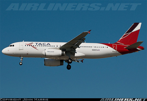
Connecting the American content, from South to North and for 77 years, TACA —Transportes Aéreos del Continente Americano (Air Transport of the American Continent) — unveiled a new identity at the end of September. (Sorry for the delay on this one!). I believe the golden thingies in the old logo were super streamlined eagles, and they were in need of a major overhaul that they handsomely received from Lippincott. This is a really great update, the new icon is elegant and dynamic with an inherent motion that most airline logos strive for but rarely achieve even when they “italicize” every element of the identity. The wordmark is also rather nice, and it evolves the extended serif from the previous logo with a custom sans serif that complements the icon very well. The one thing I don’t get is the purple “crest” at the top of the eagle’s head, it seems a little unnecessary to add that third color. And the one thing that did disappoint was the livery, it just seems like the identity would have lent itself to a much more engaging and attractive design on the airplane. Nonetheless, one of my favorite icons of the year.
![]()
Televison ad from South America, worth putting up with the images of the impossibly pretty people to see the animated logo at the end. Thanks to Longina León for sending this.


Jump to Most Recent Comment
Lindsay’s comment is:
Nice logo, not sure what the airline routes are but comes of very "United States of America" rather than the whole continent or Central. With it's colour, bird and blue on the left and stripes on the right.
I see the purple part as the top part of the wing, rather than the crest of just the head. Then the bird is of the whole, rather than just a profile head.
Armin, "favorite icons of the year so far." How many more logos that you think are great are going to be critiqued in the next fortnight or so?
On Dec.15.2008 at 06:59 AM
Paul Lloyd Johnson’s comment is:
Oh... that is lovely.
On Dec.15.2008 at 08:12 AM
Rodrigo Müller’s comment is:
that is one nice eagle!
On Dec.15.2008 at 08:19 AM
Skythe’s comment is:
Really good job.
On Dec.15.2008 at 08:35 AM
Armin’s comment is:
> How many more logos that you think are great are going to be critiqued in the next fortnight or so?
Ha! You are right. That's how much I'm already thinking about the new year or that our daughter woke us up at 4:30 am. Wording changed.
On Dec.15.2008 at 08:35 AM
dMullins’s comment is:
I flew TACA to Costa Rica last year, and I have to say it was the WORST experience in customer service I've experienced in my life thus far.
Great revamp of their identity though.
On Dec.15.2008 at 08:44 AM
Giacomo Cesana’s comment is:
As Lindsay said the dark part of the bird is not a crest but the left wing.
What's more the bird is not an eagle, since the tail is too long. It looks more like a parrot or a bird of paradise.
Julio Ferro’s comment is:
From parrots to eagles! OMG.
I like the new design, but since the revamp of Mexicana's logo I think TACA missed part of something really owned for this Costa Rican airline.
On Dec.15.2008 at 09:03 AM
Hector Laitano’s comment is:
I live in Honduras Central America, i just want everyone to know that IT'S NOT AN EAGLE IT'S A GUACAMAYA! a native bird of Central America, and the icon of Taca.
On Dec.15.2008 at 09:13 AM
Willis’s comment is:
As harsh as these comments can be, I think they appropriately recognize a job done well. And this one has been done very well. Nice work.
On Dec.15.2008 at 09:37 AM
IhateDesign’s comment is:
Hector Laitano’s its right, its a guacamayo.
excellent redesign, more flexible and ellegant too, i like a lot.
cheers!
On Dec.15.2008 at 09:48 AM
Josh’s comment is:
I don't even pay attention to the type.
I love the eagle too much. Dig the balance between central american renderings of the eagle and modern graphic treatments. Spectacular mark.
On Dec.15.2008 at 09:52 AM
Bart O'Dell’s comment is:
I personally think that this is beautiful. I love the stylized bird regardless of what it is. Great job.
On Dec.15.2008 at 10:11 AM
dmagy’s comment is:
Great redesign, but I agree about the third color. Maybe it is accurate coloring for the species? But, I did not even see it until it was brought to my attention.
On Dec.15.2008 at 10:26 AM
Luke D.’s comment is:
Gorgeous!
On Dec.15.2008 at 10:29 AM
Michael’s comment is:
OMG the read earphones from the girl at 0:12 in the video look like blood's coming out of her ear...
On Dec.15.2008 at 10:33 AM
Josh’s comment is:
Finished watching the commercial. The last five or six seconds make me think "ED perscription". Love the animated mark as well though.
On Dec.15.2008 at 10:39 AM
colormist’s comment is:
LMAO@Michael. I wasn't even going to watch the video, but I did because of the bleeding ears. Thank you Michael. You made my day.
LOVELY logo, though. It looks even better now that I don't see an eagle's head and, instead, see the flying bird.
On Dec.15.2008 at 10:52 AM
felix sockwell’s comment is:
nice job. agree about the crest, but seen from distance, it appears fine. any notes on which lippincott office was responsible?
On Dec.15.2008 at 12:34 PM
Bruce’s comment is:
Beautiful update. I like the tail of the livery, but the logo should be larger, as the eagle does not stand out well.
On Dec.15.2008 at 12:34 PM
jRod’s comment is:
i like the tail treatment on the plane as a logo a lot more than the "crippled wing" look it has now. the head of the eagle looks more like a shoulder to me. as a passenger, i think i would feel more at ease with a strong, sturdy wing as the icon rather than a weak one that is losing feathers.
just sayin....
On Dec.15.2008 at 01:26 PM
ScottS’s comment is:
I think this is a very cool design, not only a huge improvement over the former, but quite remarkable in its own right. It feels very polished and well-thought out. I love the movement in the lines, and there is an almost subliminal Native American/tribal feel to it. The type treatment is likewise done well. I didn't see an eagle when I first saw this, for some reason I thought of the wing/tail feathers of a macaw. Their press release doesn't reveal much about the inspiration behind the logo, whether it is a stylized eagle or macaw. But that crest reminds me of the harpy eagle, a bird of prey native to Central and South America.
On Dec.15.2008 at 03:11 PM
rynot’s comment is:
very nice update. i must say my flying exoerience to peru on taca was amongst the best i've had, certainly better than any us airlines. i'm glad they now have a visual component befitting the totality of their brand experience.
On Dec.15.2008 at 04:11 PM
matt’s comment is:
ehhh. too much praise for this. then again, everyone usually follows what the moderator/poster says to begin with. had he said it was awful, so would the majority.
it's ok, nothing special
On Dec.15.2008 at 04:39 PM
lodenmuse’s comment is:
Very beautiful.
When I would fly in South America, we referred to TACA as "Take A Coffin Along," which was only slightly better/worse than SAHSA: "Stay At Home, Stay Alive."
The bird would have looked lovely blown up much larger on the front of the plane also.
On Dec.15.2008 at 05:16 PM
stupidgit’s comment is:
I do love the new livery, its a color you don't see often on airplanes.
I'm just glad they got rid of the pointless red cap of the old planes.
On Dec.15.2008 at 05:25 PM
Morgan Smail’s comment is:
beautiful, clever, flexible, appropriate logo type and mark. doesn't get much better than that... great job.
i love the cultural relevance of the bird and how the rendering captures that specific species' distinctiveness in shape
... would've liked to seen color options that capture the Guacamaya's variety a little more though. great job regardless
On Dec.15.2008 at 05:56 PM
damon’s comment is:
sure is pretty.
On Dec.15.2008 at 06:29 PM
Sam’s comment is:
Hey Matt. Cheer up or shut up would you.
On Dec.15.2008 at 10:03 PM
Mongoose’s comment is:
My first thought upon seeing the logo was similar to Armin's: "What's up with that crest?" I thought for a moment it was a Secreatary Bird, until the wing nature was pointed out to me. Perhaps it's a bit *too* stylized, but I'm sure the folks in TACA's area will know what it is faster than my Yanqui self.
And, I really like it as well. Dynamic, a good font (though I'm fonder of the As than the T) that updates the old collegiate-styled one. No gradients needed here, which is good. I think this logo could hold well for fifteen, twenty years for them.
I'm giving it an A, and what's holding it back from A+ is that little bit of crest+head/wing+body confusion/
On Dec.15.2008 at 10:12 PM
T-Bone’s comment is:
must… follow… what… the moderator/poster… says to begin with… it's… very… nice.
On Dec.15.2008 at 11:06 PM
dMullins’s comment is:
Wow, Matt. Wow. I've been posting here for several years, and tend to skip over everything the mod/O.P. says and get straight to commenting. Sometimes I'll go back if the piece merits reading up more on, but for the most part I post on gut instinct normally.
You could clearly use a swift kick in the pants.
On Dec.16.2008 at 02:58 AM
dMullins’s comment is:
Let me know if I can oblige.
On Dec.16.2008 at 02:59 AM
Kevin M. Scarbrough’s comment is:
Beautiful logo, the typography fits very nicely with the icon. Each element can stand on it's own and still represent the company as necessary.
In terms of color, I love the red-violet crest because it draws in the blue-violet of the type and the red of the other feathers. Splendid.
On Dec.16.2008 at 08:15 AM
anonymouse’s comment is:
i'd guess that most people have a gut feeling if they like something or not before even reading the post that goes with the picture.
this one was straight away "oooh nice".
On Dec.16.2008 at 08:21 AM
koyo’s comment is:
Nice!!!
On Dec.16.2008 at 08:53 AM
Matt’s comment is:
^^^ Not the same 'matt' as before.
This update is great, you see the motion, the flying, the stability, everything you want in an airline identity. If i designed it, i'd put it straight in my portfolio, pimp work
agreed it could be larger on the plane, but that is only cuz it looks so good...
On Dec.16.2008 at 11:48 AM
Paul Riehle’s comment is:
The plane is a bit dissapointing, could have done a lot more considering the logos elements
On Dec.16.2008 at 12:03 PM
Ivan’s comment is:
Sorry, at first I saw a parrot and not an eagle... type treatment is great tho.
On Dec.16.2008 at 06:20 PM
John Mindiola III’s comment is:
i love it. not because i necessarily like it, but because it's GOOD. my favorite thing about it? the fact that the bird is super stylized, and is NOT constrained to a circle or square, means that it will need LOTS of white space around it, especially when in a largely gridded environment. and hey, who doesn't want more white space?
On Dec.16.2008 at 10:42 PM
Cool Unicorn’s comment is:
Check out TACA's website... this must be the best airline site I've ever seen.
On Dec.17.2008 at 05:20 AM
George - LogoDesign.org’s comment is:
Cool. Definitely a step upwards.
On Dec.17.2008 at 10:57 AM
Gianni’s comment is:
I think stylistically it looks dated.
I guess that's why the Americans like it so much ;)
Also it's swooshiness bothers me.

It is an improvement, but not as good as you all think.
On Dec.17.2008 at 11:49 AM
Hector’s comment is:
Hey as i say before it's a GUACAMAYA NOT AN EAGLE, and it's a very nice work one of my favorites
On Dec.18.2008 at 09:04 PM
David Cadia’s comment is:
I am sorry to disagree with most you. I think this is a very poor and generic re-branding effort. It's too red, white and blue for me. I currently live in Central America and I can tell you this place is full of color, diversity and life. Lippincott could have done a much more representative and unique mark had than this generic red, white and blue eagle. One thing is if we like the aesthetics of the logo but if it has no substance behind it, to me it is a failure and TACA could have done better going to a smaller firm that had more creativity.
Just look at this picture of a Guacamaya...http://farm3.static.flickr.com/2242/2269571505_3f29feebe0.jpg?v=0
where is the color in this mark?
And the commercial ....please what a joke.
On Dec.22.2008 at 11:50 AM
David’s comment is:
I'm going to have to agree with David here ^^^
I'm originally from El Salvador and I have been on Taca a few times. For me, this identity looks a bit too American (US). Yes, they do fly to the US a lot...but for a Central/South American airline, a little more culture would have given it more substance.
On Dec.24.2008 at 03:14 AM
Luis’s comment is:
Hey people its a GUACAMAYAAA wich is a bird quite common in central america, this airline has nothing to do with north america (at least its core) and its origins are from central america, i was born where one of its centrals is El Salvador and im familiar to the airline since i remember anyway great change looks awesome, ironically the ad campaing has a lame concept compared to the renewed logg but thats not a theme of debate here.
greetings :D
On Jan.02.2009 at 11:42 AM
Roni’s comment is:
TACA was originally Transportes Aereos de Centro America, based in El Salvador. The old logo had 5 Guacamayas in it, each representing the other airlines from Central America that TACA had bought (Aviateca/Guatemala, Sahsa/Honduras, La Nica/Nicaragua...), or the 5 countries of Central America... Now they have merged/bought a number of South American airlines as well (I might be wrong...)
Now TACA flies all over the Americas. I never had any problems flying with them. They had very good airplane maintenance facilities working for many airlines (US and the rest of the Americas), but it was sold to a Canadian company.
I agree that the colors could have represented the culture of the region in a better way. And that ad... jeez...
On Jan.27.2009 at 11:29 AM
Mark’s comment is:
Beautiful.
A much needed improvement over the old one which looked tight, regimented and cold. Which is seemingly more fit for something like a military or government logo rather than an airline.
I like the tail design as well, very unique.
*thumbs up*
On Jan.27.2009 at 12:02 PM
Comments in Brand New, V1.0 have been closed.


