

NOTE: This is an archived version of the first incarnation of Brand New. All posts have been closed to comments. Please visit underconsideration.com/brandnew for the latest version. If you would like to see this specific post, simply delete _v1 from the URL.
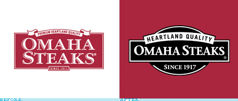
I must adamantly disclaim that I realize there is nothing particularly impressive, groundbreaking or interesting about this redesign. It is mostly, if not purely, a nostalgic nod. Back in the 1990s, when I was living in Mexico City, we had one of the first DirecTV dishes and since I have always had an insatiable TV appetite this was simply awesome. Like many people I religiously watched Friends — sure, laugh away, you probably did too — as part of the extinct species known as Must See TV, the primetime sitcom block of Thursdays that has yet to be repeated. So, to get to the point, at 7:59 pm, right before said primetime feast, the NBC channel that we received invariably had a 1-minute spot for Omaha Steaks, with a very jolly white fellow in a suit selling steaks. I was always surprised that such an offering (steaks by mail) could yield enough money to warrant such a prominent advertising slot. Yesterday, Omaha Steaks, a fifth-generation, family-owned business, announced its change of logo. It may not be a primetime redesign, but it’s a solid improvement.
Thanks to Tony Hall for the tip.


Jump to Most Recent Comment
Ben’s comment is:
Good basic simple design. Nothing wrong with that.
On Mar.03.2009 at 06:54 AM
Craig ’s comment is:
The ONLY thing that improved is the readability, which by changing the burgundy to a deeper tone on the original, would have improved.
On Mar.03.2009 at 07:11 AM
DG3’s comment is:
I like the simplicity of it. For once it's nice not to see them think too hard with a revision.
On Mar.03.2009 at 07:51 AM
Frank’s comment is:
This makeover actually makes more sense than the new Pepsi logo.
On Mar.03.2009 at 08:24 AM
dMullins’s comment is:
Looks like a nice, on-strategy refresh.
I don't love it, but I can't say anything bad about it. I would very much like to see some of the implementations of this in its system.
On Mar.03.2009 at 08:29 AM
dMullins’s comment is:
@Craig: I agree, but I think losing the inline type also helps as much as the color shift.
On Mar.03.2009 at 08:30 AM
R Berger’s comment is:
No award-winner here, and we could nitpick it to death, but I agree it's definitely an improvement.
Extra points for using solid black to imply a shadow underneath the main 'Omaha Steaks' panel instead of a gradation.
On Mar.03.2009 at 08:59 AM
Josh’s comment is:
Fine update. I prefer the original, but I don't think they missed on the new.
On Mar.03.2009 at 09:12 AM
rickyaustin’s comment is:
'Heartland Quality' is sort of taking over the mark, but overall, a good job.
On Mar.03.2009 at 09:13 AM
Drew Davies’s comment is:
Everyone here has suggested that there's nothing great about the old logo, and nothing any much better about the new one. But then several people go on to call it a fine update, or a nice refresh. If only change has been accomplished, not actual improvement, why would anyone make the argument that this change is an appropriate business move?
As a side note, also know that both of these logos were acceptable-use variations on the old Omaha Steaks logo.

Being from Omaha, I'm disappointed to see such an opportunity squandered, if they're going to go through with a rebrand. On the other hand, being a 20-year vegetarian, I can't say that I pay all that much attention to Omaha Steaks. ;)
On Mar.03.2009 at 09:19 AM
TheMaster’s comment is:
An improvement in legibility and usability. If anything, at least they got rid of that inner shadow on the old type. I like the size of Heartland Quality in the new logo, even if it is a big large.
It's a slight shift, not a full change--and i'd say it's a success.
On Mar.03.2009 at 09:41 AM
Glenn Sakamoto’s comment is:
This is a step backward. The original is meatier and is more tasty.
On Mar.03.2009 at 10:40 AM
Rodrigo Müller’s comment is:
love it. it's clean, it's nice, it's tasty. there were no reason why they should've kept all those details in the type. nice one!
On Mar.03.2009 at 10:41 AM
jRod’s comment is:
a couple of things:
First, I really think the font of the first version would have carried over nicely to the new one, especially the variant without the highlights built into it. The new font is not as meaty, as we are calling it, and to me, that would be the point, you know? And maybe another meatier font like Rockwell would be better suited for the job.
Secondly, i think the age credentials at the bottom are way to large. Using the original condensed font from the previous version would have been almost perfect.
On Mar.03.2009 at 10:55 AM
Bek’s comment is:
"I must adamantly disclaim that I realize there is nothing particularly impressive, groundbreaking or interesting about this redesign."
Nonetheless worth noting; bravo for the broad range of coverage.
Thanks for keeping it real.
On Mar.03.2009 at 11:02 AM
Chris ’s comment is:
Well. Done.
On Mar.03.2009 at 11:02 AM
Kevin Zwirble’s comment is:
It's fresher and cleaner. It still has some nic edetail, with the shadow on the seal. It could be pushed further but otherwise, not bad.
On Mar.03.2009 at 11:02 AM
Matt’s comment is:
I would've liked to see the "Heartland Quality" worked in a bit better. It seems like it was an afterthought, and not fully incorporated with the new shape.
On Mar.03.2009 at 11:29 AM
Steve Rose’s comment is:
Looks like they went from an 1850's style to a 1950's style. I like it, and I think it will show better in packaging.
On Mar.03.2009 at 12:00 PM
Anonymous’s comment is:
the hierarchy is too tight, and the SINCE... is fighting the curve of it's containing shape too hard...either OS isn't large enough or the other elements are to horsey.
On Mar.03.2009 at 12:09 PM
Harris’s comment is:
The old one looks like it represents a steak that came from a real cow and was cooked with care, like in the past. The new design looks like it's trying too hard to look like a steakhouse.
On Mar.03.2009 at 01:03 PM
christina’s comment is:
no primetime sitcom block on thursdays? office, 30rock? no?
On Mar.03.2009 at 01:22 PM
Char’s comment is:
I like this. Simple is ok too, and also YOU CAN READ IT.
Mmmmmm, bbq steak.
Diane Faye Zerr’s comment is:
I like the logo update. Their bacon-wrapped fillets are scrum-dilly-umptious! I've ordered from them several times and was never disappointed.
It's a nice update but they are still using an all red version near the bottom of their site, should have used this for your "after" image.
I'm always interested when companies subtly add or remove words, did no one notice that they removed Premium before the words Heartland Quality?
On Mar.03.2009 at 01:45 PM
fakar’s comment is:
I like steak....
On Mar.03.2009 at 07:04 PM
Brad McCall’s comment is:
Why such a non-dramatic change, rather than just an upgrade of the existing logo? It seems to be if both logos were going to be ho-hum, that the original logo should have just been updated. The main element which bothers me is the black circle behind the black box, and then the overlapping white parenthesis shape that seems to have it's own angle. Doesn't seem like the elements fit together well in my opinion.
On Mar.03.2009 at 07:23 PM
t-bone’s comment is:
the new one has greatly improved legibility, but i prefer the aesthetic of the old one. good refresh though.
On Mar.03.2009 at 07:38 PM
Tom’s comment is:
better.
On Mar.03.2009 at 07:56 PM
okeyco’s comment is:
I am glad a few designers are getting assignments for doing so little. Omaha decided they are no longer "premium" steaks! : ) Still, I prefer the before version.
On Mar.03.2009 at 11:23 PM
Nisio’s comment is:
Removing premium allows them to lead with Heartland, and therefore increase the scale of 'Heartland Quality' and signals a positioning change.
Considering the state of the economy I would say 'heartland' resonates with the american consumer more than 'premium'.
Skythe’s comment is:
Jesus, how could anyone seriously prefer the old version....
Get a grip
On Mar.04.2009 at 04:14 AM
Craig ’s comment is:
Skythe
It is not so much a matter of preferring the old version - but more of a lack of interest in the new version.
On Mar.04.2009 at 08:22 AM
TBE’s comment is:
This is a pretty good rebrand IMHO. The new version is forward thinking whereas the last version seems like a throwback to the "since 1917" implication.
The two of them are similar enough that there is no confusion about the brand.
On Mar.04.2009 at 07:48 PM
Jason A. Tselentis’s comment is:
Having grown up in Omaha, and as a true steak lover, I am not impressed with the touch-up. All the original logo needed was a better type treatment of Omaha Steaks, because the inline typography lacks readability. Moreover, I'm sad they did away with the ribbon on top, and reduced it to a strip. The ribbon really spoke to the 4-H, down-home, ribbon-winning flavor of their steaks. Now it's just a little gesture, a bent rectangle.
On Mar.05.2009 at 12:28 PM
Mongoose’s comment is:
Let's cover what's better, first off: Legibility. A good thing, though I don;t think the old logo was at all hard to read; The 'est 1917' and 'Heartland quality' are a great deal larger, though. i think 'est 1917' is much more important to emphasize here; it adds to solidity.
The overall new treatment, though. I don;t think is an improvement. It's rather like the 'Gracious Home' logo in reverse: they seem to be trading down a quality-premium typeface for a mass-appeal one. And if I'm going to pay for my steaks to be mailed to me, dangit, premium is what I want- dropping the actual word 'premium' from the logo is fine, but you should keep the feel.
As commented, it's really kind of minor a rebrand, so don't let me seem overly vociferous. But I don't think the new one, except for legibility (Which wasn't a problem) is improved.
C-.
On Mar.08.2009 at 06:51 PM
scs’s comment is:
Armin,
What does the skin color of the man in the commercial have to do with anything?
On Mar.12.2009 at 04:14 PM
Armin’s comment is:
As much as it has to do with the fact that he was in a suit: nothing. I was describing the commercial. It was a jolly white guy in a suit. It wasn't a jolly African America guy in a suit. It wasn't a jolly Asian guy in a suit. It wasn't a jolly Mexican guy in a suit. It was a jolly white guy in a suit.
On Mar.12.2009 at 04:22 PM
Comments in Brand New, V1.0 have been closed.


