

NOTE: This is an archived version of the first incarnation of Brand New. All posts have been closed to comments. Please visit underconsideration.com/brandnew for the latest version. If you would like to see this specific post, simply delete _v1 from the URL.
![]()
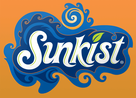
Sunkist, one of the many orange sodas looking to capitalize in parallel to the zesty orange success of Fanta, has recently updated its logo and line of packaging. Not much information to go on from the internet, but it doesn’t take a rocket scientist to figure out this one: More swirls equals more sales; it’s the kind of thing they teach you at Harvard Business School. Serious. Swirls. And swirls within swirls? It’s an implosion of success waiting to happen. In all fairness, the lettering isn’t half bad, it resolves the counterspaces rather successfully, but the orange party happening around it is just a little too much to handle. And in comparison to the recent Fanta rebrand, this is just way too undercooked.
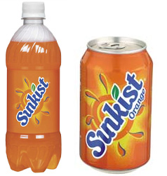
Old Sunkist packaging.
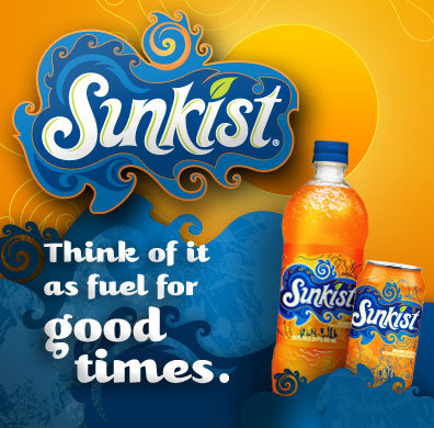
Promo image from Facebook.
Thanks to Tim French for the tip.


Jump to Most Recent Comment
Paul Lloyd Johnson’s comment is:
Nice to see a bottle that doesn't look like a penis. Great!
On Nov.23.2008 at 10:25 PM
Neven’s comment is:
Love the hell out of it, warts and all. Glad to see someone go baroque after the templatey Pepsi "design".
On Nov.23.2008 at 10:37 PM
Dean’s comment is:
Also interesting that compared to the other pepsico rebrandings this one is a much more complicated design compared to the very simple pespi/max etc brands.
On Nov.23.2008 at 11:05 PM
Craig’s comment is:
Very messy design here.
I like the current design, much easier to spot in the drinks fridge.
On Nov.23.2008 at 11:11 PM
Jeff’s comment is:
The S immediately reminded me of Snapple's ...
On Nov.23.2008 at 11:13 PM
AW’s comment is:
Somebody looked at this and said "it's great but it needs a gradient" so they snuck one in on that ball-type object above the lettering.
On Nov.23.2008 at 11:17 PM
oscar’s comment is:
Sinkist?
(Yes, I realize the old logo has the same weird "un" ligature)
On Nov.23.2008 at 11:26 PM
Harrison’s comment is:
i guess its alright if swirls are your thing, but the thing that really kills me is that hideous swirl blob abomination in the bottom left corner. it's like someone took the swirl tool and smoothed it to the point of complete un-swirl.
On Nov.24.2008 at 12:02 AM
Sergie’s comment is:
Hmmmm.... the swirl/wave action isn't working well in general and with the new text treatment. I think adding blue and this weird style hurts the brand image of sunkist. They are totally losing the SUN in sunkist and replacing it with some badly-drawn swirls or whatnot. Are they trying to appeal to us surfer brahs in so-cal? I'm not buying it.
On Nov.24.2008 at 12:37 AM
Mr. Frankie L’s comment is:
I do like the typography but the blue stuff surrounding it seems a bit overkill...It does have this baroque/70s/surfer vibe...which makes it very aggressive looking compared to its stale predecessor. More aggressive = more sales? I dunno..I'm a bit indifferent to this re-design..I wonder if there were any conceptual objectives which lead to this visual route, like "make it the pitbull of oranga sodas!"
On Nov.24.2008 at 01:34 AM
Bjorn’s comment is:
This is hideous. *puke*
And I am puking not because its so ugly, but because the swirly water is making me seasick. And then maybe after that I would drink some Sunkist.
Plamen’s comment is:
Actually, I like it.
Tho there's much detail for designers to pick on.
On Nov.24.2008 at 03:46 AM
Henry’s comment is:
On the bottles and cans, the logo is strangely compelling. The lettering really shines when viewed on the bottles and cans. Out of this context though, it loses something significant. I can't quite put my finger on it.
On Nov.24.2008 at 03:58 AM
Nisio’s comment is:
I think it's great. It has what the previous logo lacked... energy
On Nov.24.2008 at 04:23 AM
Mrs. M.’s comment is:
I've seen this live and I think the new look is quirky and attractive. My husband is more or less addicted to Sunkist, and we had absolutely no trouble finding it. In fact, I think it was a tad easier, truth be told.
I remember seeing the box and cans, then thinking: Did they redesign this? It looks more festive than I'm remembering.
I really like it. It's bright and fun.
I also saw the new Pepsi fridge packs last night. UGH! They're even worse than the cans and phallic bottles. So plain and cheap.
On Nov.24.2008 at 07:29 AM
colormist’s comment is:
I like the font and I like swirls--but there's a limit for everything.
Plus, I really don't understand the shadow play on that ad. Does anyone else find it confusing?
On Nov.24.2008 at 08:40 AM
Billy’s comment is:
Hum.. I read Sinkist the first time... Why have they collapsed the "U" and the "N". I know it always been that way with that brand, but hey, you always need improvement.
I don't know about this new identity. Too much waves for me. Seems a little bit uncontroled... It's my first impression tough.
On Nov.24.2008 at 09:12 AM
jean claude vanMammal’s comment is:
i like the bottles with the shape of the orange bursting thru the top! nice little detail!
im not too crazy about the rest of it, though. It still reads like "Sinkist".
On Nov.24.2008 at 09:14 AM
Jonathan’s comment is:
That "un" ligature is solid. Its actually refreshing to see the company decide to stick with it! The typography is nice, I'd be curious to see it stand alone without the swirls.
I'm not much for swirls, in fact, I freaking hate swirls. But this does have an energy now that is was missing before. I think this makes them able to compete with Fanta, and not from a design standpoint, but in a consumer state-of-mind,
On Nov.24.2008 at 09:20 AM
koyo’s comment is:
Where's the Graphic Design?????
On Nov.24.2008 at 09:32 AM
Philip’s comment is:
It's almost like when you have that friend that thinks he is artistically gifted and he designs his own tattoo...
On Nov.24.2008 at 10:08 AM
Ben’s comment is:
Way to much!
Could have promoted the wave concept with a simplier design. Looks like the logotype squished a blue paintball when it was applied to the bottle.
Andrew Klein’s comment is:
I really liked the original typography, I think they lost something.
I don't really care for the blue swirls; too Van Gogh neo-retro-trend-is-the-new-concept for me.
Mingshi’s comment is:
S.I.N.K.I.S.T.
- the excessive waves at all directions reminds me of some colourful fuzzy drinks from SE Asia...
On Nov.24.2008 at 11:18 AM
Harper’s comment is:
It's quite astounding how well it works on the bottle and can, and how dreary it looks flat.
I guess when you're designing a logo for a soft drink it's all about what it looks like on the actual merchandise.
On Nov.24.2008 at 11:38 AM
The Spelling Nazi’s comment is:
Please read:
ITS/IT’S
The exception to the general rule that one should use an apostrophe to indicate possession is in possessive pronouns. Some of them are not a problem. “Mine” has no misleading “s” at the end to invite an apostrophe. And few people are tempted to write “hi’s,” though the equally erroneous “her’s” is fairly common, as are “our’s” and “their’s”—all wrong, wrong, wrong. The problem with avoiding “it’s” as a possessive is that this spelling is perfectly correct as a contraction meaning “it is.” Just remember two points and you’ll never make this mistake again: (1) “it’s” always means “it is” or “it has” and nothing else. (2) Try changing the “its” in your sentence to “his” and if it doesn’t make sense, then go with “it’s.”
TO/TOO/TWO
People seldom mix “two” up with the other two; it obviously belongs with words that also begin with TW, like “twice” and “twenty” that involve the number 2. But the other two are confused all the time. Just remember that the only meanings of “too” are “also” (“I want some ice cream too.”) and “in excess” (“Your Walkman is playing too loudly.”). Note that extra O. It should remind you that this word has to do with adding more on to something. “To” is the proper spelling for all the other uses.
And just to make this on-topic: I think this is an excellent rebranding!
On Nov.24.2008 at 11:40 AM
Yeison Agudelo’s comment is:
i feel the blue wave thing is a bit too much
On Nov.24.2008 at 11:56 AM
Camryn’s comment is:
It seems much more 'ocean' than 'sun' or 'orange' now, so somewhat of a disconnect there for me... except in-context on the packaging because the product itself injects more than enough orange into proceedings.
The seriously annoying thing is that tagline. I automatically reject any tagline that says "Think of it as X". The whole idea is to make you think of the product in some way that's more subtle than simply commanding you to do so!
On Nov.24.2008 at 12:07 PM
Spike’s comment is:
Why are the "u" and "n" merged? Looks sloppy and makes it harder to read for the average, non-designer consumer.
On Nov.24.2008 at 12:25 PM
Rodrok’s comment is:
I think it's an improvement to the last logo, definitely has more personality, I like the use of dark blues, give a sense of deepness... like "deep in the flavor" that's what comes to my mind.
the swirls... i like the risk maybe a little too much but hey now a days you have to stand out in those fridges. I think the sun at the top could be executed a little better, to much going on there..
I like the ligature
On Nov.24.2008 at 12:32 PM
rickyaustin’s comment is:
Reminds me of the NBA All Star game in New Orleans.
Bleh.
On Nov.24.2008 at 01:01 PM
Hibryd’s comment is:
This is your logo.
This is your logo on acid.
Any questions?
On Nov.24.2008 at 01:12 PM
Bb’s comment is:
The top leg on the "k" looks like an "r". So i feel like I'm reading Sunkrist. Lot's of fun elements, but size and placement of the swirly sun in a wave feels awkward.
On Nov.24.2008 at 01:28 PM
Bb’s comment is:
The Fanta redesign is out juicing Sunkist in my book.
On Nov.24.2008 at 01:32 PM
Darel’s comment is:
It's very nice, but doesn't really scream 'ORANGE SODA'. Which, it is.
On Nov.24.2008 at 01:32 PM
Brian Yerkes’s comment is:
I liked it at first, but now that I look at it a little more closely, I can't help but wonder "What were they smoking when they came up with this"
On Nov.24.2008 at 01:56 PM
Larissa Gaston’s comment is:
Too busy. I liked the old one better.
On Nov.24.2008 at 01:56 PM
ryan’s comment is:
It's a bit overdone, but I actually like it. I think it's biggest downfall is that this logo does nothing to tell me what the product actually is. Is it a water park? A movie? So yeah, I agree with Darel, no notion that it's orange soda. But I do like the organic, almost graffiti-style execution.
On Nov.24.2008 at 01:57 PM
Brian Yerkes’s comment is:
Oh, and you are completely correct with your statement that this is far from the success of the fanta re-brand. Fanta got it right. "Sinkist", unfortunately, swing and a miss.
On Nov.24.2008 at 01:59 PM
antoine butler’s comment is:
YIKES!
Looks gypsy-esque. If I rub the can does a genie pop out and grant me 3 wishes?!
FAIL
On Nov.24.2008 at 01:59 PM
blue’s comment is:
I quite like it but ... isn't it a little blue for an orange drink? Shouldn't the liquid wave motifs resemble the orangy drink that they are supposed to represent?
Take away the orange background and you have ... water? Take away the leaf as well and ... toilet cleaner?
The swirls are good though. I dig the groovy swirls.
On Nov.24.2008 at 02:09 PM
Glenn Sakamoto’s comment is:
I like the lettering. The 'wave' frame is a bit much, tho...
On Nov.24.2008 at 04:35 PM
gak’s comment is:
I like it better than the old one. I wish they wouldn't have done the outer swirl-ring though.
On Nov.24.2008 at 05:07 PM
Andrea’s comment is:
I like it better than the old one; it really stands out and is more "active."
However, the blue and the name make me think Starkist Tuna. Anyone else get that?
Orange-flavored tuna!
On Nov.24.2008 at 05:10 PM
Matt L.’s comment is:
"I think it's biggest downfall is that this logo does nothing to tell me what the product actually is. Is it a water park? A movie? So yeah, I agree with Darel, no notion that it's orange soda."
Come on, I think at this stage of the game anybody who's in the market for Sunkist knows exactly what it is.
On Nov.24.2008 at 05:28 PM
Chris’s comment is:
Way too busy. Good thing for Sunkist, Fanta tastes terrible.
Here's the "un" ligature done well: Link
On Nov.24.2008 at 05:37 PM
XK9’s comment is:
A little too Sigmund the Sea Monster for my taste. Seems more slimy briny kelp, than sun kissed orange.
And yes the bottle isn't phallic, but that bulbous top is a little too reminiscent of another part of the male anatomy. I'm just saying.
On Nov.24.2008 at 06:11 PM
XK9’s comment is:
BTW, I'm all for hand drawn type. When will someone give the boys at House a crack at a soft drink or breakfast cereal?
On Nov.24.2008 at 06:13 PM
Scott jay’s comment is:
Agreed, this is nothing on the fanta rebrand.
On Nov.24.2008 at 09:21 PM
cmd’s comment is:
yeah, just because you know how to use the twirl tool on illustrator doesnt mean you should.
On Nov.25.2008 at 01:04 AM
Mark’s comment is:
ohhhhhhhhhhh myyyyyyyyyyy......
it went backwards
um at least there's no errr swooshes...
On Nov.25.2008 at 05:39 AM
Lauren’s comment is:
Mrs M said:
"I've seen this live and I think the new look is quirky and attractive."
As a logo it is offending my senses, but there is some weird star power going on with the packaging. Can't wait to see it in person as the renderings of the package look so much better than the real thing. (I was so relieved to see that in person the new Pepsi bottle does NOT look suggestive!)
Has Sunkist ever been a fun brand like Fanta?
Pamela L.’s comment is:
I'm not totally sold on it.
It looks like a decal on a t-shirt a "tween" would wear. Only it would have said "SWEET" or "GRRL POWER" on it.
I think this will be a short lived style, just like fashion.
On Nov.25.2008 at 12:22 PM
Mrs. M’s comment is:
Humorous incident last evening.
We bought a 12-pack box of Diet Sunkist last week, and I noticed the box itself bears the new design (modified for its diet status, natch), but the cans retain the old design. Since I don't drink it, I hadn't paid it much mind.
I suppose I can concede that as a stand-alone logo, the wavy holding shape is dubious. The type, even the funky ligature, works for me. I confess to harboring a deep and abiding love for psychedelic excess, though, so even the holding shape appeals to my weird little eyes.
I don't know much about Fanta. I believe they were the cola that used silly dancing bimbos in their advertising campaign a few years ago? Blah!
I drink good old Coca-Cola, so these other drinks fall below my consumer radar. My husband's the one who tests the carbonated waters.
On Nov.25.2008 at 12:44 PM
brand new reader’s comment is:
I know that Pepsi makes Sunkist. Sunkist's new logo is way better than the new Pepsi and the Tropicana logo. I think Pepsi fired their graphic designer and hired a better person. If Pepsi's new logo was like the Sunkist-people would begin to buy Pepsis again and not Coke.
On Nov.25.2008 at 01:37 PM
Jamie’s comment is:
Reminds me of this, but not as good.
On Nov.25.2008 at 02:23 PM
Nathaniel’s comment is:
Take the text out of the blue swirly blob and I would like it a lot more.
On Nov.25.2008 at 02:28 PM
BWJ’s comment is:
The type treatment works well, but the surrounding swirls just seem to be so random and poorly executed, it ruins the whole thing.
Fanta FTW.
On Nov.25.2008 at 03:19 PM
Design’s comment is:
Looks like Crush is our last hope for maintaining some dignity.
http://www.drpeppersnapplegroup.com/files/2008/05/05/img_151052712372.png_large.png
On Nov.25.2008 at 04:18 PM
Randy Hill’s comment is:
What's with the swirly blob? What's the point?
On Nov.25.2008 at 05:22 PM
Paul’s comment is:
certainly has the energy it needs.
the trippy aspect probably isn't necessary ... but it seems to work.
looks delicious.
On Nov.25.2008 at 06:02 PM
Dylan ’s comment is:
It swirls too much around the first S. If it was meant to get the eye moving over the rest of the logo, it works but moves it back around to the big S again without reading the rest of the name.
On Nov.26.2008 at 02:23 PM
Diego’s comment is:
The Sunkist logotype has always annoyed the hell out of me.. IT SAYS SINKIST FOR CRYING OUT LOUD...
On Nov.27.2008 at 08:48 AM
Dylan ’s comment is:
Now that I look at it, the type face looks awfully similar to this:
![]() http://www.pleasantvillemusicfestival.com/images/snapple_logo.jpg" />
http://www.pleasantvillemusicfestival.com/images/snapple_logo.jpg" />
Miam’s comment is:
ugly junkie
On Dec.07.2008 at 06:14 PM
Syme’s comment is:
I love Sunkist soda. I know I shouldn't, but I do. For 25 years I've been loving this orangy drink. I even remember their previous logo updates back in the 80's and 90's - long before I knew that I even cared about graphic design. I'd go to open a can, stop and say "hey this logo looks a little different" and then drink that sucker down. Things were good between us.
However, after 25 years of being one of the bigger advocates of Sunkist soda, I can honestly say that this logo is ugly enough that it will prevent me from buying the drink. Opening my refrigerator and seeing this staring back at me?! Nope.
Sorry new Sunkist. You're done. Guess I better go stock up on 'old' Sunkist like we did on 'old' Coke back in 83...
On Dec.08.2008 at 03:11 PM
Mark’s comment is:
I actually saw the bottles in person, they look very nice, thew pictures don't do it justice.
On Dec.10.2008 at 10:29 AM
D’s comment is:
My team created this.
This is fun dialog and I appreciate the stir its created.
A few comments without getting into it too deep:
- The logo as shown has been taken out of context - it was not designed to be "extracted" and placed on a plain orange background. Look at the packaging or the website. There's some fun stuff in the background that lends narrative.
- This was designed for teens - if you're a twenty or thirty something designer and it's not your cup of tea, that's cool - it wasn't designed for you.
- The ligature is a legacy from the old identity. We explored getting rid of it and keeping it. In the end we liked the quirkiness.
- Pepsi doesn't own Sunkist. Neither does Coke.
- Interestingly the Sunkist and Fanta redesigns were launched almost simultaneously (they are made by different companies). We "gulped" when we saw Fanta because one of our other "near final" designs had the same retro-funk, manga/anime feel Fanta used: they would have looked like cousins. Teens we talked to about it felt it was too youthful or "tweeny" and preferred the slightly more grown-up (aspirational) design we launched with.
Anyway, keep up the conversation!
On Dec.11.2008 at 10:45 AM
Lance Langdon’s comment is:
I've seen it on shelf and it really stands out. Sunkist was long overdue for a redesign and now it has character.
I love it. Bravo.
On Dec.11.2008 at 01:07 PM
jmc’s comment is:
i think the new logo, especially when on the bottle and can, look fantastic. why can't a fun, flavored soft drink have energy, and look like a good time? i think the designer(s) hit the nail on the head!
the only thing i disagree with is the comment above about the logo not being designed to be extracted. as far as i am concerned, a logo should ALWAYS be able to function when extracted, and to not consider this during the design exploration seems like a major oversight. extractability should be one of the pillars of good design...at least the way i was taught...perhaps at brandimage things are different? :)
D - thanks for the add'l background information...it's always helpful to know more of what went into the design process.
On Dec.11.2008 at 01:08 PM
Mongoose’s comment is:
To 'D': Thanks for stopping by! Always nice when we get to hear the voice from the people doing the work.
Now, Sunkist to me has always been been very much a brand of the oranges first and the orange soda second; but that's my personal experience. Sunkist=Orange, while the competition, Fanta=Orange but other flavors.
So I'm somewhat surprised at the de-emphasis of orange in the packaging and brand; there's a huge punch-up of the blue and swirly here. It works a lot better on-packaging, agreed, where there's orange background.
But the leaf's still there, the up-top swirl has a bit of the old logo's feel to it.. it's a smidgen harder to read cleanly, though I don't think the ligature is any more complicated in this version. The in-letter pale green marks, I suppose a maritime feel was tried for; this reads ocean, ocean, ocean to me. No Scurvy when you sail with Sunkist!
Overall, I give it a B, with +=- not yet ready to hand out. I want to see it in person, and want to see what the diet will do for packaging (Can you make it look diet and keep orangy with that new logo?) before I can finalize the grade.
--Mongoose
On Dec.15.2008 at 12:34 AM
Tim’s comment is:
I like the old look much better. I read that this new look is suppose to appeal to the 'Young Folk' and I have to let Sunkist know that I am 18 and I rather see the old look with the sun.
On Jan.05.2009 at 11:31 AM
karen’s comment is:
I drink Sunkist regularly, love the taste. When I saw the new packaging, I didn't think much of it, but when I tasted the product in the new packaging, it just didn't taste the same as what came in the old packaging. Am I the only one who thinks the flavor has changed? To me it tastes more like tangerine soda than a Sunkist Orange. Also, I notice the spelling is "Sinkist" instead of "Sunkist." This made me wonder if Sunkist had sold out to another company that uses a different recipe.
On Feb.18.2009 at 03:05 AM
Adam Bestwick’s comment is:
Bold update of the typography - it's fun, lively and it appeals to me although I do agree with the comments about the surrounding swirls being over-done.
Does anyone else get an indian vibe from this styling, like it's been plucked from a Bollywood poster?
Shauna ’s comment is:
how the u is joined to the n makes me read it as Sinkist at a first glance.
I'm not too fond of it, not a complete failure but not a success in my books.
Comments in Brand New, V1.0 have been closed.


