

NOTE: This is an archived version of the first incarnation of Brand New. All posts have been closed to comments. Please visit underconsideration.com/brandnew for the latest version. If you would like to see this specific post, simply delete _v1 from the URL.
![]()
Operating since 1933, Air France has become one of the biggest and most recognized airlines in the world, traveling to nearly 100 countries. A new identity, replacing its last update since 1975, has been designed by Brandimage. A brief video explains a little bit about the change.
![]()
Despite still being officially referred to as “Air France” in two words, the logo is set as one word, which is oddly confusing. Its saving grace is that the typography is quite handsome and alone worth the upgrade. Gone are the race car-like, angled stripes that didn’t quite do much for me, and instead there is a new single ribbon-like icon that is simpler and, ideally, more iconic. With enough usage and years under its belt, I’m pretty sure it will become so. Questionable whether the shadow on the ribbon is necessary, but it does add some nice, subtle depth.

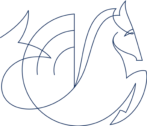
When Air France was formed in 1933 from the merger of various airlines, it adopted the logo of Air Orient, a hippocampe ailé (winged sea-horse), which has served as the icon for Air France and its parent company on and off through the years. I’m not entirely sure what role this latest iteration plays in the identity, but it sure is beautifully crafted. This image was floating around a few months ago, but I don’t know how official it is.

The new livery is nothing to get excited about, it’s pretty simple and harmless. Although the graphic on the tail seems contradictory to the idea of change as it reflects the old stripes. Overall, a nice, elegant update.
Thanks to Austin for first tip back in January and Plamen for reminding me this week.


Jump to Most Recent Comment
Nick Irwin’s comment is:
"handsome" is a great way to describe the typography. The icon maybe a little subtle for me but over all well designed.
Is it just me or does the right terminal on the "A" of "Air" appear different than the "A" on "AF" ?
On Feb.11.2009 at 08:33 AM
Matt’s comment is:
No Nick, I see it too.
Was probably just to mimic the curve under the ribbon, sort of mirror'd opposite side of the F.
On Feb.11.2009 at 08:37 AM
Remy Overkempe’s comment is:
NOOOO!! It was such a recognisable logo, and yes, even though it wasn't very smart or exciting, I believe most Europeans will immediately recognise those stripes and think "Air France." The new stripe? Blech.
On Feb.11.2009 at 08:48 AM
Benjamin Hickethier’s comment is:
Actually there was a more recent update of the logotype, done by Jean-François Porchez in 2000.
Well, the seventies-like racing stripes were not that iconic either, but writing »there is a new single ribbon-like icon that is simpler and, ideally, more iconic« sounds a bit ironic to me, since its so zeitgeisty effects and shape (the shape of course gets quite inspiringly beautiful when in combination/abbreviation with AF and the A's tail).
On Feb.11.2009 at 09:06 AM
diogo’s comment is:
Yes, it's pretty and it's elegant. But the concept is too similar to British Airways... I wouldn't say this if it was any the company, but British Airways?? They should have thought about that. And I kind of liked their sport shoes look...
On Feb.11.2009 at 09:08 AM
Andreas Lanjerud’s comment is:
My first thought too, Nick. What's up with the different "A"?
Not sure if they needed a rebranding, but I instantly felt good about the result so ... it's all good.
On Feb.11.2009 at 09:14 AM
Jeff’s comment is:
I like it a lot! The shadow & gradient were tastefully executed. Good re-brand.
On Feb.11.2009 at 09:17 AM
Dale Campbell’s comment is:
I think it's pretty nice.
I would like to see that new iteration of their hippocampe as line art on the plane - might look pretty sweet.
At the very least it would add a little flavor to what seems to be a dull graphic for the plane.
I like the typography and shedding of stripes in the logo. Nice and simple. Perfect for something that will be used across so many different mediums.
Keep well,
Dale
adrian’s comment is:
Just to have said it: The hippocampe appears at the very end of the presentation video mentioned in the article above...
On Feb.11.2009 at 09:36 AM
rickyaustin’s comment is:
Are they a division of Delta? Because this feels a bit too much like the new Delta identity for my liking... only because they are in the exact same industry.
![]()
jRod’s comment is:
although it is very conservative, it was still well executed and deserves credit for that. many people would disagree with me on this, but i think its better than the TACA logo.
nice job frenchie.
On Feb.11.2009 at 09:43 AM
dani’s comment is:
It seems like a serious, unpretentious work.
The overall solution is correct, but the AF contraction has some problems, they letters look different somehow...
AnthonyHarding’s comment is:
rickyaustin, they actually are very strong codeshare partners and will soon be granted anti-trust immunity (about the closest you can get to a merger without merging). Very shortly, they will operate almost as one airline. So yes, I do believe that the similarities you noticed were not coincedental, but done on purpose.
Personally, I think it's a nice, refreshing change with a nod to their historical identities. To me, the new logo represents that of a wingtip, or a ribbon, or the French Flag (with the AIRFRANCE being the blue, much in the style of their old logo, the way the blue was 'chopped' up). If only Delta could've had a better rebrand.
On Feb.11.2009 at 10:11 AM
Pamela’s comment is:
Air France lost some weight! :D
How very healthy!
Although...I'd work a bit harder to shed that extra 2 pounds, ie. the shadow.
Cheers!
On Feb.11.2009 at 10:17 AM
damon’s comment is:
the A's are different, and so are the ribbons themselves. the thickness, length and shadow are all inconsistent.
I like the typography in general, but kind of like what they've done by rounding out the corner of the A in AF to match the ribbon. Perhaps that could have taken the air france type a bit further.
it does resemble british airways for sure. I like it ok, but I think there was some potential that wasn't utilized....however who knows what the client wanted in the end.
On Feb.11.2009 at 10:20 AM
Matt Puchlerz’s comment is:
I really can't believe that more people aren't calling out the AF/ alternate logo, as the modifications to the type are horrendous to say the least. While I'm not the biggest fan of the typeface in general—particularly the A and the R—the bastardization of the A to somewhat mirror the "ribbon" is a major offense in my opinion.
Gross.
On Feb.11.2009 at 10:28 AM
Rodrigo Müller’s comment is:
like it, but don't love it.
On Feb.11.2009 at 10:53 AM
Chris Herron’s comment is:
The new mark is a positive step forward. Its subtlety should allow it to stand the test of time. The type appears to have some minor weight inconsistencies, but it's fairly distinctive for unassuming sans serif caps.
I suspect the designers were trying to avoid the splashy color trend apparent on the planes of competitors, but the tail graphic does not make a strong statement. With some more colorful livery, this could be a strong visual identity system.
On Feb.11.2009 at 11:03 AM
Ben’s comment is:
The video makes me believe that it is in a place very similar to Delta, as well. It's not that it was "stolen", but rather that it isn't differentiated in it's execution enough.
Does anyone else see 'AFJ' in the shortened mark?
Also, it's a bit troubling that they have nothing to indicate the two words "air" and "france", but perhaps the purposefulness of that is directly related to how one would say the brand's name. Curious.
On Feb.11.2009 at 11:35 AM
Nick Irwin’s comment is:
French typography has been pretty consistent...

too bad Peugeot doesn't make bikes anymore
On Feb.11.2009 at 11:36 AM
Austin’s comment is:
I think that the new logo is a good change. It has a stronger presence than the previous logo, even though the previous one was quite heavy. The little shadow on the ribbon is kind of funny, but I like it.
On Feb.11.2009 at 11:37 AM
Plamen’s comment is:
The typography comes from the corporate Air France-KLM logo:
![]()
The overall look does remind of BA, though.
django nr.5’s comment is:
the red element looks like the austrian airlines logo..
![]()
Nate’s comment is:
No better, no worse.
On Feb.11.2009 at 12:18 PM
Carlo’s comment is:
I for one, am getting a little bored though with all the red marks for airlines. On an individual basis it makes complete sense for visibility and polish; I mean who wouldn't want to have a plane in the sky with a big red mark on a light-blue-cloudy backdrop. But what about distinction and individuality in the big picture?
And I agree Ben, to me the "AF" mark with the red ribbon reads more like "AFI". Which may be why they stayed away from modifying the "A" to exactly mimic the ribbon?
On Feb.11.2009 at 12:58 PM
Kevin’s comment is:
I agree, Dale. I think the hippocampe could be used more effectively - at least more prominently perhaps on the tail instead of arbitrary lines.
On Feb.11.2009 at 01:11 PM
Snerdey’s comment is:
I agree that Red is over used but its a symbol of power and due to the fact that it's remembered 1st in the brain not even the name of the airlines is remembered it always about the logo or eye candy, swoops whatever that people recall 1st.
Funny how something so small can have such an impact on the success or failure of grabbings ones attention.
On Feb.11.2009 at 01:56 PM
Lincoln Rozelle’s comment is:
As was said above:
The ribbon just reminds me of BA. And that's fine because whenever I'm tempted to fly Airfrance because of the price, that little ribbon will remind me to go with BA.
On Feb.11.2009 at 03:09 PM
Dan’s comment is:
Snerdy & Carlo:
Why are you even debating the use of red? Have you overlook the small fact that this is Air FRANCE, and the French flag is RED, WHITE & BLUE. Nearly all national airlines use the national flag as their colour palette. Hard to avoid that really.
Serviceburo’s comment is:
I'd have to say that the redesign is an improvement, albeit a small one. The stripes in the old version threw me off as they were not referencing the text in any particular way. However, I would like to see spacing between "air" and "france" in the logotype - I'm not a fan of creating compound words. The new stripe is pretty innocuous (the shading isn't necessary, but is also not terrible) but at the same time, it just begins to look too much like a generic airline logo. With the new visuals from XL and JetBlue that have been posted on this site, I would really hope for someone to have done something a bit more eye catching and original.
The alternate logo, however has a serious issue - by modifying the upright on the "A" it creates the impression that the ribbon graphic is an "i" and causes confusion about how to read the logo.
On Feb.11.2009 at 06:41 PM
Paul Lloyd Johnson’s comment is:
That red thingy is so forgettable. The plane looks nice though.
On Feb.11.2009 at 06:42 PM
Nisio’s comment is:
Much prefer the older logo, heavy type and all. Much more character.
On Feb.11.2009 at 06:43 PM
lucid’s comment is:
Better than all the logos I have seen here lately... proof that Europe kicks our ass!
Need to get American designers to wake up!
On Feb.11.2009 at 06:46 PM
Grant’s comment is:
The subtle shadow of the red mark gives an interesting dimension, but it probably gets lost, especially when it is large scale on the actual plane. The Austria logo also has a shadow, but it is more pronounced.
On Feb.11.2009 at 06:59 PM
Sab’s comment is:
This is the BA logo:
![]()
I think the new logo is clean, simple, elegant; but I don't understand the union between "Air" and "France"; the shadow of the ribbon just gets lost and finally I have a question: is that tone of blue the same one of the French flag?
On Feb.11.2009 at 08:40 PM
Cuda’s comment is:
My first thought on seeing this is nooooooo....
Those "racing car stripes" are so instantly recognisable along with the bold confident typeface. Yes it's been around since 1975 but it looks as good now as it did then. The new logo is just so "meh". The red squiggle thing, taken in isolation could represent absolutely anything. As has been pointed out, BA did the ribbon first and did it much better.
Resembling a poorly formed J does not help much. AIRFRANCEJ, AFJ? WTF?
Seems like a very unnecessary rebrand. Wonder how much it cost.
On Feb.11.2009 at 09:09 PM
mm’s comment is:
France had to make their logo from the ribbon scraps left over from the British logo.
On Feb.11.2009 at 09:18 PM
T-Bones’s comment is:
pretty nice. but the drop shadow is unecessary. i had to stare at it to figure out if it was supposed to be there.
Cuda, interesting comment about the 'J' – maybe they should've placed it in front of the wordmark, it would run nicely against the 'A'.
On Feb.11.2009 at 09:33 PM
William’s comment is:
the ribbon symbol should've been taken a little further. i'm a believer in subtlety, but the current ribbon effort comes across as just a bit too unintentional / meek-hearted.
the letterforms aren't bad (esp. in light of what we've been seeing here lately), but they need add'l. love to really sing a'la a bit of visual tension and dynamism. overall, a nice effort.
Louhead’s comment is:
The fact that a plane only has so much height to plaster a logo, a simple sans serif logotype is the way to go. However, most planes are plenty long enough that they could have added just a little space between 'Air' and 'France'. Just a thought. Overall, though, it pretty much says "I'm an airline" to me.
On Feb.11.2009 at 10:55 PM
ShapeOfThings’s comment is:
Very, very, very poor.
Roger Excoffon must be rolling in his grave.
It does very much look like a watered down version of BA's logo. The strong antique olive derived original has a much more optimistic, organic and strong character as compared to the new clumsy version. We have gone from the supersonic Concorde to giant buses in the sky.
Perhaps it is just symptomatic of the state we are at in the beginning of the 21st century.
On Feb.12.2009 at 04:29 AM
Paul Cooley’s comment is:
I agree with Louhead with the "I'm an airline" bit...it just has that feel immediately.
Success in that regard and we can't forget about that pretty solid type set-up. I'm not in any way bothered by the "airfrance" instead of "air france" situation and i think it flows very nicely.
I want to see it on all the signage and uniforms!
On Feb.12.2009 at 08:33 AM
Goffredo Puccetti’s comment is:
This logo is a watered down version of BA's logo + a shadow.
These are bad times. In USA and in Europe too.
Noah’s comment is:
I dig it with a shovel.
On Feb.12.2009 at 09:56 AM
Adam’s comment is:
It does look very similar to all the other airlines mentioned above...but it doesn't make me want to vomit like many of the other recent redesigns mentioned on this site...so is that good?
On Feb.12.2009 at 10:32 AM
Tony’s comment is:
Such a shame. While the type is lovely, the stripes have always been so distinctive. It looked great on the tailfin (which is still there) but also on napkins, chair backs, luggage tags... Such a lovely accoutrement used in such broad ways that you can't do with the swoosh.
On Feb.12.2009 at 12:36 PM
Jerry Kuyper’s comment is:
It is amusing to me to hear people lament the loss of the "racing stripes".
Around 25 years ago, I recall hearing RitaSue Siegel saying if she saw one more portfolio with racing stripes she was going to vomit.
I don't understand why the AF version needs to exist. Air France is a short, clear, descriptive name.
"Let's bring back our historic beast, we can still use the racing stripes on the tail, let's create something minimal for our new logo and do a contemporary abbreviation of our perfectly good name, you know like nwa".
On Feb.12.2009 at 01:09 PM
Loren’s comment is:
this airline lost my luggage on a recent trip to Madrid! They have money for new logos but no money to reimburse me?
Seriously though, how come we cant talk about that CSX freight train logo, that is brilliant...
http://cee.uiuc.edu/railroad/CEE/images/RR%20logos/CSX%20in%20Brackets_BLACK.jpg
it rivals KLM in its brilliant simplicity. love it...
On Feb.12.2009 at 04:03 PM
twilk’s comment is:
Which font would this be closest to?
On Feb.12.2009 at 04:29 PM
Chris’s comment is:
This looks really terrible, and within a few years, will be so very dated.
On Feb.12.2009 at 06:18 PM
Josh’s comment is:
So disappointing to see the French move from bold simplicity to the bland ubiquity of 21st century airline identities. Quick! Someone do something daring.
On Feb.12.2009 at 07:54 PM
David’s comment is:
Its cute, which kind of irritates me. Makes me wanna sneeze and wipe my nose with a perfectly clean, white, neatly folded cotton cloth.
On Feb.12.2009 at 08:38 PM
Fr. Chris Decker’s comment is:
yarr, tis a horizontally condensed Gill Sans Bold it is!
On Feb.12.2009 at 11:57 PM
koyo’s comment is:
Cool.
On Feb.13.2009 at 07:57 AM
Anonymous’s comment is:
Am I the only one who wodners what the French government thinks about the mark being in English, especially when the French version (I assume "Aero Francais" or something) would be understandable to almost as many people around the world?
It makes me giggle.
On Feb.13.2009 at 09:54 AM
Nathan McKinney’s comment is:
I see a J. Especially on the AF version. I read a J.
On Feb.13.2009 at 12:38 PM
Frank’s comment is:
Meh.It's just a ribbon, that's what it is.Is it supposed to mean something (beyond "Ribbon")?
If so, i can't see it.
On Feb.13.2009 at 01:00 PM
Roger van den Bergh’s comment is:
Great update of this airline classic. Sophisticated and simple, like the service they provide, and the way they are. I am very pleased with the re-introduction of the well-known winged sea horse, which rendering adds even more elegance.
Congratulations to Brandimage and Air France.
Roger van den Bergh
Onoma, LLC
New York
Mark’s comment is:
eh. it ok, nothing exciting, I like the tail design.
But do they REALLY need the shadow effect? It doesn't add anything to the logo.
On Feb.13.2009 at 05:34 PM
Glenn Sakamoto’s comment is:
Simple and clean. I like it.
On Feb.13.2009 at 08:58 PM
Joze’s comment is:
NO!!! Air France can't do that. The old logo was really a symbol of a company, that had tradition in it, but the new identity look like a completely new low cost airline company. Just too cheap for Air France! I'm not saying the old logo was excellent, but it had to remain unchanged.
PS: The F in AF just sucks!
http://www.enjoyart.com/single_posters/africa/afrique_air_france.htm
Lollipop’s comment is:
Looks like the son of British Airways and Austrian...


Joseph Maguire’s comment is:
I actually think the earlier stripes were more... professional they seemed more air officer like. The other symbol they kept reminds me of too much of what the rest of their entire field is doing. I liked the military officer stripes...
On Feb.15.2009 at 10:17 PM
lacroix’s comment is:
RE:Dale Campbell’s comment is:
I would like to see that new iteration of their hippocampe as line art on the plane
Traditionally Air France puts the Hippocampe on the side of each jet. In the plane image above u can see on the jet is the old hippocampe ... I checked with Air France Corporate website and it shows the same thing, I would assume they would change the hippocampe on the airplane too, but no plane as of yet is sporting the new look.
BTW, I belive just the design costs Air France 7 Million Euros... in a year when they expect to either make no profit or lose money (AF is one of the most successful airliners in the world and would NEVER officially merge with Delta, which always operates at a loss)
On Feb.17.2009 at 11:06 AM
Andrew Sabatier’s comment is:
My first thought was also 'British Airways ribbon', but on further reflection I think the new Air France identity stands its ground. Or is that airspace?
The name Air France has huge equity and the new abbreviated ribbon-esque symbol is clearly an evolution of the diagonal stripes, with additional subtle but significant attributes.
The new brand identity is crisp and clean but very formal and corporate. Formal and corporate normally comes at the expense of personality and uniqueness. The new look is restrained and highly disciplined but not entirely without character.
I get lift, tick, near vertical takeoff and hint of a curl around the aircraft maybe but also perhaps, conceptually, of the customer.
In the context of Air France the symbol suggests A and F enough to be owned, despite the generic and universal graphic language. It provides a visual shorthand for the brand which may work to iconic merit in the long term.
Air France as a one word logotype is a sensible move and has the gravitas two words wouldn't have. However, I'm all in favour of shorthand brandmarks but the AF and symbol alone seems weak. The identity is already highly abstracted. 'Air France' is critical to the identity and too much is lost without the full name. I think the shorthand version should be abandoned.
The hippocamp is an enigma. It's difficult to determine its worth without any apparent commitment to it as part of the identity system. The new drawing of the hippocamp is indeed elegant and as subject matter narratively rich.
It seems like a job done well but also half done.
A.
Randy Hill’s comment is:
I like it. Nice and clean.
On Feb.20.2009 at 03:25 PM
OSM’s comment is:
Anonymous-
The words; Air and France are spelled the same in French and English. Doofus.
On Feb.22.2009 at 10:47 AM
Anonymous’s comment is:
Red, White, Blue, Ribbons, Shadow, 2 letter usage (AF).....might as well merge wih BA !! Having said that nice fonts and the colour is a darker better blue than BA's...
On Feb.24.2009 at 10:00 AM
@dean’s comment is:
airfrance tries to look like british airways?
On Feb.25.2009 at 04:25 PM
Johann Laissez’s comment is:
The wireframe hippocampus horse or whatever it is will be a disaster... especially for any employee at AF without Illustrator, Gimp, or a vector program. And why 'skeleton' it, when it is the fantasy half-brother of the Mustang pony? :((
On May.30.2009 at 08:42 PM
Anonymous’s comment is:
navy blue, predominant since the birth of Air France, evokes the brand’s historical capital and the airline’s efficiency,
white, the colour of excellence, suggests well-being and the French travel experience,
the bright red accent, punctuates and energizes the brand, underlining both French chic and the attention paid to Air France customers by the airline’s staff, both on the ground and on board.
(This is from the Air France site itself.)
On May.30.2009 at 08:46 PM
Anonymous’s comment is:
This is the link:
On May.30.2009 at 08:47 PM
Adam Haase’s comment is:
Air France has recently been in the news for an Aeroplane mishap.
On Jun.01.2009 at 06:42 PM
Duy Pham’s comment is:
I really love the old logo, it is more french for me, classic and trendy, bold and graceful.
On Jun.01.2009 at 11:58 PM
blueangelnumberfive’s comment is:
The new design is fresh and clean. I do not understand why there is not a space between air France. With that being said, would it be typographically correct to type AirFrance, AIRFRANCE, or Air France?
Presently, the auto speller underlines AirFrance and AIRFRANCE.
On Jul.02.2009 at 01:36 PM
Comments in Brand New, V1.0 have been closed.


